Tag: baroque
Copacabana Font
Copacabana is heavily based on one of my favourite typefaces Goudy Old Style Italic. It is sharper and more clearly defined than Goudy yet still retains it old style characteristics. The face is slightly angled so is basically upright whilst
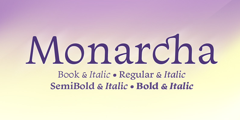
Monarcha Font
Monarcha is a type family with strong influence of the baroque style, for extended texts. Its roman versions are slightly skewed, in the sense of reading, and its italics have unusual calligraphic features. Moreover, the contrast between thick and thin
Coliseum Font
Coliseum was designed by A. Pat Hickson/Julie Hopwood. An original design and release by Red Rooster. Published by Red RoosterDownload Coliseum
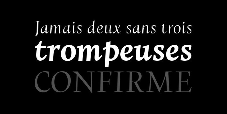
Braga Font
DSType proudly introduces BRAGA, an exuberant baroque typeface, named after a portuguese city, also known as the baroque capital of Portugal. Our latest typographic extravaganza comes with a multitude of fonts designed to work like layers, allowing to insert color,

Brigade Font
In searching for a Roman to use there were bits of Bembo,Times,Garamond etc., that I liked and bits that I did not. So I set out to take the best bits of all my favourite Romans and tried to create
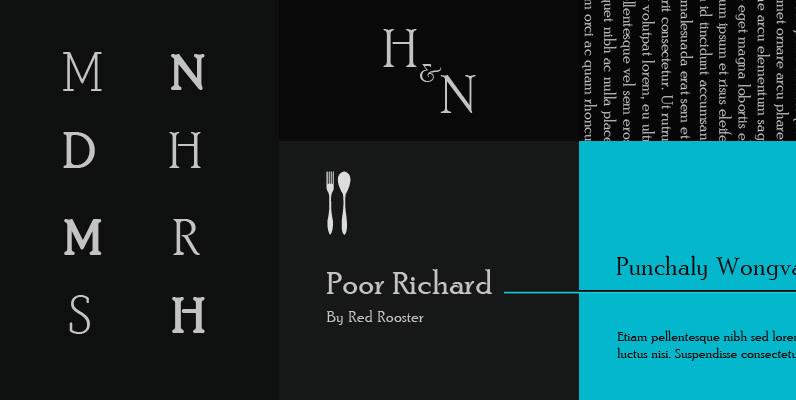
Poor Richard Font
Designed by Paul Hickson. Based on the Keystone Type Foundry design, circa 1919. The l/c ‘g’ appears as an alternate character in our font. Published by Red RoosterDownload Poor Richard
Beckenham Font
Designed by Les Usherwood, Beckenham was digitally engineered by Steve Jackaman. The x-heights are radically different; the x-height on the light version is small, and gets larger as the weights progress. Published by Red RoosterDownload Beckenham
YWFT Herzog Font
Originally drawn in 2008 by YouWorkForThem, we revisited the Herzog drawings in 2011 and developed them into a fully functional opentype font release. YWFT Herzog comes with two style options (regular and alternate), with each style containing opentype stylistic alternates
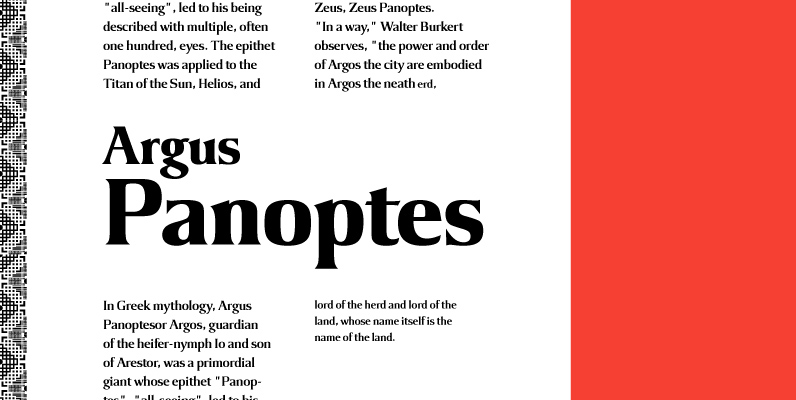
Argus Font
Designed by Steve Jackaman, Argus is a serif design based on the popular 1968 VGC typeface. Published by Red RoosterDownload Argus
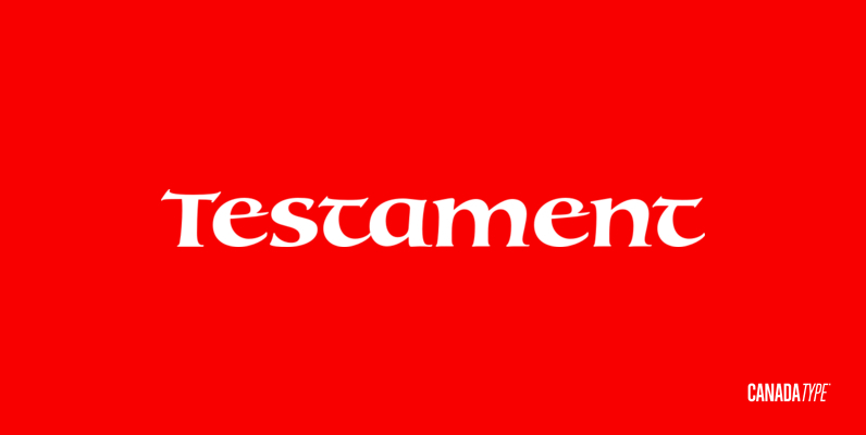
Testament Font
From the standpoint of calligraphy, a font family of capitals and uncials makes perfect sense. The Roman square capitals, the quadrata, are matched by round capitals of older Greek origin; the word “uncus” means hook-shaped like a beak or talon.
Astoria Font
Based heavily on Gill Sans especially in the mid weights, Astoria has a subtle top left serif which makes it not quite a Roman and not quite a Sans. Designed specifically as a text face it still works very well
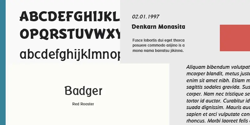
Badger Font
Designed by A. Pat Hickson, Badger is an original and unique sans-serif design. Designed for the Red Rooster Collection in 2002. Published by Red RoosterDownload Badger
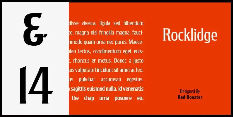
Rocklidge Pro Font
Designed by Steve Jackaman & Ashley Muir. This design was inspired by the 1965 VGC typeface, Jana by Richard D. Juenger. Originally available as a single weight, Rocklidge now has five weights and contains all the high-end features expected in
Forum Titling Font
Designed by A. Pat Hickson. An original design based on the Frederick Goudy design first shown in 1912. Originally a caps only design in one weight. Produced as a foundry face by Lanston Monotype 1924. Published by Red RoosterDownload Forum
Dominus Font
Designed by Steve Jackaman and Ashley Muir. It was our initial intention to develop a suitable lowercase for Les Usherwood’s ‘Elston’ typeface, based on a few characters from an old German typeface called Hermes Grotesque (Woellmer, Berlin). However, the new