Tag: balanced
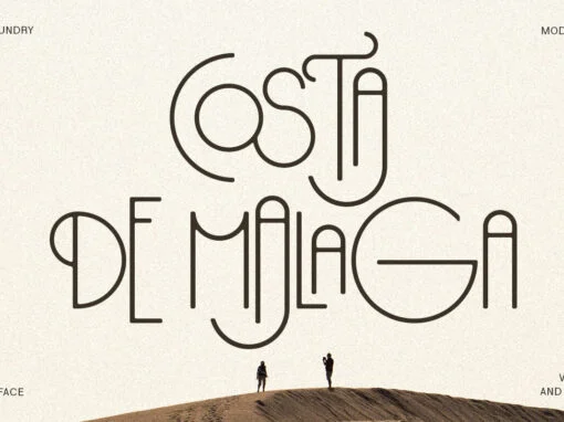
Costa de Malaga: Invigorating Design Narratives through Typeface Artistry
In the world of graphic and digital design, the visual power of fonts is undeniable. A well-selected typeface can breathe life into a message, capturing the viewer’s mind and imagination. Among the wide array of fonts available to the design
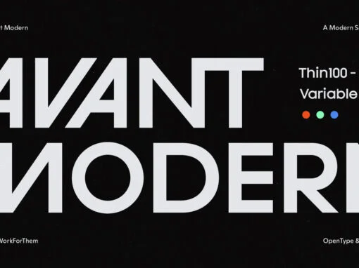
YWFT Avant Modern: A Definitive Crossroad of Classic Elegance and Contemporary Savvy in Typography
In the evolving landscape of digital design, the quest for a unique font that truly dawns the cap of both classic elegance and modern savvy can sometimes feel like a journey without an end. Yet, the creative minds at YouWorkForThem
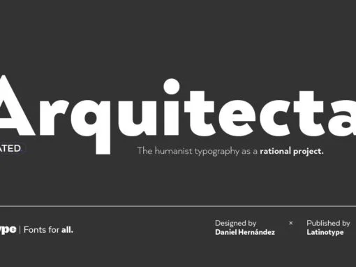
Arquitecta Font: Perfected Union of Tradition and Modern Typeface Innovation
Introducing Arquitecta, a versatile digital product merging the grandeur of classic typefaces with the efficiency of modern design. A welcome alternative to stalwarts like Futura and Kabel, Arquitecta is the humanist typography as a rational project; a sublime blend of
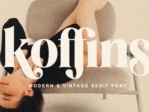
Koffins Font
Koffins is a bold vintage-style serif font with solid confidence. This customizable font will look great on a variety of design ideas such as, search style, high contrast and light fonts perfect for feminine logo signs, fashion & editorial design
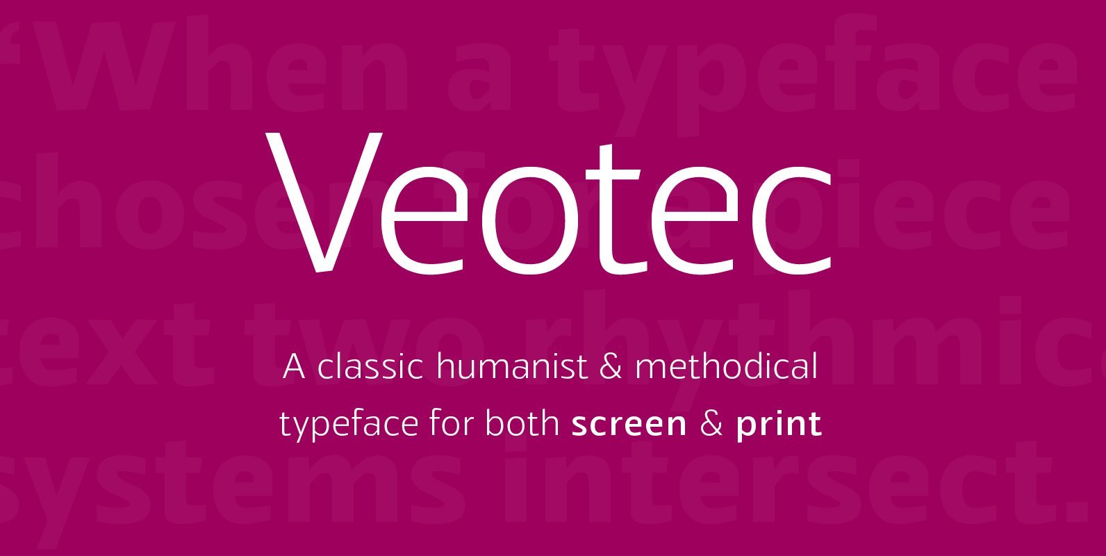
Veotec Font
Veotec is a classic humanist sans that skilfully works for both screen and print due to its steep and precise angles enabling more negative space. Not only does this methodical approach improve legibility and readability at small sizes, it allows
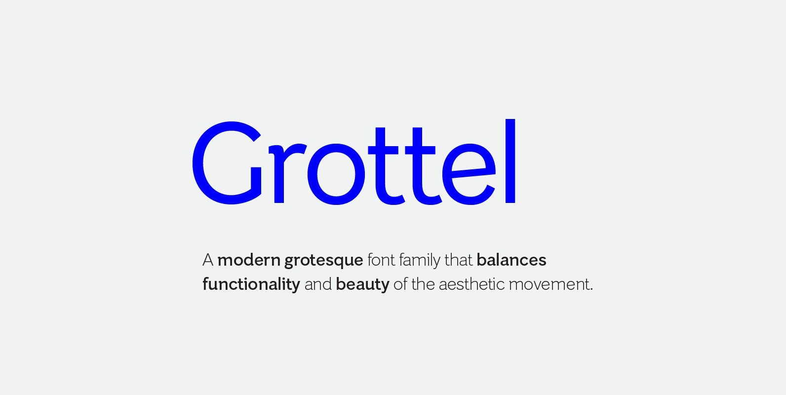
Grottel Font
Grottel is a modern grotesque sans serif font family that follows the philosophy of original grotesque typefaces with enhanced personality. Fine details and tuning, balance functionality and the beauty representative of the aesthetic movement in the 19th century. Details include
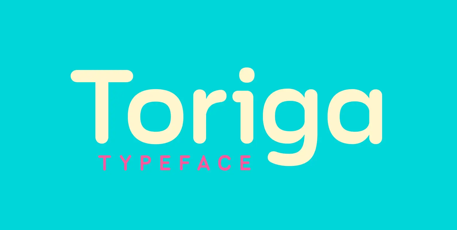
Toriga Font
The Toriga typeface was named after the Portuguese grape variant known as Touriga Nacional. This fun typeface boasts the features of a well-balanced, versatile, modern sans which is highly legible as a text font and with a clean, elegant look
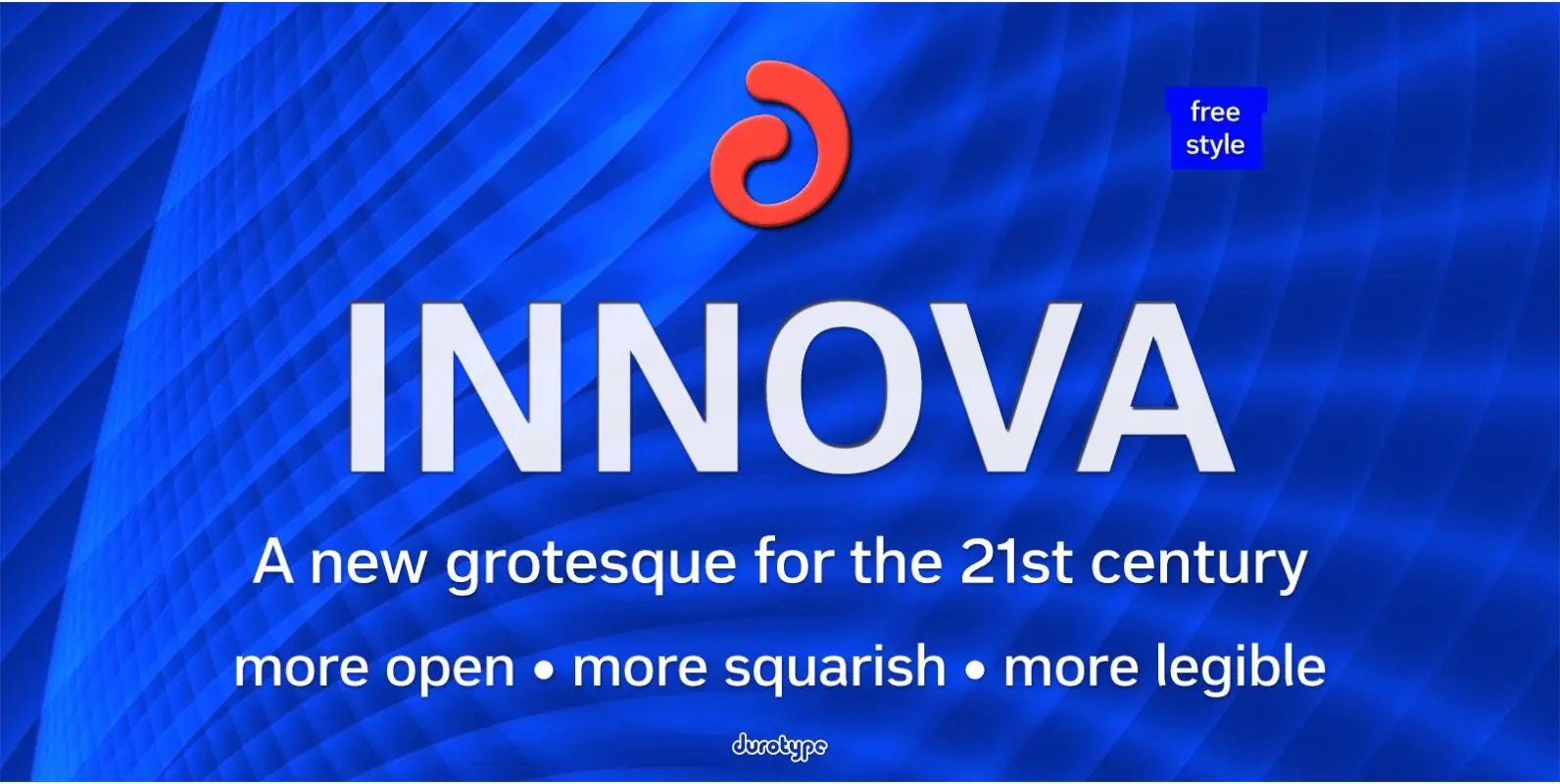
Innova Font
Innova. A new grotesque for the 21st century. More open. More squarish. More legible. After the many grotesques which have been designed over the years, is it still possible to improve this genre? Innova is a new design—a contribution to
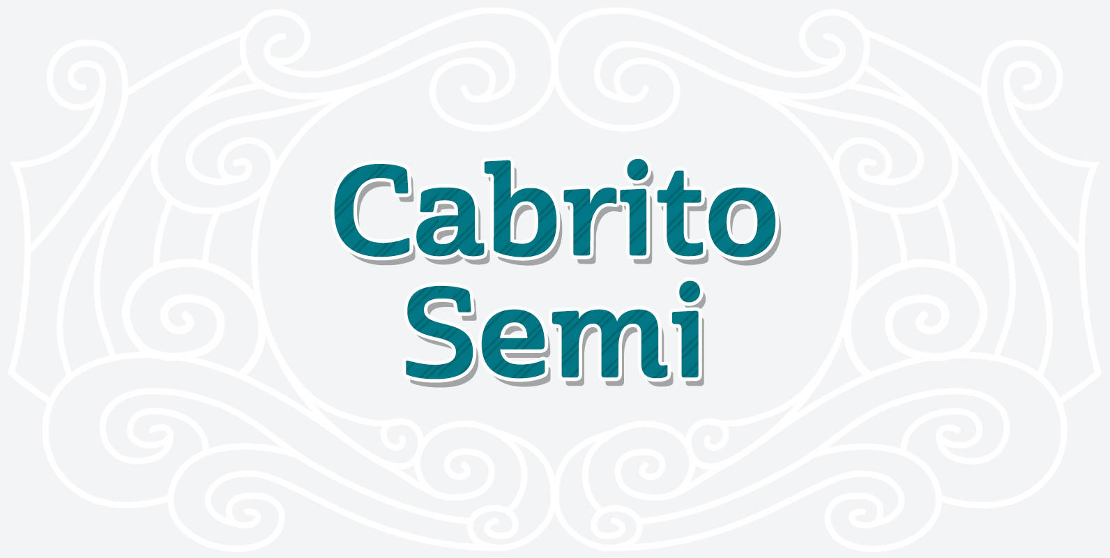
Cabrito Semi Font
Relax. Deep breath. And step away to font nirvana with Cabrito Semi. Like its Cabrito relatives, Semi’s handwriting-inspired feel is mellow and care-free. But don’t misunderstand us. Even with its fun-loving peculiarities, this free spirit will command whatever party you
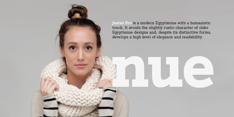
Justus Pro Font
Justus Pro is a modern Egyptienne with a humanistic touch. It avoids the slightly rustic character of older Egyptienne designs and, despite its distinctive forms, develops a high level of elegance and readability. Designed by Volker Schnebel for the Digital
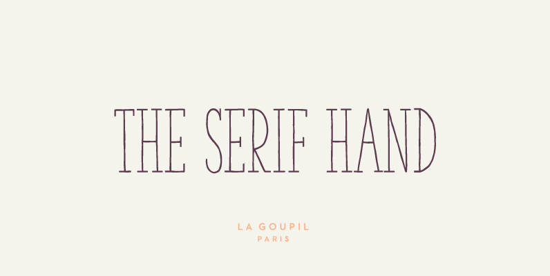
The Serif Hand Font
The Serif Hand is a handwritten font designed by Fanny Coulez and Julien Saurin in Paris. We wanted to create the most generic, readable and balanced serif handwritten font, to work well in every kind of design. It’s an all-caps
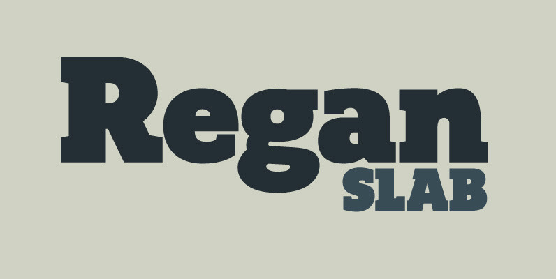
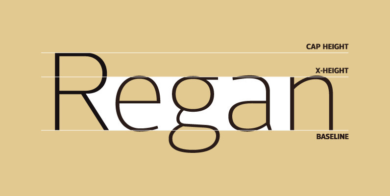
Regan Slab Font
A precision cut slab serif typeface. Simple curves are combined with sharp angles to provide a readable font with subtle characteristics. Regan Slab is ideally suited to a wide range of applications including magazines, newspapers and handheld devices. Details include
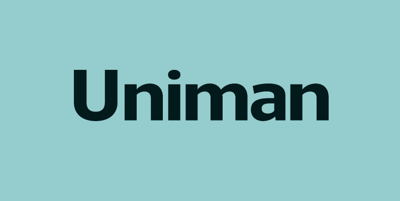
Uniman Font
A clear and simple sans serif typeface. Straight lines are combined with precision curves to form a functional and versatile font best suited for a wide range of applications. Developed to meet the needs of the professional user, details include
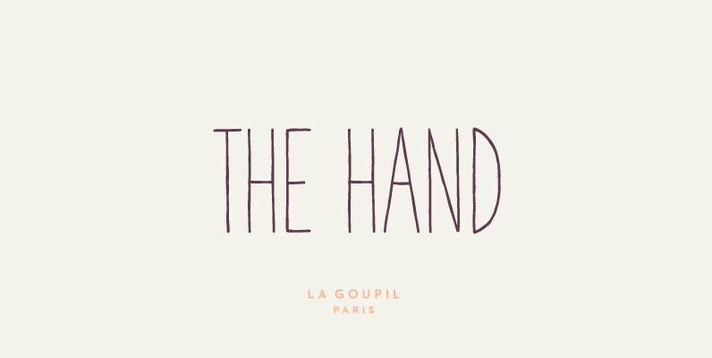
The Hand Font
The Hand is a handwritten font designed by Fanny Coulez and Julien Saurin in Paris. We wanted to create the most generic, readable and finely balanced handwritten font, to work well in every kind of design. We also designed two
Regan Font
A finely crafted sans serif typeface with an uncomplicated appearance. Soft curves are mixed with minimal angles to create a readable font ideally suited for identity, editorial and online uses. Details include 10 weights with italics, 540 characters, 5 variations
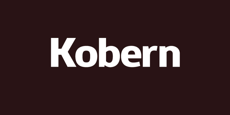
Kobern Font
A strong, horizontal sans serif typeface. The letterforms distinct lateral emphasis combined with condensed proportions helps improve readability and use of space across layouts. Ideally suited for a wide range of modern applications, details include 9 weights with italics, 540