Introducing Arquitecta, a versatile digital product merging the grandeur of classic typefaces with the efficiency of modern design. A welcome alternative to stalwarts like Futura and Kabel, Arquitecta is the humanist typography as a rational project; a sublime blend of geometric consistency and humanist proportions, engineered for effective, continuous reading.
Arquitecta: The Genesis
Inspired by American and European hand lettering from the first half of the 20th century, Arquitecta traces the progressive stride of the Bauhaus movement and modern sans history while establishing its own identity. IBM and Sky Sports, among others, have successfully harnessed its distinct aesthetic.
Arquitecta’s Features: Enhancing Readability and Aesthetics
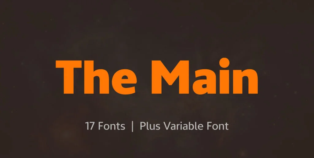
The Arquitecta family contains 8 upright romans and 8 italics, bringing a versatile typeface to your digital canvas. Prioritizing legibility, Arquitecta features a low X-height with accentuated ascenders and descenders. The characteristic ink traps help to avoid press impressing spots, while its hinting optimization ensures exceptional readability across a variety of platforms and resolutions.
The digital font further includes European accents, old-style numbers, numerators, and fractions, making it versatile and internationally compatible.
Arquitecta: Beyond Typefaces
The developers, aimed to breathe humanity into a rational project, constructed the Arquitecta Font. This vision underscores Arquitecta not just as a typeface, but as a representative of a distinct aesthetic expression budding from a rich typographic history.
In a very graphical twist of fate, our digital age is putting more fonts at our fingertips, rekindling appreciation for typeface design. As this appreciation deepens, the versatility and the humanist rationality of Arquitecta are increasingly spotlighted.
Maintaining Relevance: Continuous Upgrade
Retaining relevance in the ever-dynamic digital world requires regular evolution. Keeping up with this imperative, come March 2023, Arquitecta promises an upgrade. The contours will undergo necessary corrections to realign with contemporary aesthetics while extending the set to match the current Latinotype.
From graphic design to digital arenas, professionals are continuously seeking tools that enhance their creativity. A versatile font like Arquitecta is an invaluable tool, capable of elevating any design project. Downloadable at YouWorkForThem, the typeface is already a preferred choice for various designers worldwide.
Arquitecta, with its understated elegance, intricate craftsmanship, and impressive versatility, should be an essential part of any designer’s arsenal. Its subtle nod to historical hand lettering, coupled with its modern elements, stands out as a defining feature, marking the intersection of legacy and future in typography. The amalgamation of humanism with methodical design in Arquitecta epitomizes a pioneering perspective in typeface design – a perfect choice for creating digital masterpieces.