Tag: Architectural
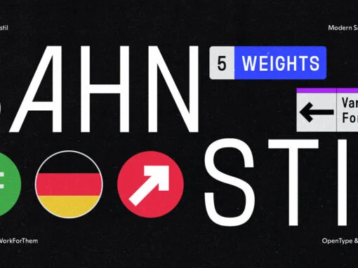
YWFT Bahnstil: The Renaissance of Traditional Design with a Modernist Twist
In the bustling realm of graphic and digital design, the harmonious fusion of traditional and modern aesthetics holds a special allure. Today, we put the spotlight on YWFT Bahnstil, a distinctive typeface that embodies this delicate balance, offering a unique
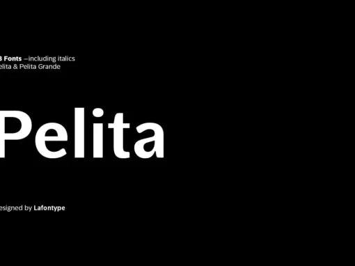
Decoding Pelita: Lafontypes Epoch-Making Font Intrigue in Digital Artistry
In the landscape of digital artistry, the language of typography plays a critical role in narrating the tale of design. Among this vast typographic vocabulary, Lafontype presents Pelita, an impeccably crafted sans-serif typographic family that gratifies an array of aesthetic
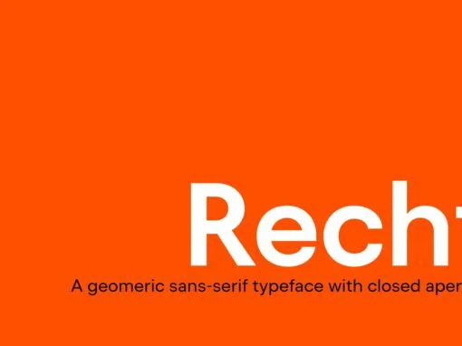
Recht Font: Marrying Tradition with Innovation in Digital Design
The field of digital design is constantly shifting and evolving, riding the waves of innovation and creativity. As we journey into the heart of this transformative industry, it’s essential that we not overlook one of its vital arteries: typography. Among
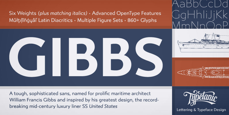
Gibbs Font
Gibbs is a tough, sophisticated sans, named for prolific maritime architect William Francis Gibbs and inspired by his greatest design, the record-breaking mid-century luxury liner SS United States. Taking various cues from the unique cast aluminum signs found on board,
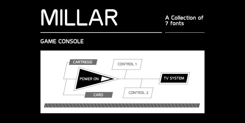
Millar Font
An elegant monoline typeface with smooth corner detailing. The simple linear design is best suited to identity, editorial and on screen uses. Details include 7 weights, a complete character set, manually edited kerning and Euro symbol. Published by The Northern
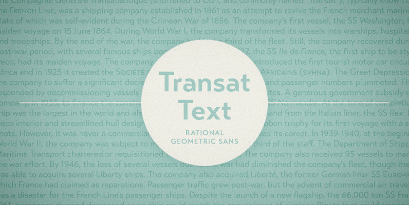
Transat Text Font
Transat Text is a geometric sans serif typeface, and is the more rational sibling to the unabashedly Art Deco “Transat”. Transat Text has a slightly taller x-height than its counterpart, making it easier to read at small sizes, but also
Simplo Font
Simplo: the ‘Italian Futura’. Simplo is a geometric sans serif typeface, built in sixteen styles. It is a tribute to the 1930s typeface Semplicità, designed by Nebiolo’s Alessandro Butti. Although many details of Simplo differ from Semplicità, it preserves the
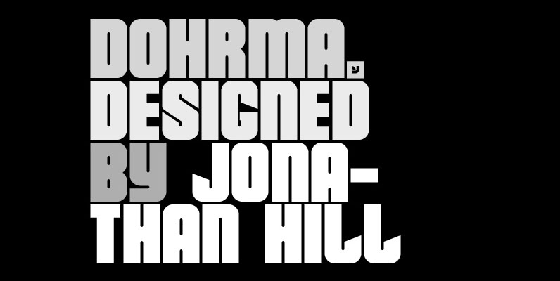
Dohrma Font
A bold display typeface that blends subtle curves with precision geometry. This crafted detailing creates a wide variety of typesetting options ideal for use on signage, book jackets, packaging, posters and t-shirts. Details include 4 unique styles, a full character
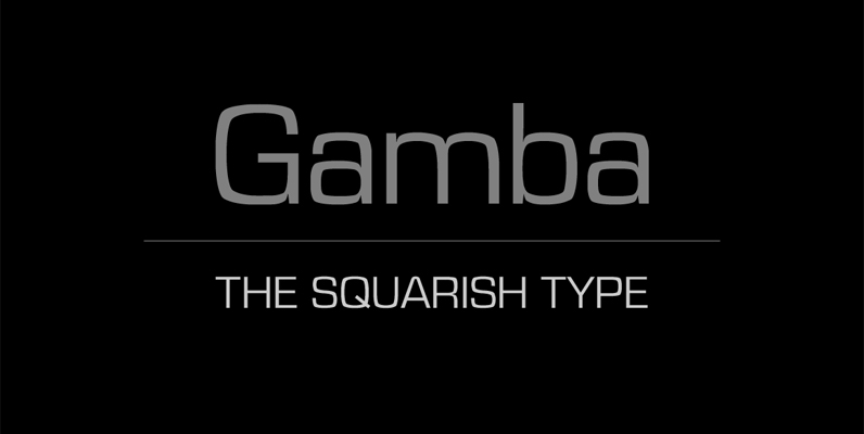
Gamba Font
This squarish type is designed to create strong and clean layouts. Gamba combines futuristic shapes with high legibility, utilitarian design and personality. The quality of spacing and kerning is ensured by Igino Marini. Published by Juraj ChrastinaDownload Gamba
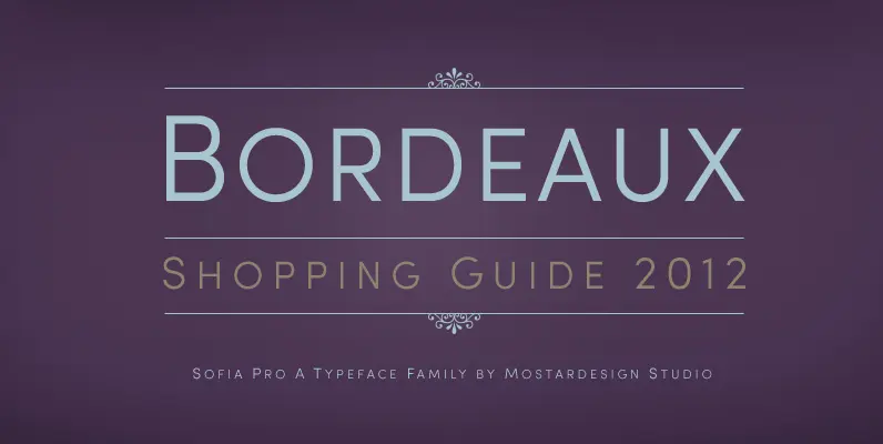
Sofia Pro II Font
Originally designed in 2008 by Olivier Gourvat, this font family gives an impression of modernism, harmony and roundness. These nuances give Sofia a harmonious and sensible appearance for both texts and headlines. Redesigned in 2012, this typeface supports a wide
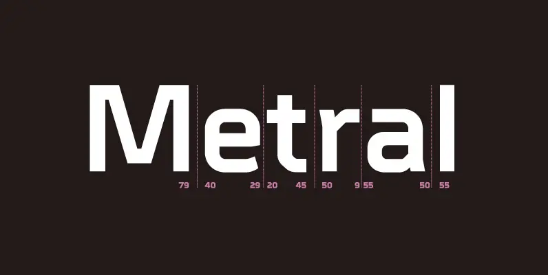
Metral Font
A geometric sans serif with a precise fabricated appearance. Smooth corners are mixed with subtle angles to form a strong, legible typeface ideally suited for a wide range of applications. Details include 6 weights with italics, an extended European character