Tag: 1930s
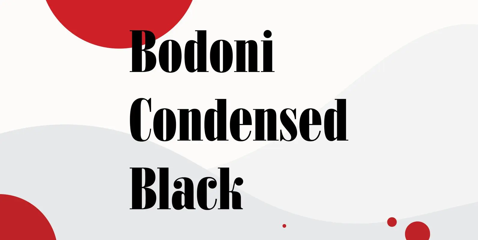
Bodoni Condensed Black Font
Bodoni Condensed Black was designed by R.H. Middleton for Ludlow, circa 1930. Digitally engineered by Steve Jackaman. Published by Red RoosterDownload Bodoni Condensed Black

Stanhope Font
Designed by Les Usherwood. Digitally engineered by Paul Hickson. Les based the design on a turn-of-the-century typeface of the same name. The foundry is believed to be Soldans & Payvers, circa 1904. Published by Red RoosterDownload Stanhope

Konstantin Font
My son “Konstantin” wants to become a cook. So I thought it would be a nice idea if I designed a script for his fabulous future menus as a gift for him. I think he will become a great cook.

Administer Font
Designed by Les Usherwood. Digitally engineered by Steve Jackaman. A few weights were originally released by another foundry; but this complete version of the family is a better match to Les original drawings! Published by Red RoosterDownload Administer

Silverado Font
Designed by Steve Jackaman, Silverado is based on a classic serif type design called Eldorado. Published by Red RoosterDownload Silverado

Leighton Font
Designed by Paul Hickson, Leighton is a clean serif based on Lectura, a design by Dick Dooijes of the Amsterdam Foundry (1966). Published by Red RoosterDownload Leighton
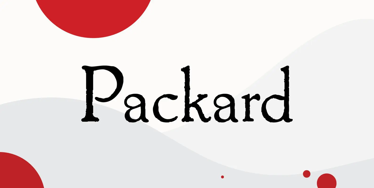
Packard Font
Designed by Steve Jackaman & Ashley Muir. Packard Old Style is based on lettering drawn by Oswald Cooper for the Packard Motor Company (ATF 1913). The bold weight is credited to Morris Fuller Benton (ATF 1916), but it is highly
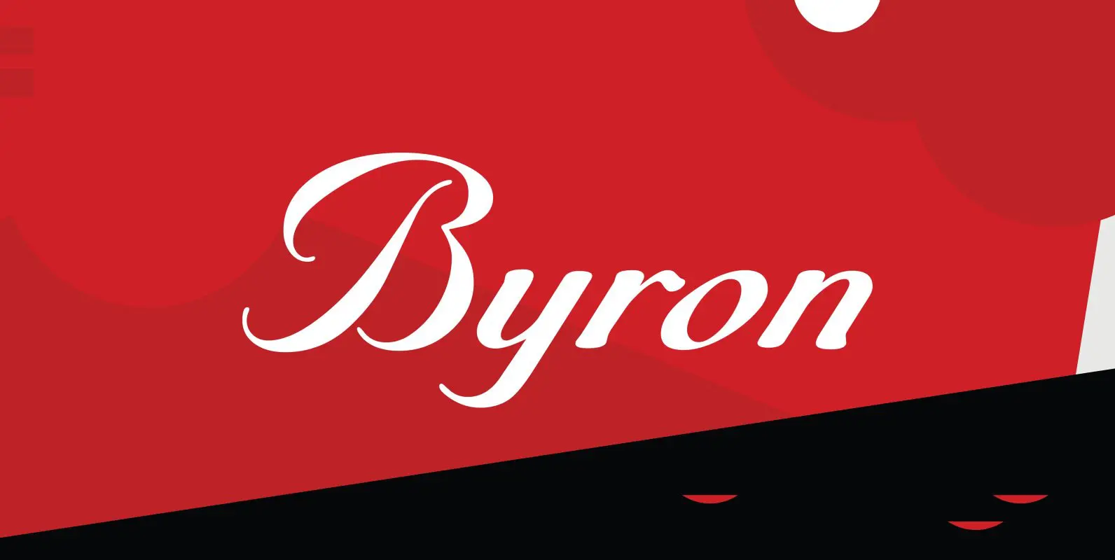
Byron Font
Designed by A. Pat Hickson, Byron is a script font based on a turn of the century design. Published by Red RoosterDownload Byron
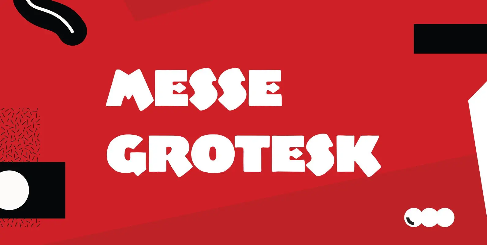
Messe Grotesk Font
Designed by Paul Hickson. Based on the Albert Augspurg design, circa 1921-27. Published by Red RoosterDownload Messe Grotesk

Ultra Modern Font
Designed by Douglas C. McMurtrie and digitally engineered by Steve Jackaman, Ultra Modern is based on the original Ludlow drawings, circa 1928. Published by Red RoosterDownload Ultra Modern
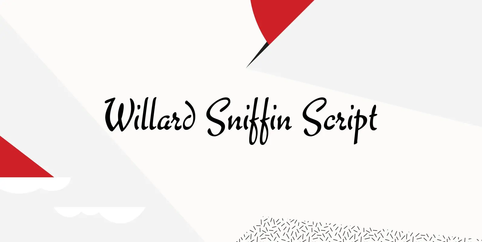
Willard Sniffin Font
Designed by Willard T. Sniffin. Digitally engineered by Steve Jackaman. Based on the original Willard T. Sniffin design of 1933 for ATF, this informal brush script was known as Keynote. Published by Red RoosterDownload Willard Sniffin
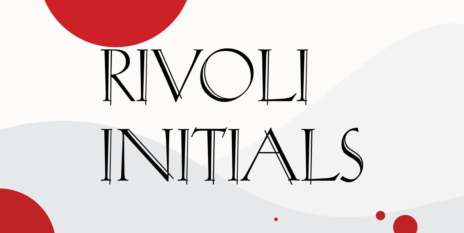
Rivoli Initials Font
Designed by Paul Hickson, Rivoli Initials is a decorative font based on the William T. Sniffin design for ATF, circa 1928. Published by Red RoosterDownload Rivoli Initials
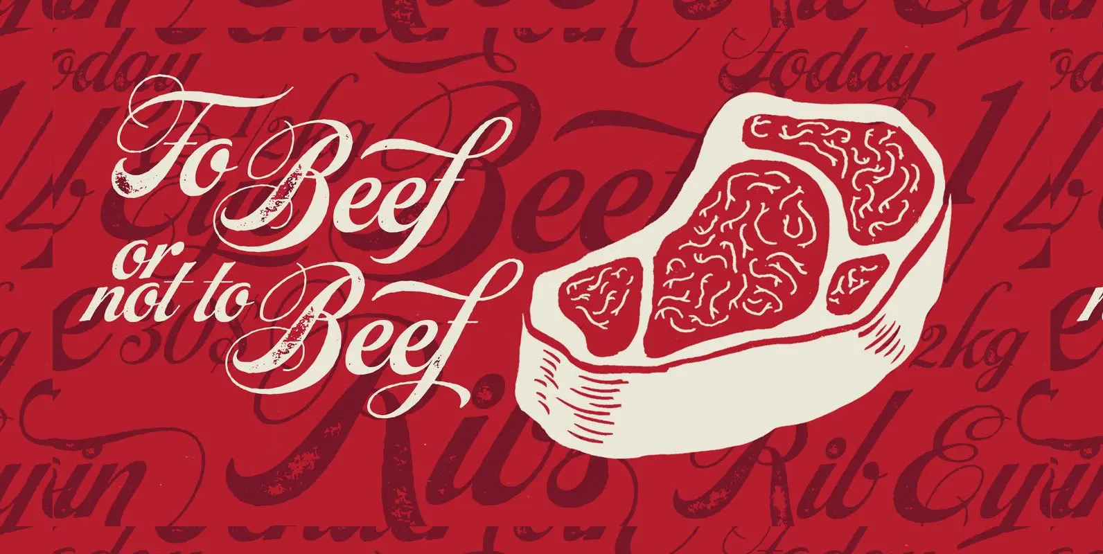
Steak Font
Here I am, once again digging up 60-year sign lettering and trying to reconcile it with the typography of my own time. The truth is I’ve had this particular Alf Becker alphabet in my sights for a few years now.

Morning News Font
“Morning News” is the sister font of “Evening News” which I designed some years ago for use with my local newspaper “Abendzeitung”. “Morning News” is an adaption, a little bit rounder, which gives the font a much softer touch. The


Konstantin Forte Font
My son “Konstantin” needs a bold face for his recipes as well. So I made “Konstantin Forte” for him and the rest of the world. Published by Wiescher DesignDownload Konstantin Forte

Fleurie Font
“Fleurie” is a small town in France on the high banks of the Beaujolais-area where they make excellent, fruity wine. Fleurie means flowery and that is what that village and this font is all about. The font is a very
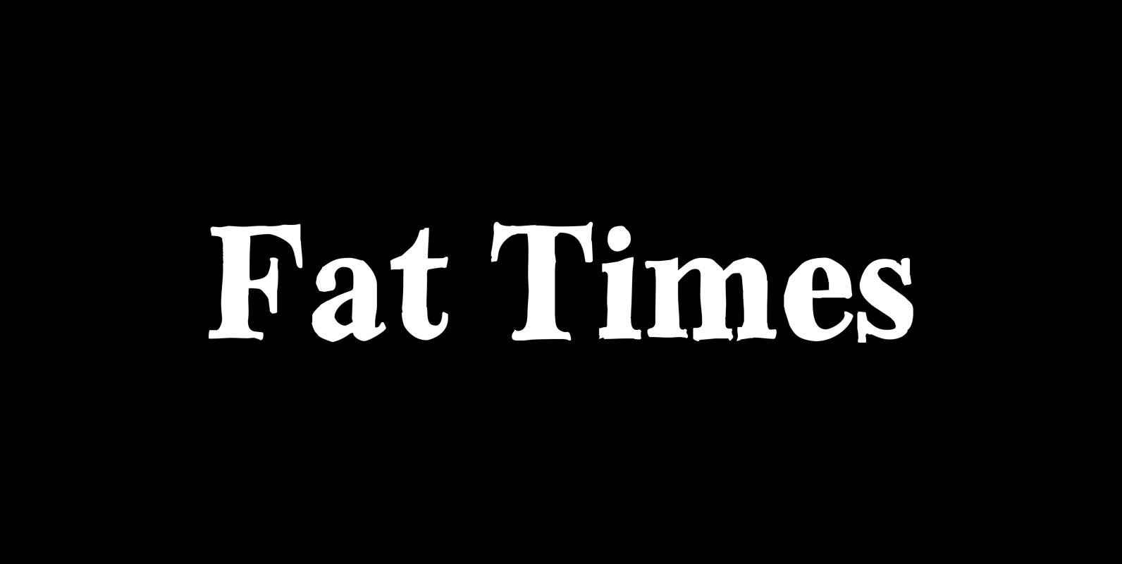
Fat Times Font
“FatTimes” is an extension to my HardTimes family. Times are too hard for boring typefaces, so try the fat one one for a change. Published by Wiescher DesignDownload Fat Times