Tag: 1930s
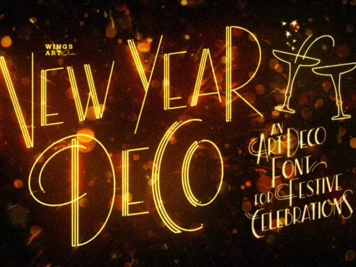
New Year Deco Font
Raise a glass to the New Year with this elegant, vintage inspired Art Deco header font. This first edition of New Year Deco is the introduction to an experimental design that I hope will evolve into the ultimate in Art
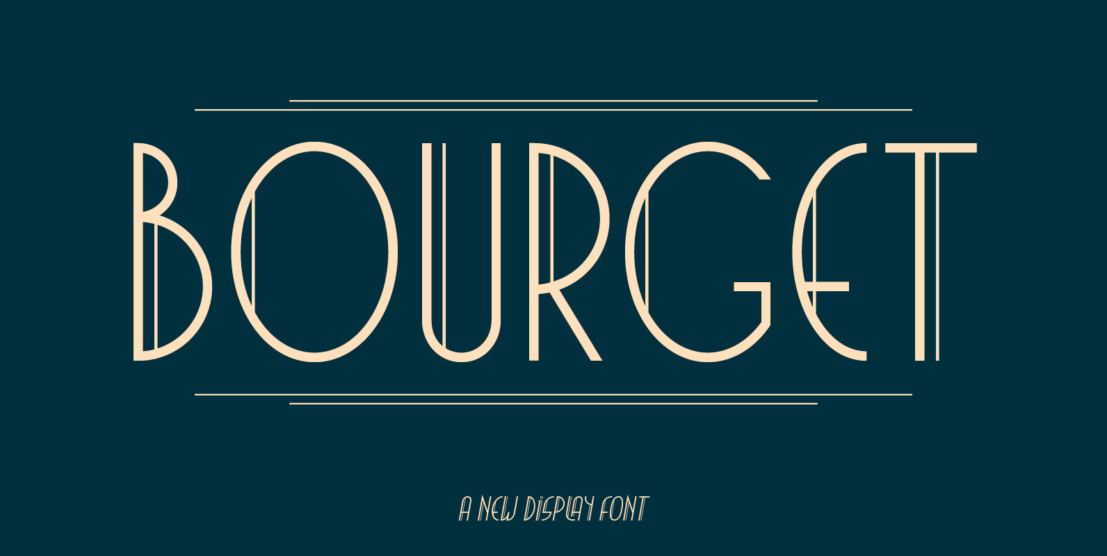
Bourget Font
Bourget is a Display-Sans, which is inspired by the Art Déco Typography of the 1920´s, 1930´s years. It has a very characteristic and unique style by its thin line through every letter. The upright and italic versions have each 750+
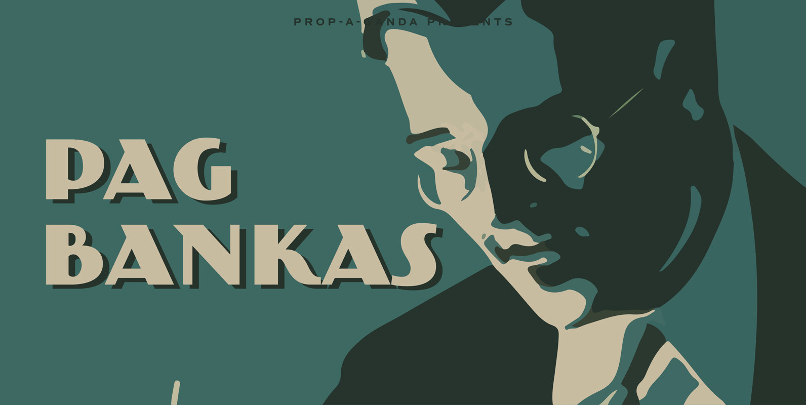
PAG Bankas Font
Inspired by and based on retro propaganda posters, movie posters, shopfront lettering and advertisements of the early 20th century. Published by Dharma TypeDownload PAG Bankas
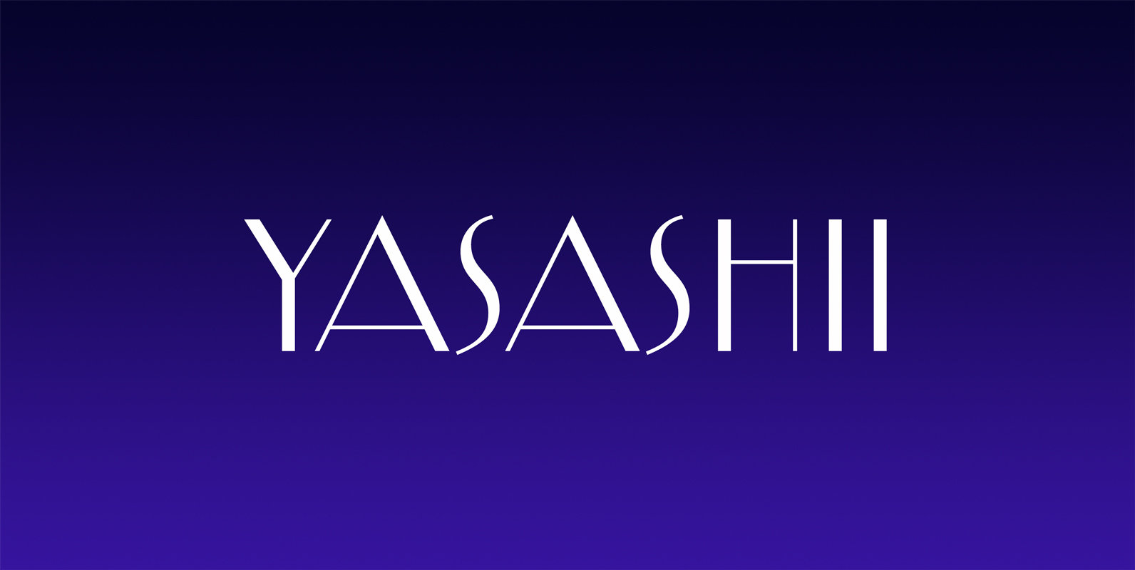
Yasashii Font
Inspired by Japanese cosmetic packaging from the early 1900’s, Yasashii makes for a beautiful Art Deco themed typeface. It’s thin lines and elegant curves even make it a perfect type choice for fashion projects of today. Published by Dharma TypeDownload
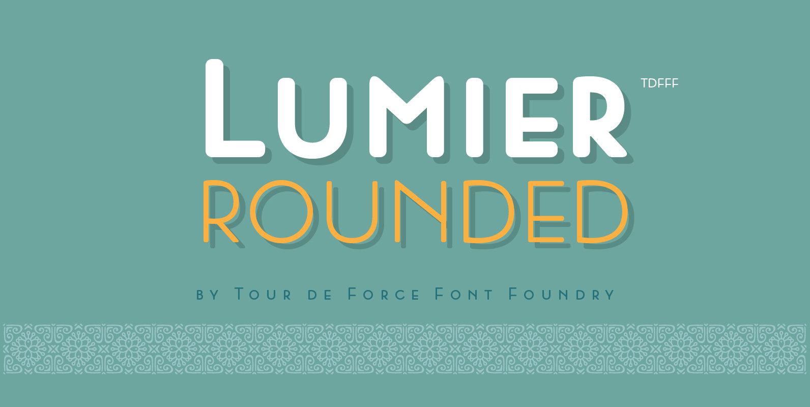
Lumier Rounded Font
Lumier Rounded is a sans serif font design published by Tour de Force Font Foundry Published by Tour de Force Font FoundryDownload Lumier Rounded
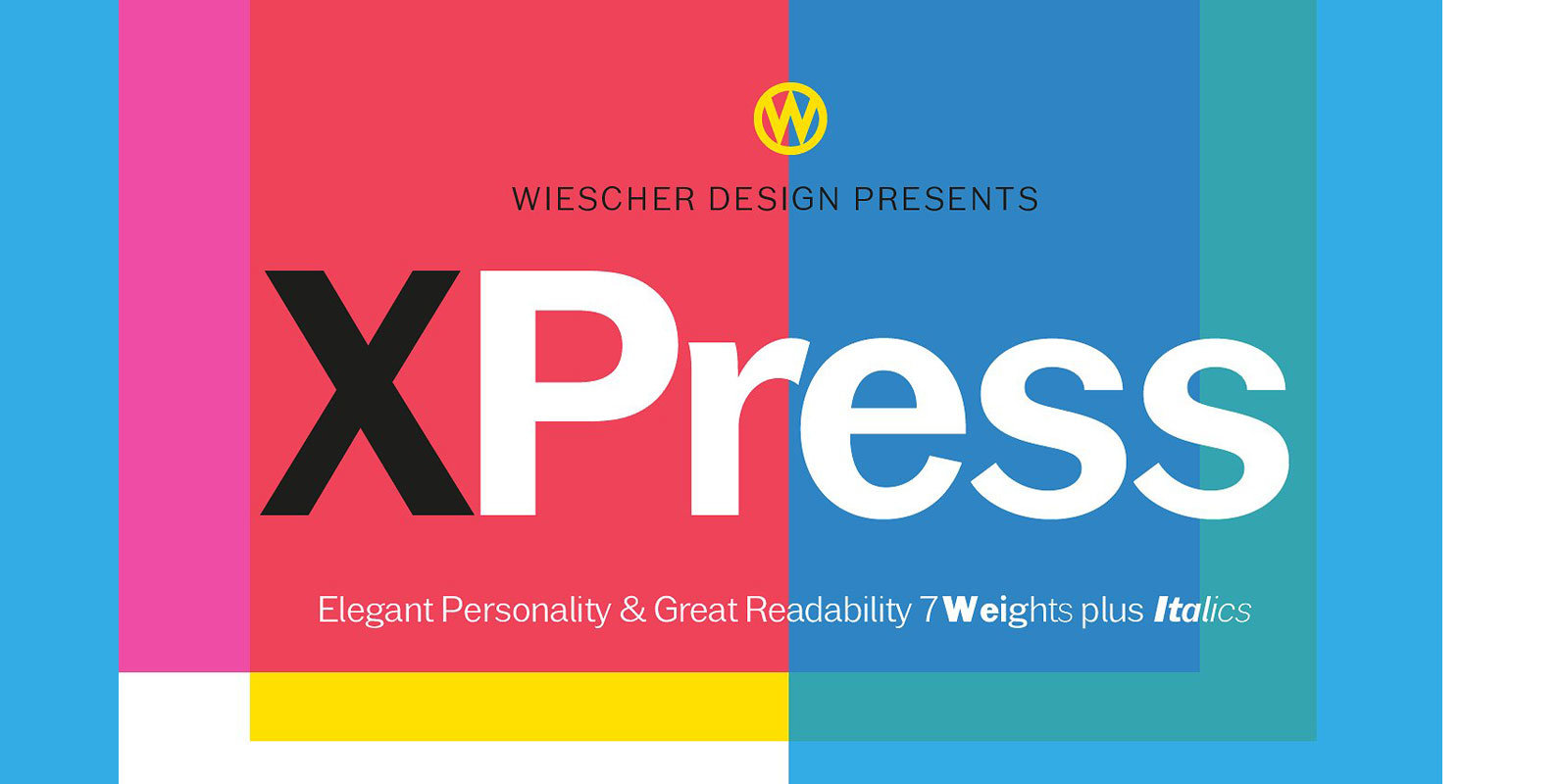
XPress Font
“XPress” is a very distinct, expressive, typical new Sans. “XPress” is my new Sans-Serif that impresses – especially in small sizes – with its outstanding readability. Seven precisely calibrated weights from »Thin« to »Heavy« and its corresponding italics make this
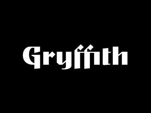
Gryffith CF Font
Gryffith is a display typeface blending a wide range of influences from medieval calligraphy to art deco lettering to high technology. Strange, captivating, and elegant, Gryffith is especially useful for logos, headlines, posters, and artwork. The typeface is based on
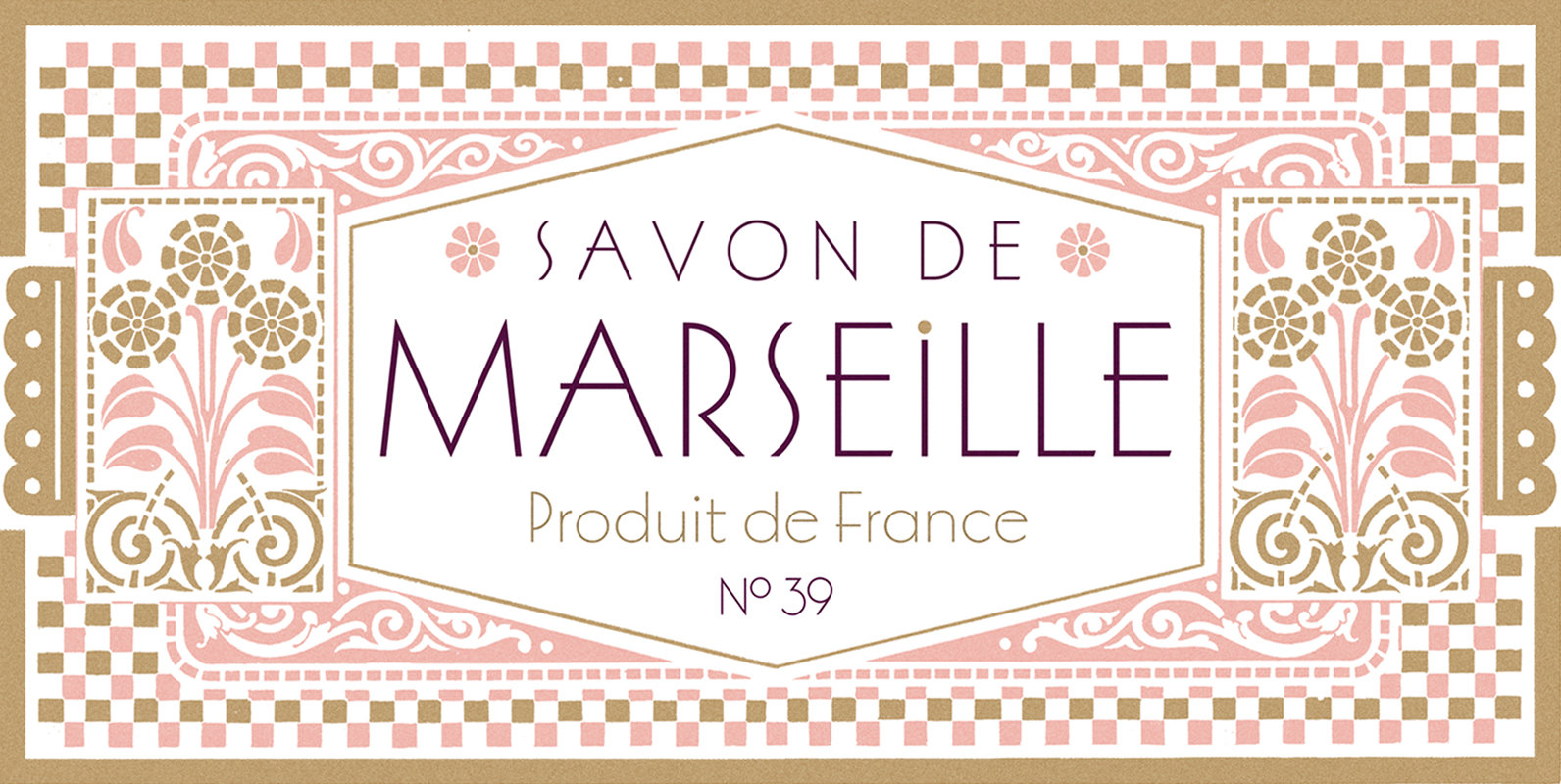
Marseille Font
Marseille is an Art Deco-inspired typeface which is based on Louise Fili’s iconic cover design for the hauntingly beautiful Marguerite Duras novel, The Lover. The font is available in six irresistible weights: thin, light, regular, medium, semibold, and bold. Each
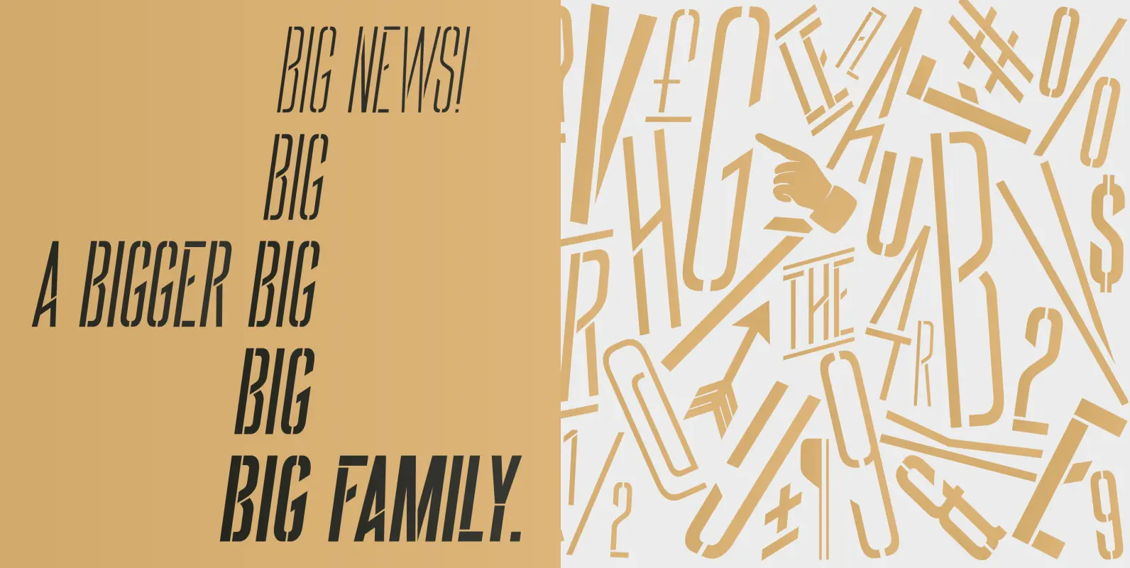
BIG Stencil Font
BIG is an elegant condensed display font created for strong and impactful headlines. It comes from a series of hand printed specimens taken from wood type found in Porto (Portugal) that reassembles the industrial victorian style. With a family of
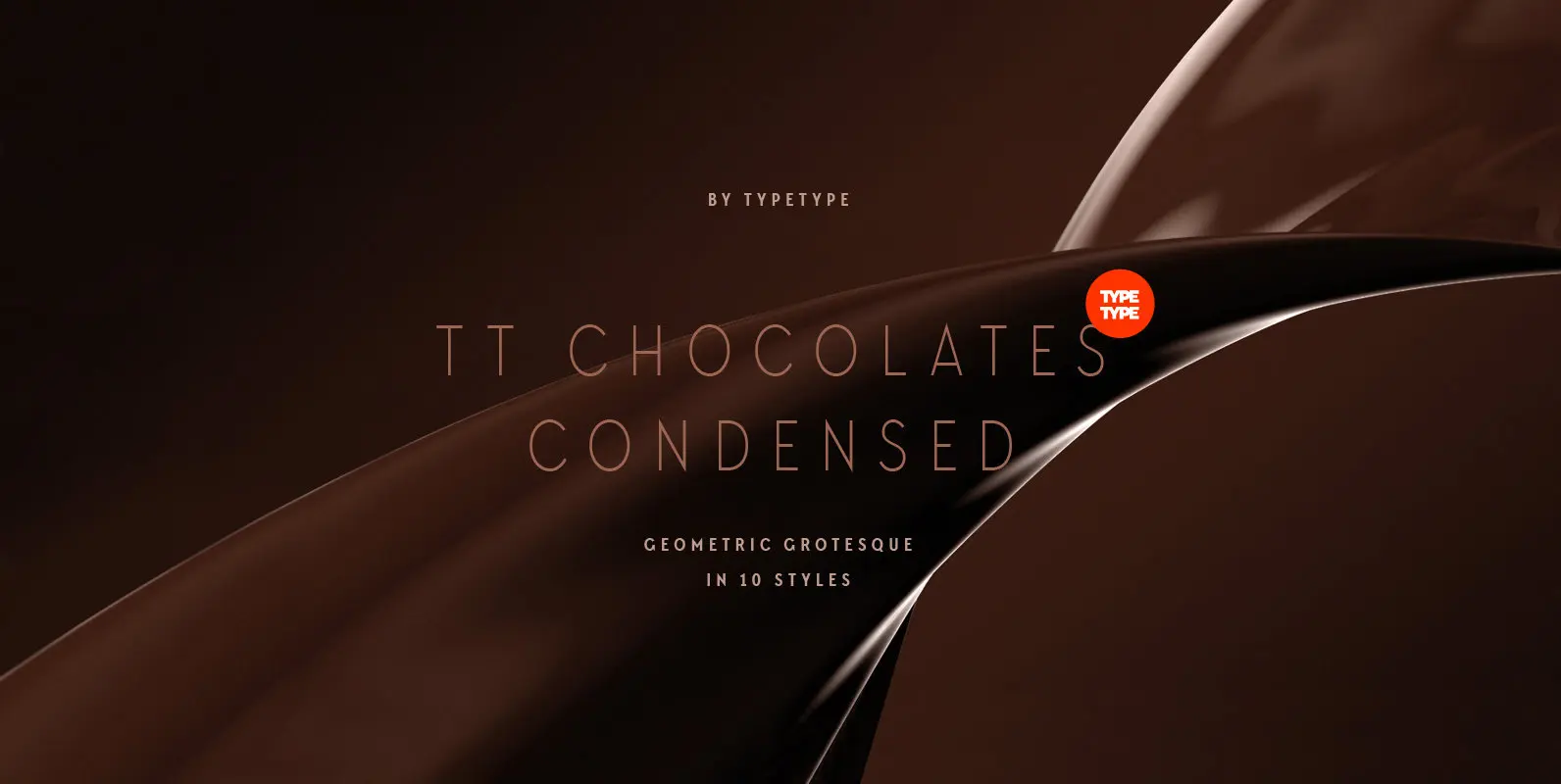
TT Chocolates Condensed Font
Have you heard the expression, 'you can never have too much chocolate'? We completely agree with this point of view and are gladly presenting you the TT Chocolates Condensed fontfamily, the narrow version of your favorite TT Chocolates. Keeping its
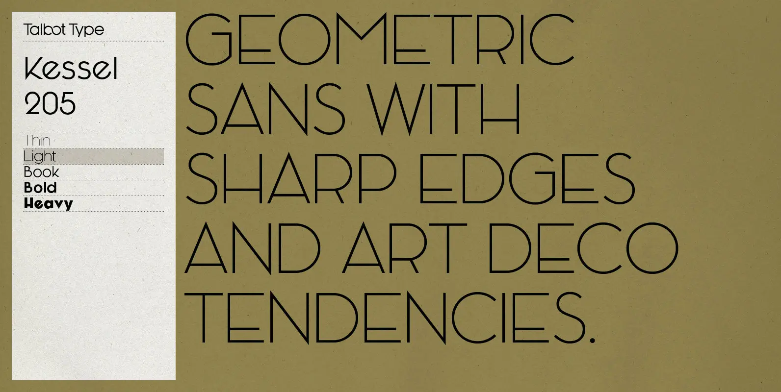
Kessel 205 Font
Kessel 205 is inspired by the classic, geometric sans-serifs such as Futura, but has shallower ascenders and descenders for a more compact look, and features an art deco influence with sharp points at the apex of many characters, lowered crossbars
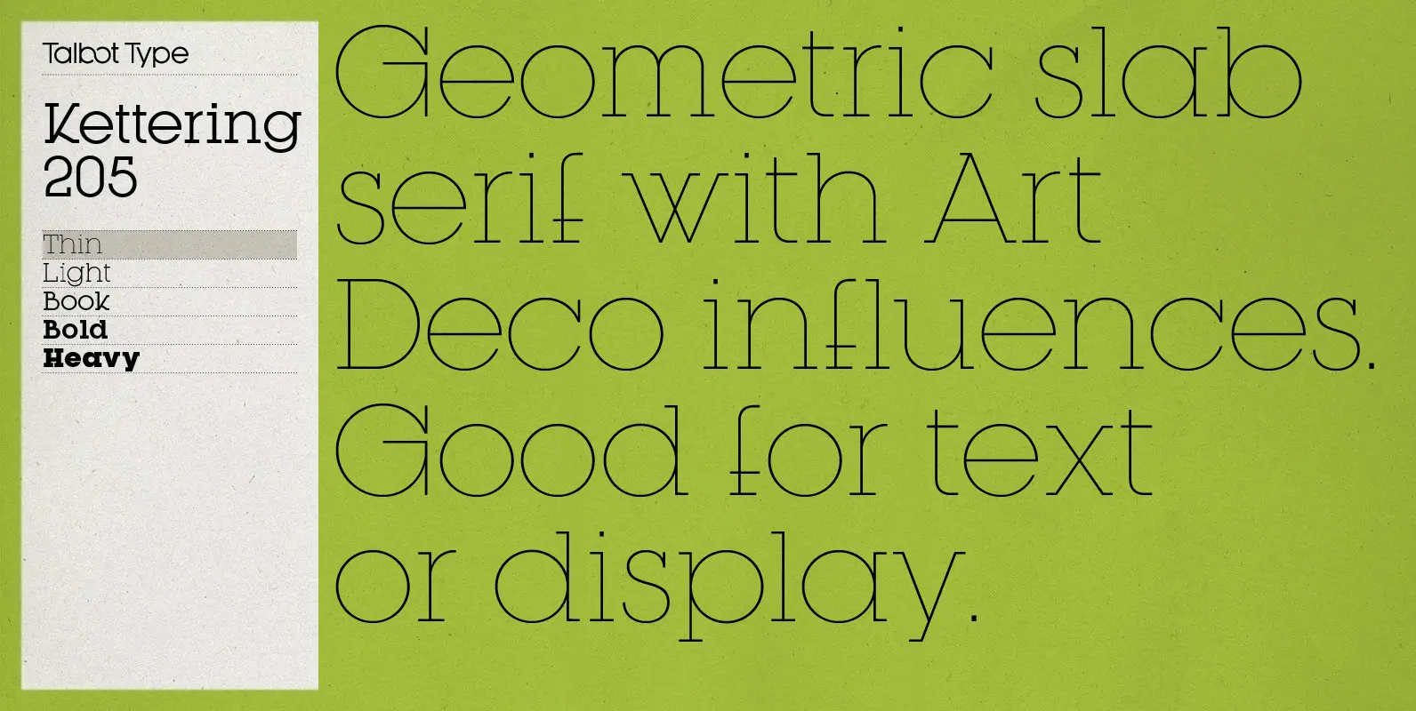
Kettering 205 Font
Kettering 205 is inspired by the classic, geometric slab-serifs such as Lubalin, but has shallower ascenders and descenders for a more compact look, and features art deco influenced, lowered crossbars and an oblique crossbar on the lower case e. It’s
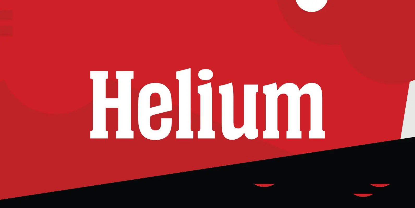
Helium Font
Designed by Steve Jackaman, Helium is a unique serif design re-tooled from the classic BF Collection. Published by Red RoosterDownload Helium
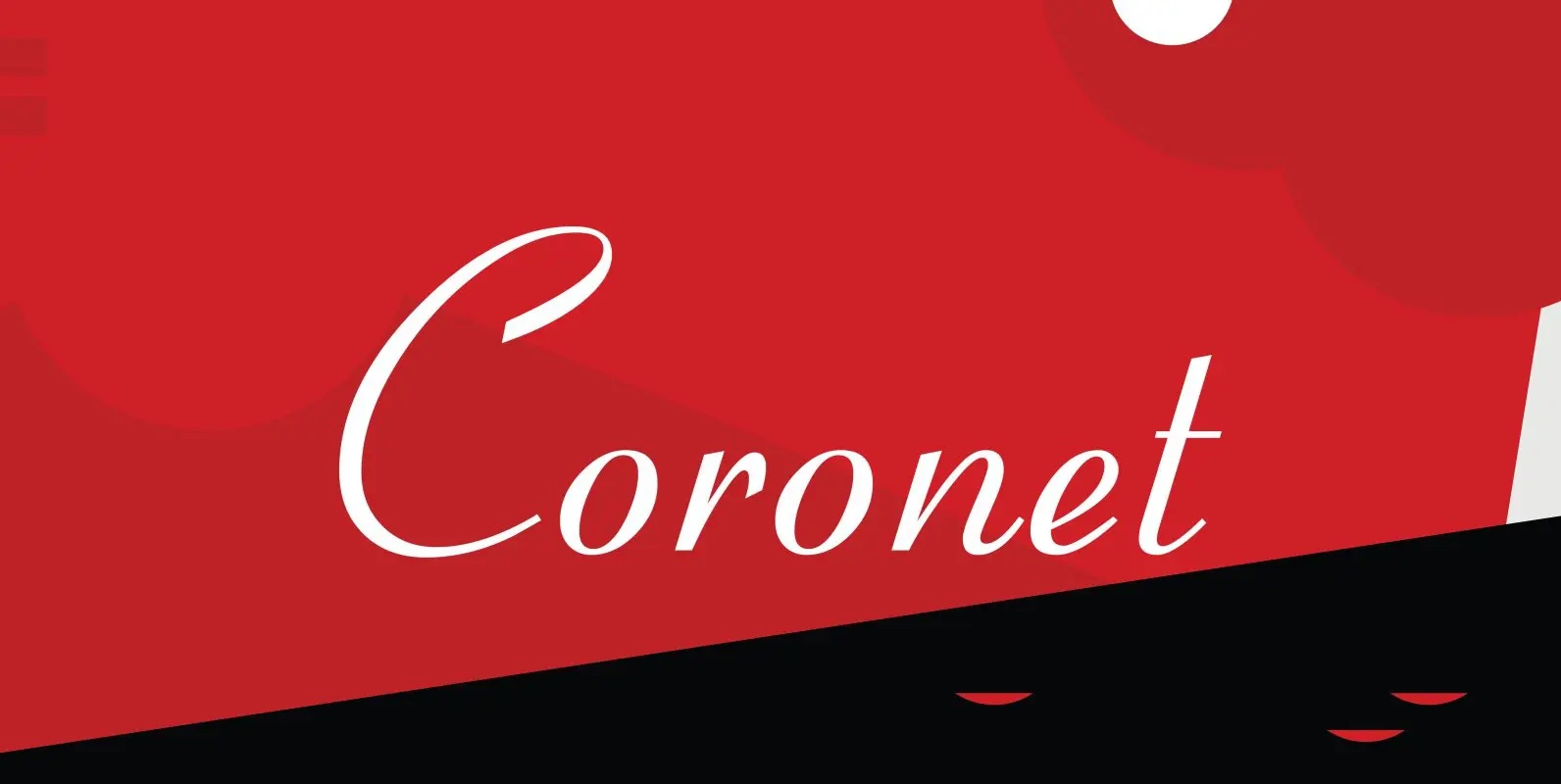
Coronet Font
Designed by R.H. Middleton for Ludlow (1937), Coronet is a script font that was digitally engineered by Steve Jackaman for the Red Rooster Collection. Published by Red RoosterDownload Coronet
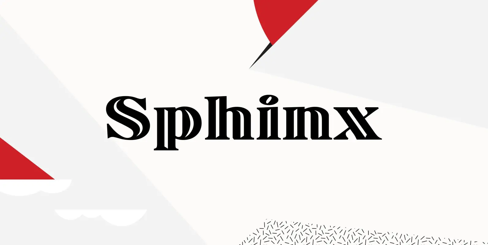
Sphinx Font
Designed by Steve Jackaman, Sphinx is a serif font based on the Deberny & Peignot, circa 1925. Originally, the inline was a capitals only font. Published by Red RoosterDownload Sphinx
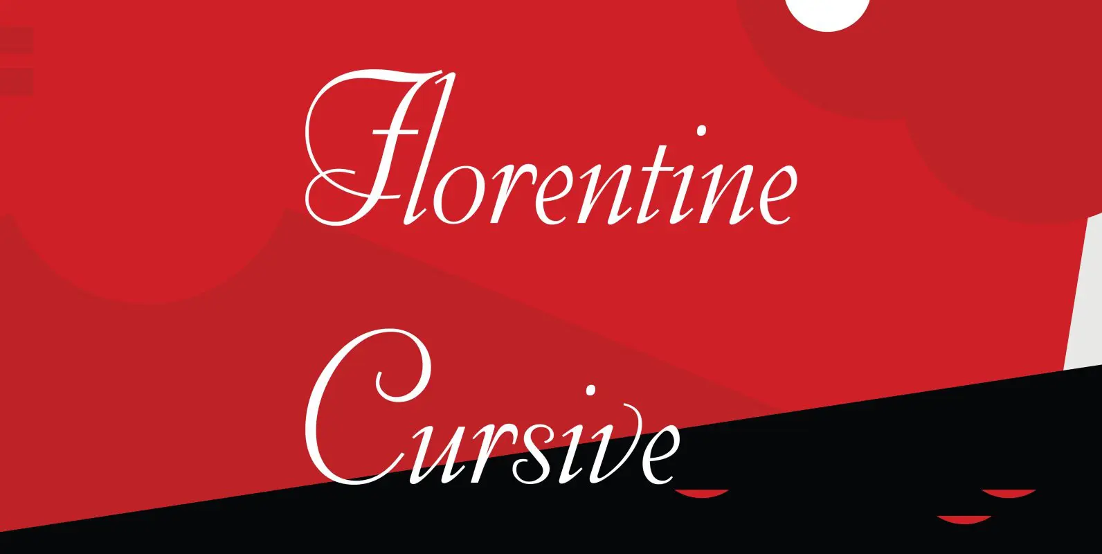
Florentine Cursive Font
Florentine Cursive was designed by R.H. Middleton for Ludlow, circa 1956. Digitally engineered by Steve Jackaman. Published by Red RoosterDownload Florentine Cursive