Tag: 1930
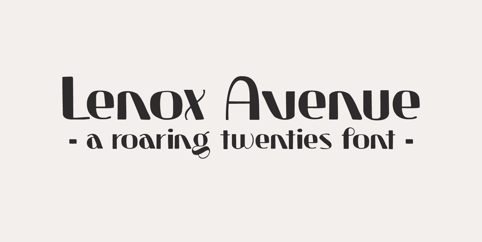
Lenox Avenue Font
I came across an old book called ‘Studio Handbook Letter And Design For Artists And Advertisers’ by Samuel Welo. Samuel Welo was an American advertising calligrapher, typographer and lettering artist, who was most active during the roaring twenties. Lenox Avenue
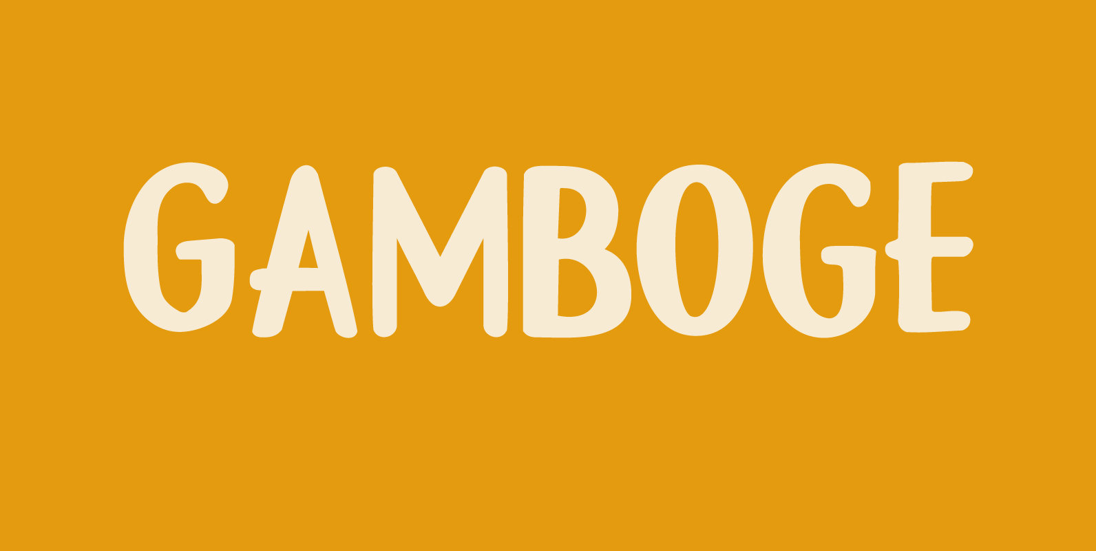
Gamboge Font
Gamboge is a deep saffron to mustard yellow pigment which is extracted from a tree. Its name comes from gambogium, the latin word for the pigment. Gambogia font is a beautiful all caps typeface with a pre-war feeling to it.
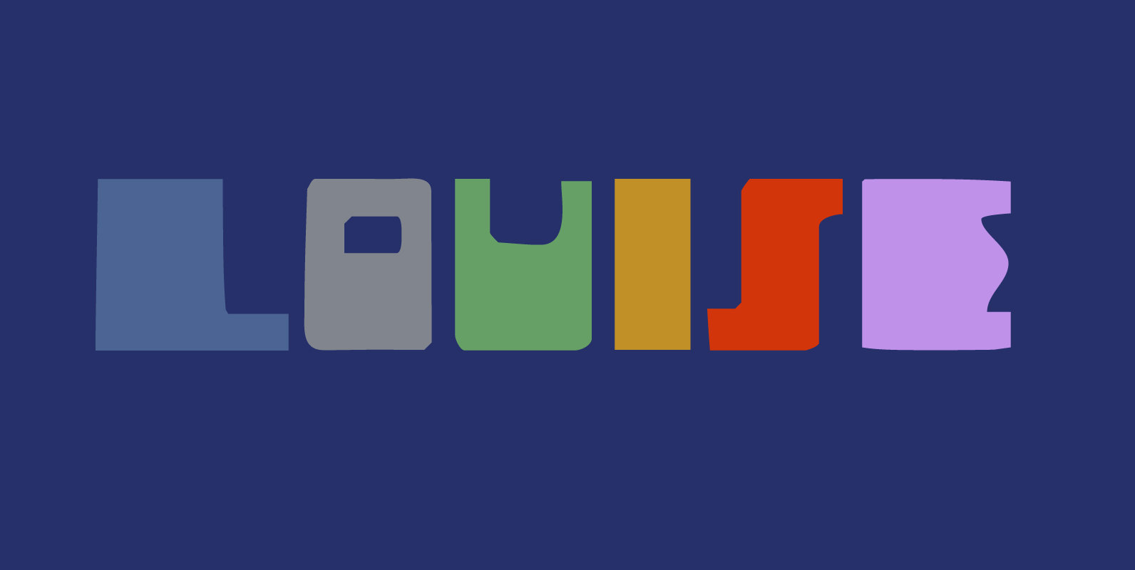
Louise Font
Louise font was based on the art of Louise Marie (lou) Loeber, a Dutch painter. She was born in Amsterdam in 1894 and flirted with several styles like De Stijl, Cubism and Bauhaus. Her artworks are characterized by a sober
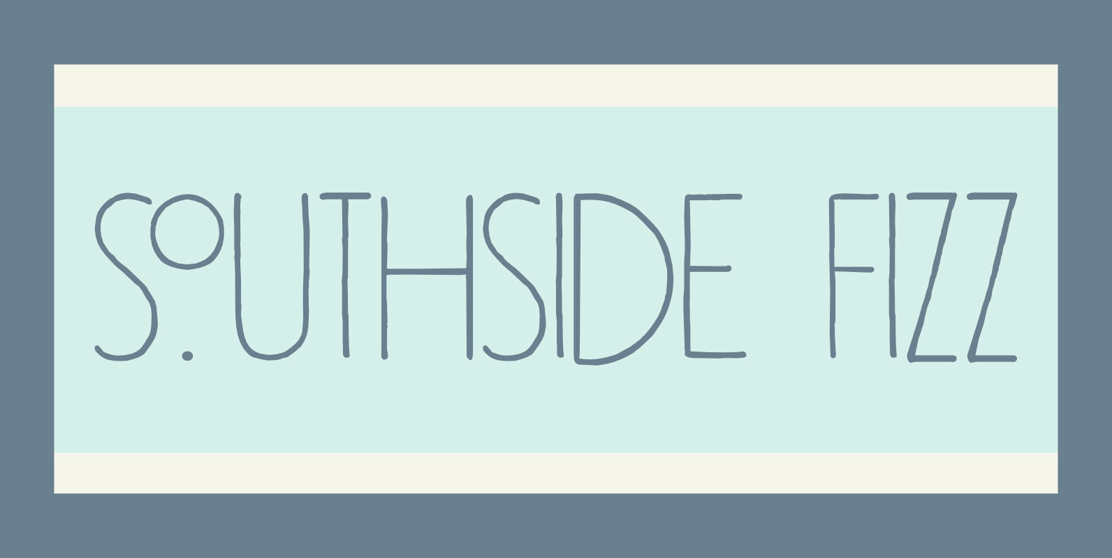
Southside Fizz Font
Southside Fizz is a cocktail (made with gin, lime, mint and soda). Southside Fizz font was based on a single word in a 1930’s advertisement and my Palembang font. I did not have that many glyphs to work with, so
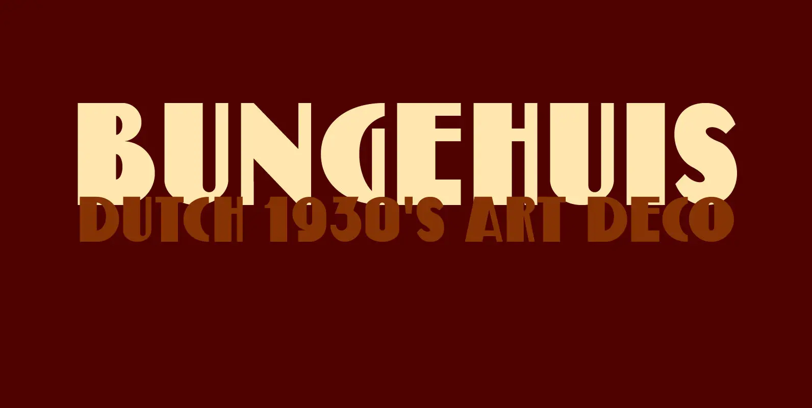
Bungehuis Font
Bungehuis font was modeled on the lettering found on an Amsterdam art deco building from 1931. This building on the Spuistraat, also called ‘Het Bungehuis’, used to house offices, but is now part of the University of Amsterdam. In 2015
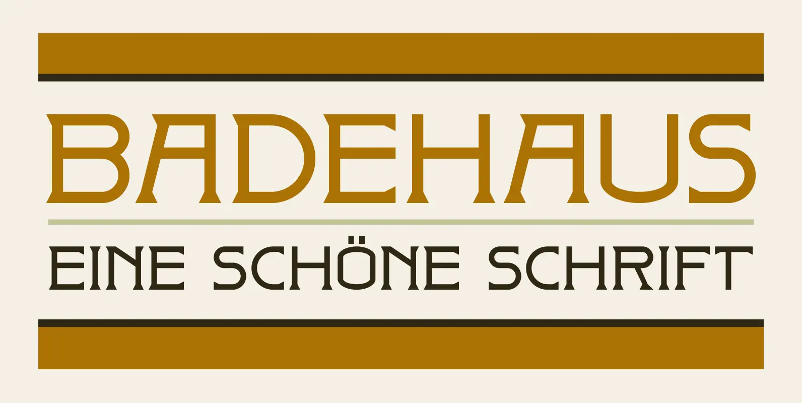
Badehaus Font
In the German city of Bad Neuenahr you can visit a spa called Thermal Badehaus. This beautiful art deco building has an even more beautiful art deco lettering covering its facade. I had to work with only a couple of
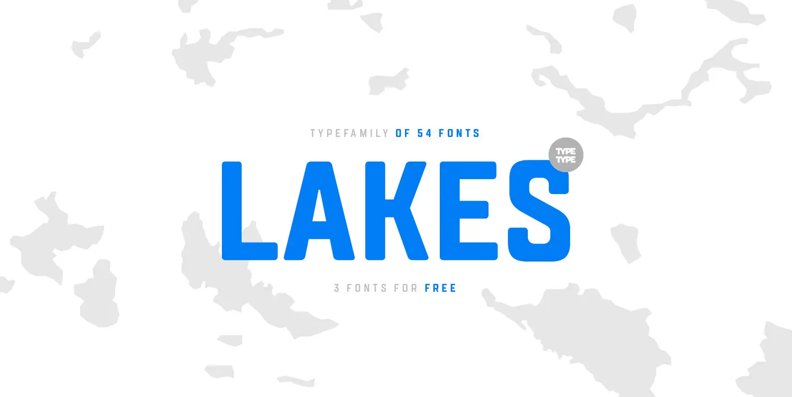
TT Lakes Font
The idea for this font emerged in the city of Priosersk, which until World War II was a Finnish city called Kakisalmi. At the city museum we came across an unusual sign plate with the former name of the railway
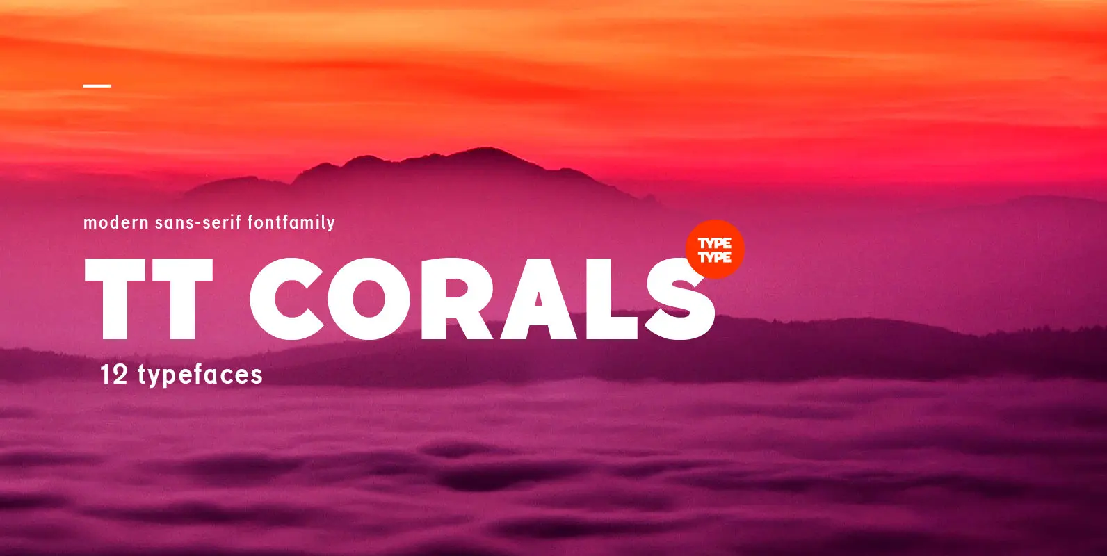
TT Corals Font
TT Corals is a modern humanistic sans-serif which has many typical traits of the beginning of the 20th century. For an increased functionality of the font family we’ve created 6 typefaces of various weights: Thin, Light, Regular, Bold, Extrabold, Black.
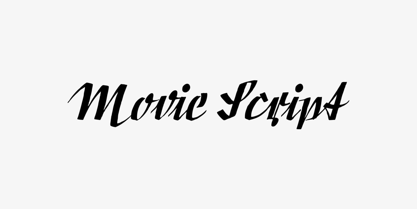
Movie Script Font
“Movie Script” is the script that was used in German movie-brochures. Those were small four page leaflets with a lot of sepia-colored pictures about the movie one was about to see. Today those things are collectors items. The script was
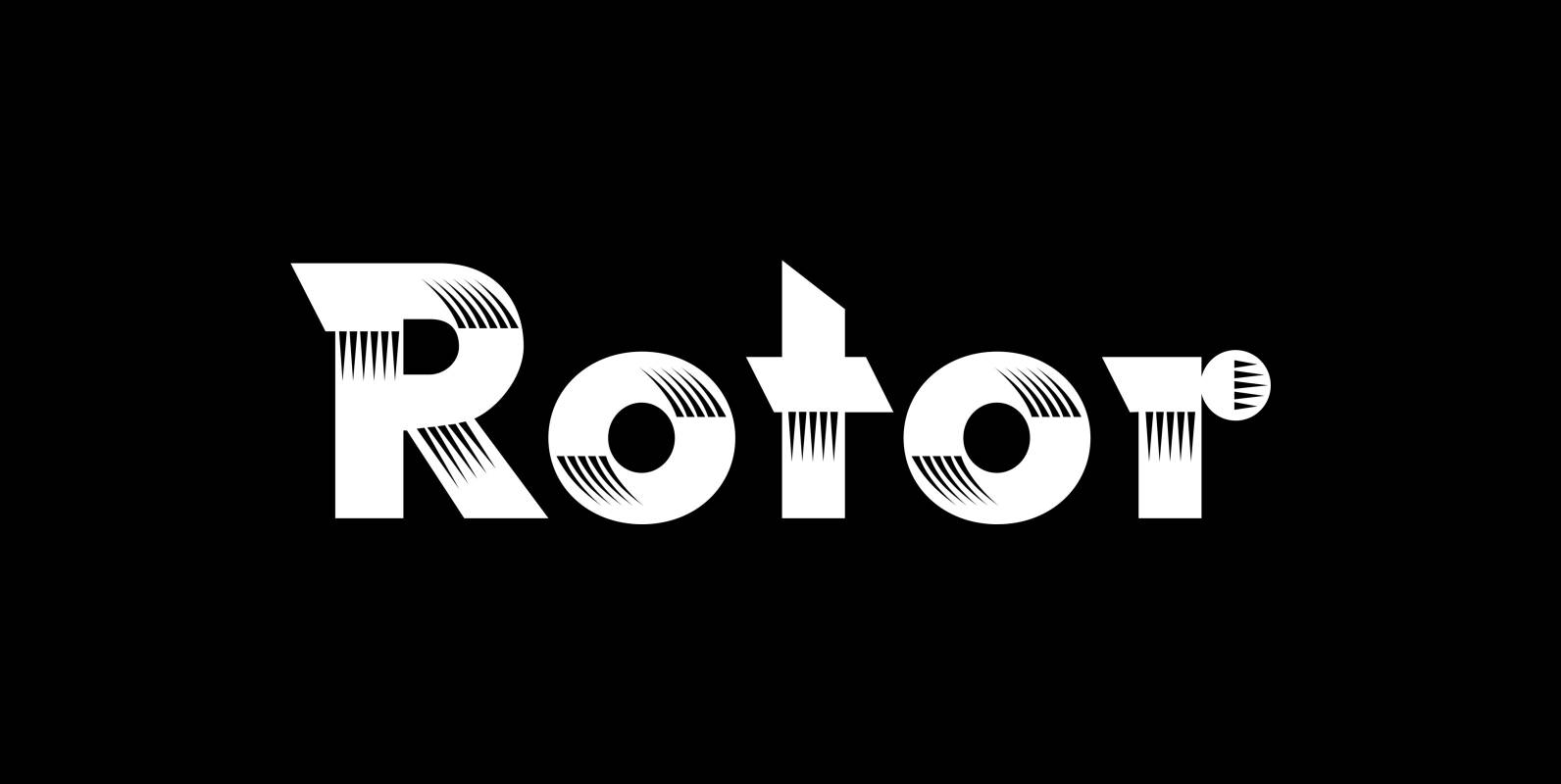
Rotor Font
“Rotor” is a speedy font. In 1929 K. Sommer designed a typeface for Linotype called »Vulcan«, some years later they re-published the typeface and called it “Dynamo”. The early Vulcan design inspired me to do this new, faster typeface in
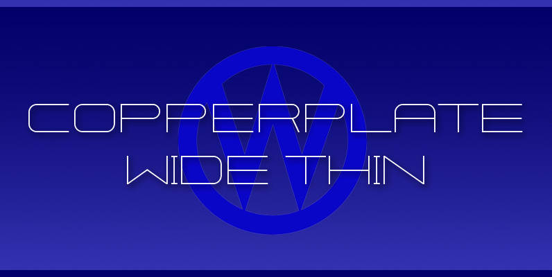
Copperplate Wide Font
“Copperplate Wide” is remotely based on the traditional Copperplate typeface that can be seen on many business cards. I have completely redrawn the typeface in a much wider version and without those stubby little serifs. In the place of the
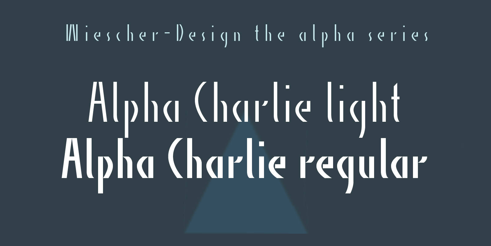
Alpha Charlie Font
“Alpha Charlie” started as an experiment. But once I had a couple of letters, I thought it looked very interesting. So I just designed the whole set. Published by Wiescher DesignDownload Alpha Charlie
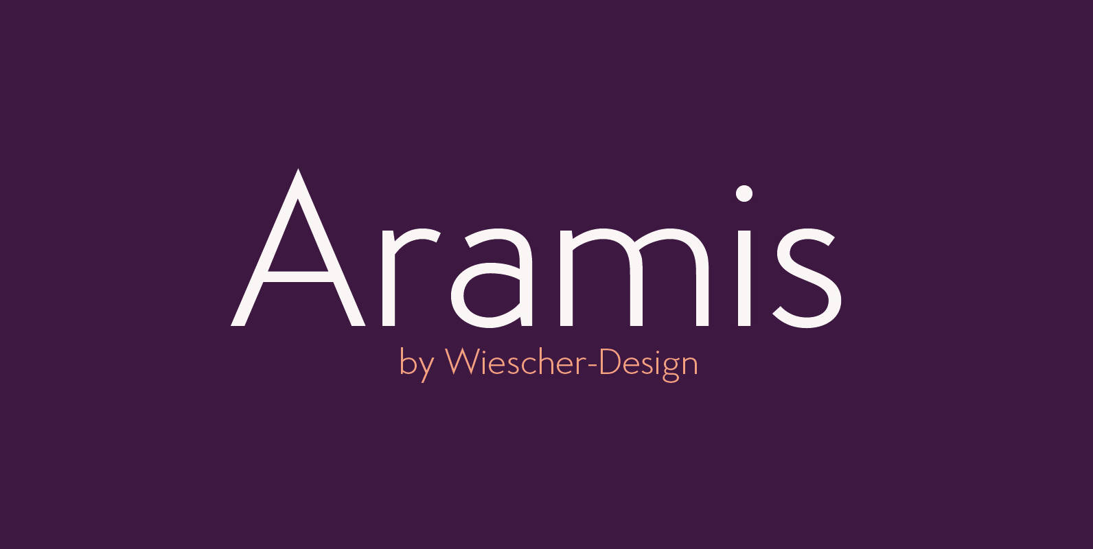
Aramis Font
“ARAMIS” is a new linear Sans with a French touch– designed by Gert Wiescher in 2014 and 2015 – has 7 weights with corresponding italic cuts. The small contrast in the linear Sans makes it not quite so linear and
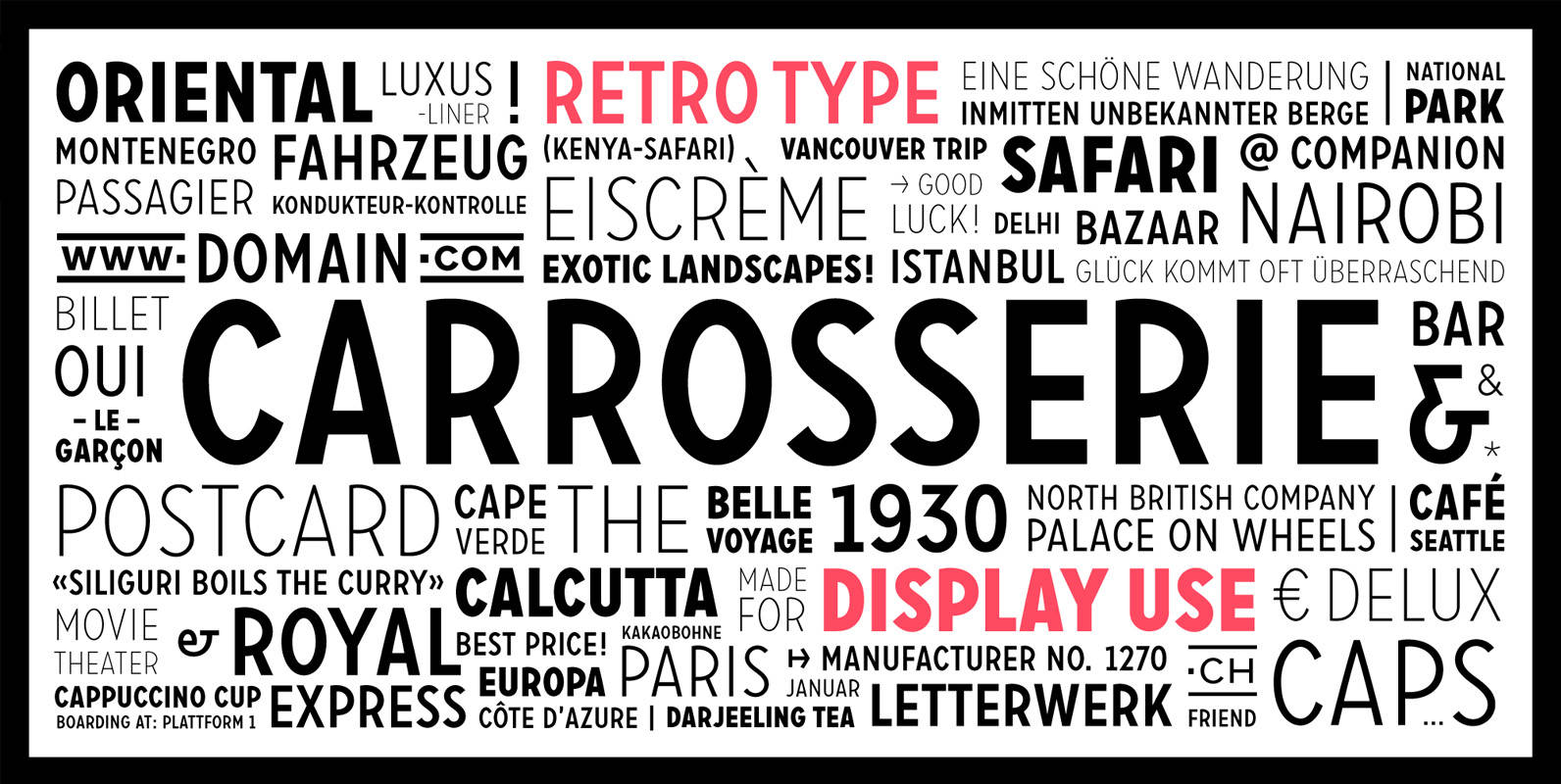
Carrosserie Font
Carrosserie is made for display use, inspired by the shapes of the ’30s. It is a capital letter font with alternate characters and special domain symbols. The font is available in thin, extra light, light, regular, medium, bold & fat.
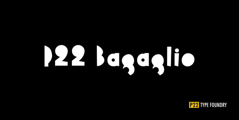
P22 Bagaglio Font
A mysterious 1930s Italian luggage tag inspired Bagaglio. Given its historical and geographical origin, this rough-hewn font could be considered a cousin to our Il Futurismo. Published by P22 Type FoundryDownload P22 Bagaglio
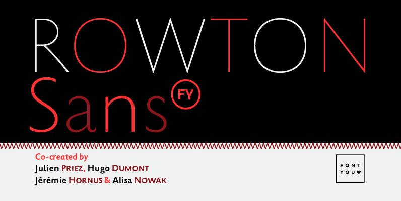
Rowton FY Font
Rowton FY digs its roots in Eric Gill’s views on typography in his book “An essay on Typography”. This typeface has the very British feel of the 20th century. Taking as inspiration the calligraphic illustrations of the book, Julien Priez,
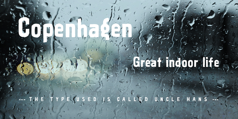
Uncle Hans Font
A versatile font that will work equally well in a retro design as in a modern context. Based on a signboard from the Freemasons club that my late uncle used to be a member of. Published by Jacob TeschDownload Uncle
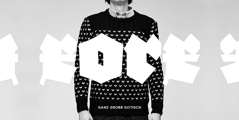
Ganz Grobe Gotisch Font
Ganz Grobe Gotisch is an intense and masculine blackletter font originally designed by F.H. Ernst Schneidler and Ralph M. Ungern. Works great in headline usage, for logos and poster design. Published by URW Type Foundry GmbHDownload Ganz Grobe Gotisch