Tag: 1920s
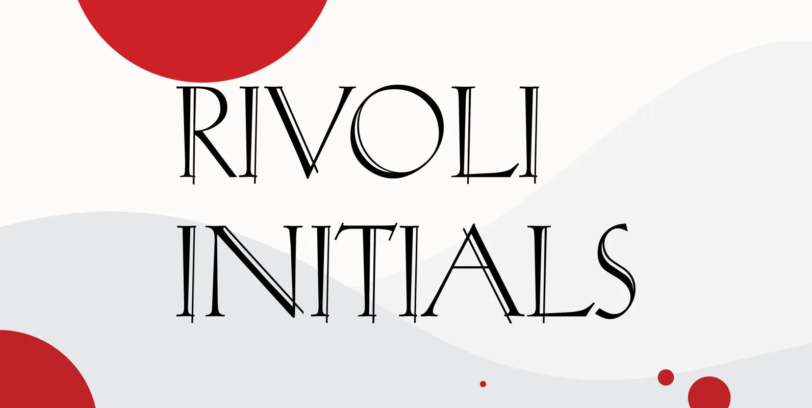
Rivoli Initials Font
Designed by Paul Hickson, Rivoli Initials is a decorative font based on the William T. Sniffin design for ATF, circa 1928. Published by Red RoosterDownload Rivoli Initials
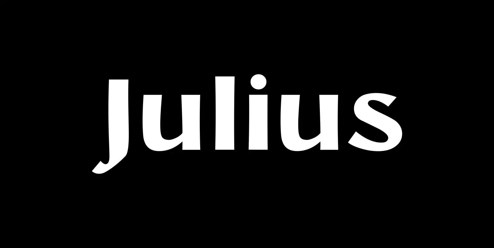
Julius Font
“Julius” comes in very handy if you want to jump back in time to the middle of the last century. “Julius” is also one of my first typefaces, recently I added the light version. Published by Wiescher DesignDownload Julius

Fleurie Font
“Fleurie” is a small town in France on the high banks of the Beaujolais-area where they make excellent, fruity wine. Fleurie means flowery and that is what that village and this font is all about. The font is a very
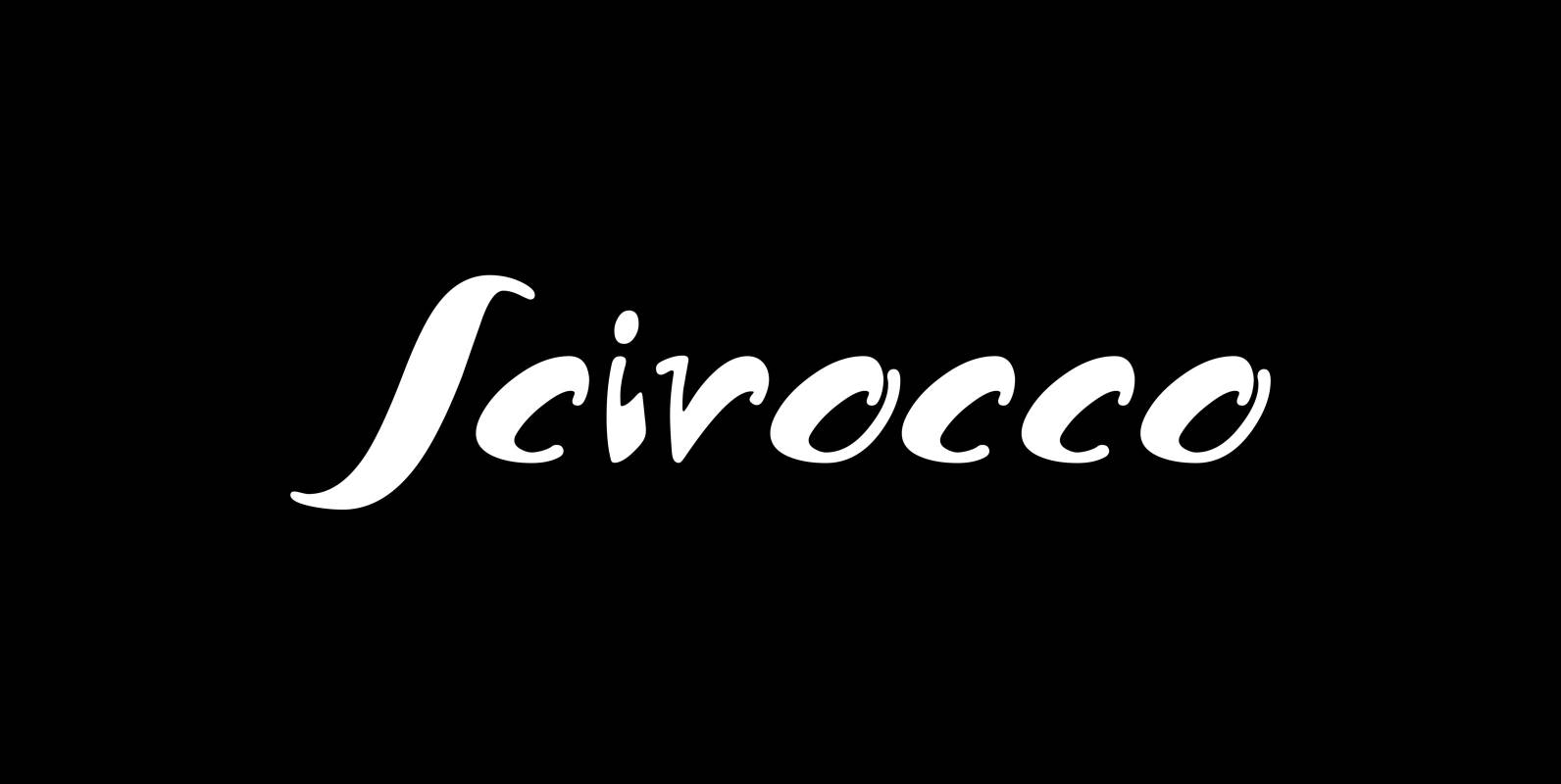
Scirocco Font
“Scirocco” is a hot and humid wind that blows from the Sahara over to France and Italy. It crosses the mediterranean sea and carries lots of fine desertdust with it. Once it hits the costs of Provençe one can feel
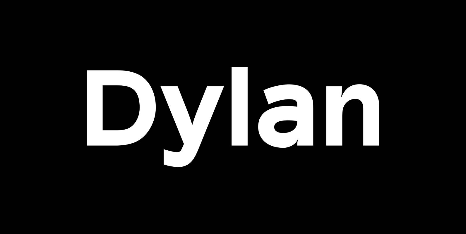
Dylan Font
“Dylan” is a Sans typeface in the best American tradition. In order to keep corners open and to make the font more readable in small sizes it has deep cuts where curves join straights. I designed 7 finely tuned weights
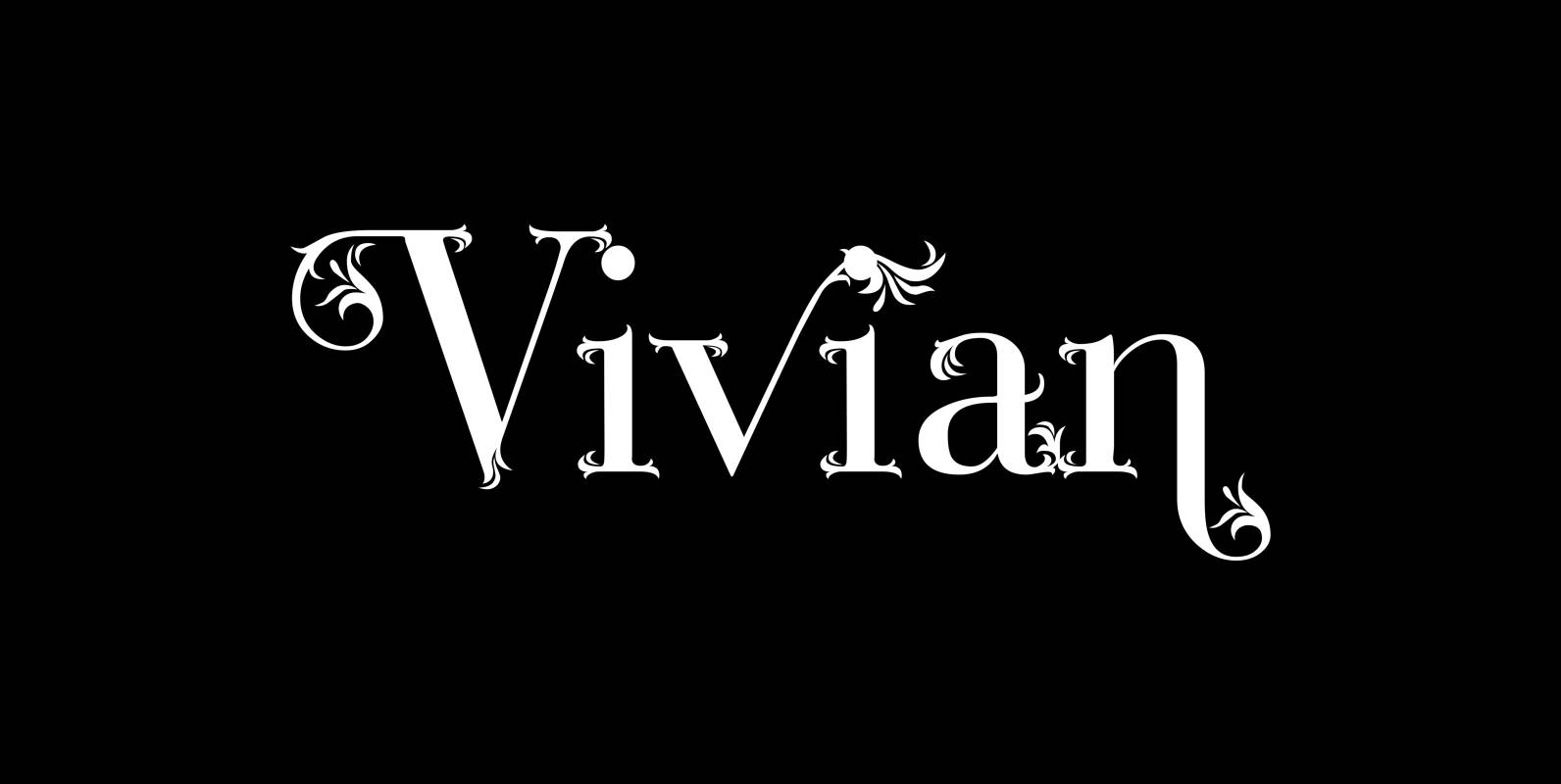
Vivian Font
“Vivian” is a heavily decorated serif typeface based on my “Bodoni Classic” font. I have this “flaw” in my personality that just enjoys designing decorative typefaces. I designed three cuts. First: the straight forward “Vivian” with nicely decorated capitals and
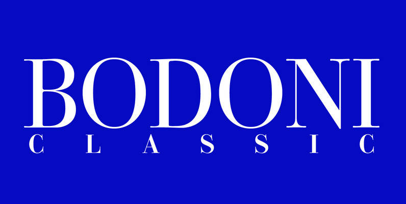
Bodoni Classic Font
I became interested in designing Bodoni Classic because of a lazy graphic designer at Jacques Damase publishing house. He had to change a single letter on a bookcover about J. B. BODONI. The French call him Jean Baptiste instead of
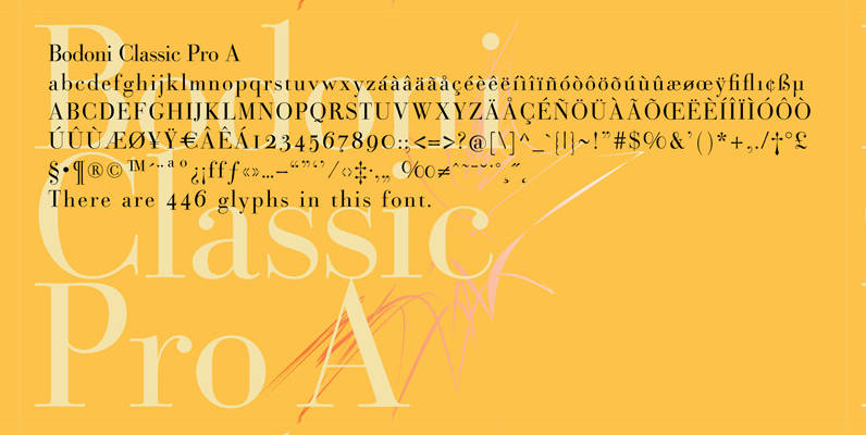
Bodoni Classic Pro Font
This is my new, completely worked over and fine-tuned Bodoni Classic for Europe (no Greek and Cyrillic). I have added a set of elegant Swashes (B) and 2 alternating uppercase swirly Initials (C) as well as two lowercase end-letters (D).

Supra Extended Font
Supra Extended – designed by Gert Wiescher in 2013 – is the extended version to this new sans typeface family of eight weights. The extended version is designed for sheer elegance and has no italics because they didn’t look nice
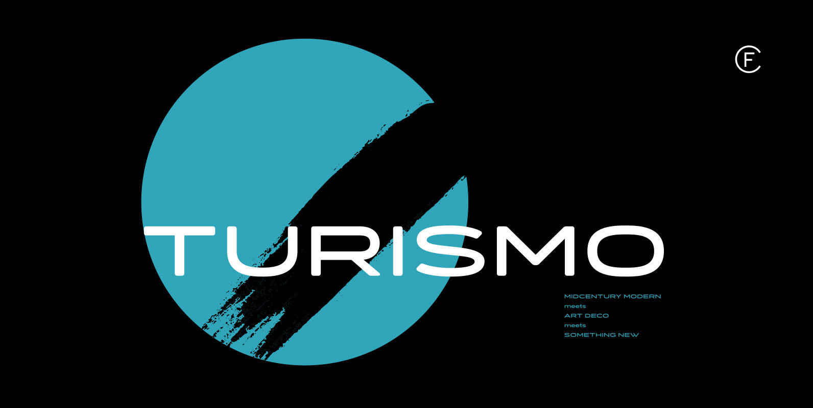
Turismo CF Font
Inspired by midcentury motorsports, technology, and business, Turismo CF is designed for stunning logotypes and gripping headlines. Taking cues from both the 1960s and 1920s, Turismo combines strong rectangular shapes with sloping, elongated curves. Includes seven weights, upper and lower
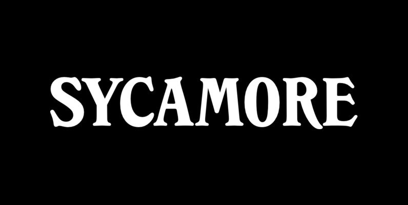
Sycamore Font
Designed by Les Usherwood, Sycamore was digitally engineered by Steve Jackaman. Published by Red RoosterDownload Sycamore
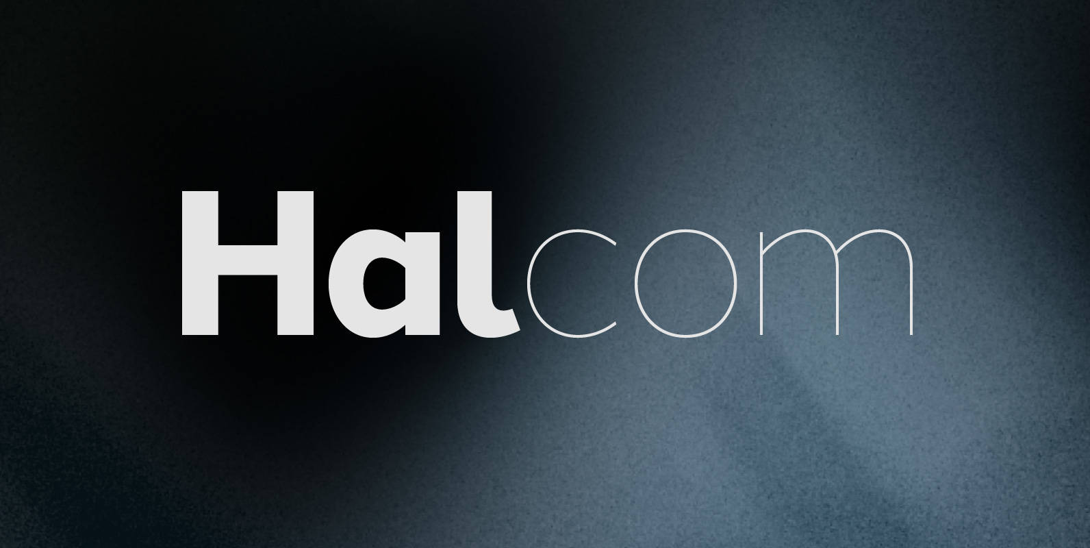
Halcom Font
A modern sans serif typeface inspired by the historic geometric’s of the 1920’s, specifically Futura. The design is not a simple pastiche of what went before this is much more than that. It is a close investigation to how Futura
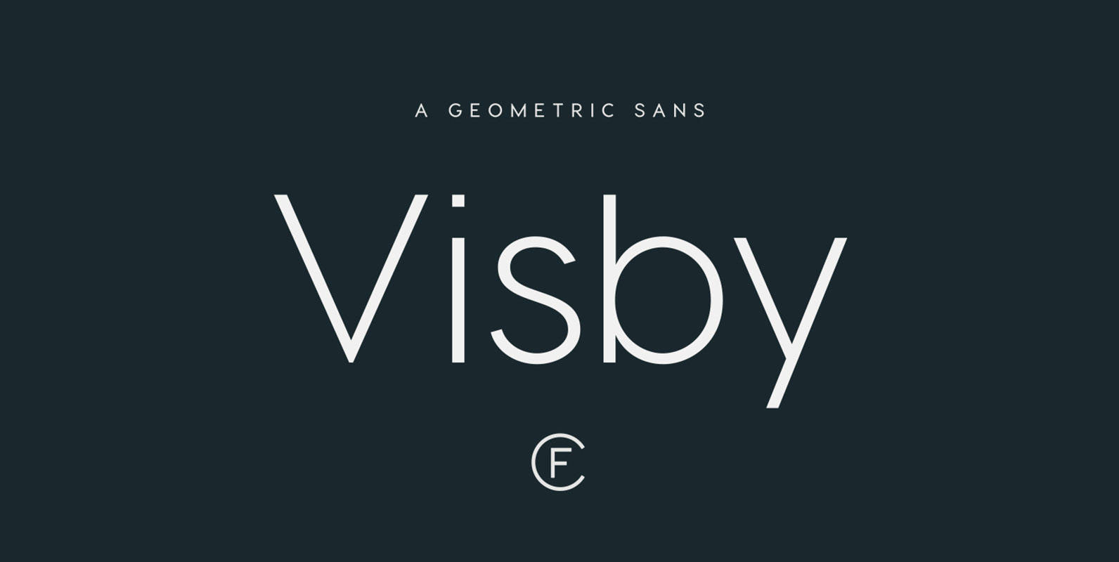
Visby CF Font
Friendly and charismatic in lowercase; sophisticated and authoritative in uppercase. Visby is a geometric font family inspired by the stark beauty and crisp air of the Arctic North. Hard lines and sharp corners mesh with smooth, rounded forms, while subtle
Weiss Antiqua Font
In 1928 Emil Rudolf Weiss designed Weiss Antiqua, a classic and and versatile serif design. Use this design in a wide range of projects, great for the design toolbox. Published by URW Type Foundry GmbHDownload Weiss Antiqua
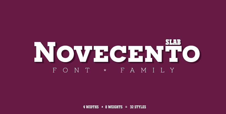
Novecento Slab Font
Novecento Slab is the “slab serif” companion of Novecento Sans, a font family inspired on european typographic tendencies between the second half of 19th century and first half of the 20th. This font face is designed to be used mostly
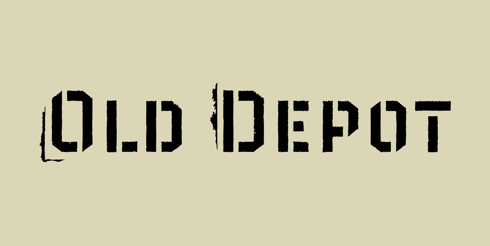
Old Depot Font
Old Depot is a newly reworked idea for the Depot Trapharet 2D font. It supports more languages and is available in more lettering. Old Depot stands out with its industrial nature of archaic spirit. It is a wonderful choice for