Search results for: grid base
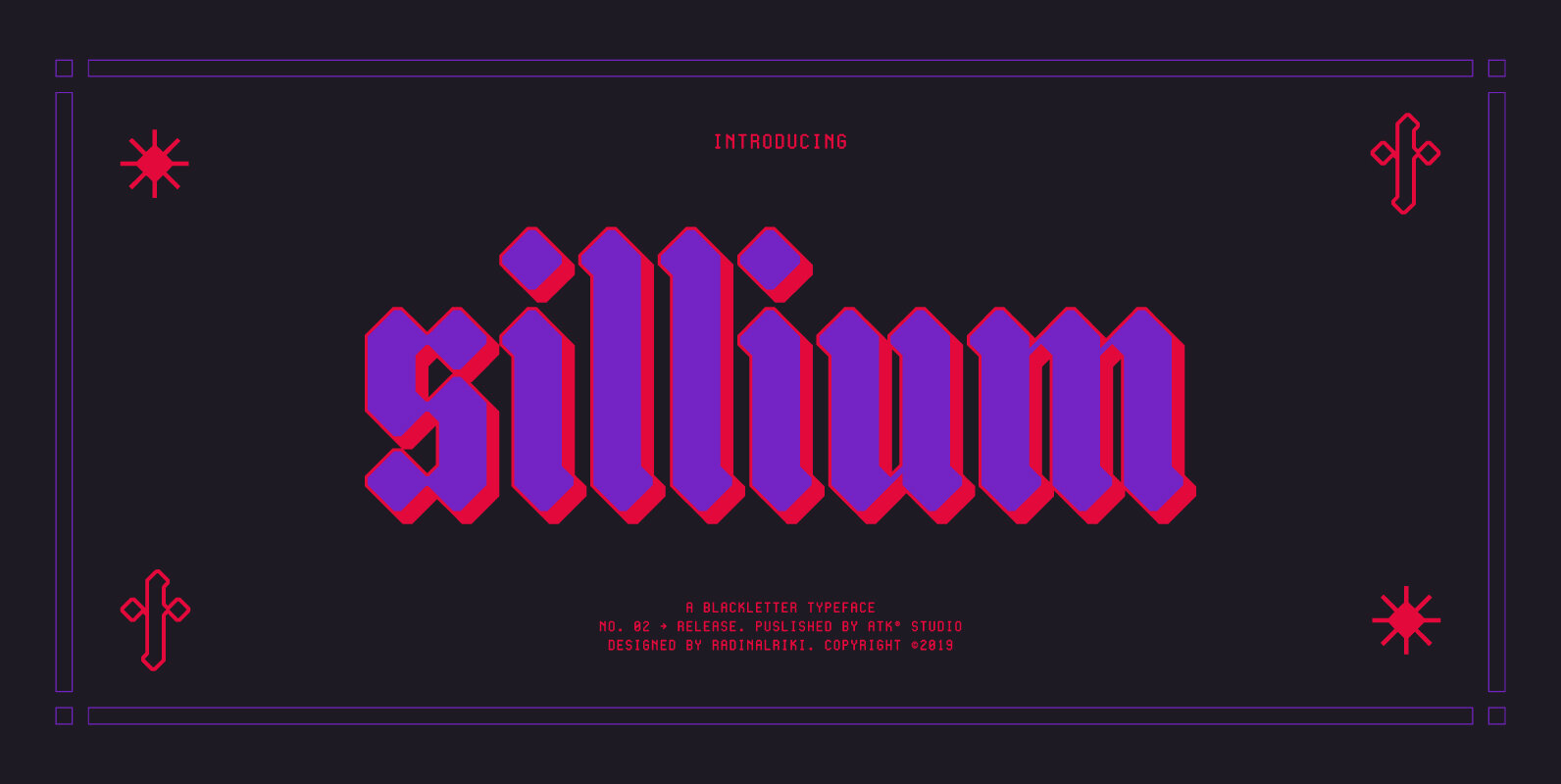
Sillium Font
Inspired by blackletter type styles. Sillium is built on modular basis. As a result, it excels in a wide range of display settings, logotypes, and short text. Determine the grid and create a complete set of cohesive characters (a-z) and
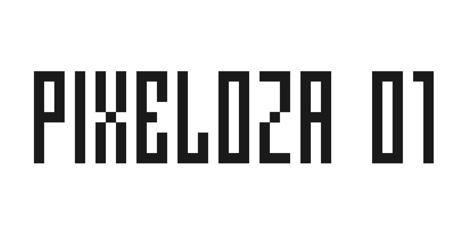
Pixeloza 01 Font
Pixeloza 01 is a pixel-style, grid-based, display typeface. It is distinguished by its simplicity and original form. It gives a lot of possibilities in creating unconventional, creative, unique projects. Published by FontsphereDownload Pixeloza 01
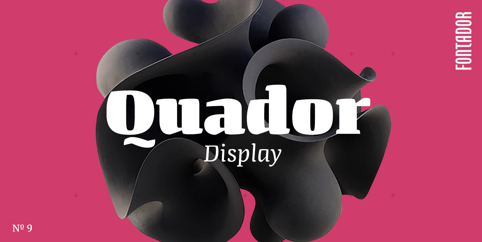
Quador Display Font
Quador Display is a serif, especially designed for contemporary typography on print and screen. The superellipse-based forms and high x-height allow large and open letterforms, perfectly adapted to the pixel grid on screen. The font contains 6 weights from light
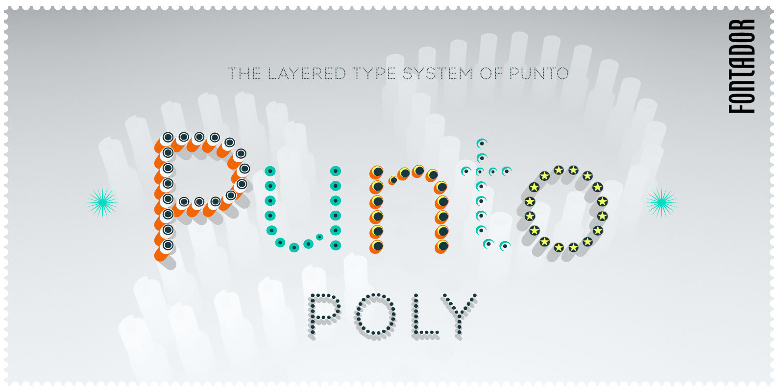
Punto Poly Font
Punto Poly is the layered type system of Punto for cromatic typesetting. Endless effects can be created by 11 stackable layers and different colors. The dots of Punto Poly are not made up of grid-based dots, they are optical corrected
Cygnito Mono Font
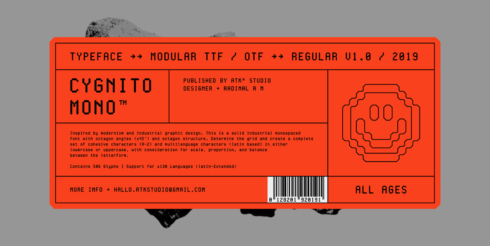
Cygnito Mono is the debut font from ATK® Studio. Inspired by modernism and industrial graphic design. This is a solid industrial monospaced font with octagon angles (±45°) and octagon structure. Determine the grid and create a complete set of cohesive
Polyline Font
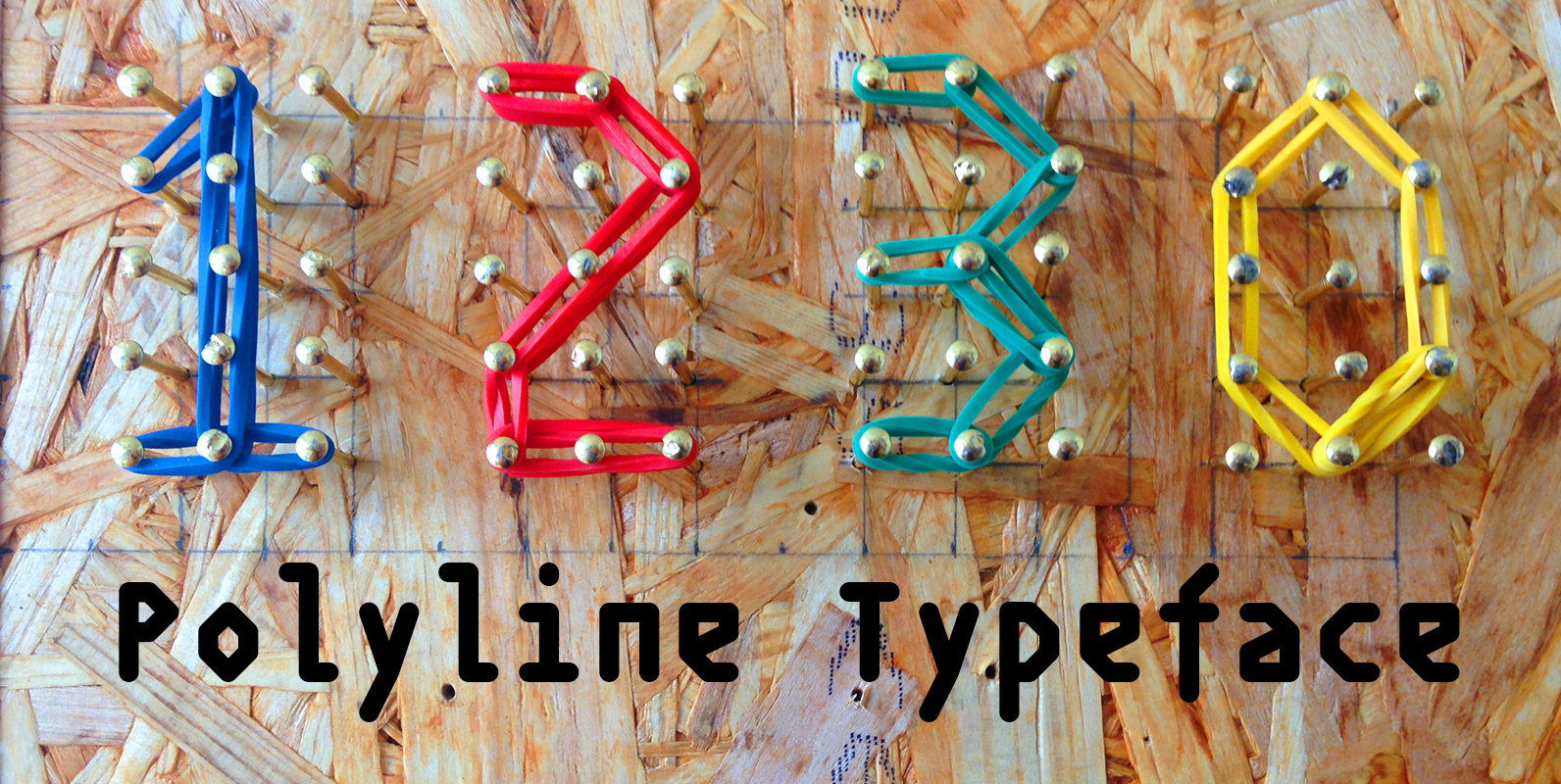
Polyline is based on a small 3×5 grid giving it a rather crude and technical look, further emphasized by the monospacing. ‘Polyline’ is a command often found in CAD-software that is used to create a series of connected lines. Published

Arabigram Font
Arabigram is an Arabic display font that is inspired by the Chinese Tangram. Letters are uniquely designed by connecting triangles, squares and parallelogons while keeping the visual identity of Arabic script in mind. Arabigram suits various applications including web and
Bw Nista Font
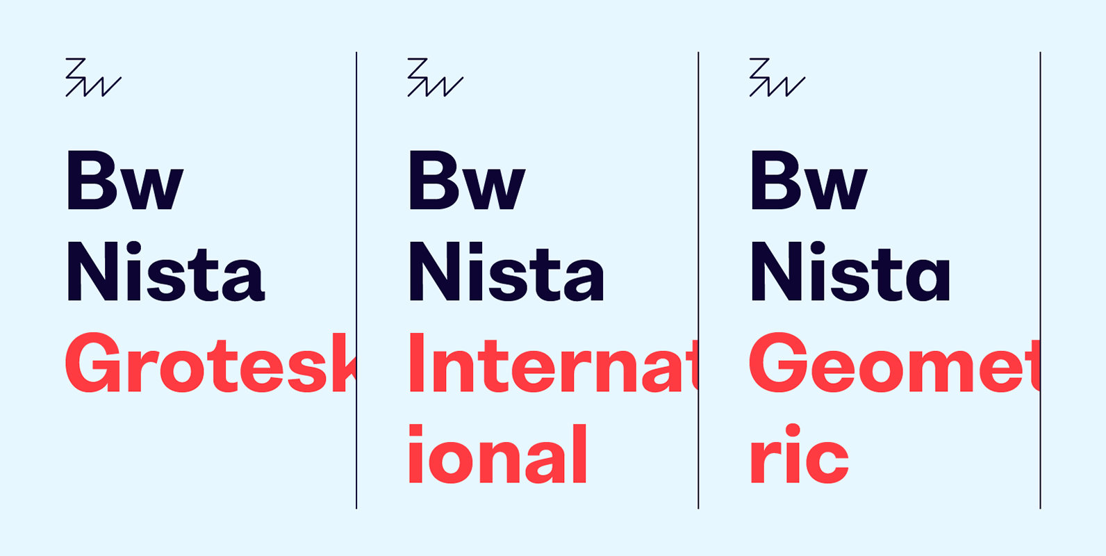
Bw Nista is a clean modernist sans serif font family. Designed to provide a neutral tone of voice, it comes in three different sets each with subtle features portraying different personalities. Bw Nista Grotesk's clean shapes are peppered with subdued
Zenga Font
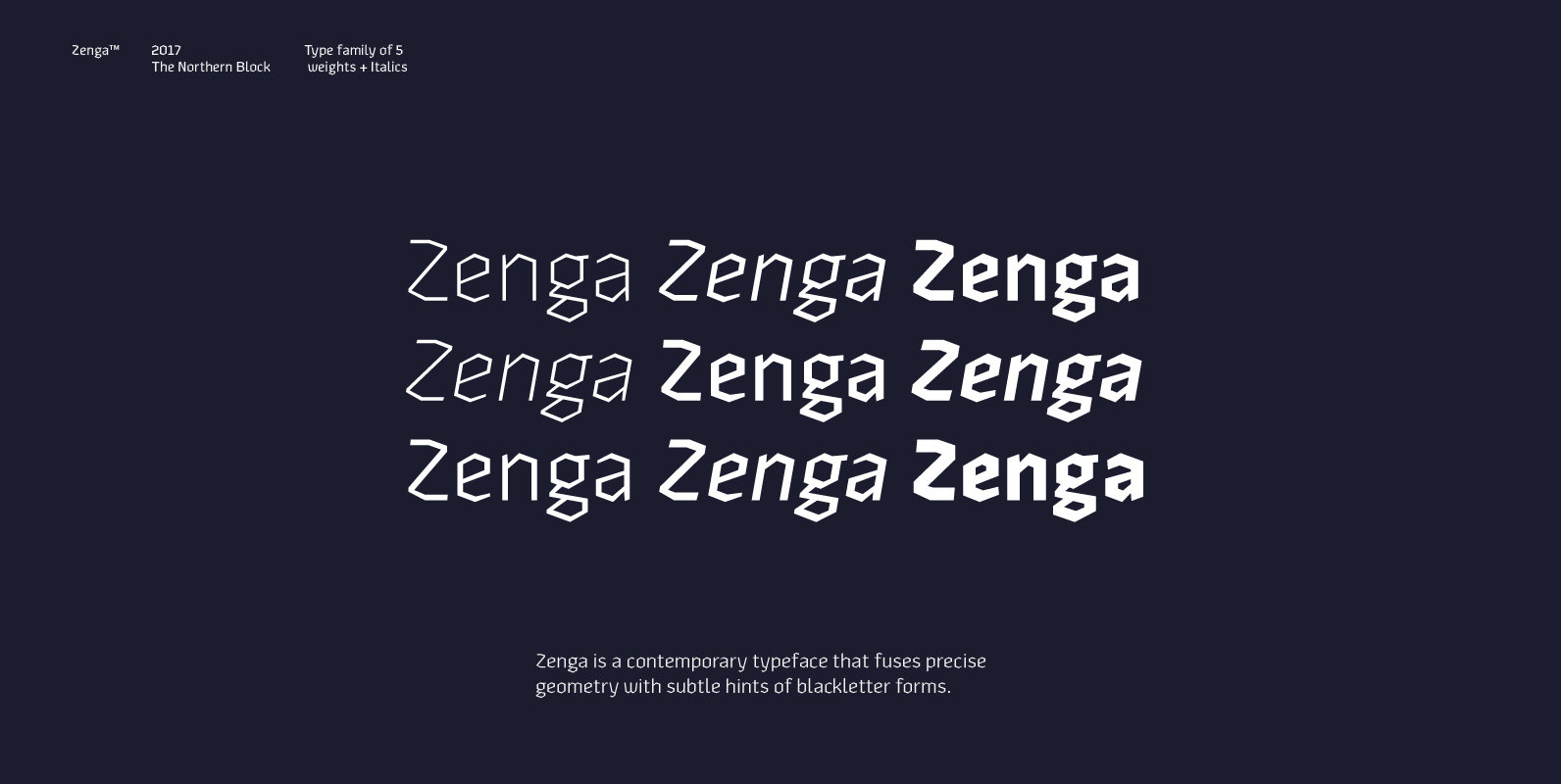
Zenga is a contemporary typeface that fuses precise geometry with subtle hints of blackletter forms. The concept was to adapt core values from the gothic style and develop a design suitable for grid and pixel based platforms. Details include five

Mixcoatl Mono Font
The Typeface «Mixcoatl» by Elia Salvisberg was developed as a part of a course at the Lucerne School of Design and Art in 2016. Based on the book «The Empire of the Inca», a display-font has been created, which is
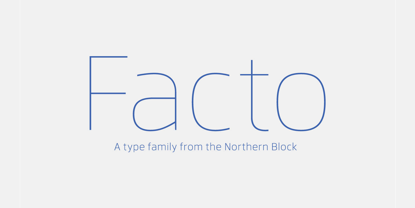
Facto Font
A simple, mechanical typeface without distractions. Slightly condensed curves are developed from a compact grid layout to produce a crisp, fresh and legible type family. The unadorned letterforms work perfectly with complex information-based applications such as user interfaces, mobile devices
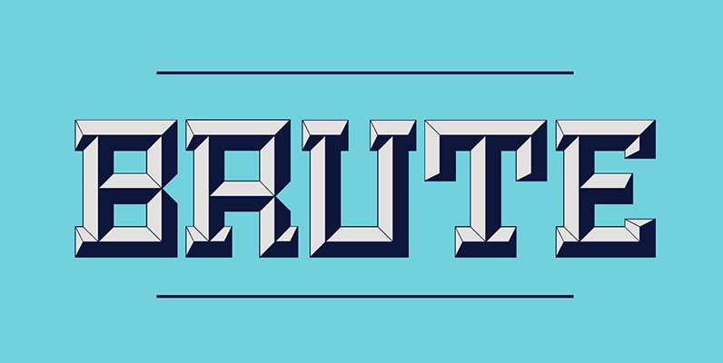
Brute Font
Brute is a new kind of beveled display face based upon a modular grid-like system. Its precisely sharp edges convey a solid yet aggressive feel that add personality to any project. Unlike many beveled typefaces, Brute puts the lighting direction
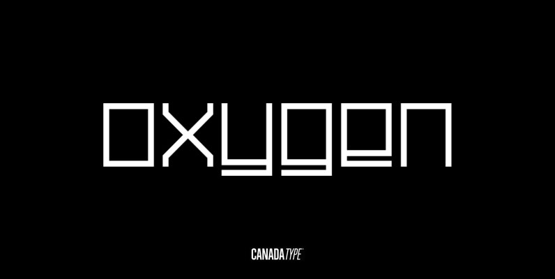
Oxygen Font
Oxygen is a square and strict grid-based unicase design that expresses the 21st century with an unmatched clinical precision and clarity. With three weights and italic counterparts, Oxygen covers geometric expression ranges from the thin and delicate artist to the
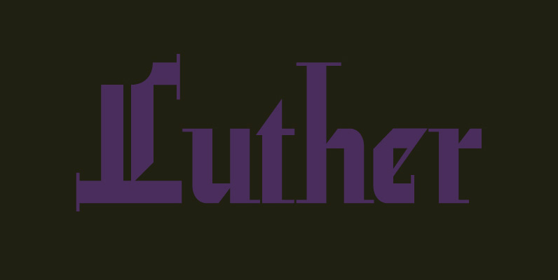
Leather Font
Leather has three features usually not found in other blackletter fonts: Grid-based geometric strokes and curves: In the early 1930s, blackletter design had already begun interacting back with the modern sans serif it birthed at the turn of the century.
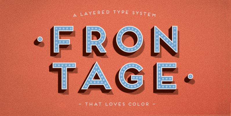
Frontage Font
Frontage is a charming layered type system with endless design possibilities using different combinations of fonts and colors. Achieve a realistic 3D effect by adding the shadow font or just use the capital letters of the regular and bold cut

Blackhaus Font
Almost a half of a millennium after being mistaken for the original 4th century Gothic alphabet and falsely labeled ‘barbaric’ by the European Renaissance, the blackletter alphabet was still flourishing exclusively in early 20th century Germany, not only as an
