In the exuberant atmosphere of the Roaring Twenties, a decade marked by unprecedented economic prosperity and cultural dynamism, a new aesthetic movement emerged that would forever change the landscape of design: Art Deco. This style was not merely a fleeting trend but a seismic shift that influenced various facets of life and art. From the towering skyscrapers that punctuated city skylines to the intricate designs of jewelry that adorned the social elite, from the sleek, aerodynamic forms of automobiles to the luxurious interiors of ocean liners, Art Deco left an indelible mark on the world.
Yet, its impact was not confined to three-dimensional space; it extended into the realm of typography, breathing life into the printed word. Art Deco fonts encapsulate the essence of the era, characterized by geometric shapes, symmetrical patterns, and a sense of grandeur that was reflective of the optimism and affluence of the time. These fonts are more than just letters on a page; they are visual narratives that tell the story of a society caught in a whirlwind of change, eager to break free from the constraints of the past and embrace the possibilities of the future.
Today, Art Deco fonts stand as enduring symbols of a bygone era, yet their appeal is far from antiquated. They continue to captivate designers and audiences alike, serving as a bridge between a historical period marked by extravagance and a contemporary world that still values elegance and sophistication. These fonts are not merely relics to be admired from a distance; they are dynamic elements of design that continue to adapt and thrive, proving that the Art Deco movement was not just a moment in time, but a timeless testament to human creativity and ambition.
Imprint of Elegance: The Origins and Evolution of Art Deco Typefaces
Emerging from the ashes of World War I, the Art Deco movement found its genesis in France, a nation eager to distance itself from the grim realities of a devastating conflict. This new aesthetic was not merely a stylistic shift; it was a cultural revolution that sought to redefine the very essence of beauty and elegance. In stark contrast to the Art Nouveau period, which reveled in intricate, flowing designs inspired by natural forms, Art Deco was a clarion call for a new kind of sophistication. It was a style that borrowed liberally from a diverse array of sources, including Cubism, Constructivism, and even ancient Egyptian and Mayan art. This eclectic mix was then distilled into a singular design language characterized by geometric precision, symmetrical balance, and a grand sense of scale.
In the realm of typography, Art Deco made an equally transformative impact. It gave birth to a family of fonts that were a radical departure from the ornate, serif-laden typefaces of earlier periods. These new fonts were a celebration of geometric simplicity, featuring unadorned lines and shapes that conveyed a sense of modernity and efficiency. Names like Manhattan, Metropolis, and Broadway became synonymous with the glamour and allure of the Art Deco era. These typefaces were not merely decorative elements; they were integral to the visual narrative of the time, capturing the zeitgeist of a society that was increasingly urban, industrial, and enamored with the promise of a brighter future.
Over the years, these fonts have not only stood the test of time but have also evolved to adapt to contemporary sensibilities. They continue to be the go-to choice for projects that require a touch of vintage elegance or modern minimalism. Whether gracing the cover of a luxury fashion magazine or serving as the visual anchor for a cutting-edge website, Art Deco fonts like Manhattan, Metropolis, and Broadway remain iconic staples in the design world, a testament to an era that continues to inspire and captivate.
The Art Deco Aesthetic in Typography: A Study in Contrast and Harmony
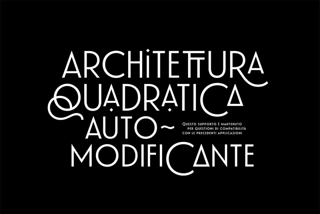
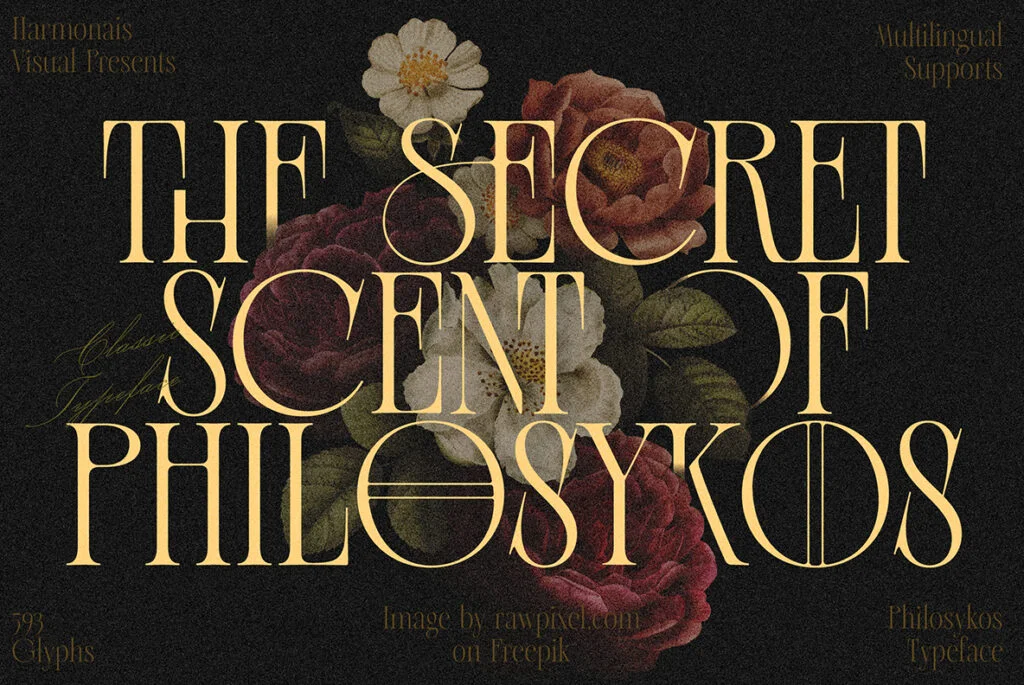
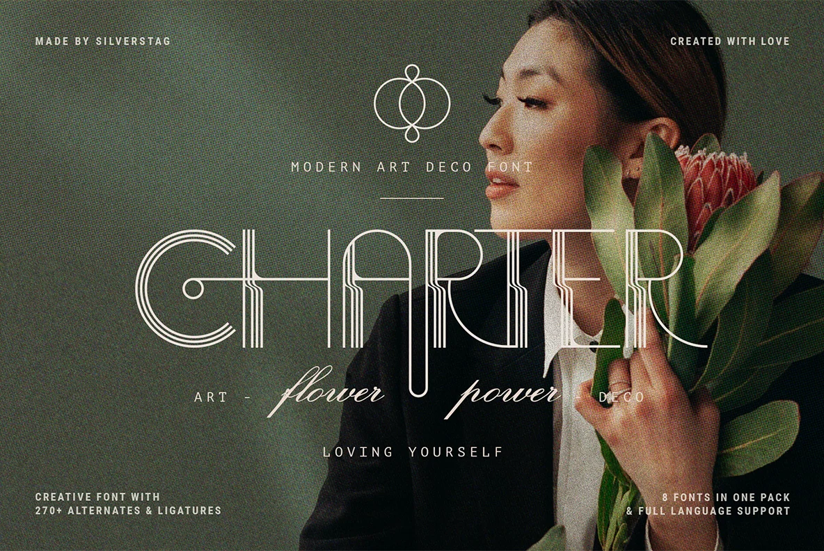
Art Deco fonts are a study in contrasts, a harmonious blend of seemingly disparate elements that come together to create a striking visual impact. At the core of their design lies a bold, blocky structure, a nod to the architectural marvels of the era that were often monumental in scale. This robust framework is then punctuated by dramatic variations in line thickness within individual characters, creating a dynamic tension that captivates the eye. The result is a typeface that is both assertive and graceful, a paradox that is quintessentially Art Deco.
But the allure of Art Deco typography doesn’t end there. These fonts often feature sharp, angular edges that are artfully balanced by smooth, flowing curves. This juxtaposition creates a visual rhythm that is both energizing and soothing, a dance of form and space that engages the viewer on multiple levels. To further embellish this intricate ballet of shapes, some Art Deco fonts incorporate ornamental motifs—geometric flourishes, intricate patterns, or stylized elements—that serve as distinctive accents, adding a layer of complexity and intrigue.
Despite their grandeur and complexity, Art Deco fonts are remarkably versatile. They exude an air of luxury that is never ostentatious, a sense of elegance that is as accessible as it is refined. This makes them ideal for a wide array of applications, from high-end advertising campaigns and editorial layouts to product packaging and digital interfaces. Whether you’re aiming to evoke the opulent glamour of a bygone era or seeking to infuse a contemporary project with a touch of retro sophistication, Art Deco fonts offer a timeless aesthetic that is both visually stunning and endlessly adaptable.
Applications in Modern Design: The Ubiquity and Versatility of Art Deco Fonts
Art Deco fonts are far from being relics of a bygone era; they are vibrant participants in the contemporary design landscape, lending their unique aesthetic to a myriad of applications. Their Jazz Age roots may evoke a sense of nostalgia, but their geometric precision and clean lines resonate with modern sensibilities, making them a go-to choice for today’s designers. Whether illuminating the marquees of Broadway theaters, gracing the logos of luxury brands, or adding flair to stylized movie posters, these fonts are as relevant today as they were in the 1920s.
In the digital realm, the influence of Art Deco fonts is equally pervasive. They are frequently employed in user interfaces, web design, and even mobile applications, serving as visual anchors that guide user interaction. Their bold, easily readable forms make them ideal for digital environments, where clarity and impact are paramount. Moreover, their inherent elegance adds a layer of sophistication to digital experiences, elevating them above the mundane.
The versatility of Art Deco fonts is further amplified by the extensive range of styles and weights available, particularly on platforms like YouWorkForThem. This rich variety opens up a world of creative possibilities, allowing designers to tailor their typographic choices to the specific needs and aesthetics of a project. Whether the goal is to evoke a specific historical period, add a touch of luxury, or simply to make a bold, contemporary statement, Art Deco fonts offer a versatile toolkit for innovation and expression, ensuring that they will continue to be a staple in design portfolios for years to come.
Art Deco Fonts: Bridging Epochs and Aesthetics in the Modern Design Lexicon
Art Deco fonts encapsulate a fascinating duality, serving as both a reverberation of the past and a vision of the future. Their geometric rigor and streamlined forms echo the unbridled optimism and industrial prowess of the 1920s, while their minimalist elegance makes them strikingly relevant in today’s digital age. For graphic designers, employing Art Deco typography is akin to being a time traveler, capable of forging links across different epochs and crafting a visual narrative that is as resonant today as it was nearly a century ago.
These fonts are more than mere stylistic choices; they are a living testament to a transformative period in history when the boundaries between man and machine, between tradition and innovation, were being redrawn. This was an era that gave us skyscrapers and jazz, that saw the rise of the automobile and the allure of the silver screen, and it’s this eclectic fusion of influences that Art Deco fonts distill into their very glyphs. Today’s graphic designers are the stewards of this rich legacy, equipped with an array of digital tools that allow them to reinterpret, adapt, and breathe new life into the Art Deco aesthetic for contemporary audiences.
In the ever-evolving landscape of design, Art Deco fonts retain their status as indispensable elements in the designer’s repertoire. They are not just historical artifacts but dynamic tools for modern expression, serving both as a homage to design traditions and as a forward-looking lens through which we can envision the future. Whether you’re crafting a vintage-inspired poster or a sleek, modern website, the extensive and varied collection of Art Deco fonts available at YouWorkForThem offers a wealth of options for engaging in this timeless dialogue between past and future.