Antique Olive, designed by Roger Excoffon in 1962 for the French Olive type foundry, was meant to be the French answer to Helvetica and Univers. However, the typeface is way too eccentric and distinctive to ever become a rival for Helvetica and Univers or any other neutral and versatile linear sans serif. Its x-height is very large, and there is plenty of contrast where curves meet stems. On top of that, the ‘s’ seems to be upside down. These distinctive details make Antique Olive quite different from any pure linear sans serif. Sans Serif translates to Antique in French and so the name Antique Olive was found. Excoffon designed a new logo for Air France back then, and the lettering formed the basis for the complete Antique Olive typeface design. Antique Olive is still quite popular, obviously especially in France, although it is not that easy to set type with it. It is not really good for lengthy text copy but rather ideal for large headlines, ads, and posters. It can be set tight and even very tight without compromising legibility or optical quality. A company logo giving birth to the typeface design as well as Antique Olive’s character shapes seem to make it particularly well suited for logos and letterings of that kind. Its advantages, namely its strength of character and its distinctiveness, are its disadvantages at the same time comparing it to Helvetica, Univers, and alike.
Save 10% off YouWorkForThem fonts with the code: MRSAVE10
Download Antique Olive Font
Related posts:
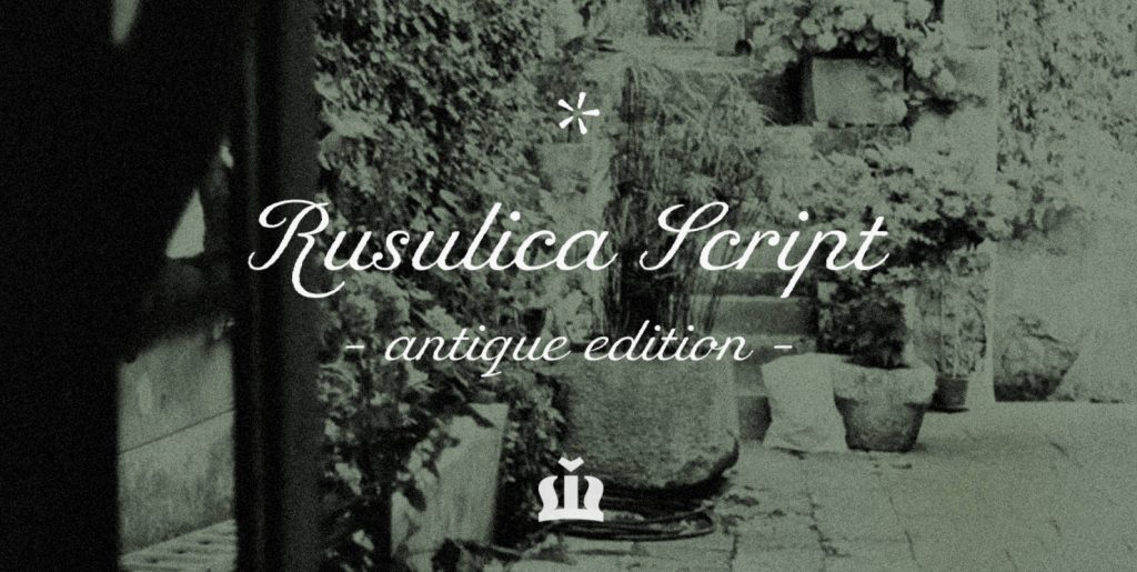
Rusulica Antique Font
Rusulica Antique is a modification of the erstwhile script. With rough edges it has a distinctive appearance, rich aroma and antique charm. Because of its ornamental and playful design, it offers plenty of possibilities. Rusulica Antique has a high contrast.
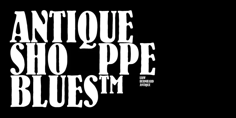
Bernhard Antique Font
Bernhard Antique is a distressed serif font designed by Lucian Bernhard in 1912, released by URW. Bernhard Antique is a Trademark by Bauer Types Published by URW Type Foundry GmbHDownload Bernhard Antique