Tag: glyphic
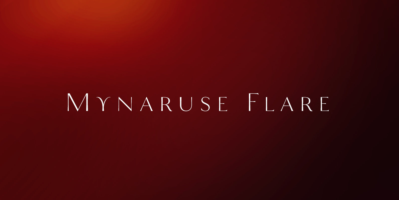
Mynaruse Flare Font
Mynaruse Flare is a new version of the Mynaruse superfamily. This version eliminates the elongated serifs of the original, and instead stems end with a flare. You will find that the thinner weights are delicate and beautiful, while the heavier
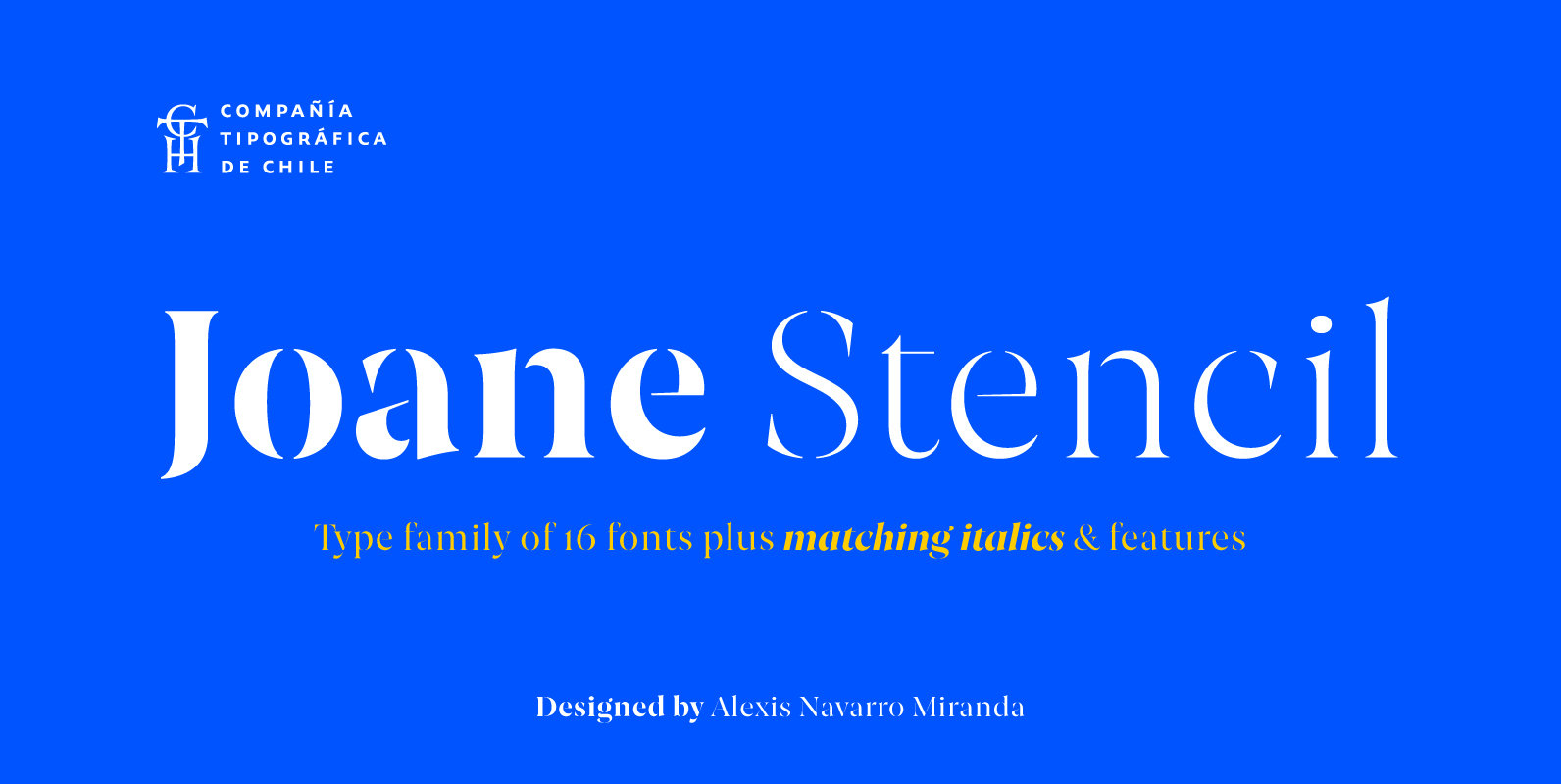
Joane Stencil Font
Joane Stencil is Joane’s fearless sequel. Mixes the elegancy of French didones, calligraphic endings, glyphic serifs and the split of the Stencil is treated very carefully. Thus its features convey a warm unique style. Moreover, it has powerful OpenType features
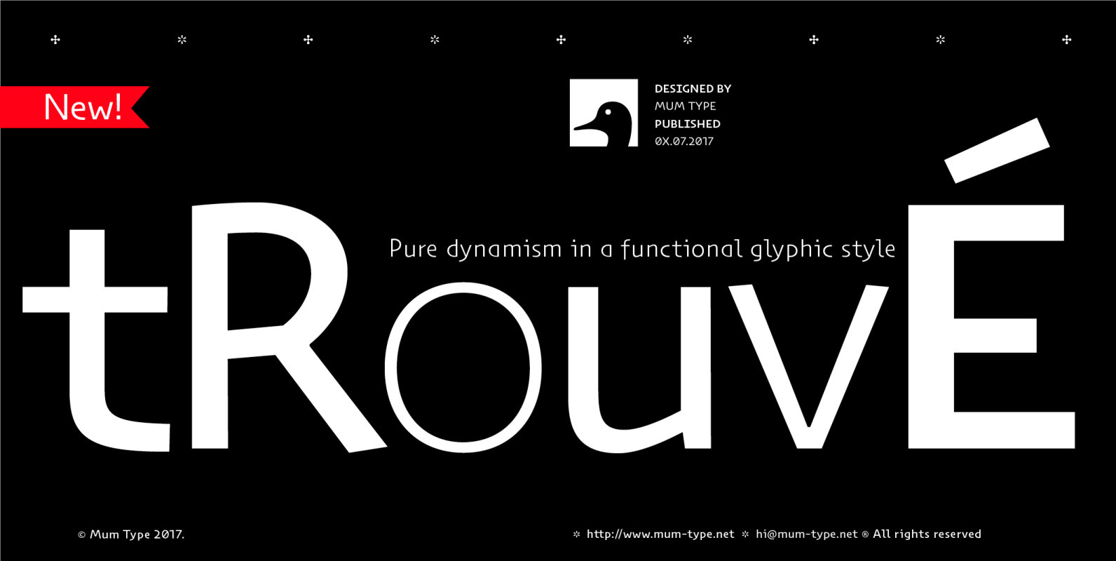
Trouve Font
When we started Trouvé, we read about some old paleontologist who found an old greek inscription back in the days. The anecdote tells that when he found the inscriptions on the stones, he jelled “trouvé! trouvé!.”. Now Trouvé is an
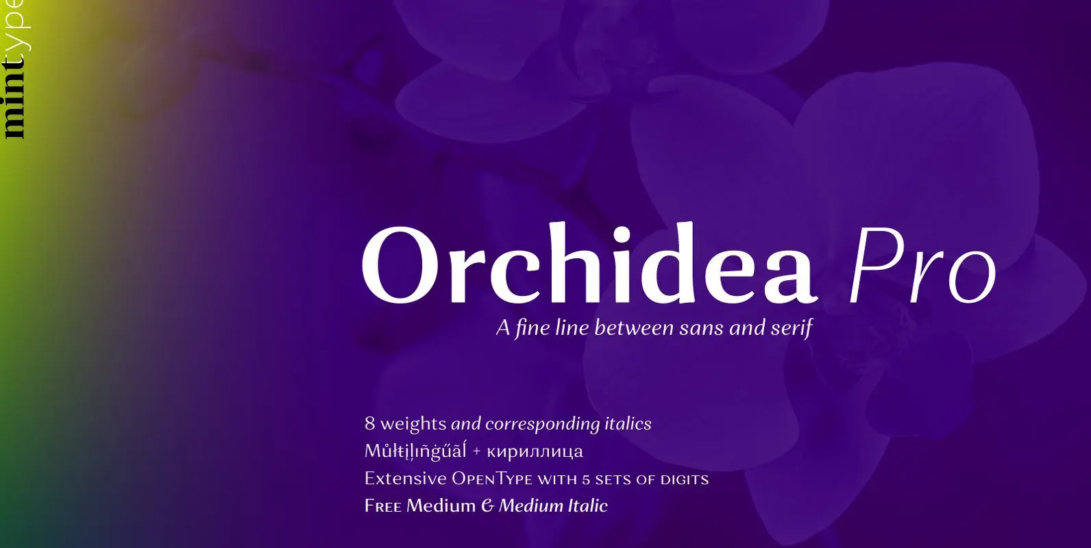
Orchidea Pro Font
Orchidea Pro is a typeface balancing on the verge of sans and serif. Called a stressed sans or a serifless serif, it does not feature any serifs, but resembles a serif typeface by build, and features unilateral nibs that speed
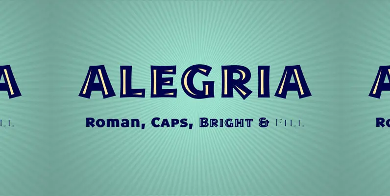
Alegria Font
Alegria is a font family for joyful communication. The family consists of Alegria Roman (with upper/lowercase and oldstyle figures), Alegria Caps (with uppercase, small caps and lining figures), Alegria Bright (a small caps version with a three-dimensional feel) and Alegria
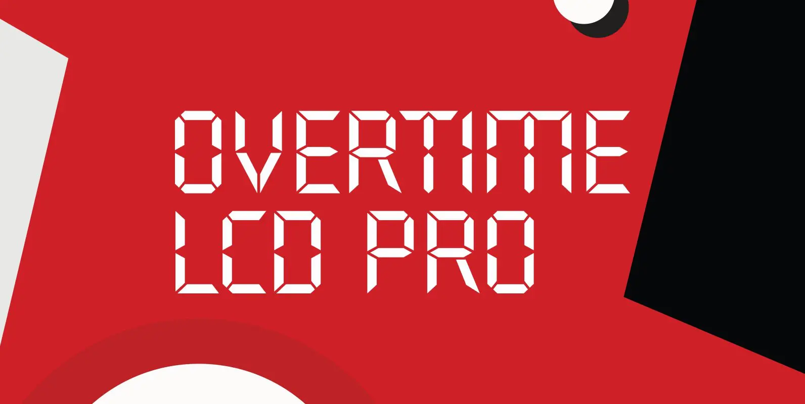
Overtime LCD Pro Font
Designed by Steve Jackaman & Ashley Muir. Our collection was missing a small piece of the jigsaw puzzle until now; a quartz digital LCD font! Overtime LCD contains all the high-end features expected in a quality OpenType Pro font. Published
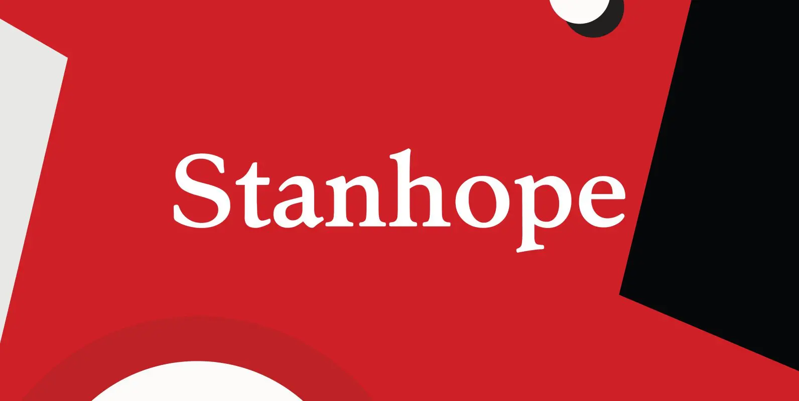
Stanhope Font
Designed by Les Usherwood. Digitally engineered by Paul Hickson. Les based the design on a turn-of-the-century typeface of the same name. The foundry is believed to be Soldans & Payvers, circa 1904. Published by Red RoosterDownload Stanhope
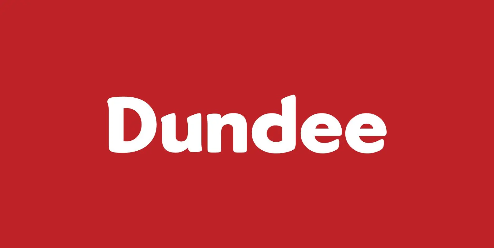
Dundee Font
Designed by A. Pat Hickson, Dundee is a new design inspired by the various mastheads used in children’s comic books in England, published by D.C. Thompson of Dundee, Scotland. Published by Red RoosterDownload Dundee
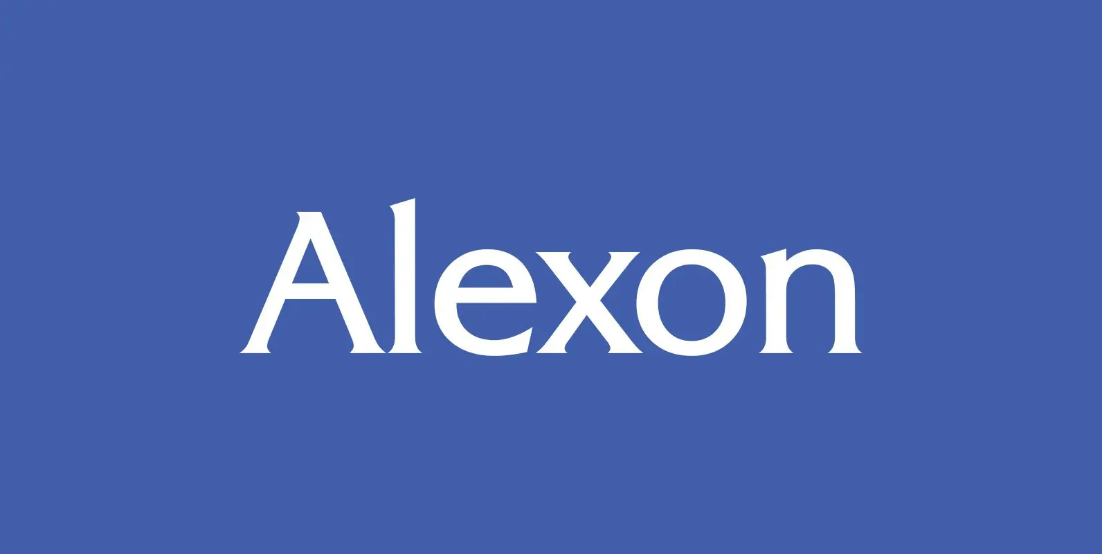
Alexon Font
Designed by Les Usherwood. Digitally engineered by Steve Jackaman. Originally in one weight, Steve designed and produced three additional weights. Published by Red RoosterDownload Alexon
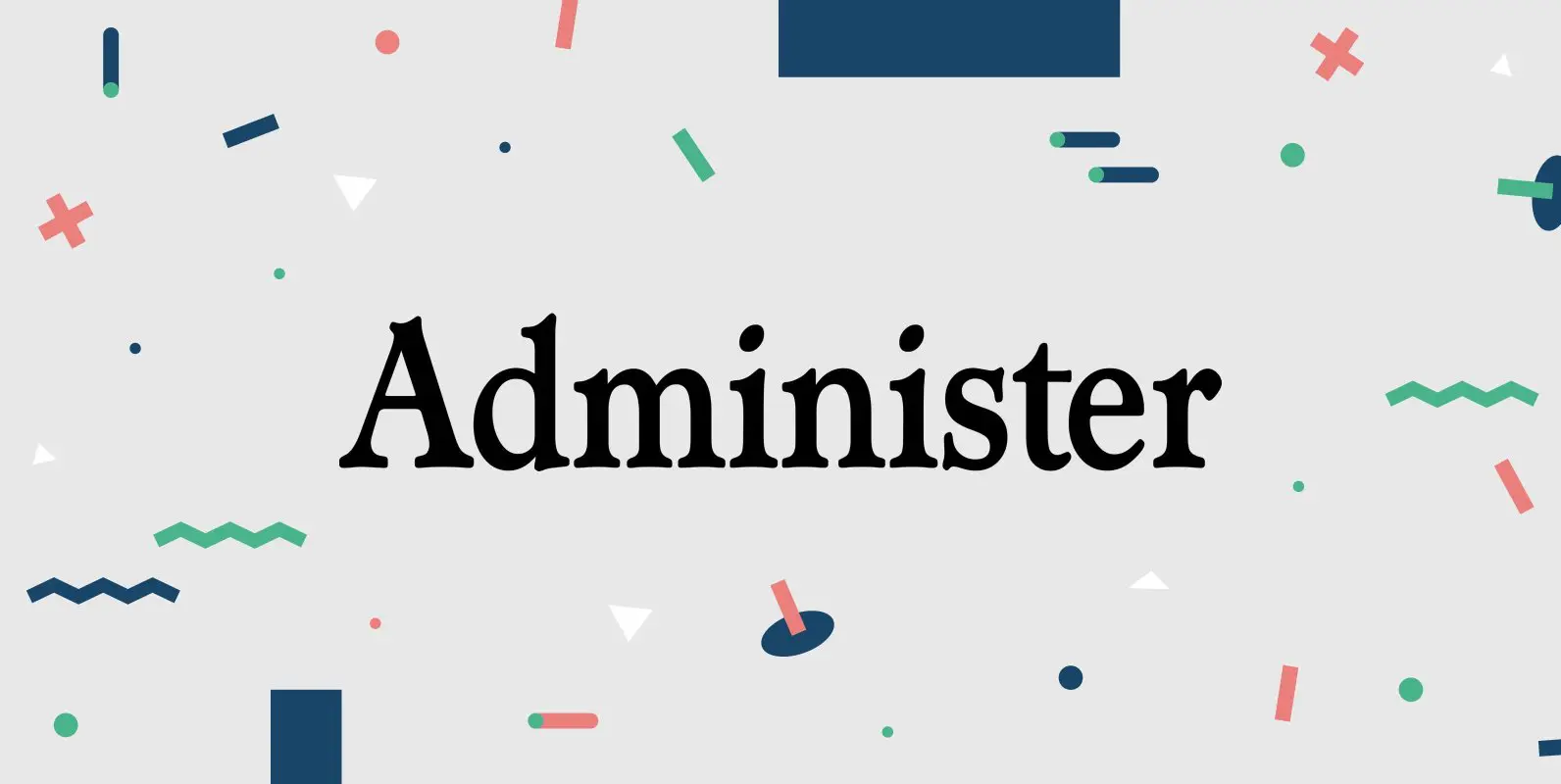
Administer Font
Designed by Les Usherwood. Digitally engineered by Steve Jackaman. A few weights were originally released by another foundry; but this complete version of the family is a better match to Les original drawings! Published by Red RoosterDownload Administer
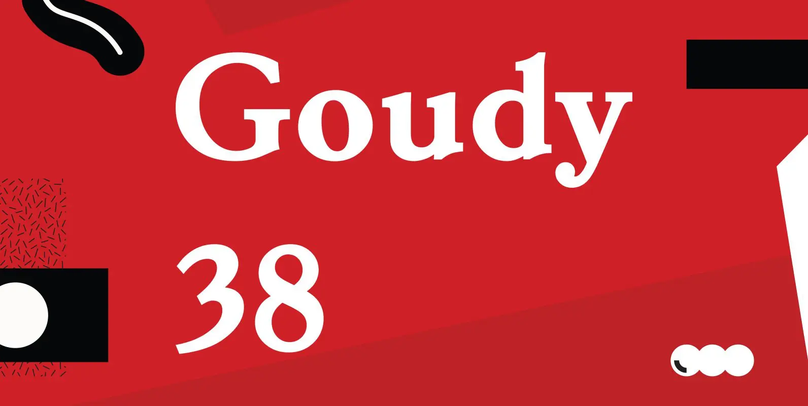
Goudy 38 Font
Designed by Les Usherwood. Digitally engineered by Steve Jackaman. Originally designed by Frederick Goudy for the original Life magazine, circa 1908. The typeface was used almost exclusively for their advertising and was often known as Goudy Gimbel; but the typeface
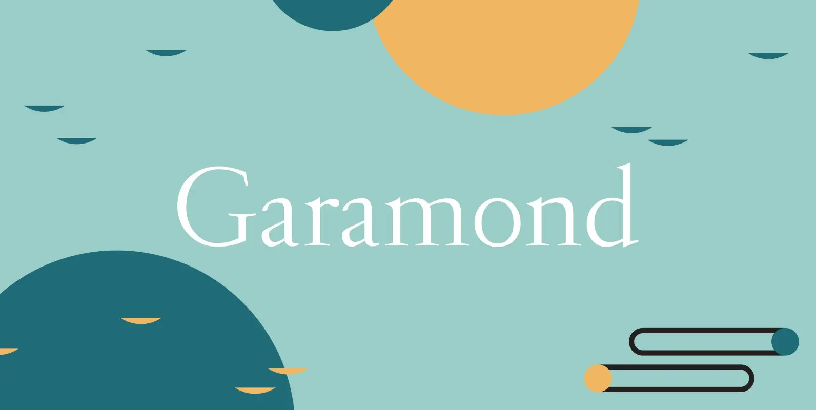
Garamond Font
Garamond was originally designed by R.H. Middleton for Ludlow, circa 1929-30. Digitally engineered by Steve Jackaman. Published by Red RoosterDownload Garamond
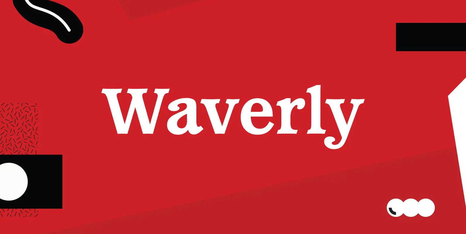
Waverly Font
Waverly is a round and soft serif designed by Les Usherwood, digitally engineered by Steve Jackaman. Published by Red RoosterDownload Waverly
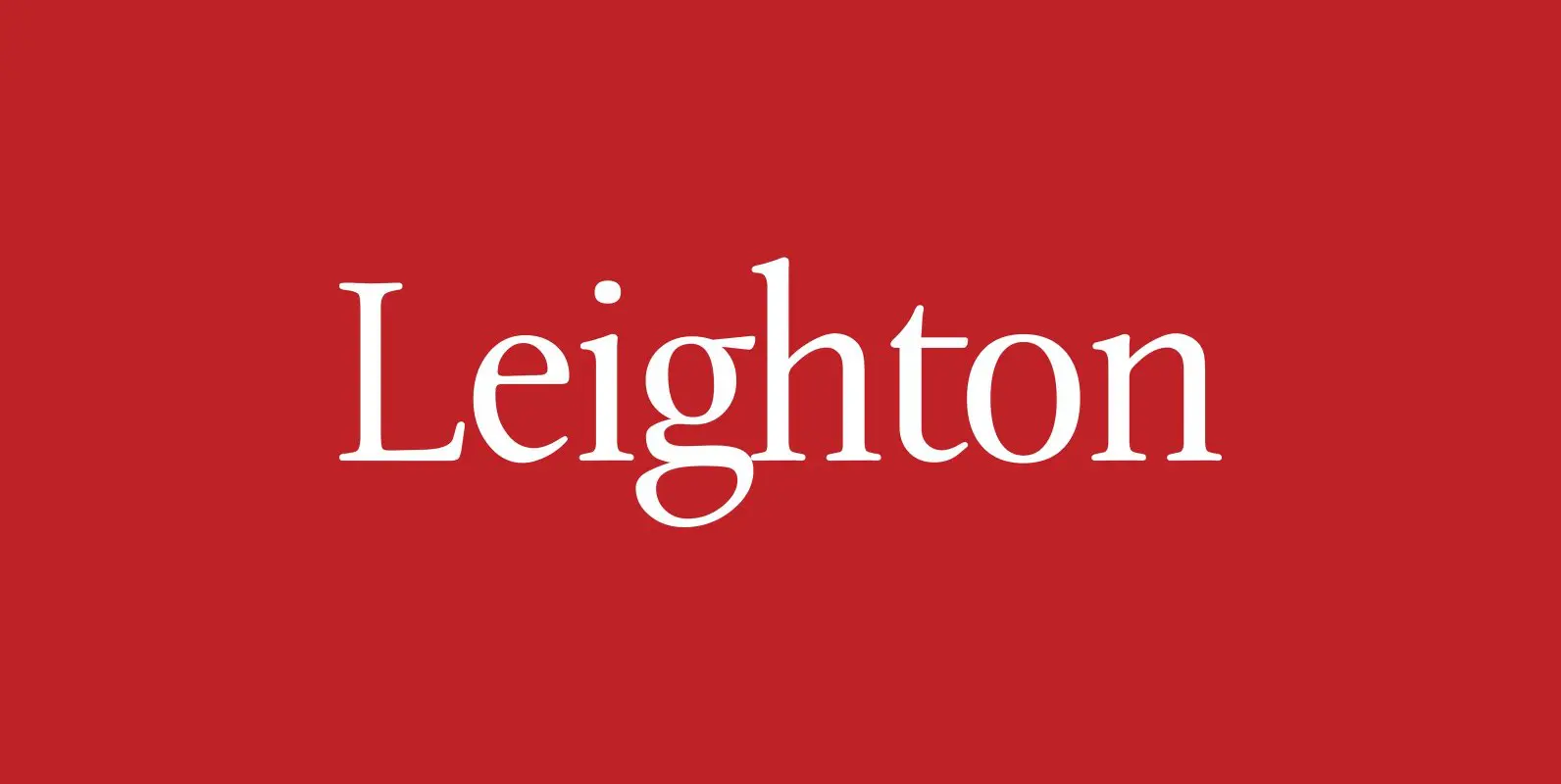
Leighton Font
Designed by Paul Hickson, Leighton is a clean serif based on Lectura, a design by Dick Dooijes of the Amsterdam Foundry (1966). Published by Red RoosterDownload Leighton
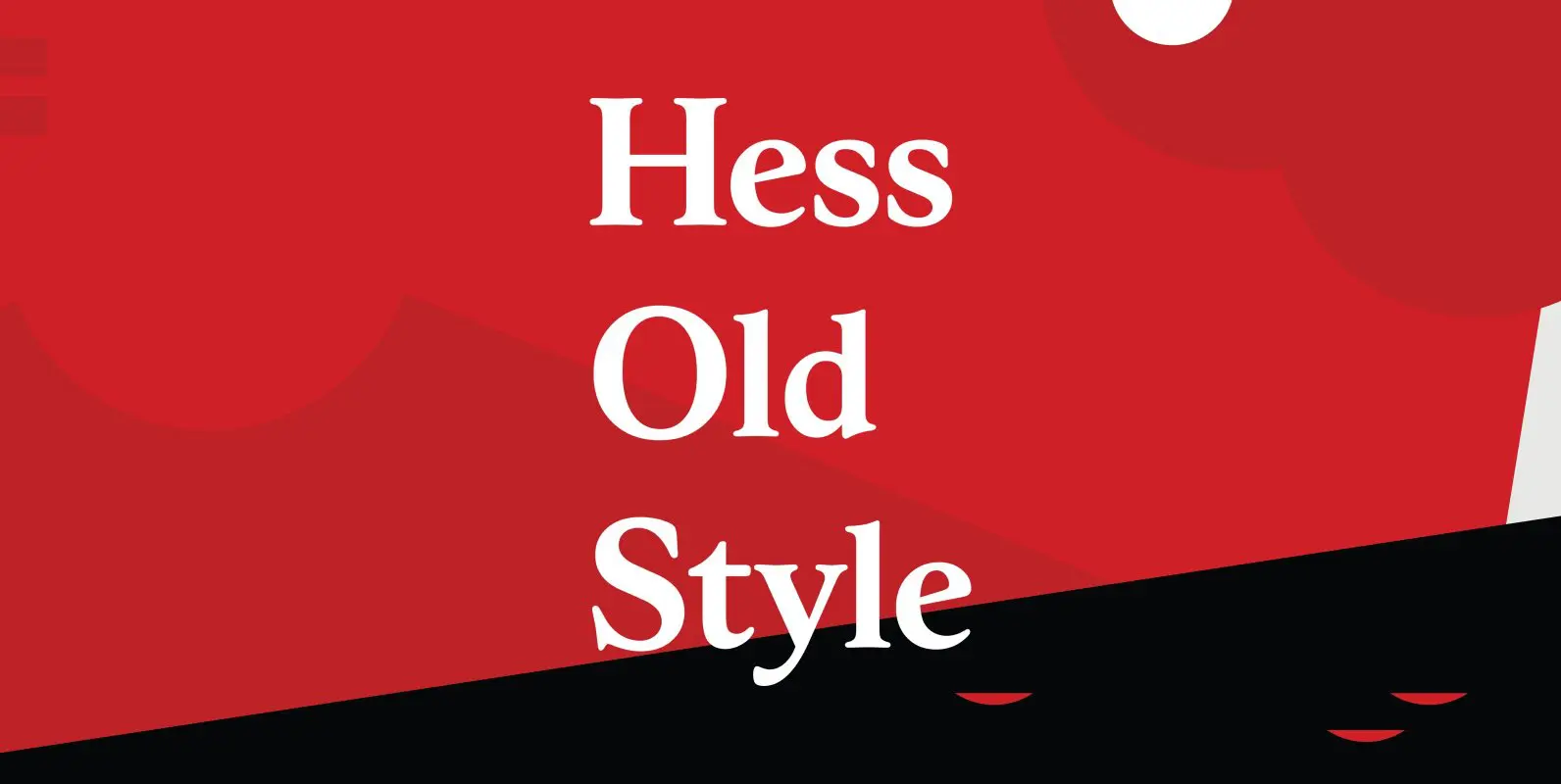
Hess Old Style Font
Designed by Steve Jackaman, Hess Old Style was originally designed by Sol Hess as just a roman and italic for Lanston Monotype, circa 1920-23. Published by Red RoosterDownload Hess Old Style
Kingsrow Font
Designed by Les Usherwood. Digitally engineered by Steve Jackaman. Unofficially named No Frills in the early stages of development, his widow Elsie decided that it would be called Kingsrow. Published by Red RoosterDownload Kingsrow
Bellini Font
Designed by A. Pat Hickson, Bellini is an original design based on the typeface Progreso from the Gans foundry circa 1923. Published by Red RoosterDownload Bellini