Introduction: The Power of Typography in Poster Design
Posters have long been a powerful medium for communication, whether for advertising, political campaigns, or artistic expression. The choice of fonts for a poster can make or break its effectiveness. It’s not just about aesthetics; the right typeface can convey the message, mood, and values behind the poster. In this article, we’ll explore the art of choosing fonts for posters, considering various factors that can guide designers in making the best typographic decisions.
A Historical Perspective: Fonts in Poster Design Through the Ages
The Bauhaus Movement: Function Meets Aesthetics
The Bauhaus movement, which emerged in the early 20th century, emphasized the unity of art, craft, and technology. In poster design, this translated into the use of geometric shapes, minimal ornamentation, and sans-serif typefaces. Fonts like Futura, with its geometric forms, became synonymous with the Bauhaus style, reflecting the movement’s focus on functionality and simplicity.
Modernist Typography: The Pursuit of Purity
The Modernist movement sought to strip away unnecessary elements and celebrate the purity of form. In poster design, this led to the use of clean, unadorned typefaces that emphasized clarity and readability. Helvetica, with its neutral and unobtrusive design, became a quintessential Modernist typeface, widely used in posters for its timeless elegance.
Post-Modernist Design: Breaking the Rules
The Post-Modernist era saw a rejection of the strict rules of Modernism, embracing complexity, contradiction, and diversity. In poster design, this translated into a playful and experimental approach to typography. Fonts like Mistral, with its expressive and irregular forms, captured the eclectic spirit of Post-Modernism, allowing designers to break free from traditional constraints.
The 1990s: The Rise of Digital Typography
The 1990s marked a significant shift in typography with the rise of digital design tools. Designers had access to a vast array of digital fonts, leading to a surge in creativity and experimentation. Grunge typography, characterized by its distressed and irregular appearance, became popular in posters, reflecting the rebellious spirit of the decade.
The 2000s and Beyond: The Age of Customization
The 21st century has seen a continued evolution in poster typography, with designers increasingly creating custom fonts tailored to specific projects. The availability of advanced design software has enabled designers to craft unique typefaces that perfectly align with the message and aesthetics of the poster. From bold and dynamic to subtle and elegant, the possibilities are endless, reflecting the diverse and ever-changing landscape of contemporary design.
Artistic Movements in Poster Design: Art Deco and Art Nouveau
Art Deco: Geometry and Glamour
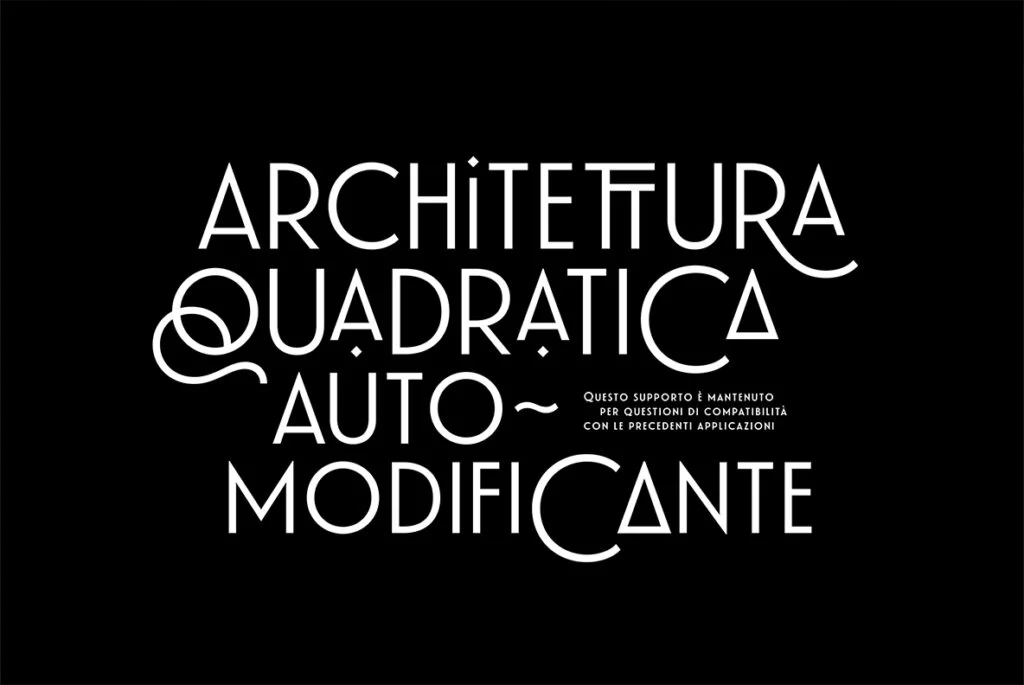
The Art Deco movement, which flourished in the 1920s and 1930s, brought a sense of elegance and sophistication to poster design. Characterized by geometric shapes, bold outlines, and lavish ornamentation, Art Deco posters often featured typefaces with tall, sleek letters and sharp angles. Fonts like Broadway captured the glamour and modernity of the era, reflecting the optimism and luxury of the Roaring Twenties.
Art Nouveau: Nature and Elegance
Preceding Art Deco, the Art Nouveau movement of the late 19th and early 20th centuries emphasized organic forms, flowing lines, and natural motifs. In poster design, this translated into the use of elegant, sinuous typefaces that echoed the graceful curves of nature. Fonts like Arnold Böcklin, with its decorative and whimsical style, embodied the romantic and organic aesthetics of Art Nouveau.
The Printing Press: A Revolution in Typography
The invention of the printing press in the 15th century marked a turning point in the history of typography. Before the printing press, typefaces were hand-crafted by scribes, limiting the variety and availability of fonts. The printing press allowed for the mass production of typefaces, leading to the standardization of letterforms and the creation of new fonts.
The printing press also democratized access to typography, allowing designers to experiment with different styles and techniques. This technological advancement paved the way for the diverse artistic movements that followed, from the ornate elegance of Art Nouveau to the geometric precision of Art Deco.
The Readability: Ensuring Clarity
While creativity and aesthetics are vital, the readability of the fonts cannot be compromised. After all, a poster must communicate its message effectively. Here are some considerations:
- Size Matters: Fonts must be large enough to be read from a distance but not so large that they overwhelm the design.
- Contrast is Key: The color contrast between the text and the background must be sufficient to ensure that the text stands out.
- Avoid Overcrowding: Too many different fonts can make the poster look cluttered and confusing. Stick to a few complementary typefaces.
The Emotional Impact: Choosing Fonts that Resonate
Fonts carry emotional weight and can evoke specific feelings and associations. Here’s how to align your font choices with the intended emotional impact of the poster:
- Bold and Strong: For a powerful and assertive message, consider using bold typefaces like Impact or Bebas Neue.
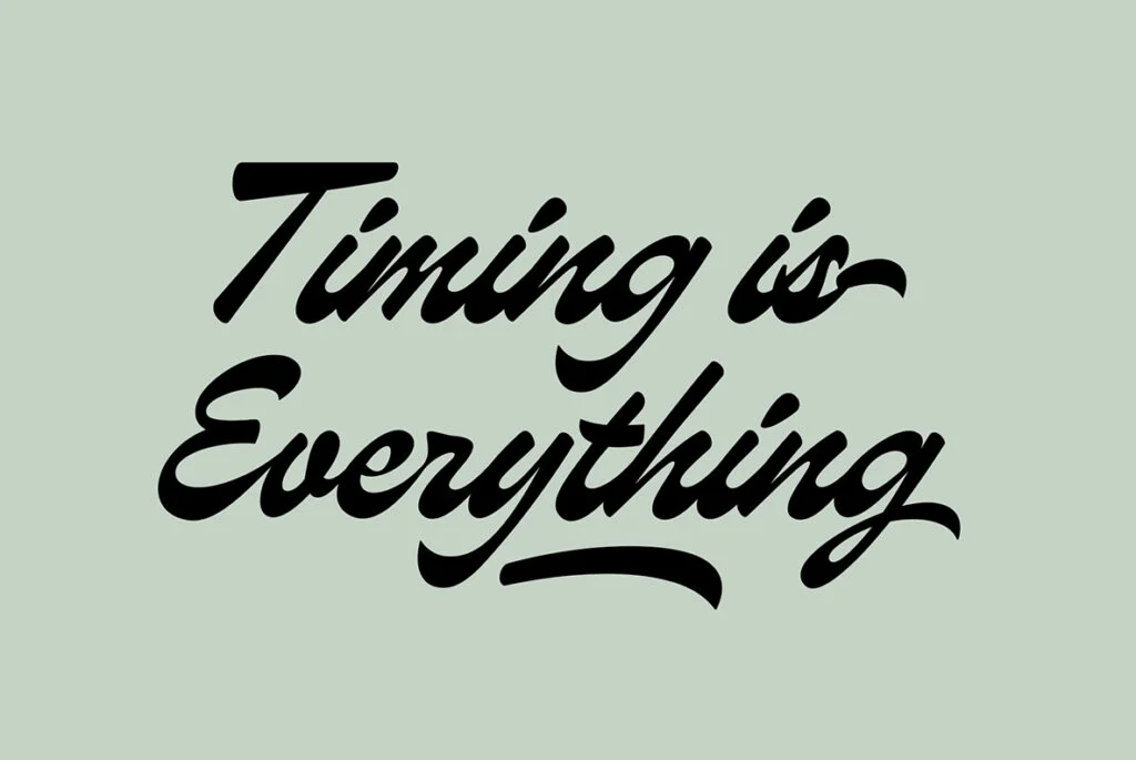
- Elegant and Sophisticated: For a more refined and graceful tone, script fonts like Great Vibes or serif fonts like Times New Roman can be suitable.
- Fun and Playful: To convey a light-hearted and cheerful message, playful fonts like Comic Sans or Bubblegum Sans can be effective.
Practical Considerations: Licensing and Accessibility
When choosing fonts for posters, practical considerations must also be taken into account:
- Licensing: Ensure that the fonts are appropriately licensed for commercial use if the poster is for a business or commercial event.
- Accessibility: Consider the needs of all viewers, including those with visual impairments. Simple, clear fonts can make the poster more accessible to a broader audience.
A Symphony of Styles and Innovations
The history of fonts in poster design is a fascinating journey through different artistic movements, technological advancements, and cultural shifts. From the functional elegance of the Bauhaus to the rule-breaking exuberance of Post-Modernism, each era has left its mark on the typographic landscape. The art of choosing fonts for posters is a dynamic and ever-evolving craft that reflects the complexity and beauty of human expression.
The rich tapestry of poster design history, from the organic beauty of Art Nouveau to the geometric glamour of Art Deco, is a testament to the creativity and innovation of designers across different eras and movements. Whether embracing the past or forging new paths, the art of choosing fonts for posters is a dynamic and ever-evolving craft that reflects the complexity and beauty of human expression.
The key to successful poster design lies in understanding the interplay between aesthetics, readability, emotion, and practicality. By carefully considering these factors and drawing inspiration from the rich history of typography, designers can create posters that not only look stunning but also communicate their message effectively and resonate with their audience. Whether you’re a seasoned designer or just starting your journey in the world of typography, the art of choosing fonts for posters offers endless opportunities for creativity, exploration, and expression. Happy designing!