The Dawn of Typography: From Cave Paintings to Papyrus Scrolls
The story of typography is as old as civilization itself. It began with the first cave paintings, where early humans used symbols to communicate and tell stories. As societies evolved, so did their means of communication. The Egyptians carved hieroglyphs into stone, the Sumerians pressed cuneiform into clay tablets, and the Chinese developed intricate characters on bamboo strips.
The invention of papyrus by the Egyptians marked a significant milestone in the evolution of typography. For the first time, writing was not confined to hard surfaces but could be rolled, stored, and transported easily. This revolutionized the dissemination of information, paving the way for the first libraries and, ultimately, the first typefaces.
The Middle Ages: Illuminated Manuscripts and the Birth of Blackletter
The Middle Ages saw the rise of illuminated manuscripts, where text was written by hand and accompanied by intricate decorations and illustrations. The script used in these manuscripts varied greatly, from the rounded and compact Insular script to the elaborate and ornate Gothic script.
It was during this period that the first recognizable typeface style, Blackletter, emerged. Characterized by its dense texture and highly ornate letterforms, Blackletter was used extensively in Gutenberg’s 42-line Bible, the first major book printed using movable type.
The Renaissance: The Emergence of Roman and Italic
The Renaissance was a period of great cultural and intellectual rebirth, and typography was no exception. The humanist movement, with its emphasis on clarity and legibility, led to the development of Roman type. Inspired by the lettering found on ancient Roman buildings, Roman type is characterized by its balanced proportions, vertical stress, and serifs.
Around the same time, Italic type was developed. Unlike Roman type, which was designed for formal use, Italic was more informal and was often used for personal correspondence. Italic is characterized by its slanted letterforms, which were designed to mimic the look of handwriting.
The Industrial Revolution: The Birth of Display and Slab Serif
The Industrial Revolution brought about significant changes in typography. The advent of new printing technologies and the rise of advertising led to the creation of new typeface styles designed to catch the eye and attract attention.
Display typefaces, characterized by their large size and often elaborate designs, were created for use in headlines and advertisements. These typefaces were designed to be used at large sizes and often featured intricate details and decorations.
Around the same time, Slab Serif, or Egyptian, typefaces were developed. These typefaces are characterized by their heavy, block-like serifs and were often used in advertising and posters due to their high impact and readability at large sizes.
The Modern Era: The Rise of Sans Serif and the Digital Revolution
The 20th century saw the rise of Sans Serif typefaces, which, as the name suggests, lack the small projecting features, or ‘serifs,’ at the end of strokes. These typefaces, with their clean, minimalist design, became popular in the mid-20th century, particularly for use in headlines and display purposes.
The latter part of the 20th century saw the digital revolution, which had a profound impact on typography. The development of digital typefaces, which could be created and distributed electronically, opened up a world of possibilities for typeface design. Designers were no longer limited by the physical constraints of metal type and could experiment with a wide range of styles and forms.
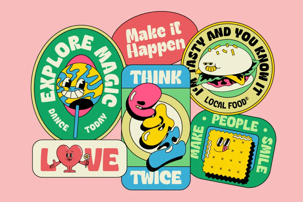
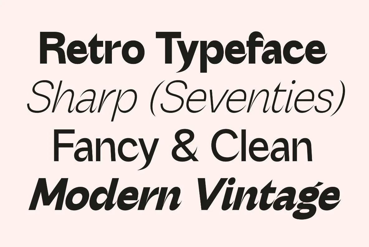
The Digital Age: The Flourishing of Font Styles
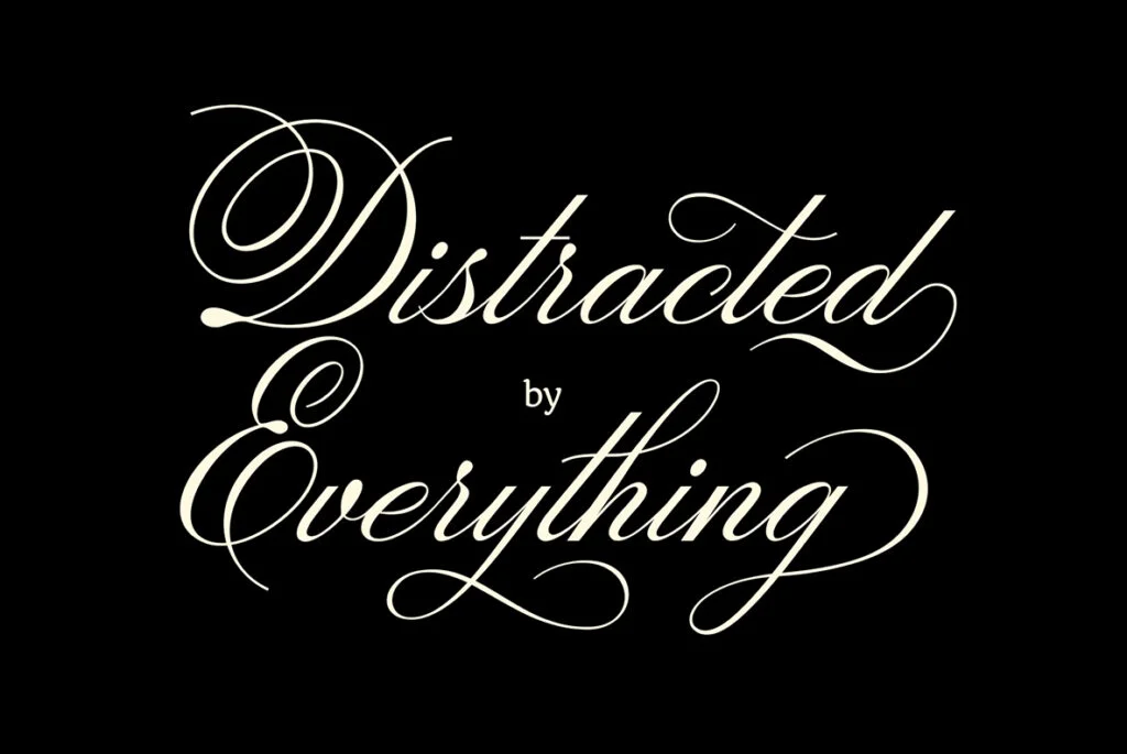
The digital age has seen an explosion of font styles, with designers pushing the boundaries of what’s possible with type. From the minimalist simplicity of Neo-Grotesque sans serifs to the ornate flourishes of modern calligraphic scripts, the range of available font styles is broader than ever before.
Variable fonts, a relatively new development in typography, allow designers to adjust a font’s characteristics, such as width, weight, and slant, along a continuous range. This gives designers unprecedented control over the look and feel of their typography.
Meanwhile, the rise of digital media has led to the creation of fonts designed specifically for on-screen reading. These fonts, such as Georgia and Verdana, are optimized for legibility on screens, with large x-heights, wide letter-spacing, and generous proportions.
The Ever-Evolving World of Font Styles
From the earliest cave paintings to the latest digital typefaces, the history of typography is a testament to human creativity and our enduring need to communicate. Each era has left its mark on the typography landscape, contributing to the rich tapestry of font styles we have today.
As we move forward, it’s exciting to imagine what the future holds for typography. With advancements in technology and an ever-growing community of talented designers, the possibilities for new and innovative font styles are virtually limitless. As we’ve seen throughout history, typography is much more than just a tool for communication – it’s a form of artistic expression, a reflection of cultural trends, and a key component of our visual landscape.