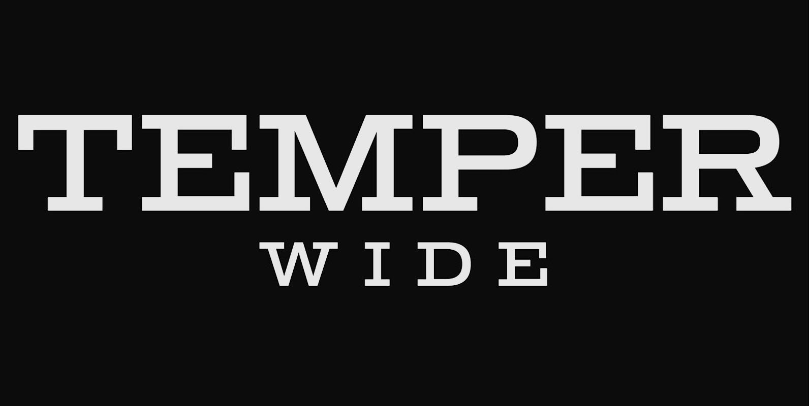
Temper Wide was designed in 2018 by type designer Jeschke in Berlin.
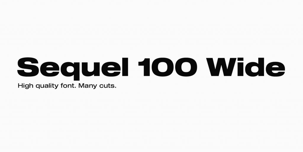
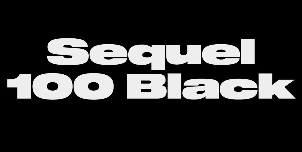
The font consists of many cuts from light to bold and is formally based on its predecessor, Sequel 100.
A characteristic feature of the Temper Wide is the almost equal thickness of the vertical and horizontal strokes, the horizontally cut endings of the letters a, c, e, g, s, as well as a striking R.
Unlike other slab faces, the forms are absolutely clean and the x-height, in the normal thickness gradation a bit higher, in favor of legibility.
Temper Wide supports up to 74 languages.
Graphics by Sagara Hirsch, Zurich.


