Tag: woodtype
Adorn Slab Serif Bold Font
Adorn Slab Serif is one of twenty fonts available in the Adorn family of seven display fonts, four script designs, monograms, ornaments, illustrations, banners, frames, and catchwords. While each font in the carefully orchestrated Adorn collection can stand alone, the
Cordelia Font
Impacting and vibrant, Cordelia family draws inspiration from covers of ‘cordel literature’, small booklets of popular story-poems that played an essential role on the folk-popular cultural life of Brazil. Printed in coarse paper, usually with an woodcut illustration and lettering
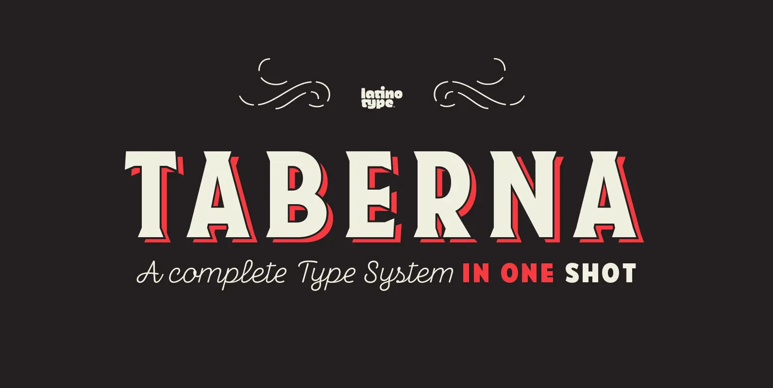
Taberna Font
Taberna is a type system that provides a wide range of choices for any design project. The typeface comes in Sans and Serif layered versions plus a monolinear Script font. Taberna is the result of having explored design trends in
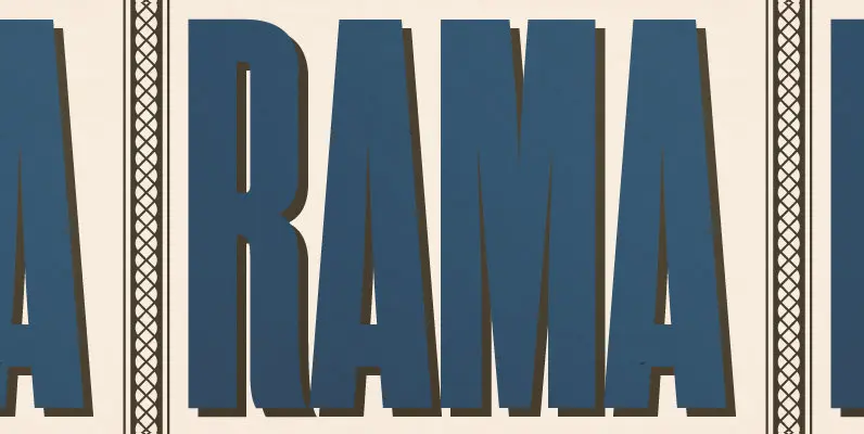
Rama Gothic Font
Rama Gothic is an antiqued sans serif designed inspired by 1800s-style wood type. All glyphs had been designed carefully to be retro-looking of the old time and to fill all with nostalgia. This condensed font family with 18 styles will
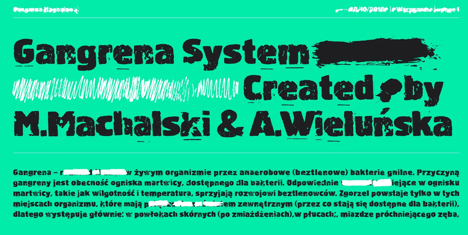
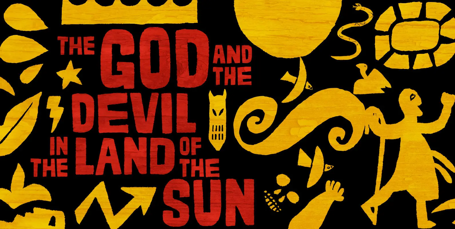
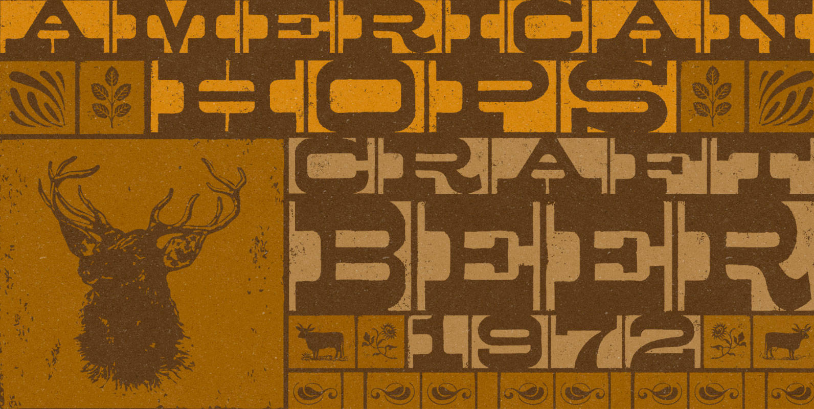
Gangrena System Font
Gangrena is a display font family, based on a old letter sets and style of UK punk posters from 80’s. It is characterized by a huge amount of automatic alternates, cycling in a random way through the text. Each letter
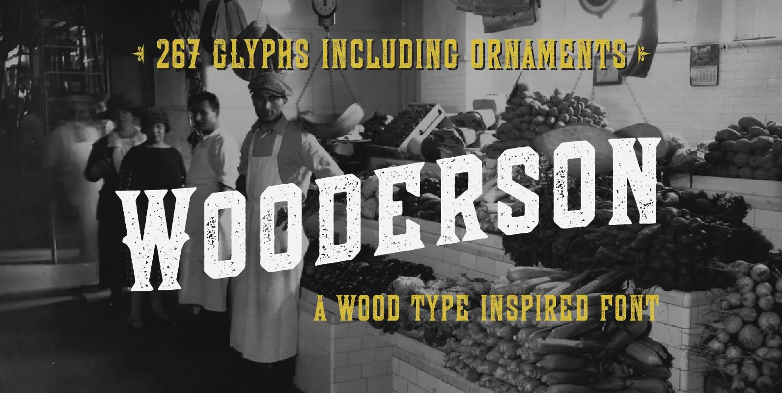
Wooderson Font
Wooderson is a typeface based on some old wood block type. 267 handcrafted glyphs obsessed over, redrawn, and updated for the new world. This typeface feature five styles: • Crisp for sharp lines or DIYers. • Soft for those of
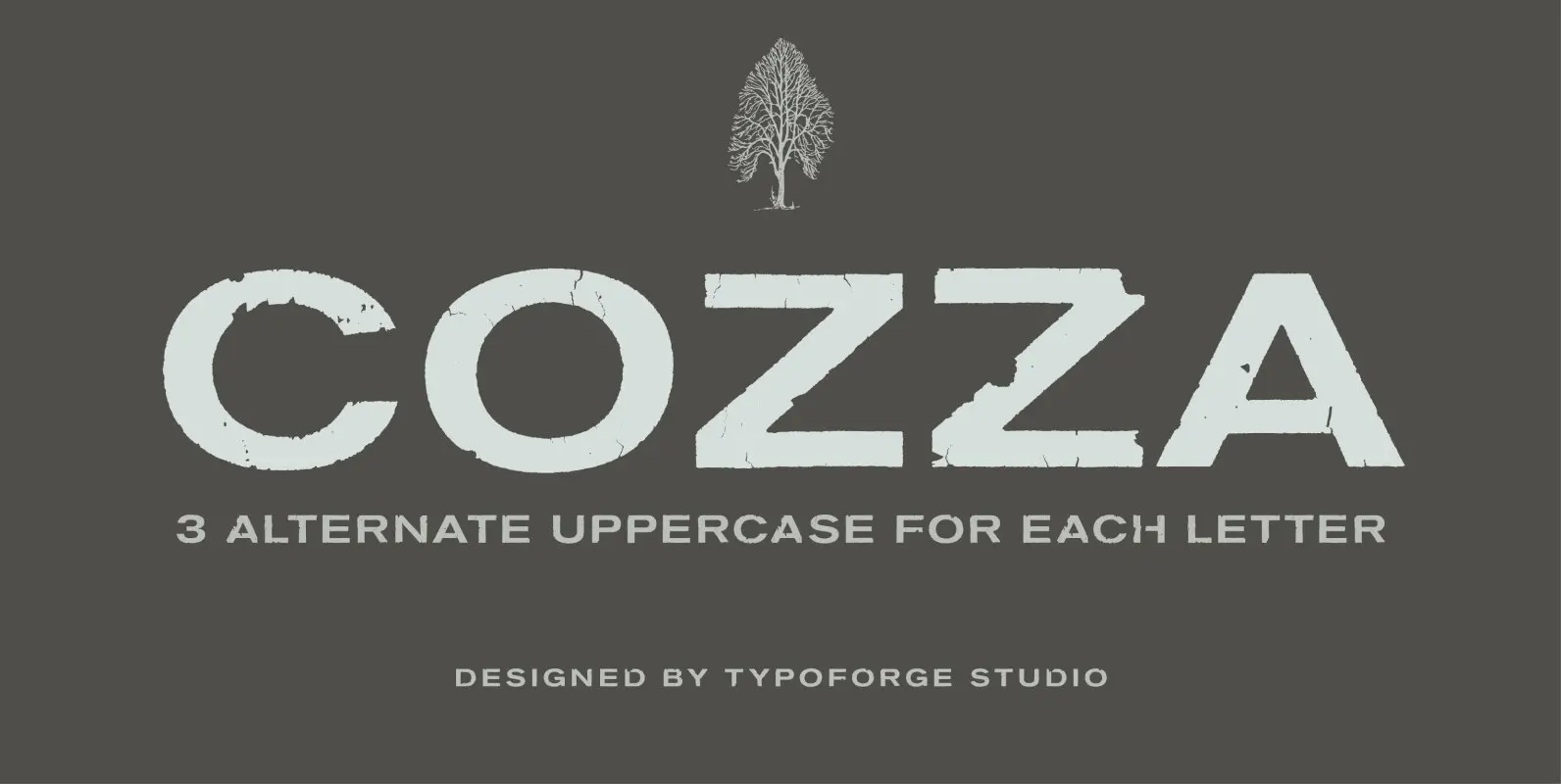
Cozza Font
The inspiration for the design of the font Cozza was Unitra Letraset from the 80s. Dry transfer lettering was used by architects from Poland and Czech Republic. Font Cozza, for each character has three alternative characters with their automatic replacement.
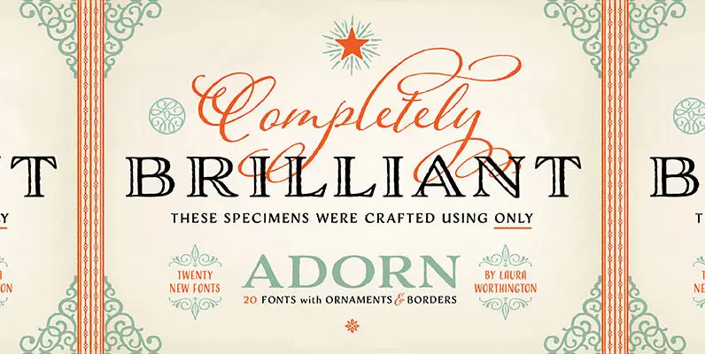
Adorn Collection Font
What can be more lovely than a wedding, an intimate invitation, a gift from the heart? One whose presentation uses the warm and welcoming family of typefaces, Adorn. With a modern and sometimes quirky twist on the staid, almost corporate
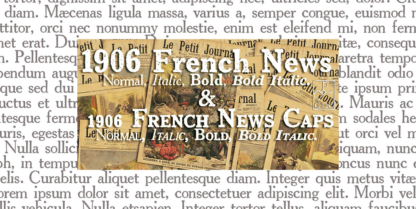
1906 French News Font
We have created this family inspired from the numerous derivatives in use for newspapers since the middle of 1800’s to the years 1970’s, inspired from the well known Clarendon. Mainly, the patterns are these used to print “Le Petit Journal”,
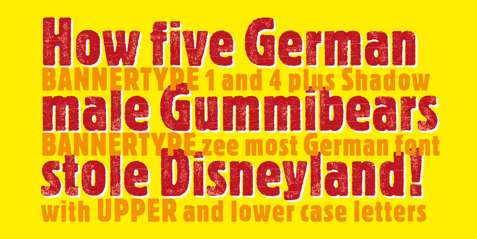
Bannertype Font
Bannertype is – at least for my feeling – the most German of all fonts. It was used heavily mostly in newsprint and advertising in the early 1900s. I designed a dirty version of the narrow font in 4 stages
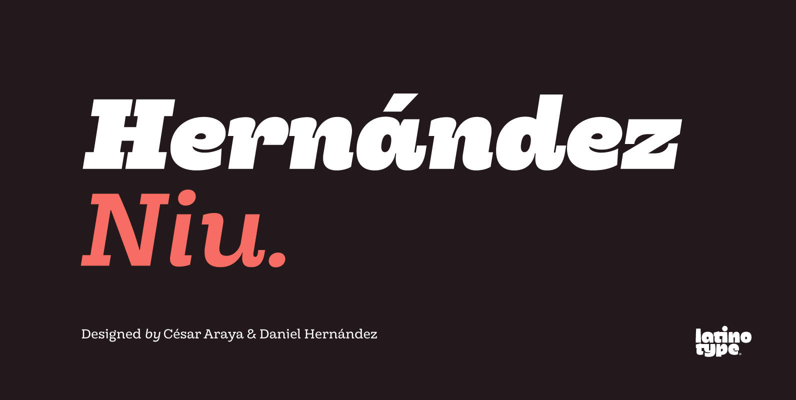
Hernandez Niu Font
In the typedesign industry the terms ‘nova’, ‘neue’, ‘next’, ‘new’ are often used to refer to a typeface that has been modified in different ways: redesign, technical readjustments, greater number of characters, etc. At Latinotype we are now starting to
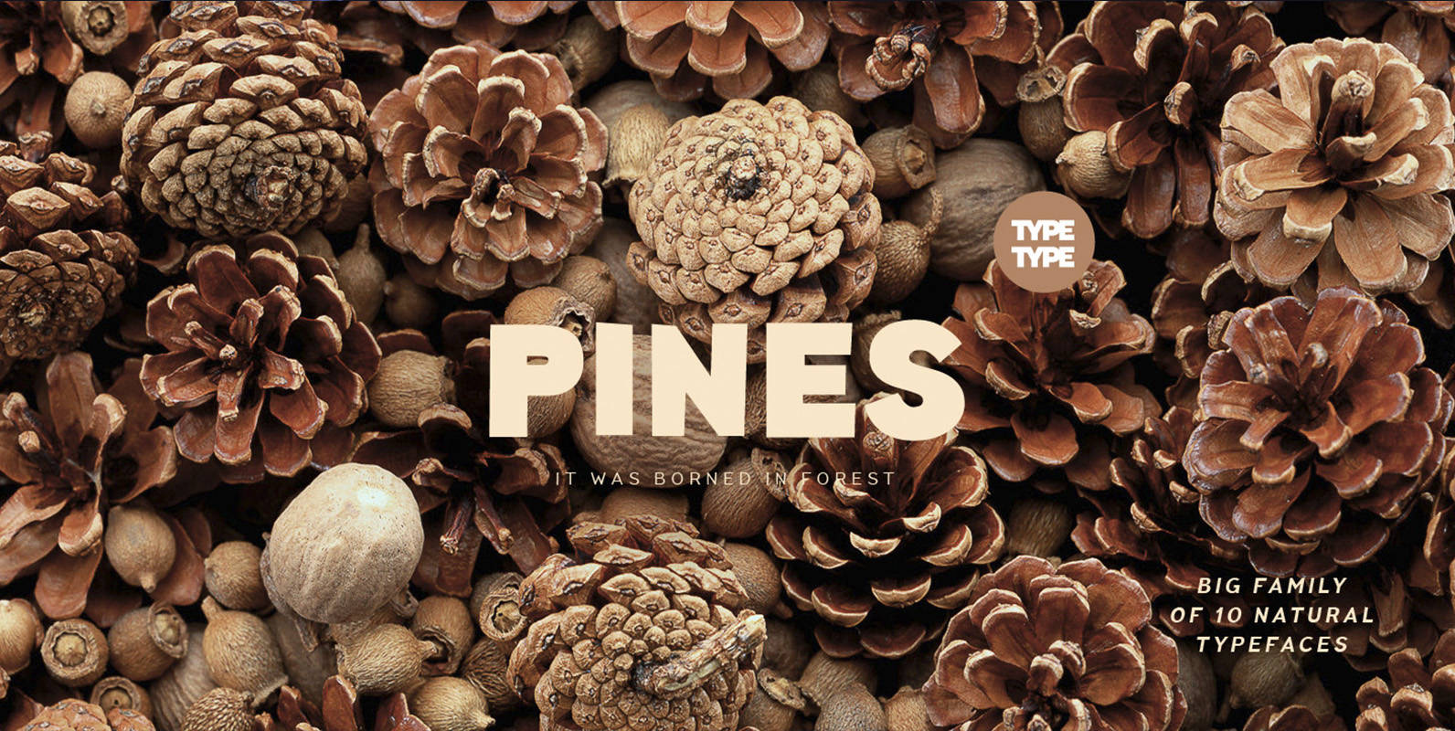
TT Pines Font
Imagine you've decided to cut letters out of paper thereby creating a modern sans-serif for a broad application range. What result would you get? We already know the answer! TT Pines is a fontfamily that we've carefully cut out of
Mamute Font
Mamute is a block rockin’ family with a cool letterpress look. Its upper- and lower-case slots hold glyphs with slightly different textures for a natural look. Numbers and punctuation marks also have alternate versions. Just trigger the Contextual Alternates feature
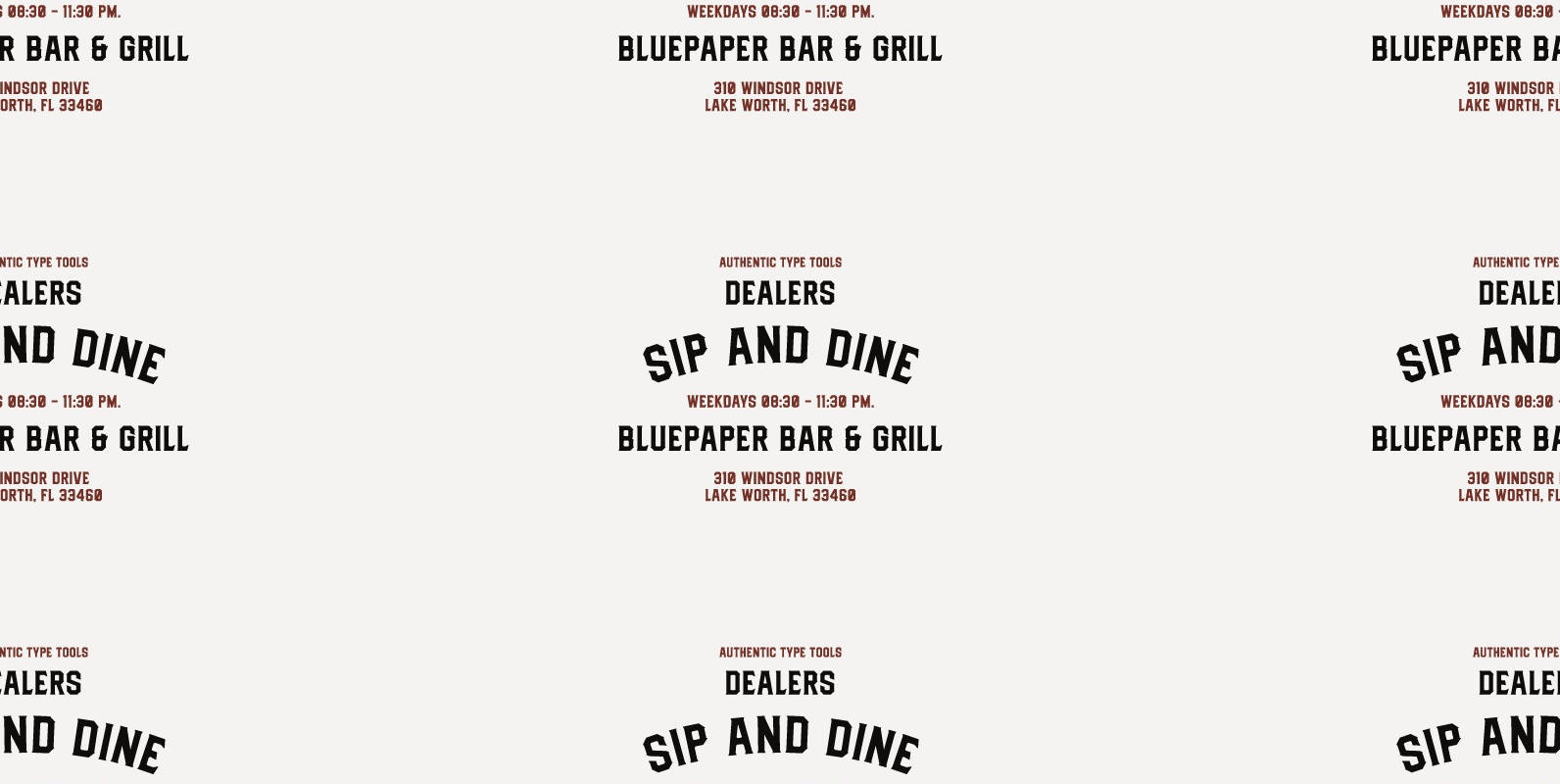
Dealers Font
Back to the past when the old building and the beauty of a old store decorated by distinctive signage. With a clear feels of authentic historical value and the today’s needs must be balanced in order to create the nostalgic
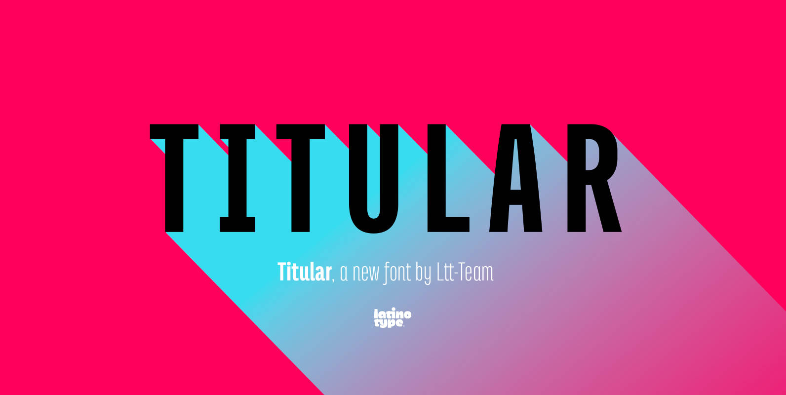
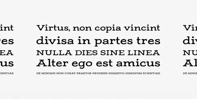
Titular Font
Titular is a condensed Sans Serif typeface that works well with headings, subheadings, newspapers, magazines as well as with logotypes, brands and posters. This typeface revives the spirit of old Woodtypes, but adding a contemporary flavour and Latin American seasoning.
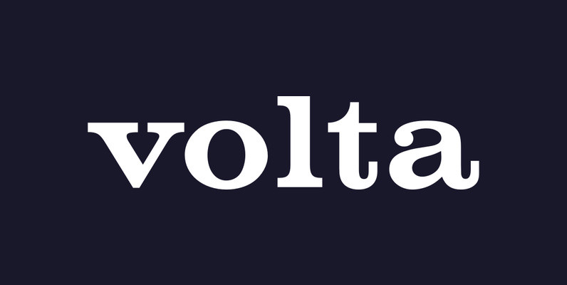
Volta Font
Designed by URW Studio, (Dr. Konrad F. Bauer, Walter Baum), Volta is a heavy slab-serif design released in 1993. Volta contains six unique styles, including a very interesting stencil option. Published by URW Type Foundry GmbHDownload Volta

YWFT Tall Tex Font
YWFT Tall Tex was originally a handset design by Jeff Rogers, now converted into a working system font by YouWorkForThem. The original cowboy and wild west influenced characters have been preserved beautifully and make this a unique and great choice
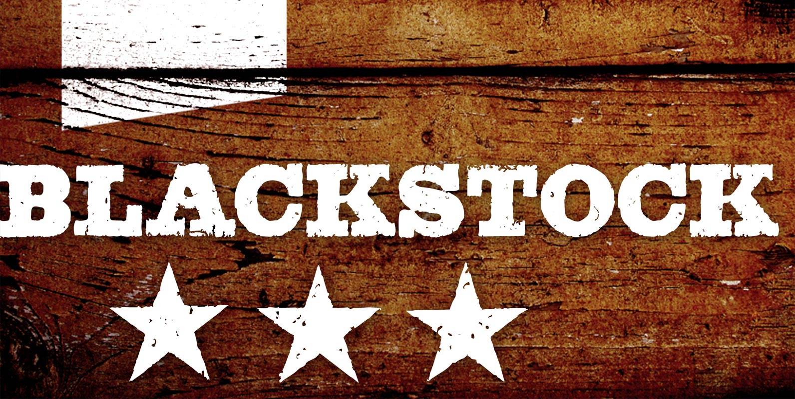
Blackstock Font
Blackstock has 52 OpenType features that automatically substitute a unique pair of distressed characters when any upper or lower case letter is keyed twice in a row, as well as features for Old Style Numerals and Small Caps. Published by