Tag: Wood Type
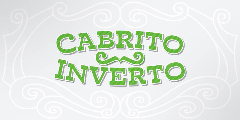
Cabrito Inverto Font
And so now, here it is. Cabrito Inverto, which features the reversed stress of the strokes from a font’s “normal” traits. Inverted stress fonts are most often associated with cowboys and the Old West. The inverted stress gives it a
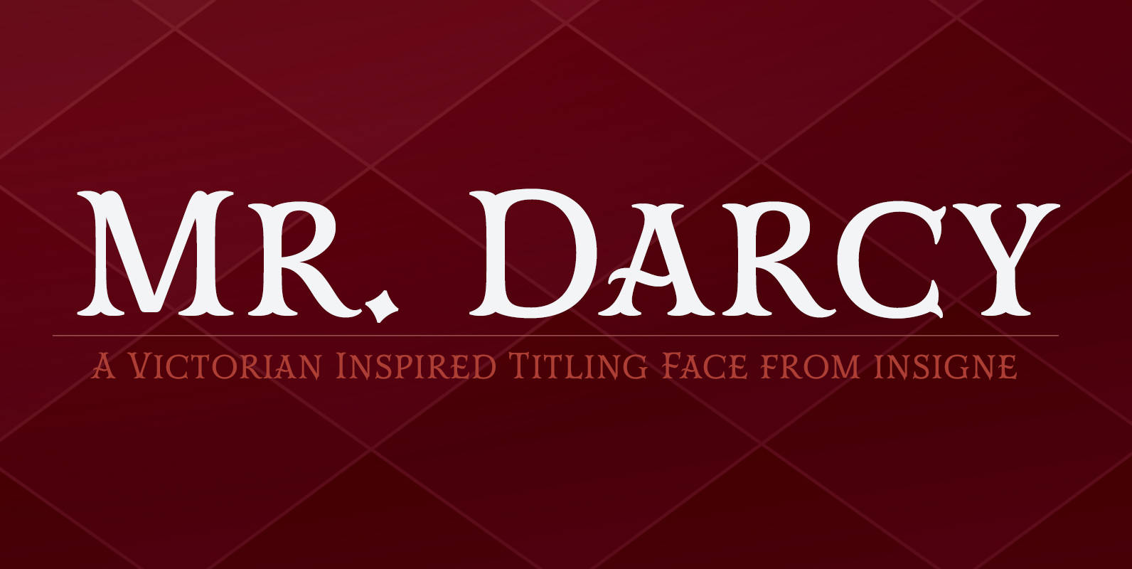
Mr Darcy Font
The elegant and very graceful Mr. Darcy is sufficiently compete with its additional characters–to be stated more precisely, over 136 defining alternates. These optional features are carefully displayed within the supplied brochure. The employ of the Mr. Darcy family moreover
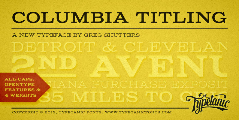
Columbia Titling Font
Columbia Titling is an titling-caps display family based on wide Clarendon-style wood type and industrial signage design from the late-19th and early-20th Century. Columbia Titling includes a small set of OpenType features, including both tabular and proportional figures, special superscript
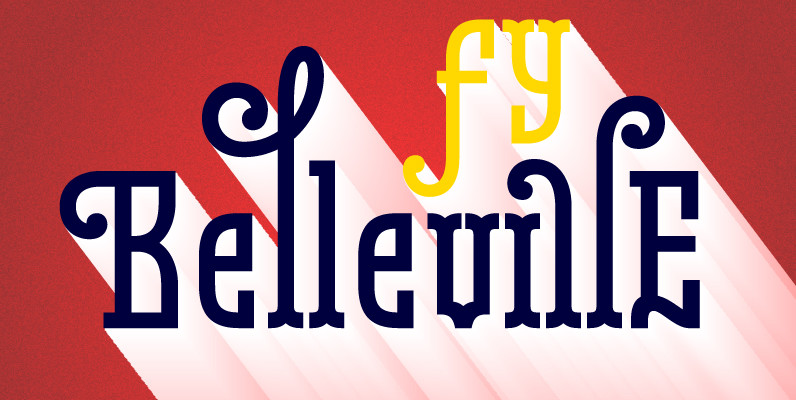
Belleville FY Font
Belleville FY is an original 16 retro and modern fonts family, inspired at the same time by New art movement, graffitis, 19th century wood type, and modern slab fonts. Each style has specific shapes and serifs which give it a
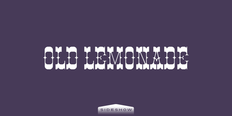
Old Lemonade Font
From the porch of small-town America to Farris-wheels and corn dogs at the World’s Fair, Old Lemonade takes you back to simpler times. From posters to penny postcards, this style invites you to stroll leisurely down tree-lined streets…enjoy a trolley
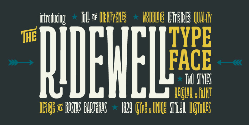
Ridewell Font
Ridewell is a wood type inspired typeface filled with amazing opentype features. It has a wonderfully warm and letterpress vintage look and it comes in two styles, a regular and a printed/weathered version. Both styles feature a full uppercase and
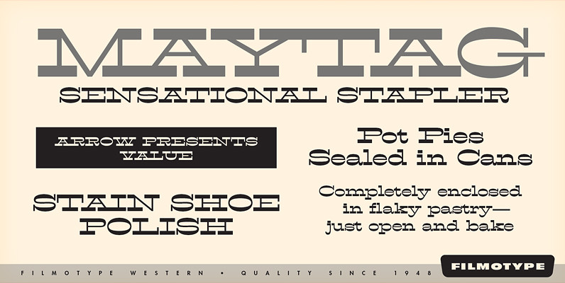
Filmotype Western Font
Inspired by French Antique reverse-stress types of the 1880s, Filmotype Western was released in 1955 to expand its Flat Serif category. Popular in broadsides, circus posters and advertisements at the turn of the 19th century, Filmotype Western will add old

Bobbin Cyrillic Font
To design a font Bobbin I was inspired by a You And Me Monthly published by National Magazines Publisher RSW Prasa that appeared from Mai 1960 till December 1973 in Poland. In the Bobbin family, every variety contains 3 alternative
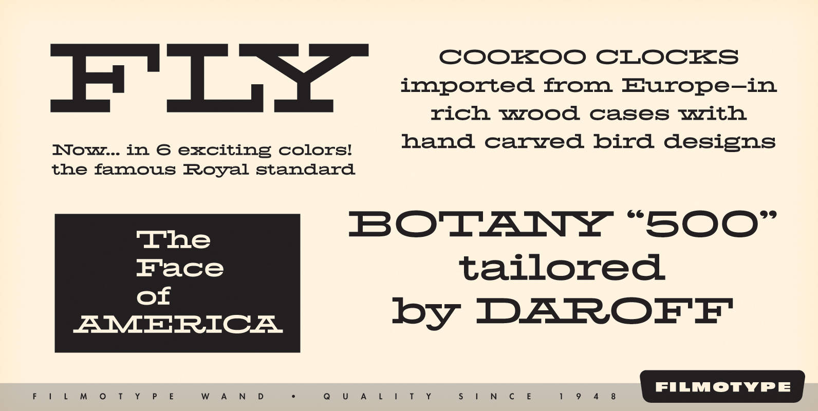
Filmotype Wand Font
Filmotype Wand was introduced in 1955 as part of the Flat Serif category. Inspired by smart slab serifs including Hellenic Wide popular in American television westerns and in heavy use in corporate letterhead and store packaging, Filmotype Wand takes a

Lodge Font
Lodge is a display face that has a woodtype aesthetic of the early 1900’s. It’s form makes it highly unique while still being legible. Published by Sparky TypeDownload Lodge
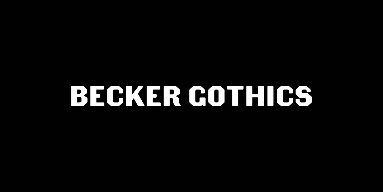
Becker Gothics Font
The Becker Gothics pay homage to the nineteenth century American lettering master George Becker. Designer James Puckett has given new life to the ingenious gothic alphabets found in Becker’s 1854 lettering manual Ornamental Penmanship. Use this quintet of typographic voices
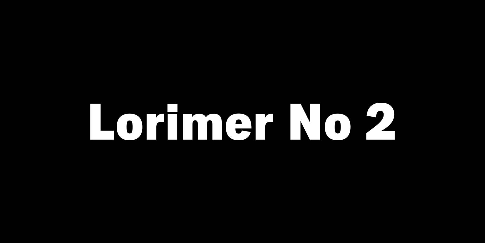
Lorimer No 2 Font
Lorimer No 2 is a sans family designed for display settings. Narrow letters, tight spacing, and a low x-height make Lorimer No. 2 better suited to display settings than fonts adjusted to work in text settings. Packaging, identities, and headlines
Woodie Font
Woodie is a sans serif typeface based on original letterpress type. Published by Mateusz Machalski Download Woodie
Shelton Font
Shelton is a Typeface with a eroded, printed look. The letters seem to be from different alphabets to support the wood type feeling. Every letter has an alternate character. Shelton has a wide language support and also contains arrows and
Joseph Font
Joseph is a brand new slab-serif face designed by TOMO. With a wood type look – letterpress print technic, this fatty come in handy when is time to design an informal —yet strong—looking communication piece. Ideal for promotion-matter. Published by
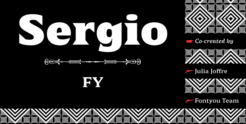
Sergio FY Font
Sergio FY is an antique latin font family inspired by a 19th century wooden type font, found in an italian print – Gazetta Musicale di Milano, 10 Guigno 1897. This typeface is characterized by its large, sharp, and triangular serifs,
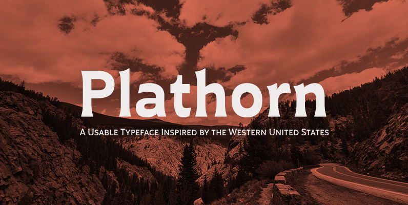
Plathorn Font
That’s right, folks. When the West called, Jeremy Dooley reached up like Pecos Bill, grabbed it by the reins and pulled it in, then using its wide, roaming elements to design this functional font that still has an unbroken spirit