Tag: valuable
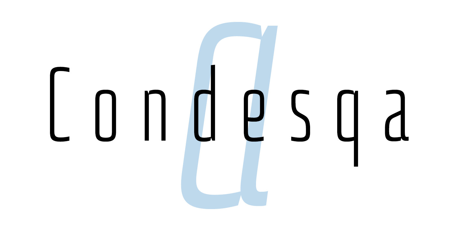
Condesqa 4F Font
Condesqa 4F is a sans serif font design published by Sergiy Tkachenko Published by Sergiy TkachenkoDownload Condesqa 4F
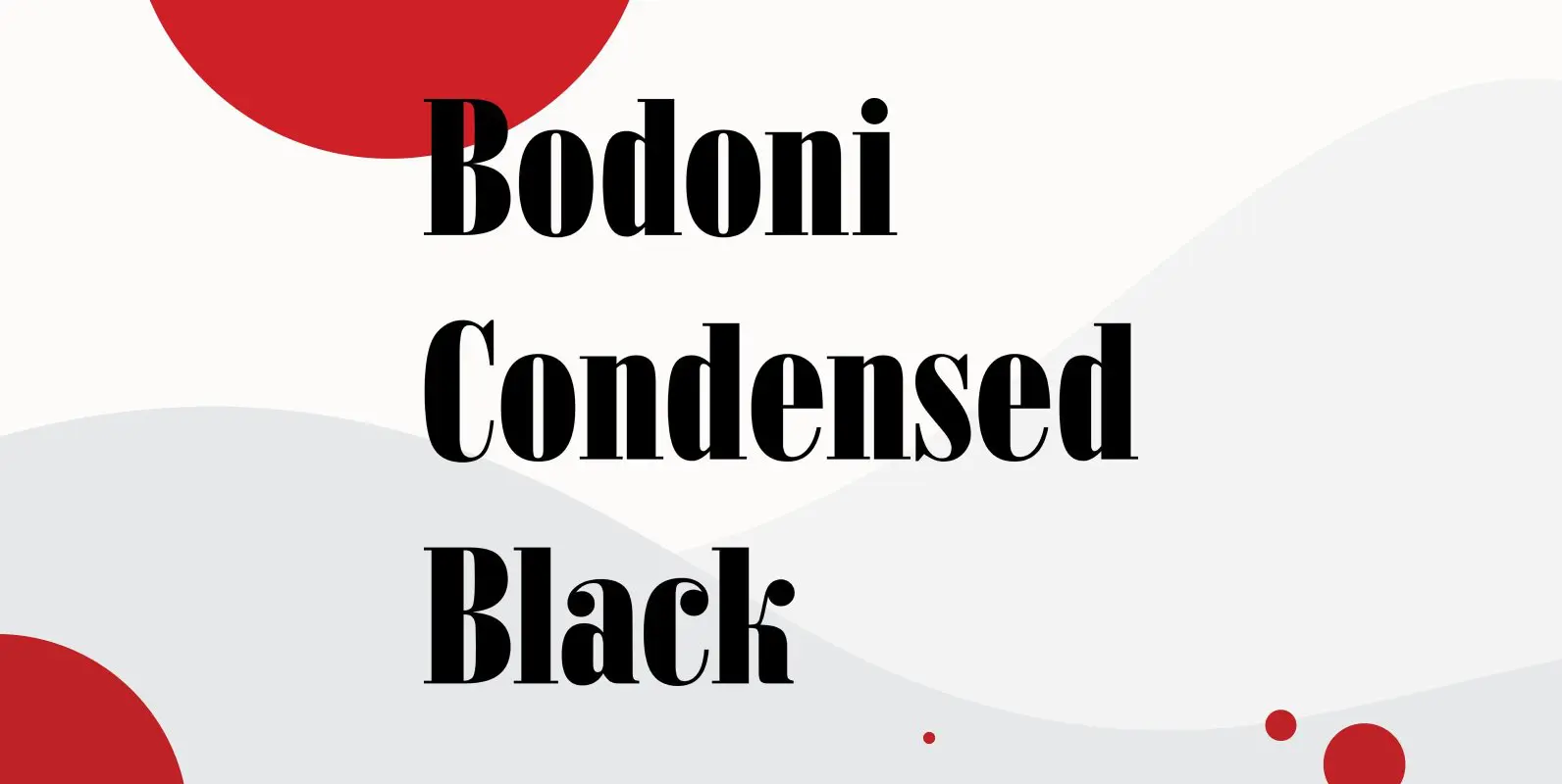
Bodoni Condensed Black Font
Bodoni Condensed Black was designed by R.H. Middleton for Ludlow, circa 1930. Digitally engineered by Steve Jackaman. Published by Red RoosterDownload Bodoni Condensed Black
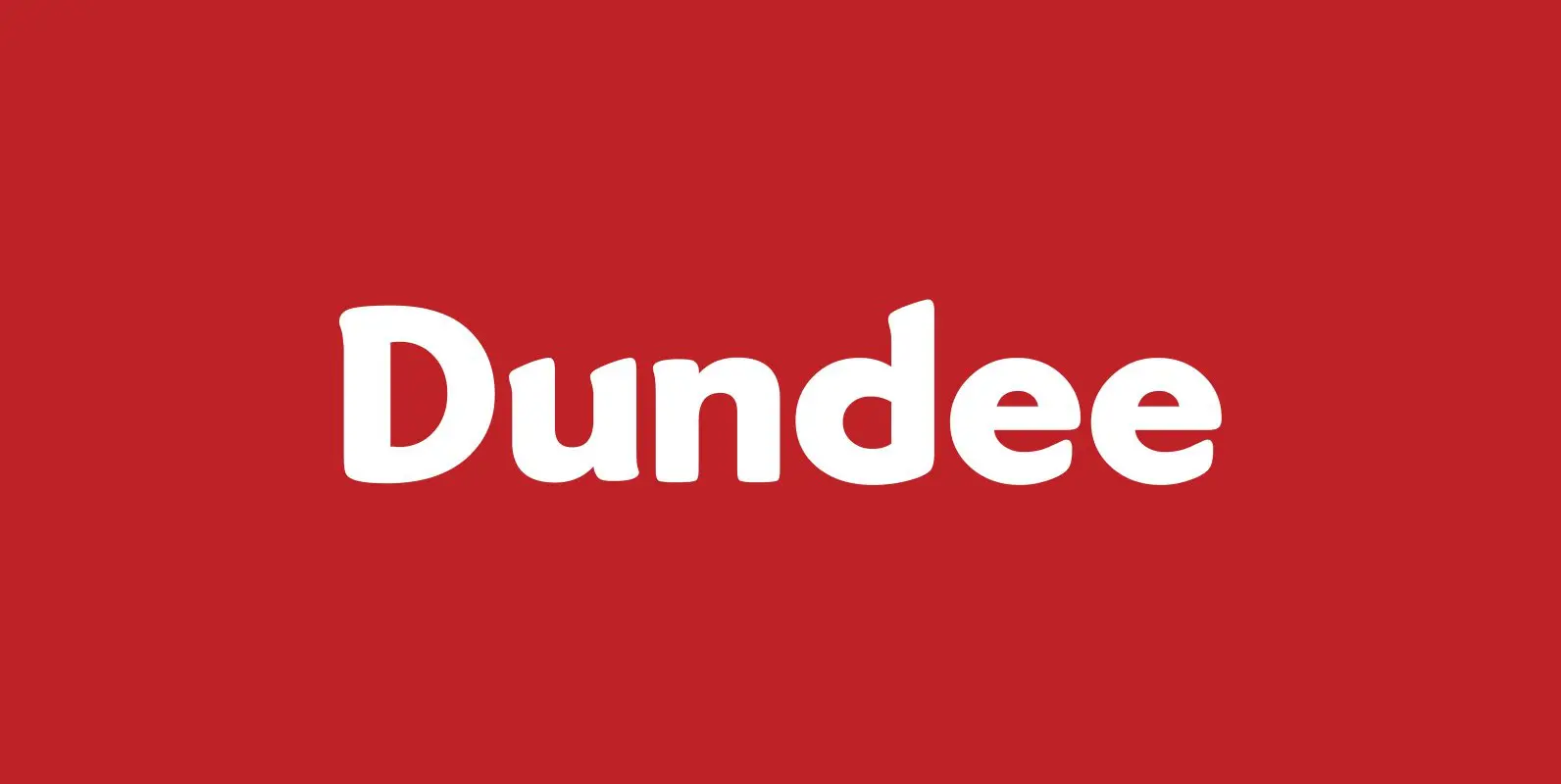
Dundee Font
Designed by A. Pat Hickson, Dundee is a new design inspired by the various mastheads used in children’s comic books in England, published by D.C. Thompson of Dundee, Scotland. Published by Red RoosterDownload Dundee
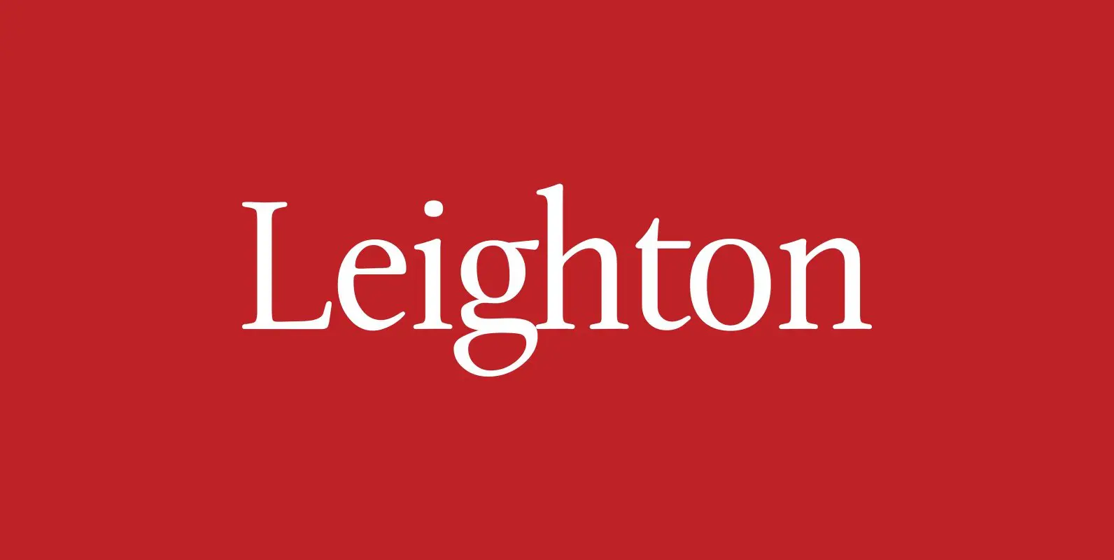
Leighton Font
Designed by Paul Hickson, Leighton is a clean serif based on Lectura, a design by Dick Dooijes of the Amsterdam Foundry (1966). Published by Red RoosterDownload Leighton
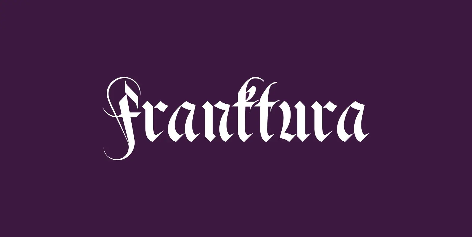
Fraktura Font
“Fraktura” and “Fraktura Plus” is a set of classical Fraktur (Blackletter) in a modern interpretation. The two fonts differ in the amount of embellishments and can and should be mixed. I only sell the pair, but for a fair price.
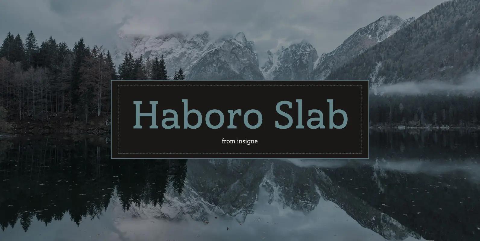
Haboro Slab Font
Haboro Slab. It’s a nose-to-the-grindstone kind of font like the first of its family. This slab serif pushes through the clutter powerfully in editorial and corporate work such as business websites and software. The Haboro hyperfamily as a whole is
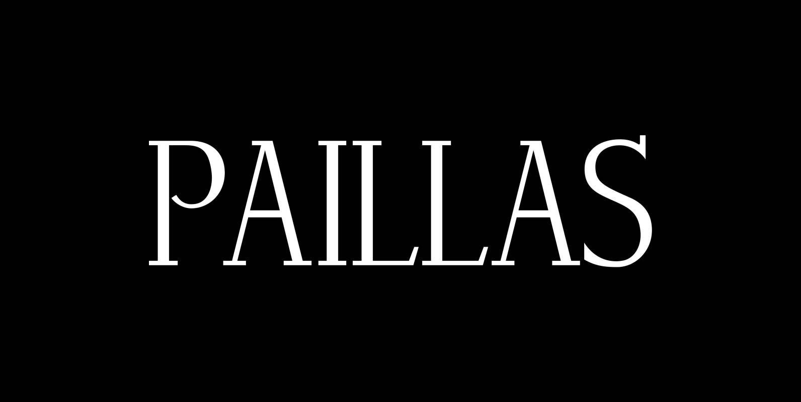
Paillas Font
“Paillas” is a very elegant and unusual Antiqua typeface I have been working on during the last three years. So far I just have the normal and oblique cuts, but eventually I will design a bold version as well. Published
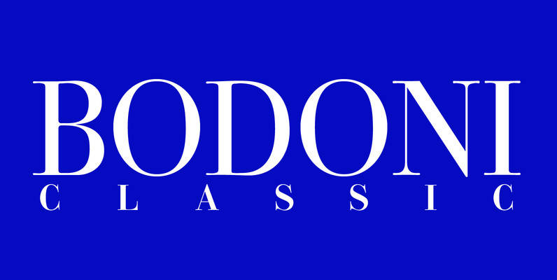
Bodoni Classic Font
I became interested in designing Bodoni Classic because of a lazy graphic designer at Jacques Damase publishing house. He had to change a single letter on a bookcover about J. B. BODONI. The French call him Jean Baptiste instead of
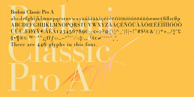
Bodoni Classic Pro Font
This is my new, completely worked over and fine-tuned Bodoni Classic for Europe (no Greek and Cyrillic). I have added a set of elegant Swashes (B) and 2 alternating uppercase swirly Initials (C) as well as two lowercase end-letters (D).
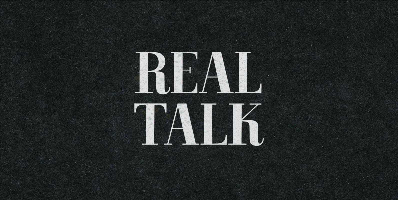
Real Talk Font
Real Talk packs the same lip flapping smacks and pharyngeal grunts as any old nonsense. But while a baby can only babble, a grown man can mean something. Put words in perspective, located on the axes of breadth and depth,
Bodoni Sans Font
Bodoni Sans is a new classic built on the foundation of two centuries of history. Fresh and contemporary, while feeling familiar. Stylish and sophisticated, confident and elegant. Bodoni Sans is more than just chopping off the serifs. The classical proportions
Weiss Antiqua Font
In 1928 Emil Rudolf Weiss designed Weiss Antiqua, a classic and and versatile serif design. Use this design in a wide range of projects, great for the design toolbox. Published by URW Type Foundry GmbHDownload Weiss Antiqua
Bodoni M Font
Bodoni is a classic serif release by URW, originally designed by type legend Giambattista Bodoni in 1798. This version of Bodoni contains language support for West, East, Turkish, Baltic, and Romanian. The typeface is classified as didone modern. Bodoni followed
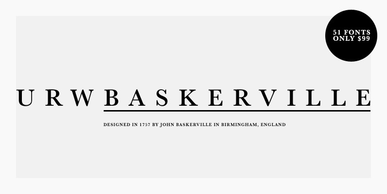
URW Baskerville Font
URW Baskerville is a 51 serif font family for an amazing price. If you need a classic serif family in your studio’s collection, you cannot go wrong with this release from URW. Baskerville is a transitional serif typeface designed in
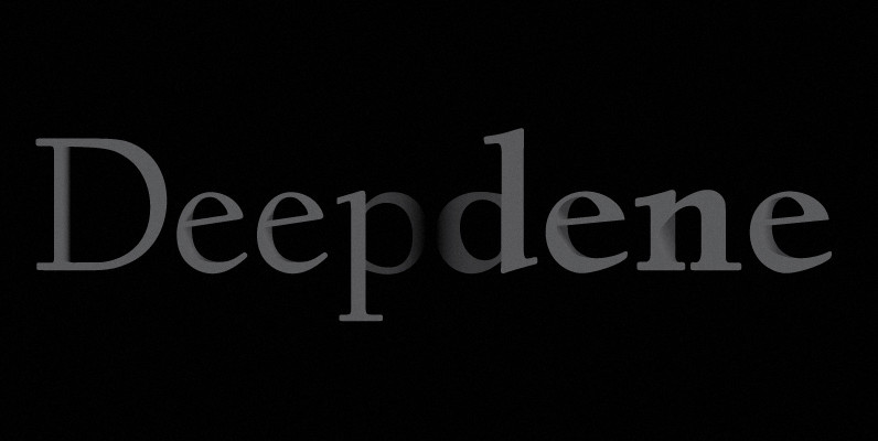
Deepdene Font
Deepdene is a unique and creative font release by the German type foundry URW. Originally designed by Frederic William Goudy in 1927. Published by URW Type Foundry GmbHDownload Deepdene
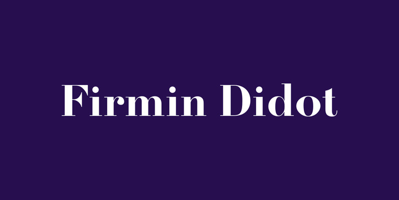
Firmin Didot Font
Designed by URW Studio in 1995, Firmin Didot is a Serif (Antiqua) / Old Style font release by URW. Contains language support for West, East, Turkish, Baltic, and Romanian. Published by URW Type Foundry GmbHDownload Firmin Didot
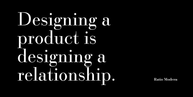
Ratio Modern Font
Designed in 1923 by Friedrich Kleukens for the Stempel foundry, Ratio was one of the first metal faces to bring the Didone genre to the forefront of industrial mass publishing as a headline and magazine face. Though essentially modern in