Tag: useful
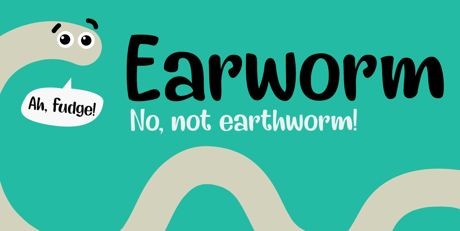
Earworm Font
An ‘Earworm’ is a catchy tune that keeps repeating itself in your head. I didn’t know this (in Holland (where I’m from), earworm (oorwurm) means earwig – you know, the animal). Earworm is a happy handmade font. It’s a little
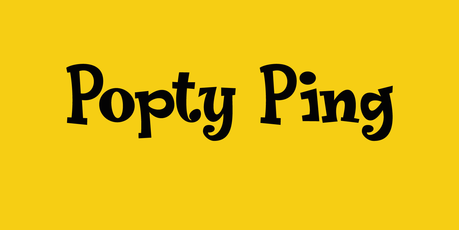
Popty Ping Font
Popty Ping is Welsh slang for microwave oven. It literally means ‘oven that goes ping’. Popty Ping was sort of based on an older font of mine called Jambo. It is a very happy cartoon font, ideal for children’s book
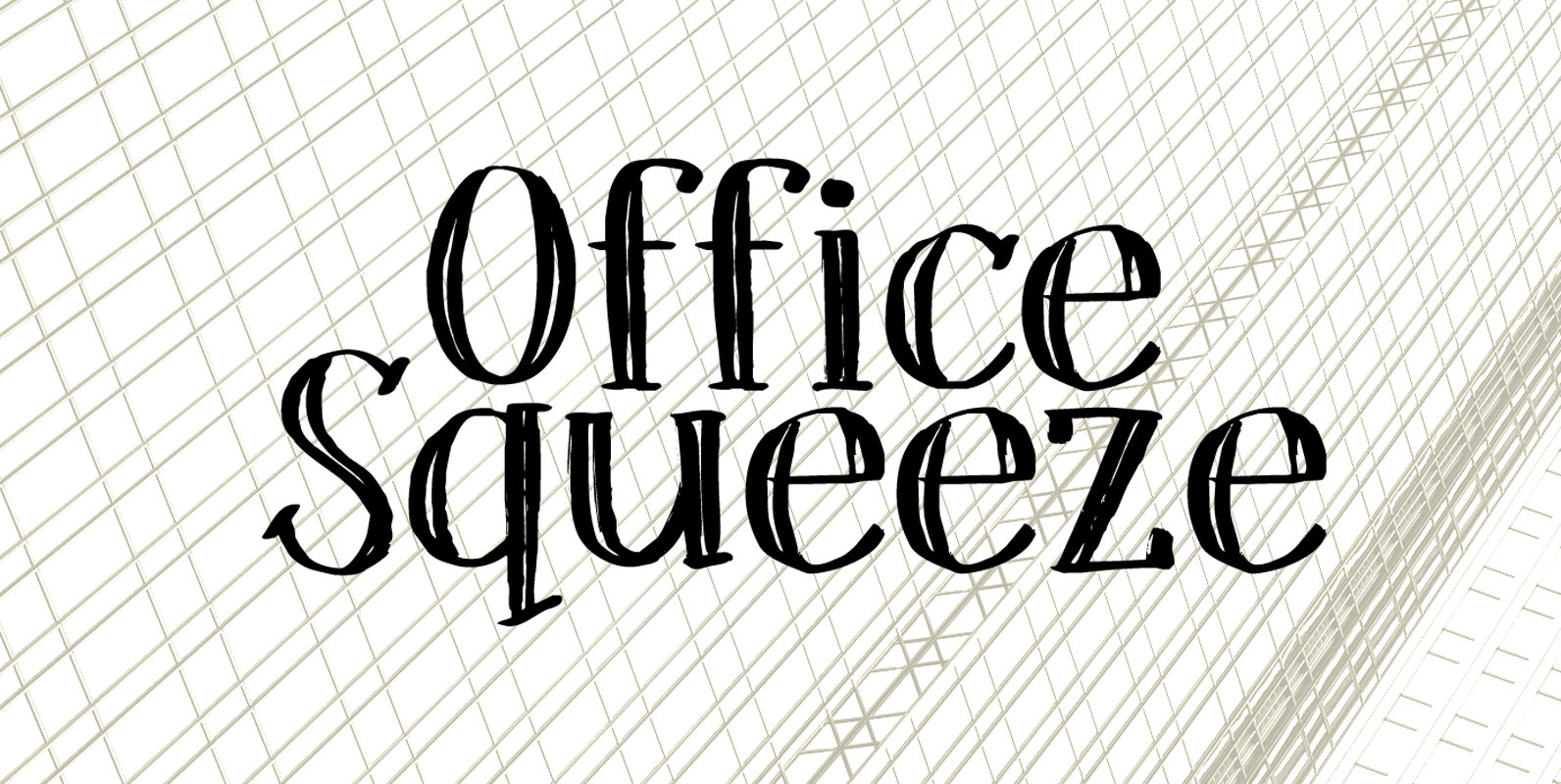
Office Squeeze Font
Office Squeeze was made with a Japanese brush pen. I kind of like the fact that, despite its roughness, Office Squeeze still maintains a very neat appearance. Office Squeeze can be used for just about anything, but product packaging, logos
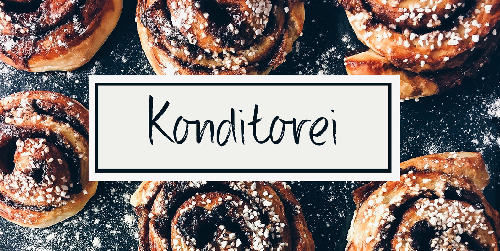
Konditorei Font
A Konditorei is a German Confectionery Shop. A good Konditorei offers a wide variety of pastries and often also serves as a café. This handmade script font is like the wares in a confectionery shop: full of calories, but sweet
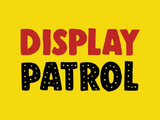
Display Patrol Font
I have always liked handmade display fonts – maybe that’s why I have so many of them! Display Patrol is a rather fat, in your face font. It is completely handmade and comes in two distinct styles: regular and dots.
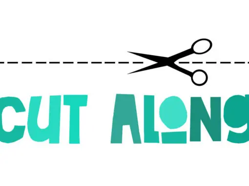
Cut Along Font
I made Cut Along by stealing some red cardboard from my kids (red, because they didn’t have any black…) and cutting out the glyphs one by one with a pair of scissors. I then pasted the shapes onto white paper,
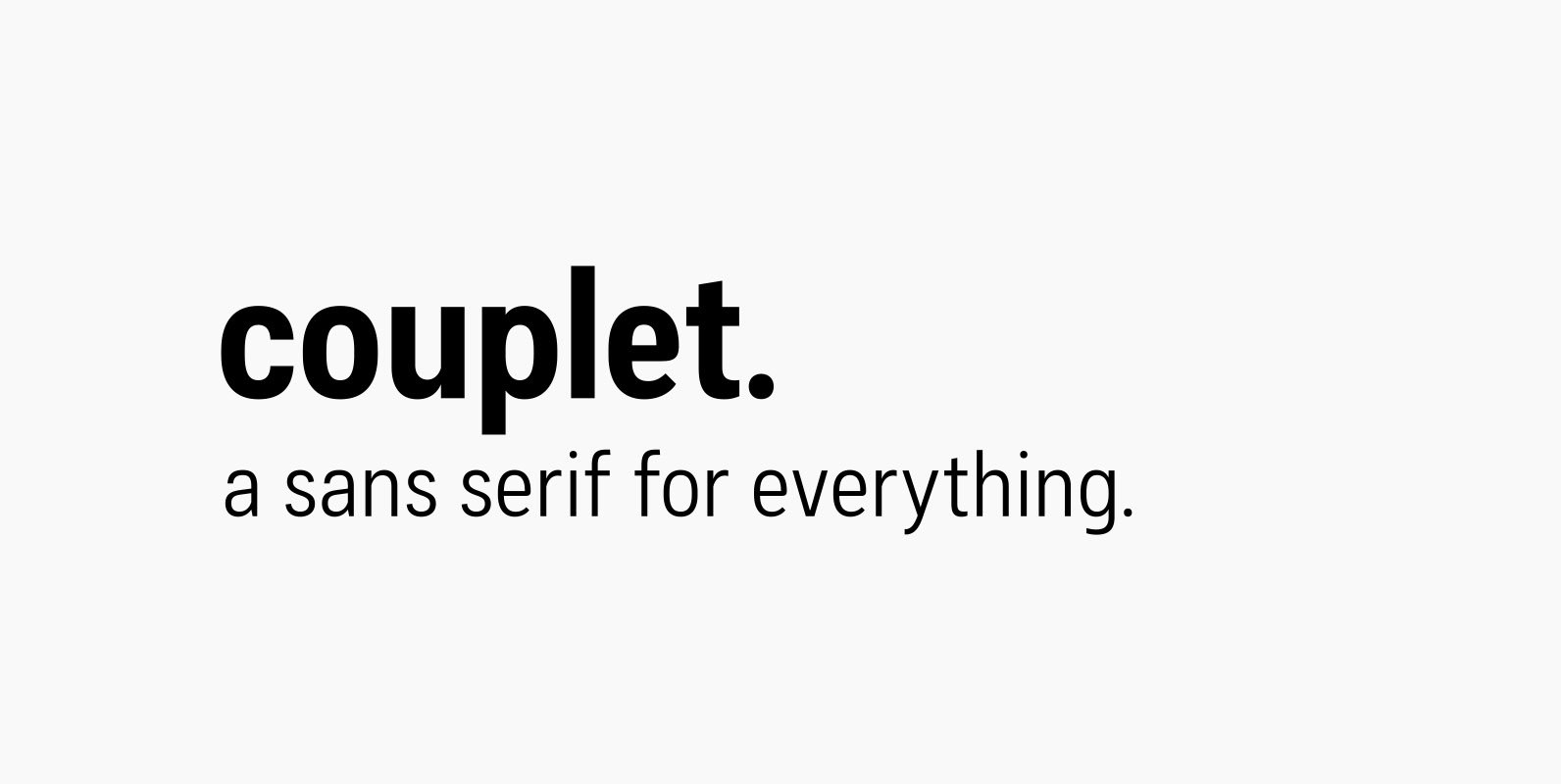
Couplet CF Font
Couplet CF is expressive and practical, with a blend of precision and warmth. A strong rectangular underpinning and slightly condensed construction support bright, attractive letterforms across seven weights. Couplet’s simple shapes and clean construction are designed to be used anywhere
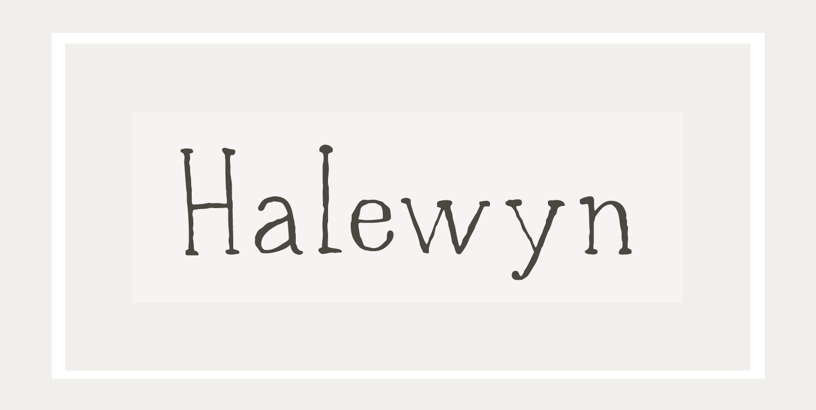
Halewyn Font
Heer Halewijn (The Song of Lord Halewijn) is a 13th century Dutch folk tale which survives in folk ballad. The story tells of a man called Halewijn, who lives in the woods and who lures pretty women with his songs
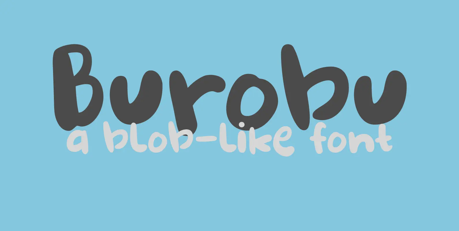
Burobu Font
Burobu, in case you’d like to know, means ‘blob’ in Japanese. I thought it was quite an appropriate name for this blob-like font! Burobu is a messy font and comes with a generous helping of jittery, jumping glyphs, exaggerated strokes
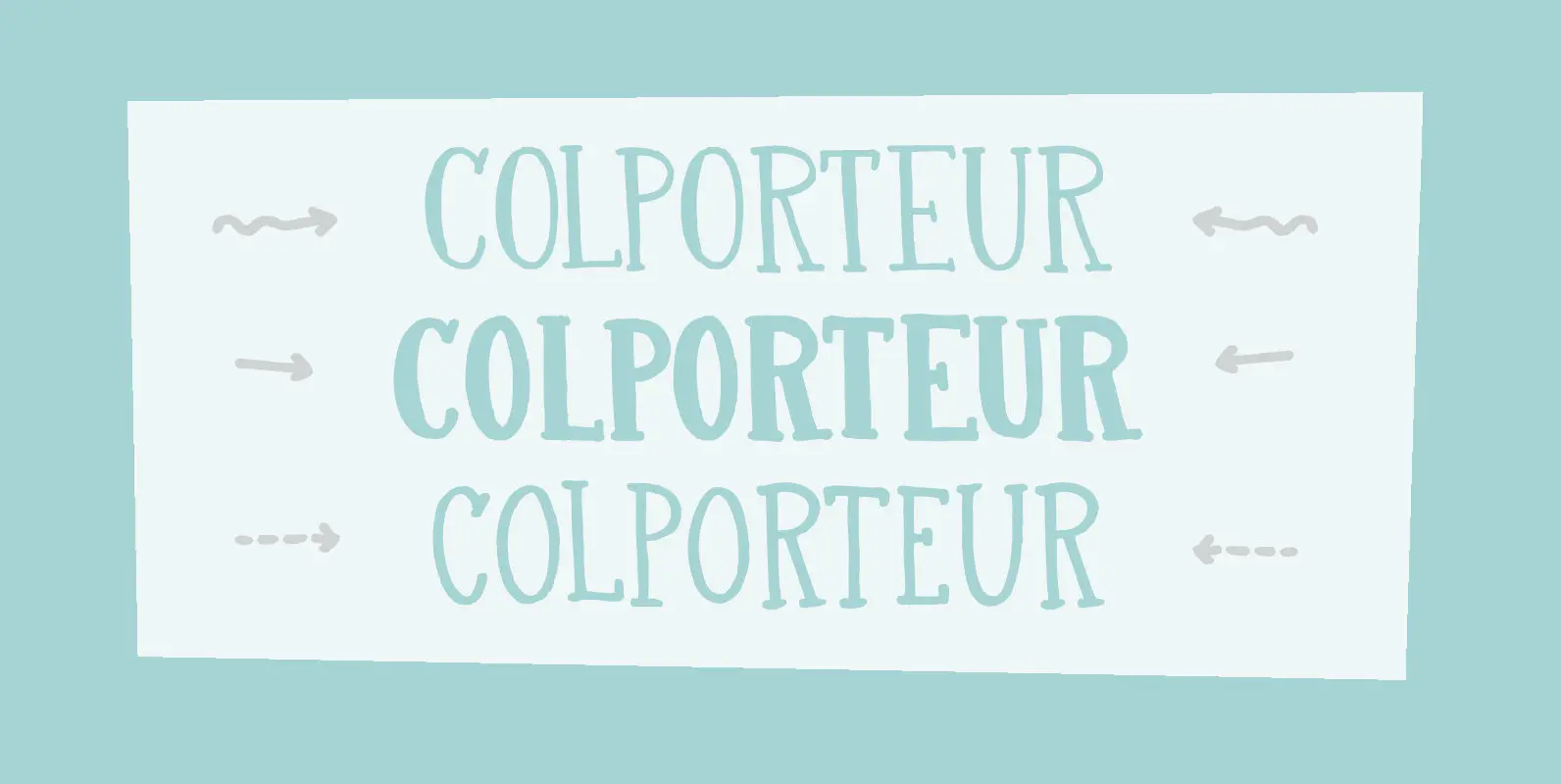
Colporteur Font
A Colporteur is a peddler of books, newspapers, and similar literature. When I was young, we often got visits from colporteurs – mostly they wanted to sell us a very expensive encyclopaedia. I haven’t seen them for a while –
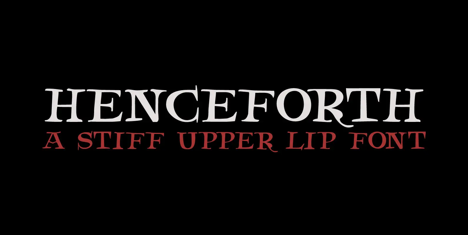
Henceforth Font
Henceforth is a hand-drawn, all caps didone-style typeface. It is a little rough, a little uneven, but lively and elegant as well. Personally I think it has a certain poshness about it: I mean, it wouldn’t look out of place
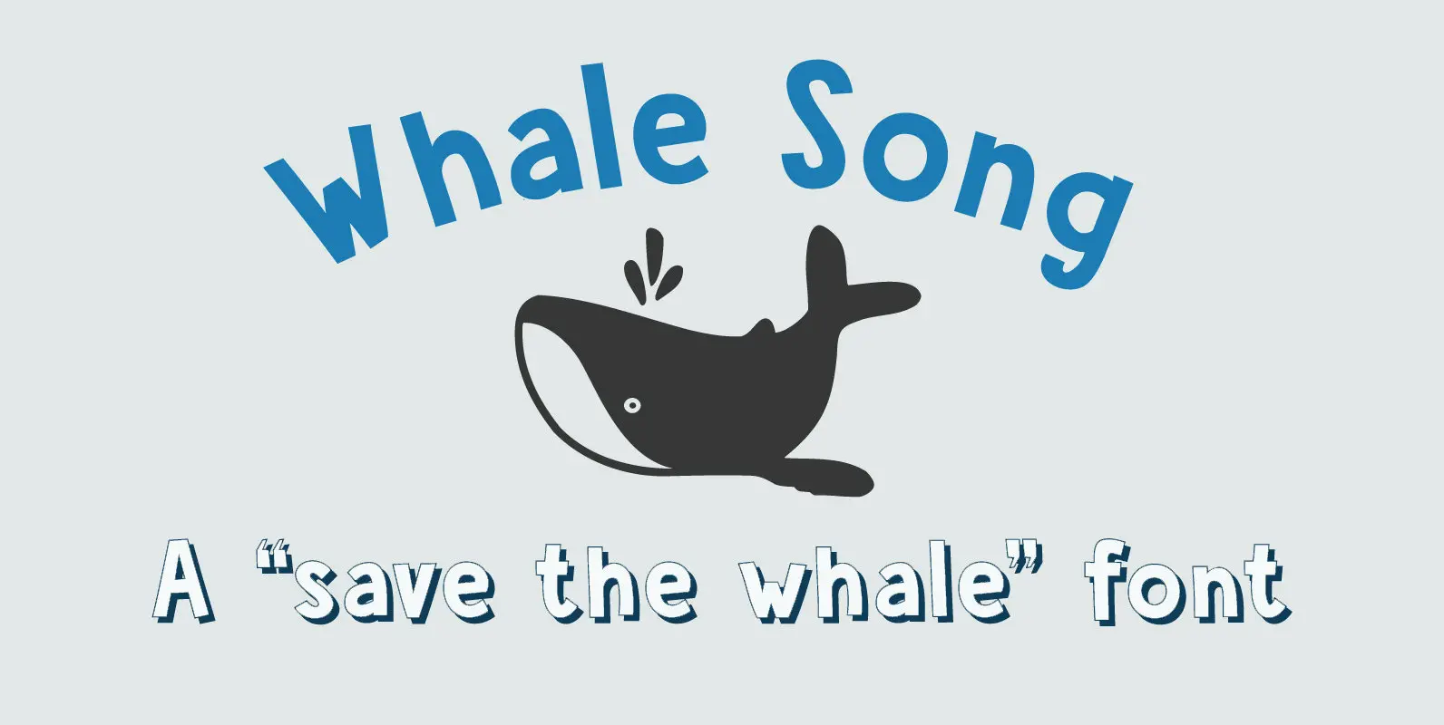
Whale Song Font
I grew up with the ‘Save The Whales’ slogan: I remember watching the news and seeing little Greenpeace dinghies taking on huge Japanese whalers, and activists clinging on for dear life. I haven’t heard that slogan for a while: maybe
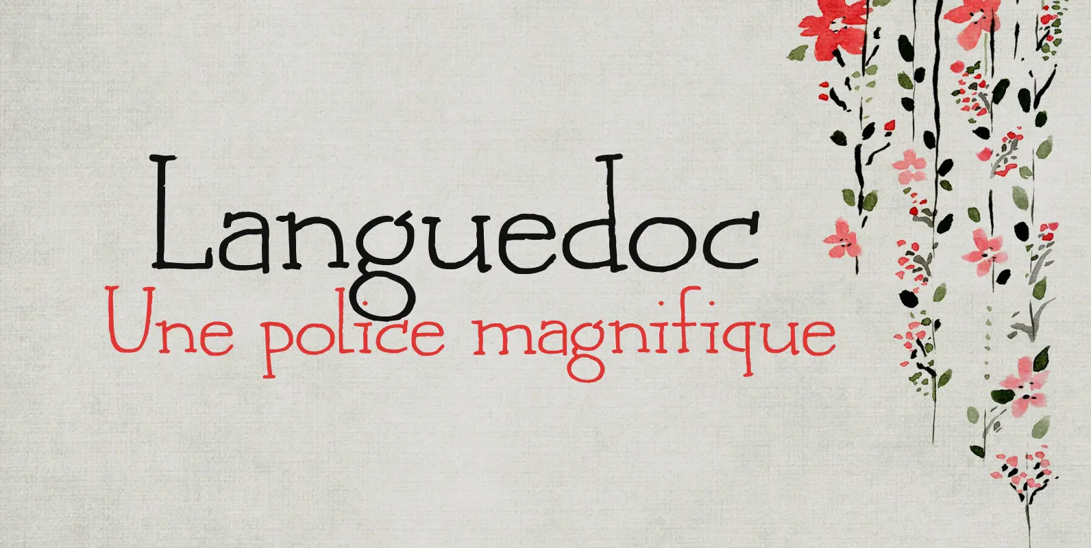
Languedoc Font
Languedoc is a former province of France. Most of its territory lies in what is now the Occitanie region. My family and I love camping there and I figured I’d name a font after it! Languedoc is a beautiful and
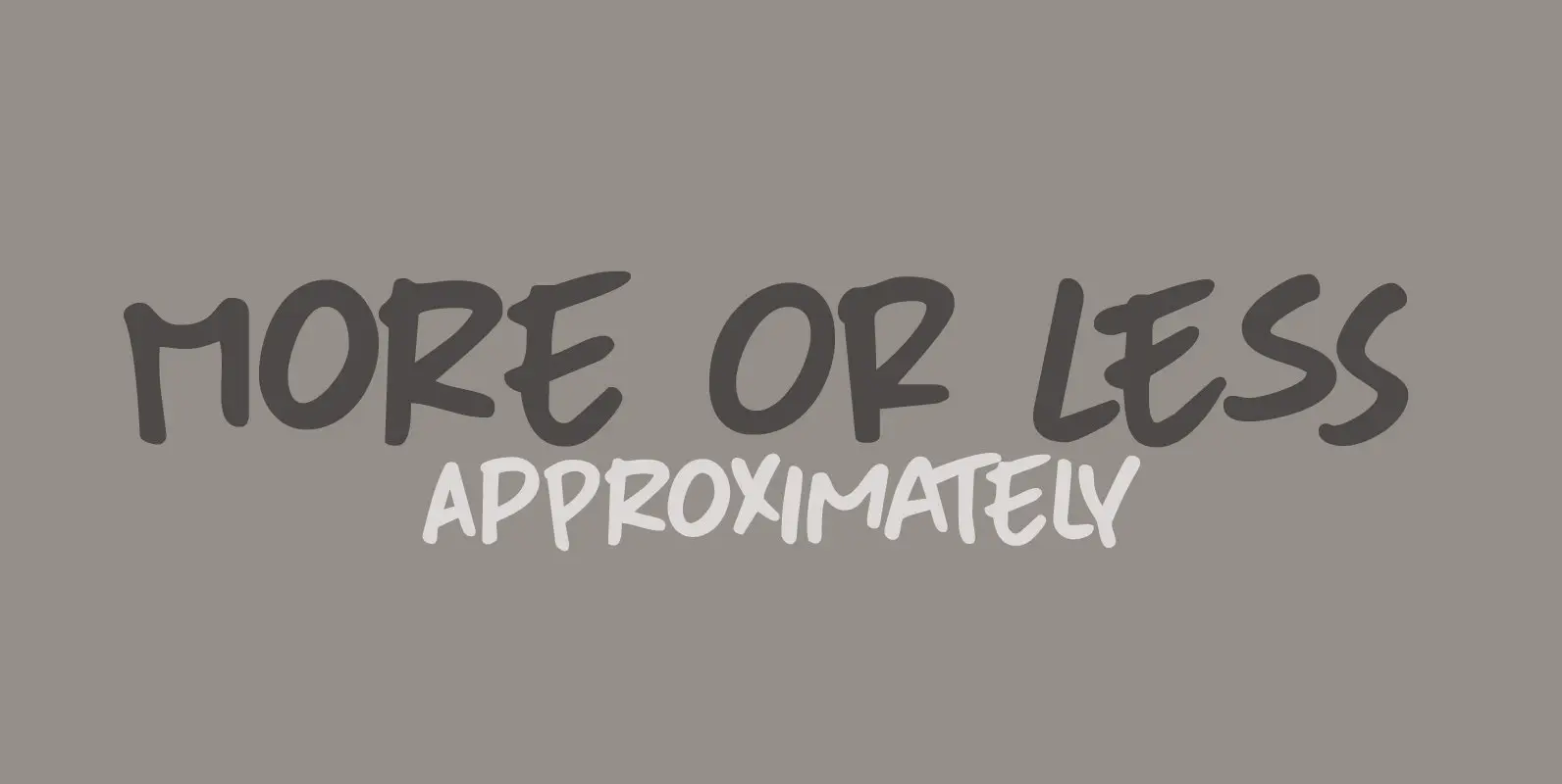
More Or Less Font
More Or Less was made with a permanent marker pen on thin Japanese paper. It is a handwritten note-style font with an uneven baseline and zippy glyphs. Comes with bells & whistles and a whole bunch of diacritics. Published by
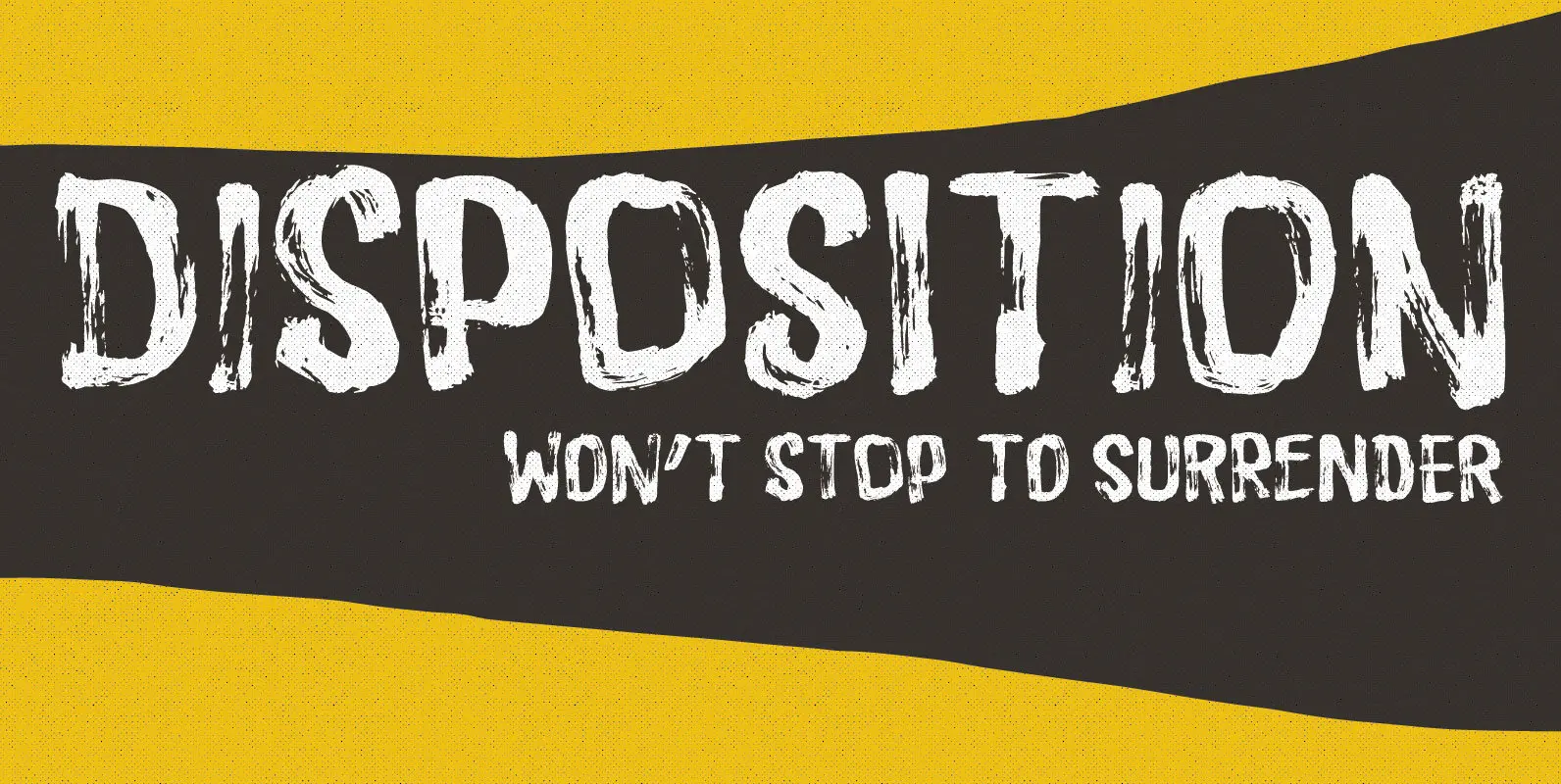
Disposition Font
You may not know it, but you’ve been looking for a font like DISPOSITION! Yeah, it’s a font…but it doesn’t act or look like one! Why?! Because there are 6 different versions of each letter! Yes, SIX different versions! Enough
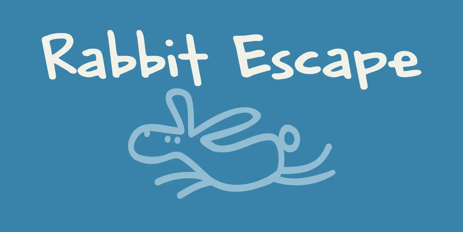
Rabbit Escape Font
Lately I have been thinking about rabbits. Not that I have a particular love for rabbits – they’re cute, but also kind of stupid. But as Christmas dinner is approaching, I see more rabbit carcasses lining the shelves of supermarkets.

Starlight Lovers Font
I have always loved gazing at the stars. Too bad that you don’t get to see a true starry night these days – mostly because of light pollution. Starlight Lovers is a messy serif. It is hand painted, using a
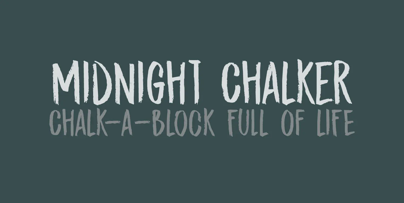
Midnight Chalker Font
Midnight Chalker is, well, a chalk(ish) font and it was (fro the greater part) created around the midnight hour. That’s usually when I get my inspiration. Midnight Chalker is a tall, eroded font – all caps, but the upper and