Tag: type design
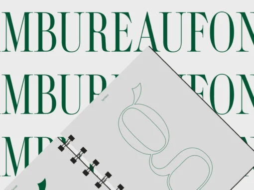
KT Bureau Font
Bureau, a typeface inspired by the distinguished Didot, presents a harmonious fusion of narrow width and high-contrast serif. Designed with the ambitious goal of serving both headline and text purposes, this font embodies a delicate balance that caters to a
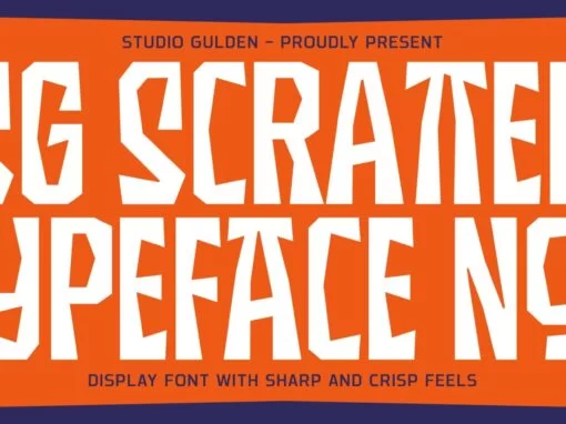
SG Scratter Font
SG Scratter is a dynamic and eye-catching display font that is sure to make any design stand out. With its sharp and crisp edges, this font exudes a sense of boldness and confidence that is perfect for headlines, logos, and
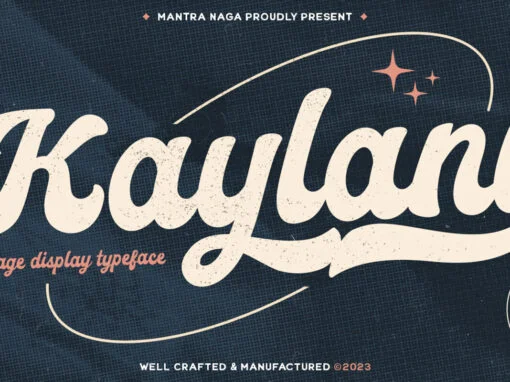
Kaylani Font
Kaylani – a Vintage Script Display Typeface. This typeface has many alternatives with swashes that can make your lettering/logotype more attractive. This font is suitable for logos and various other formal forms, such as invitations, labels, logos, magazines, books, greeting/wedding
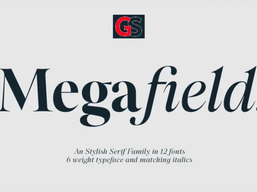
Megafield Font
Megafield is a contemporary display serif typeface with sharp and dynamic strokes, strong contrast and delicate pointed serifs. giving traditional serif design elements a modern feel, it’s a graceful and confident typeface family with an extensive set of functional and
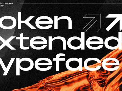
Noken Font
Noken Extended is a sleek and versatile sans-serif display typeface family that comes in three weights with ligatures and alternate letters. Its extended width makes it perfect for creating attention-grabbing typography, whether you’re designing for print or digital media. Noken
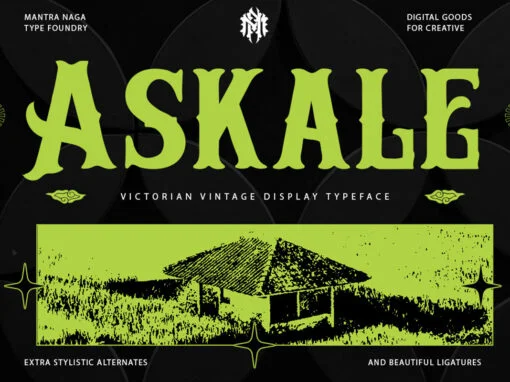
Askale Font
Askale – Victorian Vintage Display Typeface. This typeface has many alternatives with swashes that can make your lettering/logotype more attractive. Bold serifs and more swash on each character make this font even more unique. This font is very suitable to
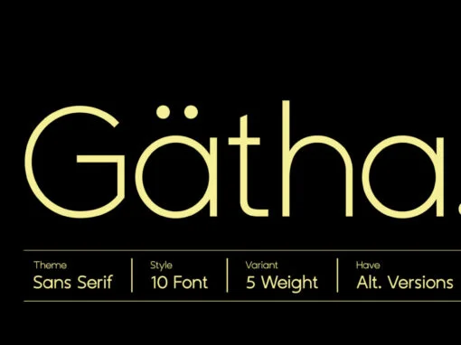
ZT Gatha Font
Introducing ZT Gatha, a font that’s about to shake up your design game. This font is a continuation of the Gatha Duo family, but with a focus on even more complete variations of sans serif. With two unique variants, you’ll
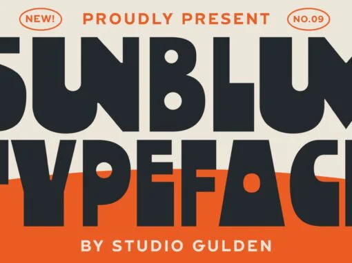
SG Sunblum Font
Introducing the “SG-SUNBLUM” font, a modern sans-serif typeface that stands out from the crowd with its extraordinary design elements. This font features sleek, elongated lines and bold, asymmetrical letterforms that give it a dynamic and eye-catching appearance. It also includes
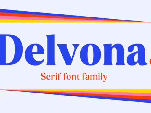
Delvona Font
Delvona is a serif font design published by Great Studio Published by Great StudioDownload Delvona
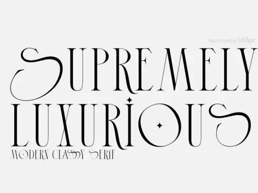
Supremely Luxurious Font
Whether you’re a branding enthusiast or just looking for some fresh fonts to spice up your design, this font is perfect. Try it on everything from product packaging and invitations all the way to t-shirts! Features: – Uppercase & Lowercase
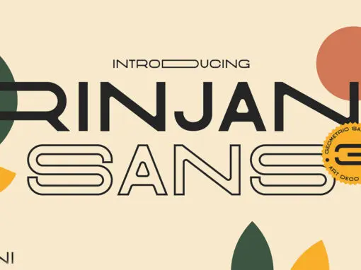
Rinjani Font
Rinjani sans is a all-caps sans serif with Wide Stretch contemporary typographic, vintage futuristic art-deco touch Streamline influence of the 1930s and 1940s. A mix from the old Euro-American signage/advertising letters and modern clean sans serif, carefully mousecrafted to bring
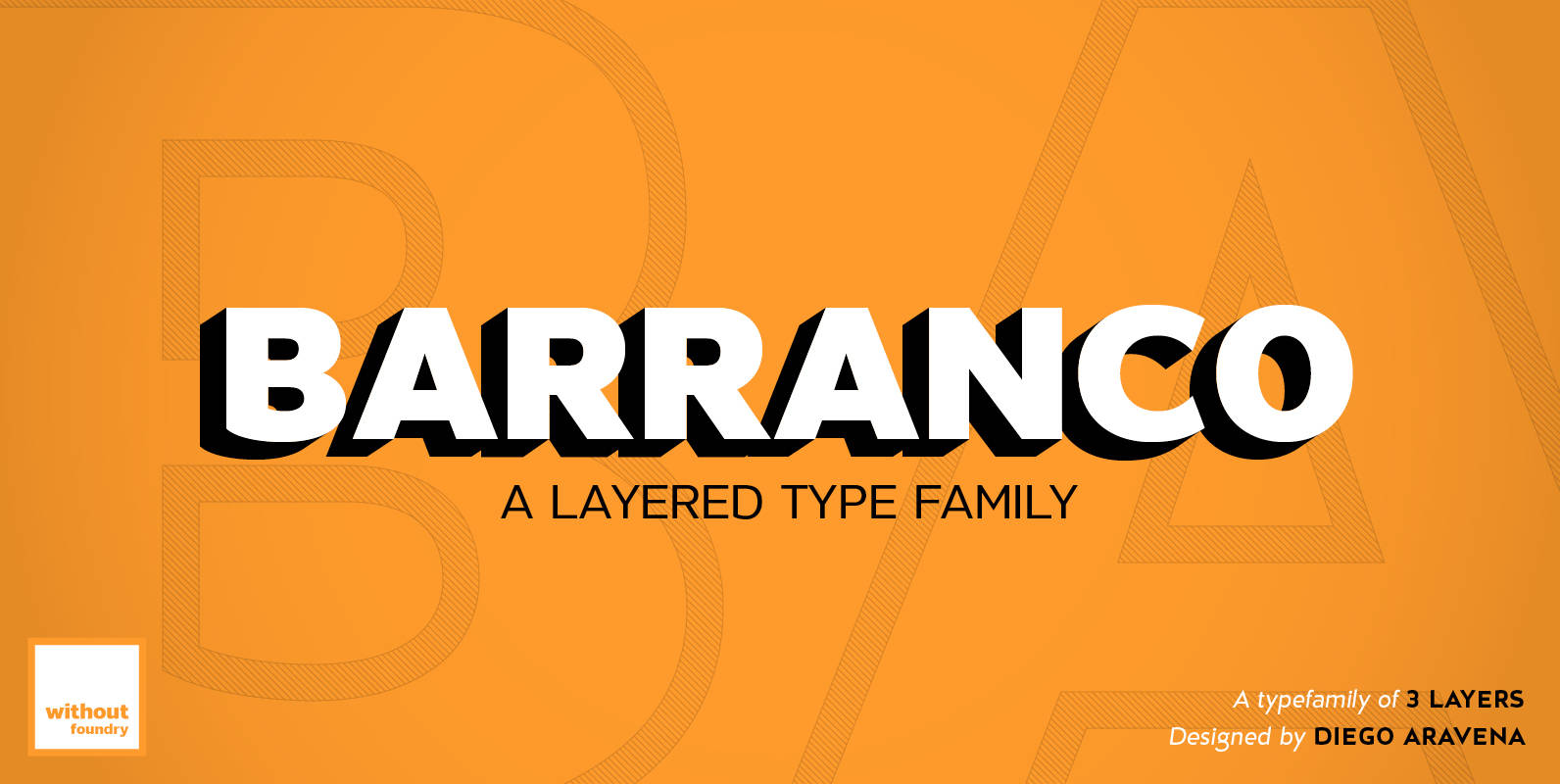
Barranco Font
Barranco is a 3d layered font family of 3 weights (thin, medium, black), plus shadows and one inline effect layer. It’s inspired by the caps neo-humanist typefaces of the 80’s with a mix of new trends such as the new
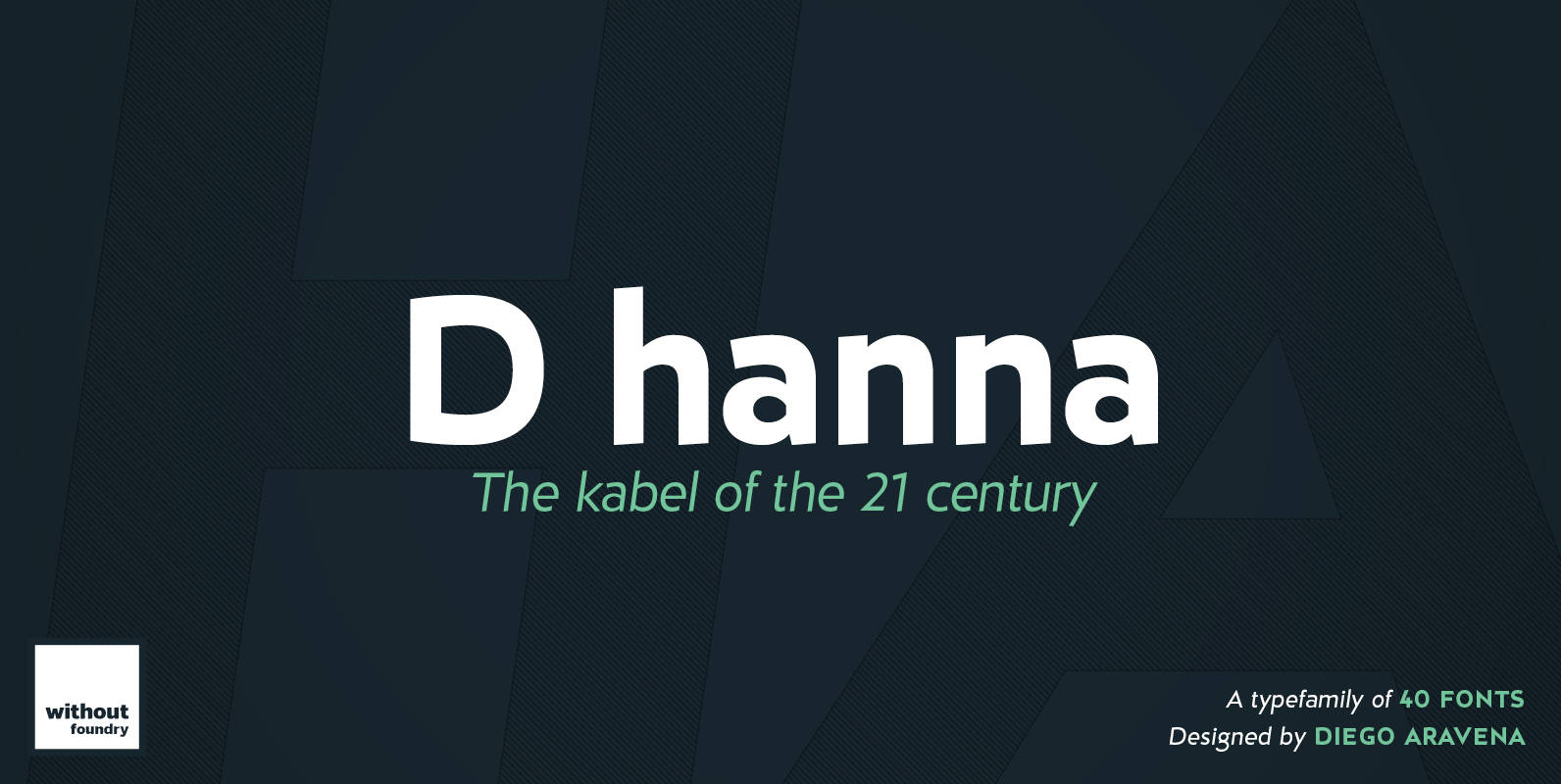
D hanna Font
D Hanna is a typeface that has 22 variants. It’s inspired by 1920s German modernism as well as by the neohumanist typeface of the ‘90s. It has a rigid structure but also an ink drawn ductus, which softens the form.