Tag: transport
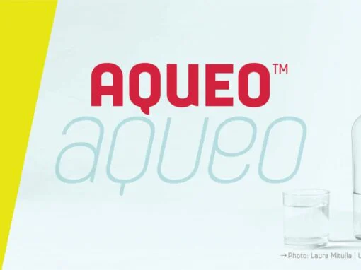
Aqueo Font
Aqueo™ is a versatile display font family inspired by the cylindrical wireframe of a water glass. The one-sided round corner details added a contemporary feel to this unique typeface. It comes in 6 weights and 12 styles. To ensure the
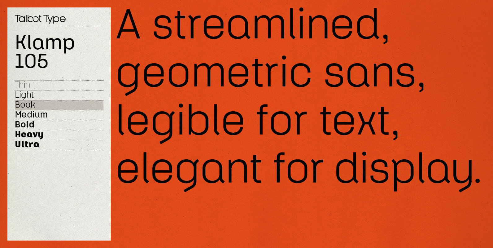
Klamp 105 Font
Talbot Type Klamp 105 is an elegant and streamlined, geometric sans-serif. A legible text font, its narrow proportions mean it’s economical with space; while at larger sizes it makes a confident, modern display face. Klamp 105 is available in a
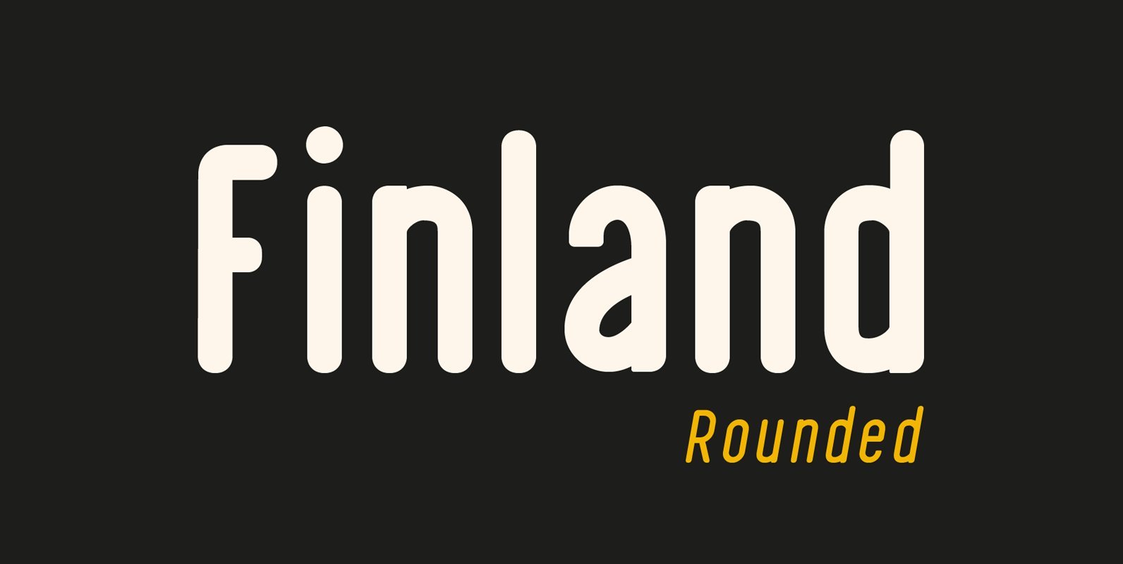
Finland Rounded Font
Finland Rounded Font Family has been crafted from scratch with a structural logic of its own: a fusion of pure geometry and optical balance. Finland Rounded font family comes with 6 Styles, Regular, Italic, Thin, Thin Italic, Bold, Bold Italic.
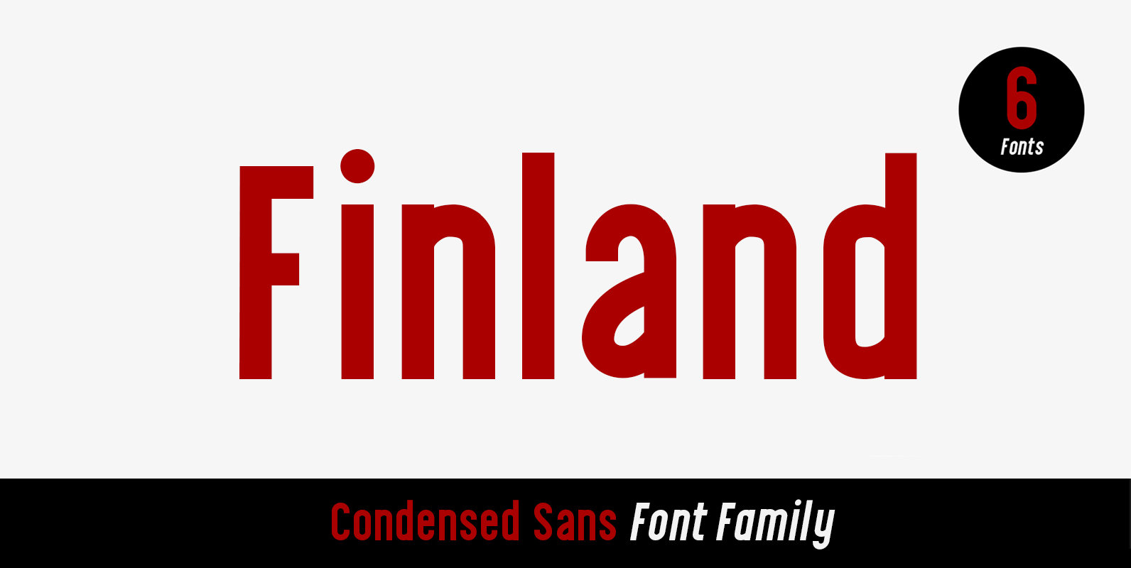
Finland Font
Finland was inspired by European type specimen books, especially Finland type standard. Delivering some glorious vibes of the solid values from the pioneers and keeping one eye on todays demands and technology, Finland is made for high professional use. Finland
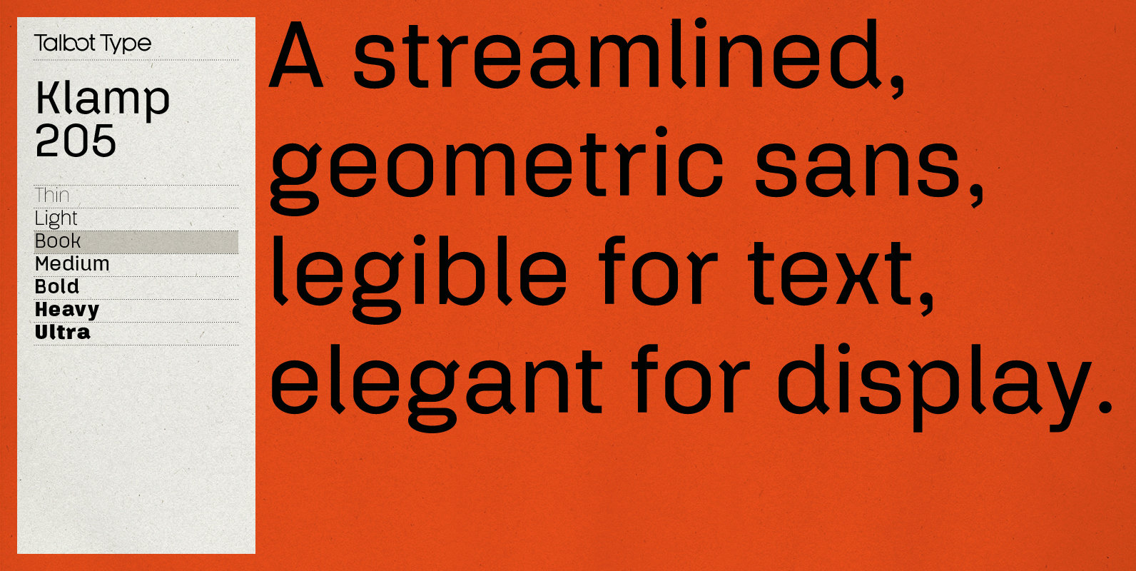
Klamp 205 Font
Talbot Type Klamp 205 is an elegant and streamlined, geometric sans-serif. A legible text font, its narrow proportions mean it’s economical with space; while at larger sizes it makes a confident, modern display face. Klamp 205 is available in a
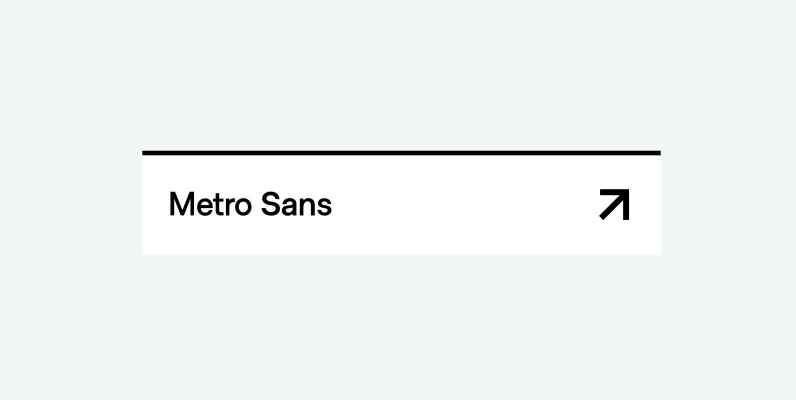
Metro Sans Font
The result of a study into the Paris Metro system; Metro Sans is a Grotesk typeface with personality. It bridges the gap between the stern terminals of a Swiss Neo-Grotesk, and the smooth curves of a modern day Geo-Grotesk. The
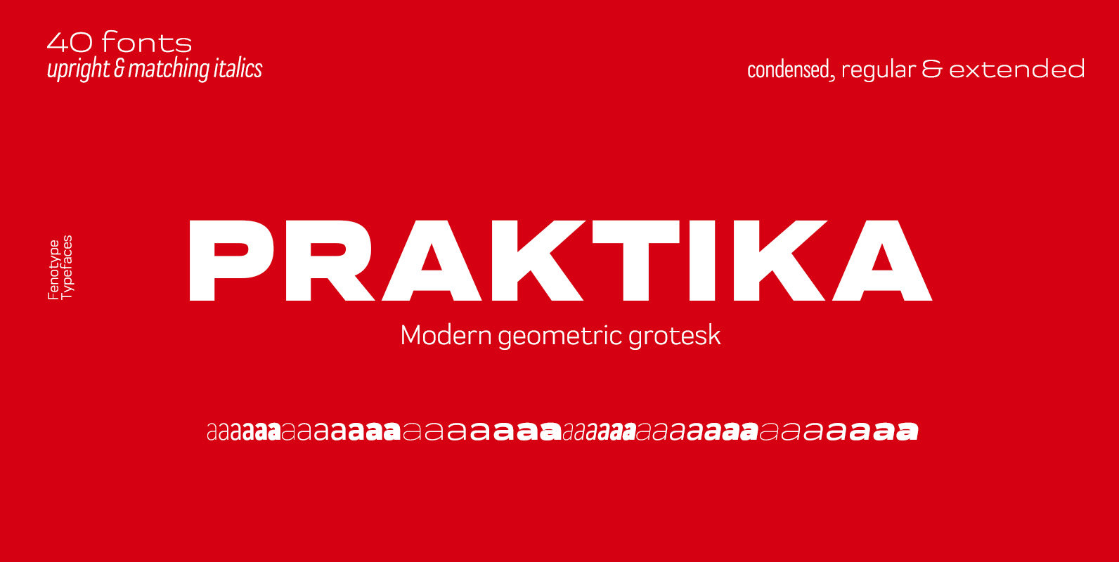
Praktika Font
Praktika is a multifunctional super family of 40 fonts. It consists of three distinct widths and weights from extra light to extra bold. Conceptually, it is a rendition of the familiar early 20th century European grotesque styles, used in road
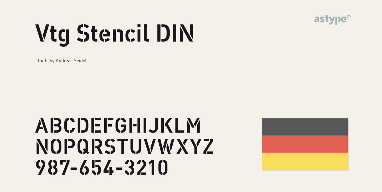
Vtg Stencil DIN Font
The Vtg Stencil DIN fonts were developed to made the most common stencil type of Germany available in digital type. Vtg Stencil DIN comes in many styles – Regular, Alt, Fabric, Halftone and Rough. The Alt style features older designs
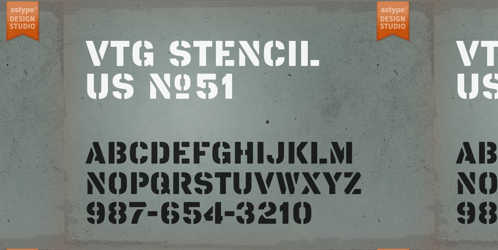
Vtg Stencil US No 51 Font
The Vtg Stencil font series by astype is based on real world stencils. The US No. 51 design was derived from authentic stencil plates used by the U.S. Army in the 1950’s and 1960’s. Published by astypeDownload Vtg Stencil US
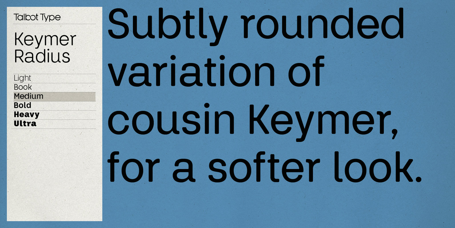
Keymer Radius Font
Talbot Type Keymer Radius is related to Talbot Type Keymer; where Keymer is square-edged, Keymer Radius is subtly rounded for a softer look. Keymer Radius mixes geometric and humanist traits to achieve a modern, clean, elegant appearance. It is a
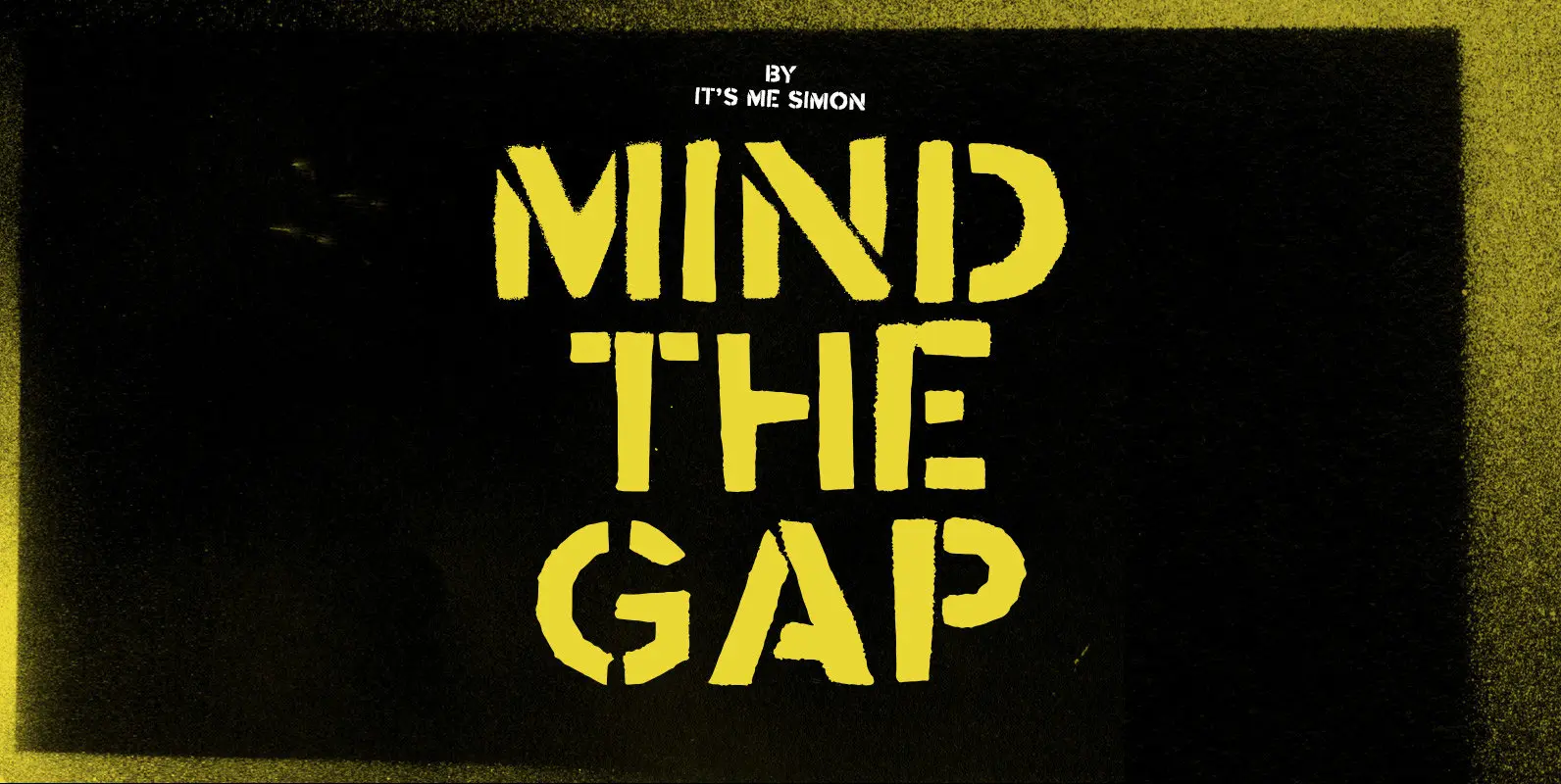
Mind The Gap Font
Mind the gap is a stencil font created with real hand cut stencils and a can of black spray paint. It looks dirty and industrial and has an almost military look and feel. It includes one stylistic alternative for uppercase
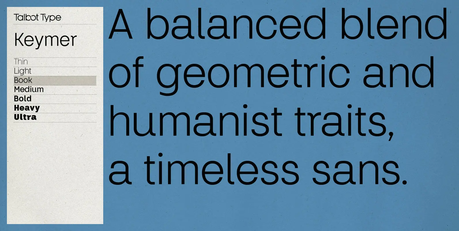
Keymer Font
Talbot Type Keymer is inspired by Margaret Calvert’s Transport typeface, designed for the British road sign system in the early 1960s. Keymer mixes geometric and humanist traits to achieve a modern, clean, elegant appearance. It is a legible and versatile
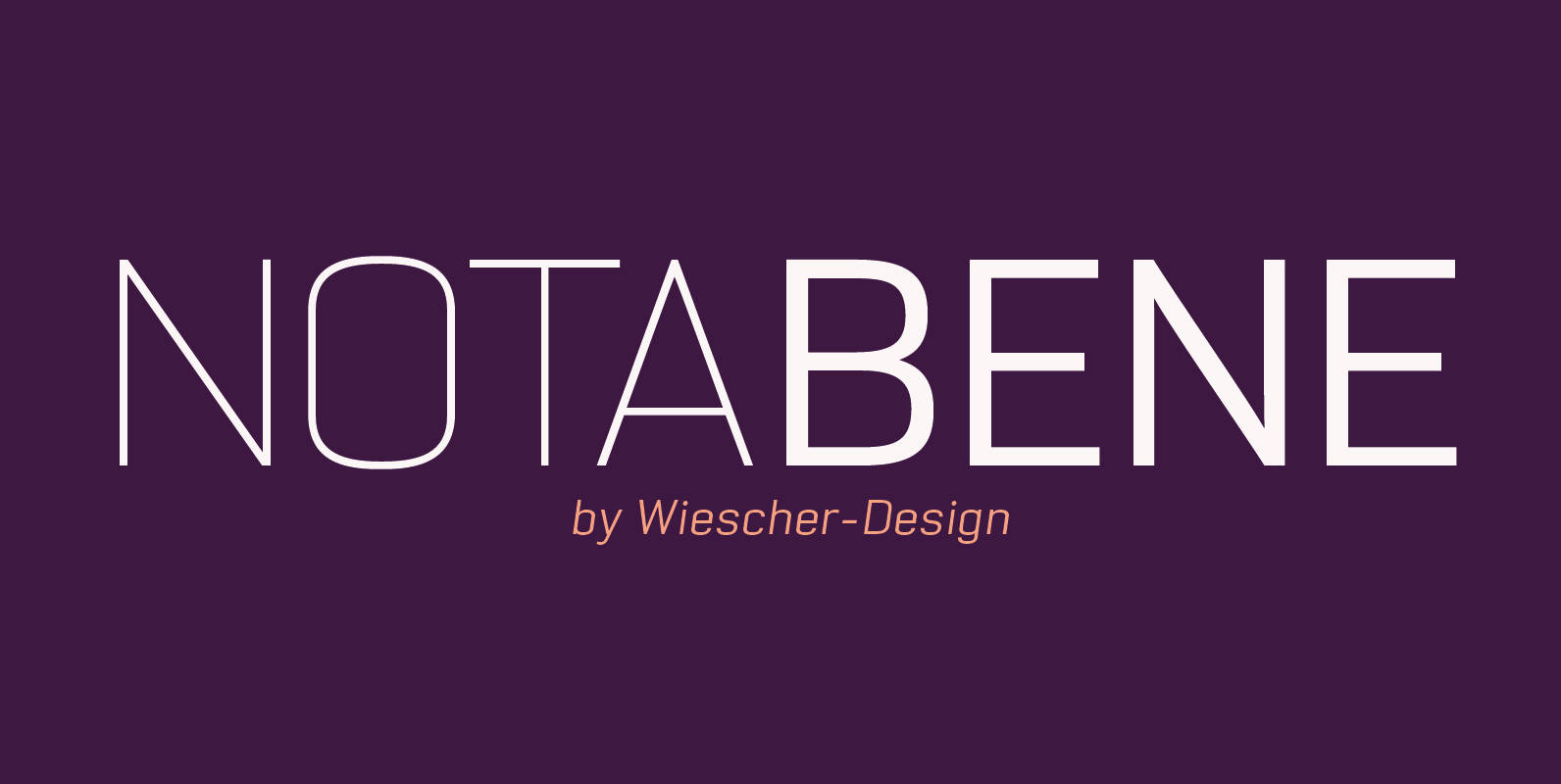
NotaBene Font
“NOTABENE” is a new, squarish, narrow, technical font– designed by Gert Wiescher in 2015 – has 7 weights with corresponding oblique cuts. “NOTABENE” is well suited for advertising, logo, billboards, small text, signage, branding, packaging, editorial, posters, web and screen

Ranelte Font
The beauty of a classic is that it never really goes out of style. The pure, simple elements which define its greatness only strengthen and solidify with time and exposure–elements like those that inspired Ranelte, the new sans serif from
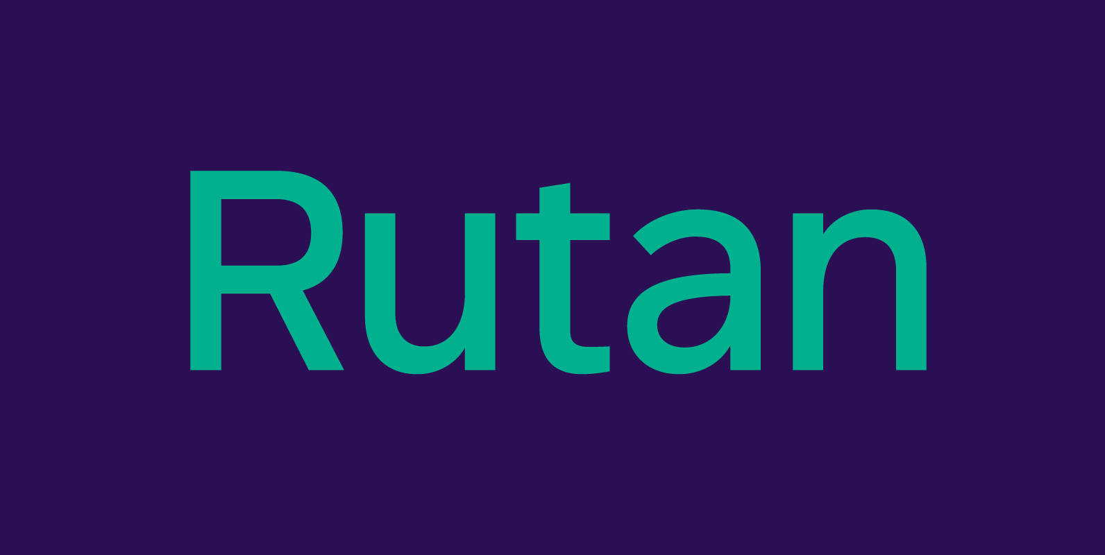
Rutan Font
Rutan is a modern sans serif type family designed for pleasurable reading. Although built essentially on a geometric foundation, the typeface has been skilfully shaped into an aesthetically pleasing and legible tool. Slightly condensed and compact, it is a perfect
Ainslie Slab Font
Based on the inspiration from Mt. Ainslie and the Ainslie suburb outside Canberra, the original Ainslie adds [these characteristics] to the project. And now the muses of Ainslie are back at work, lending their structure as the foundation of Ainslie