Tag: timeslike
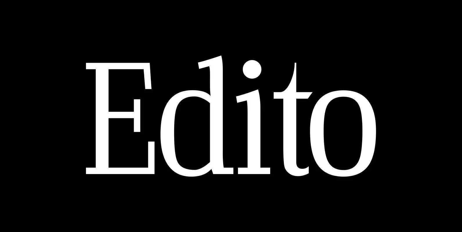
Edito Font
“Edito” is a completely new body copy-font. The special thing about this font is, that all serifs have the same height. So no matter if you take the thinnest cut (A) or the fattest (F), you will always have aligning
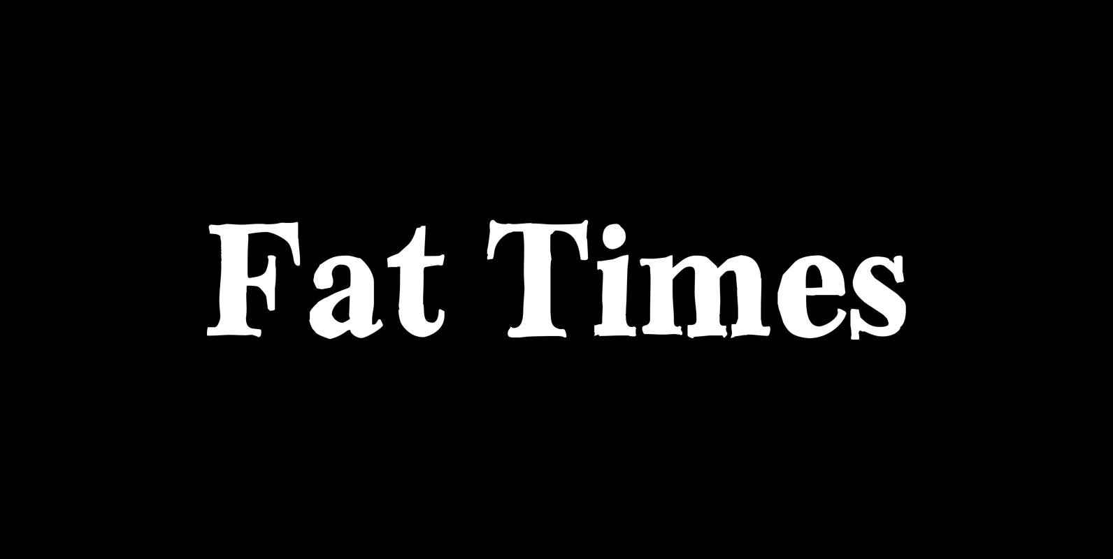
Fat Times Font
“FatTimes” is an extension to my HardTimes family. Times are too hard for boring typefaces, so try the fat one one for a change. Published by Wiescher DesignDownload Fat Times
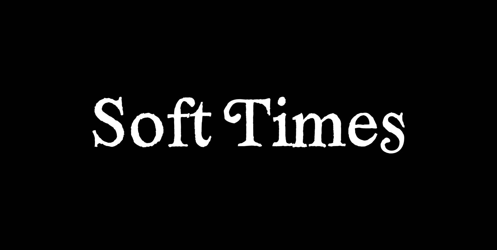
Soft Times Font
“Soft Times” has been easy on my nerves after the strain of “Hard Times”. The harder the Times are the more do we need some soft typefaces, this one is the soft counterpart for “HardTimes”. Published by Wiescher DesignDownload Soft

Hard Times Font
“Hard Times” has been hard work, designing a handmade typeface must always have the right balance between rough and smooth, specially with this Times-like face. It has the big European glyph-set, so that it can be used all over the
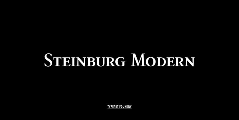
Steinburg Modern Font
Steinburg Modern™ is largely a variation on a Garamond-styled typeface with differences in some character designs and in the overall character proportions. In addition, the curved brackets that were a distinctive part of Garamond’s 16th century design are perhaps the