Tag: tapered
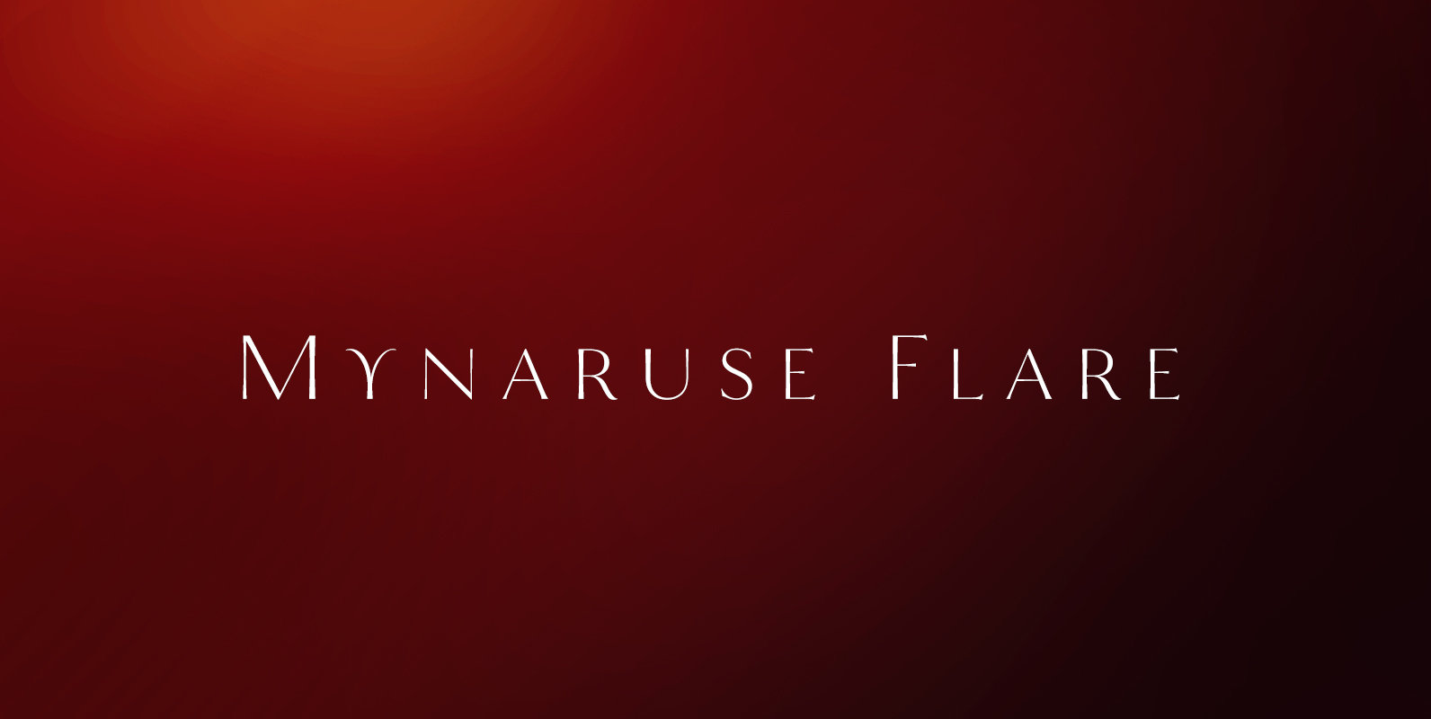
Mynaruse Flare Font
Mynaruse Flare is a new version of the Mynaruse superfamily. This version eliminates the elongated serifs of the original, and instead stems end with a flare. You will find that the thinner weights are delicate and beautiful, while the heavier
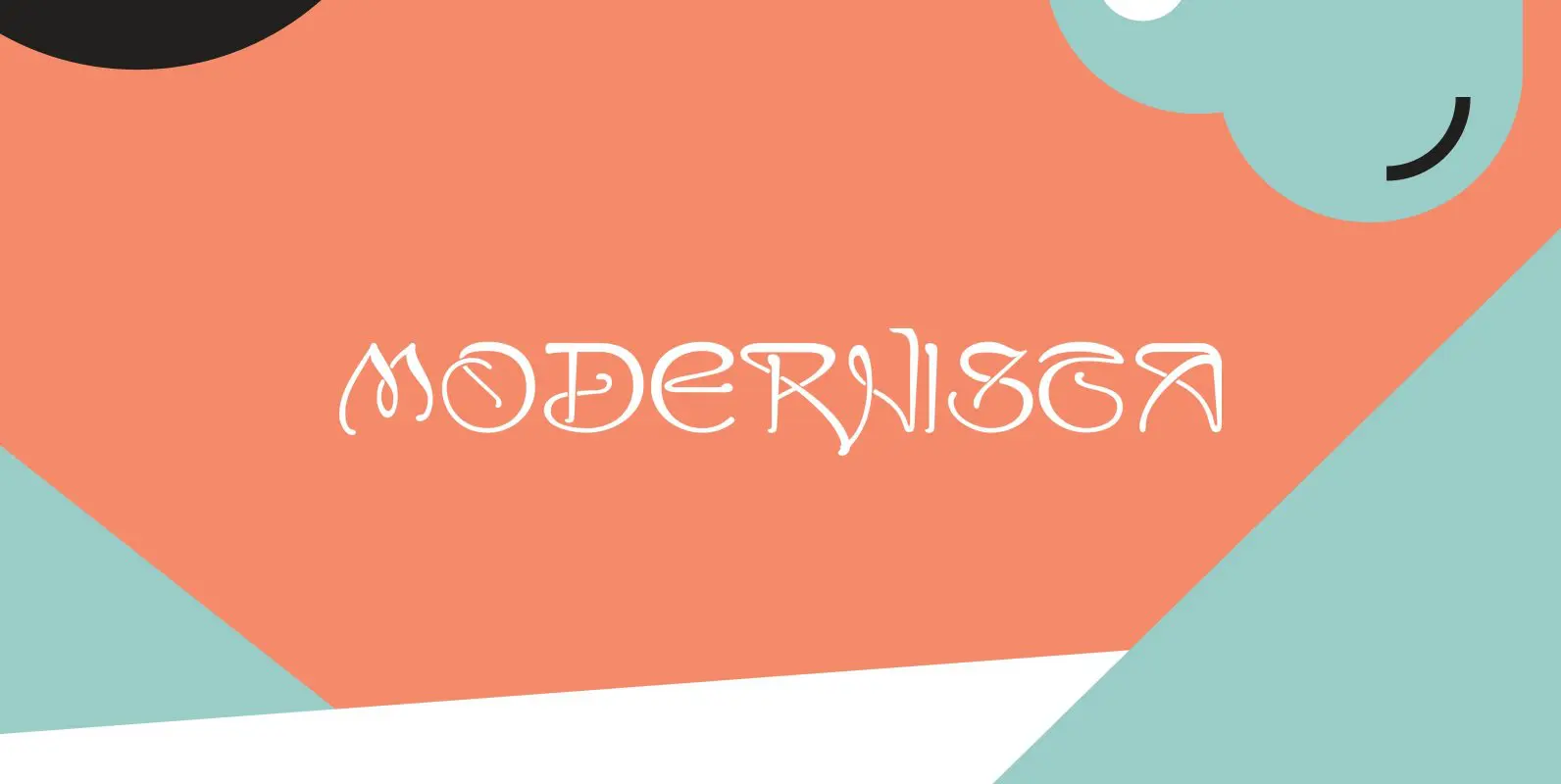
Modernista Font
“Art Nouveau” happened over Europe under different names. They called it “Jugenstil” in Germany, “Le style moderne” in France, »Sezessionsstil« in Austria and Eastern Europe, “Stile Liberty” in Italy and “Modernista” in Spain. “Jugendstil” in Germany is what started modern
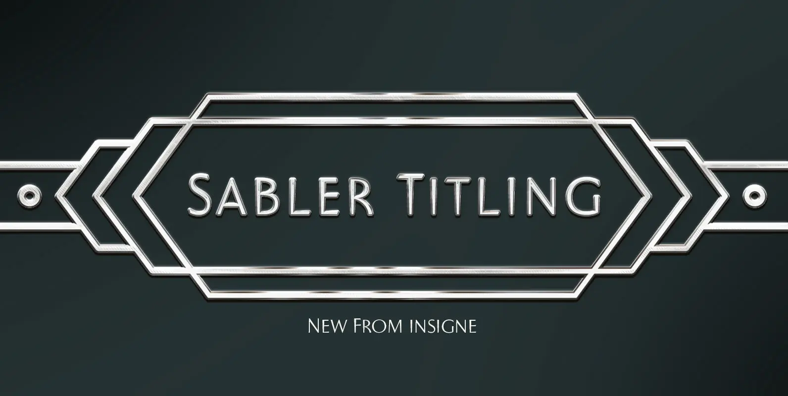
Sabler Titling Font
Make the right statement with the elegant Sabler Titling. This showstopping font features an inherent grace combined with the classic style of the Art Deco period. The subtle beauty of its letters is highlighted by the typeface’s stems, which taper
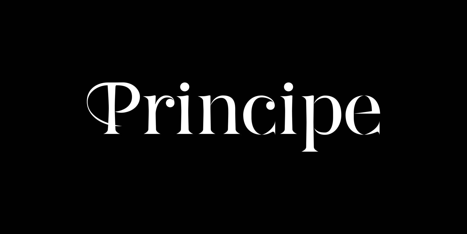
Principe Font
“Principe” is the Bodonian idea driven to the limit by abolishing most of the hairlines! The shape is completed only by the eye of the reader. This gives room for elegant embellishments and makes for a surprisingly new look to
Eleganza Font
“Eleganza” is my most elegant typeface. At least that is what I think! I use it for business cards and everything that has to be elegant with that extra touch. The font comes in pairs for the price of one.