Tag: tabular
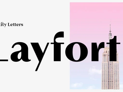
Layfort Font
What do you get when you cross Industrial Revolution with Art Déco? The raw force of steam-powered vessels with the panache of dashing streamliners? A sturdy industrial grotesque with a swanky stylized sans? We don’t know, but our Layfort is
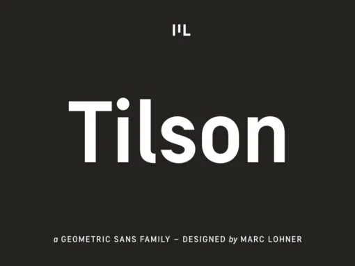
Tilson Font
Meet Tilson, a versatile workhorse family for both texts and headlines based on a geometric and straight-lined design. It will give your apps, websites, logos, posters and so much more a techy and masculine look and feel. However, some friendly
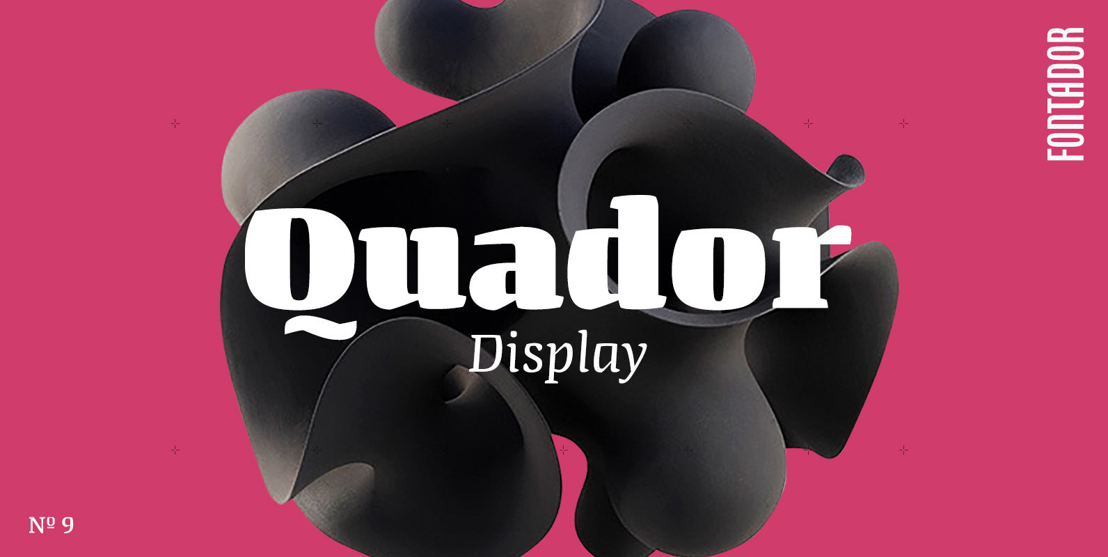
Quador Display Font
Quador Display is a serif, especially designed for contemporary typography on print and screen. The superellipse-based forms and high x-height allow large and open letterforms, perfectly adapted to the pixel grid on screen. The font contains 6 weights from light
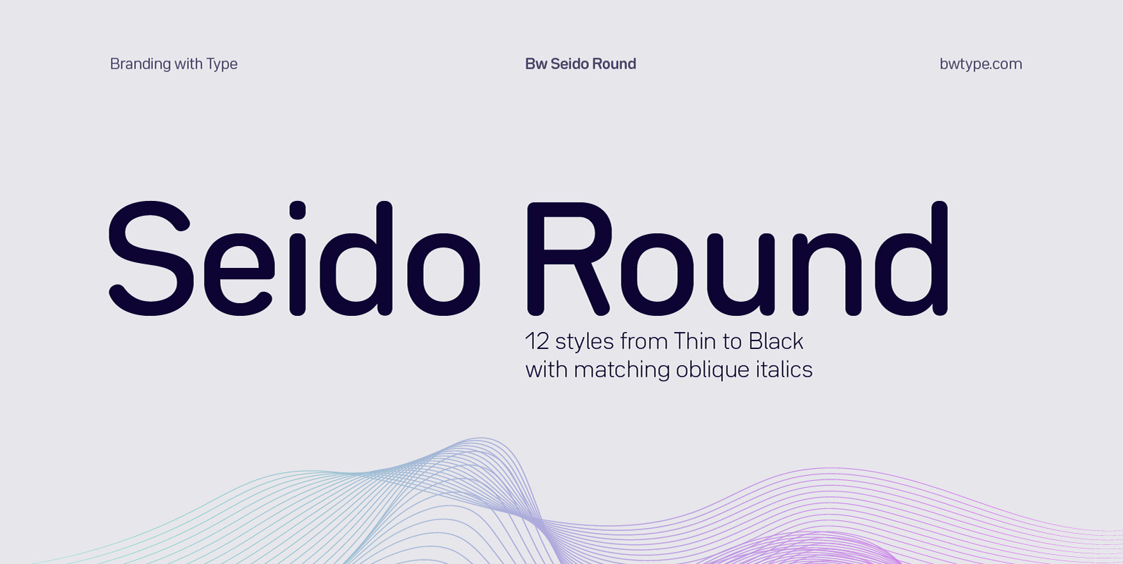
Bw Seido Round Font
Designed by Alberto Romanos, Bw Seido Round is a semi condensed font family with rounded corners striking a gentle balance between minimal strict geometry and typographic refinement, conveying a subtle industrial yet friendly feel. It consist of 12 styles (6
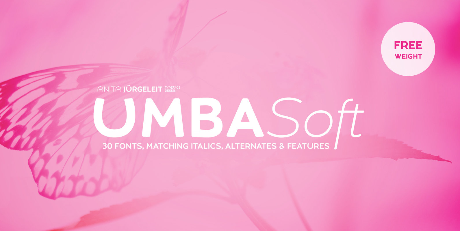
Umba Soft Font
The best thing about Umba is its surprise! UMBA Soft is a mellow sans serif typeface designed by Anita Jürgeleit. It soothes your design and helps to create to balance your visualization. Do you need a type for young cosmetics
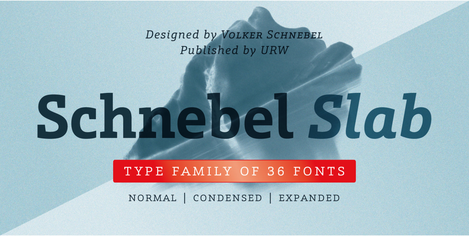
Schnebel Slab Font
Schnebel Slab is a refreshingly clear and strong interpretation of a contemporary Antiqua with subtle contrast and firm serifs, which offer excellent readability at very small size, and, at the same time, provide a lot of expression for use in
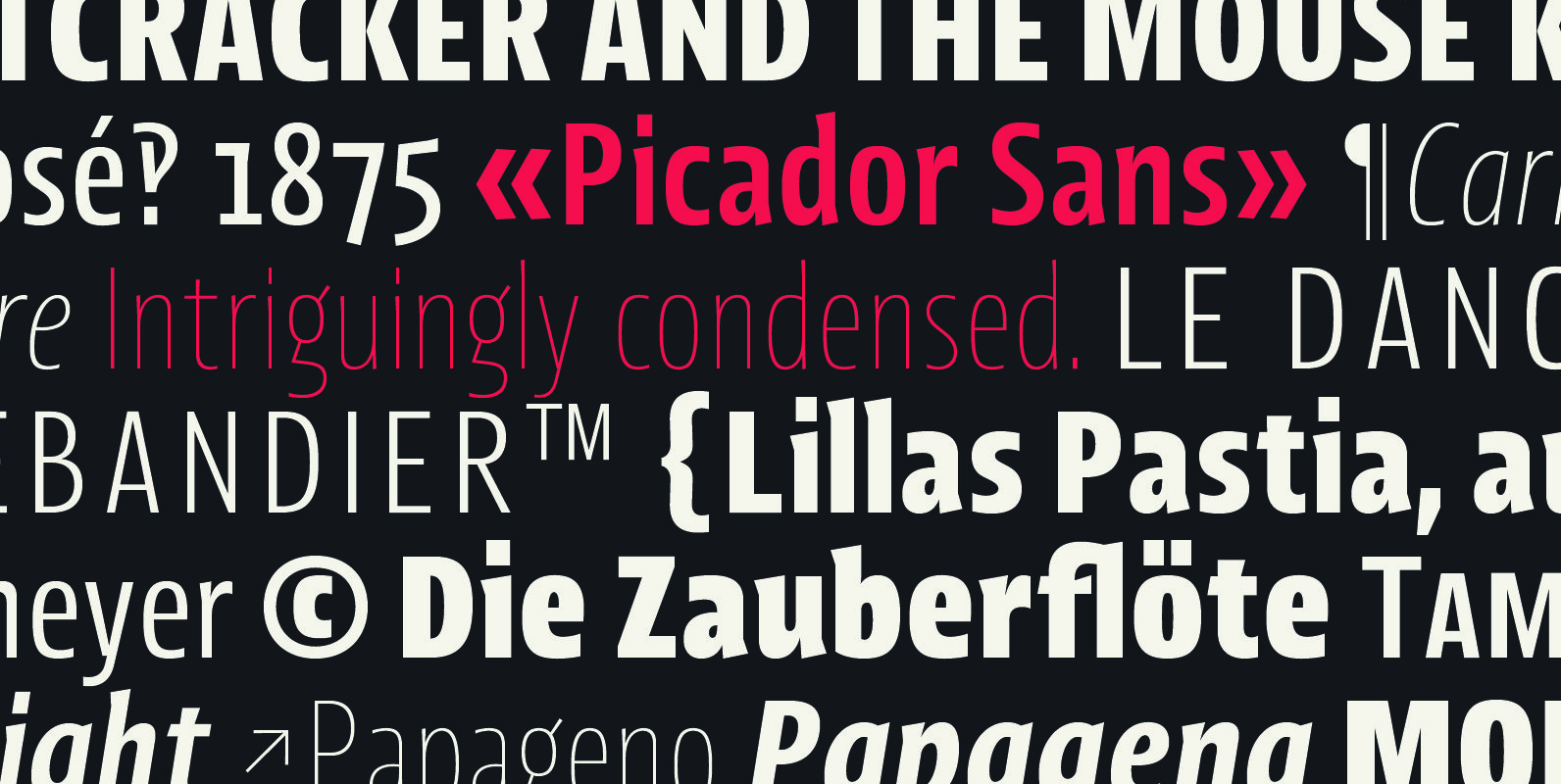
Picador Sans Font
Picador Sans is a modern sans serif typeface. Intriguingly condensed. Distinctively eye-catching. Interestingly well-developed. This family covers latin script – every weight has more than 1200 glyphs. The whole family consist of 10 weights and italics, small caps, superscript and
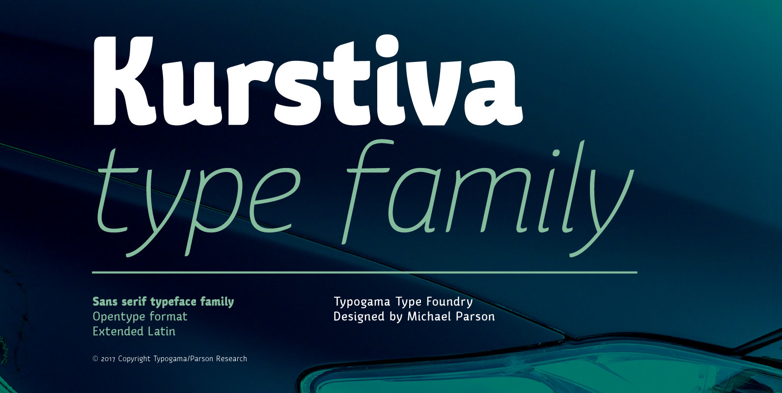
Kurstiva Font
Kurstiva is a narrow, sans serif typeface family available in ten weights ranging from a hairline, thin weight to a dark, black style. Conceived as a contemporary text face, this typeface aims to convey a strong personality while remaining very
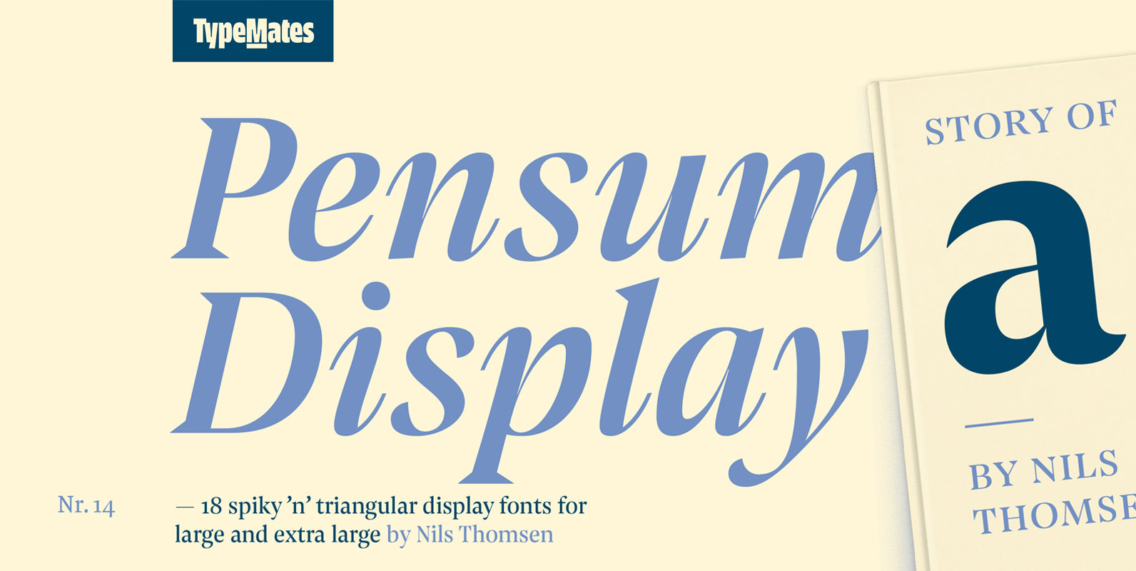
Pensum Display Font
Pensum Display is the triangular and spiky packmate of text monster Pensum Pro. Designed to be used for anything big and for nothing that isn’t big, Pensum Display is a sharp, high contrast design ready to take on display and
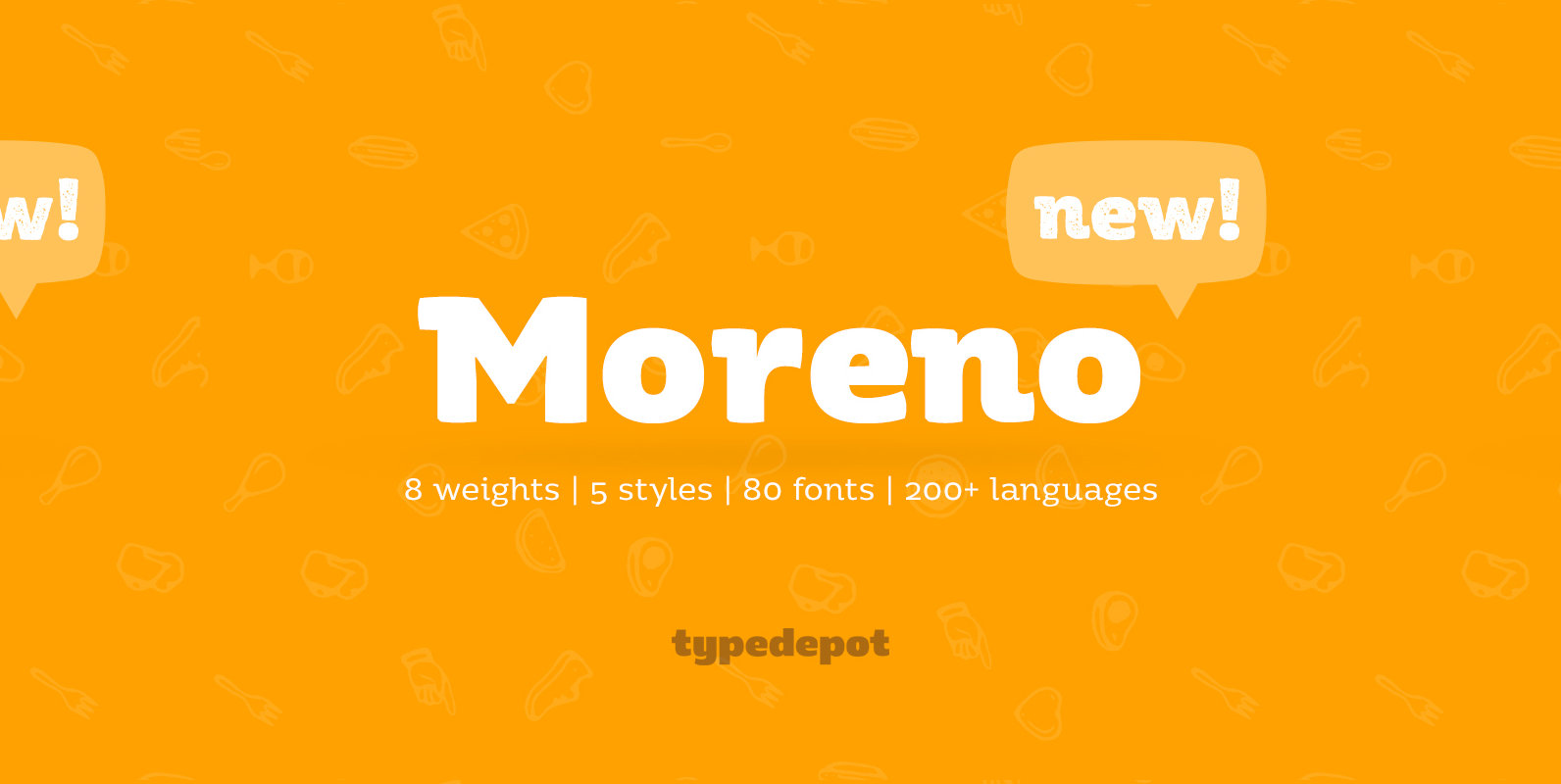
Moreno Font
Meet Moreno – a semi serif typeface full of personality and flavor. A display typeface in its nature Moreno is free and informal yet stable and trustworthy. Moreno comes with extensive OpenType support – with its more than 15 Opentype
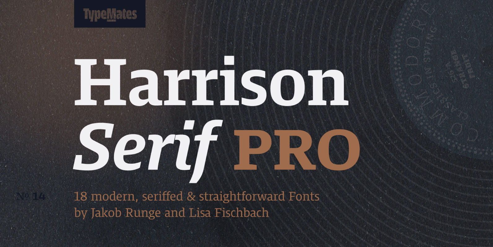
Harrison Serif Pro Font
Harrison Serif Pro is a sturdy yet contrasted slab serif that combines a rational and efficient approach with a warm voice. A typeface of nuances, the slightly carved and occasionally extended serifs evoke the friendly side of Harrison Serif and
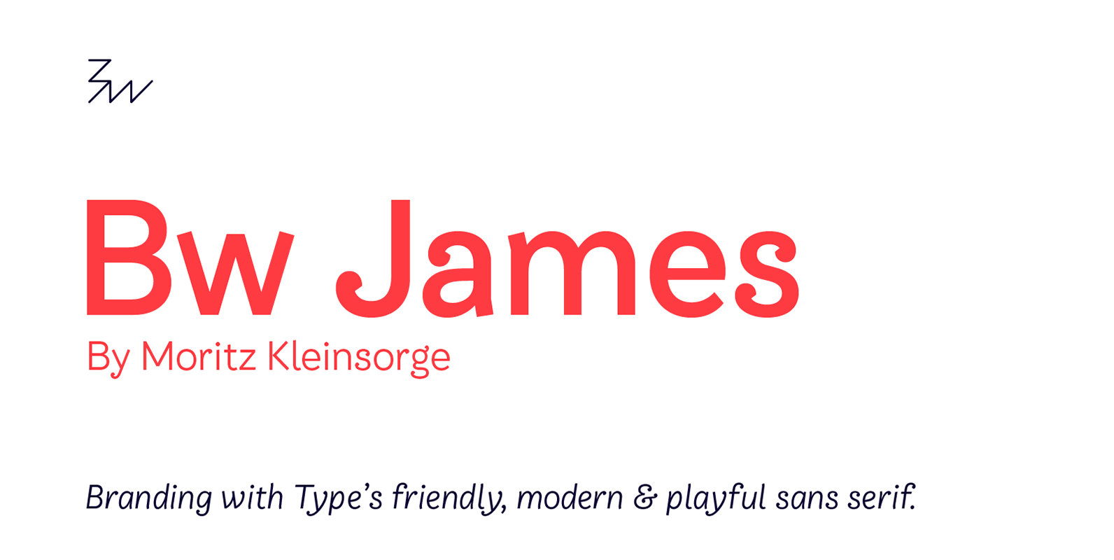
Bw James Font
Designed by Moritz Kleinsorge, Bw James is a friendly and playful sans serif: The angled stems, branching spurs and ball terminals all contribute to a personable and friendly mood, while the mono-linear body makes the typeface appear fresh and modern.
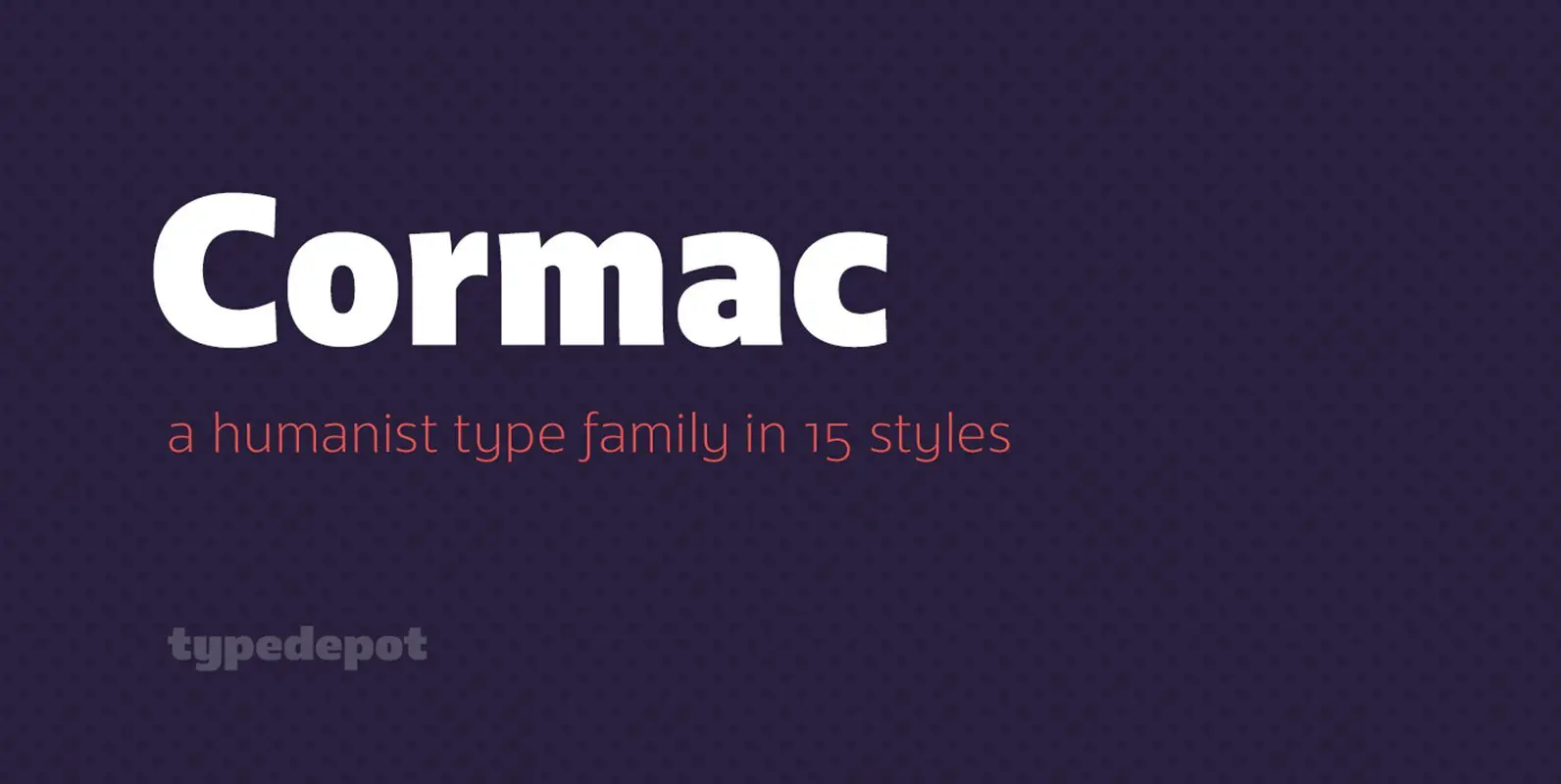
Cormac Font
Cormac is a humanist typeface characterized with it’s large x-height and slightly flared stems. The word that best describes our ideas in the beginning of the project is “simple” – the idea behind it was to strip the letter forms
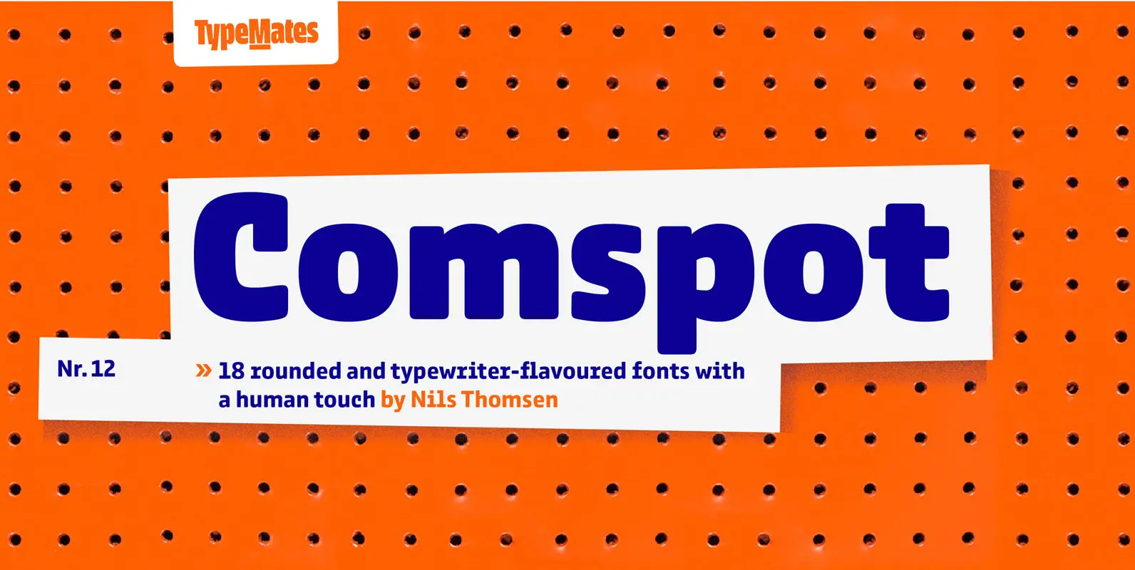
Comspot Font
Comspot is a rounded, typewriter-flavoured font family with a human touch. Originally designed as a custom typeface Comspot’s nine weights — razor-thin hairline to ultra black — and 14 stylistic alternates fulfil every need, from extended to display text. Comspot’s
Odisseia Font
Plau presents Odisseia, a monospace type family in 8 styles designed with simplicity of shapes and a humanist touch. We’ve ventured into monospace territory, where all letters must occupy the same amount of space. This style is usually associated with
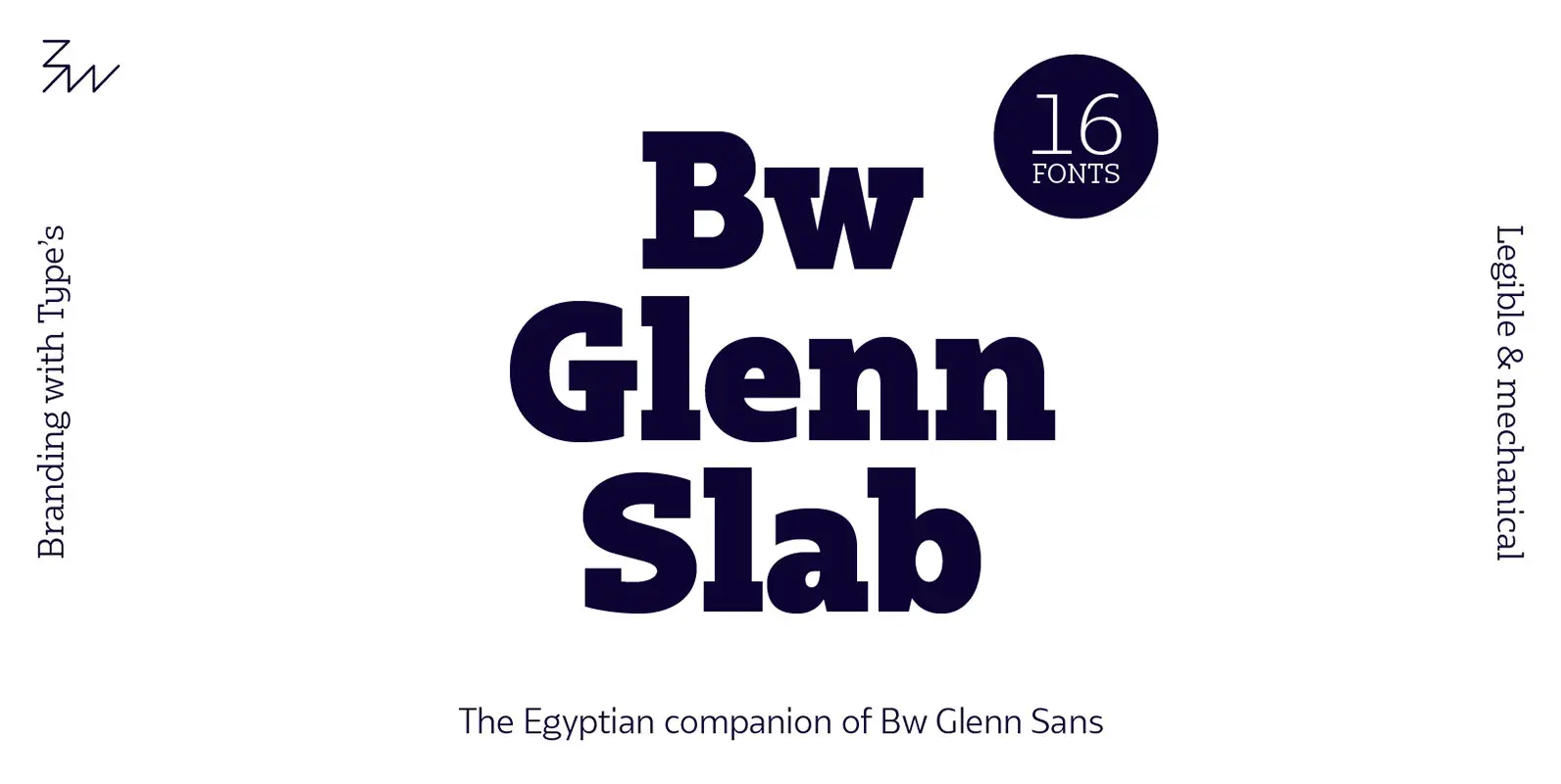
Bw Glenn Slab Font
Bw Glenn Slab is a confident and robust font family with a sturdy feel offering no concessions for ambiguity. Its strict geometry and open shapes provide a very legible and clean texture, performing well on print and screens alike. It’s
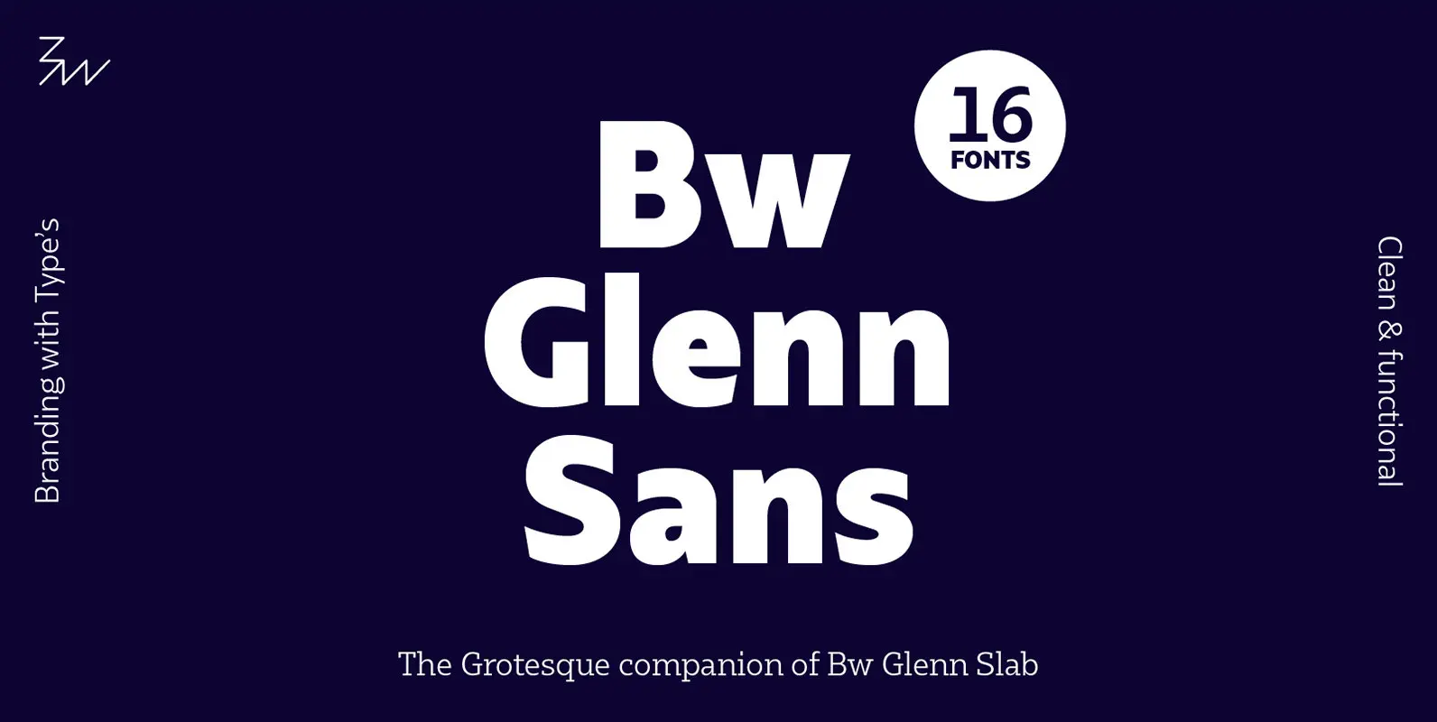
Bw Glenn Sans Font
Bw Glenn Sans is the result of mixing a grotesque skeleton with traits of the British sans serif tradition. The result is a modern and clean sans serif family that speaks with clarity and authority. Its contained width makes it