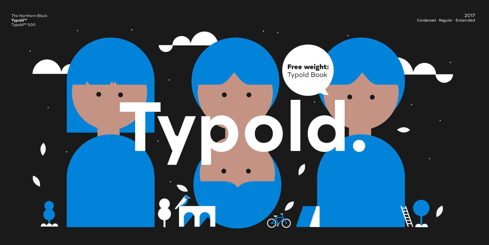
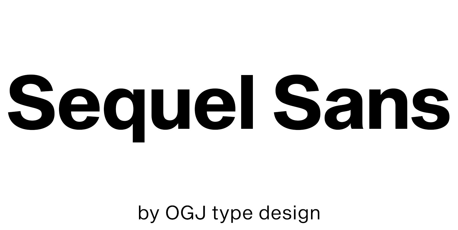
Tag: swiss

Brother 1816 Font

This year we commemorate the 200th anniversary of the first sans-serif typeface. and what better way to celebrate, than to design our own sans-serif! Brother 1816 is a very flexible, multifaceted and solid typeface, mixing Geometric shapes with Humanistic strokes

Sequel Sans Font

Sequel Sans is an homage to Max Bill, the influential mid-century Swiss architect, artist and industrial/graphic/type designer. Designed in cooperation with the Max Bill Georges Vantongerloo Foundation in Zurich, this is a modern response to the traditional Max Bill themed

Typold Font

Typold originated out of the desire to improve, geometric forms and push beyond previous achievements through collaborative working methods and knowledge sharing. The result is a finely balanced modern sans serif constructed from mathematical inputs, typographers needs, and the natural

Segaon Font

Segaon Family is a humanist sans-serif typeface that is clean, simple and highly readable. The spaces between individual letter forms are precisely adjusted to create the perfect typesetting. Segaon is versatile type family of 18 fonts. Segaon family consists of

Geon Soft Font

Geon Soft is the rounded version of Geon. Geon Soft Family is a modern sans-serif typeface that is clean, simple, soft and highly readable. Letters in this type family are designed with geometric shapes without any decorative distractions. The spaces

Segaon Soft Font

This family is the rounded version of Segaon family. Segaon Soft Family is a humanist sans-serif typeface that is clean, simple and highly readable. The spaces between individual letter forms are precisely adjusted to create the perfect typesetting. Segaon is

Trump Gothic Pro Font

Trump Gothic is a reconception of ideas from Georg Trump's seminal 1955 Signum typeface and its later reworking (Kamene) by Czech designer Stanislav Marso. Originally cobbled together for a variety of film projects in the late 1990s and early 2000s,

Studio Sans Font

StudioSans — is a modern representative of the class of sans-serif fonts inspired by the traditional Swiss design and typography of the mid 20th century. This is a minimal, clean and open font family with friendly forms. Focuses on functionality,

Artico Font

Artico Family is a modern sans-serif typeface that is clean, simple and highly readable. Letters in this type family are designed with genuine neo-grotesque and neutral shapes without any decorative distractions. The spaces between individual letter forms are precisely adjusted

Bw Gradual Font

Bw Gradual brings together the pragmatic feel of the geometric grotesque genre with the visual appeal of its very deep joins. Pure shapes and fast curves coexist on this versatile font family that claims for attention when used large, but

Integral CF Font

INTEGRAL CF is designed for maximum visual and emotional impact. Its six weights excel in posters, social media, headlines, titling, large-format print – and anywhere else you want to be noticed. Hidden among the straight lines and corporate confidence is

Trump Soft Pro Font

Trump Soft Pro is the softer, round-cornered version of Trump Gothic Pro, the popular condensed gothic seen on films, magazines, book covers and fashion brands all over the globe. Trump Soft offers a friendlier grade of the same economic functionality,

Neutrif Pro Font

Neutrif Pro is a modern style sans serif, designed for flexibility, proportions and better balance with carefully crafted diacritics and extensive kerning for a Grotesque typeface. Inspired from Geometric sans-serif typefaces and modernism style Neutrif Pro™ was a Grot constructed