Tag: superfamily
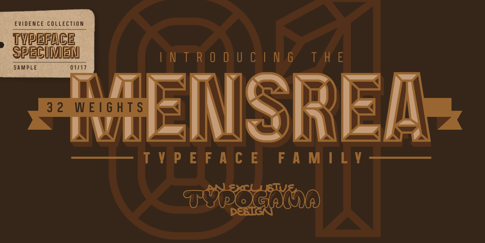
Mensrea Font
Mensrea is a versatile display and text superfamily combining 32 different styles into a urban, street, themed design bundle. Based on a functional and condensed sans serif, Mensrea equally includes a large range of complimentary weights that can either be
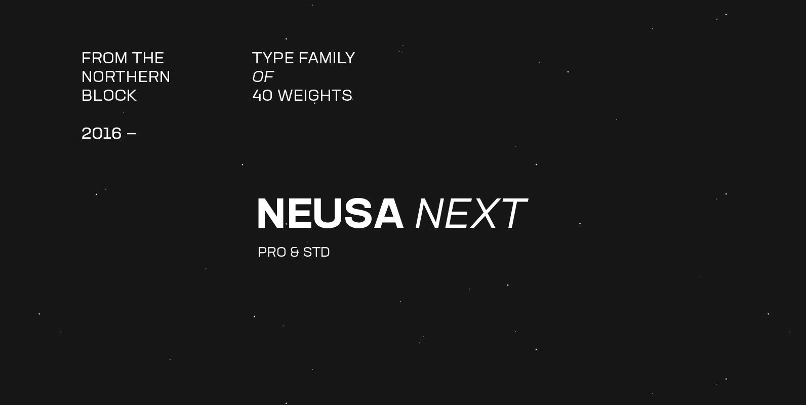
Neusa Next Font
Neusa Next is a geometric sans serif type family designed by Maria V. Pigoulevskaya. Its wide range of weights, widths and matching italics provides the designer with a complex and rich typographic palette. Designed and released as Neusa in 2012,
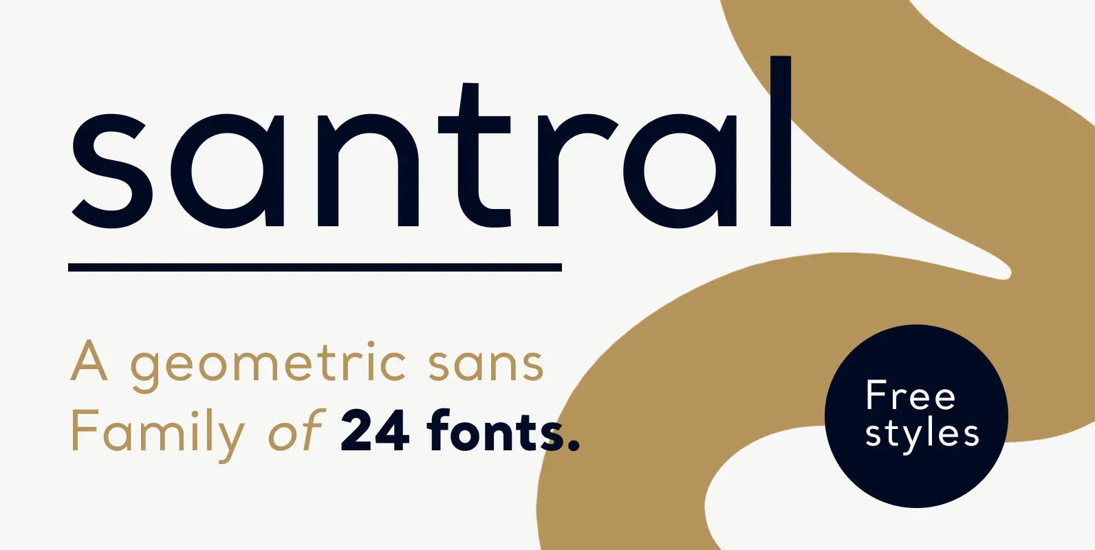
Santral Font
Santral typeface has been designed with the idea of achieving the ideal balance of geometrical perfection and optical impression. The sharp and precise design of Santral leads to a clear and reliable communuciation with the reader. 12 weights and italic
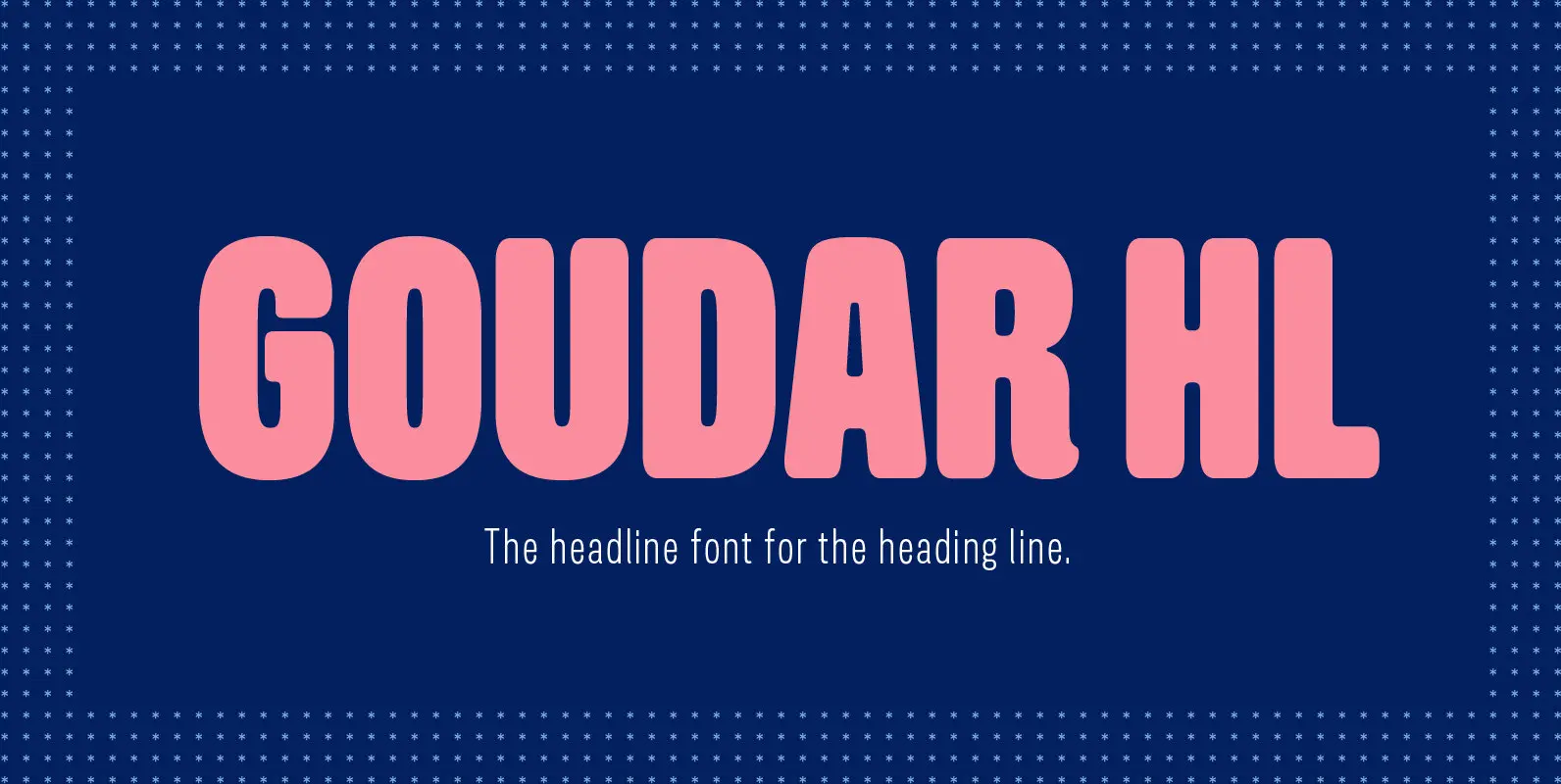
Goudar HL Font
From the old days technique to the present technology of type design, Gouda is the font that meets in the middle. With the design that has acquired the essence of wooden type letterpress but added with our own modern twist.
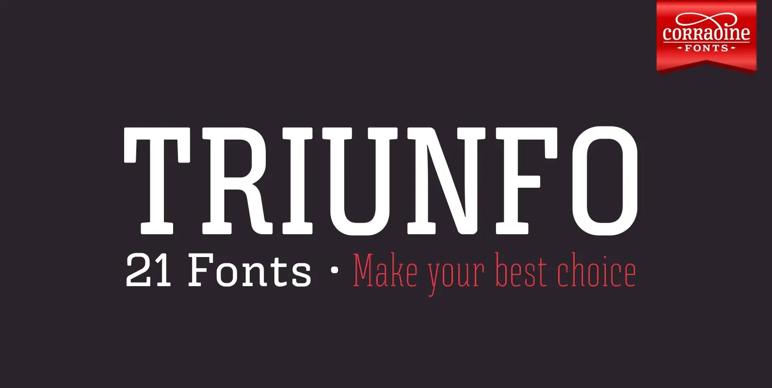
Triunfo Font
Triunfo is a modern slab serif font family with sports flavor. It comes in 21 variants of weight and wide that allows you to choose the best option to use in your work. Published by Corradine FontsDownload Triunfo
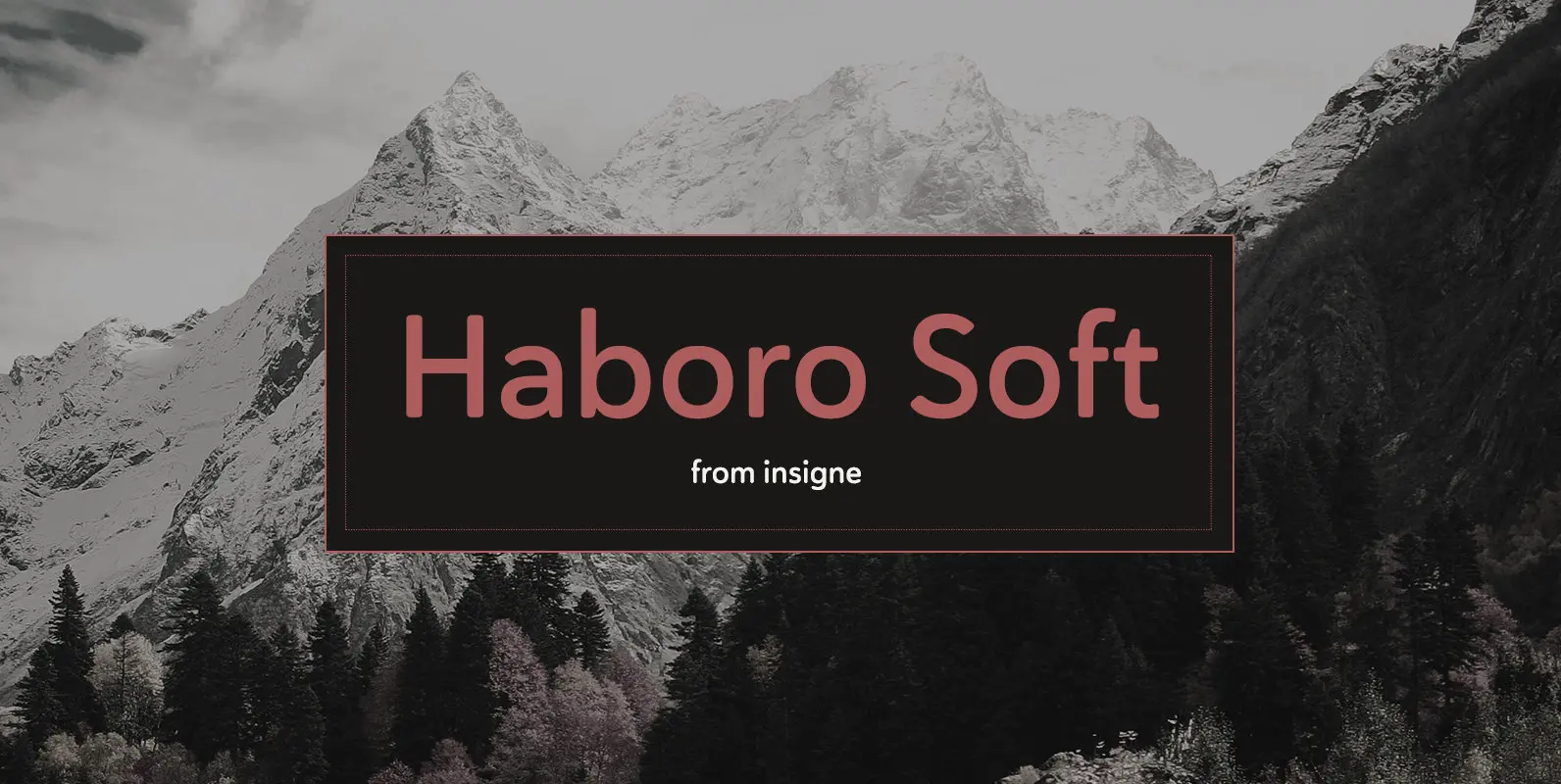
Haboro Soft Font
Stop trekking through the thick, wintery font forest, and step lightly into the fresh life of the Haboro hyper family. Though simple in nature, the Haboro hyper family provides you with a variety of options. Take, for instance, Haboro Soft,
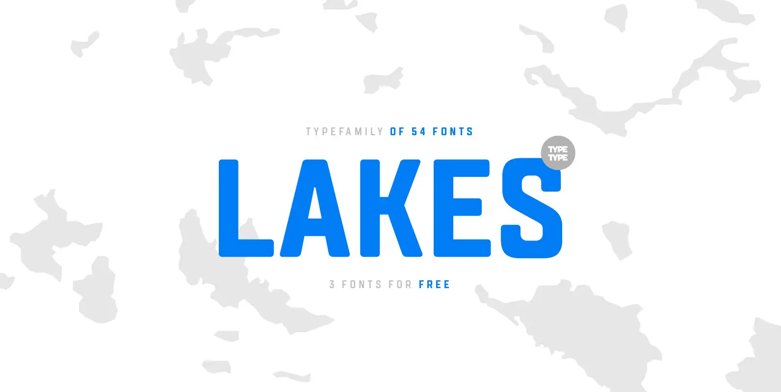
TT Lakes Font
The idea for this font emerged in the city of Priosersk, which until World War II was a Finnish city called Kakisalmi. At the city museum we came across an unusual sign plate with the former name of the railway
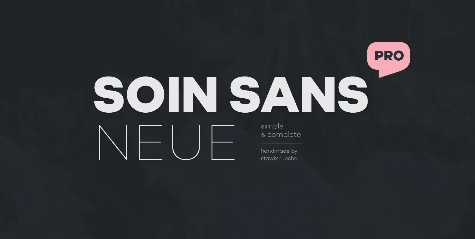
Soin Sans Neue Font
10 hours a day for almost as long as one anniversary of the Olympics to harvest the experience of designing many typefaces, thinking process and refining the craftsmanship throughout these years. From Soin Sans that has been designed and released
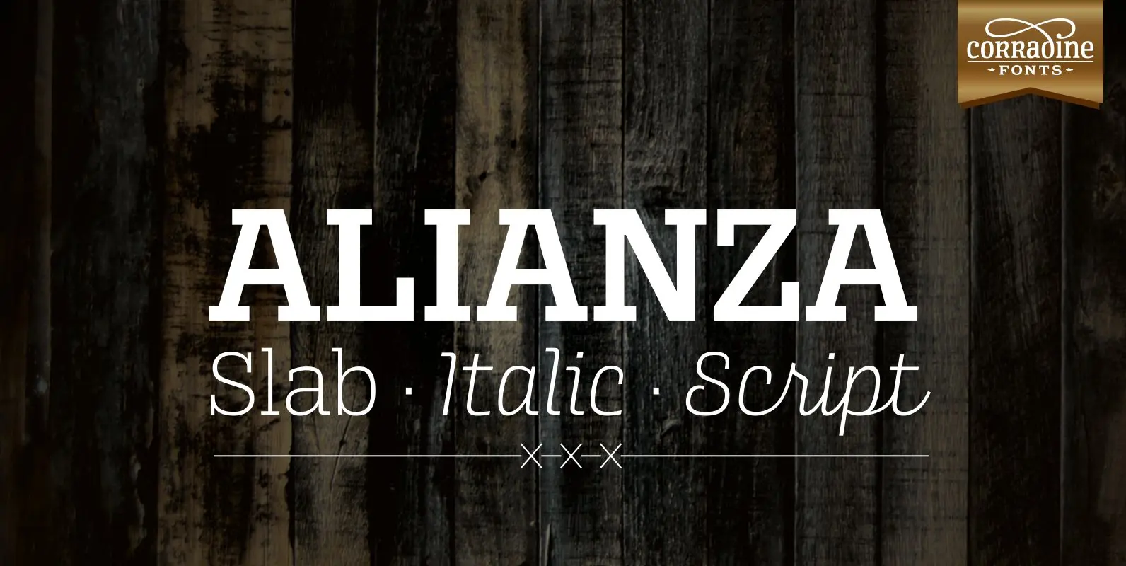
Alianza Font
This is a complex typographic system which includes three different but complementary styles so far: Slab, italic and script, with nine weights each one; plus three sets of ornamental fonts: labels, negative labels and ornaments. The soul of the family
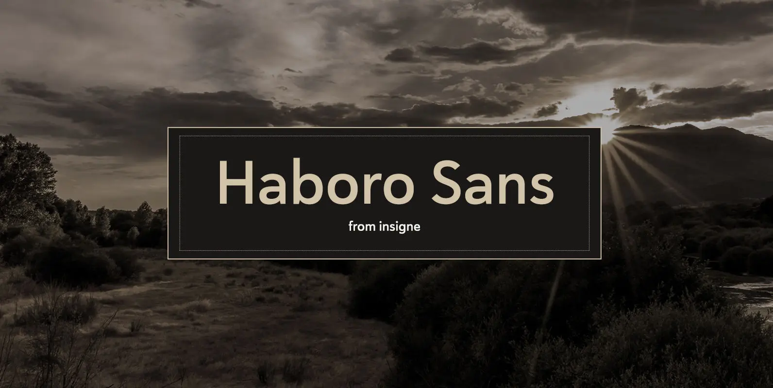
Haboro Sans Font
Quit trudging through the thick with encumbering fonts, and spring to the front of the pack with the cutting edge sans serif, Haboro Sans. With nothing to clutter up your work, your editorial designs, websites, and software will be sharp
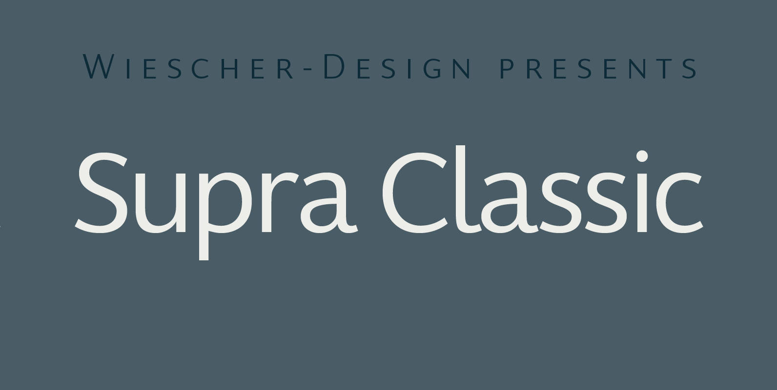
Supra Classic Font
“Supra Classic” designed by Gert Wiescher in 2014 – has 10 weights with corresponding italic cuts. The designs elegant contrast in the up- and downstrokes makes for better legibility and a pleasing personality. The dominant x-height with its high ascenders
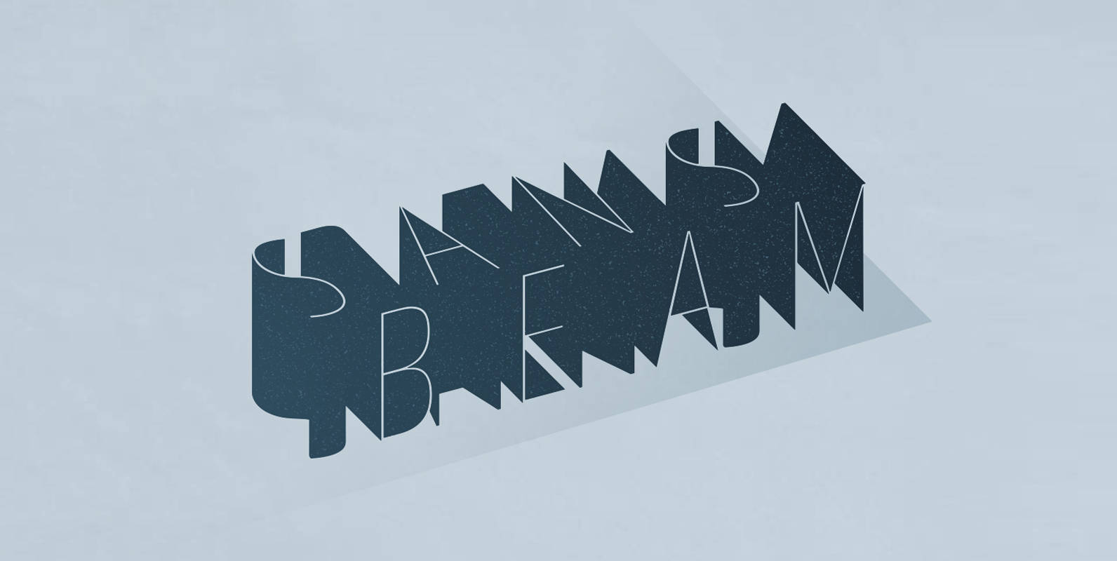
Sans Beam Font
After releasing Amsi in 2015, this year Sans Beam is now ready to launch with the design that support many different usability from Headline to Body text, and specifically designed to be compatible with other font families of Stawix Foundry.
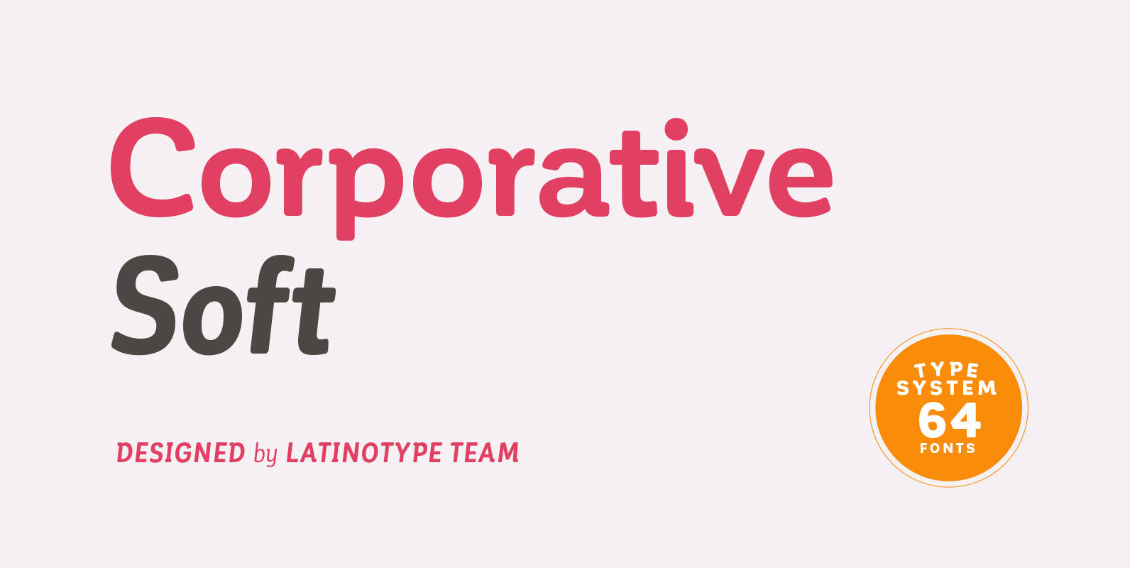
Corporative Soft Font
Corporative Soft is the slightly rounded-edged version of Corporative. This font has a marked personality and distinctive traits, what makes it suitable to be used at large text sizes. At the same time, the smooth transition from straight to curved
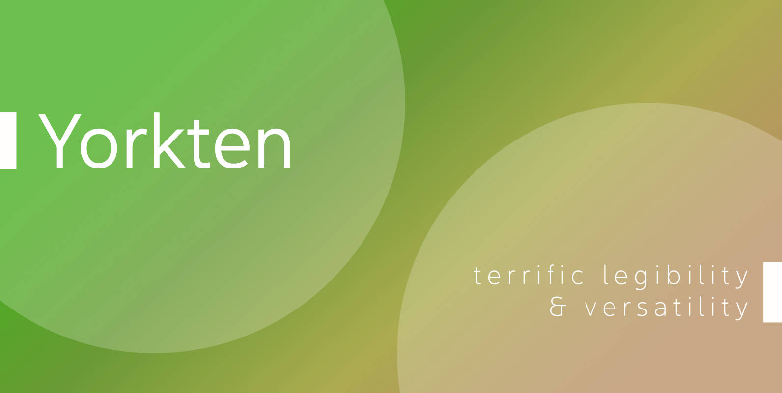
Yorkten Font
Clean and welcoming, the distinct look of Yorkten is remarkably satisfying to the eye. Straight to the point, Yorkton features a fashionable, geometric composition with angled main stems. There are no fewer than fifty-four fonts in the family, all of
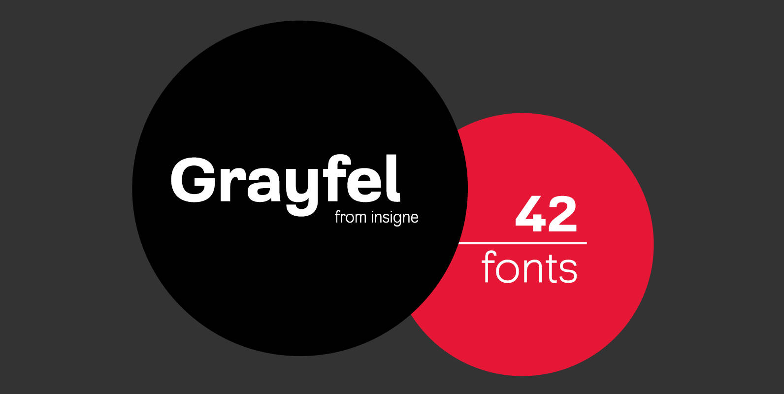
Grayfel Font
As designers, we seek perfection and originality. The more we step back and look at our work, the more changes we tend to find necessary. Drastic modifications are inevitable. The same is true of Grayfel. Grayfel began as an exercise
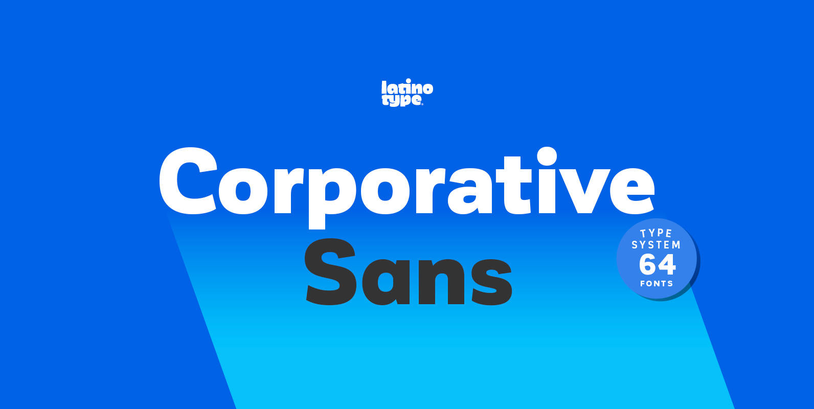
Corporative Sans Complete Family Font
Corporative Sans typeface is developed by Latinotype Team. Corporative Sans is the new version of Corporative. This font has a marked personality and distinctive traits, what makes it suitable to be used at large text sizes. Since it is a
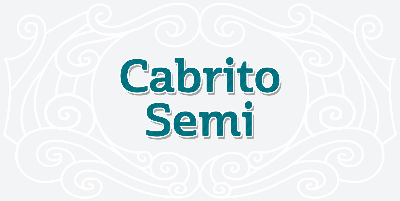
Cabrito Semi Font
Relax. Deep breath. And step away to font nirvana with Cabrito Semi. Like its Cabrito relatives, Semi’s handwriting-inspired feel is mellow and care-free. But don’t misunderstand us. Even with its fun-loving peculiarities, this free spirit will command whatever party you