Tag: standard
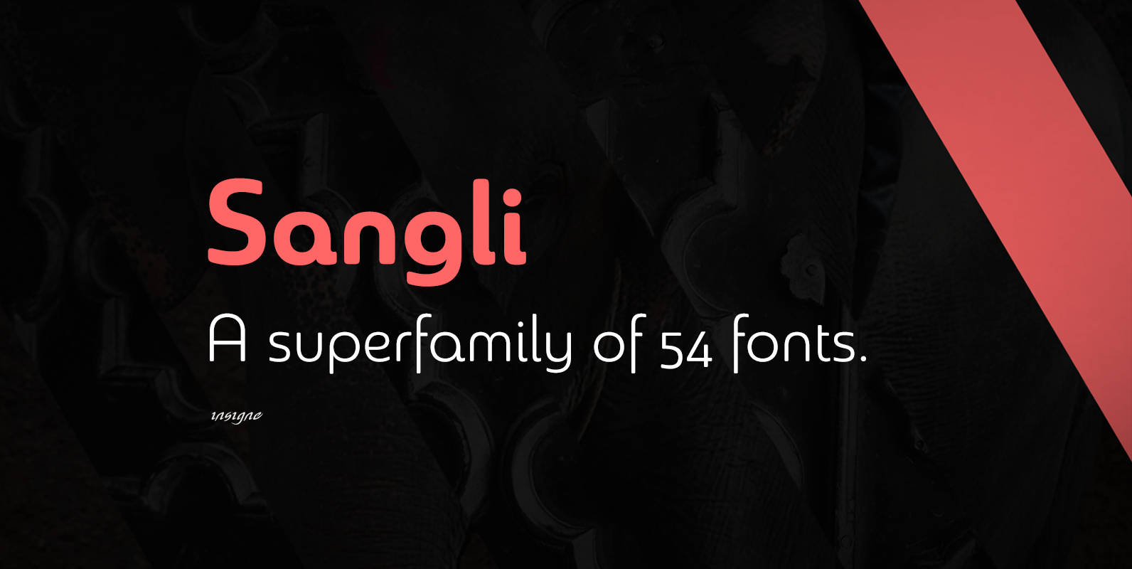
Sangli Font
It started in 2007 with Chennai, the first of a three-part series of sans that I envisioned with slab serif counterparts. Each font would differ from the others in how the stem terminals were expressed. The initial font was extremely
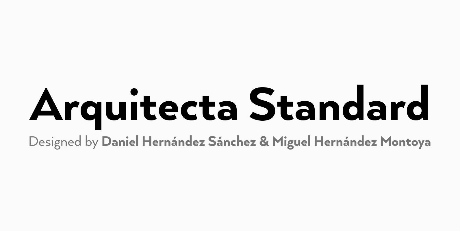
Arquitecta Standard Font
Arquitecta Standard. The humanist typography as a rational project. Since the experimentation from the Bauhaus through modern sans history we looked for a new mix to construct a rational geometric typeface with humanist proportions suitable for text layout and continuous
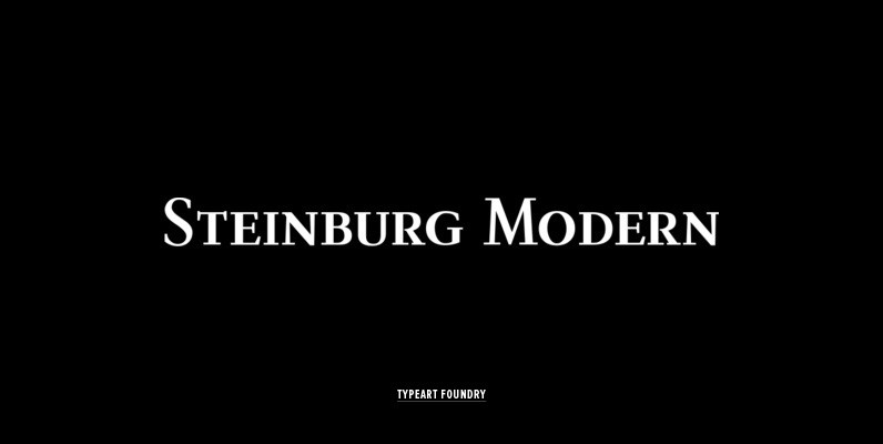
Steinburg Modern Font
Steinburg Modern™ is largely a variation on a Garamond-styled typeface with differences in some character designs and in the overall character proportions. In addition, the curved brackets that were a distinctive part of Garamond’s 16th century design are perhaps the

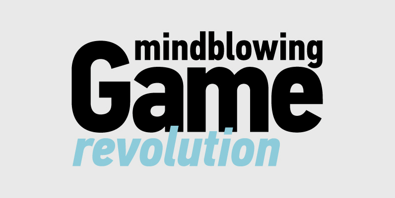
Interval Sans Pro Condensed Font
The new Interval Sans Pro is a pratical choice when you need a contemporary sans serif for text typography, headlines, signage or brands creation. This new version has many more OT features like small caps, ligatures, stylistic set, localized form.
PF Handbook Pro Font
This typeface is the result of an attempt to modernize DIN, by introducing round smooth corners and distinct design elements to several characters like ‘a, g, k, m’, without compromising legibility. In order to retain its sharpness, inner corners as
PF DIN Text Condensed Pro Font
The DIN Text series was based on the original standards but was completely redesigned to fit typographic requirements. Completed in 2002, it was first released in 2003 and published in our catalog, as a group of 4 separate families each
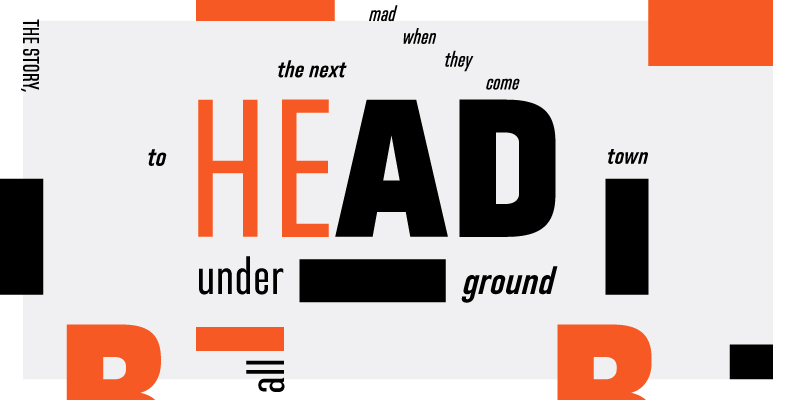
Directors Gothic 220 Font
Handcrafted by Lettering Inc as part of its core library of typefaces in the 1930s, Directors Gothic was dramatically expanded throughout the lifetime of the company and remains a timeless classic. Inspired by the Art Deco movement popular at the
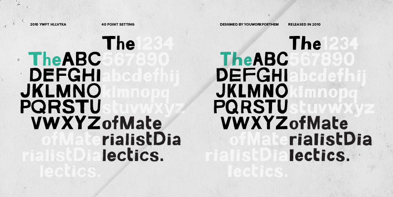
YWFT HLLVTKA Font
With great pride, we present this hand-drawn alphabet in both upper and lower case, derived from the beloved standard of all existing things: Helvetica. Originally hand drawn in 2007 by YouWorkForThem, we revisited these drawings in 2010 and developed them

PF DIN Display Pro Font
DIN Display was designed as an alternative to Parachute’s Din Text series. While Din Display seems to retain DIN’s basic characteristics, it shines with its sharper corners and contemporary look. Completed in 2002, it was first released and published in
Directors Gothic 250 Font
Handcrafted by Lettering Inc as part of its core library of typefaces in the 1930s, Directors Gothic was dramatically expanded throughout the lifetime of the company and remains a timeless classic. Inspired by the Art Deco movement popular at the
PF DIN Text Compressed Pro Font
In 1936 the German Standards committee Deutsches Institut Normung (DIN) proposed DIN 1451 as the standard type of lettering to be used in the field of road traffic. The purpose of this standard was to lay down a style of

PF DIN Monospace Font
PF Din Mono is the latest addition to the ever-growing set of DIN superfamilies by Parachute. It was based on its proportional counterpart DIN Text Pro but was completely redesigned to reflect its new identity. DIN Mono is a monospace
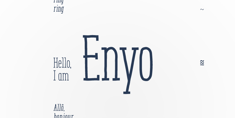
Enyo Serif Font
Enyo is a decorative, display, serif handwritten font. This font will provide an informal look to your work! It can be used for small ammount of text, and specially for display usage because of its glyph quality. Enyo offers OpenType
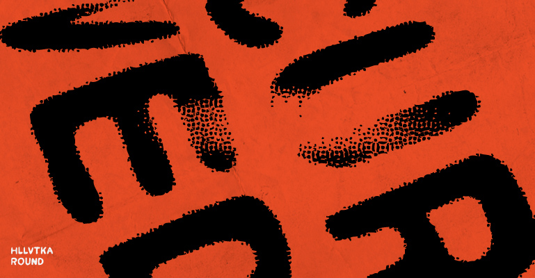
YWFT HLLVTKA Round Font
With great pride, we present this hand-drawn alphabet in both upper and lower case, derived from the beloved standard of all existing things: Helvetica. Originally hand drawn in 2007 by YouWorkForThem, we revisited these drawings in 2010 and developed them

Interval Sans Pro Font
The new Interval Sans Pro is a pratical choice when you need a contemporary sans serif for text typography, headlines, signage or brands creation. This new version has many more OT features like small caps, ligatures, stylistic set, localized form.
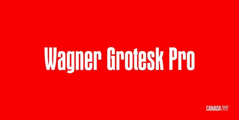
Wagner Grotesk Pro Font
This is the elaborate digital version of Edel Grotesque Bold Condensed (also known as Lessing, Reichgrotesk, and Wotan Bold Condensed) a 1914 typeface by Johannes Wagner, which was later adopted by pretty much every European type foundry, exported into the
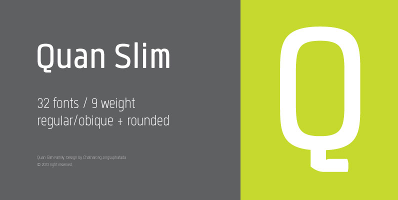
Quan Slim Font
Quan is a humanist, condensed, sans-serif design with rounded design options. Published by TypesketchbookDownload Quan Slim
Directors Gothic 210 Font
Handcrafted by Lettering Inc as part of its core library of typefaces in the 1930s, Directors Gothic was dramatically expanded throughout the lifetime of the company and remains a timeless classic. Inspired by the Art Deco movement popular at the