Tag: smart

Labrador Font
Labrador is a clean sans serif font, a great all-around font design for design studios. Published by TypesketchbookDownload Labrador
Estilo Pro Font
Five years later, DSType proudly introduces Estilo Pro: the Ultimate version of Estilo. Now with sharp edges and five weights, from Hairline to Bold, Estilo Pro includes an extraordinary set of features like Alternate Characters, Initial Swashes, Ending Swashes, Ligatures,
Solido Condensed Font
Solido is a very versatile and usable type system with five widths: Solido, Solido Constricted, Solido Condensed, Solido Compressed and Solido Compact, in a total of 35 fonts with many of alternate characters. Published by DSTypeDownload Solido Condensed
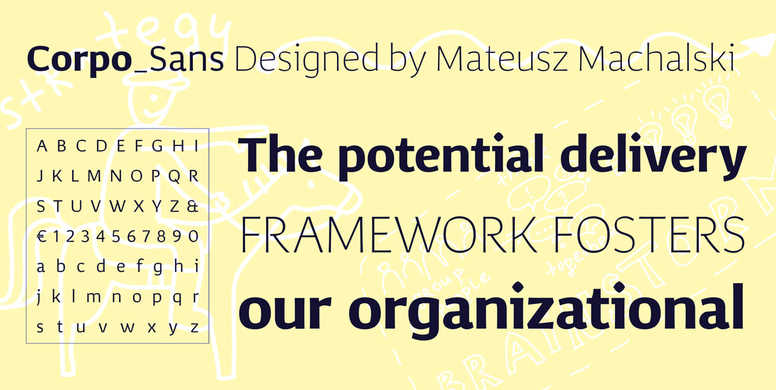
Corpo Sans Font
Corpo Sans is a refreshed version of my old font Korpo_Sans. Corpo_sans, designed by Mateusz Machalski, is a sans type family with a friendly feel. This type comprises 12 variants with 6 weights.The high contrast and high x height is
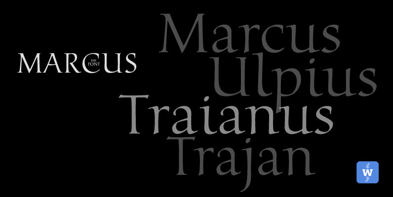
Marcus Font
Marcus, the font, was named after the Roman Emperor Marcus Ulpius Traianus (Trajan) born 18 September 53 in the Roman province of Hispania Baetica (in what is now Spain), a province that was thoroughly Romanized, in the city of Italica.
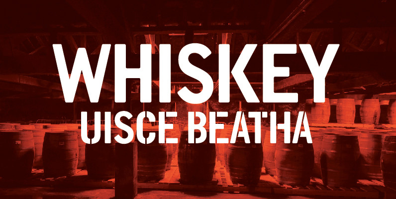
DWC Headline Condensed Font
DWC headline is a font based on the hand rendered type used on Whiskey casks Inspired by the beautiful hand rendered, stenciled and paint forms we found on old Irish and Scottish Whiskey casks, particularly the casks from the Scottish
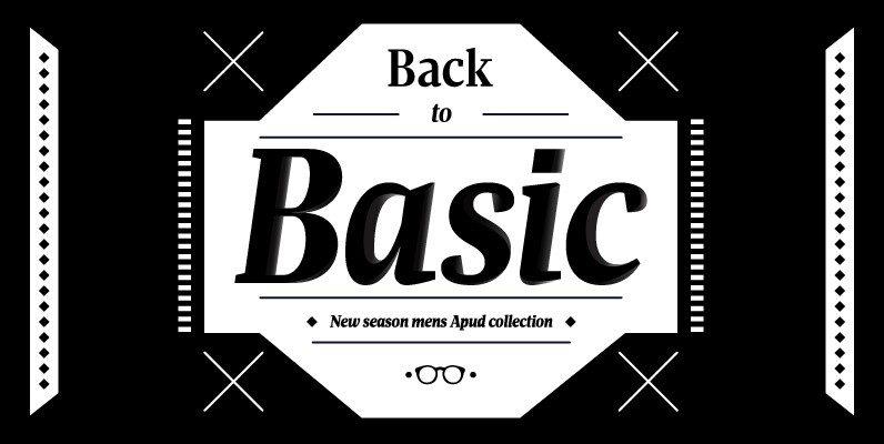
Apud Display Font
Apud Display is the perfect companion for Apud. With it’s refined high contrast and sharpness, Apud Display has the vitality and rigorousness of the modern types, every time you need your display setting to shine. Published by DSTypeDownload Apud Display
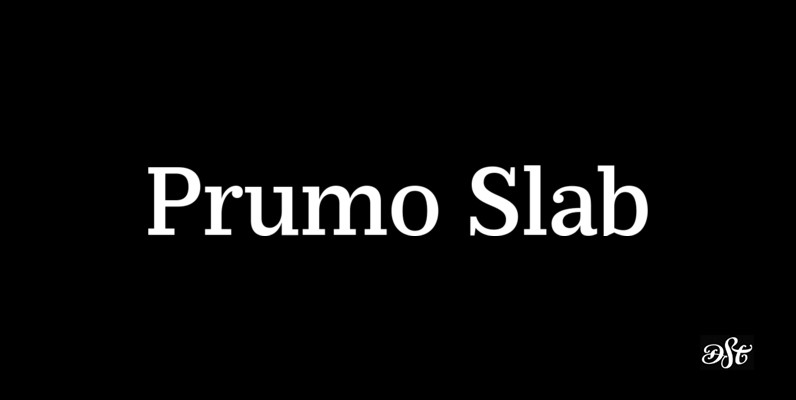
Prumo Slab Font
Prumo is a new type system, based on a unique skeleton that flows, like a pendulum, from high contrast to low contrast fonts, is a sort of typographic journey, from the eighteen century typefaces to the nineteen century slab serif

HAUS Sans Font
HAUS Sans is inspired by Bauhaus and historical grotesk typefaces of the 1930s. Available in 6 weights, from “Ultra Light” to “Extra Bold” regular and italic versions. The font includes 389 gliphs, with subscripts, superscripts, ligatures and support almost all
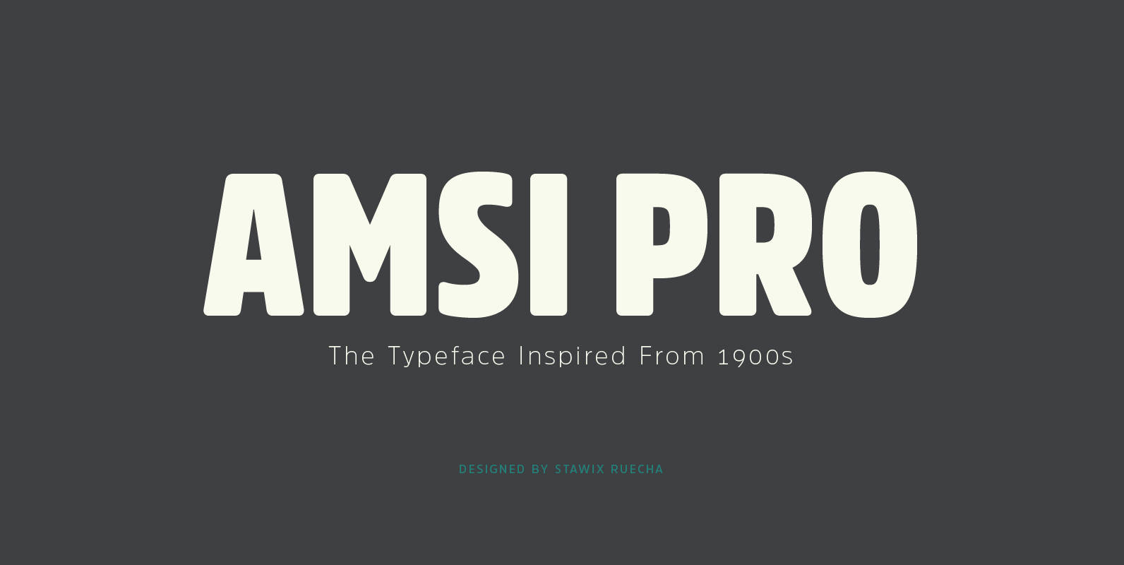
Amsi Pro Font
An unexpected encounter at ArtBasel that uses Block Berthold Condensed as their co-operated logo. It is purely a personal impression towards this particular font. Following the research, it turns out that this font has been around for approximately a hundred
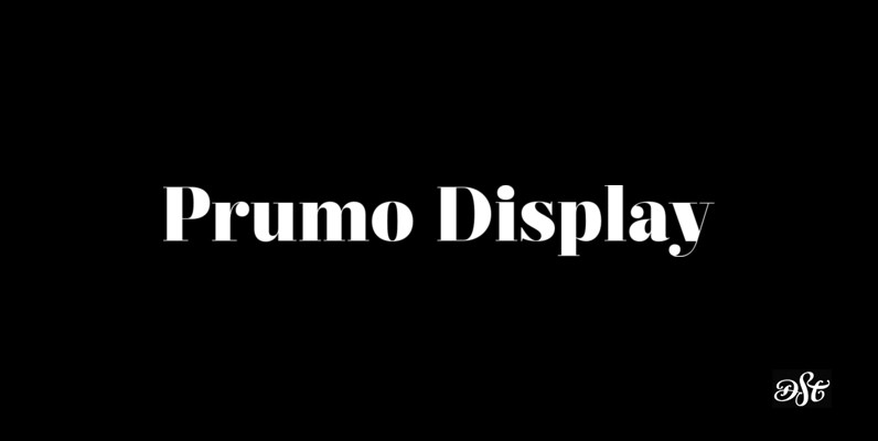
Prumo Display Font
Prumo is a new type system, based on a unique skeleton that flows, like a pendulum, from high contrast to low contrast fonts, is a sort of typographic journey, from the eighteen century typefaces to the nineteen century slab serif

Aries Ranging Figs Font
In 1995, FontHaus came upon a rare opportunity to create a revival of Aries, a little known and previously unavailable typeface designed by the legendary Eric Gill in 1931. Discovering a lost typeface by one of the major designers of
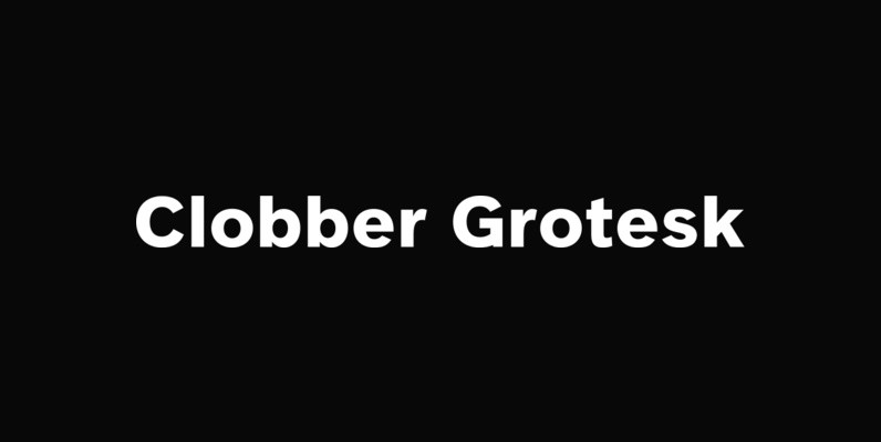
Clobber Grotesk Font
Clobber Grotesk Bold is a grotesk typeface family designed for high readability. It includes a range of weights and stencil variants. The terminals of the letterforms are slightly flared in order to increase legibility. Published by WordshapeDownload Clobber Grotesk
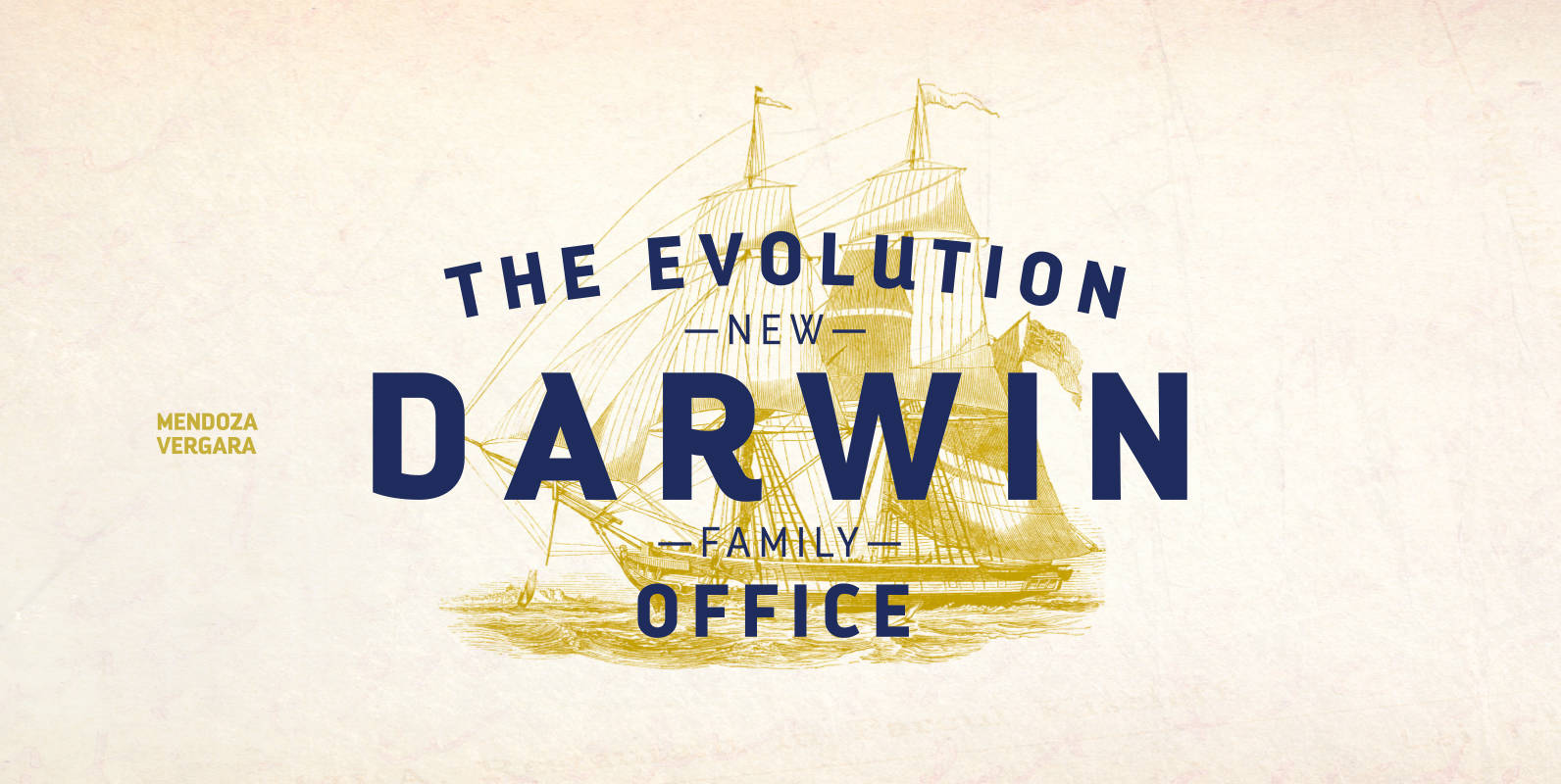
Darwin Office Font
We have adapted the version of our Darwin font for use in Microsoft Office. It only has 4 variants: regular, italic, bold and bold italic. Font weights have been named in a way that can be clearly shown up in
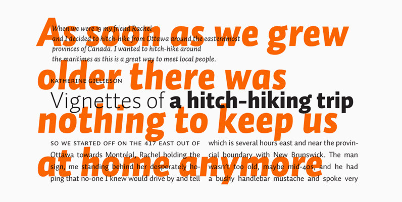
Prelo Font
Prelo was designed to be a neutral, highly readable typeface, for identity, editorial and information design. With nine weights and nine true italics, from Hairline to Black, Prelo is a workhorse typeface, full of OpenType features such as Small Caps,