Tag: rough edges
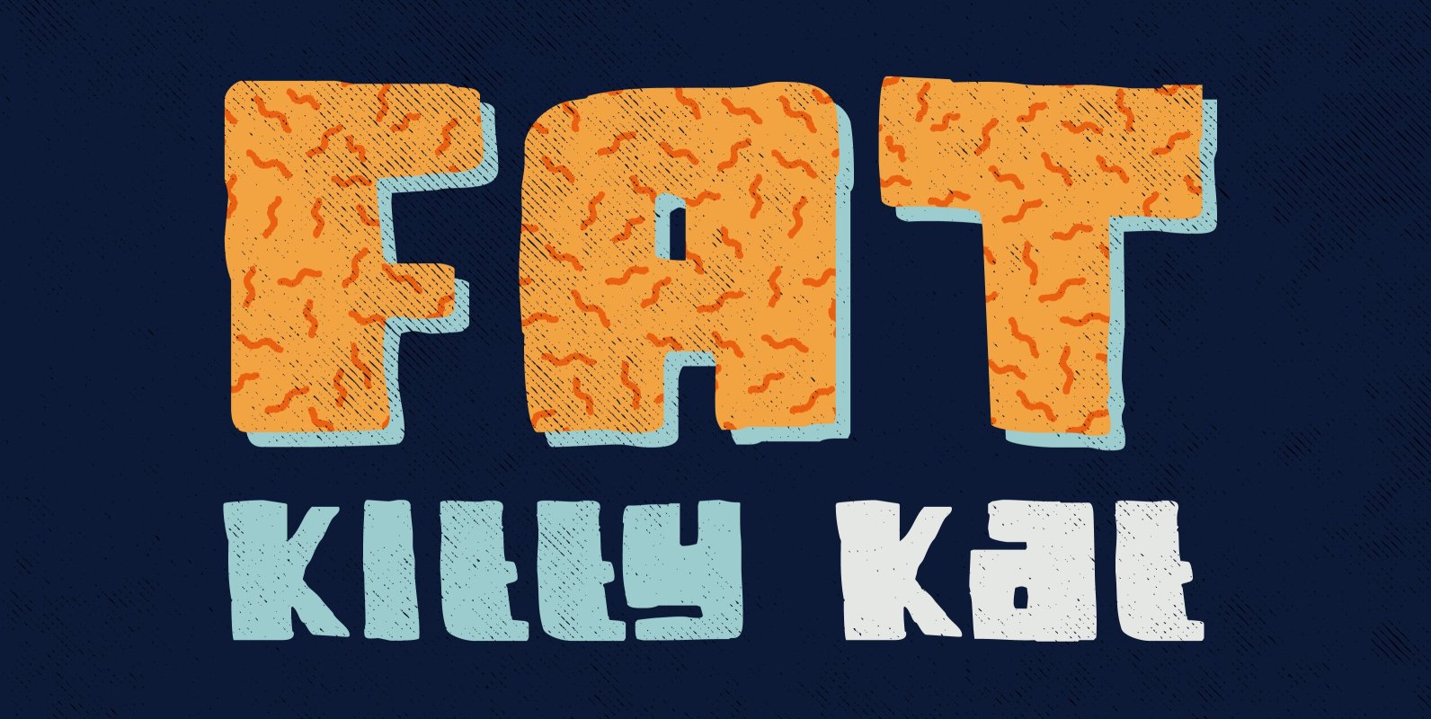
Fat Kitty Kat Font
Fat Kitty Kat is a hand made, rather bouncy and happy font. It was thought up, drawn and vectorised during an unusually long rainy period in a small Porto hotel room. Kitty Kat’s glyphs are rather rough, but legible and
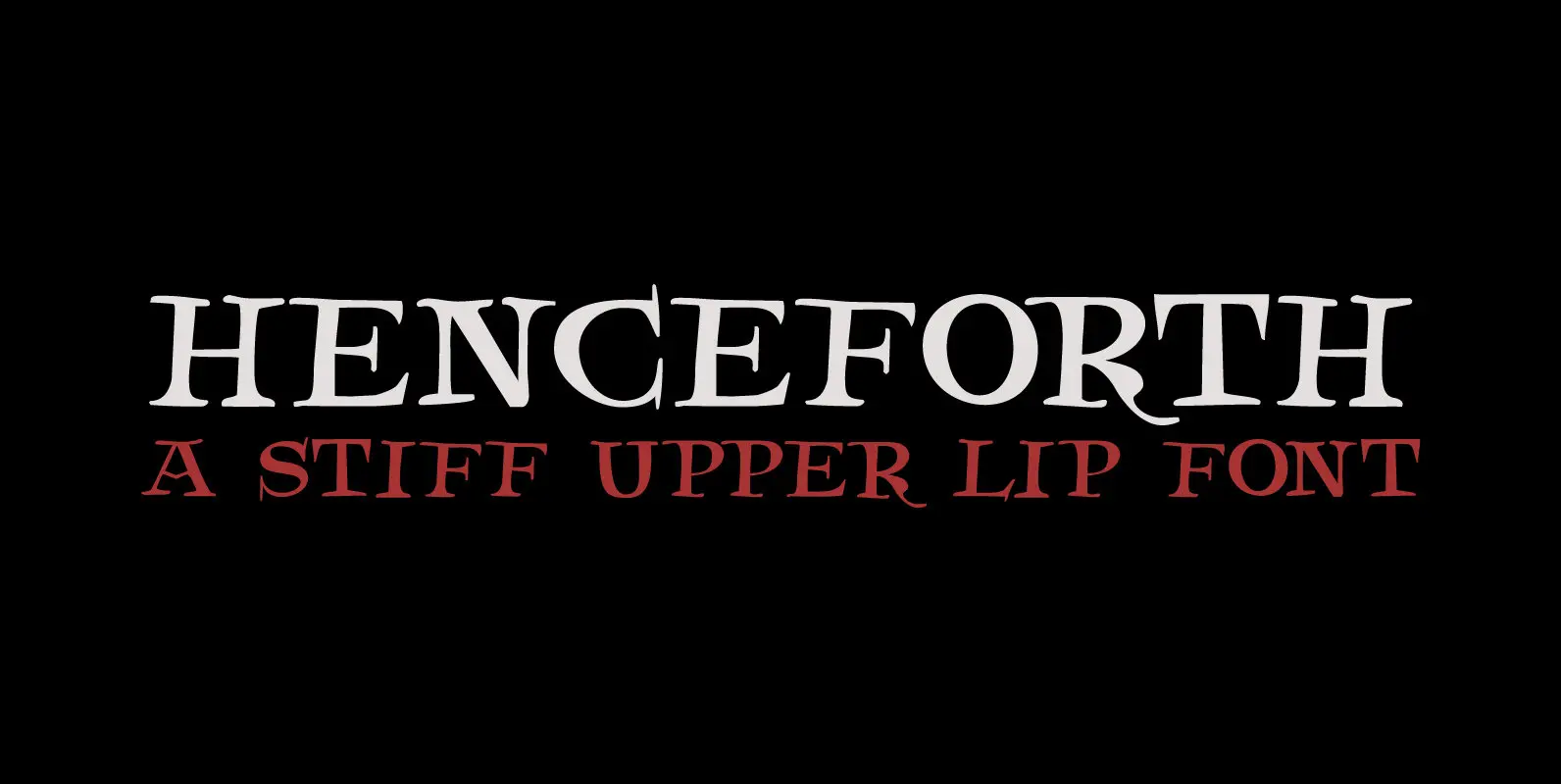
Henceforth Font
Henceforth is a hand-drawn, all caps didone-style typeface. It is a little rough, a little uneven, but lively and elegant as well. Personally I think it has a certain poshness about it: I mean, it wouldn’t look out of place
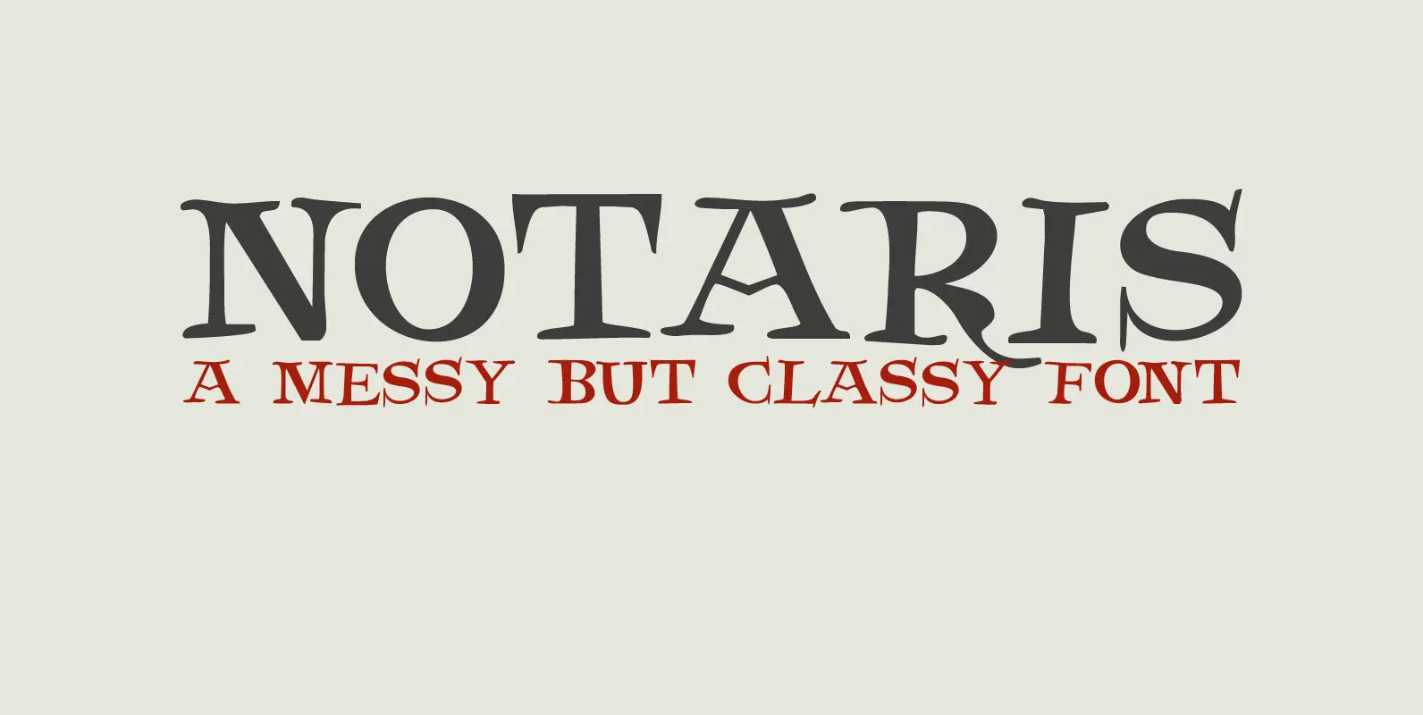
Notaris Font
Notaris (‘Notary’ in Dutch) is a hand-drawn, all caps didone-style typeface. It is a little rough, a little uneven, but lively and elegant as well. Comes with an abundance of diacritics and, lo and behold, some end-ligatures as well. Published