Tag: renaissance
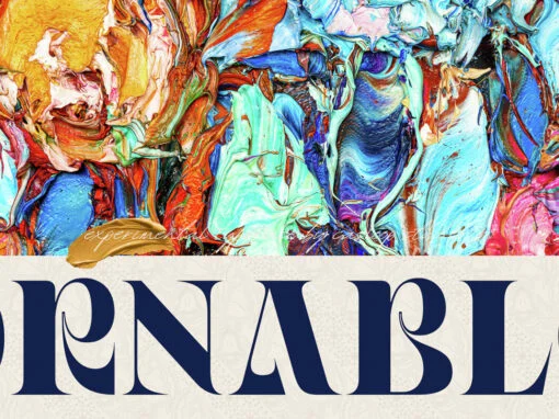
Ornable: An Intriguing Collision of Artistic Epochs in the Realm of Typography
An air of prestige and elan surrounds the melange of influences that envelope the field of graphic and digital design. Among the myriad facets lies a distinct character that carries a substantial impact in rendering aesthetic elements, one that is
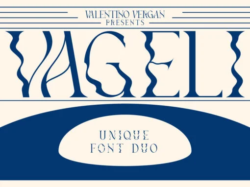
Vageli Font
Vageli is a unique font duo that combines a beautiful nostalgic uppercase and a wavy vintage lowercase, this combination gives the typeface a distinctive and trendy appearance. The typeface is very creative, this makes it perfect for creating projects that
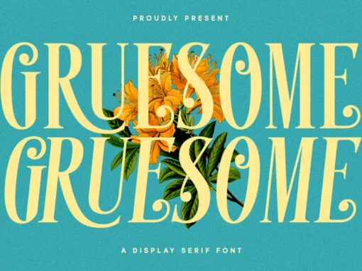
Gruesome Font
Gruesome is a decorative font design published by Letterhend Studio Published by Letterhend StudioDownload Gruesome
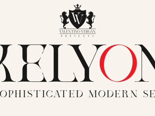
Kelyon Font
Kelyon is a sophisticated and modern serif, inspired by the late Middle Ages and early renaissance period. Kelyon was designed with a very thin hairline and long serifs, this reflects the charm and feel of the 14th century. With over
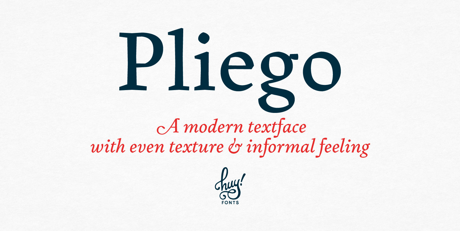
Pliego Font
Pliego is a textface designed to offer a comfortable continuous reading, with humanist proportions, an even texture, and informal calligraphic details noticeable only at big sizes, that gives it a contemporary feeling. Pliego has been named after Pliegos de Cordel,
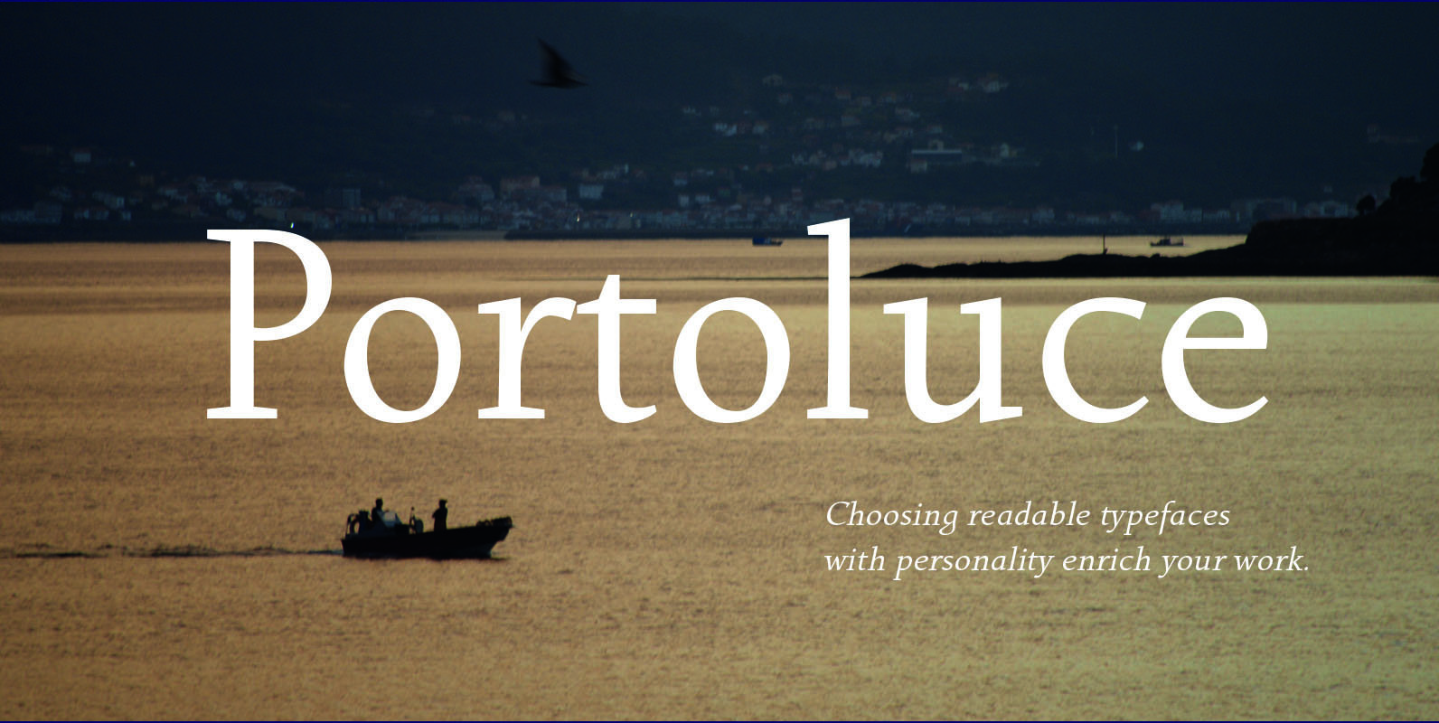
Portoluce Font
Portoluce is a Roman typeface. These fonts are delicate and highly readable at very small sizes but reveals all its strength and personality when used at big sizes. The contrast of the sharped serifs provides a fresh and very contemporary
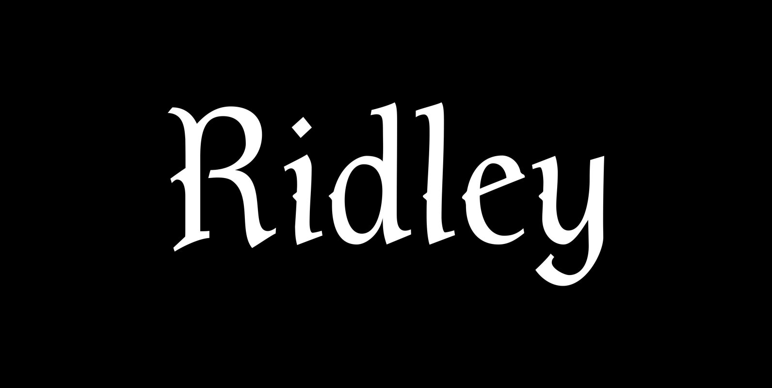
P22 Ridley Font
Ridley is a calligraphic-influenced, decorative, medieval font combining Roman and Gothic forms. It is named for Nicholas Ridley and similar to the P22 Latimer font. Ridley and Latimer were protestants burned together at the stake in 1555 during the reign
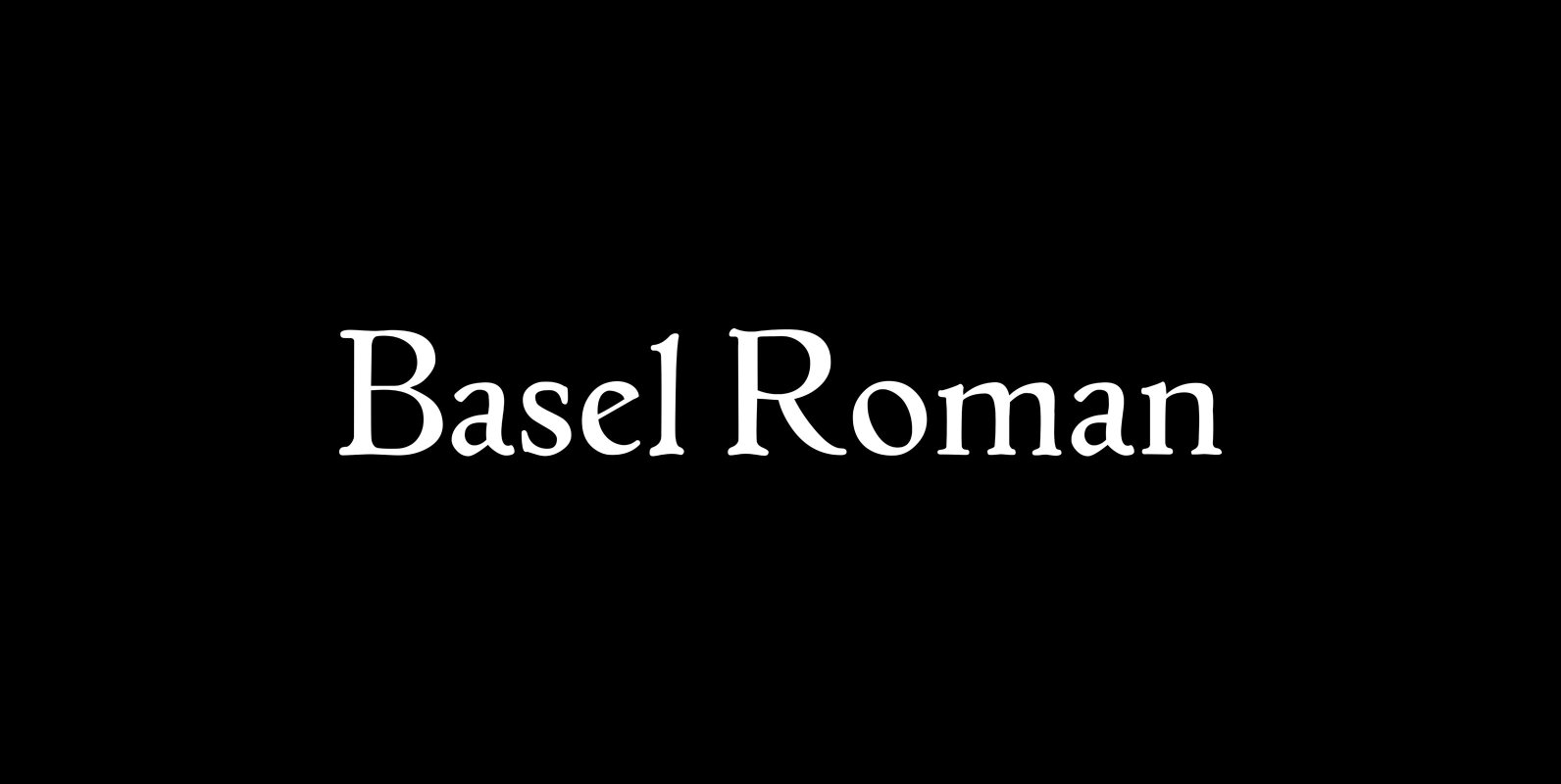
P22 Basel Roman Font
In mid 2001, P22 was approached by a Daniel Garrison, a Classics scholar at Northwestern University about possibly digitizing a long lost “Garamond” typeface. This font was used by Johannes Herbst (a.k.a. Ioannes Oporinus) in 1543 to publish Andreas Vesalius’
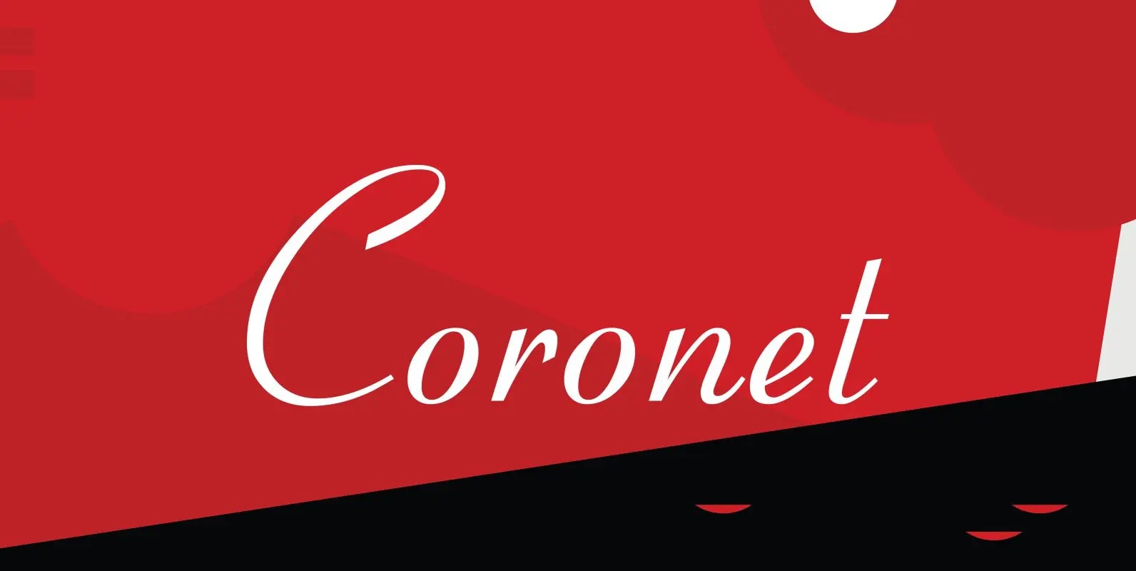
Coronet Font
Designed by R.H. Middleton for Ludlow (1937), Coronet is a script font that was digitally engineered by Steve Jackaman for the Red Rooster Collection. Published by Red RoosterDownload Coronet
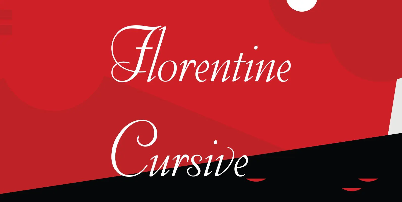
Florentine Cursive Font
Florentine Cursive was designed by R.H. Middleton for Ludlow, circa 1956. Digitally engineered by Steve Jackaman. Published by Red RoosterDownload Florentine Cursive

Stanhope Font
Designed by Les Usherwood. Digitally engineered by Paul Hickson. Les based the design on a turn-of-the-century typeface of the same name. The foundry is believed to be Soldans & Payvers, circa 1904. Published by Red RoosterDownload Stanhope

Alexon Font
Designed by Les Usherwood. Digitally engineered by Steve Jackaman. Originally in one weight, Steve designed and produced three additional weights. Published by Red RoosterDownload Alexon

Administer Font
Designed by Les Usherwood. Digitally engineered by Steve Jackaman. A few weights were originally released by another foundry; but this complete version of the family is a better match to Les original drawings! Published by Red RoosterDownload Administer

Goudy 38 Font
Designed by Les Usherwood. Digitally engineered by Steve Jackaman. Originally designed by Frederick Goudy for the original Life magazine, circa 1908. The typeface was used almost exclusively for their advertising and was often known as Goudy Gimbel; but the typeface
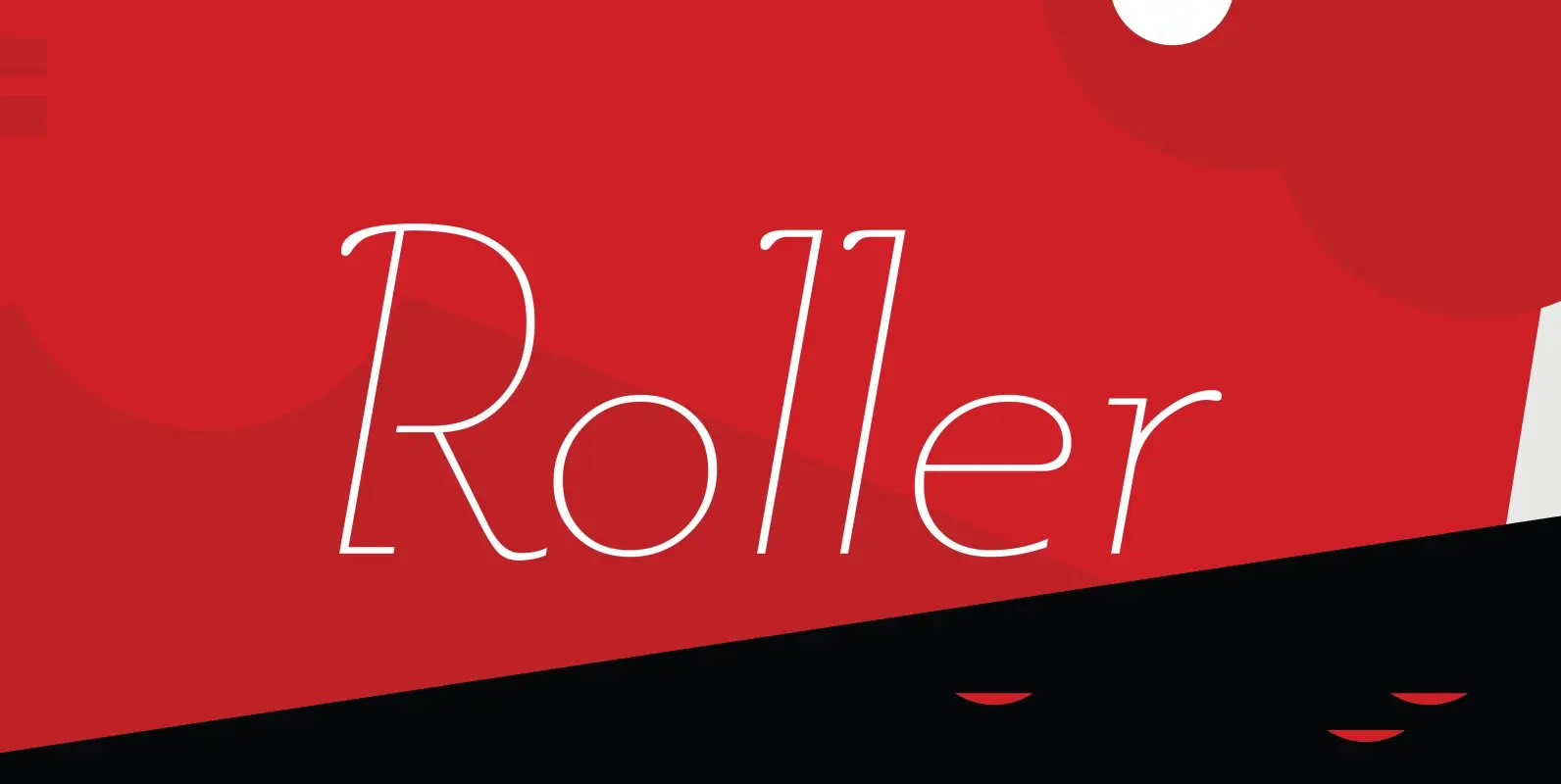
Roller Font
Designed by A. Pat Hickson, Roller is a retro font design based on Iberica by Carlos Winkow for the Spanish foundry, Nacional, circa 1942. Published by Red RoosterDownload Roller
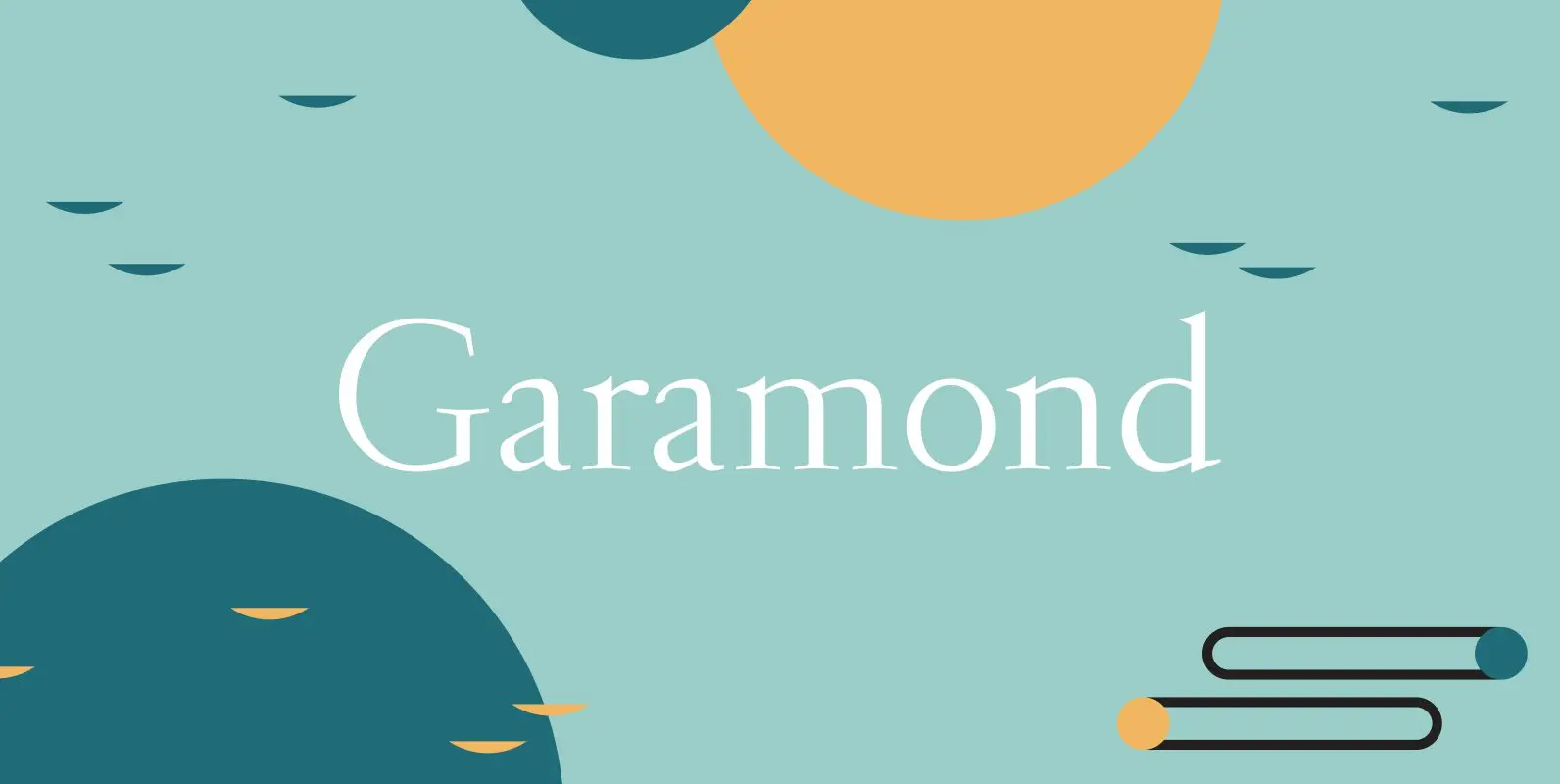
Garamond Font
Garamond was originally designed by R.H. Middleton for Ludlow, circa 1929-30. Digitally engineered by Steve Jackaman. Published by Red RoosterDownload Garamond
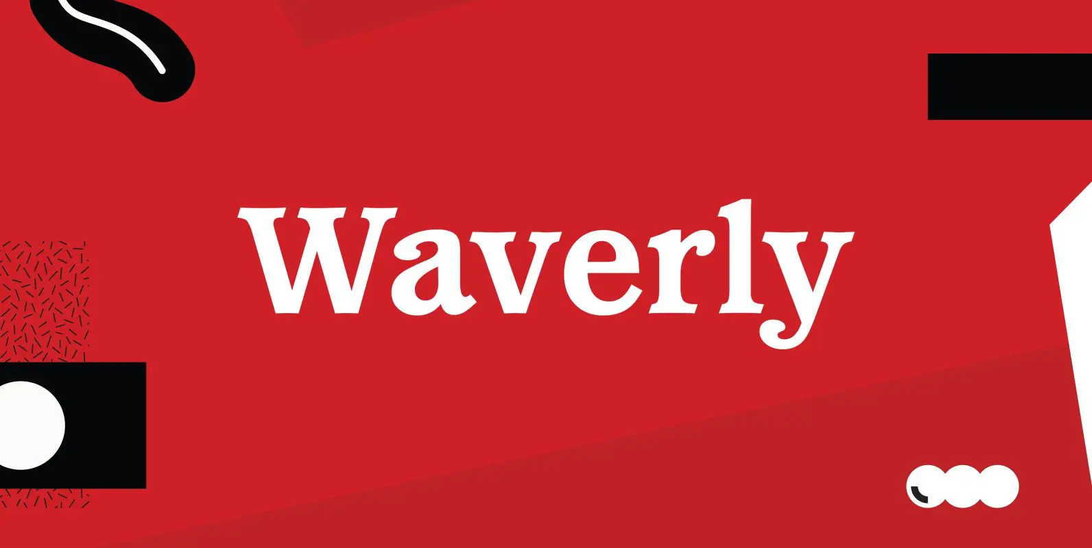
Waverly Font
Waverly is a round and soft serif designed by Les Usherwood, digitally engineered by Steve Jackaman. Published by Red RoosterDownload Waverly