Tag: refined
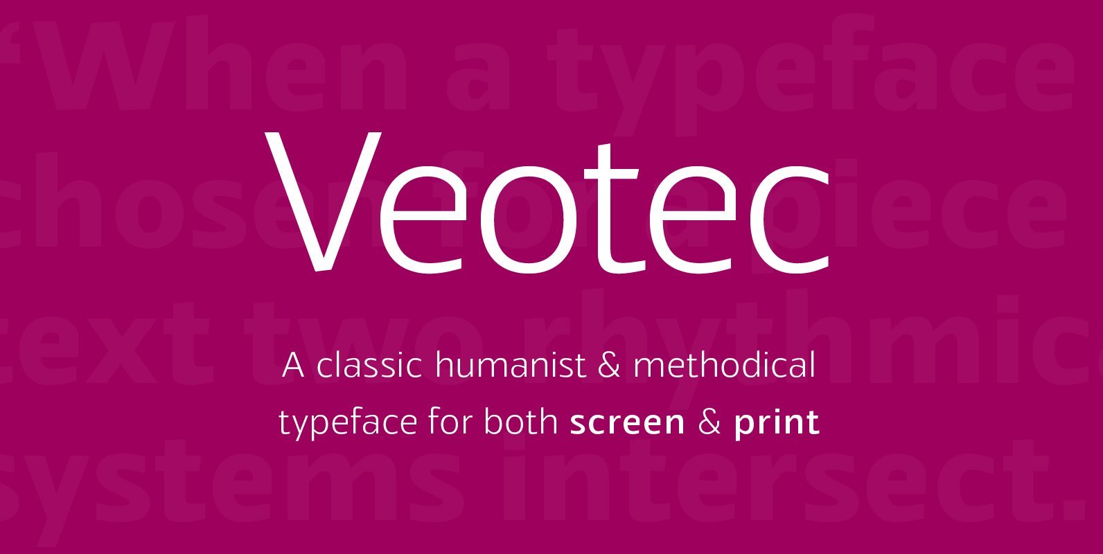
Veotec Font
Veotec is a classic humanist sans that skilfully works for both screen and print due to its steep and precise angles enabling more negative space. Not only does this methodical approach improve legibility and readability at small sizes, it allows
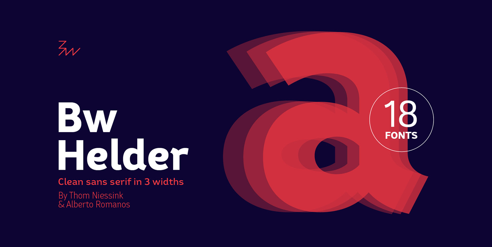
Bw Helder Font
Bw Helder is a clean and versatile sans serif combining gentle subtleties on its curves with remarkable spurs branching off its stems. It instills a friendly yet professional tone of voice, while maintaining the composure when used in longer paragraphs
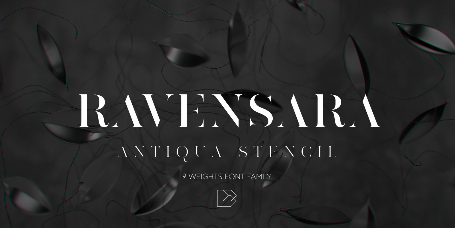
Ravensara Antiqua Stencil Font
Ravensara Antiqua Stencil is display font family with 9 weights, from Thin to Extrablack with hightest contrast. This font was inspired by old style classic typefaces, such as Didone and Baskerville, and got a modern feel by getting rid of
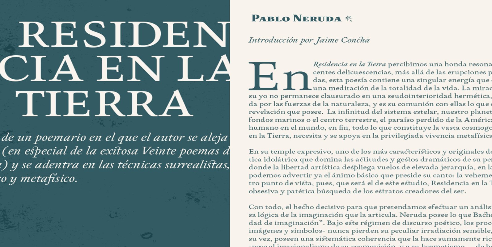
Neftalí Pro Font
Designer: Franco Jonas Hernández 2015 First Prize TipoType award. Neftali is a type family designed for continuous reading in long texts & editorial design, created as an interpretation of Pablo Neruda’s “Poema 20”. This work delivers a subtle experimentation of
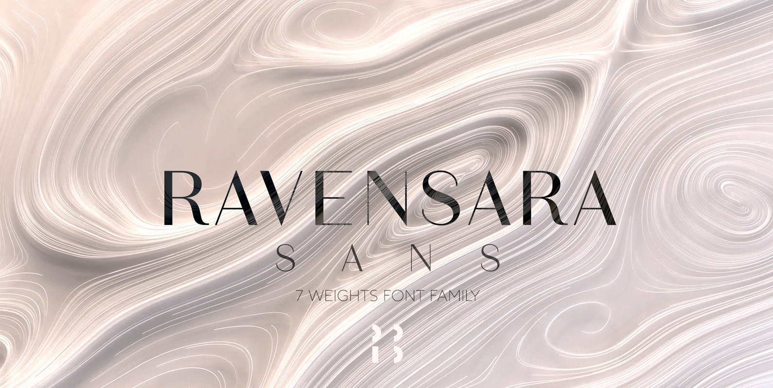
Ravensara Sans Font
Ravensara is a contemporary, high contrast, sans-serif font family that contains 7 weight options. Published by NaumTypeDownload Ravensara Sans
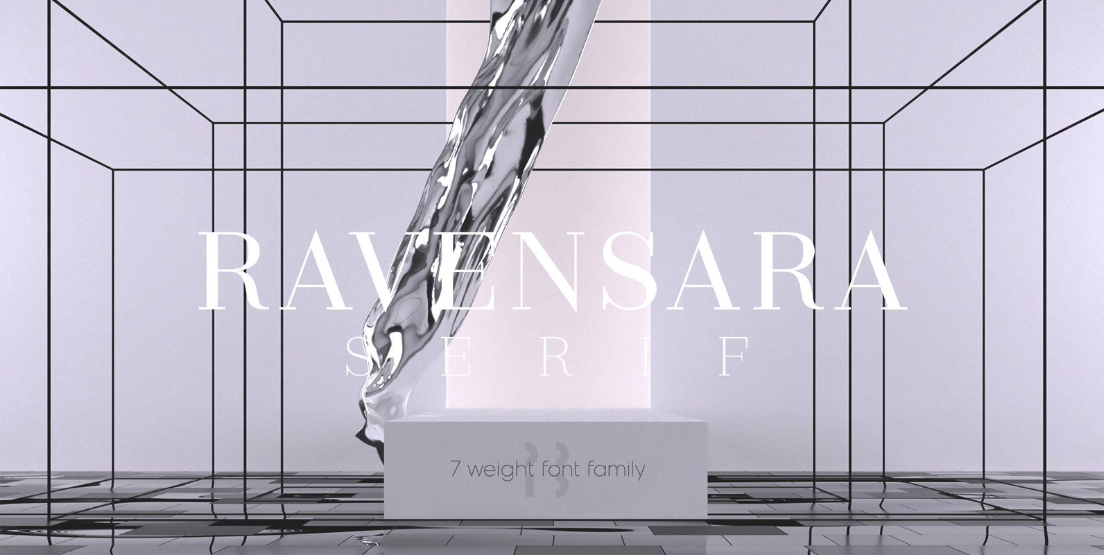
Ravensara Serif Font
Ravensara is an elegant, high contrast serif design that contains 7 weight options. Published by NaumTypeDownload Ravensara Serif
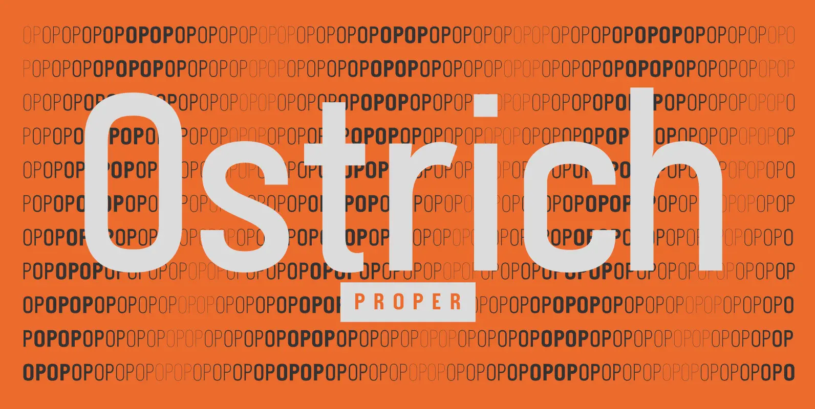
Ostrich Proper Font
Ostrich Sans is dead, Ostrich Proper is here! What started as a skinny single style has evolved to a family from ultralight to extrabold. OP is a slightly condensed typeface with clean, smooth lines and personality at each weight. Published
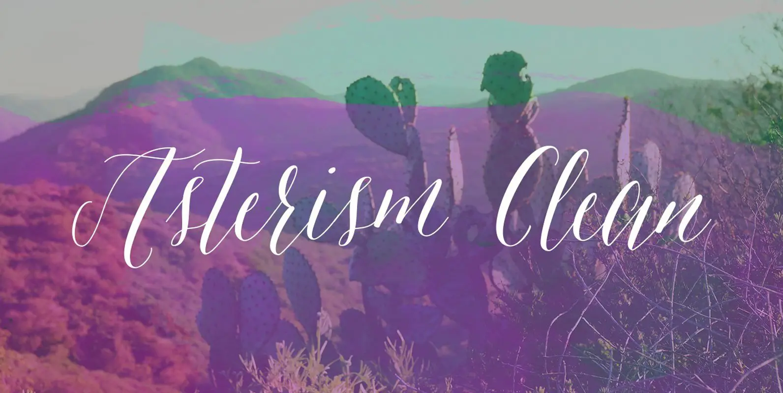
Asterism Clean Family Font
Asterism Clean is the smooth lined version of Asterism. It is a calligraphy style font with a moving baseline and lots of shining personality. Also contains a bold and a monoline version. This hand written style font is based on
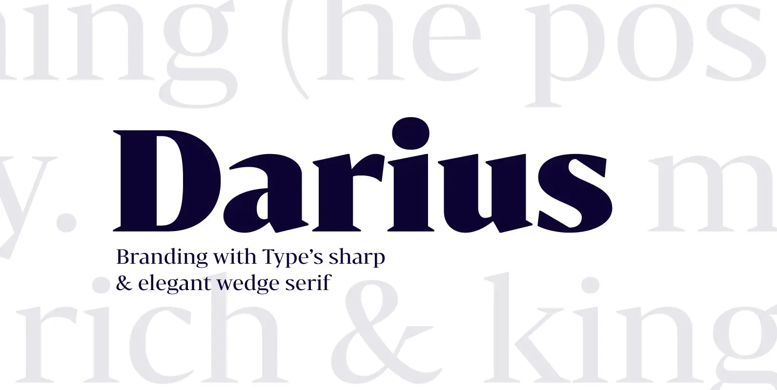
Bw Darius Font
Bw Darius is an elegant wedge serif typeface, halfway between the transitional and didone genres, with a sharper approach to terminals without falling on the stiffness of the didones. The wide skeleton, modern proportions and high contrast, all contribute to

Apollonius Font
Apollonius is a high contrast, display typeface designed by Michael Parson. Packed with Opentype features, this single weight font offers a whole range of options that designers can explore and play with to create stunning layouts. Published by Michael ParsonDownload
Imbue Font
Imbue is a new take on a condensed Didone. It's characters are elegant and memorable, and most importantly, capable of getting attention at large and small sizes. It was designed in the June/July 2016. Published by Tyler Finck Download Imbue
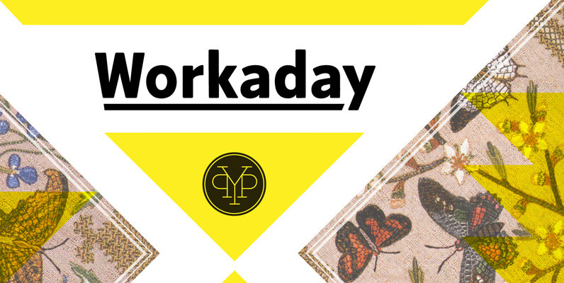
Workaday Font
Workaday from Yes Please is a bold and clean contemporary take on the classic American Sans Serif. Inspired by the wildly varied history of early to mid 20th century American signage, aircraft markings and industrial shipping vernaculars, Workaday exudes a
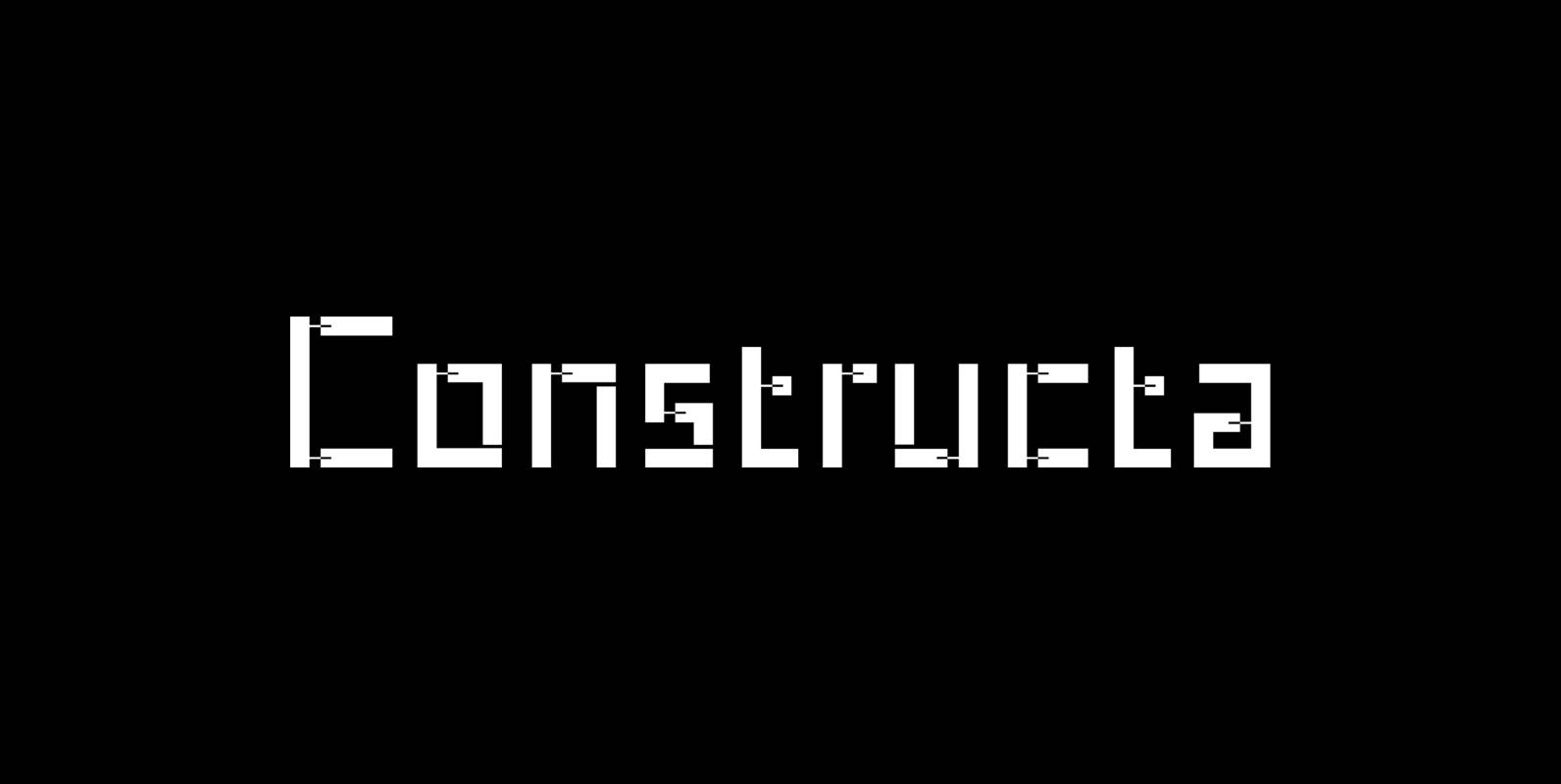
Constructa Font
Marit Otto about Constructa The building typeface. Although the 70ties were very liberating and progressive, still girls played mainly with dolls and sweet things and boys with all kinds of challenging stuff. They did all sorts of basic scientific experiments

Giger Black Font
Giger Black is a sans-serif font design by Rodrigo Araya Salas. Published by RodrigoTypoDownload Giger Black
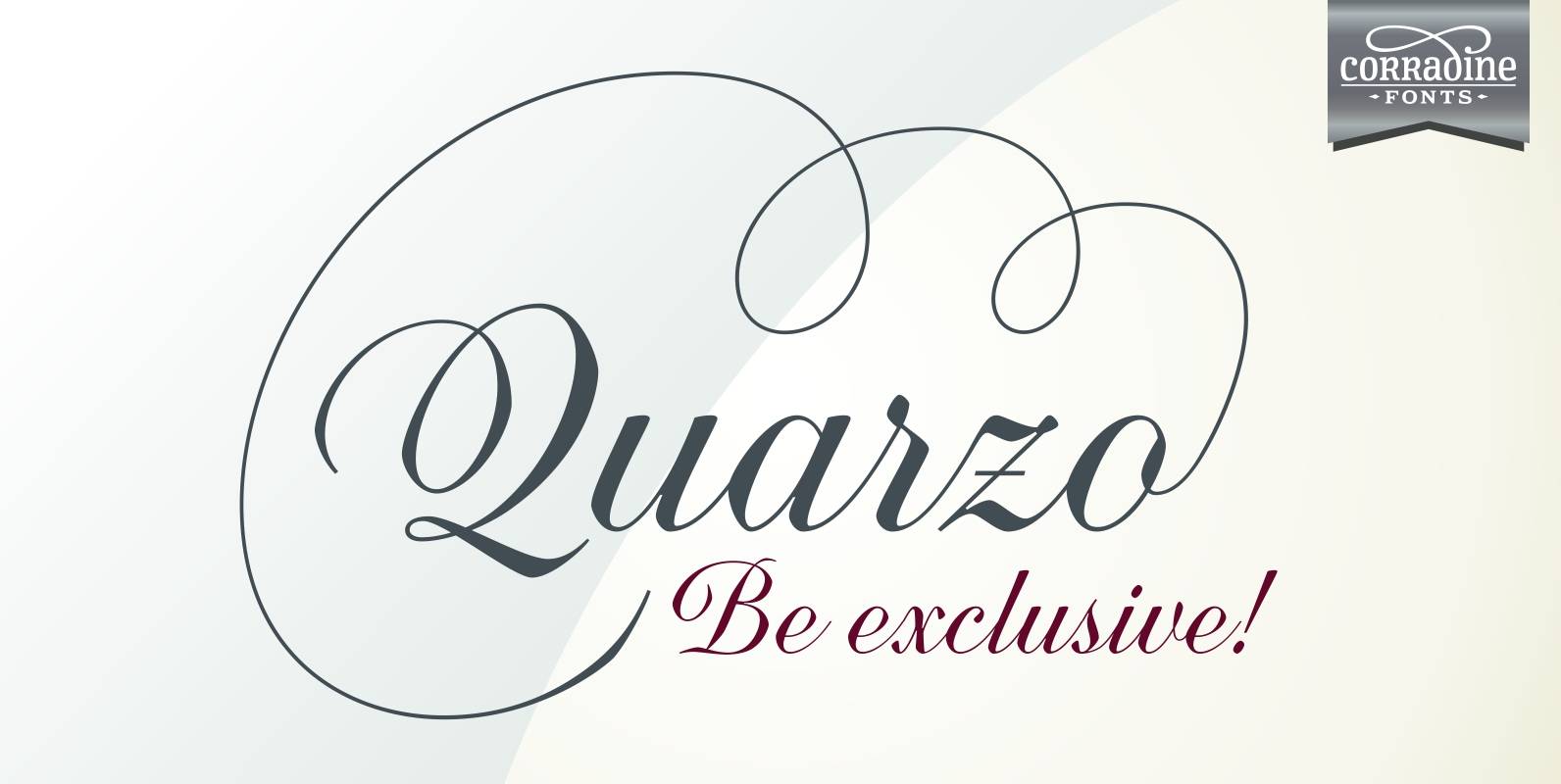
Quarzo Font
Quarzo is inspired by the flexible nib strokes to create a concatenation of refinement with character mixing the contrast with pronounced but rounded angles. This angles along with the inktraps give the font a better performance when printing. Texts will
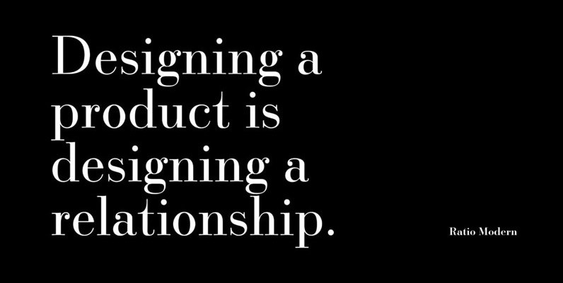
Ratio Modern Font
Designed in 1923 by Friedrich Kleukens for the Stempel foundry, Ratio was one of the first metal faces to bring the Didone genre to the forefront of industrial mass publishing as a headline and magazine face. Though essentially modern in
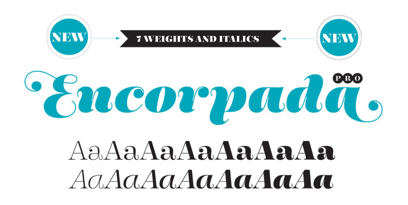
Encorpada Pro Font
With seven weights and a lot of curves. Freely inspired by the didones shapes, Encorpada Pro now have a extended character set with more than 40 languages supported, Opentype Features and Amazing Swashes in Italic Version. Enjoy It. Published by