Tag: realist
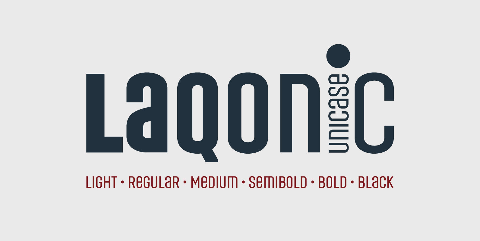
Laqonic 4F Font
Laqonic 4F is a geometric modular grotesque with a technological character, perfectly suited for signage, logos and loud headlines. Published by Sergiy TkachenkoDownload Laqonic 4F
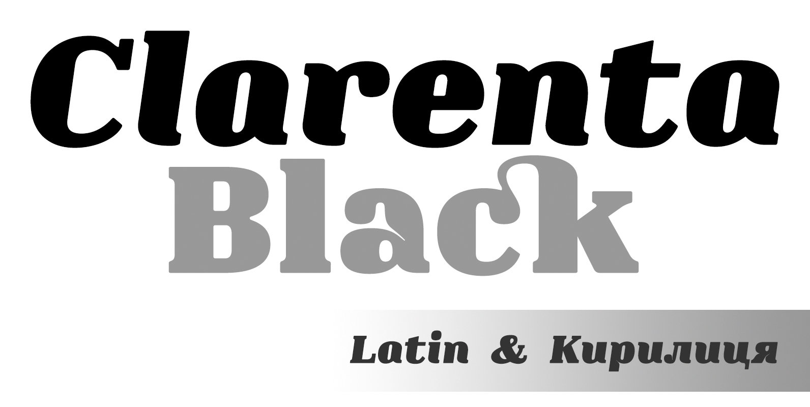
Clarenta 4F Font
Clarenta 4F is a serif font design published by Sergiy Tkachenko Published by Sergiy TkachenkoDownload Clarenta 4F
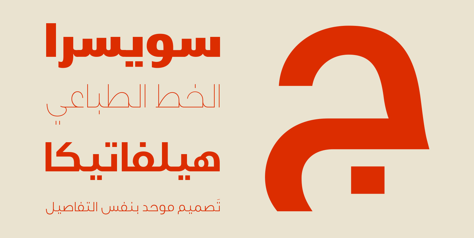
Swissra Font
Swissra is an Arabic typeface that was inspired from Swiss graphic design. The motivation behind the typeface was to create a neutral and carefully crafted Arabic font family that can be used on many different applications. Swissra also aspires to
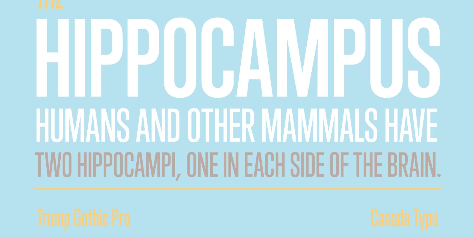
Trump Gothic Pro Font
Trump Gothic is a reconception of ideas from Georg Trump's seminal 1955 Signum typeface and its later reworking (Kamene) by Czech designer Stanislav Marso. Originally cobbled together for a variety of film projects in the late 1990s and early 2000s,
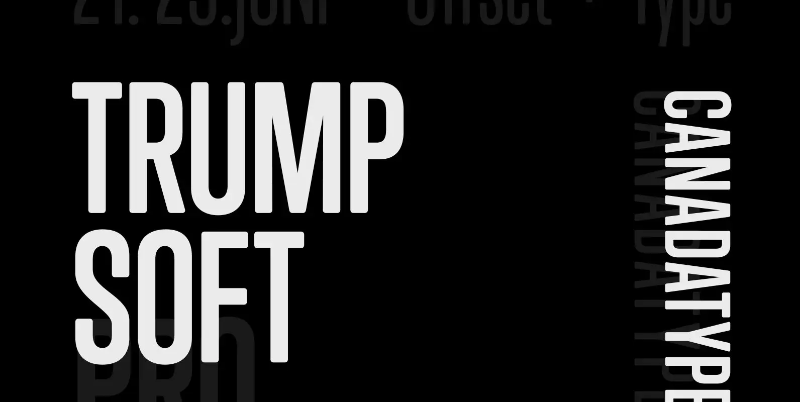
Trump Soft Pro Font
Trump Soft Pro is the softer, round-cornered version of Trump Gothic Pro, the popular condensed gothic seen on films, magazines, book covers and fashion brands all over the globe. Trump Soft offers a friendlier grade of the same economic functionality,
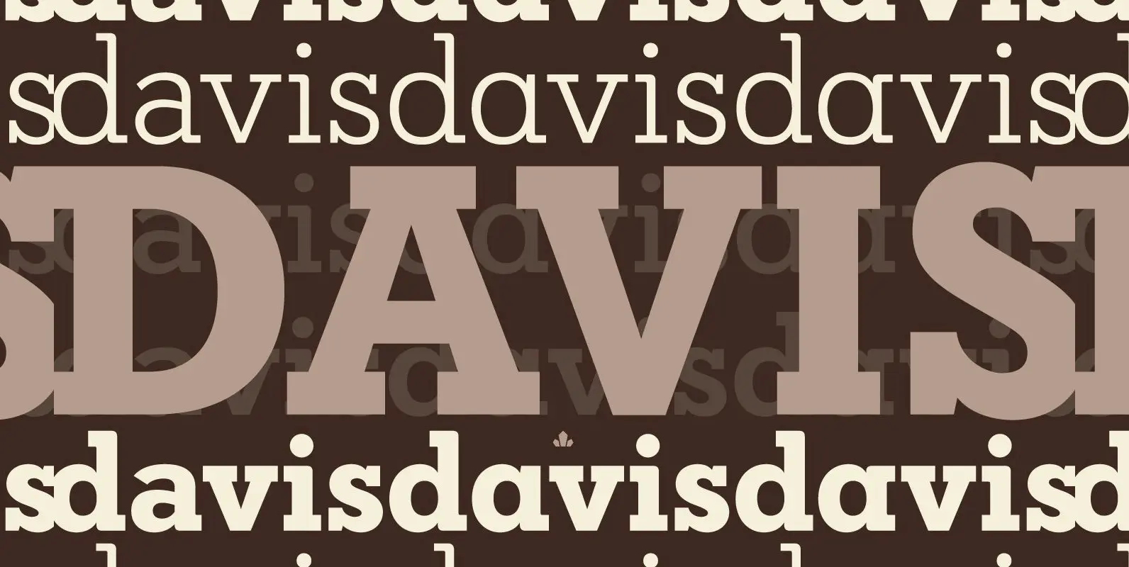
Davis Font
P22 Blox is a modular system of shapes that can build letterforms and abstract patterns. Created as a working prototype for the letterpress P22 Blox project from P22 Analog and Starshaped Press, this system of shapes presents a unique approach
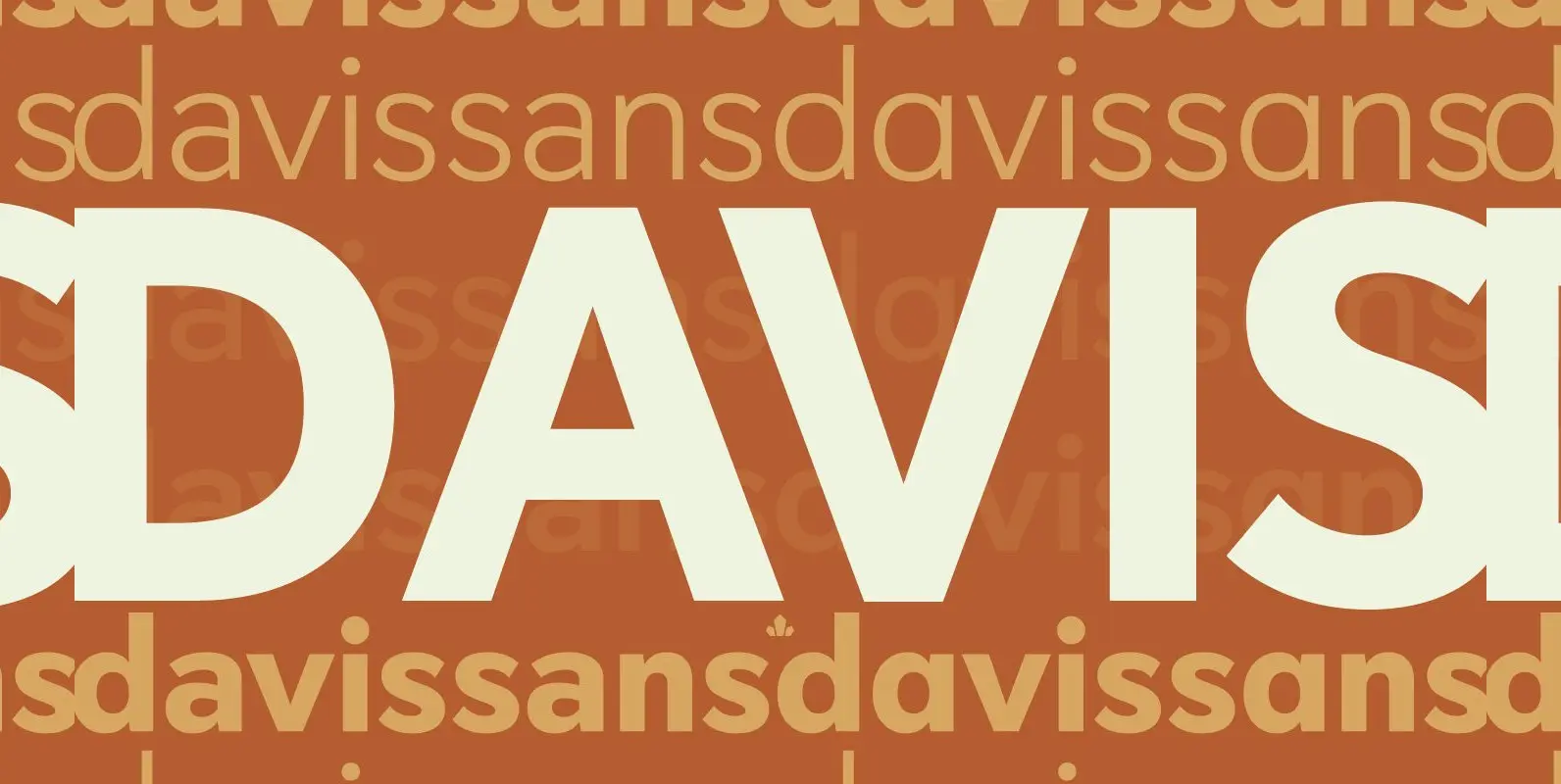
Davis Sans Font
Over the past couple of decades, the many applications that joined print as media requiring design solutions have combined to necessitate a visual evolution that favours controlled optical geometry and careful counter-space consideration over ornamental features traditionally associated with print
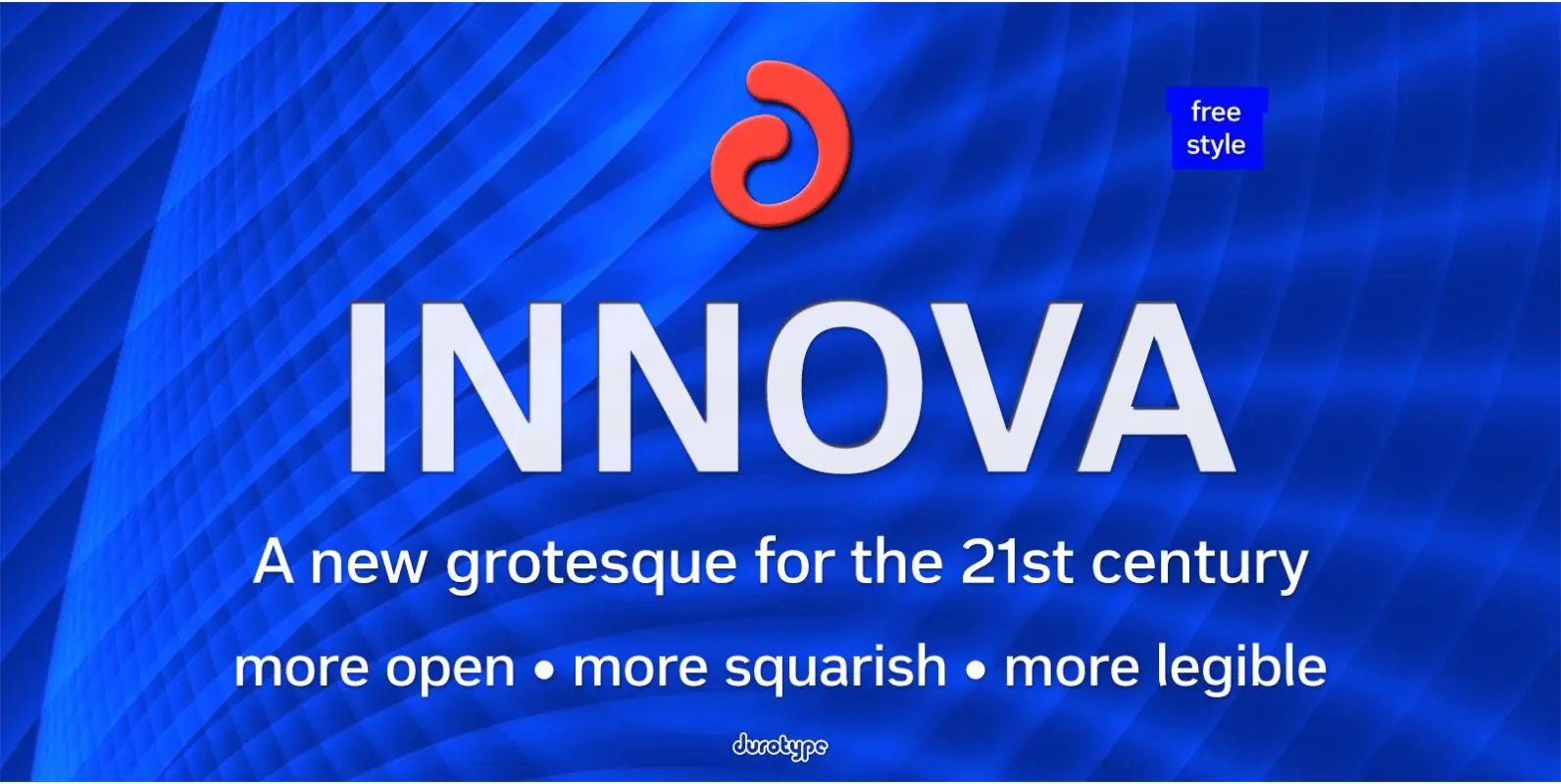
Innova Font
Innova. A new grotesque for the 21st century. More open. More squarish. More legible. After the many grotesques which have been designed over the years, is it still possible to improve this genre? Innova is a new design—a contribution to
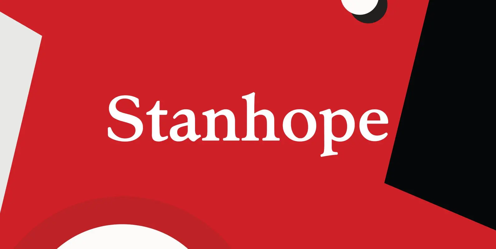
Stanhope Font
Designed by Les Usherwood. Digitally engineered by Paul Hickson. Les based the design on a turn-of-the-century typeface of the same name. The foundry is believed to be Soldans & Payvers, circa 1904. Published by Red RoosterDownload Stanhope
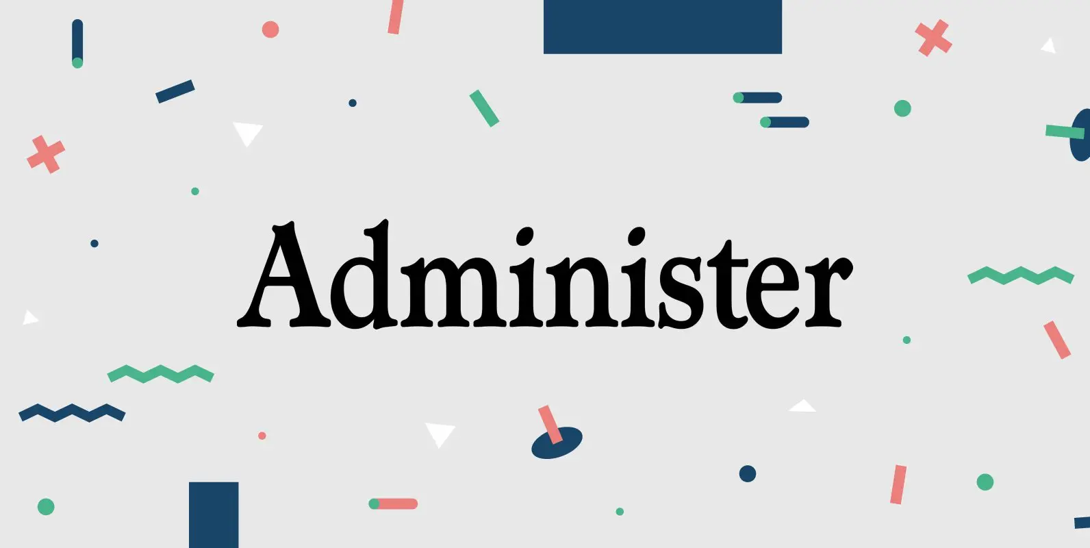
Administer Font
Designed by Les Usherwood. Digitally engineered by Steve Jackaman. A few weights were originally released by another foundry; but this complete version of the family is a better match to Les original drawings! Published by Red RoosterDownload Administer
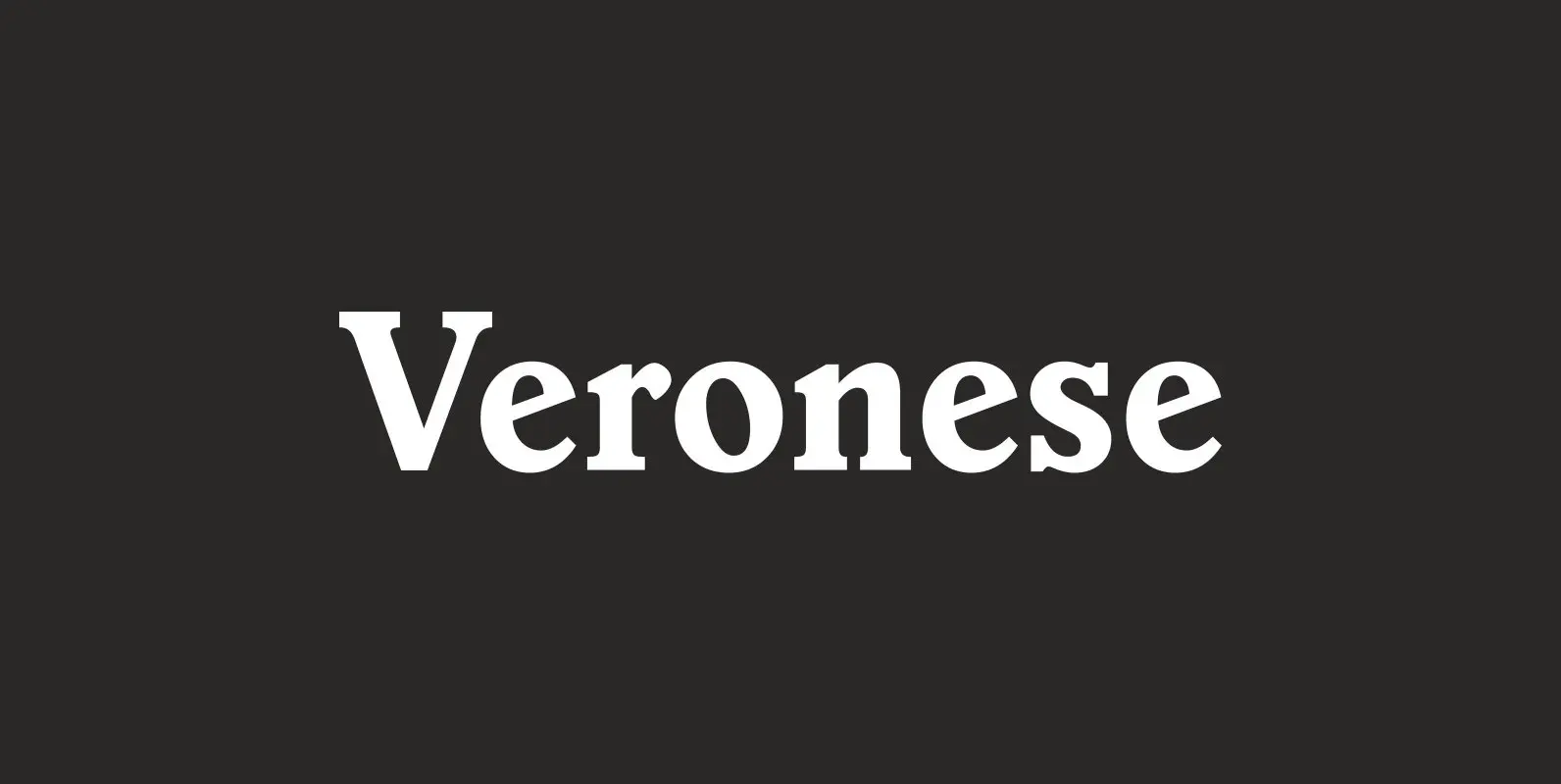
Veronese Font
Designed by Steve Jackaman, Veronese is based on the early original Monotype design, you can definitely see the influence of Italian Old Style, Jenson and Morris Golden Type. Published by Red RoosterDownload Veronese
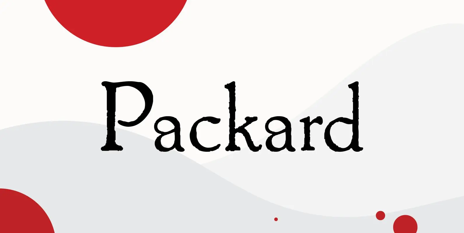
Packard Font
Designed by Steve Jackaman & Ashley Muir. Packard Old Style is based on lettering drawn by Oswald Cooper for the Packard Motor Company (ATF 1913). The bold weight is credited to Morris Fuller Benton (ATF 1916), but it is highly
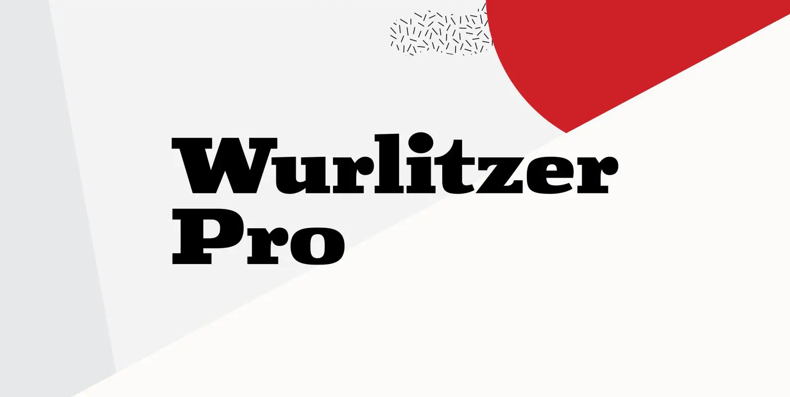
Wurlitzer Pro Font
Designed by Steve Jackaman & Ashley Muir. This design was inspired by an early 20th century woodtype. Wurlitzer contains all the high-end features expected in a quality OpenType Pro font. Published by Red RoosterDownload Wurlitzer Pro
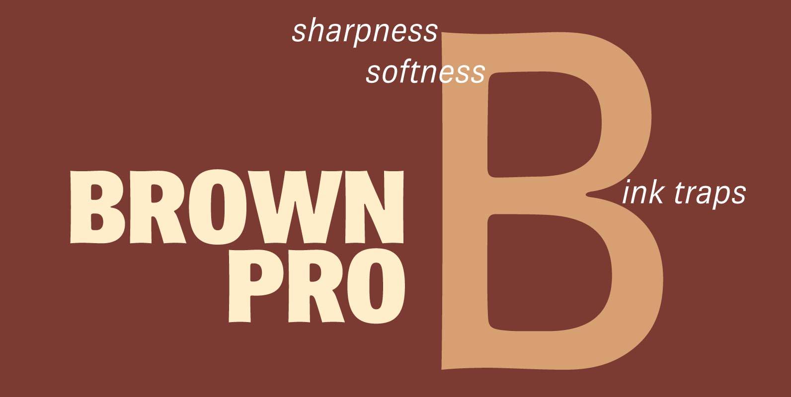
Brown Pro Font
At text size, Brown is a classic grotesque, distinguished by its semi-condensed proportions (especially in the capitals, which harmonize well with the lining figures) and with an exceptional clarity in certain high-resolution media, such as offset printing, achieved by micro-detailing.
Abrade Font
Abrade is a geometric sans serif with rational design choices for contemporary functionality. The family is designed with a medium x-height to provided great legibility in both display and text sizes. The forms are refined to work well in print
Copacabana Font
Copacabana is heavily based on one of my favourite typefaces Goudy Old Style Italic. It is sharper and more clearly defined than Goudy yet still retains it old style characteristics. The face is slightly angled so is basically upright whilst
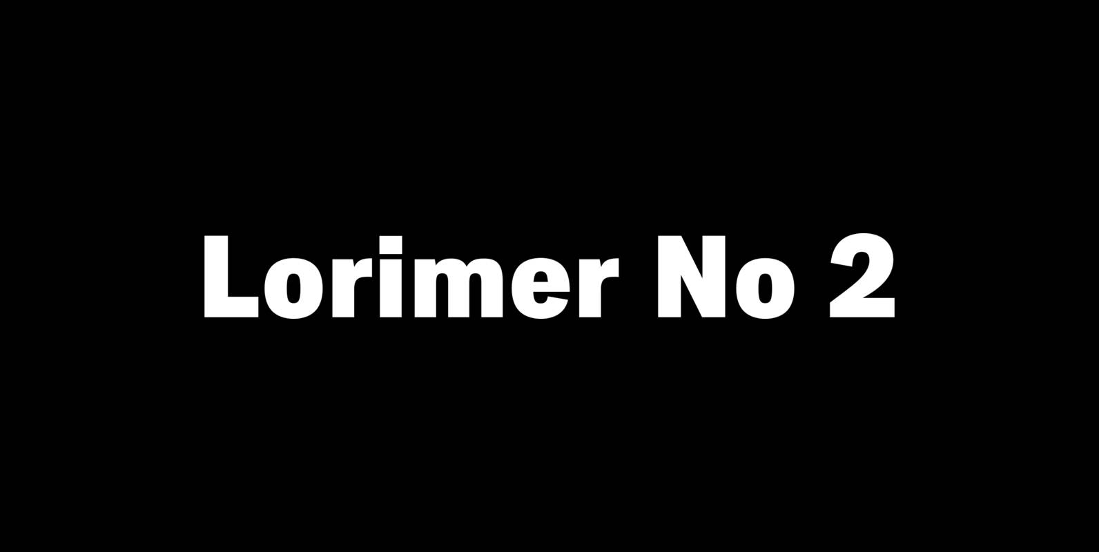
Lorimer No 2 Font
Lorimer No 2 is a sans family designed for display settings. Narrow letters, tight spacing, and a low x-height make Lorimer No. 2 better suited to display settings than fonts adjusted to work in text settings. Packaging, identities, and headlines
Brigade Font
In searching for a Roman to use there were bits of Bembo,Times,Garamond etc., that I liked and bits that I did not. So I set out to take the best bits of all my favourite Romans and tried to create