Tag: readability
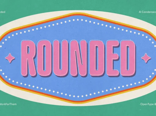
YWFT Rounded: Redefining Design Tradition with Modern Adaptability
Introducing the YWFT Rounded font, the graphic design paragon that hails from a rich lineage while integrating seamlessly into today’s hyper-digital landscape. This unique font marries the historical warmth and accessibility of the renowned VAG Rounded with a contemporary spin,

Add Personality to Your Designs with Casual Fonts
Unpack the transformative role of Casual Fonts in digital design, where text becomes a vibrant conduit for emotion and clarity.
The Impact of Instagram Fonts on Design and Branding
Discover the power of typography in Instagram stories! Dive into the world of unique, eye-catching fonts that make your content pop. Stand out from the crowd with Instagram fonts.

Scary Fonts: The Essence of Visual Terror in Graphic Design
Discover the power of Scary Fonts. Transform your designs into art of horror and suspense. Dive deep into visual terror with our vast font selection.
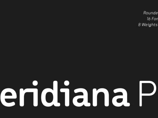
Meridiana Pro Font
The concept behind Meridiana Pro was to create an amalgamation between a rounded sans and a monospaced font in order to obtain an extensive and usable variable type-system. This typeface encapsulates a symmetrical and balanced rhythm due to the unique
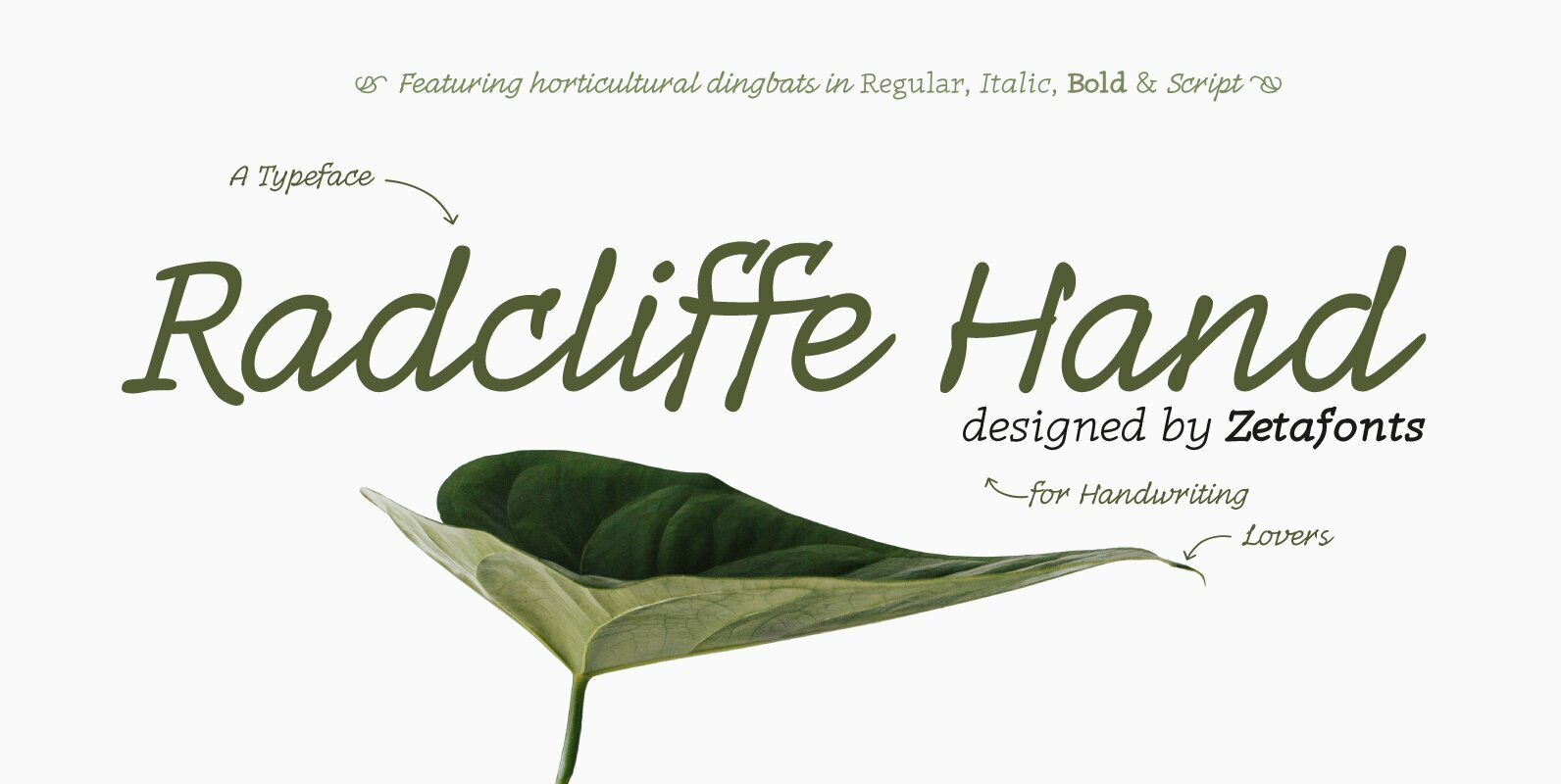
Radcliffe Hand Font
Radcliffe Hand is a typeface family designed by Cosimo Lorenzo Pancini with the help of Giulia Ursenna Dorati, re-inventing our Radcliffe family as a handwritten typeface. Each glyph of the original typeface has been lovingly traced by hand, interpreting every
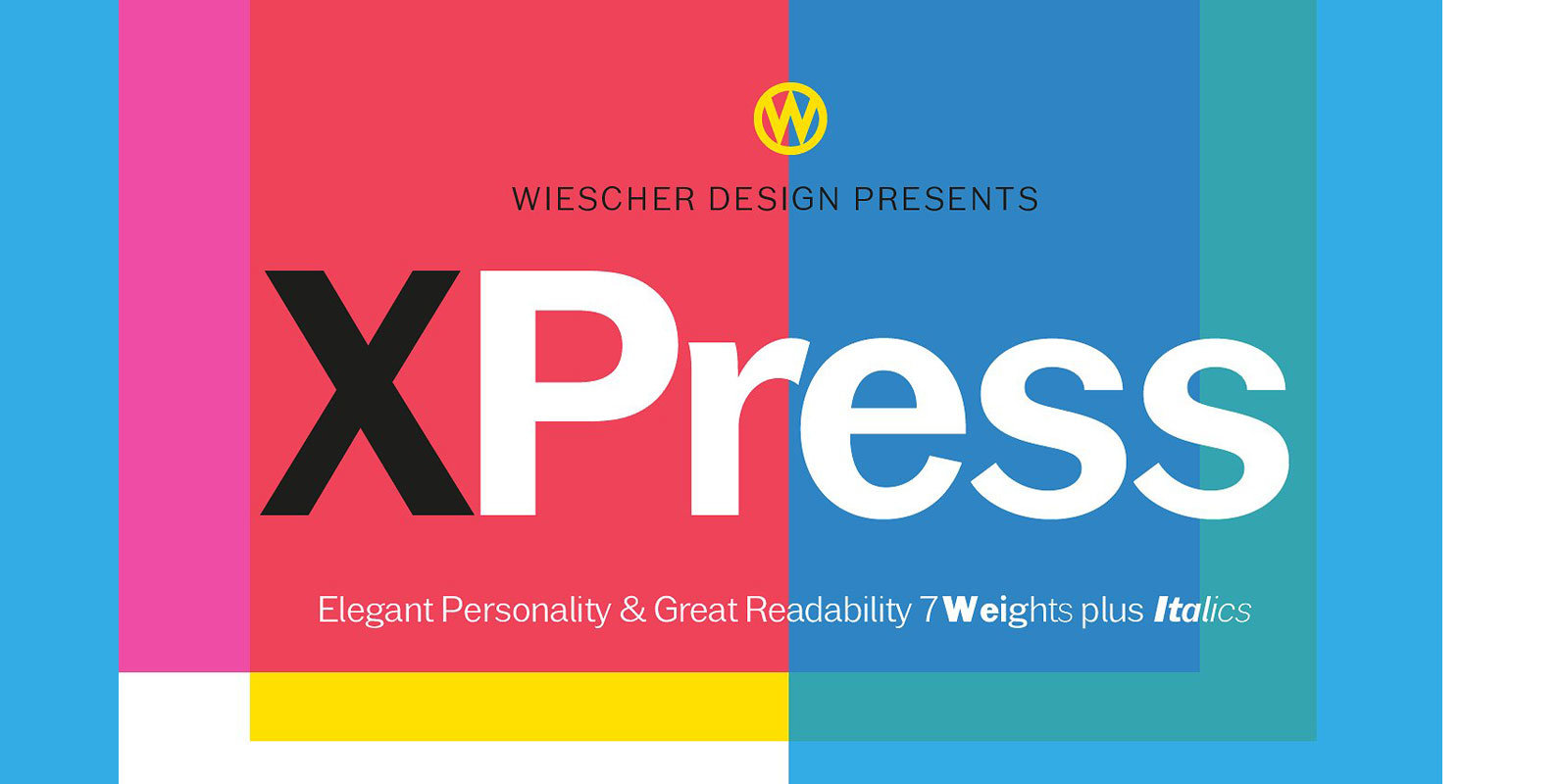
XPress Font
“XPress” is a very distinct, expressive, typical new Sans. “XPress” is my new Sans-Serif that impresses – especially in small sizes – with its outstanding readability. Seven precisely calibrated weights from »Thin« to »Heavy« and its corresponding italics make this
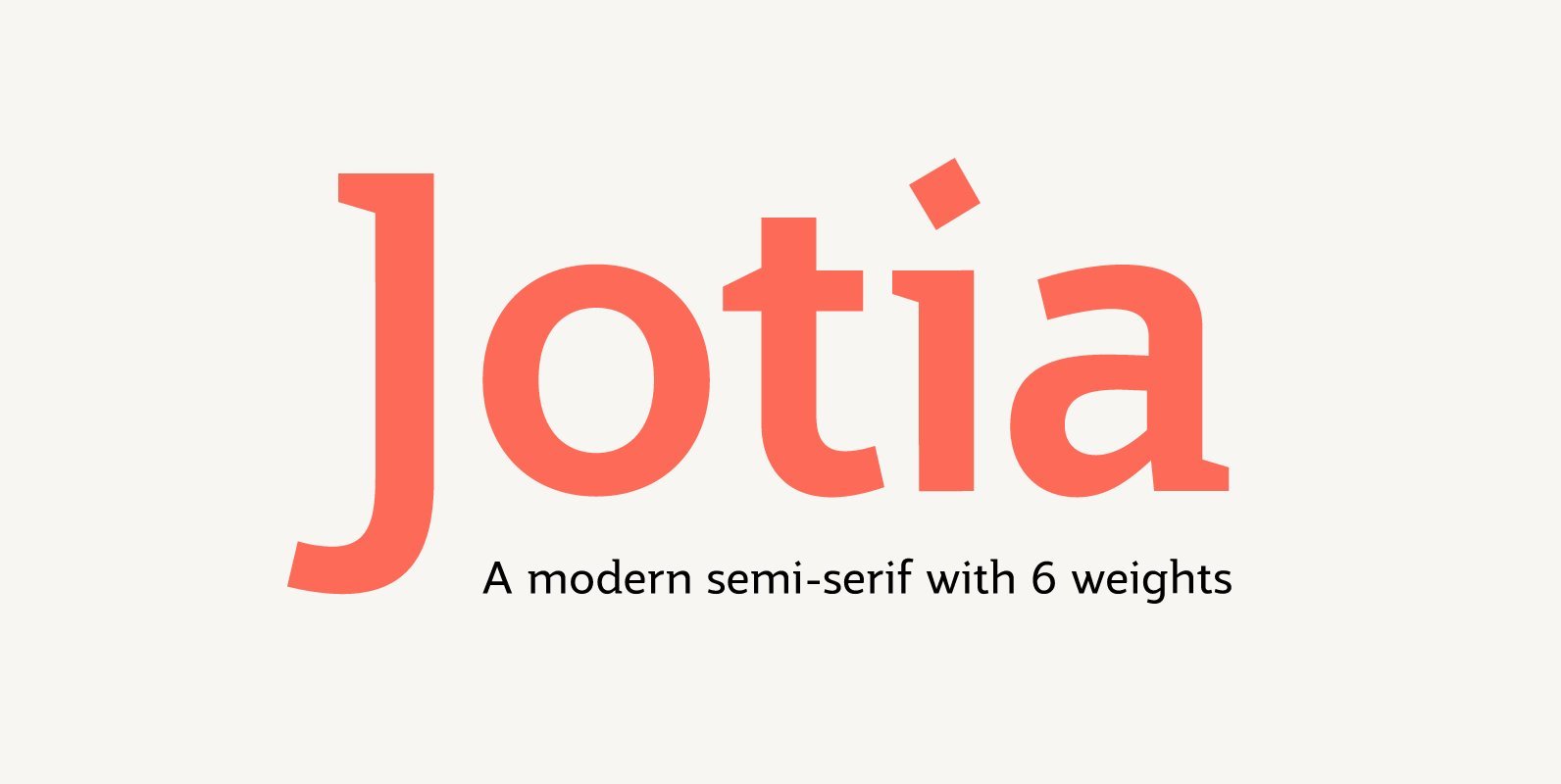
Jotia Font
Creating a combination between serif and sans serif typefaces, Jotia utilises the best of both worlds, resulting in a unique and modern neo-humanist font family. Taking its inspiration from lapidary inscriptions rather than pen drawn text, Jotia uses triangular serif
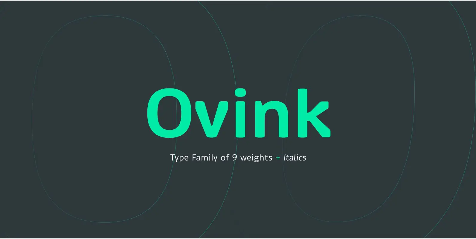
Ovink Font
Ovink is a rounded type family designed for great distance legibility. Named after the legibility researcher Gerrit Willem Ovink, in it's early stages was subjected to experimental legibility investigations of distance and time threshold methods. The results of this heavily
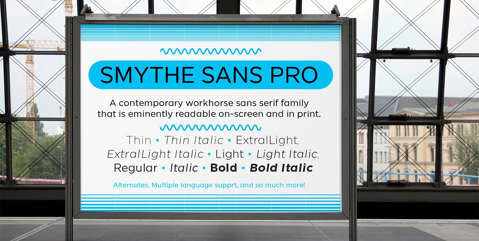
SmytheSans Pro Font
SmytheSans Pro is a contemporary workhorse sans serif family that is eminently readable on-screen and in print. It is an updated version of our popular family Smythe Sans—we extended the characters sets, redrew most of the characters, rigorously spaced and
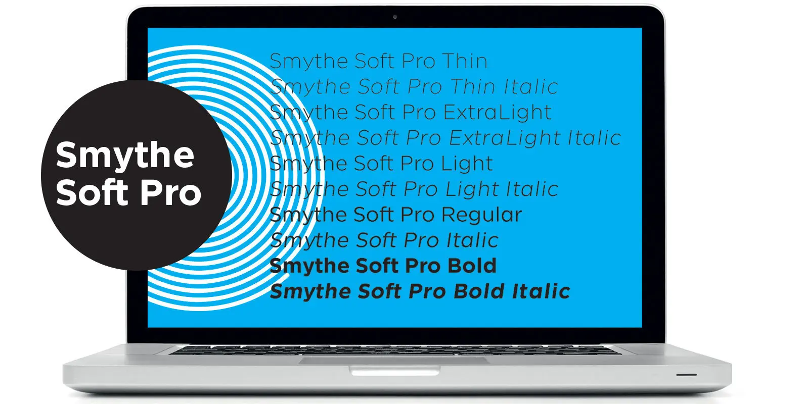
SmytheSoft Pro Font
SmytheSoft Pro is a contemporary workhorse sans serif family that is eminently readable on-screen and in print. It is an updated display version of our popular family Smythe Sans with custom rounded terminals, rigorously spaced and kerned. Smythe Soft Pro
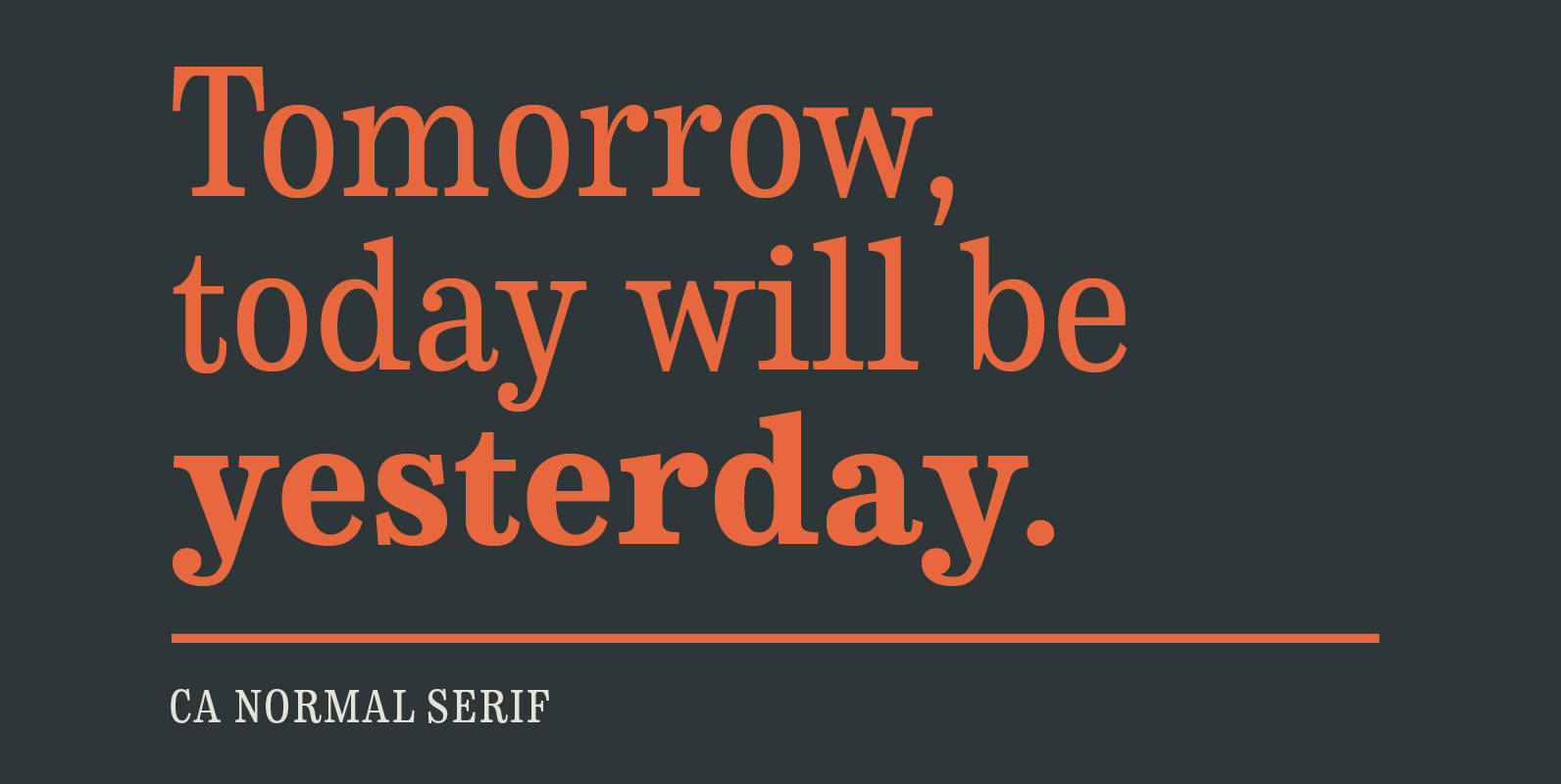
CA Normal Serif Font
CA Normal Serif is the perfect companion to its grotesque brother CA Normal. But it is not just a serifed equivalent. It has a character of its own while preserving the principal proportions and the idea of quirkiness. It was
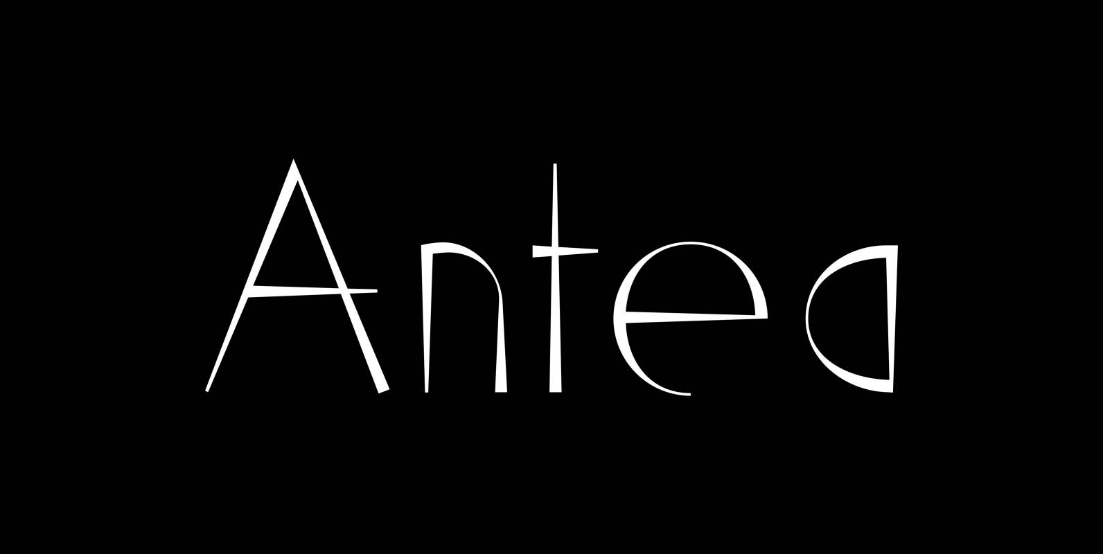
Antea Font
“Antea” is named after “Antaeus” the giant of Libya in Greek mythology, son of Poseidon and Gaia (mother earth), whose wife was Tinjis. He was extremely strong if he stayed in contact with the earth, but once lifted into the
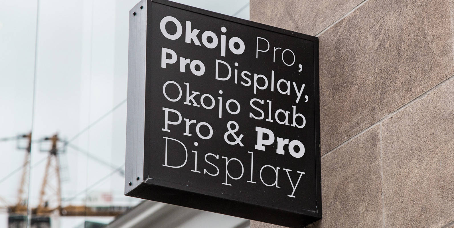
Okojo Pro Font
Okojo Pro Complete is the complete collection of the Okojo Pro family of typefaces: Okojo Pro, Okojo Slab Pro, Okojo Pro Display and Okojo Slab Pro Display. The Okojo Pro family is a reworking of Wordshape’s immensely popular Okojo family
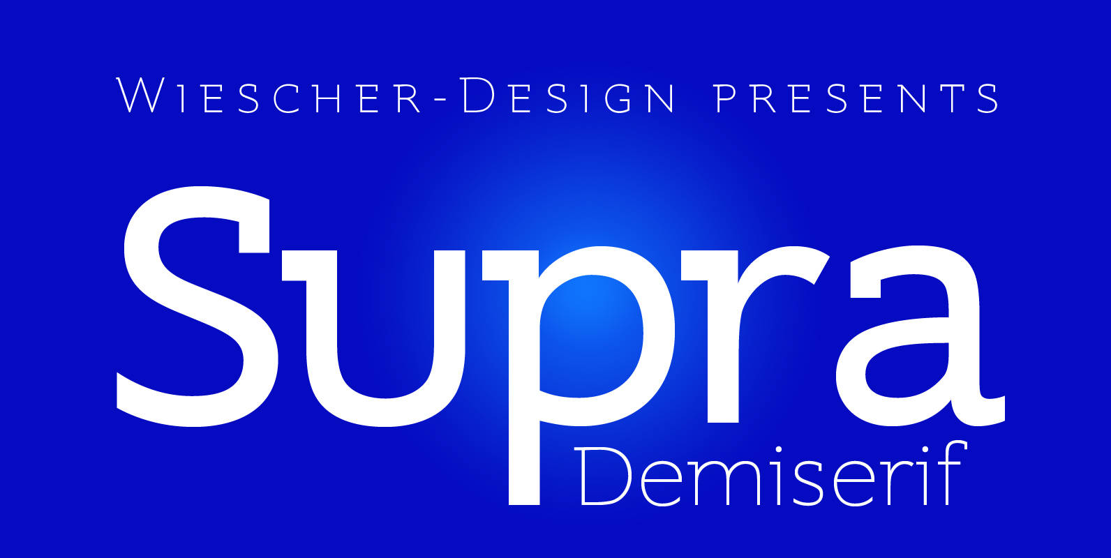
Supra Demiserif Font
“Supra Demiserif” is the demi serif addition to the Supra family. I am no fan of slab serif fonts, so I designed this one with half serifs, that makes the serifs less important. Then I found, that the italic does
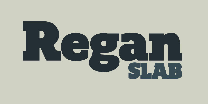
Regan Slab Font
A precision cut slab serif typeface. Simple curves are combined with sharp angles to provide a readable font with subtle characteristics. Regan Slab is ideally suited to a wide range of applications including magazines, newspapers and handheld devices. Details include
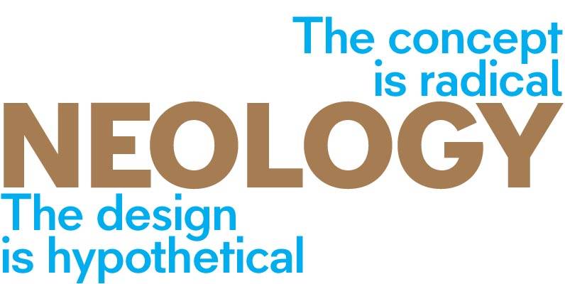
Neology Font
Variety is favored in many areas, particularly for activities which extend over time. Humanity balks at the prospect of the straight road, the assembly line, the prison cell – we are designed to respond to stimuli which vary; inertia generates
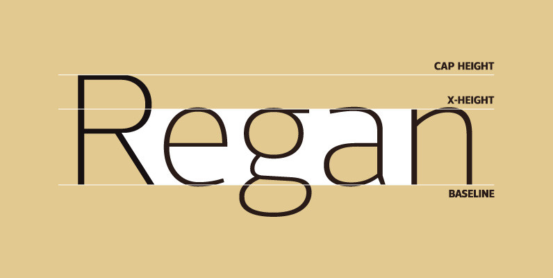
Regan Font
A finely crafted sans serif typeface with an uncomplicated appearance. Soft curves are mixed with minimal angles to create a readable font ideally suited for identity, editorial and online uses. Details include 10 weights with italics, 540 characters, 5 variations