Tag: pointed
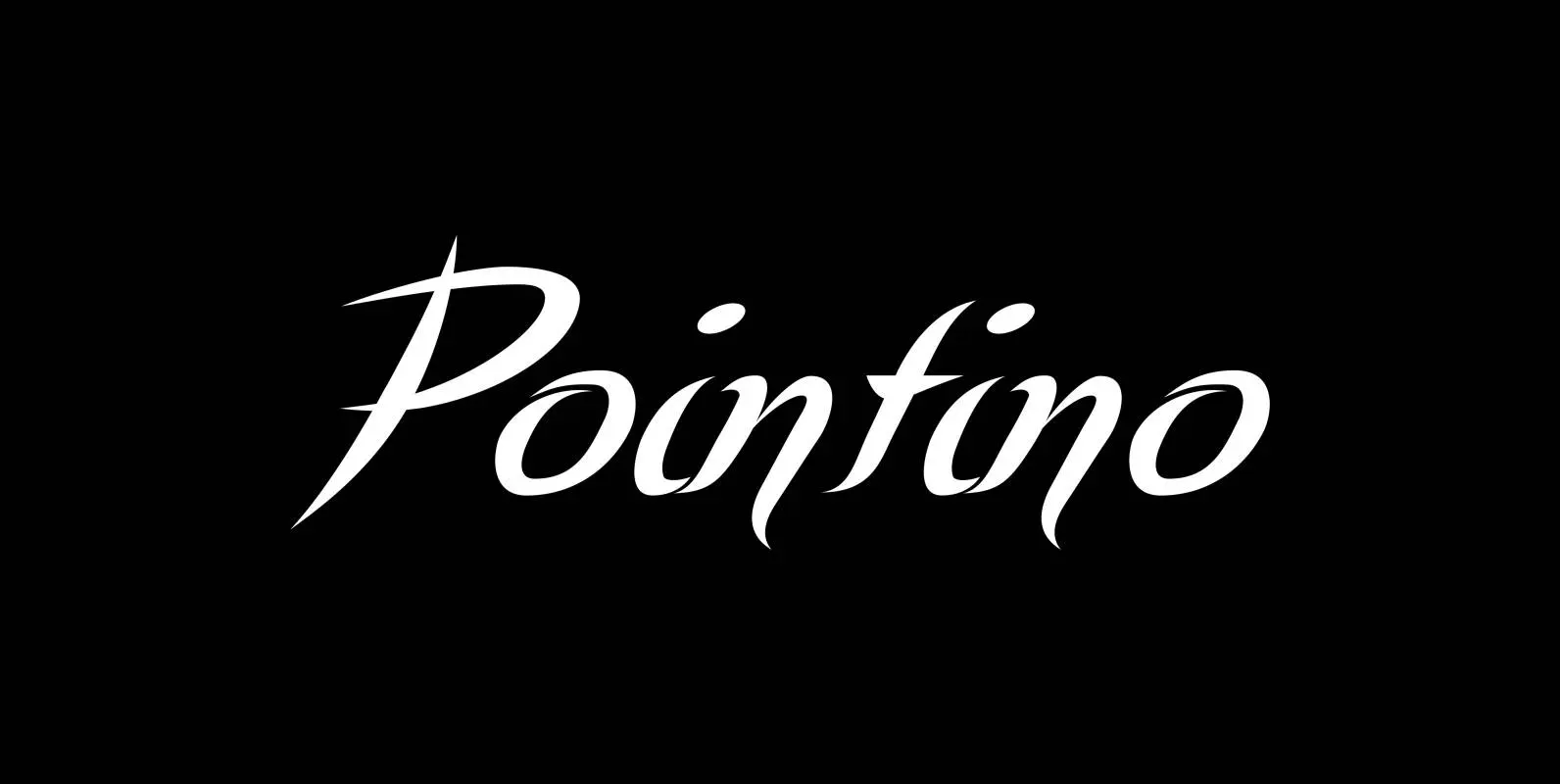
Pointino Font
“Pointino” is a very pointed script. It comes in three versions: Pointino-A has good looking curves, Pointino-B has more of those good looking curves and Pointino-C has fewer, but still sensational curves. Pointino is very sexy, as sexy as typefaces
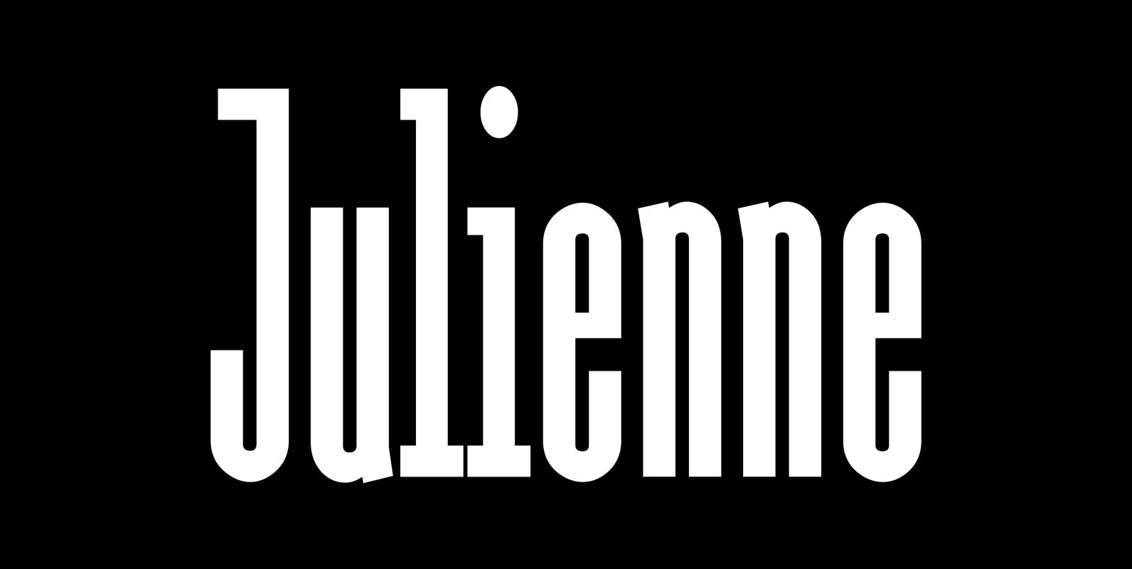
Julienne Font
Cooks call thinly cut – like matchsticks – vegetables »Julienne«. I found that was a fitting name for this very narrow typeface. Julienne Slim is the extreme cut of the two. Personally I do not use narrow typefaces very often,
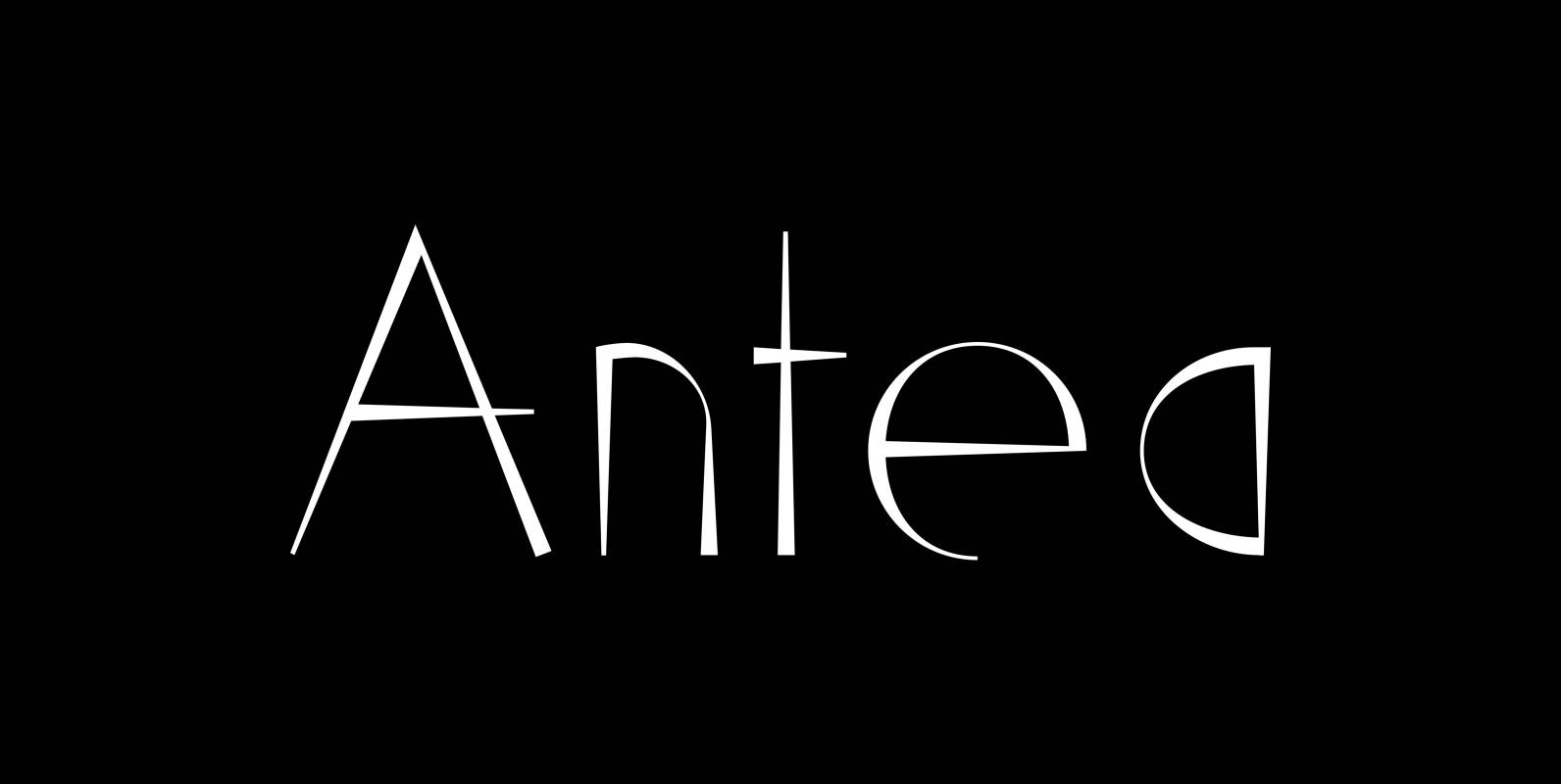
Antea Font
“Antea” is named after “Antaeus” the giant of Libya in Greek mythology, son of Poseidon and Gaia (mother earth), whose wife was Tinjis. He was extremely strong if he stayed in contact with the earth, but once lifted into the
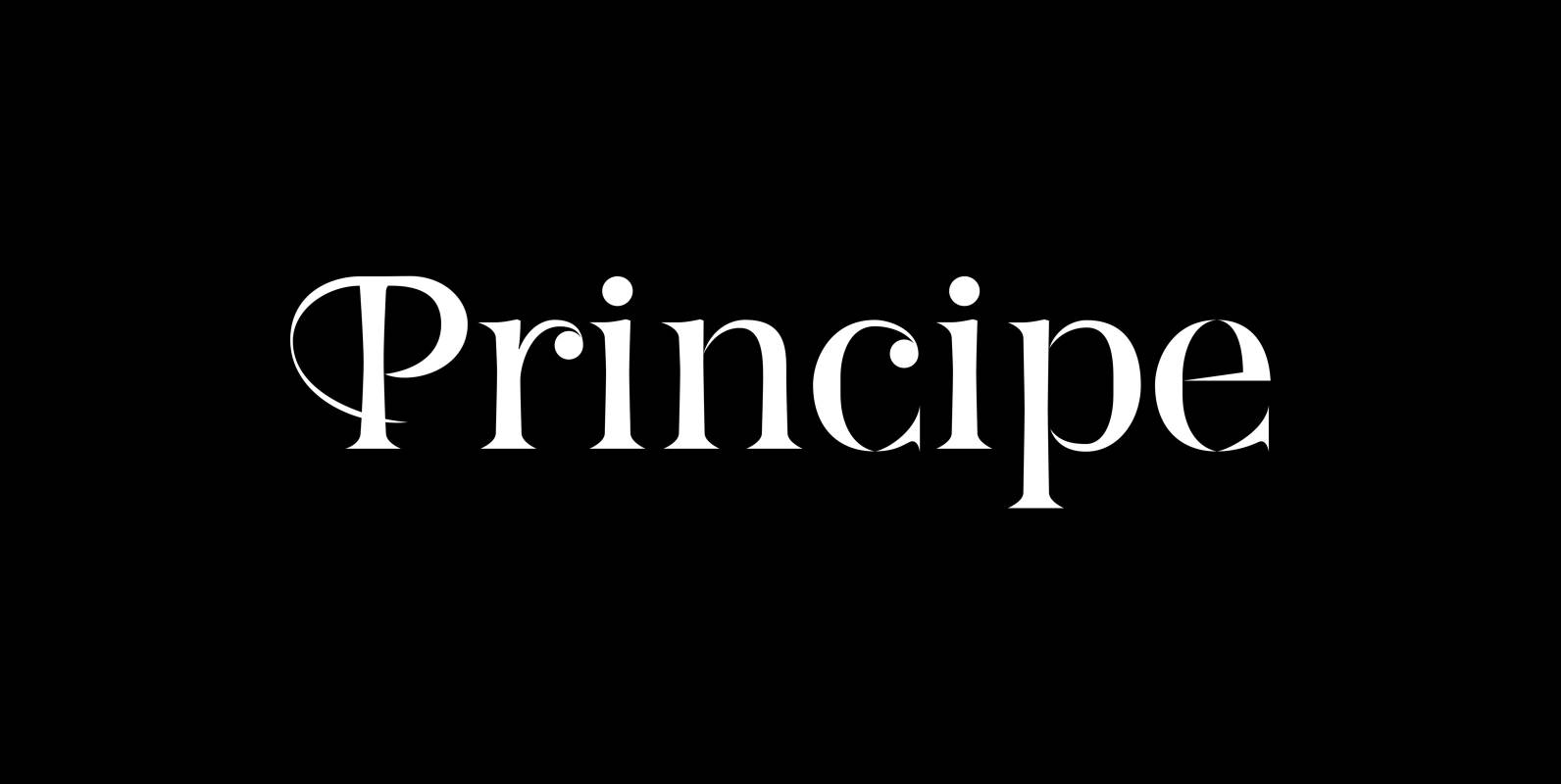
Principe Font
“Principe” is the Bodonian idea driven to the limit by abolishing most of the hairlines! The shape is completed only by the eye of the reader. This gives room for elegant embellishments and makes for a surprisingly new look to
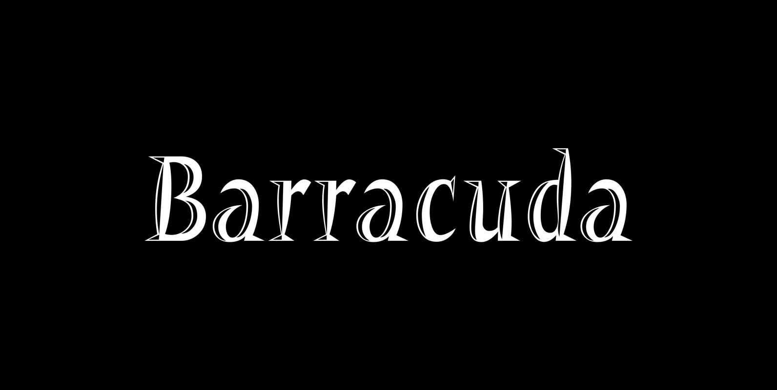
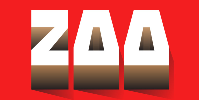
Barracuda Font
“Barracuda” has this sharp, sharky look and I do a lot of diving with my best friend. What else is there to say? If you see a shark say hello from me, yours from under the red sea Gert Wiescher
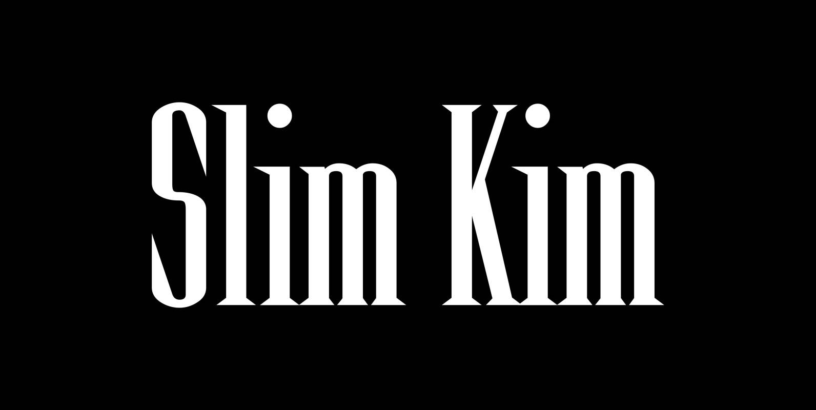
Slim Kim Font
“Slim Kim” is the sister font of “Julienne”. This font has very spiky serifs, so I did not want to make an extra slim version. This font mixes perfectly with “Julienn”. So whenever you need an especially slim serif font
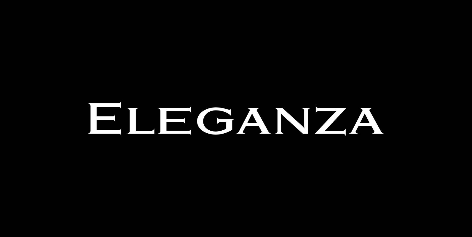
Eleganza Font
“Eleganza” is my most elegant typeface. At least that is what I think! I use it for business cards and everything that has to be elegant with that extra touch. The font comes in pairs for the price of one.
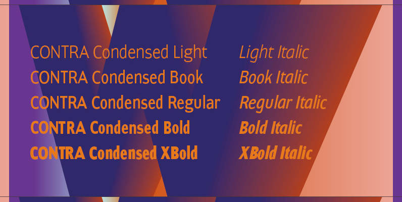
Contra Condensed Font
Contra Condensed is the condensed version of my Contra family of fonts. It is very condensed, but not yet narrow. It is well suited in all situations where one needs to save space. Published by Wiescher DesignDownload Contra Condensed
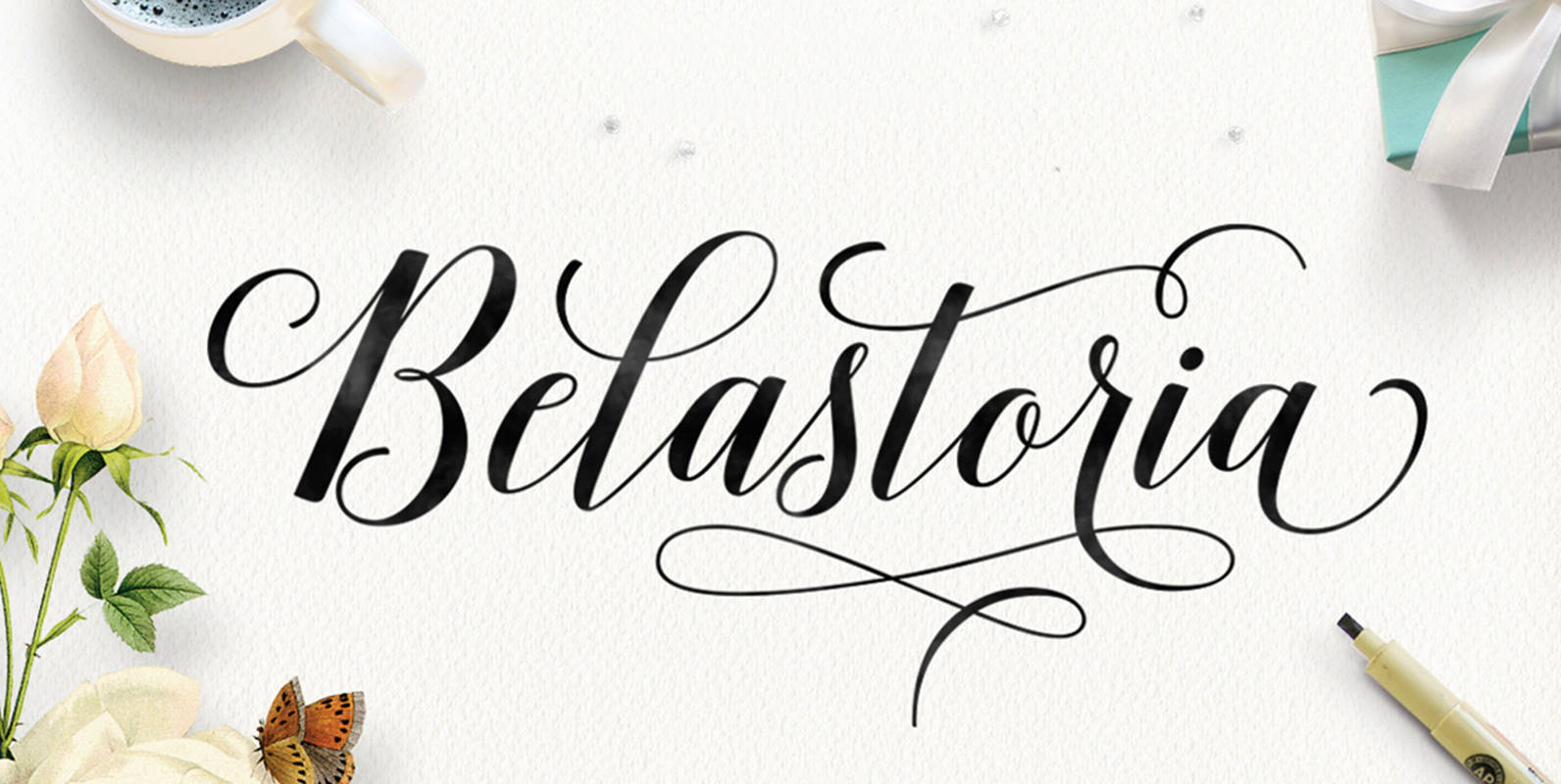
Belastoria Font
Belastoria works perfectly for logos, magazines, menus, children’s books, invitations, weddings, packaging, labels, t-shirts and more. Belastoria contains 565+ glyphs and 340+ alternate characters. It contains OpenType features such as ligatures, swashes, endings, and many early forms to unleash your
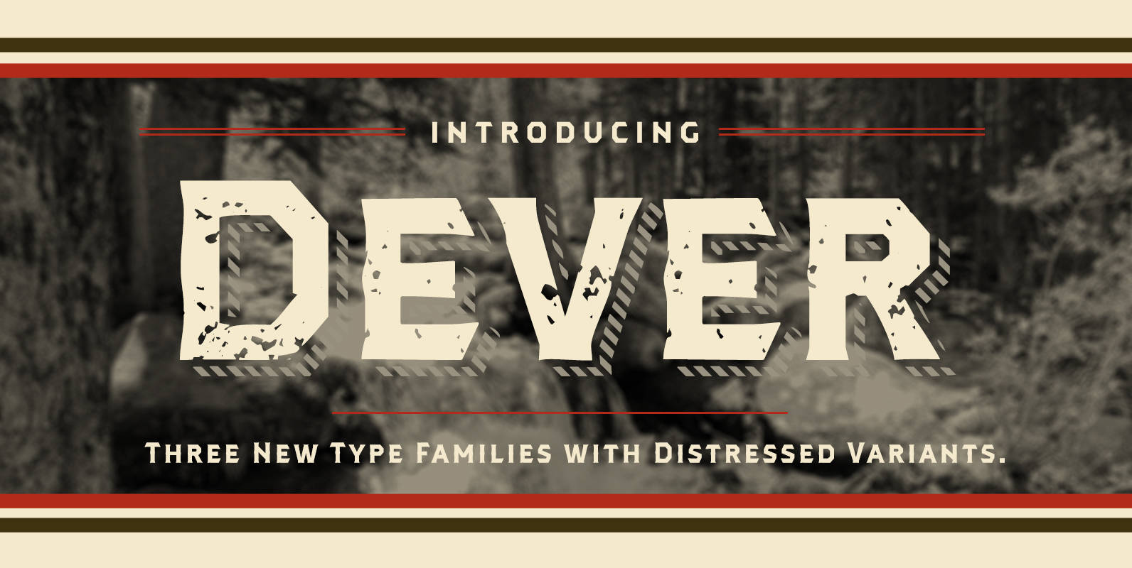
Dever Font
Dever’s brute, industrial lines are rounded up in this new typeface from Jeremy Dooley. Dever combines plenty of inspirations. It’s the flair of the Wild West melded with a shout out to the sign painters and package lettering artists of
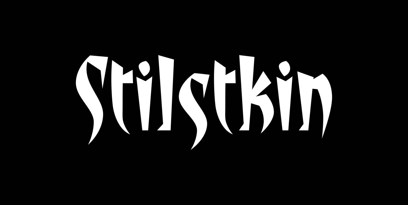
Stiltskin Font
Stiltskin is a font design published by Fonthead. Published by Fonthead Design Inc.Download Stiltskin
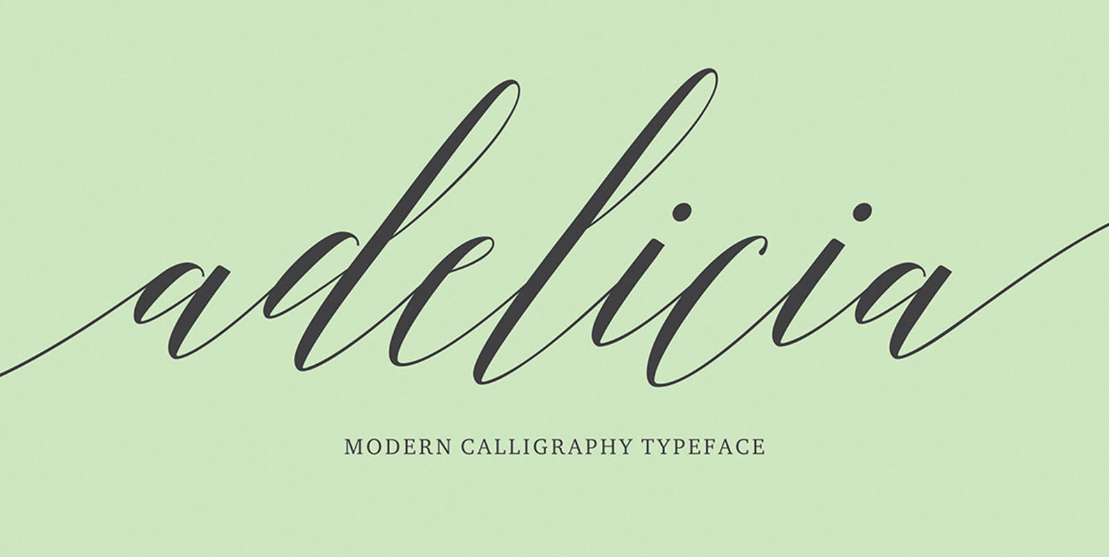
Adelicia Font
Adelicia Script features 565+ glyphs and 264 alternate characters. including initial and terminal letters, alternates, ligatures and multiple language support. To enable the OpenType Stylistic alternates, you need a program that supports OpenType features such as Adobe Illustrator CS, Adobe
Chopper Font
In 1972, VGC released two typefaces by designer friends Dick Jensen and Harry Villhardt. Jensen’s was called Serpentine, and Villhardt’s was called Venture. Even though both faces had the same elements and a somewhat similar construct, one of them became
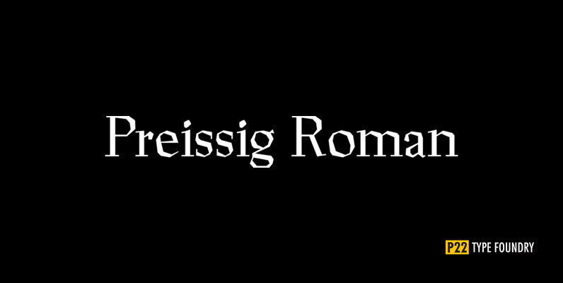
P22 Preissig Font
The type designs of Vojtech Preissig are rugged, bold and often technically flawed. The hand of the designer is clearly evident. In the true spirit of William Morris and the ideals of the Arts and Crafts movement, the tell-tale signs
Spire Extra Light Font
Originally designed by Sol Hess for the Lanston Monotype Foundry in 1938 as a fat face, this extra light revival was designed by Ann Pomeroy in the early 90s. Spire is extra condensed with a very retro look. Published by
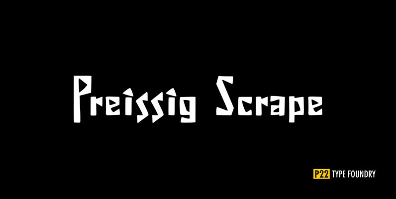
P22 Preissig Scrape Font
The type designs of Vojtech Preissig are rugged, bold and often technically flawed. The hand of the designer is clearly evident. In the true spirit of William Morris and the ideals of the Arts and Crafts movement, the tell-tale signs
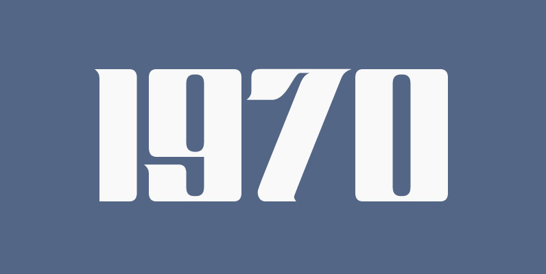
Guillotine Font
Guillotine is inspired by an uncredited early 1970s film face called Rhythm Bold. While the original film type had plenty of round forms that were uneven and somewhat badly drawn to fit within the overwhelming pop wave of the time,
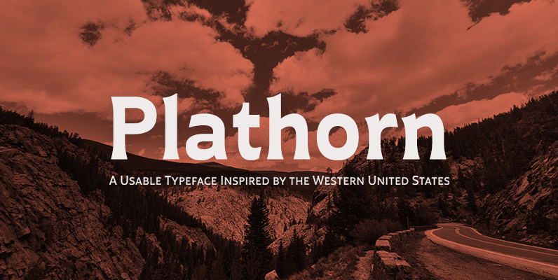
Plathorn Font
That’s right, folks. When the West called, Jeremy Dooley reached up like Pecos Bill, grabbed it by the reins and pulled it in, then using its wide, roaming elements to design this functional font that still has an unbroken spirit