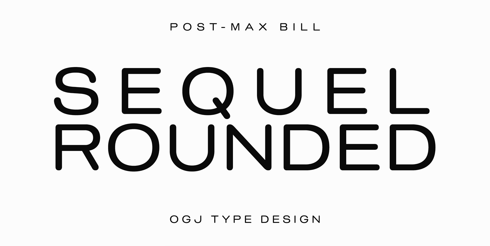
Tag: plain

YE Paradigma Font

YE Paradigma is a beautiful sans serif typeface, with 24 weights, including italics & condensed fonts, made with extra tolerance & love! He is so casual that you wouldn’t even noticed him, but still he has a lot to say,

Bebas Neue SemiRounded Font

Bebas Neue SemiRounded is Bebas Neue with rounded corners. As you know, Bebas Neue is the most widely used free font recently. The basic theory and proportion are same as Bebas Neue but rounded shape gives a warm, soft and

Bebas Neue Rounded Font

Bebas Neue Rounded is the Bebas Neue with rounded corners and terminals. As you know, Bebas Neue is the most widely used free font on the market. This rounded version is a new style where the basic theory and proportion

YE PlainSans Font

’PlainSans’ typeface, developed to be used for everyday needs. he’s plain, transparent in his environment, and yet delivers a unique interpretation to the latin type. The graphic language has a stable structure that conveys simplicity and a familiar look. Published

Fairweather Font

Fairweather is a fresh air. Clear, transparent, and lucid as if it is the spring and autumn sky. By designed condensed, legible and perspicuous, Fairweather is perfect for titles and captions. But “Title and Captions” are the just examples. Very

Sequel Rounded Font

Unfortunately we rarely meet typefaces which still show the formal quality of the time of our grandfathers or even the technical progress in their interior with the design of their exterior. A rare example is Sequel Rounded whose shapes combine

Sequel Sans Font

Sequel Sans is an homage to Max Bill, the influential mid-century Swiss architect, artist and industrial/graphic/type designer. Designed in cooperation with the Max Bill Georges Vantongerloo Foundation in Zurich, this is a modern response to the traditional Max Bill themed

Commuters Sans Font

Commuters Sans is a classic and simple geometric font design, published by Ryoichi Tsunekawa. Commuters Sans is useful for both body-text and titling by their minimal glyph shapes and slightly wide and eye-catching proportion. It consists of eight weights and

Professor Font

Professor is modeled after the handwriting of an actual professor emeritus whose cursive script displays just the plain-yet-handsome, casual-yet-legible feeling I’d been looking for in a contemporary hand—one that might prove as useful in a personal letter as, say, on

Lesmore Font

Designed by Les Usherwood. Digitally engineered by Paul Hickson. Another typeface from Les Usherwood that was released after his 1983 death. Published by Red RoosterDownload Lesmore

Gilmore Fahrenheit Font

Gilmore Fahrenheit is an original font design by A. Pat Hickson and Steve Jackaman for the Red Rooster Collection. Published by Red RoosterDownload Gilmore Fahrenheit

Designer Script Font

“Designer Script” is a very cool script, that has only one objective and that is pure transportation of information. Attracting as little attention to the script itself as possible. Published by Wiescher DesignDownload Designer Script

Bio Sans Font

Bio Sans is a super neutral sans-serif family for text designed by Ryoichi Tsunekawa and the whole family consists of 6 weights from ExtraLight to ExtraBold and their matching Italics. The basic concept of this family is the same as

Siro Font

Siro is a large x-height sans-serif family for text designed by Ryoichi Tsunekawa and the whole family consists of 7 weights from ExtraLight to Heavy and their matching Italics. The basic skeleton of their letterform was designed simply to create

Quiet Sans Font

Quiet Sans is a super geometric sans-serif family for text designed by Ryoichi Tsunekawa and the whole family consists of 6 weights from ExtraLight to ExtraBold and their matching Italics. The basic concept of this family is not only to