Tag: periodicals
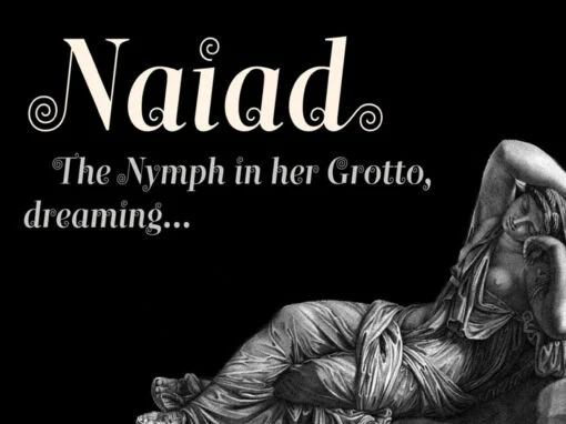
Naiad Font
A neoclassical fancy, questioning the convention that decoration is a superficial veneer of style. Here, ornament and function are combined in flourishes integral to the structure of (almost) every glyph. Much Victorian display type had a similar goal, to move
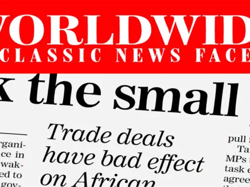
Worldwide Font
Proven in scores of magazines and newspapers around the globe since 1999, Worldwide is a semi-condensed, large x-height Century revival designed to elegantly fit large amounts of text into compact spaces while retaining maximum readability and apparent size. Its Regular
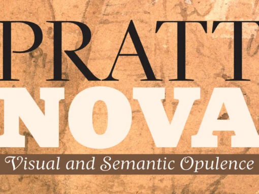
Pratt Nova Font
Shaped by constraint to accommodate a large character count, Pratt Nova has massive form: semi-condensed, large x-height, short descenders and capitals. And yet it transcends its restrictive origins in abundance, expressing a spirit of visual and semantic opulence, equipping the
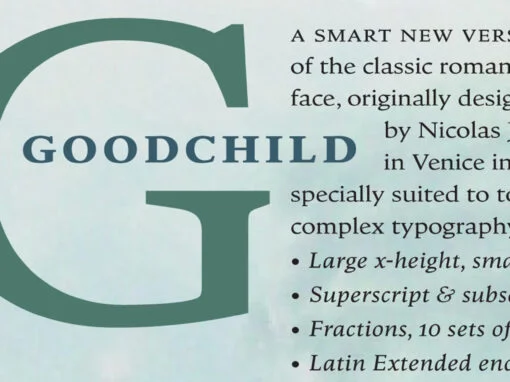
Goodchild Font
Goodchild Pro is a pragmatic text face, equipped for sophisticated academic typography. The face has a large x-height, as there is little point in adding to the stock of rangy “book” Jensons. Despite this departure from the archetype, in other
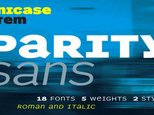
Parity Sans Font
There is a lot to choose from in this unicase megafamily, with roman and italic, six weights, text and display styles, and both proportional and monowidth versions! Published by ShinntypeDownload Parity Sans