Tag: ordinals
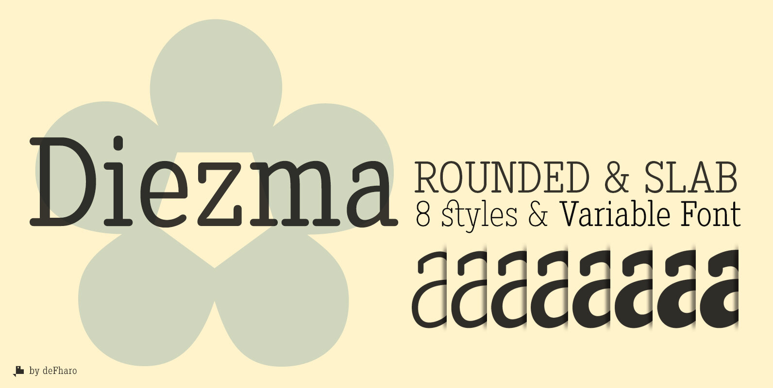
Diezma Rounded Font
Diezma is a typeface with rounded Slab serifs that give it a modern and elegant look in the lighter versions, the thicker versions complement the thin ones for titles and headlines. The personality provided by the counter forms of the
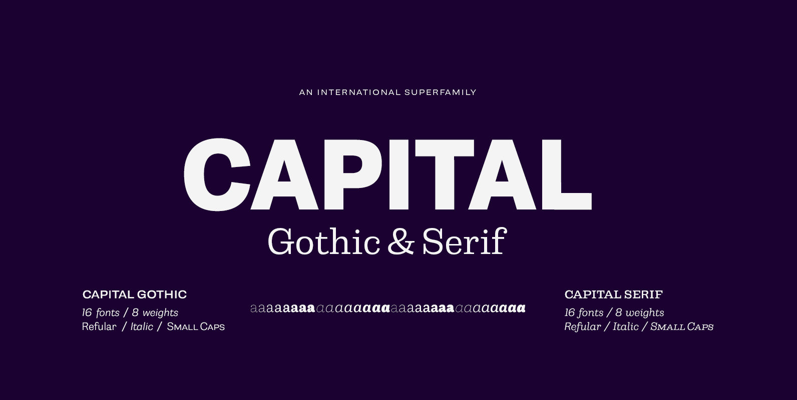
Capital Font
Capital is a multifunctional super family with modernist roots. It is comprised of two distinct subfamilies: Gothic and Serif. Both share the same structure and proportions and come in seven weights – thin, light, regular, bold, extra bold and black,
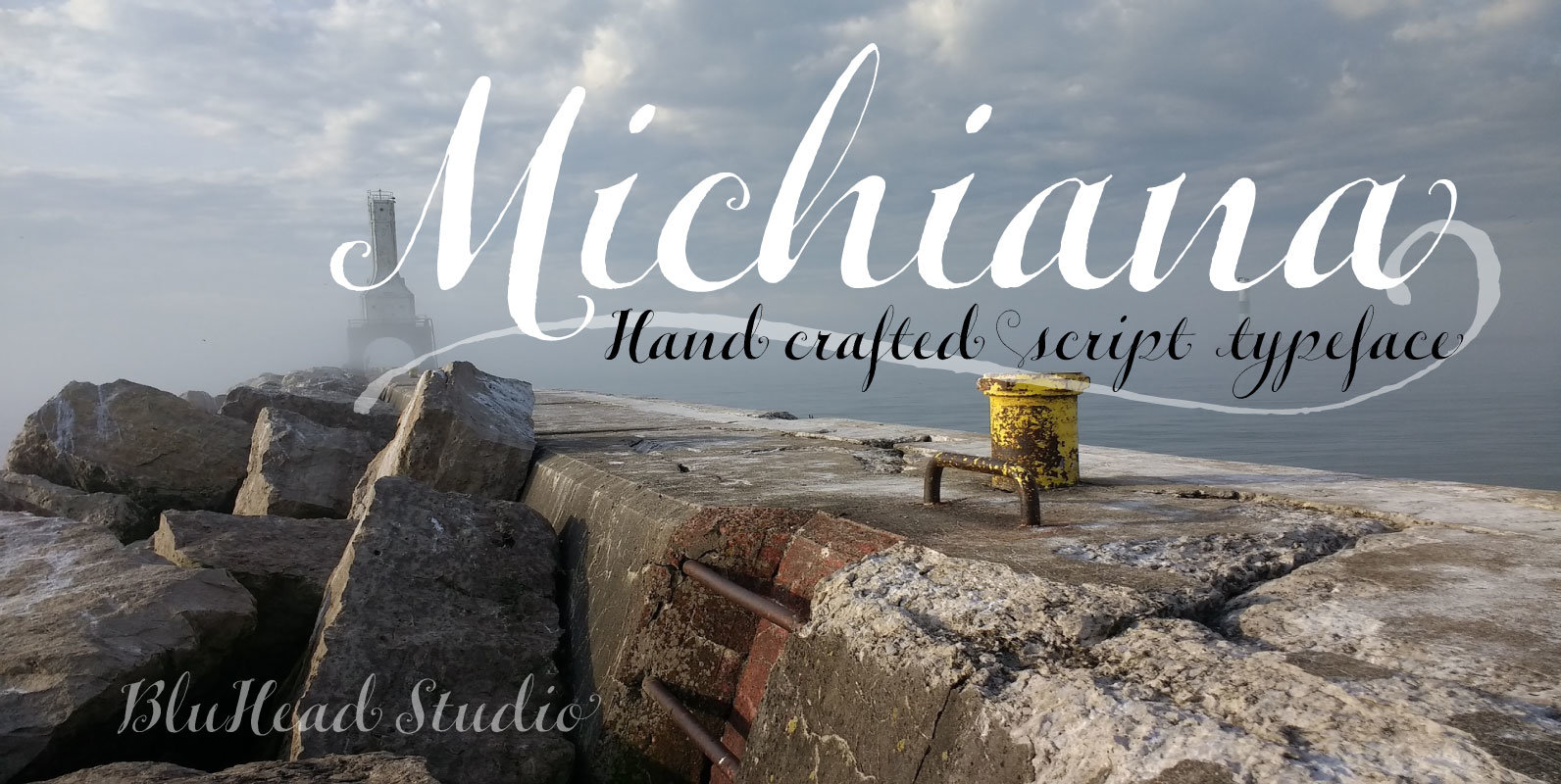
Michiana Pro Font
Michiana Pro is my new, hand-crafted connecting script! I’ve been hand lettering cards and envelopes to my wife and family in this type style for years and decided it was time to make a font based on it. I typically
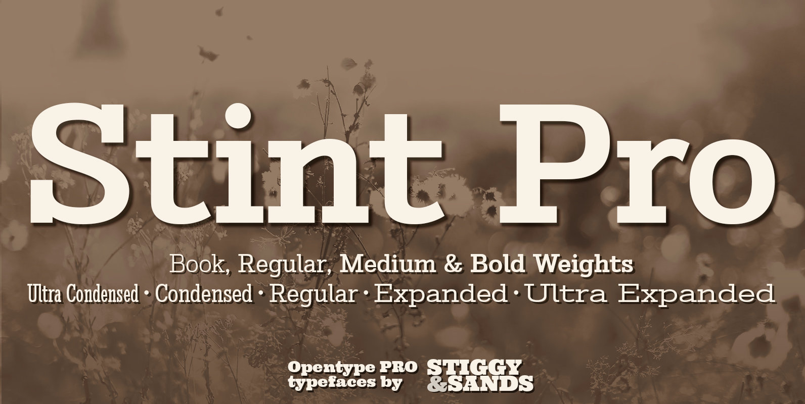
Stint Pro Font
Our Stint Family was originally influenced by extra wide letterform styles and developed later to create an ultra condensed range of fonts and the widths in-between. Highly legible throughout its width & weight ranges, the Stint Pro Family is both
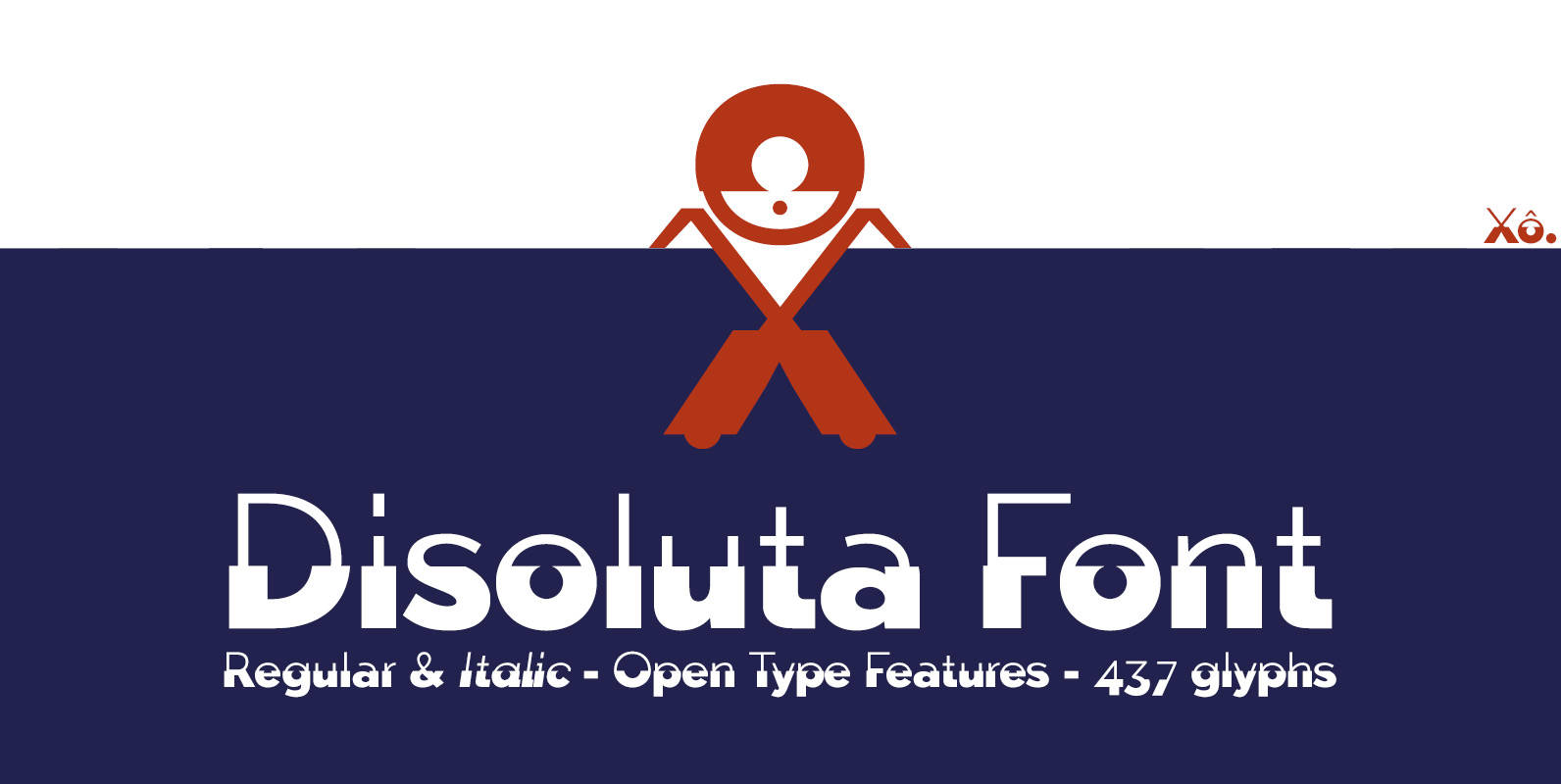
Disoluta Font
Disoluta is a typographical experiment fusion of two sans fonts with different weights, for which I used my previous Typefaces: Tabarra Light and Black. The Commercial version includes: 2 fonts (Regular & Italic) • 437 glyphs • OTT & TTF
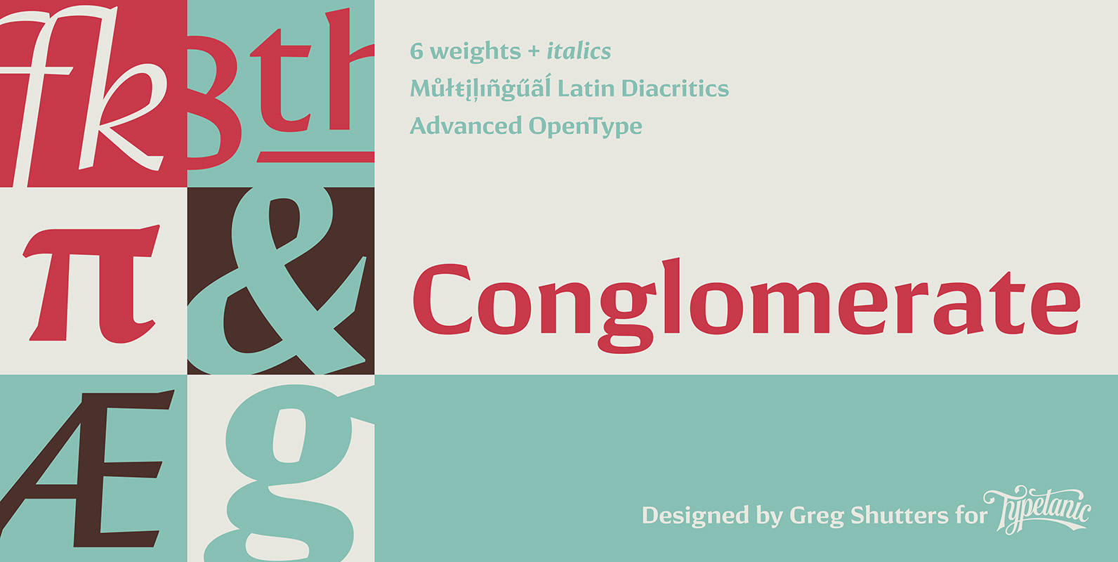
Conglomerate Font
Sans or serif? Square or rounded? Calligraphic or geometric? Conglomerate is both all and none of these things — a subtle yet unorthodox blend of typographic traits resulting in a clean, unique, and versatile font family with large, open counters
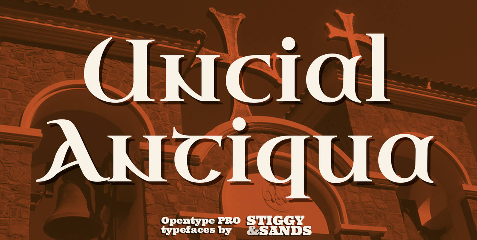
Uncial Antiqua Pro Font
Our Uncial Antiqua Pro is a hybrid typeface which combines the speedier penned styles of Uncial and Half Uncial letterforms together in a formal text representation. Signature letterforms to the Uncial & Half Uncial styles are not sacrificed in this
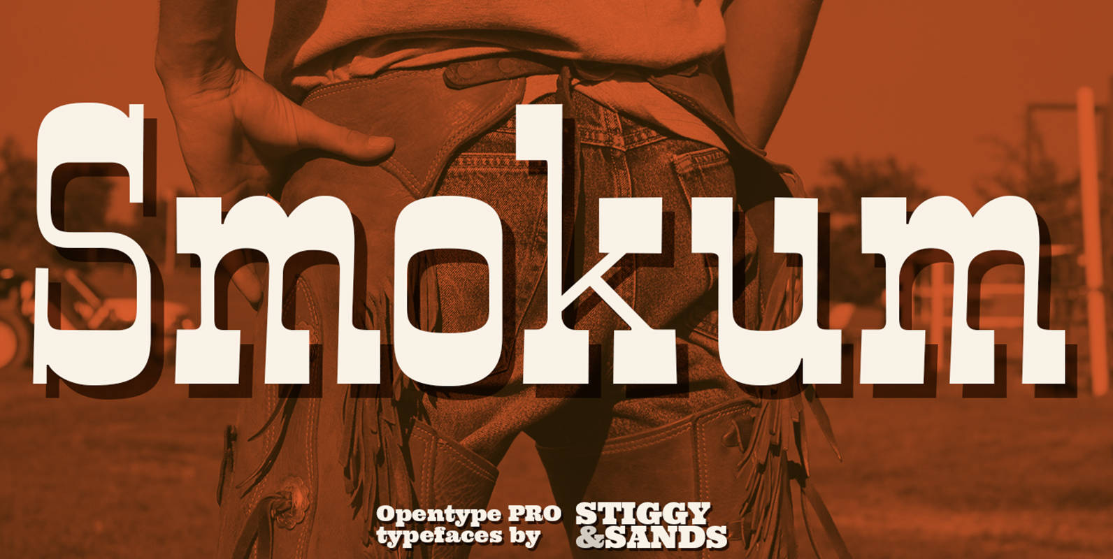
Smokum Pro Font
Our Smokum Pro is a western inspired slab-serif font with a little playful swagger to it. It’s perfect for headlines and display uses that require a little loosened up country flair, but because of the contrast of thicks and thins,
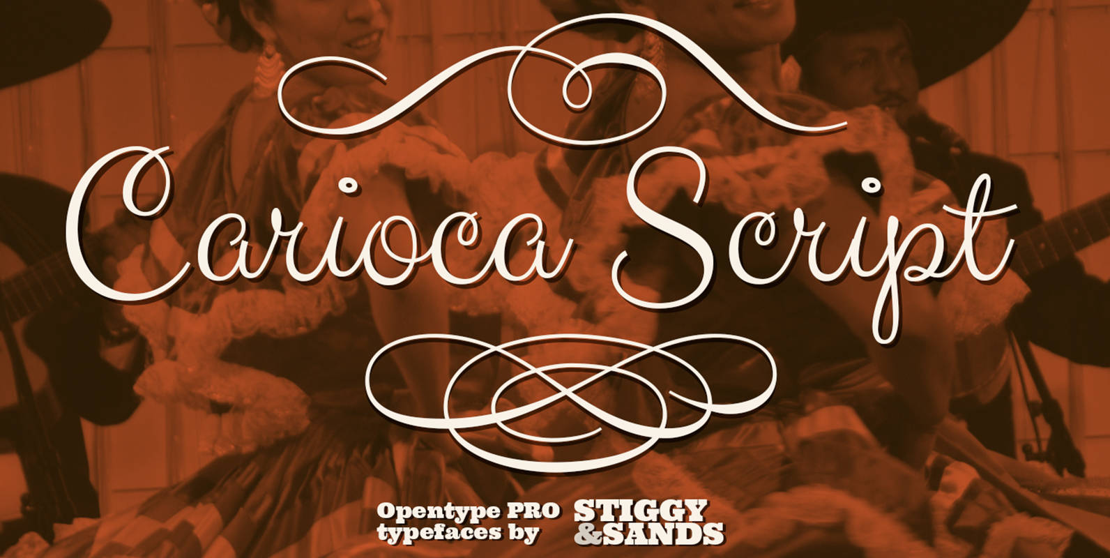
Carioca Script Pro Font
Our Carioca Script Pro was inspired the lettering from the RCA Records Stereo Action Series from the 1960’s. It’s a signature script that is both elegant yet slightly bouncy and truly sings…lending a happy-go-lucky flavor to any design. This script