Tag: nib
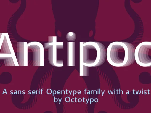
Antipod Typeface: The Unison of Artistic Nuance and Precision in Digital Design
Standing at the intersection of creativity and precision is the modern typeface, Antipod. This sans-serif font family, hailed for its unique stroke and meticulously crafted nuance, takes center stage in the realm of digital product design. Offering a blend of
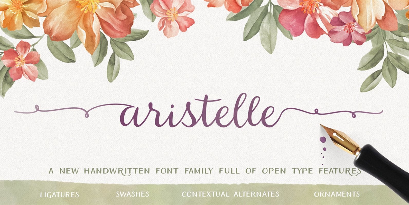
Aristelle Font
Aristelle Family is a beautiful, hand-lettered script that was created using Leonardt III EF nib. Aristelle Script is full of OpenType features such as initial and terminal swashes, ligatures, and ornaments and is best used in an OpenType-aware software. Aristelle
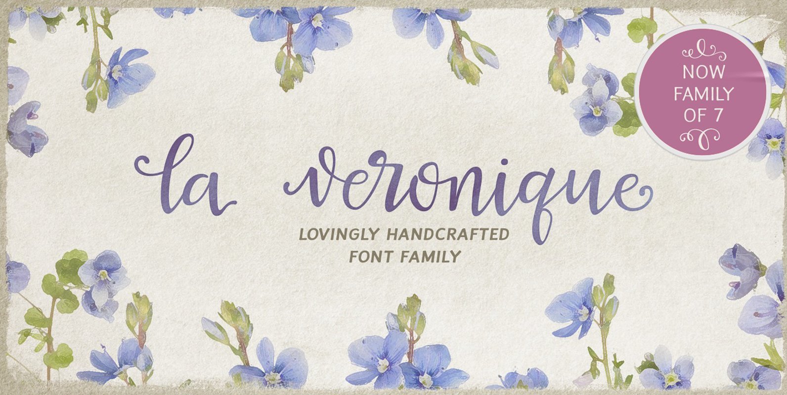
La Veronique Font
A hand written font family, created with the upcoming spring and sunshine in mind. It is full of alternates, swashes, ligatures and other open type features. You can use it for wedding invitations, thank you cards, quotes – the choice
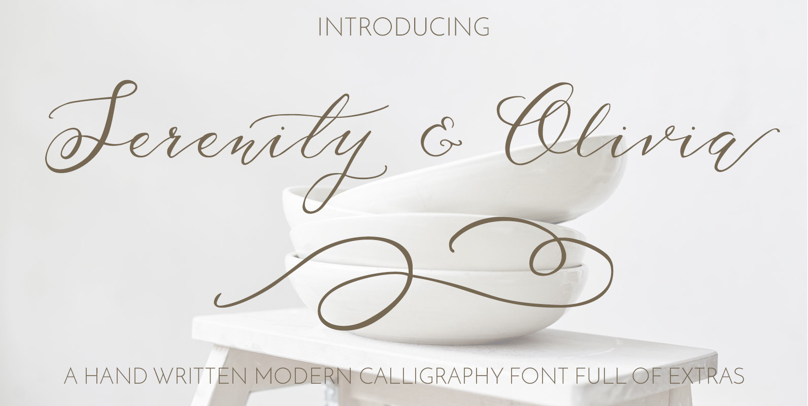
Serenity & Olivia Script Font
Introducing Serenity & Olivia! A beautiful flowing script font – carefully created using a pointed pen and ink. Each letter is unique and perfect for anyone looking for a modern calligraphy font. I have spent many hours designing and developing
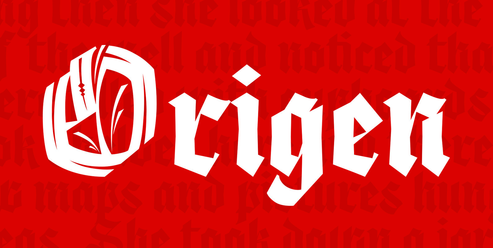
Origen Font
Origen is a typeface inspired by the illuminated manuscripts whereby the text is accompanied by a decorative capital letter at the start of the text. The family is formed by three different weights (light, regular, bold) and an additional decorative
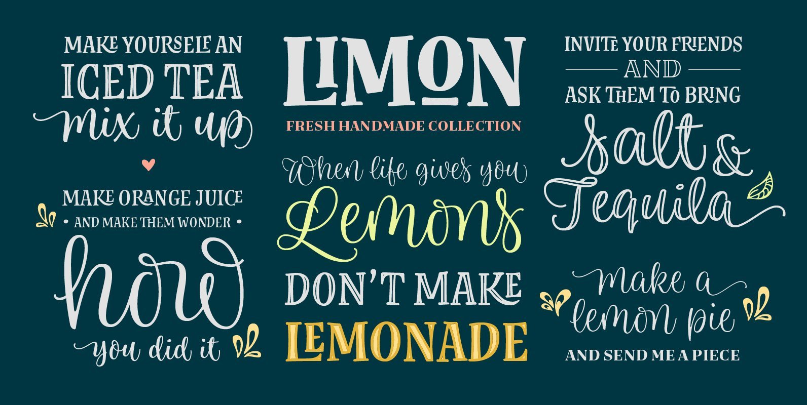
Limon Font
After the success of Blend, Typesenses presents Limon, its fresher handmade font collection. 100% hand-drawn by Sabrina M Lopez, with the collaboration of Sol Suarez, who illustrated the dingbats, and Guido Ferreyra, who made the font production and programming of
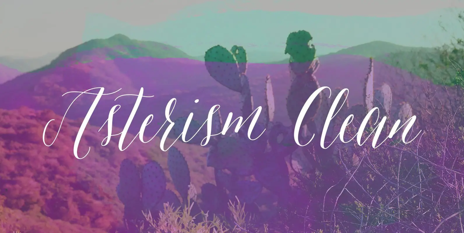
Asterism Clean Family Font
Asterism Clean is the smooth lined version of Asterism. It is a calligraphy style font with a moving baseline and lots of shining personality. Also contains a bold and a monoline version. This hand written style font is based on
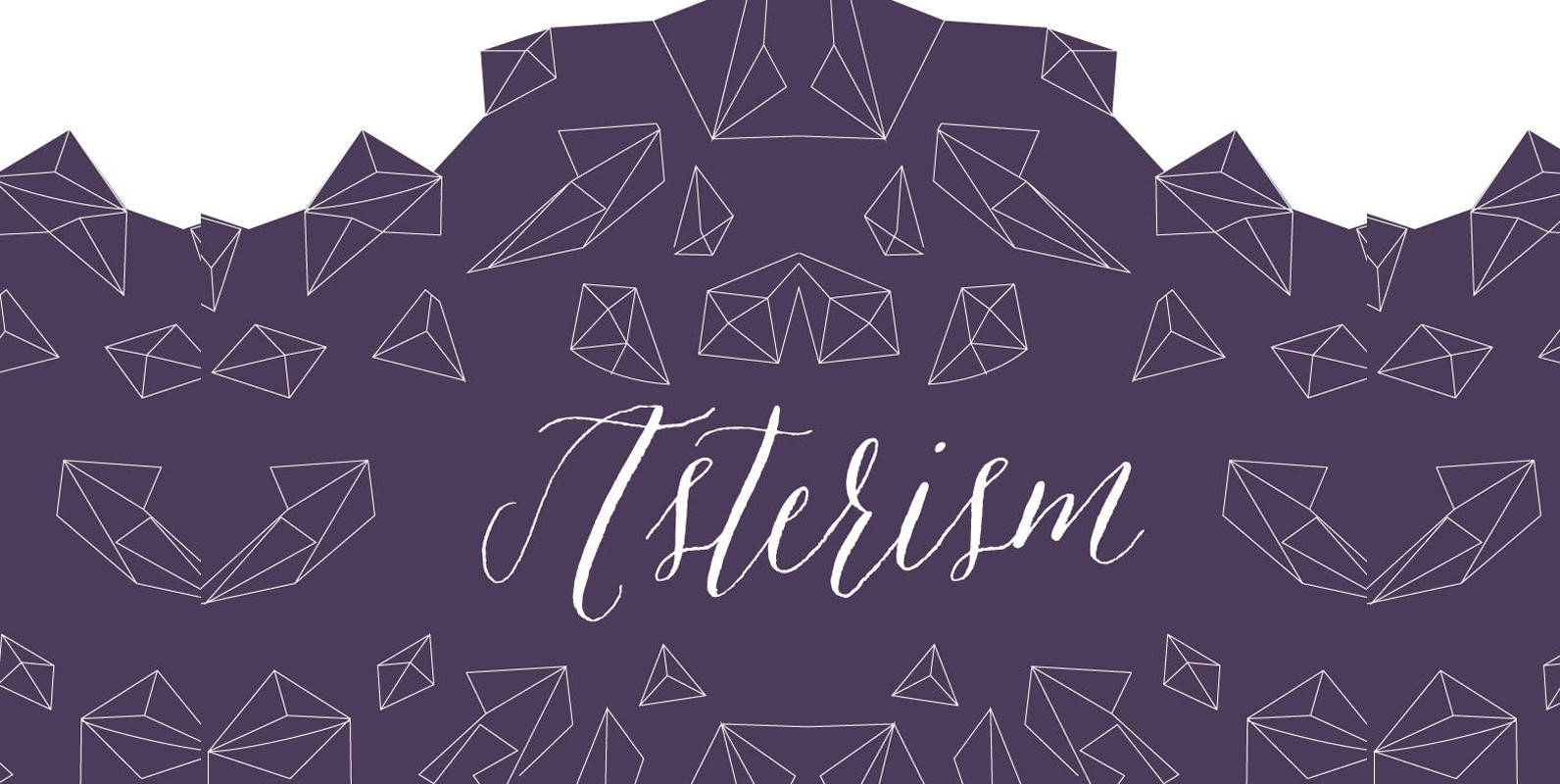
Asterism Font
Asterism is a calligraphy style font with a moving baseline and lots of shining personality. This hand written style font is based on one of Molly’s signature calligraphy styles and pairs beautifully with Frosted, Icing, Saint Agnes. Published by Great
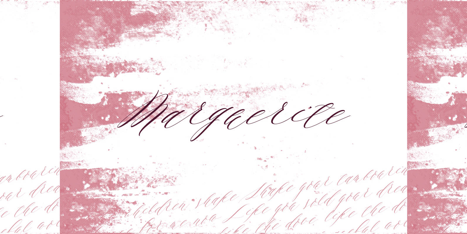
Marguerite Font
Designed by fine artist and calligrapher Alissa Mazzenga, Marguerite is is a calligraphy style font inspired by fine artistry and risk taking. She has a way of surprising her viewer, with a look that is authentic, yet chic, relaxed, but
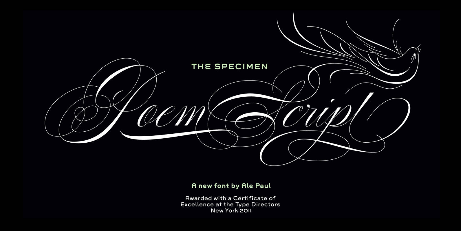
Poem Script Font
Poem Script is a mixed collection of interpretations conjuring a late nineteenth century American pen script style. Though not an actual Italian letterform, this style was called “Italian Alphabet” stemming from an old penman’s term for an alphabet where the
Blend Font
Have you ever tasted a type blend? In Coffee universe, a blend is a combination of different kinds of beans to get a more balanced taste. Typesenses brings this concept to the world of typefaces and creates its new hand-drawn
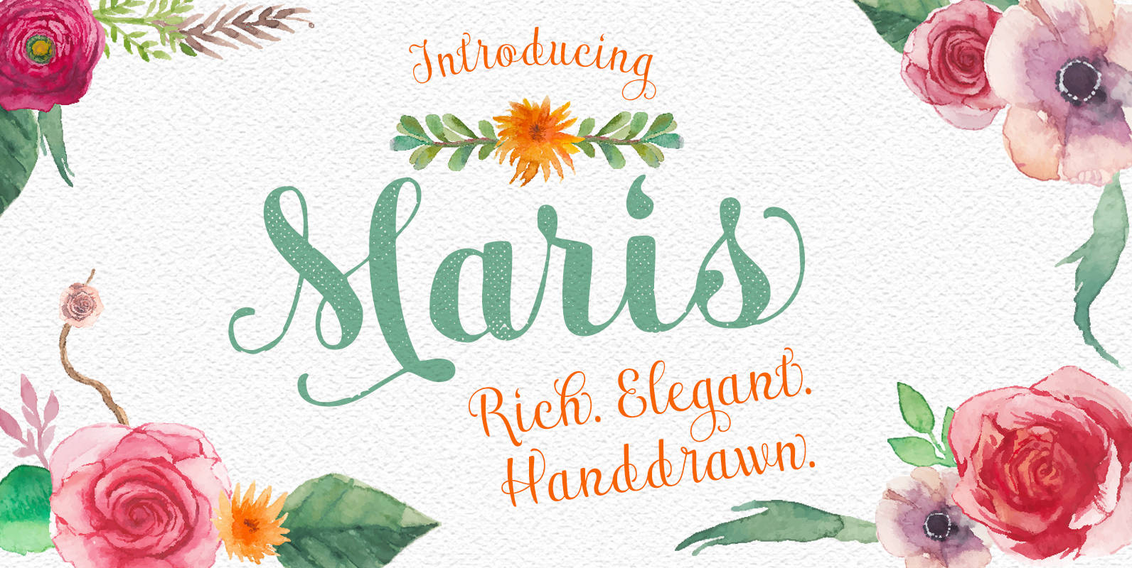
Maris Font
The family is composed of six different weights, each one bolder than the last but all equally as filling. The lighter weights move delicately through each line, showing a gentle strength in their smaller frame. The six weights from these
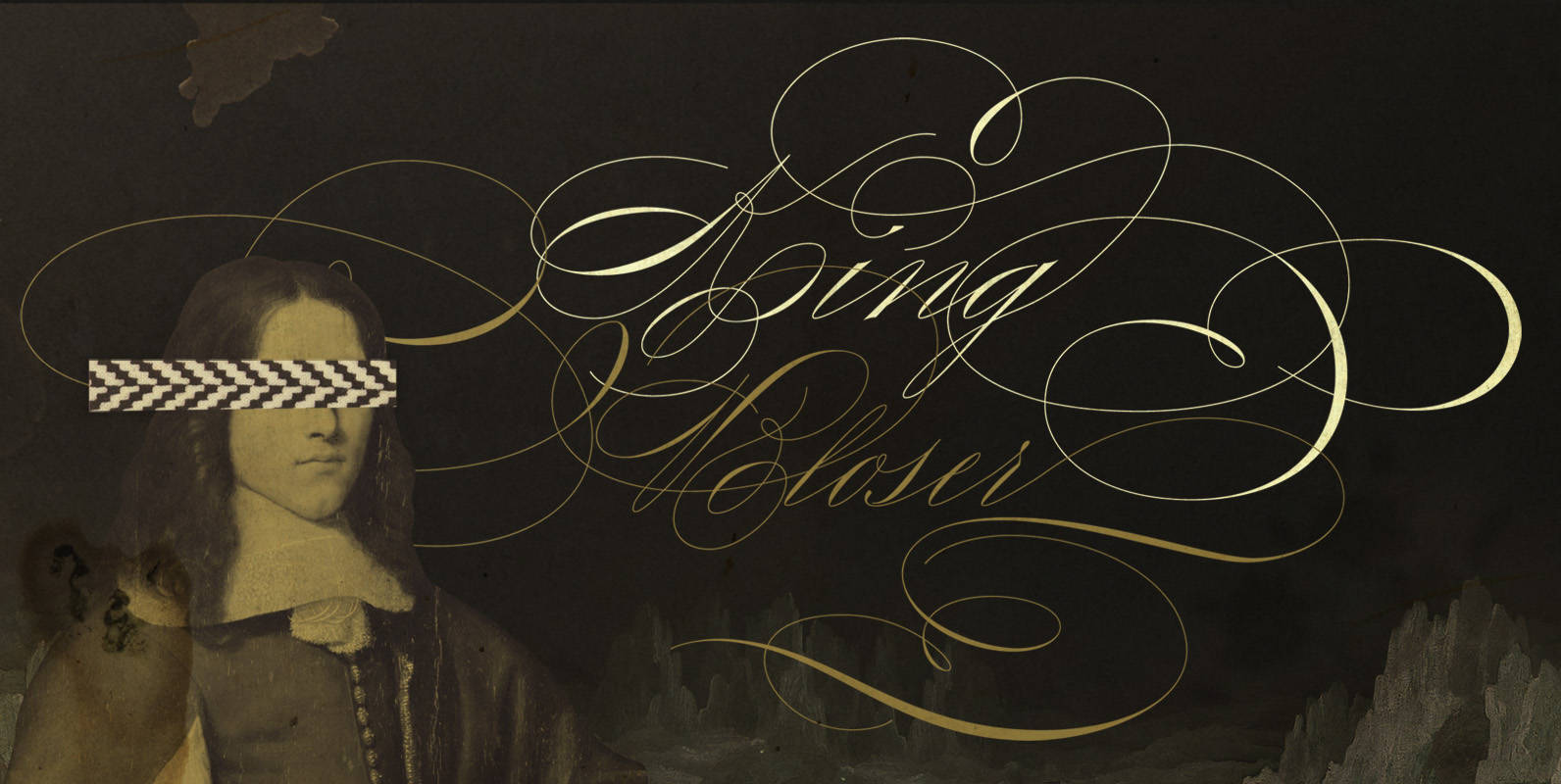
King Bloser Font
King Bloser Is a calligraphic font family inspired by Masters of Penmanship. The name King Bloser is a homage to penman E.W. Bloser from the 18th century; While the typeface has nothing from Bloser’s work, he was one of the
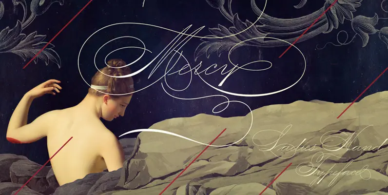
Mercy Font
This Ladies’ Hand Style font is very (somewhat) similar to ornamental penmanship, but uses slightly longer ascenders and descenders and a modest shading. Originally the Ladies’ Hand had less flourishings, which was ideal for writing long letters. Even though its
Wishes Script Font
Wishes Script is the best way to express your greetings! All you want to say is more gorgeous when using this pretty font, since it beautifies every message. Programed with Open Type, Wishes offers the designer a complete range of