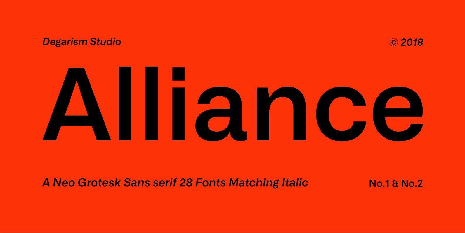
Tag: neutral

Dopis Font

Dopis (Допис on Cyrillic) is neo grotesque family available in four weights and in two widths. It is universal and neutral typeface, fully applicable in every situation. Contains extended Latin character set with Cyrillic support. Published by Tour de Force

Bebas Neue Rounded Font

Bebas Neue Rounded is the Bebas Neue with rounded corners and terminals. As you know, Bebas Neue is the most widely used free font on the market. This rounded version is a new style where the basic theory and proportion

Geometos Soft Font

Geometos Soft is a geometric sans-serif display typeface family. It is a rounded version of Geometos Neue. An all caps family of seven weights, Geometos Soft is especially suitable for headlines, headings, branding, posters, packaging, titles and logos. Published by

Silta Font

Silta is a humanist sans designed for interface typography and screen legibility. Sharp where it counts, flexible where you need it — and always a friendly tone. With seven weights and matching italics it has the range required for complex

Skema Pro Font

Skema Pro is a versatile system of 6 serif typefaces – each bearing a distinct character and purpose. Together they form a huge superfamily of 84 fonts to fit any imaginable task. Skema Pro Livro is a low contrast, low

AP pro Font

AP pro is Old-Style typeface that has 6 weights and italics. Fit for usage in branding, editorial, title in small or large sizes. Designed for text, this typeface has features small caps, case sensitive, final/terminal form (a, e, m, n,

Finland Font

Finland was inspired by European type specimen books, especially Finland type standard. Delivering some glorious vibes of the solid values from the pioneers and keeping one eye on todays demands and technology, Finland is made for high professional use. Finland

Paradroid Font

A pragmatic sans-serif which sits in the centre on the grotesque to geometric style spectrum. Equal measures of both letterforms create a neutral type family that is modern, functional, and easy to read without being too distractive. Details include seven

Fairweather Font

Fairweather is a fresh air. Clear, transparent, and lucid as if it is the spring and autumn sky. By designed condensed, legible and perspicuous, Fairweather is perfect for titles and captions. But “Title and Captions” are the just examples. Very

Bruta Pro Font

Bruta is a contemporary sans-serif grotesque typeface, conceived to become the Swiss army knife of your font library. Inheriting the modernist approach of the grotesque fonts, Bruta aims to be a rational and neutral typeface suitable for a wide range

Mymoon Stencil Font

Mymoon Stencil is an extension of the Mymoon font family. It comes in 3 weights: UltraLight, Regular and Heavy. Contains extended Latin character set with OT features such as OldStyle and Tabular numerals and fractions. Published by Tour de Force

Dart 4F Font

The face’s industrial roots are in stamp press lettering, license plates, phone books, signage and in early OSes, and its support for many European languages makes it flexible for a wide variety of applications Published by Sergiy TkachenkoDownload Dart 4F