Tag: Neo Grotesque
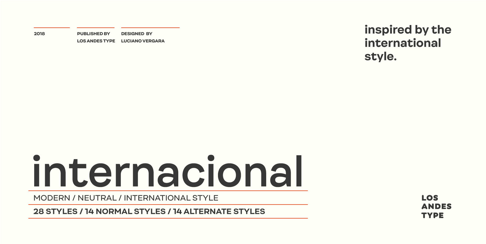
Internacional Font
Internacional, inspired by the International Style, is a Latin American-flavored neo-grotesque sans serif typeface made with organic ingredients and sweetened with organic sugar and chocolate. Internacional is well-suited for corporate identity, branding, publishing projects, logotypes, magazines and advertising. Its large
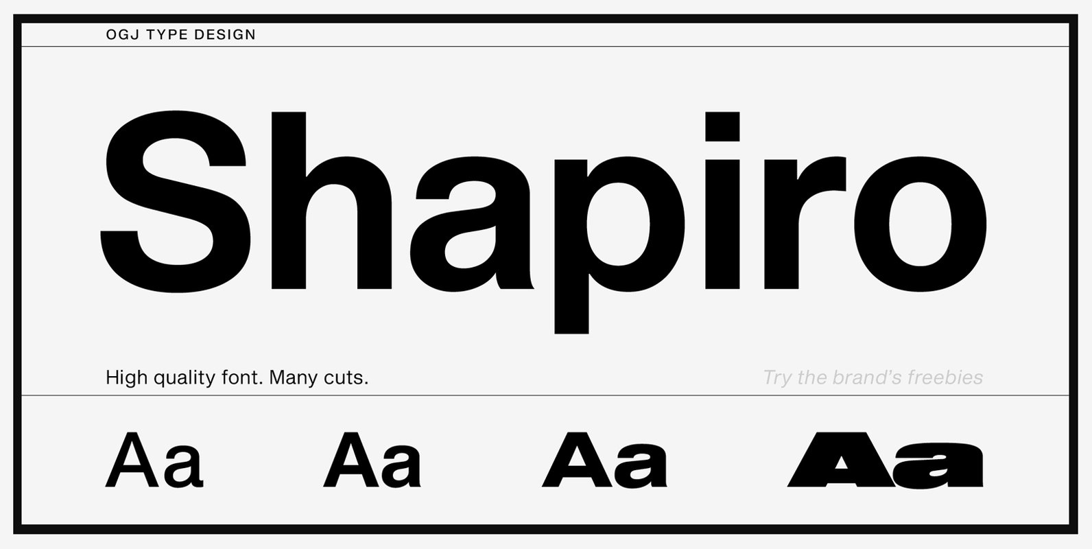
Shapiro Font
On the basis of the classical form, Shapiro meets all the requirements that are placed on a good font, such as good readability, a sympathetic overall impression, as well as a balanced gray-effect. Shapiro boasts horizontal and vertical strokes that
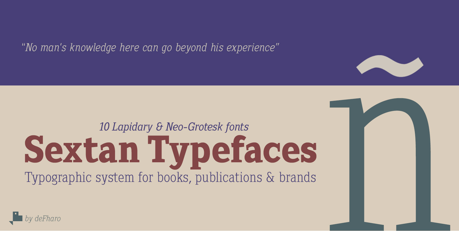
Sextan Serif Font
Sextan serif is a typographic family with 10 styles designed for editorial, corporate, advertising or web use. The excellent readability allows the use in long texts, the coherence of forms make these fonts have a great personality. The fonts have
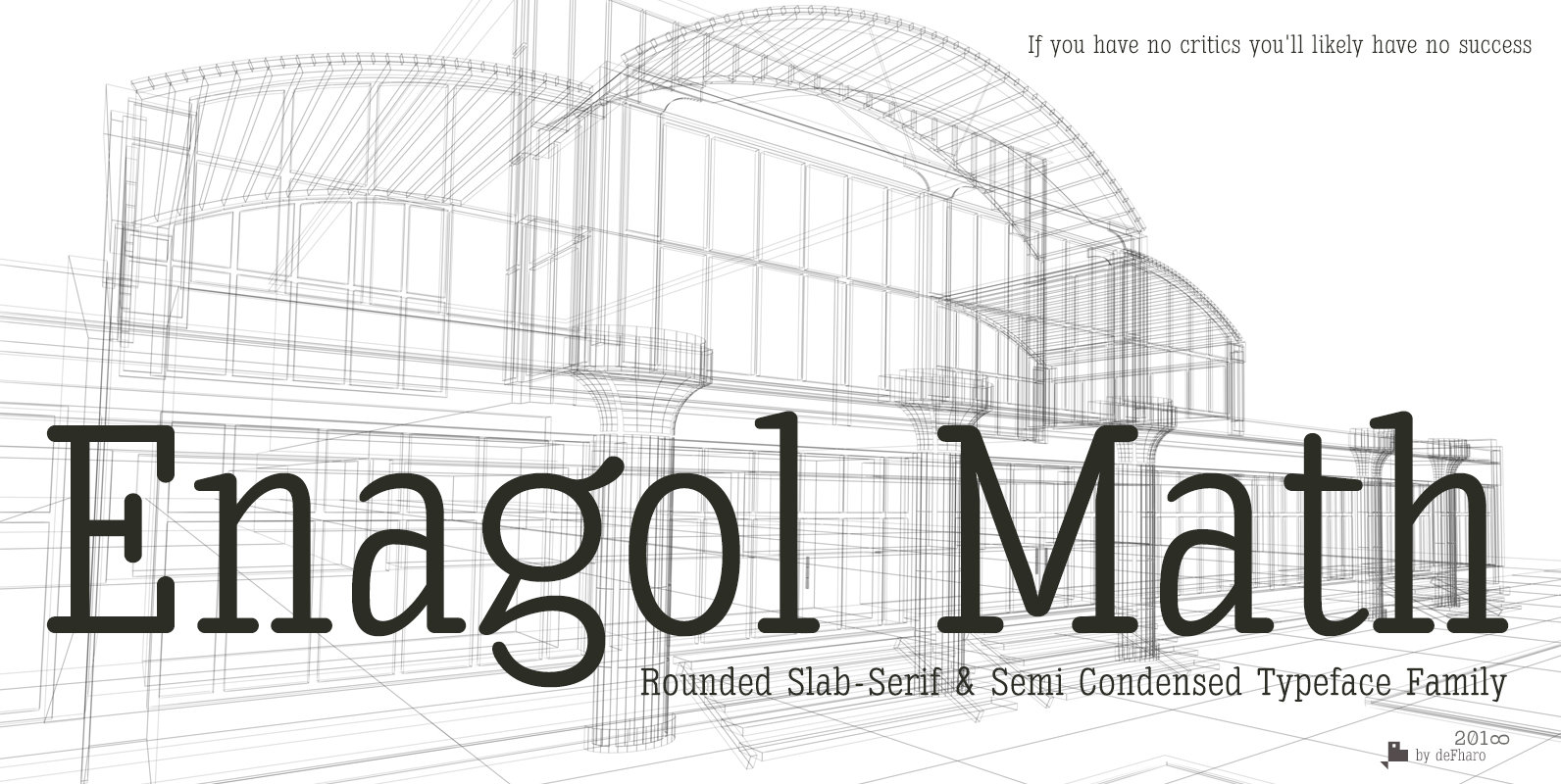
Enagol Math Font
The Enagol Math family consists of 4 weight plus True italics. It is a typeface with rounded Slab-Serif of semi-condensed proportion. I have composed all the proportions of the font based on a study of mathematical proportions related to the
BB Studio Round Pro Font
BB Studio™ Round Pro visualizes the process of a neo-grotesk typeface in daily use: compressed caps for space, adipose dots for small sizes, contemporary styling for headlines and symbols for intercultural communication. ● Styles: Headline, Headline Italic, Stencil, Text, Text
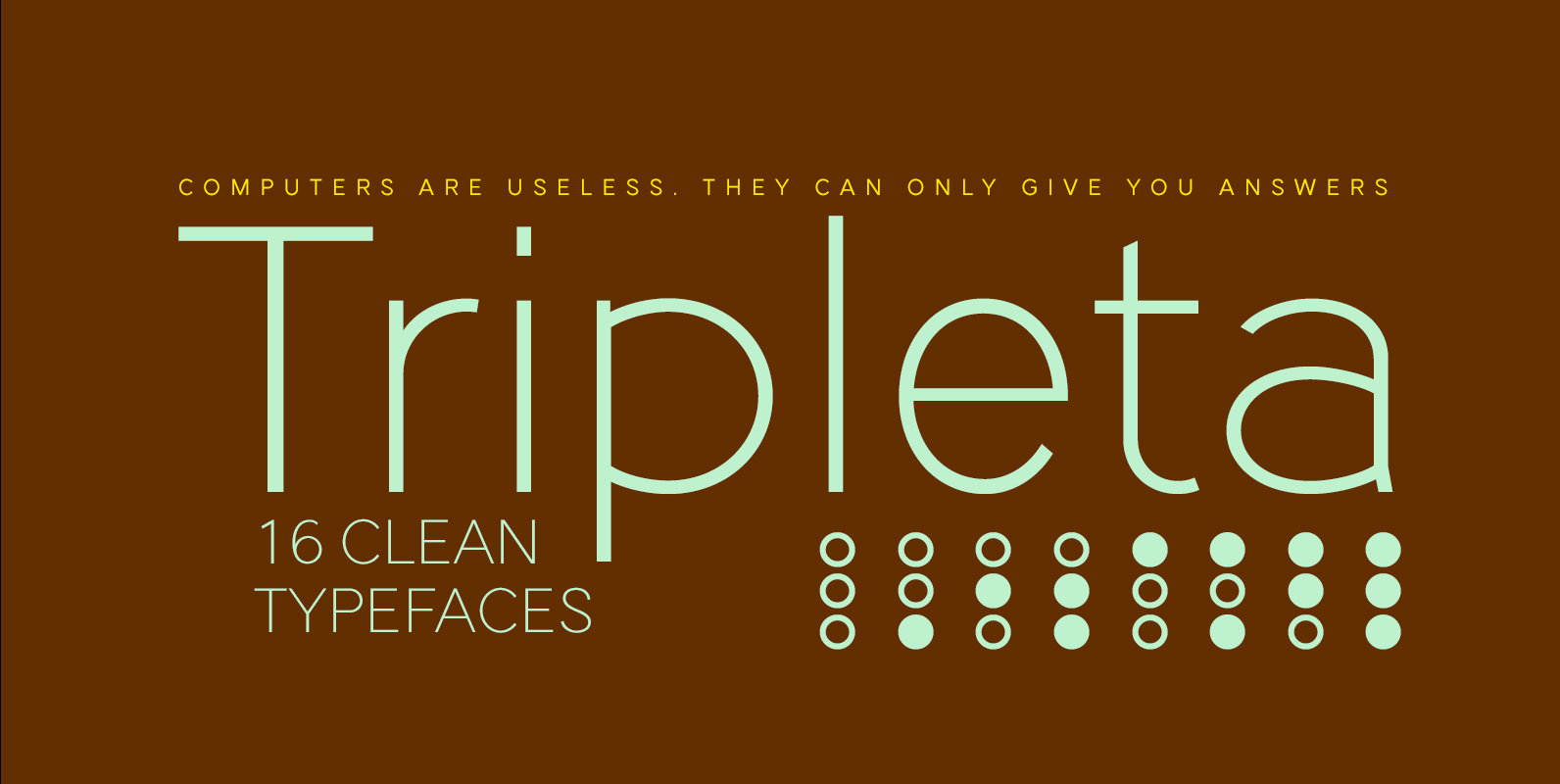
Tripleta Grotesk Font
Tripleta Grotesk is a sans serif font design published by deFharo Published by deFharoDownload Tripleta Grotesk
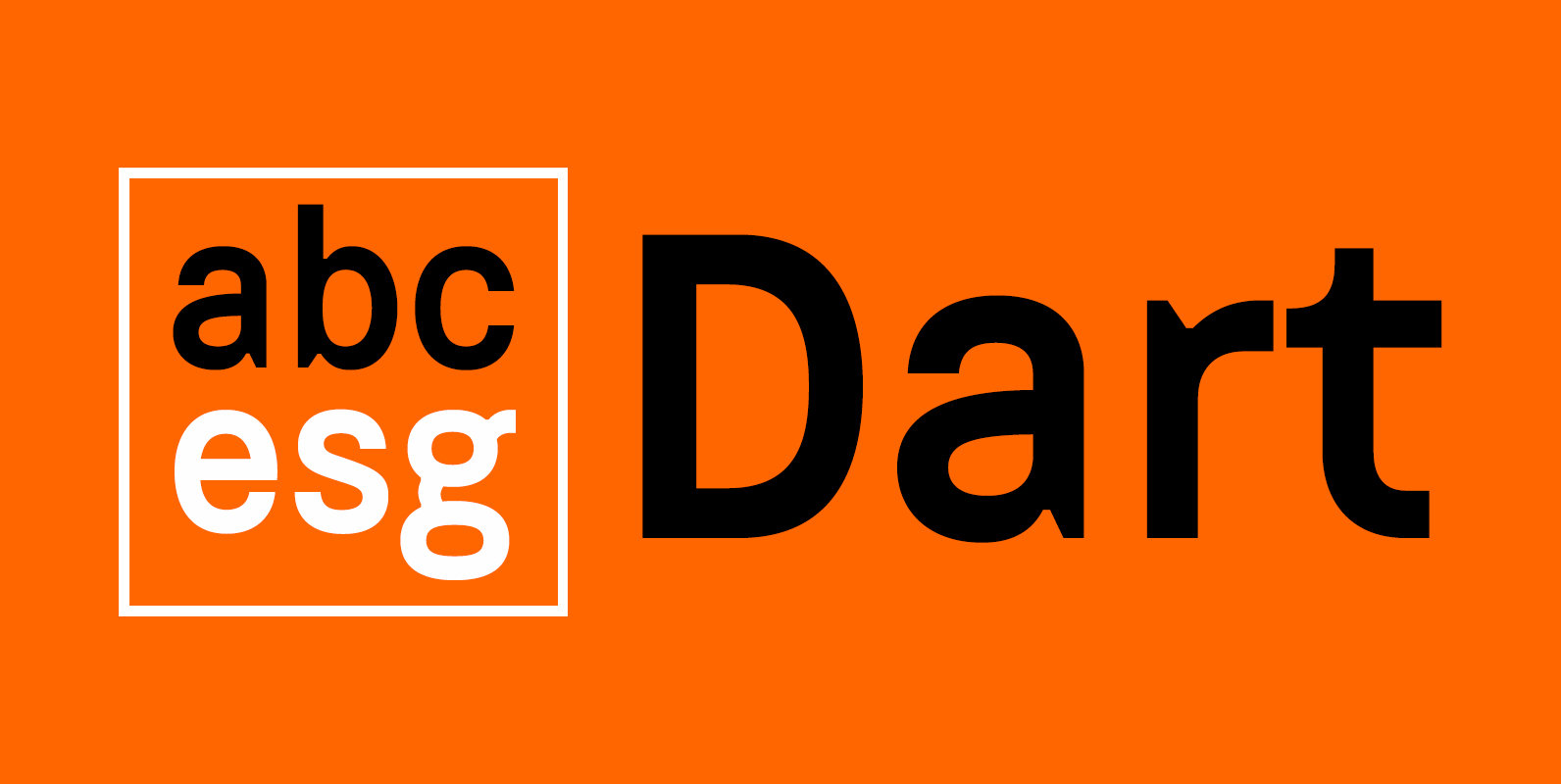
Dart 4F Font
The face’s industrial roots are in stamp press lettering, license plates, phone books, signage and in early OSes, and its support for many European languages makes it flexible for a wide variety of applications Published by Sergiy TkachenkoDownload Dart 4F
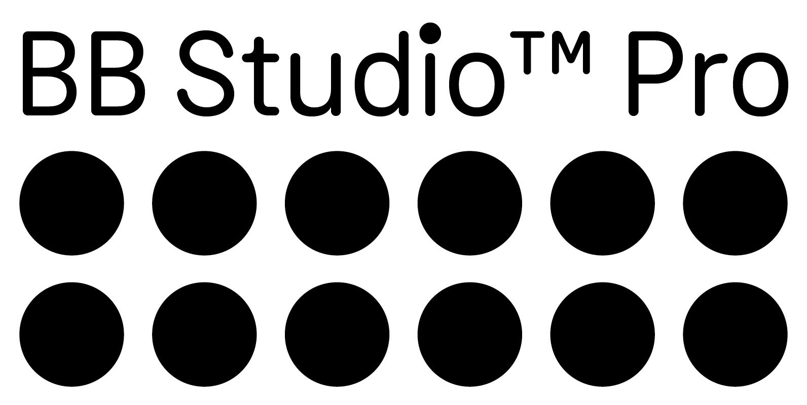
BB Studio Pro Font
BB Studio™ Pro visualizes the process of a neo-grotesk typeface in daily use: compressed caps for space, adipose dots for small sizes, contemporary styling for headlines and symbols for intercultural communication. ● Styles: Headline, Headline Italic, Stencil, Text, Text Italic,
Metro Sans Font
The result of a study into the Paris Metro system; Metro Sans is a Grotesk typeface with personality. It bridges the gap between the stern terminals of a Swiss Neo-Grotesk, and the smooth curves of a modern day Geo-Grotesk. The
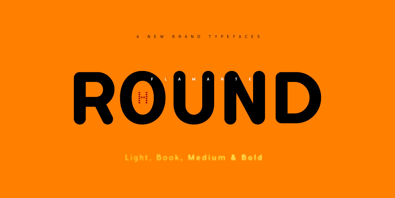
Flamante Round Font
Flamante Round is a group of eight corporate typographies of geometric construction, rounded and neo-grotesque style, are fonts with an excellent readability for titles, short texts or for use in signage. The group of fonts is made up of 4
Flamante Sans Font
Flamante Sans is a group of eight corporate typographies of geometric construction, without serifs and neo-grotesque style, are fonts with an excellent readability for titles, short texts or for use in signage. Swiss-style fonts built on a 4×6 building grid
Flamante Serif Font
Flamante Serif is a serif font design published by deFharo Published by deFharoDownload Flamante Serif
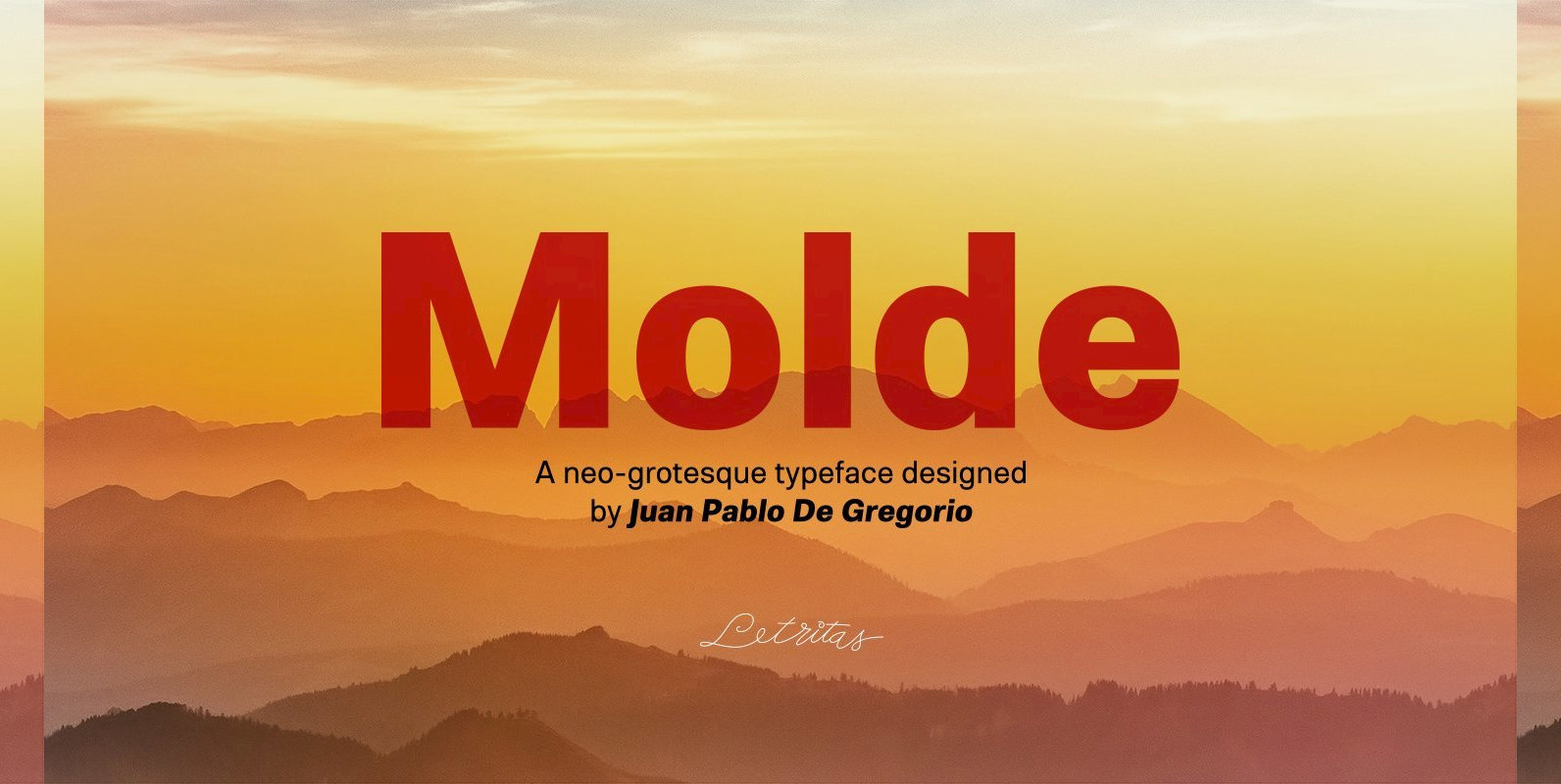
Molde Font
Molde is a super sans serif font family, belonging to the neo-grotesque style. Formally, Molde was inspired by the extreme sobriety of famous post-Bauhaus Swiss Movement of the mid-twentieth Century. The masters of this style are famous for eliminating all
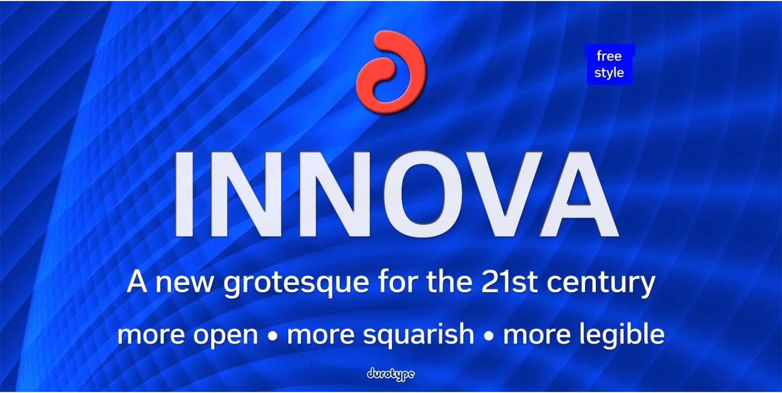
Innova Font
Innova. A new grotesque for the 21st century. More open. More squarish. More legible. After the many grotesques which have been designed over the years, is it still possible to improve this genre? Innova is a new design—a contribution to
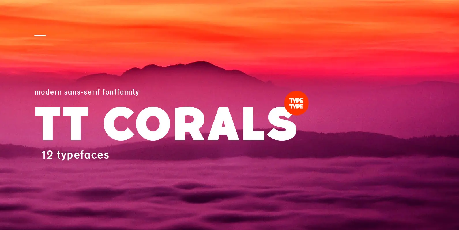
TT Corals Font
TT Corals is a modern humanistic sans-serif which has many typical traits of the beginning of the 20th century. For an increased functionality of the font family we’ve created 6 typefaces of various weights: Thin, Light, Regular, Bold, Extrabold, Black.
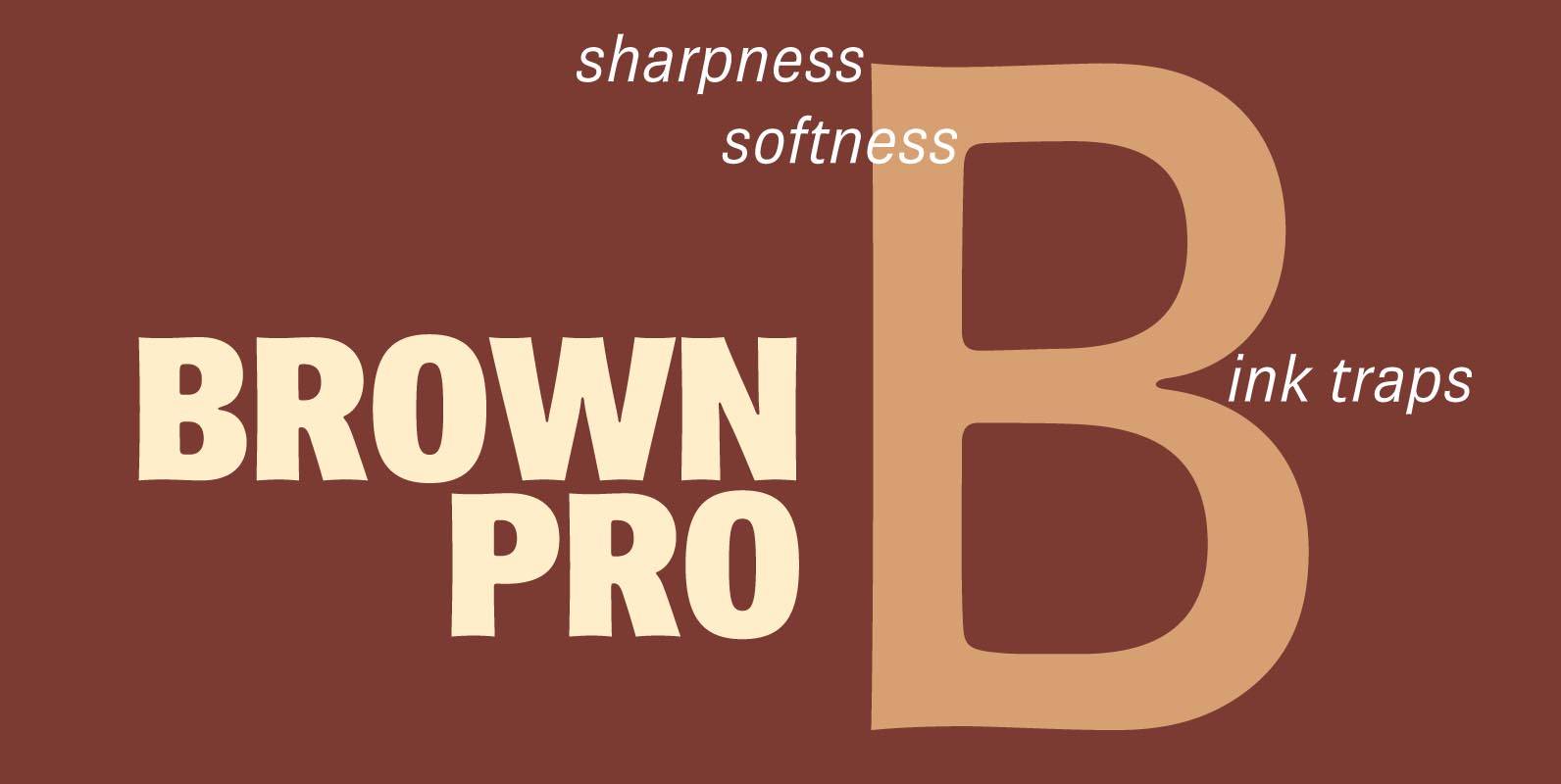
Brown Pro Font
At text size, Brown is a classic grotesque, distinguished by its semi-condensed proportions (especially in the capitals, which harmonize well with the lining figures) and with an exceptional clarity in certain high-resolution media, such as offset printing, achieved by micro-detailing.
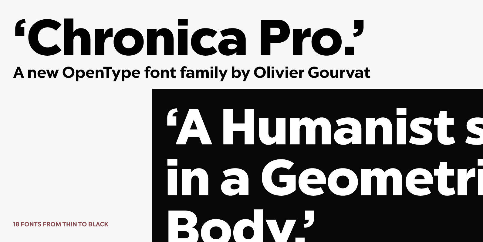
Chronica Pro Font
Chronica Pro is a new contemporary font family focusing on balance and quality for high professional use. Designed with a lot of attention to details and versatility, Chronica Pro could satisfy all kinds of demand such as editorial design, brand
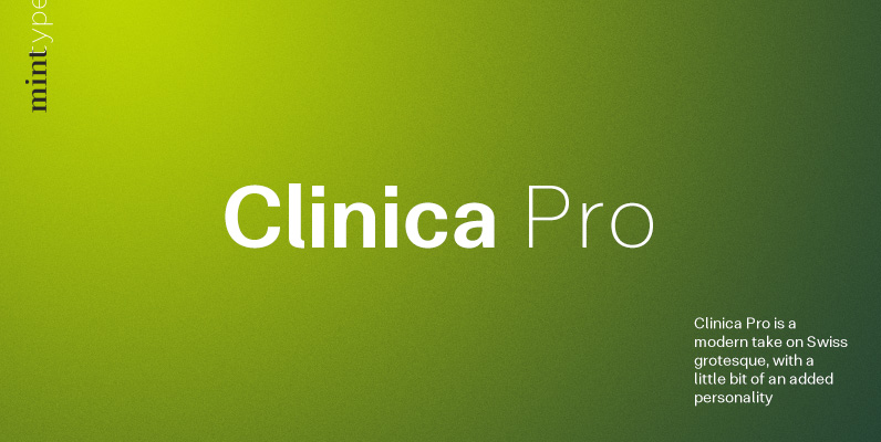
Clinica Pro Font
Clinica Pro is a modern take on Swiss grotesques, with a little bit of an added personality. It features 8 weights, italics, 6 sets of figures, small caps and a bunch of ligatures. Still relatively neutral, it lets a brand