Tag: metro
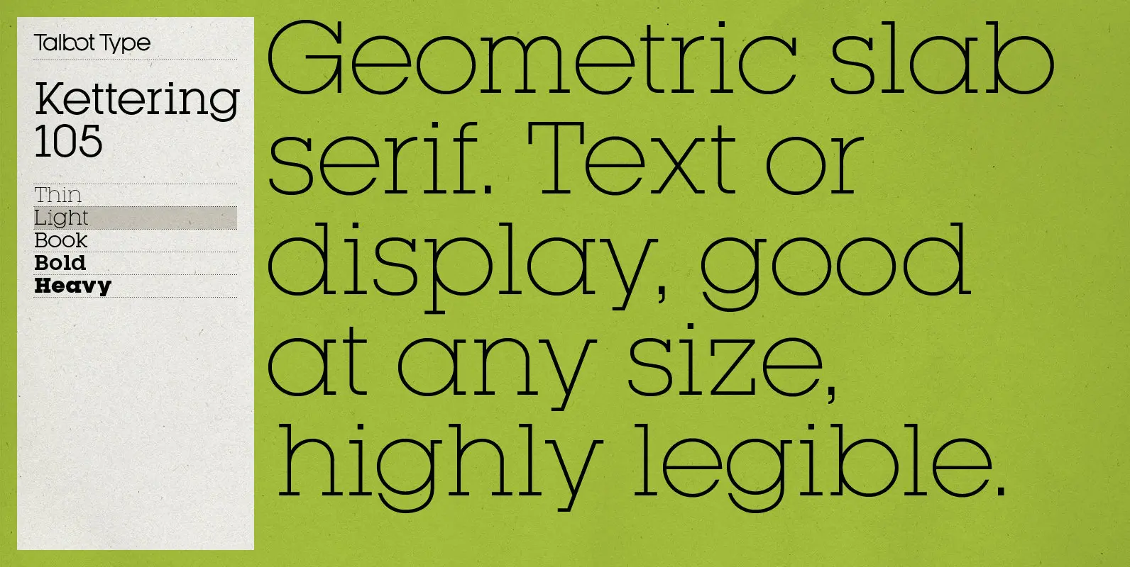
Kettering 105 Font
Kettering 105 is inspired by the classic, geometric slab-serifs such as Lubalin, but has shallower ascenders and descenders for a more compact look. It’s a versatile, modern slab-serif, highly legible as a text font and with a clean, elegant look
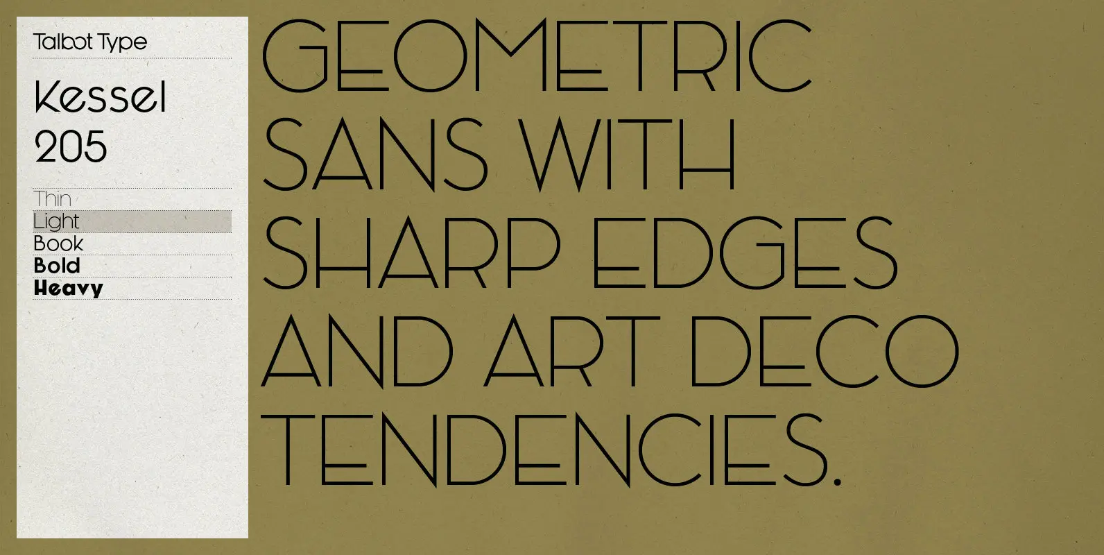
Kessel 205 Font
Kessel 205 is inspired by the classic, geometric sans-serifs such as Futura, but has shallower ascenders and descenders for a more compact look, and features an art deco influence with sharp points at the apex of many characters, lowered crossbars
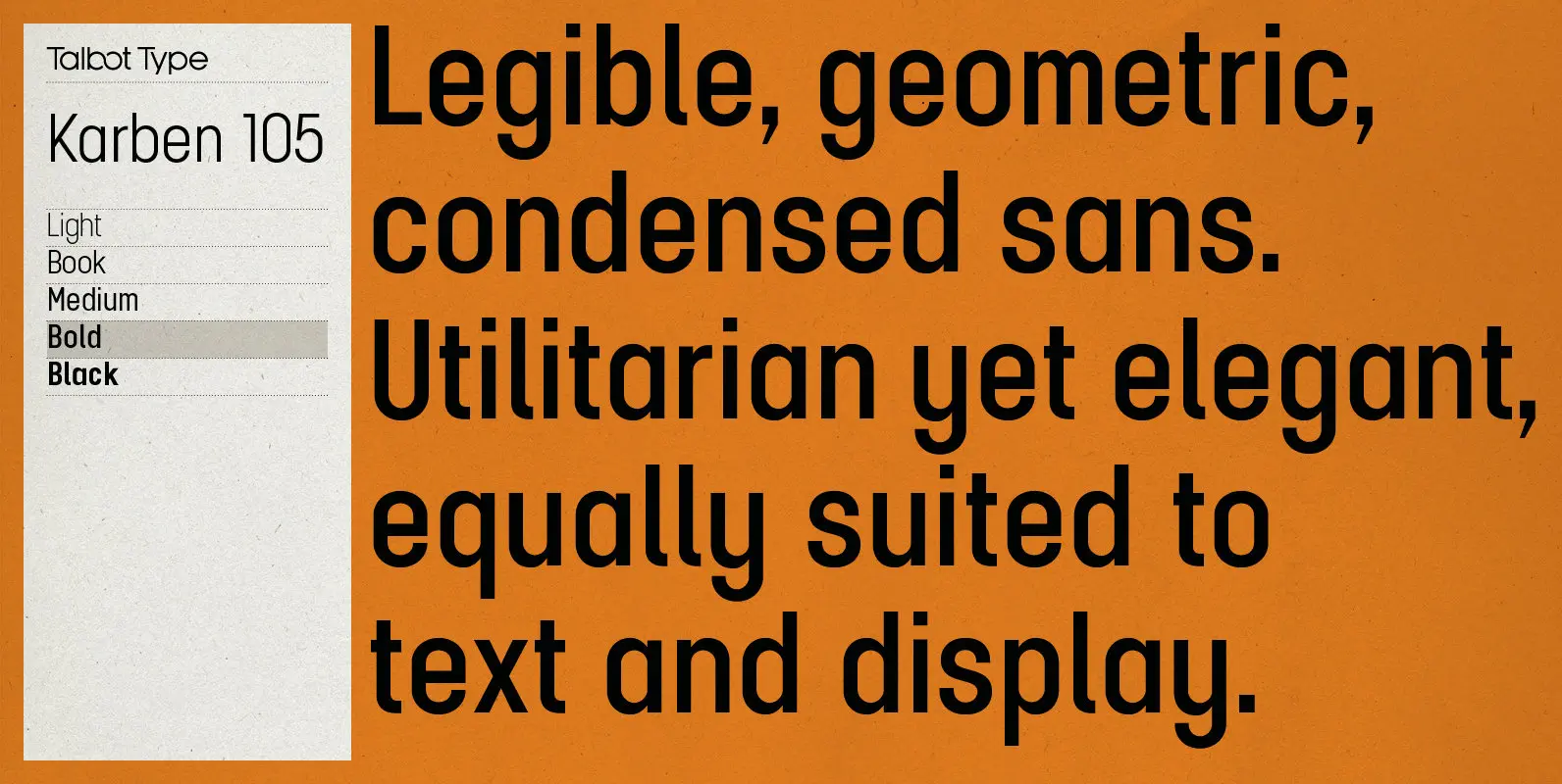
Karben 105 Font
Karben 105 is inspired by the classic, no nonsense DIN, and has a form that follows its highly legible function. Based on a lozenge, it has a clean and pure geometry with even stroke weights. Karben 105 is available in
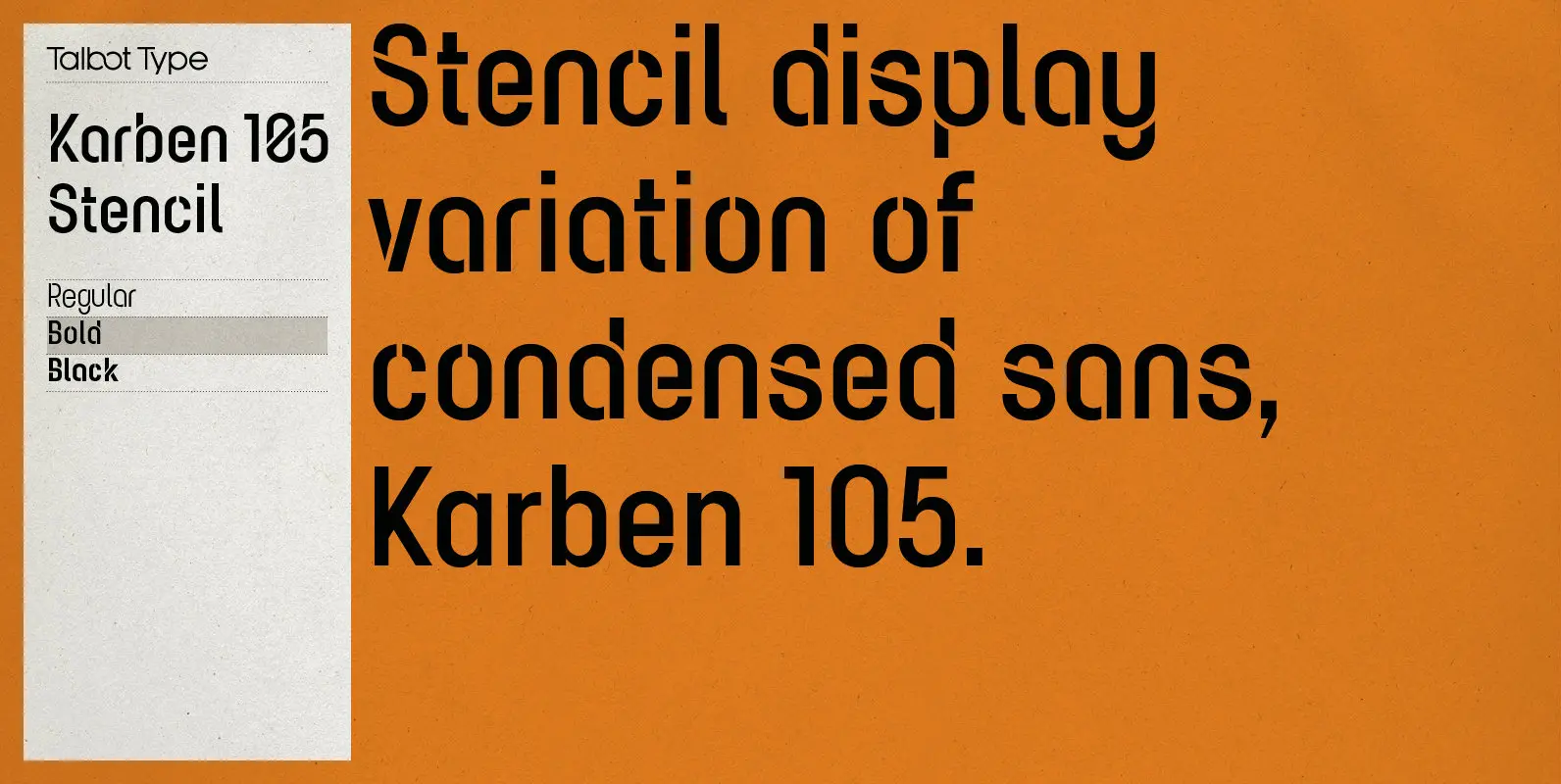
Karben 105 Stencil Font
Karben 105 Stencil is a contemporary stencil font. The stencil breaks in the letters are applied in a way that is sensitive to the forms of the character in pursuit of a more elegant stencil. Karben 105 Stencil is available
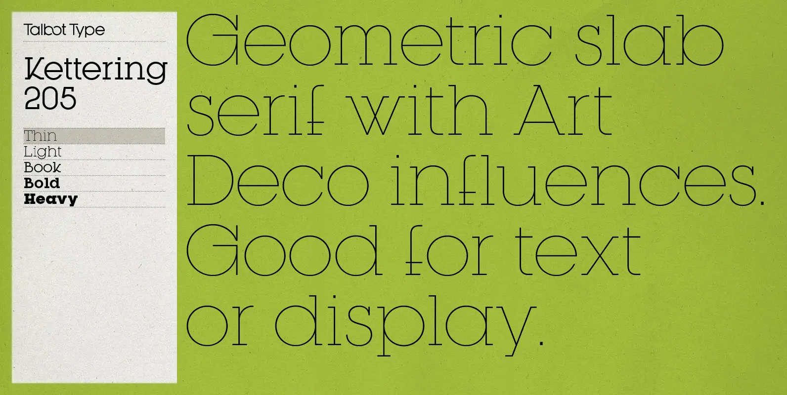
Kettering 205 Font
Kettering 205 is inspired by the classic, geometric slab-serifs such as Lubalin, but has shallower ascenders and descenders for a more compact look, and features art deco influenced, lowered crossbars and an oblique crossbar on the lower case e. It’s
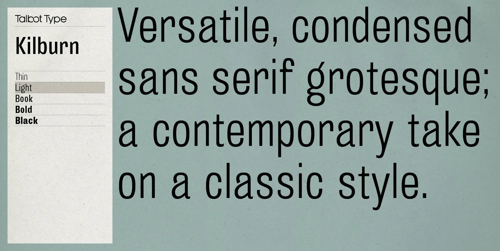
Kilburn Font
Kilburn is a no-nonsense, condensed Gothic sans-serif. For over a century the condensed sans-serif has been the ‘go to’ font for gravitas and authority. Kilburn continues in the fine tradition of fonts such as Franklin Gothic, News Gothic and Trade
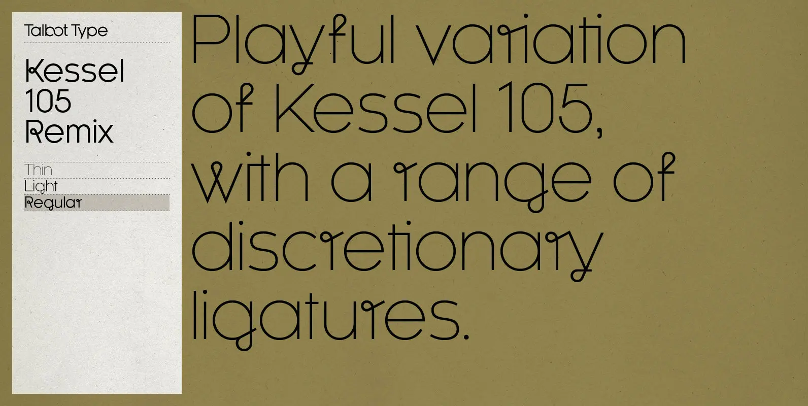
Kessel 105 Remix Font
A remixed variation, available in three weights, of the popular Talbot Type geometric sans Kessel 105. The addition of occasional flourishes at the intersections of strokes, in both upper and lower case, adds character charm, making the font a perfect
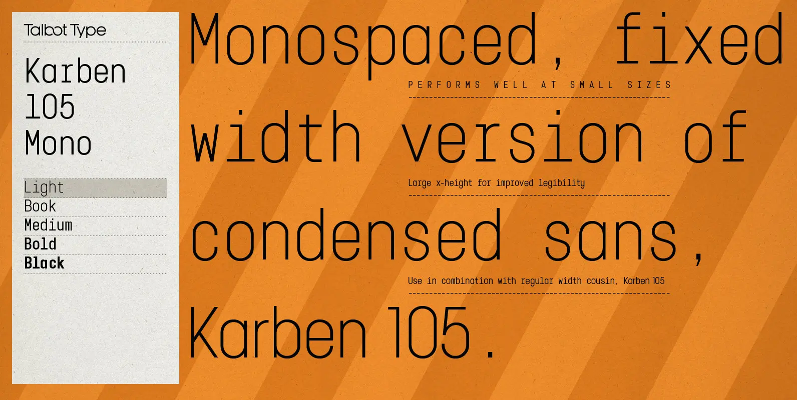
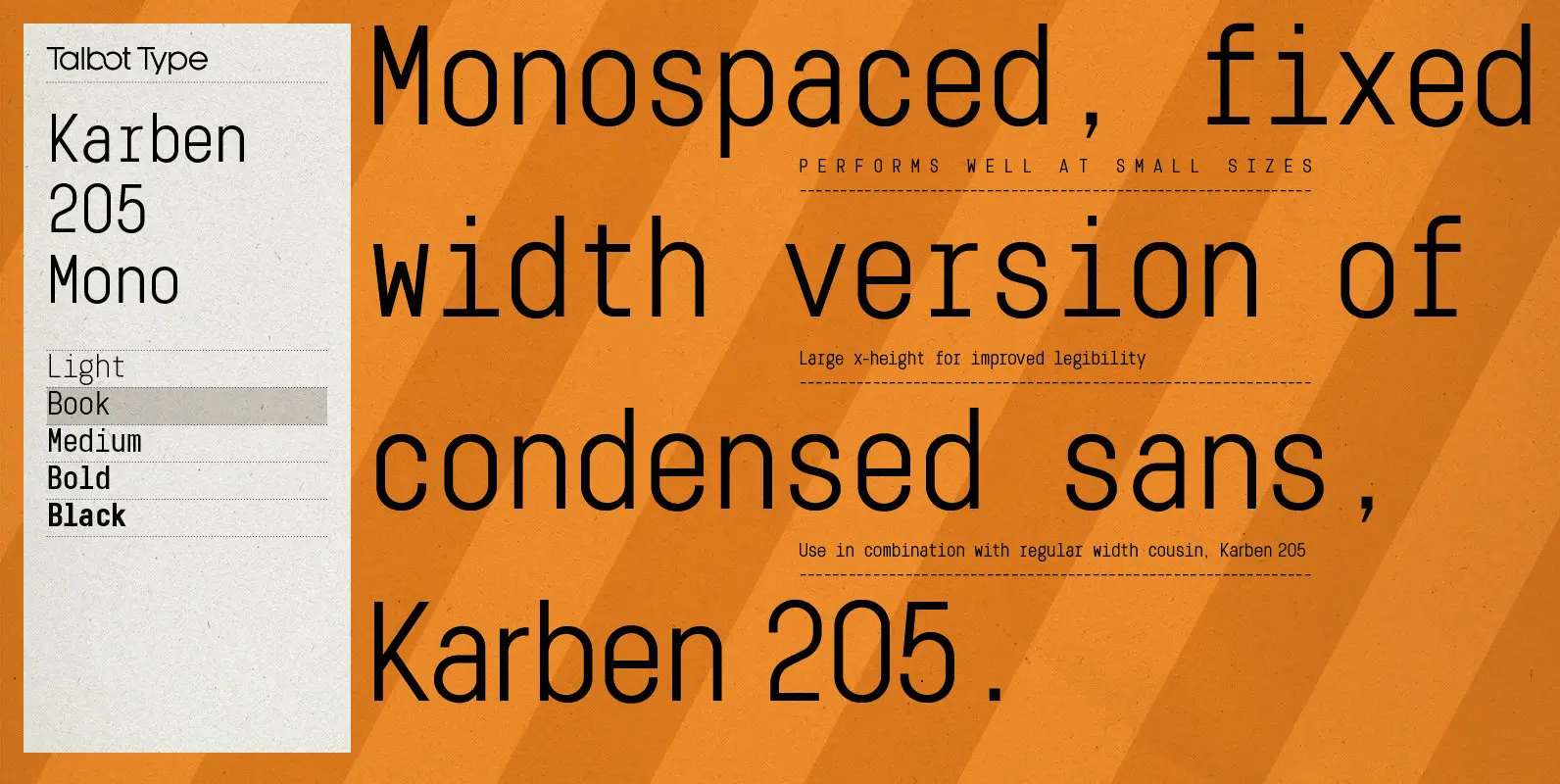
Karben 105 Mono Font
Karben 105 Mono is a monospaced variation of Karben 105. The clean and pure geometry of Karben 105 makes it highly suitable for adaptation to this monospaced variant. It has an even look and retains its legibility at very small
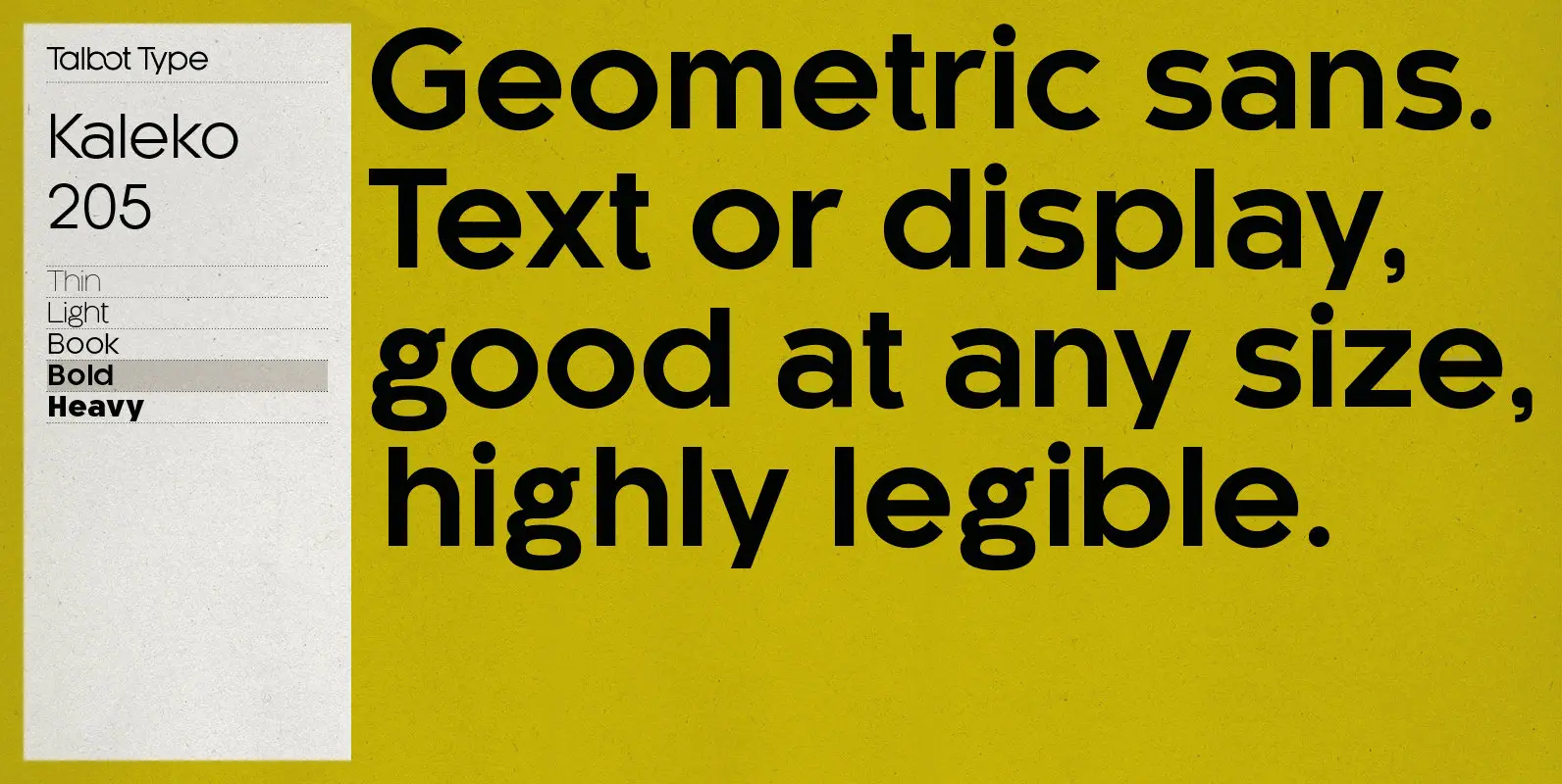
Kaleko 205 Font
Kaleko 205 is inspired by the classic, geometric sans-serifs such as Gill Sans, but has shallower ascenders and descenders for a more compact look. It’s a well-balanced, versatile, modern sans, highly legible as a text font and with a clean,
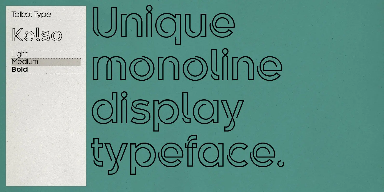
Kelso Font
Kelso is a highly original, outline display font. Each character is represented by a single continuous line to create a fluid and rhythmic look. This technique seems somehow to bring out the individual characteristics of each letter, resulting in a
Karben 205 Mono Font
Karben 205 Mono is a monospaced variation of Karben 205. The clean and pure geometry of Karben 105 makes it highly suitable for adaptation to this monospaced variant. It has an even look and retains its legibility at very small
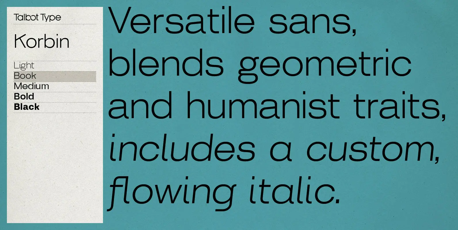
Korbin Font
Inspired by the sans-serifs of the late 19th and early 20th century, Korbin is a legible and versatile text and display face available in five weights. It mixes geometric and humanist traits to achieve a modern, clean, friendly appearance. The
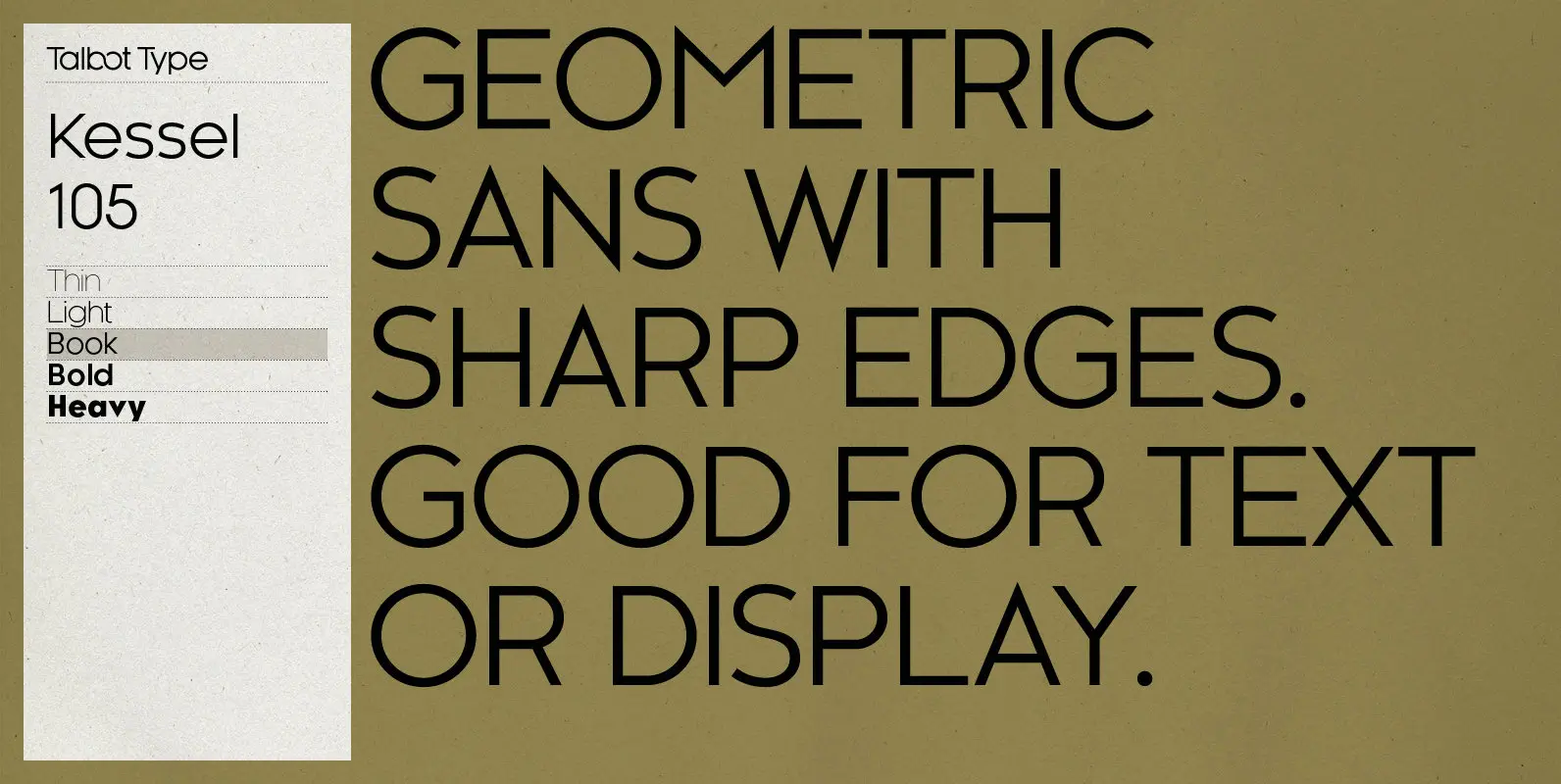
Kessel 105 Font
Kessel 105 is inspired by the classic, geometric sans-serifs such as Futura, but has shallower ascenders and descenders for a more compact look, and features an art deco influence with sharp points at the apex of many characters. It’s a
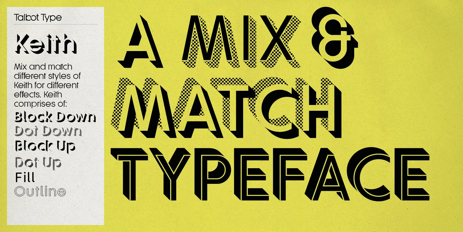
Keith Font
Keith is a striking and playful display font. Mix and match the different shadow styles, to create a variety of different looks and effects. There are four different shadow effects, along with a fill and an outline variation. Keith features
Kamerik 205 Font
Kamerik 205 is inspired by the classic, geometric sans-serifs such as Futura and Avant Garde, but has shallower ascenders and descenders for a more compact look, and features a traditional double-storey lower case a and g. It’s a versatile, modern
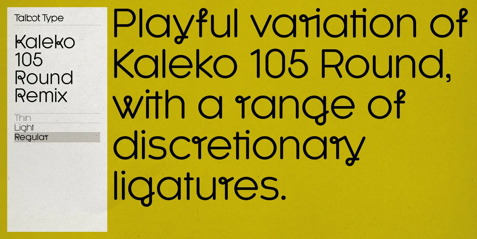
Kaleko 105 Round Remix Font
A remixed variation, available in three weights, of the popular Talbot Type geometric sans Kaleko 105 Round. The addition of occasional flourishes at the intersections of strokes, in both upper and lower case, adds character charm, making the font a
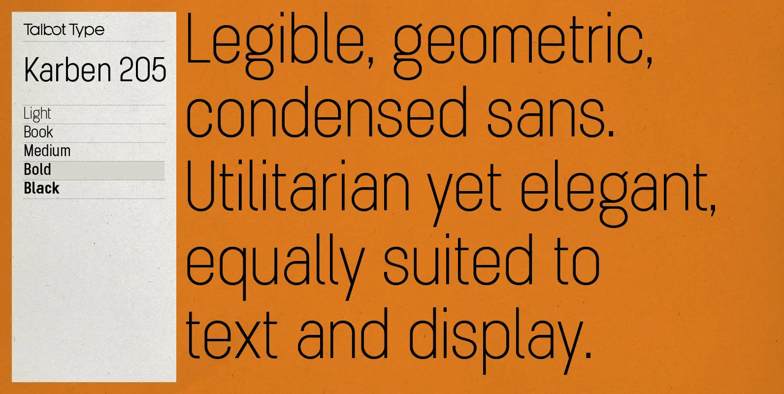
Karben 205 Font
Karben 205 is inspired by the classic, no nonsense DIN, and has a form that follows its highly legible function. Based on a lozenge, it has a clean and pure geometry with even stroke weights. Karben 205 is available in
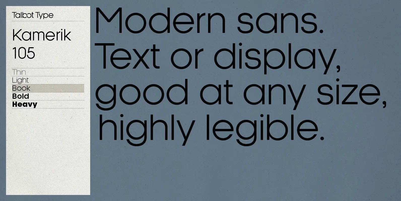
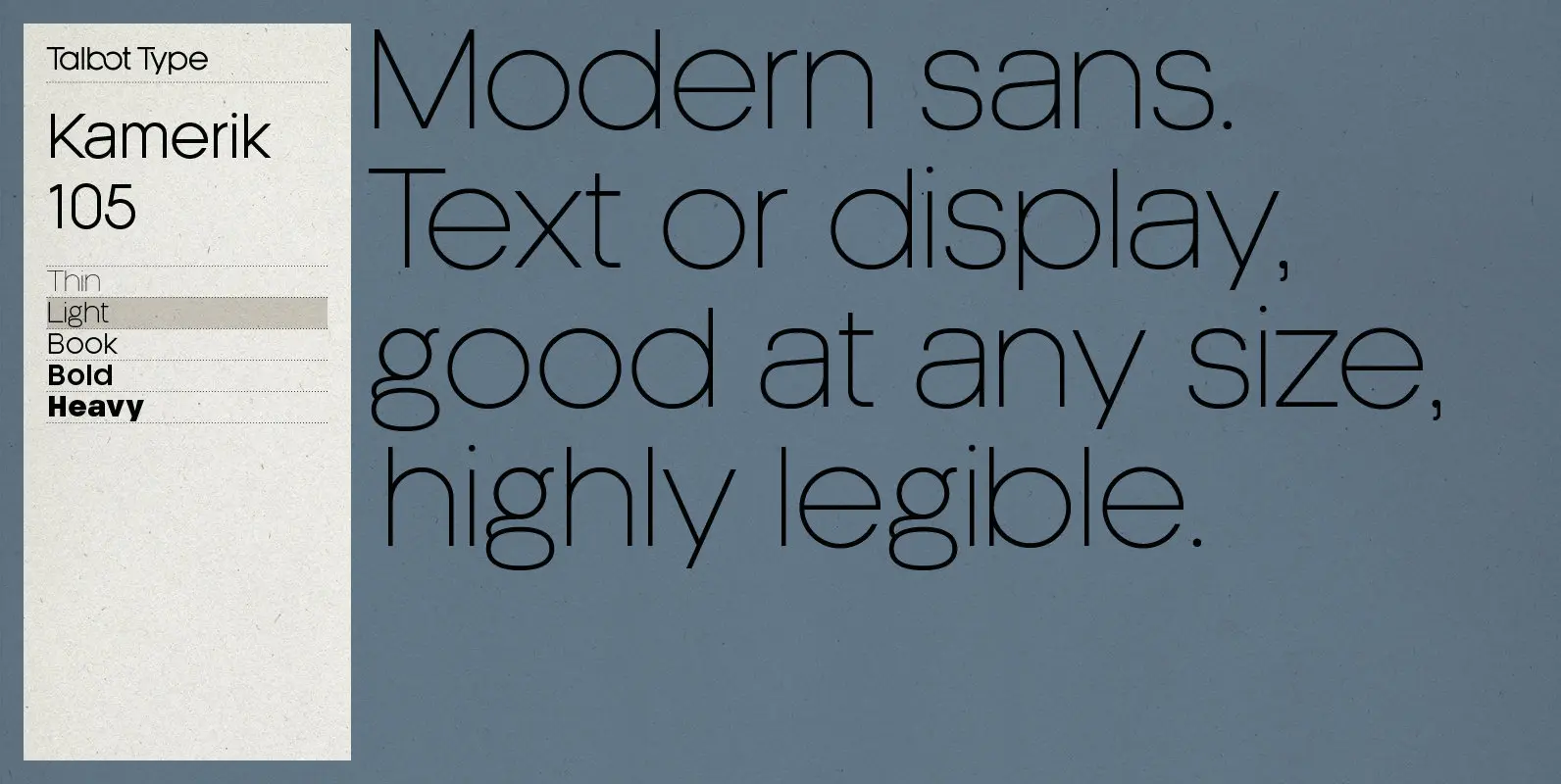
Kamerik 105 Font
Kamerik 105 is inspired by the classic, geometric sans-serifs such as Futura and Avant Garde, but has shallower ascenders and descenders for a more compact look. It’s a versatile, modern sans, highly legible as a text font and with a