Tag: medium
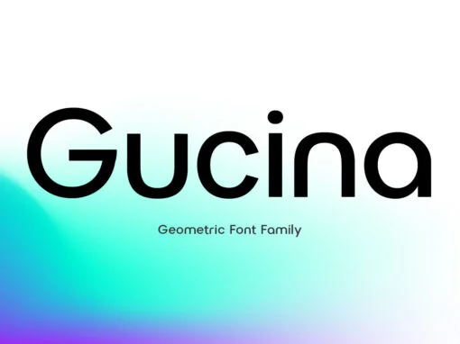
Gucina Font
Introducing the elegant and modern Gucina Geometric Font Family – a versatile typeface that will add a touch of sophistication to your designs. With its clean lines and geometric shapes, this font type is perfect for creating minimalistic logos, advertisements,
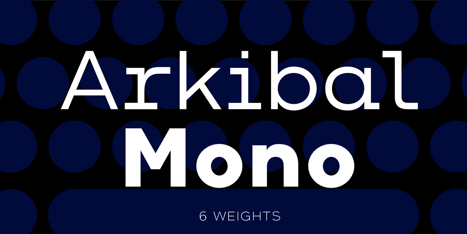
Arkibal Mono Font
The Mono version is a little different from Sans family, where the letters have a straight shape in the top bottom. The idea was to make a classic mono typed version with different selection of letters. The inspiration comes from
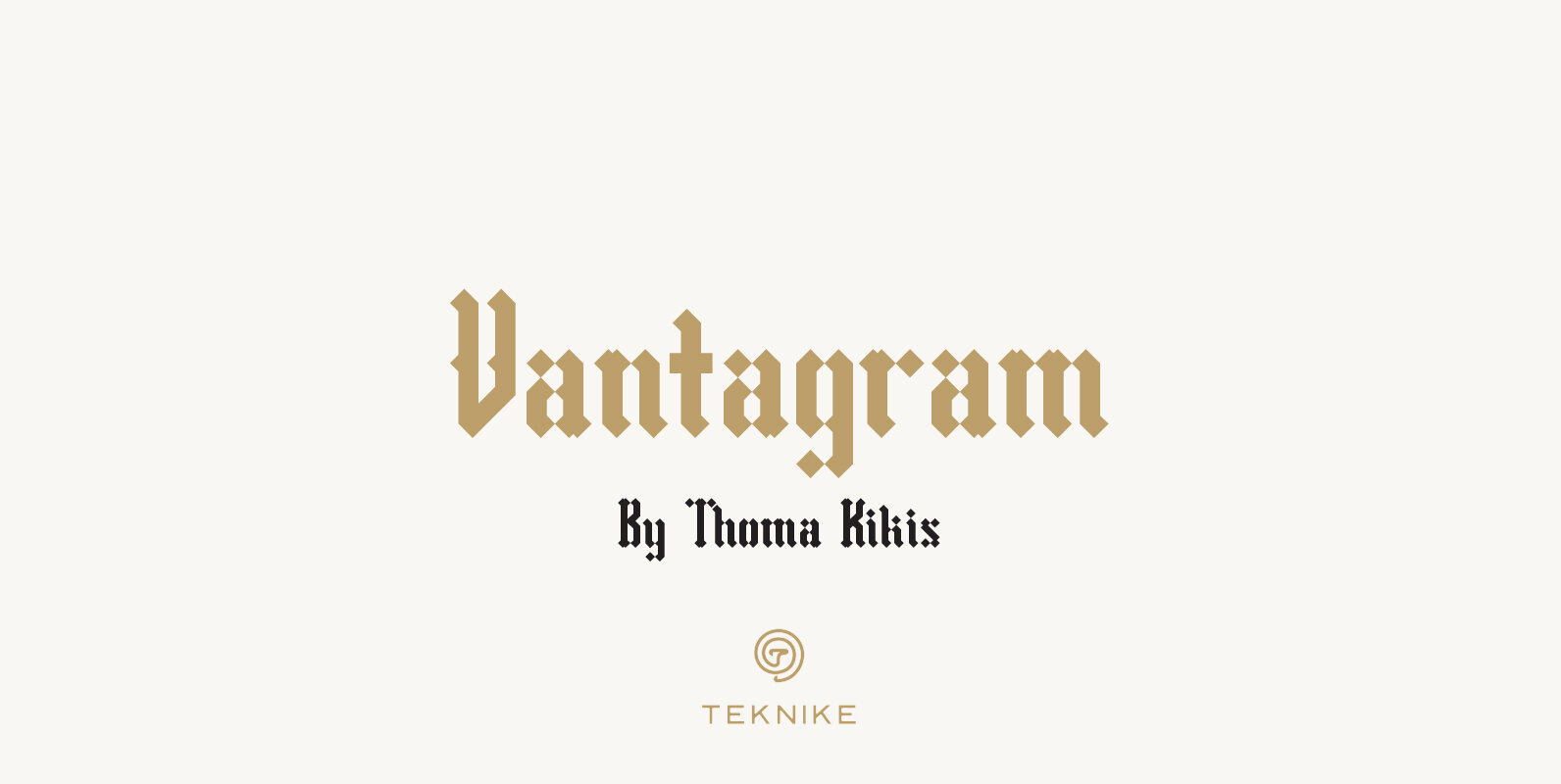
Vantagram Font
Vantagram is a modern display font. The typeface is made from basic square geometry. It is inspired by blackletter typefaces of the medieval period in Europe. The Vantagram name is a combination of two words derived from “vanta” French for
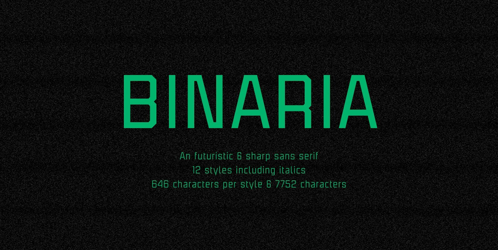
Binaria Font
Binaria font family has been designed for Graviton Font Foundry by Pablo Balcells in 2018. It is a sans serif typeface with a mechanic appearance. Its squared, angular shapes provide a futuristic and robust design. It has been conceived to
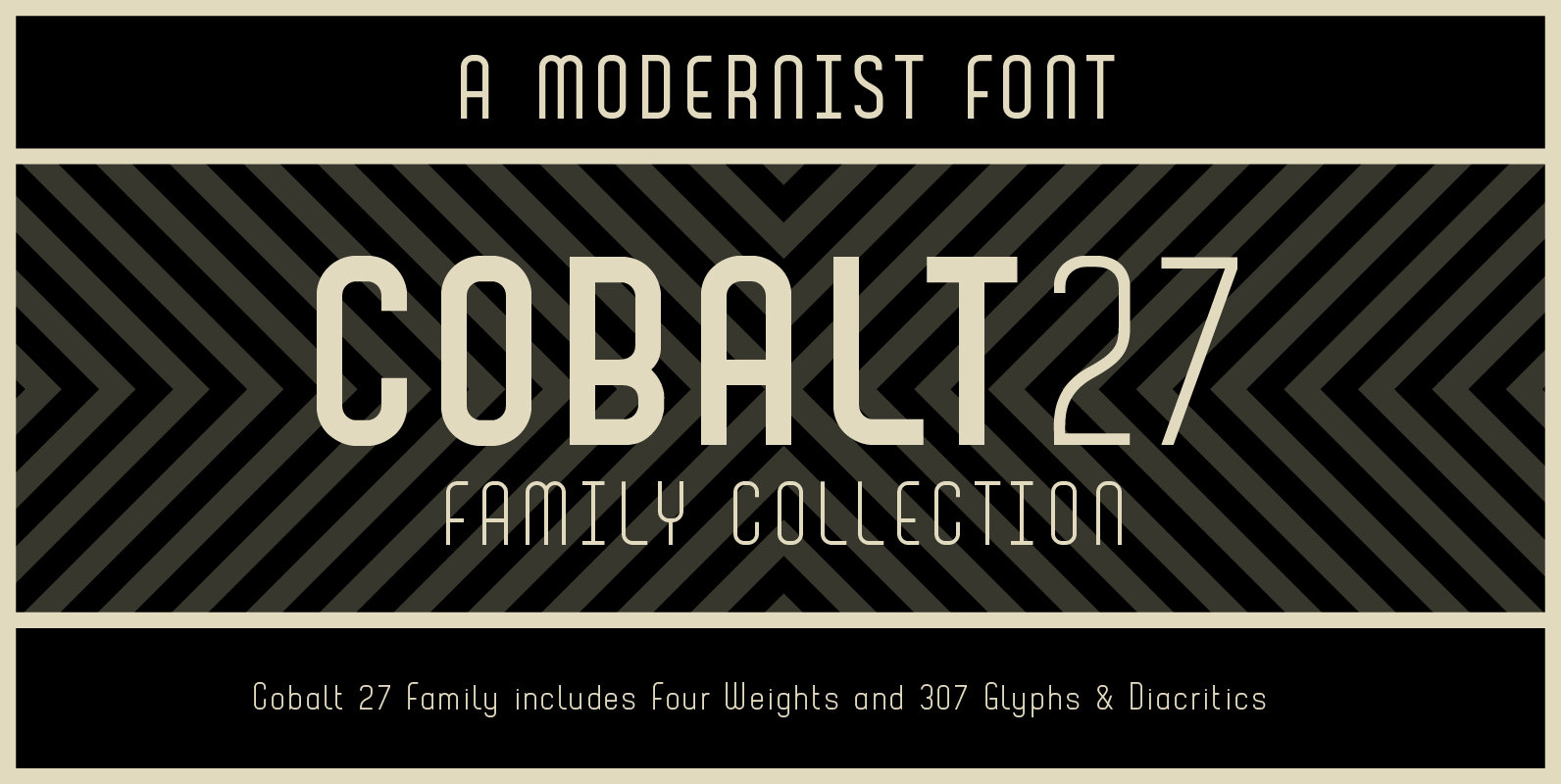
Cobalt 27 Font
Cobalt 27 was inspired by early and mid 20th century typography and graphic art movements, notably Constructivism and 60’s modernism. The family consists of three weights and one alternate text version that have been designed to be used with and
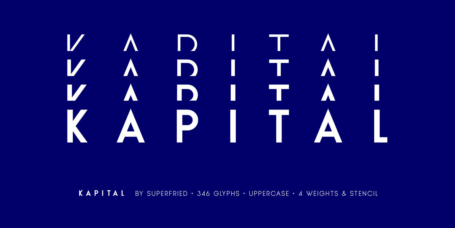
KAPITAL Font
Kapital is an elegant, geometric uppercase sans. It is available in standard and stencil style across four weights – light | regular | medium | demi – covering 346 glyphs. It is based on the capital character set from a
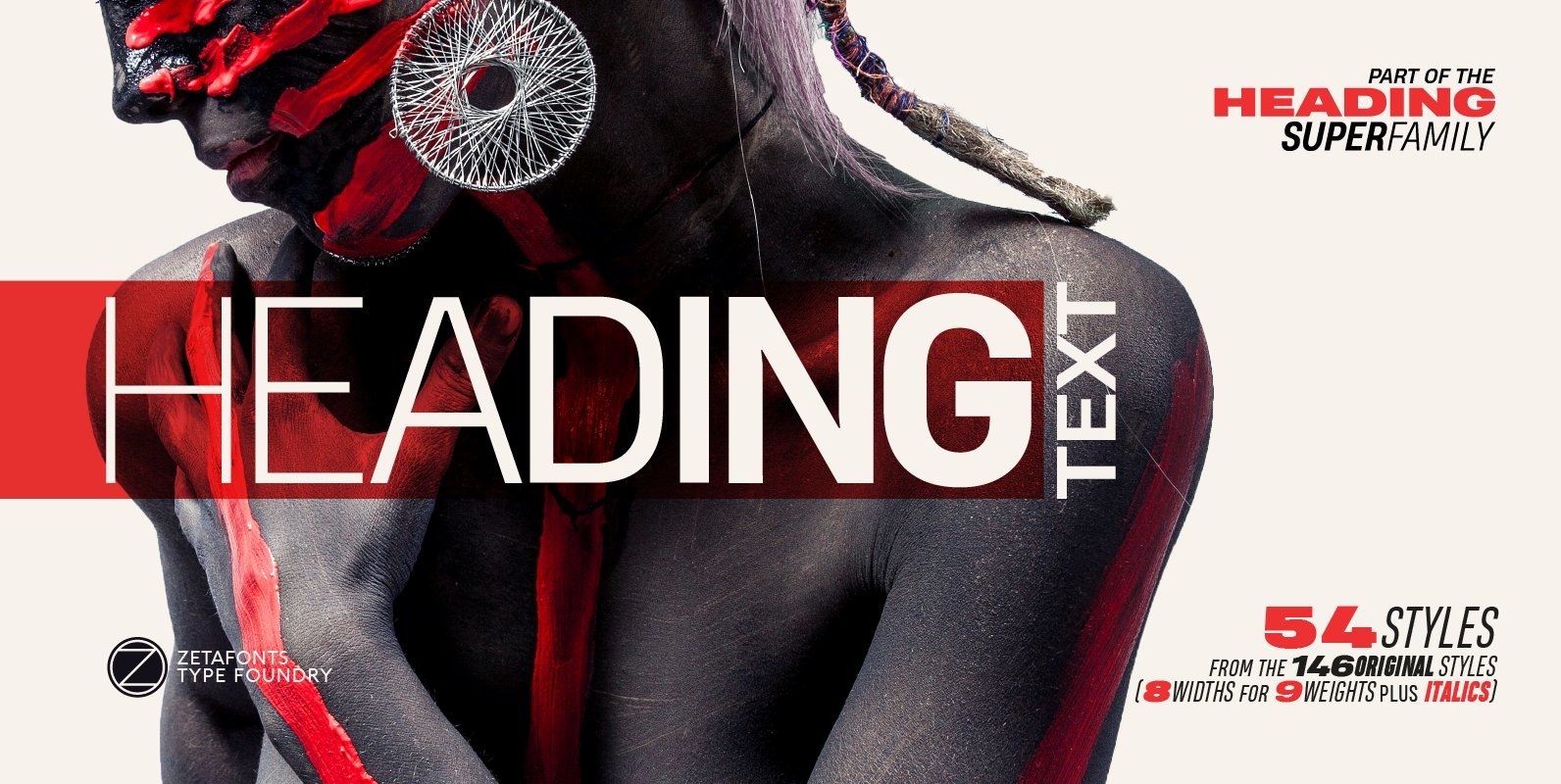
Heading Pro Text Font
Heading Pro Medium, Heading Pro Double and Heading Pro Treble are three variants of the original Heading Pro typeface designed by Francesco Canovaro for Zetafonts. These three medium width families have been added to the original condensed width family to
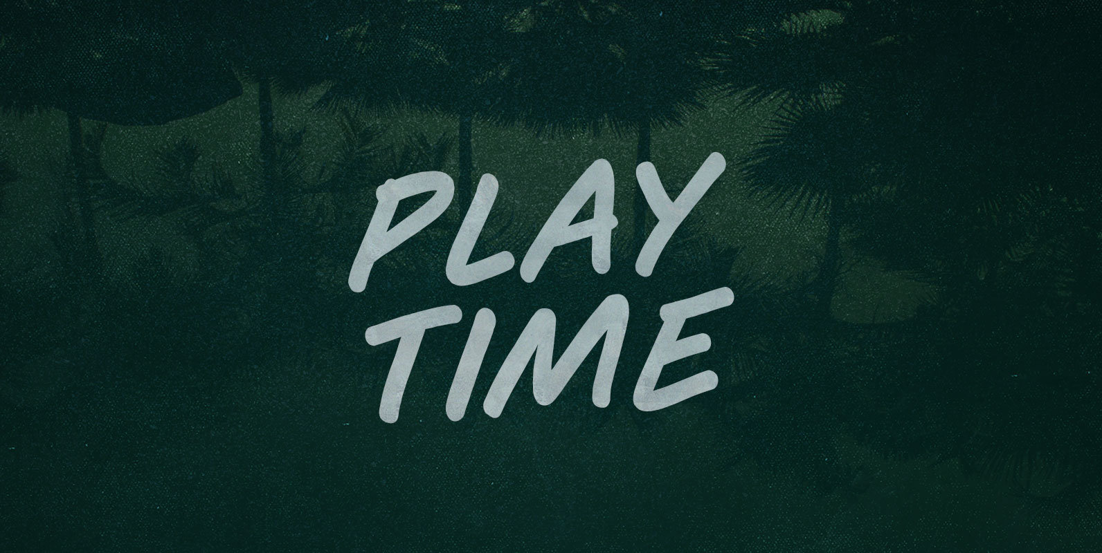
Play Time Font
You can’t Play Time, player. Time does not play. Mess around and it runs out, like quarters on a countdown. Try to hold it and it slips past, greasy and sinuous, leaving you falling, like leaves of a lost season.
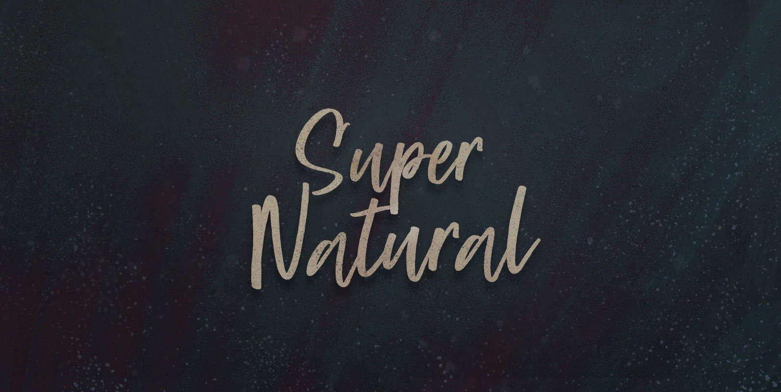
Super Natural Font
Selected and standardized to supply functional food to overstuffed and starving masses: Taking food like medicine, synthesized in sterile labs like the farm in pharmacology. Super Natural nutrition isolating supplements from senses, vitamins from vitality, and flavonoids from flavour. Published
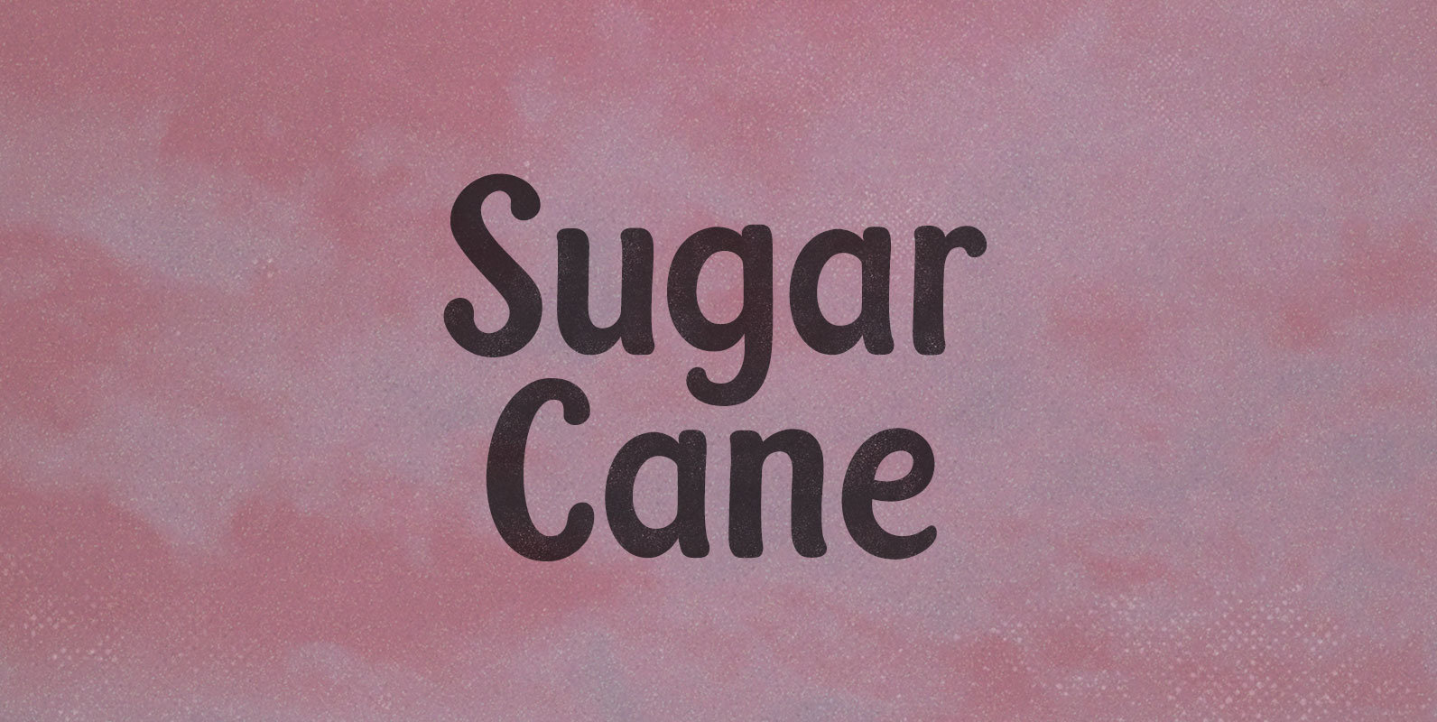
Sugar Cane Font
Machetes by the millions, cutting Sugar Cane like straw, overgrown in the tropical sun. La Gran Zafra: a whole country stacking sticky sticks in their GDP tally, mobilized behind a ten million ton harvest. Published by BLKBKDownload Sugar Cane
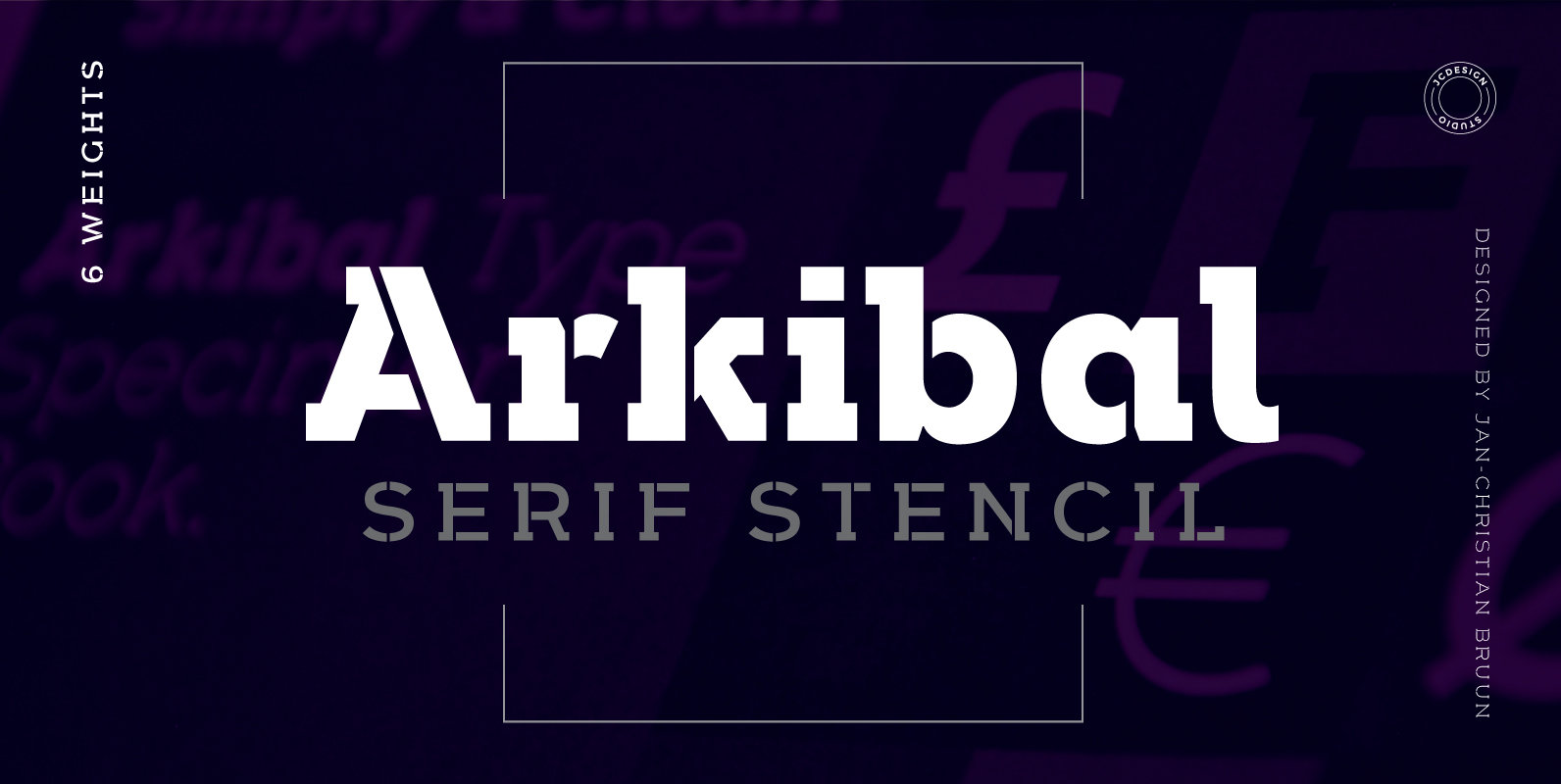
Arkibal Serif Stencil Font
The inspiration comes from some old documents and store signs from my great-grandfather’s old gold list factory from 1838. He delivered hits for many artists of that time, and various museums in Copenhagen. I priority increases to make a mixture
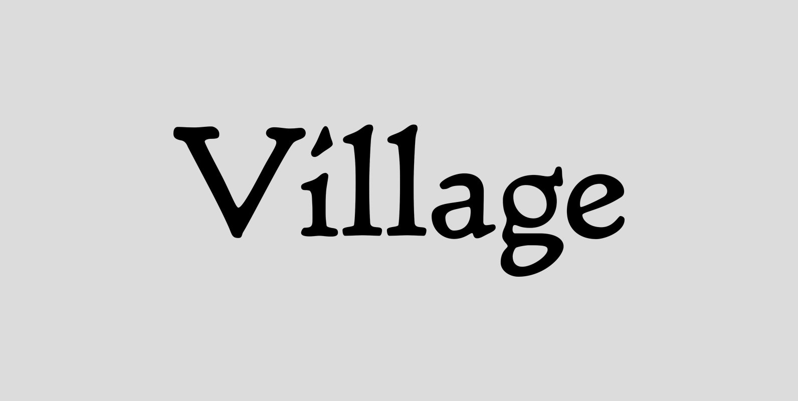
LTC Village Font
Village was originally designed by Frederic Goudy in 1903 for Kuppenheimer & Company for advertising use, but it was decided it would be too expensive to cast. It was later adopted as the house face for Goudy’s Village Press. The
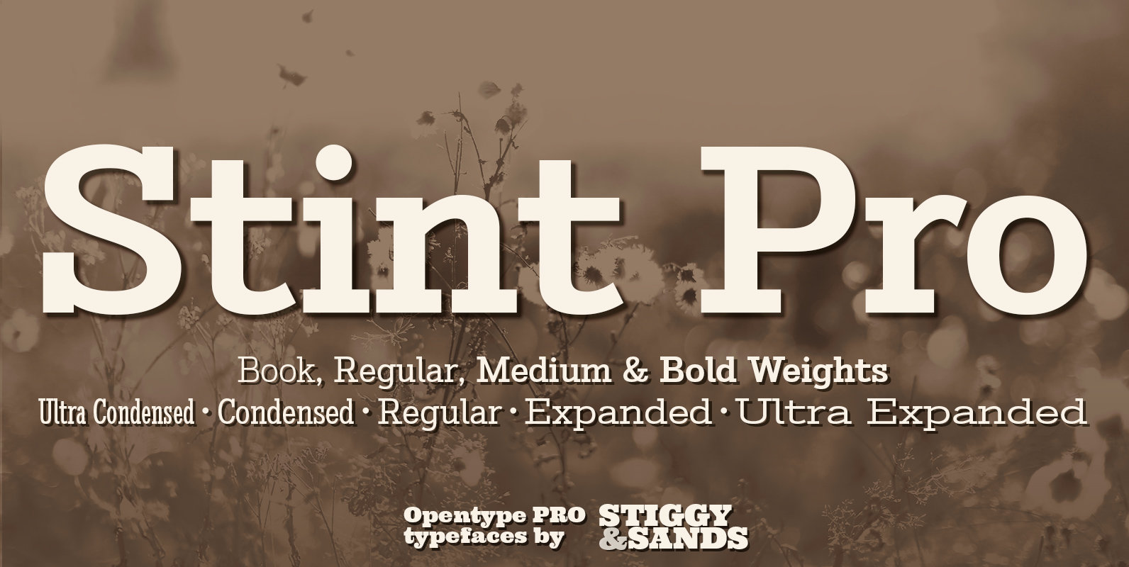
Stint Pro Font
Our Stint Family was originally influenced by extra wide letterform styles and developed later to create an ultra condensed range of fonts and the widths in-between. Highly legible throughout its width & weight ranges, the Stint Pro Family is both
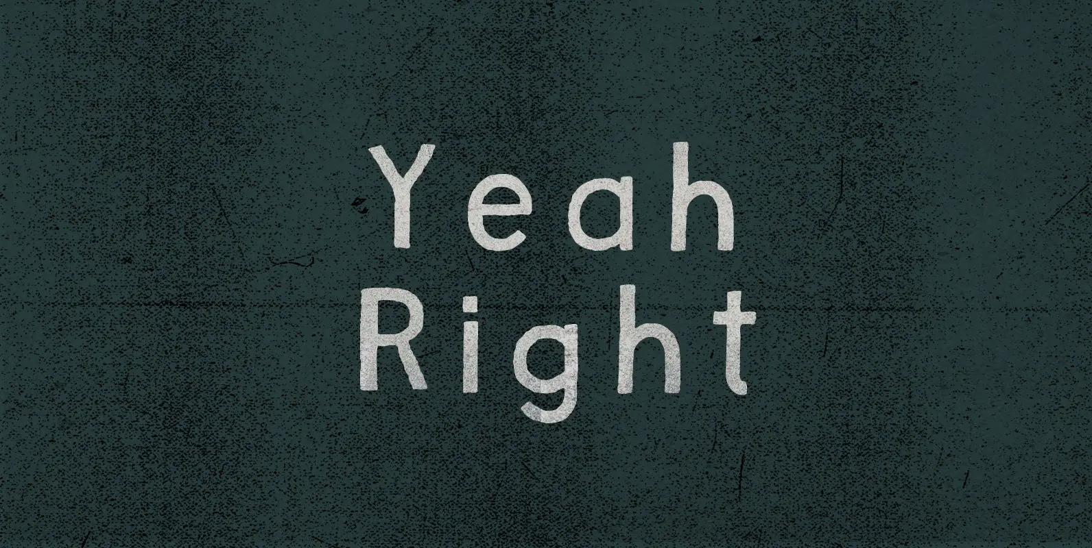
Yeah Right Font
Not far enough removed to harmonize through sarcasm, the remark struck a sour note. Skepticism, on the other hand, ducked that discord and countered with open confrontation: Yeah Right. Convince me. Published by BLKBKDownload Yeah Right
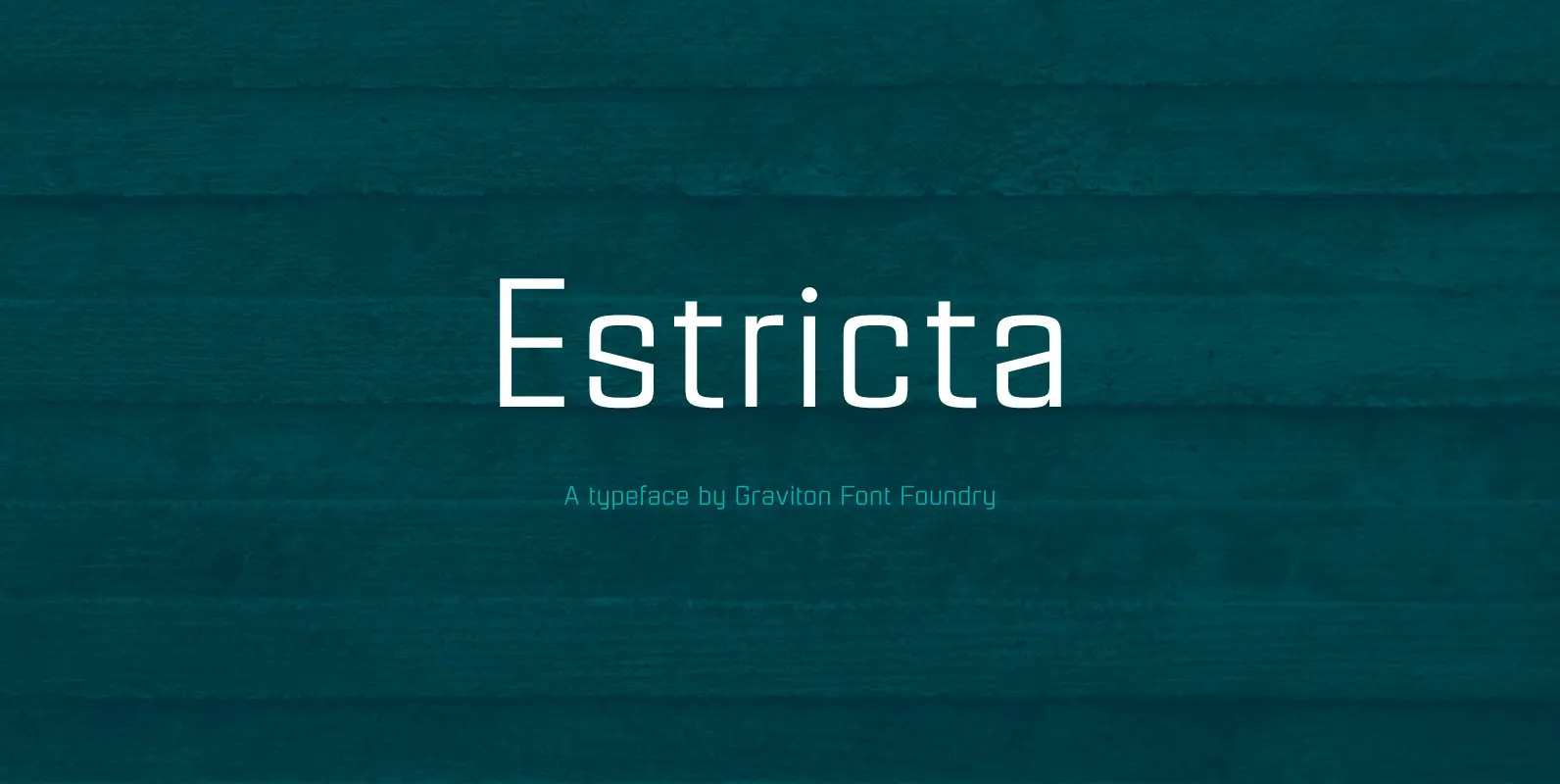
Estricta Font
Estricta font family has been designed for Graviton Font Foundry by Pablo Balcells in 2017. It is a sans serif typeface with a geometrical and mechanical appearance, its sharp, angular edges provide a strong and solid design. It has been
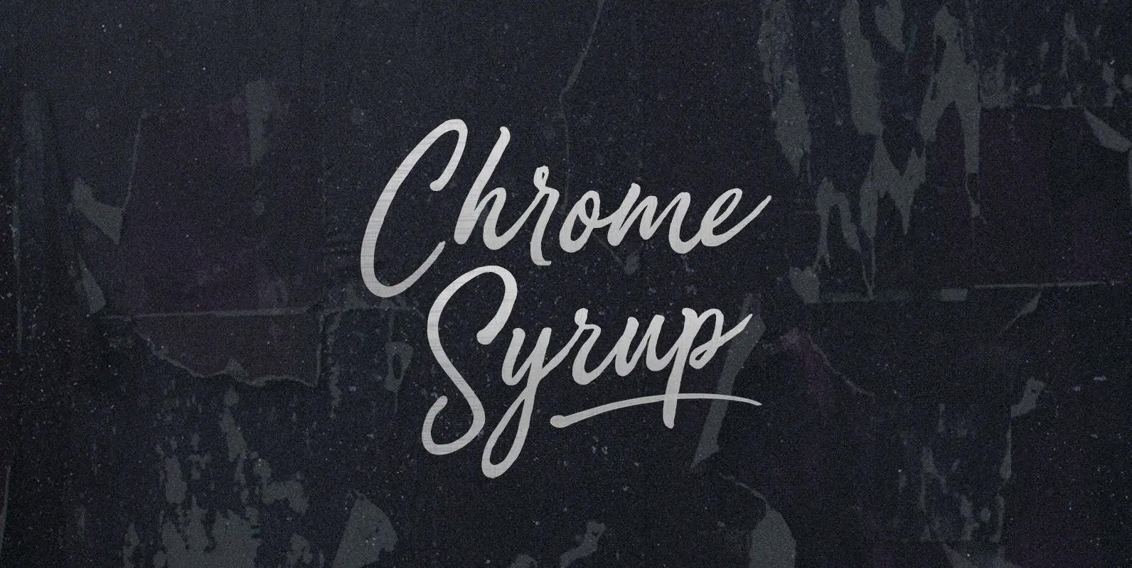
Chrome Syrup Font
Here we are, giving matter mad shine. Mad as bathing hot cakes in mercury, dripping off quick like silver with a sticky sparkle. Chrome Syrup in squeeze bottles, in the door of your fridge, to the door of your car,
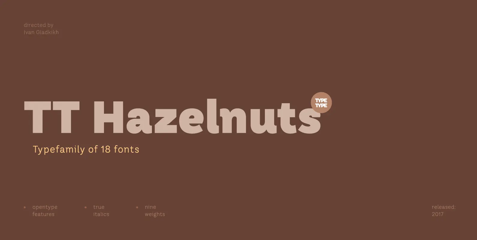
TT Hazelnuts Font
TT Hazelnuts is a display sans-serif font family containing a set of elegant and delicate decorative elements. Initially the family was designed for highly specialized areas, but we’ve decided to extend the number of typefaces and to make the family