Tag: latinotype
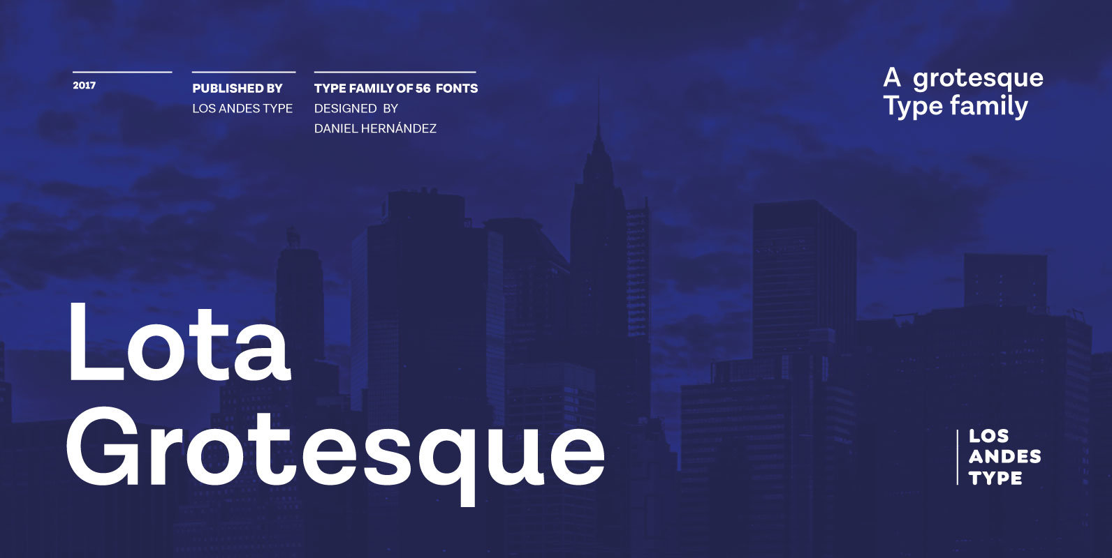
Lota Grotesque Font
Lota Grotesque was designed by Daniel Hernández with the collaboration of Rodrigo Fuenzalida and Latinotype Team in digital editing. The family comes in 7 weights with matching italics and includes alternative versions that provide high versatility and functionality. The whole
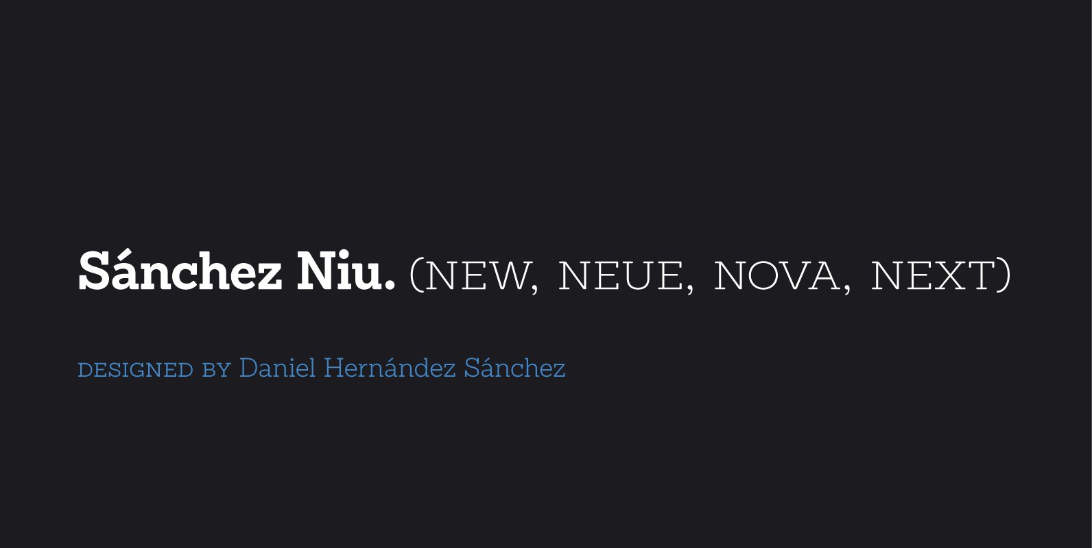
Sánchez Niu Font
Sánchez Niu is a redesign of Sánchez—one of the first font families by Latinotype designed in 2011. This new version includes improvements that make it work well with longer text. Such improvements have not had a major effect on the
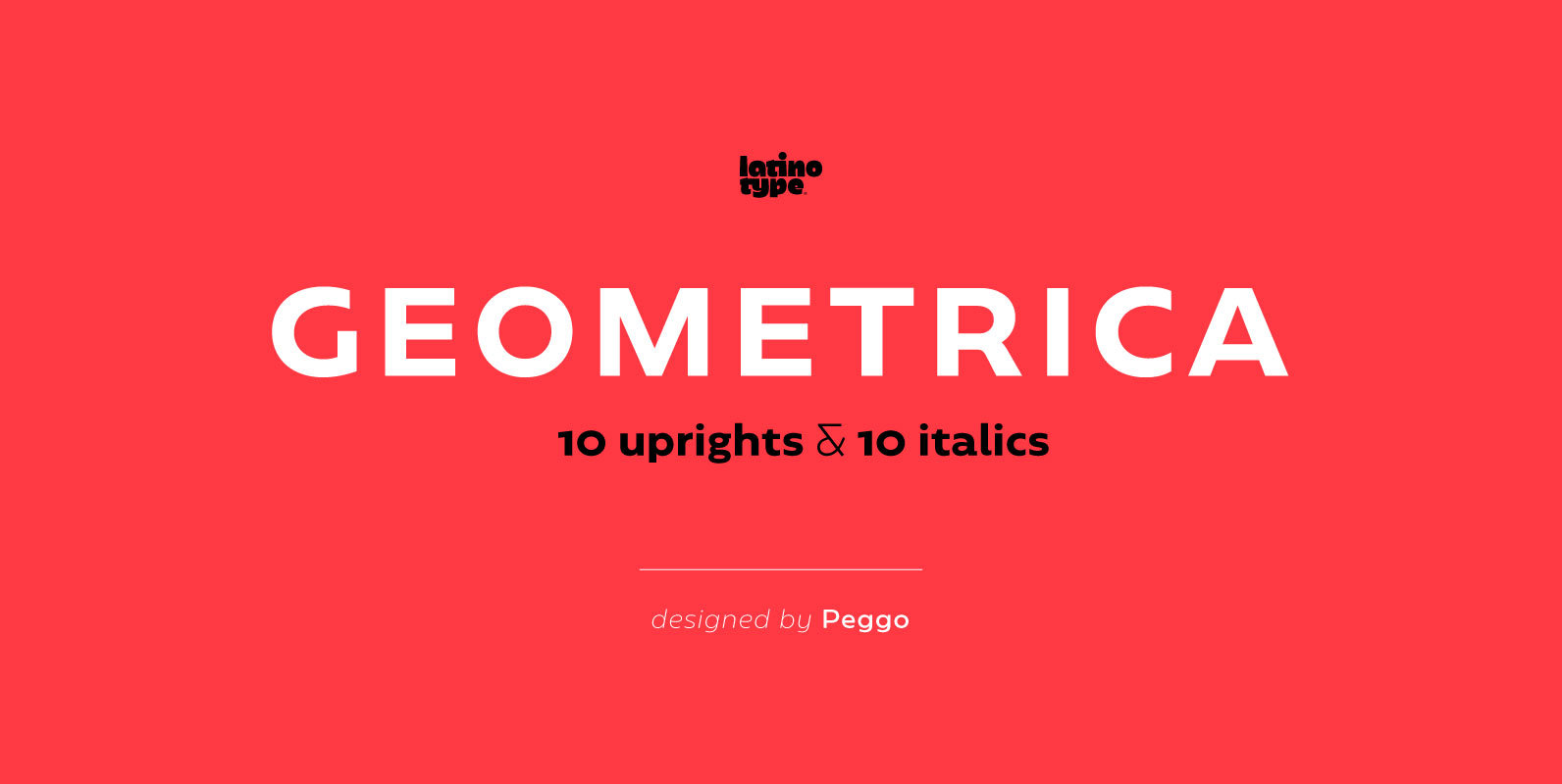
Geometrica Font
Geometrica is a low contrast rounded geometric Sans with a mid 19th/early 20th century simplicity air yet modern and minimalist. The font was inspired by the idea of creating a typeface with uppercase/lowercase characters and small caps having the same
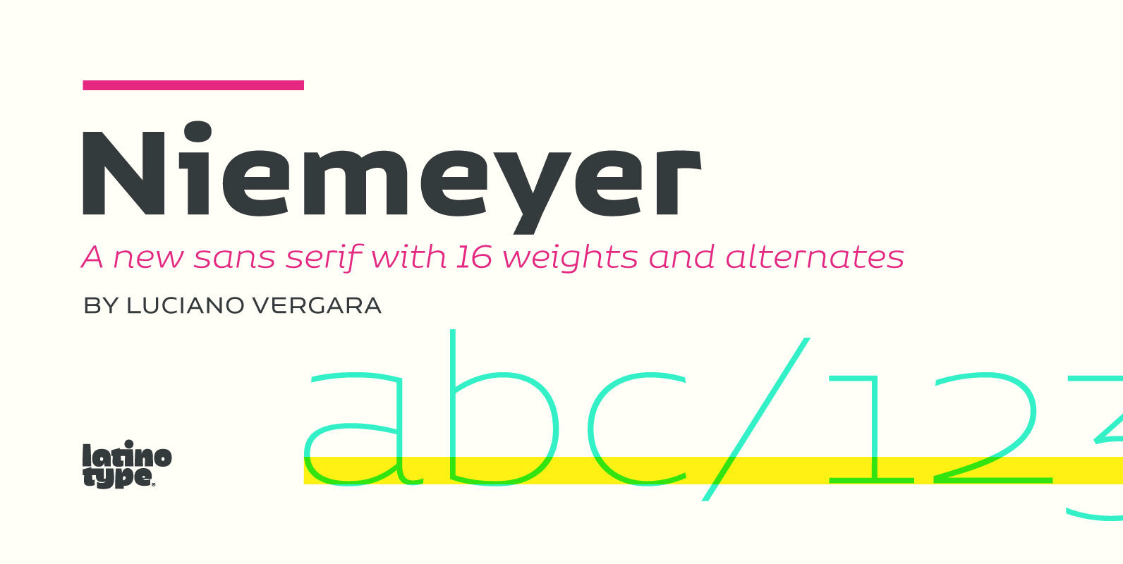
Niemeyer Font
Oscar Niemeyer is one of the greatest architects of our time—his unique way of mixing straight lines and abstract curves gives rise to an unmistakable and characteristic style. This typeface is my own tribute to Brazilian architect Oscar Niemeyer. The
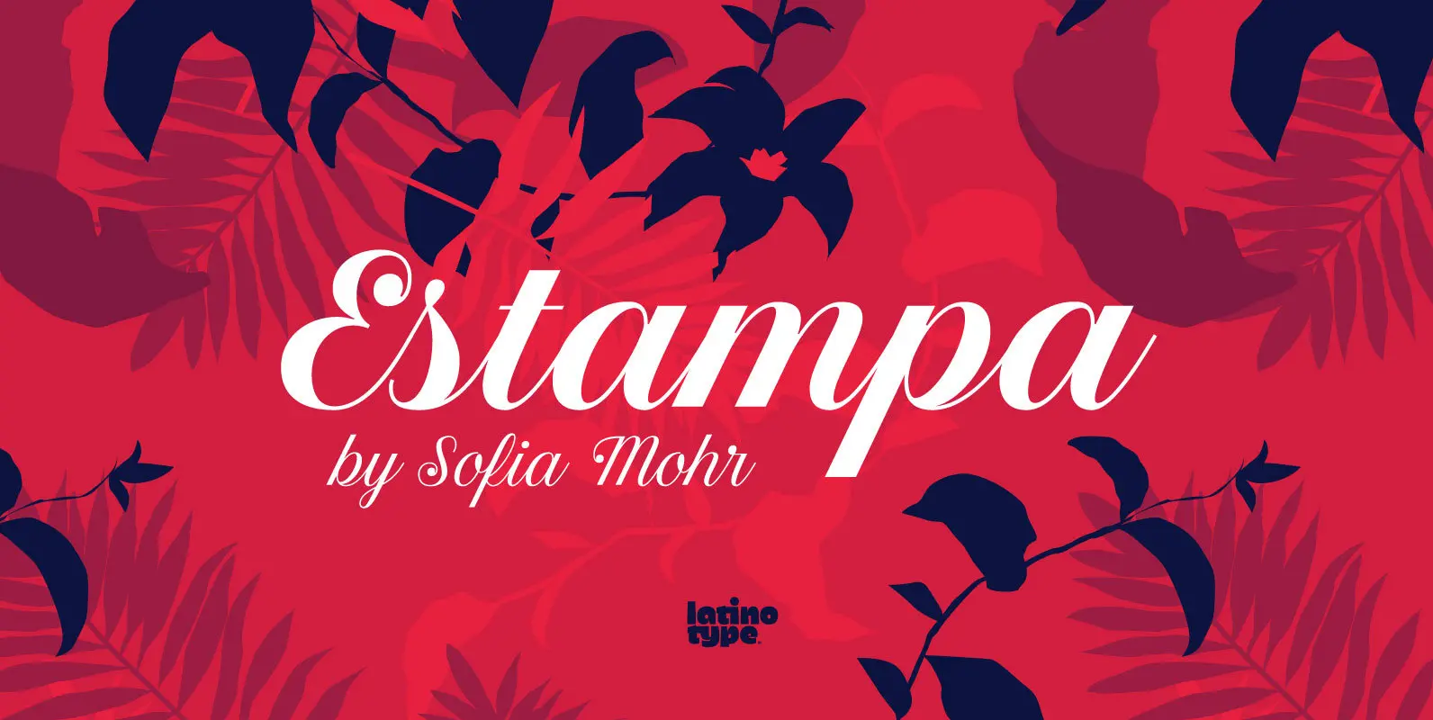
Estampa Script Font
Estampa Script is a 5-weight script typeface, designed by Sofia Mohr, with high contrast between thick and thin strokes, and teardrop terminals that remind us of Didone typefaces. These elements are the main feature of the font and give it
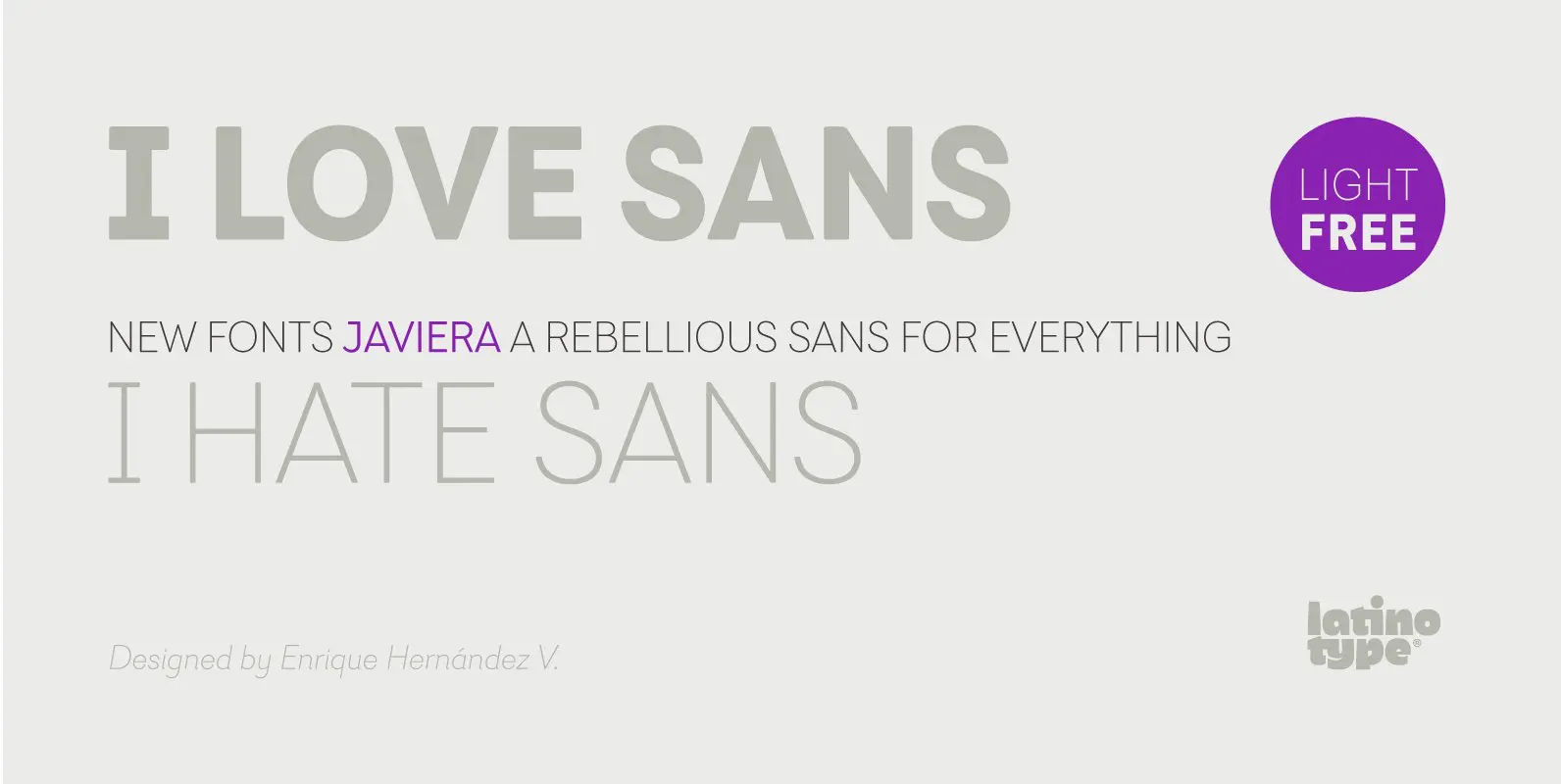
Javiera Font
Javiera is a geometric sans-serif typeface with humanist attributes. One of its main features is its small x-height, which makes ascenders and descenders look longer. The contrast gives the font a more stylised look, typical of humanist fonts. Curves and
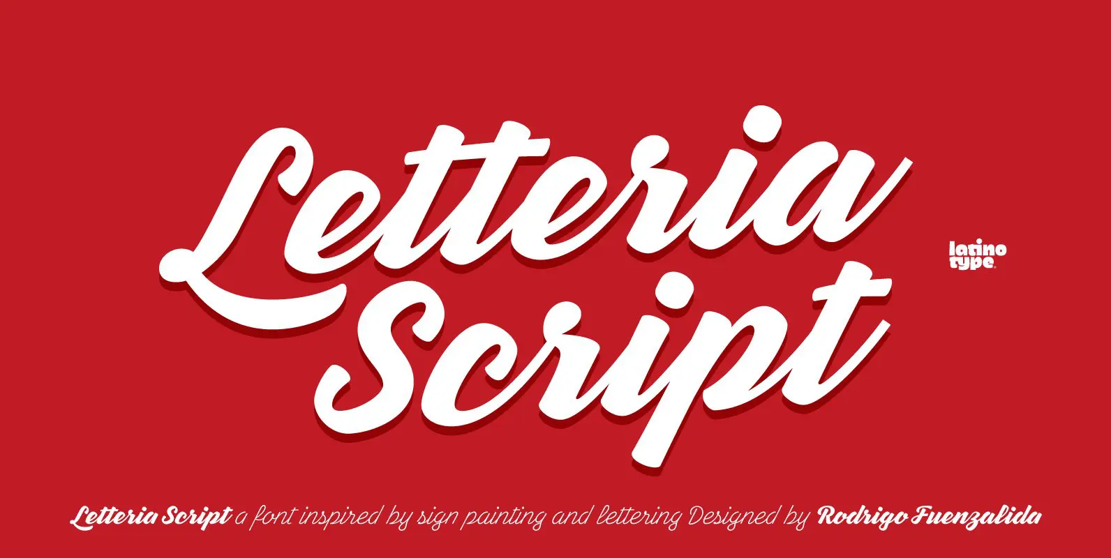
Letteria Script Font
Letteria Script is a script font that recovers the spirit of lettering on signs, products labels and store facades found across the American continent. The family comes in 5 weights and each of them gives glimpses of the tool behind

Trenda Font
Designed by Daniel Hernández and Paula Nazal. Corrections and review by Alfonso García and Rodrigo Fuenzalida. Trenda is a geometric sans-serif typeface based on the uppercase of Trend—a Latinotype font, released in 2013, that was very well received. This new
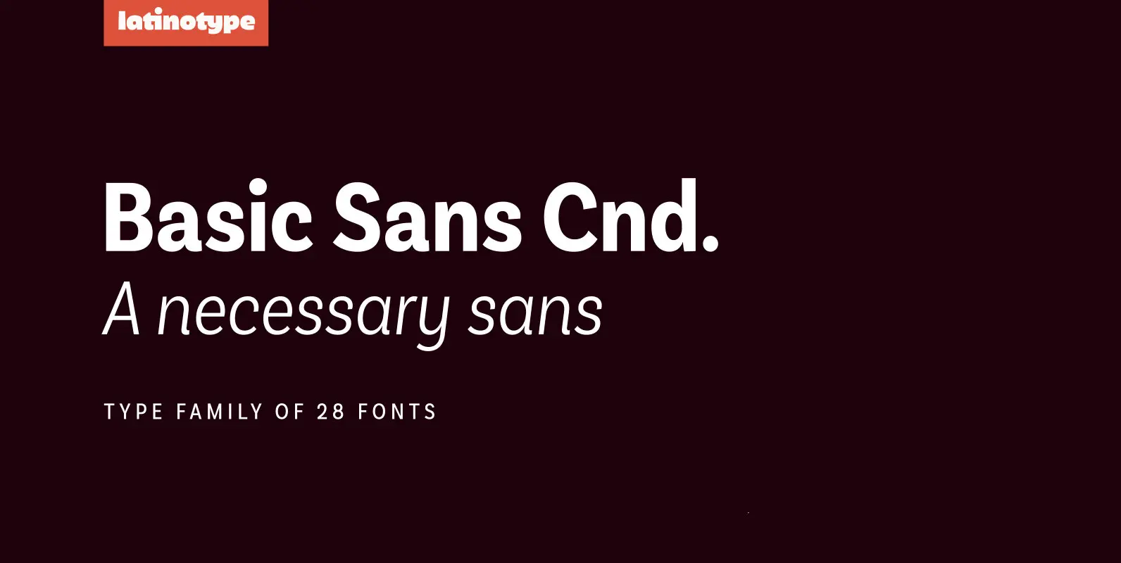
Basic Sans Cnd Font
Basic Sans Cnd: A new sans. Designed by Daniel Hernández Basic Sans Cnd is a narrower version of Basic Sans. It is a family of Grotesque features with a functional, neutral and seeming clean style that looks to keep a
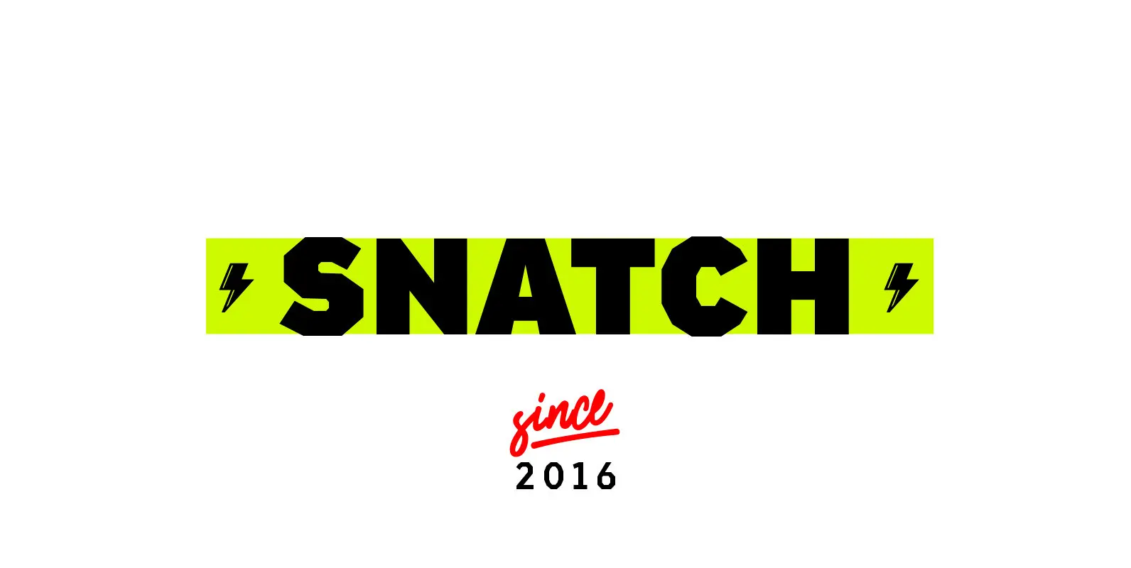
Snatch Font
Snatch is a dynamic and expressive type system designed for impassioned and unprejudiced creative directors who look to combine the rough with the sexy. The font is well-suited for publishing projects, branding and packaging. Snatch is composed of three sections:
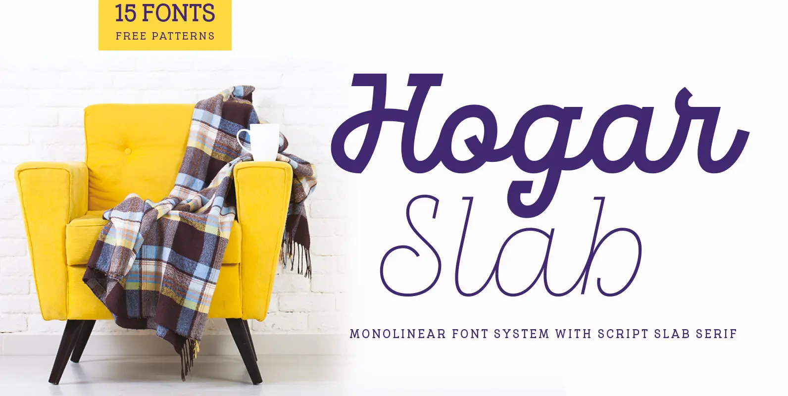
Hogar Slab Font
Hogar Slab, based on the Hogar typeface, is the result of combining a script and a slab serif into a single type system. The system has a monolinear style composed of a slab serif and a script slab serif version
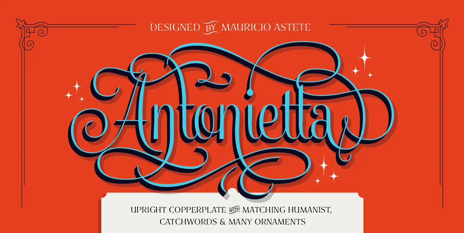
Antonietta Font
Antonietta is Mauricio Astete Brito’s first typeface, which is inspired by the eccentricity of the rococo style and Queen Marie Antoinette’s wild personality. This project, supervised by Latinotype Team, was born from the idea of turning lettering into a digital
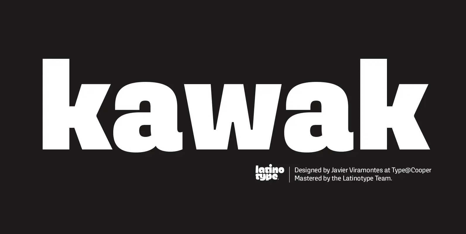
Kawak Font
Kawak is a sans inspired by Mayan glyphs from the Tzolk’in ritual cycle. Kawak marries modernist typographic tradition with Pre-Hispanic formalism, creating a perfect blend between cleanliness, readability, objectivity, and the Mayan super-ellipse. Kawak was designed by Javier Viramontes during
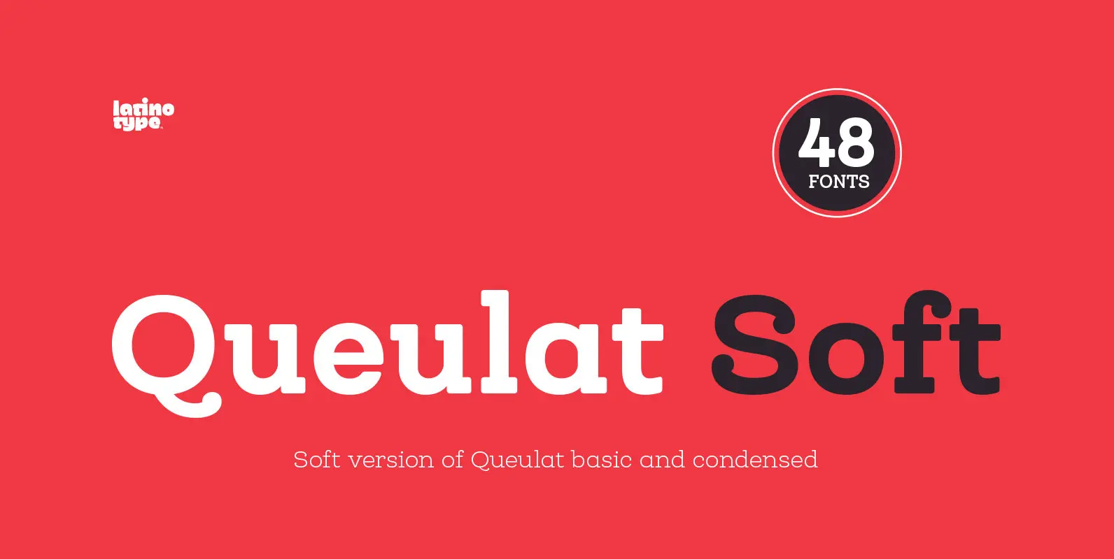
Queulat Soft Font
The font is the soft version of the Queulat basic and condensed families, but keeping the same features as the original typeface. Queulat Soft is a hybrid font that combines different styles, reflecting charm, freshness and, especially, a strong personality.
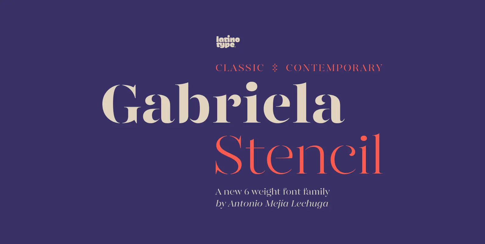
Gabriela Stencil Font
Gabriela Stencil is a classic font family with a unique character designed by Antonio Mejía Lechuga in collaboration with Latinotype Team. This font, well-suited for headlines, has features that emphasise its modern and elegant personality, inspired by the style of

Hogar Font
This font is the result of merging my architecture background and my love for typography, which inspired me to create a system of fonts based on interior architecture design, furniture design and, especially, the love I feel for my home.

Ocean Shore Font
Ocean Shore is a modern display sans typeface with stencil characteristics and based on geometric shapes. That when combined gives the font a retro-futuristic look and makes it ideal for big and catchy editorial headlines. The family includes 6 styles,
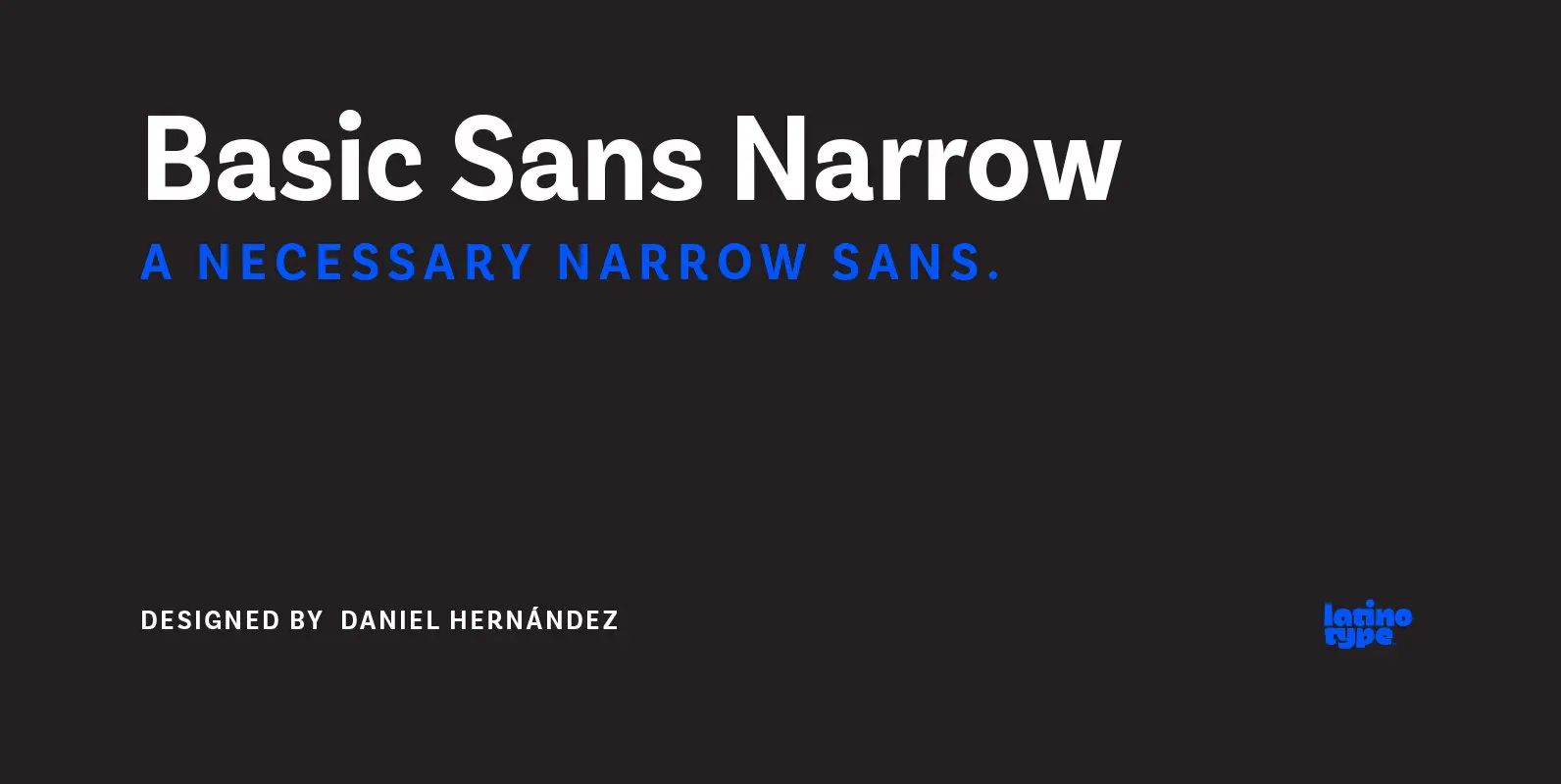
Basic Sans Narrow Font
Basic Sans Narrow is a narrower version of Basic Sans. It is a family of Grotesque features with a functional, neutral and seeming clean style that looks to keep a neutral (or basic) appearance on paper, but including lots of