Tag: jagged
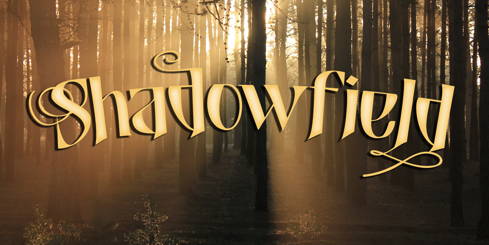
Shadowfield Font
Shadowfield is a fantasy font which was inspired by the hand lettering on the Spiderwick movie posters (which itself was apparently based on Hand Skript One). Every glyph was drawn by hand, using a gel pen on 160 grams paper.
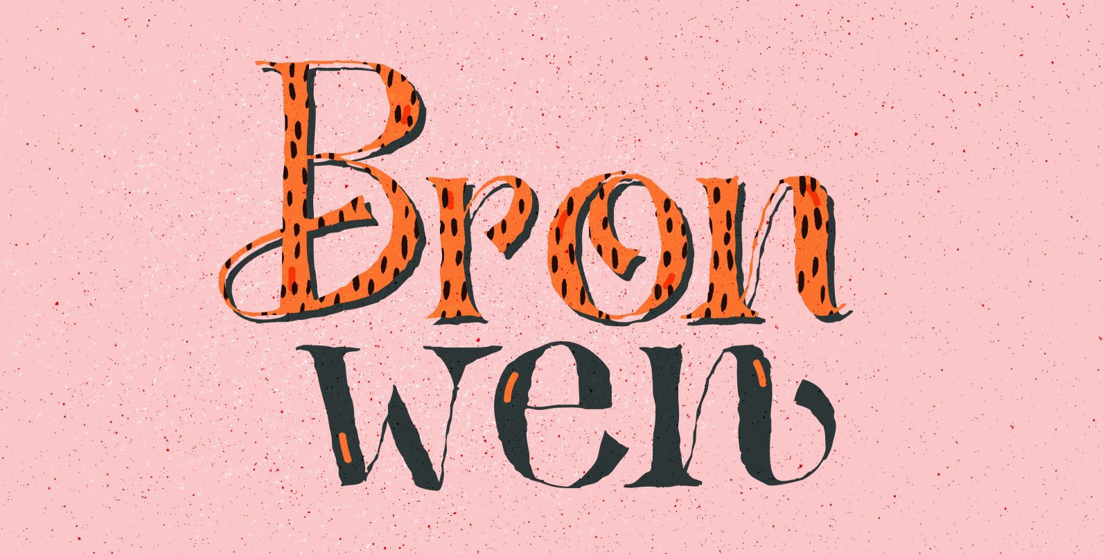
Bronwen Font
In Welsh mythology, Bronwen was the daughter of Llyr, the god of the sea. It is a popular girls name in Wales and it apparently means ‘white breast’ or ‘pure heart’. I really like this name and I think it
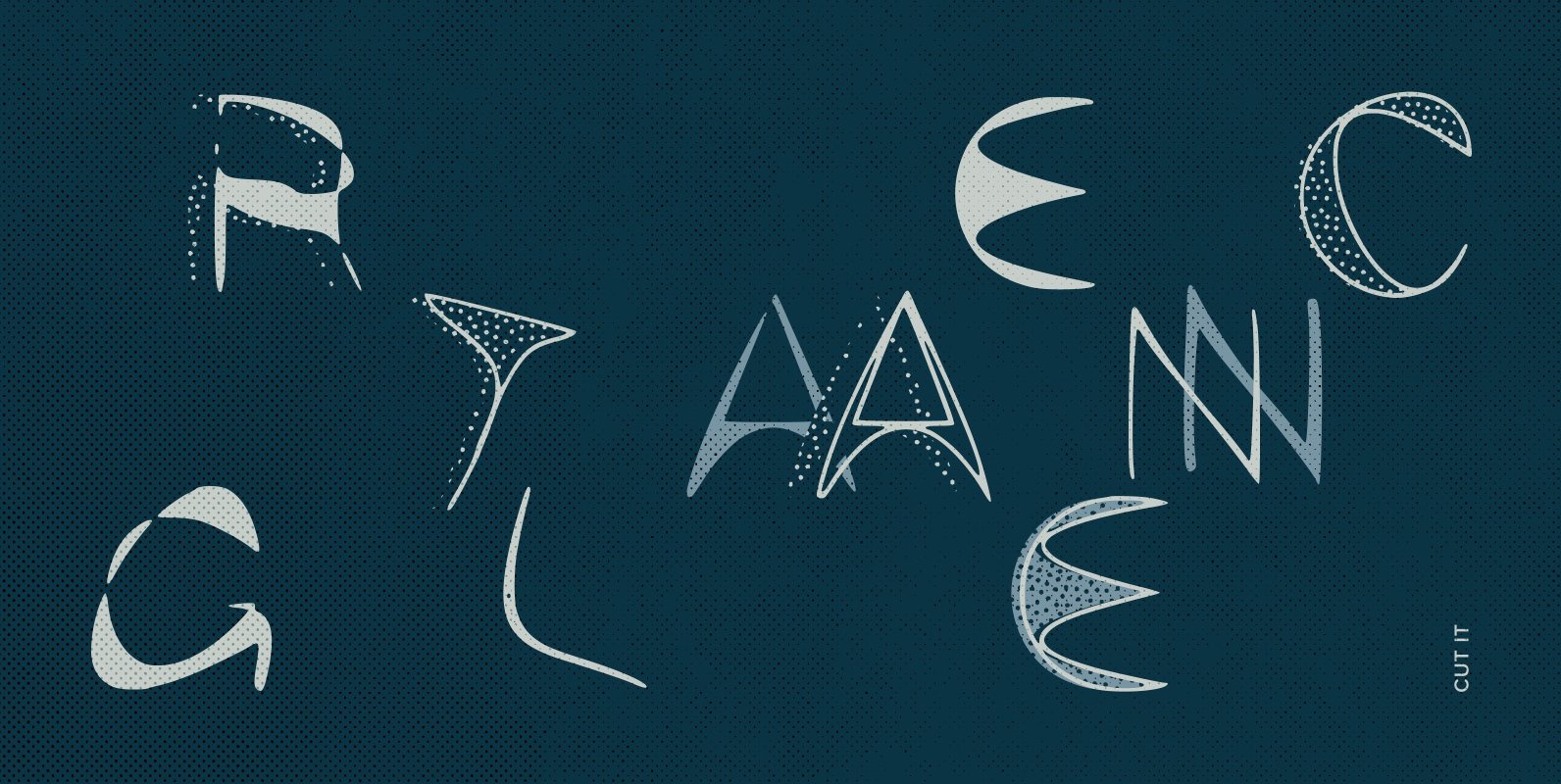
Cut It Font
Cut out, snipped, this is a font that looks like it’s been snapped out of some scrap paper. Thin, freaky looking, its odd features look irregular and a little alien. Use for a party, crafts or Halloween, Available in regular
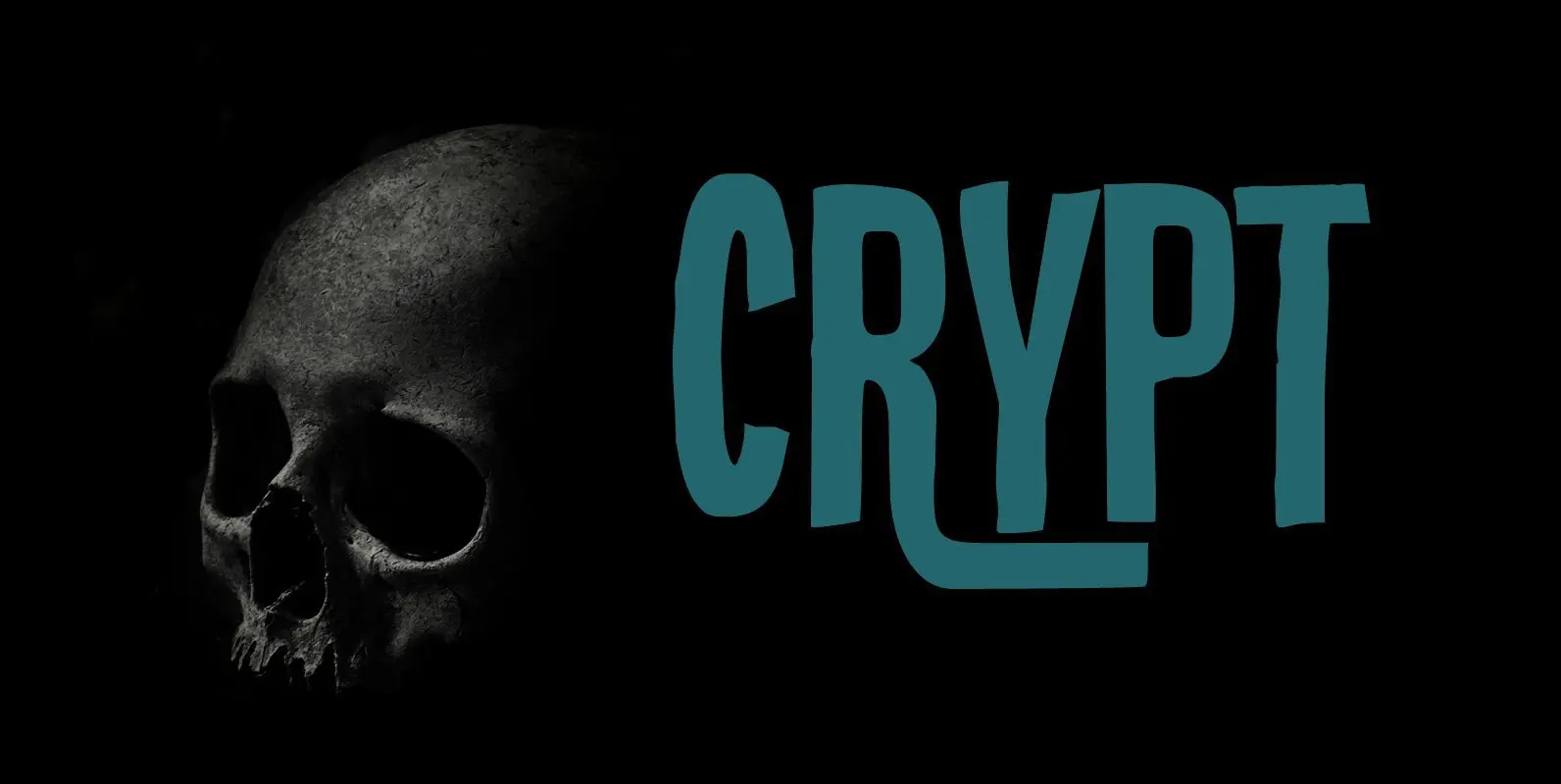
Crypt Font
Crypt is a seemingly lovely font that will look good in just about any design. But if you take a closer look, then Crypt is actually quite a scary font: it has jagged edges and a sinister undertone, making the
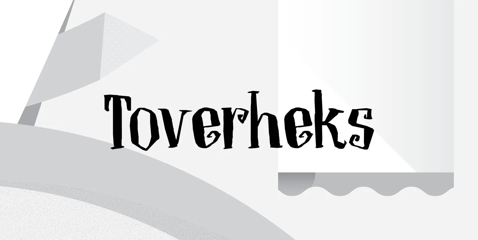
Toverheks Font
A Toverheks in Dutch means ‘witch’ – well, actually it means ‘magic witch’ (it doesn’t translate well). The reason for this kind of weird name is the nature of the font: it reminded me of a book of spells –
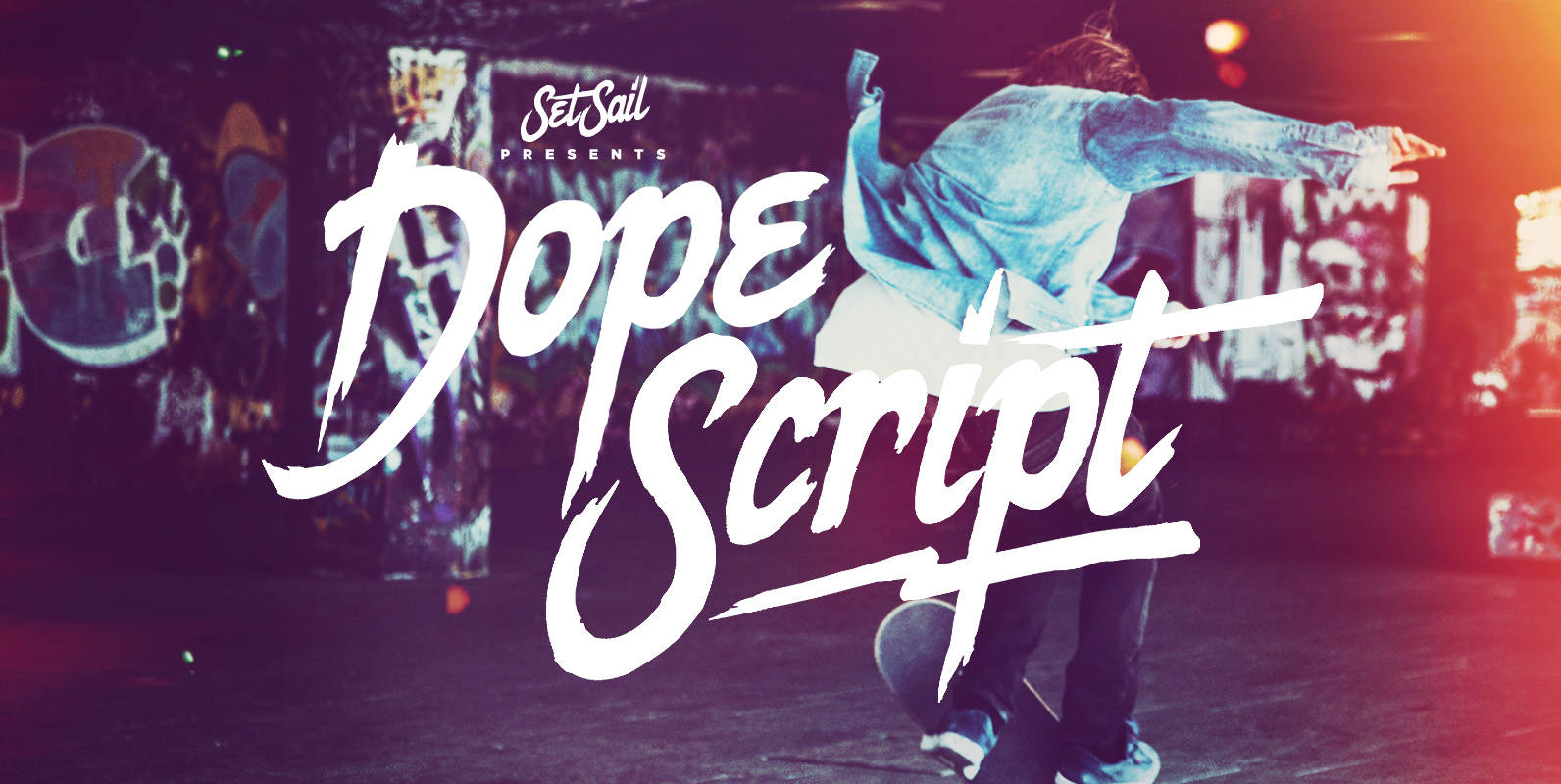
Dope Script Font
Dope Script is a rough around the edges, hand-made paint brush font with bags of personality. It comes with a large range of characters including capitals, lower-case, numerals, punctuation, currency and accents. Also try the characters { } [ ]
Vatican Font
Vatican is a calligraphic face. The lower case is influenced by the lettering of Arthur Baker but the caps are more formal, the shape of the Cap V reminded me of a Bishops Mitre which led eventually to the name.
Stalker Font
Stalker is one of those necessary fonts in a designer’s toolbox: Grungy sans serif caps that are most useful for entertainment project chores. Originally made in the summer of 2003 for set and prop design of an Alliance film, Stalker
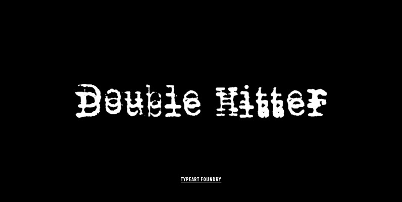
Double Hitter Font
This font was created mostly to be a companion set for our other Typewriter families, allowing you to introduce the typewriter flaw where you end up with a double impression of a character. A Typewriter emulation with slight inking imperfections,
Alghera Font
Designed by A. Pat Hickson, Alghera is quirky serif design based on a handwritten Portuguese wine label design. Published by Red RoosterDownload Alghera
Piedra Pro Font
The world may seem cartoonish to you, pilgrim, but the funnies ain’t really that funny. The Flintstones are so last century. The Hulks are in, and they’re here to stay. Piedra is the rocky, fear-inducing face of galvanized triceps and
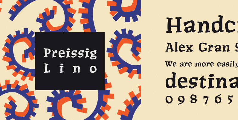
P22 Preissig Lino Font
Type designs of Vojtech Preissig show a great affinity for hand-craftmship and a distinct attempt to avoid appearing too clean. Legend has it Pressig hand cut fonts in linoleum, which served as the basis for this font, dating about 1912.