Tag: irregular
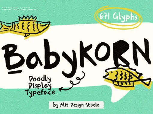
Unveiling Baby Korn Typeface: The Whimsical Harmony of Innocence and Sophistication
In the fascinating realm of graphic design and digital creation, fonts play a pivotal role in carrying the message from designers to their audience. Fonts do not merely communicate; they tell a story, embody ideas and, most importantly, evoke emotions.
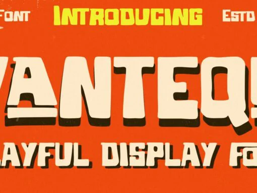
Vantequ Typeface: The Bold Edge in Contemporary Design Mastery
In the dynamic world of graphic and digital design, having innovative, versatile, and expressive typefaces in one’s creative arsenal is an essentiality. The right typeface can convincingly deliver the intended emotional resonance, boost the comprehension of an idea, and craft
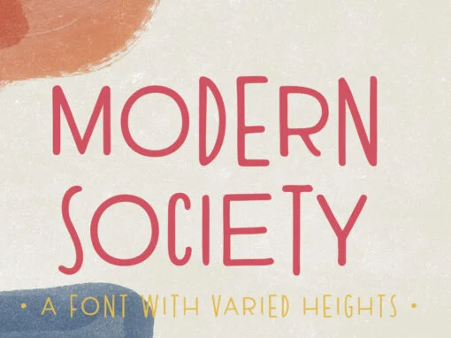
Modern Society Font
Modern Society is a hand drawn all-caps font with a unique look. Although Modern Society is hand lettered, the letterforms are geometric in structure. The unmistakable difference between cap heights and baselines as well as letter widths is what gives
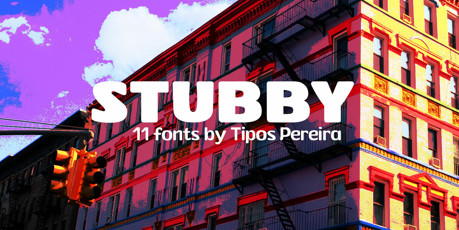
Stubby Font
Stubby is a display type family with 11 styles, inspired by the vernacular landscape. It was made for titles, headlines and also packages, posters and everything that provide space for a rude, fat and widish type. Nonetheless it can be
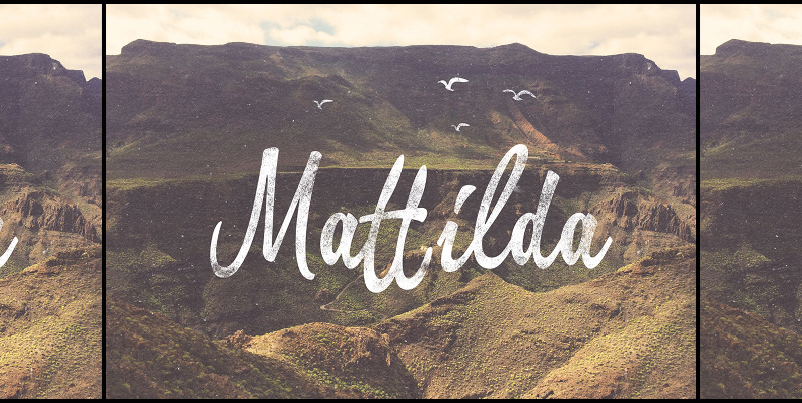
Mattilda Font
Mattilda is a script typeface inspired by freestyle brush lettering which is great to use in urban and free design styles. It is bold, fun and attractive. You can make your own brush-lettering logo, wedding invitation, greeting cards, etc. Published
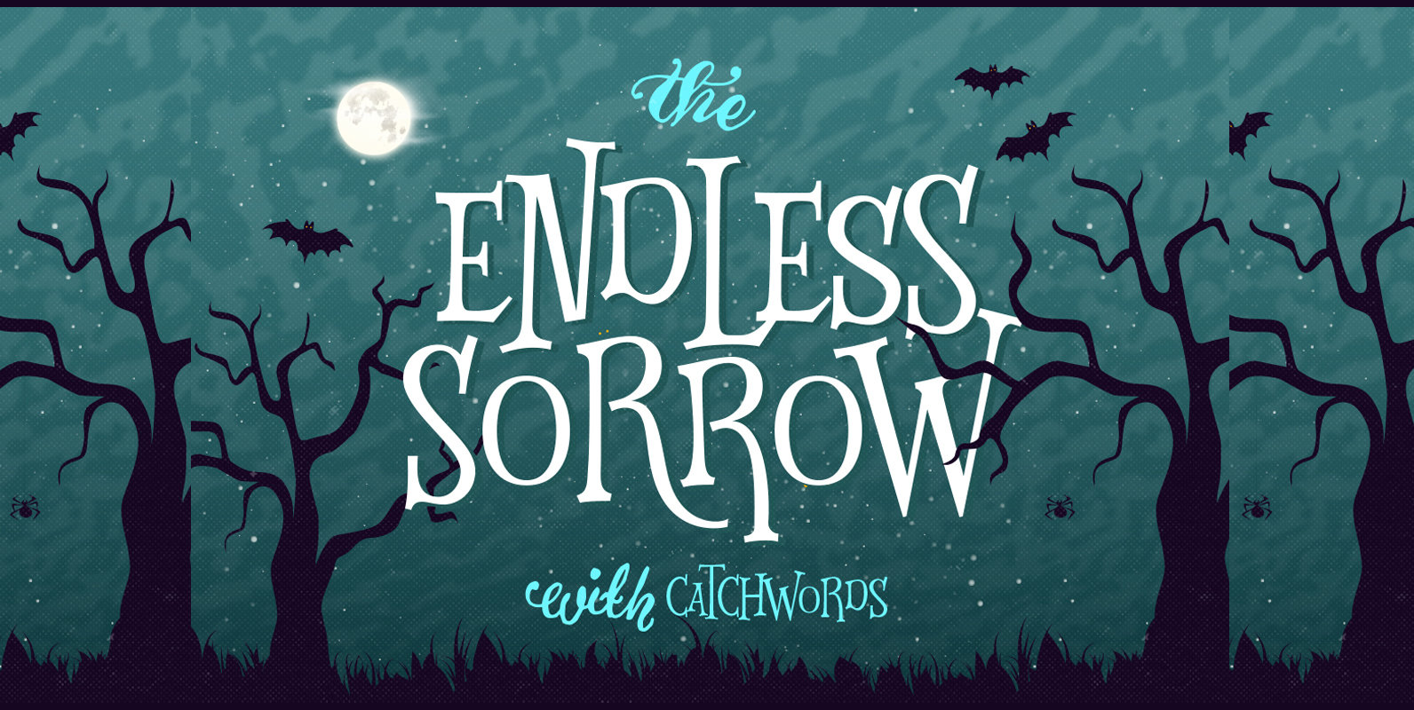
Endless Sorrow Font
Endless Sorrow is an all-caps versatile display font inspired by vintage typography that usually shown on the poster, book and CD cover. The irregular height of the font clearly represents the feeling of hand-drawn and humanist. You can use it
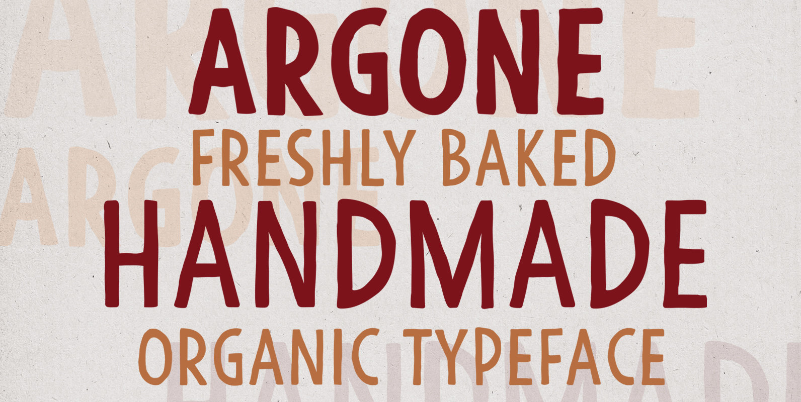
Argone Font
Argone is a handmade, organic, display family and comes in four weights. Published by Deepak Singh DograDownload Argone
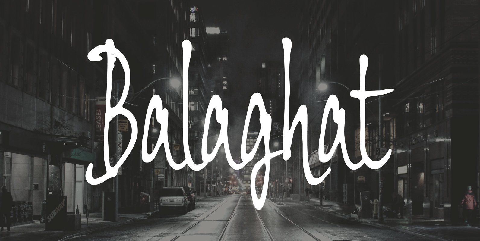
Balaghat Font
Rapid handwriting script for posters, advertising and visual part of work. Very impressive and strong letterform stands out. Published by Dharma TypeDownload Balaghat
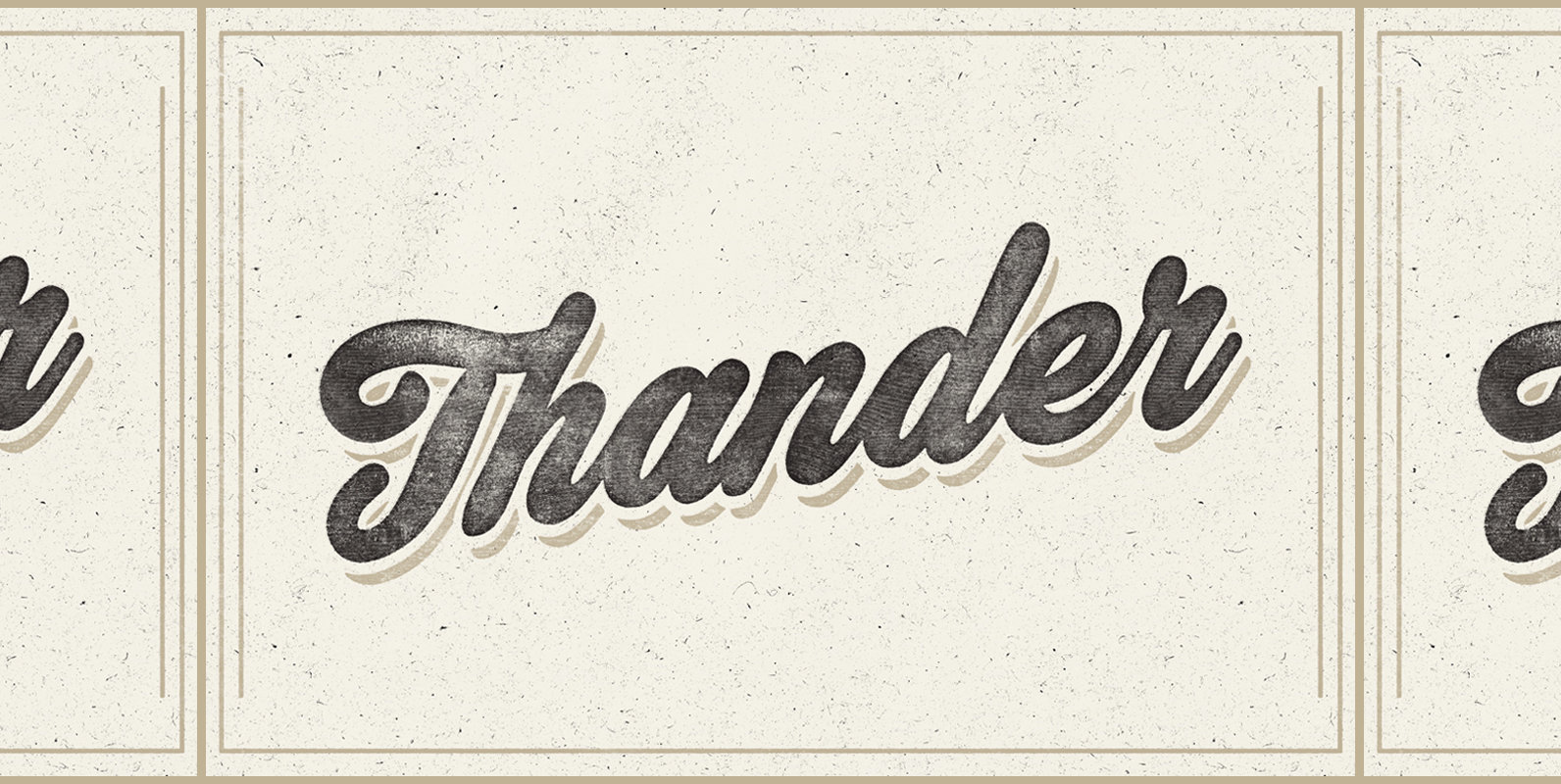
Thander Font
Let’s meet Thander! A round bold script that really brings the classic and personal feel to life. Thander is a combination between brush lettering and speed writing. It is thick, tight, and have irregular shapes to make it feel much
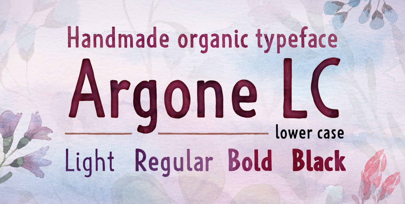
Argone LC Font
Argone LC is a handmade organic typeface family. It is a variant of Argone typeface, but has lower case letters. It comes in four weights– light, regular, bold and black, which is a feature not seen much in handmade typefaces.
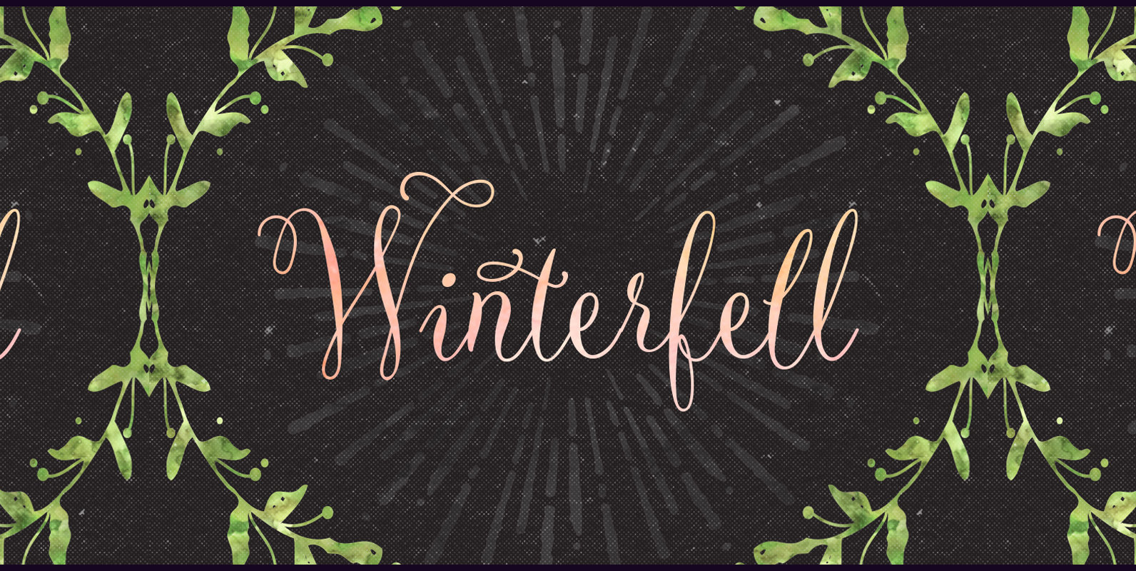
Winterfell Font
Winterfell is a dancing script font that proportionally presents natural feel to create a personal message with calligraphy style. You can use Winterfell in the wedding invitation, greeting cards, valentine day, etc. Winterfell consists of 331 glyphs in total and
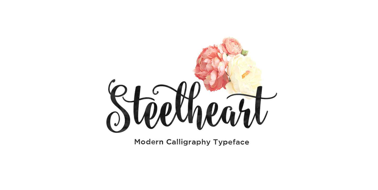
Steelheart Font
Steelheart is a modern calligraphy typeface with a dramatic movement. It suitable for wedding invitation, greeting cards, watercolor based design, or anything that need natural feeling to put on to. Steelheart font comes with a complete set of standard characters,
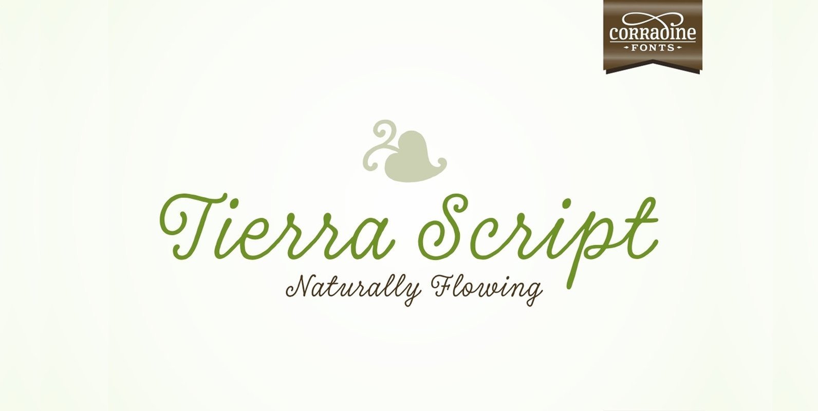
Tierra Script Font
Tierra Script is a connected script typeface with a simple structure and organic contour. Its naivety and fluency makes it easy to read and close to everyone. The system has two main styles, one more formal than the other, then
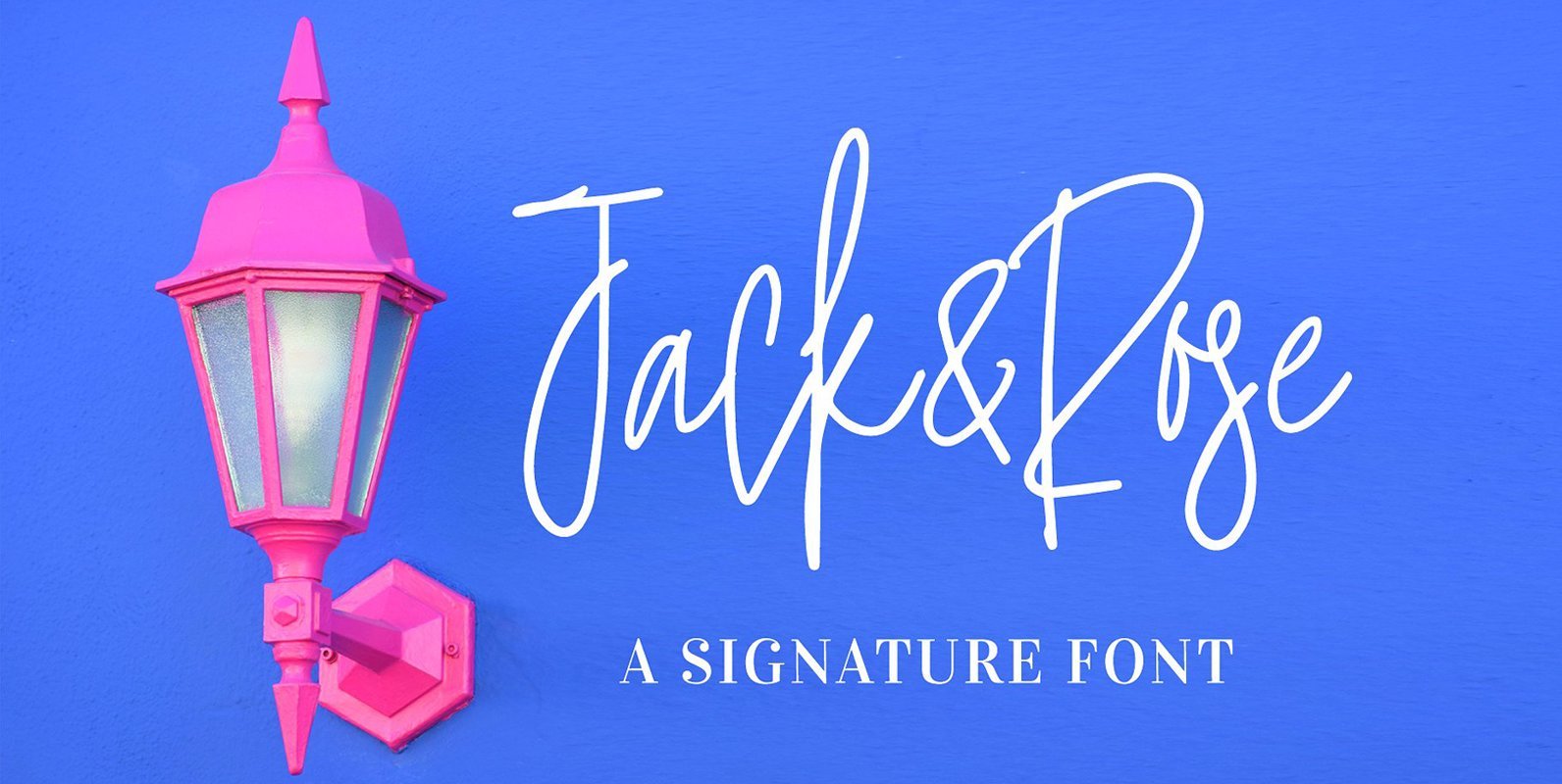
Jack and Rose Font
Boost your design by giving a super personal touch to it with Jack and Rose font. A natural handwritten script font that can be used for various purposes such as wedding invitation, greeting card designs, logotype/branding, fashion magazine/brochure, etc. Published
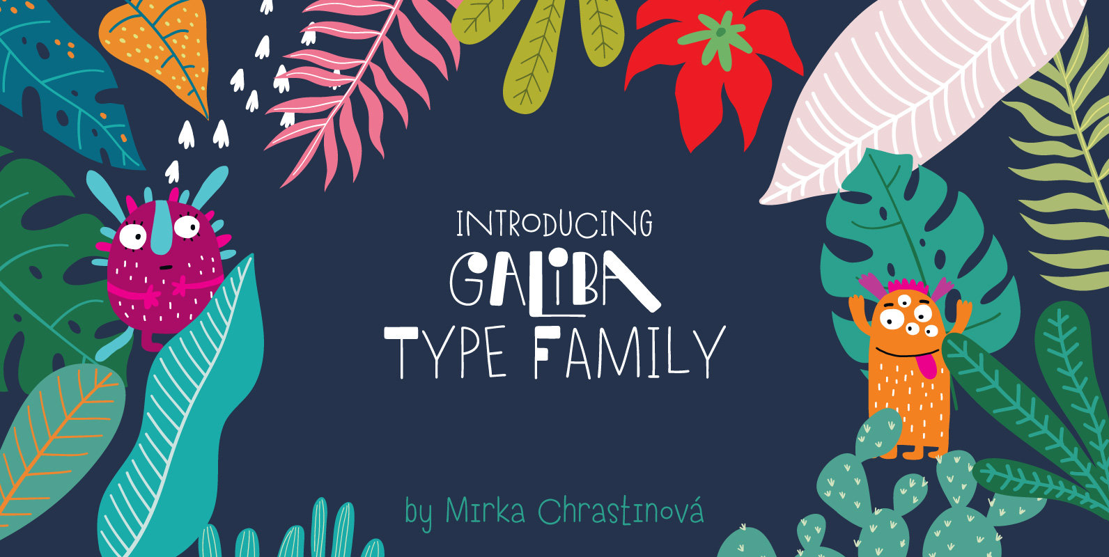
Galiba Font
Give your voice an eye-catching hand-drawn look thanks to this playful font family. You’ll get three styles, along with OpenType features including alternates, ligatures and stylistic sets. Galiba Regular works very well with his small brothers Light and Thin. In
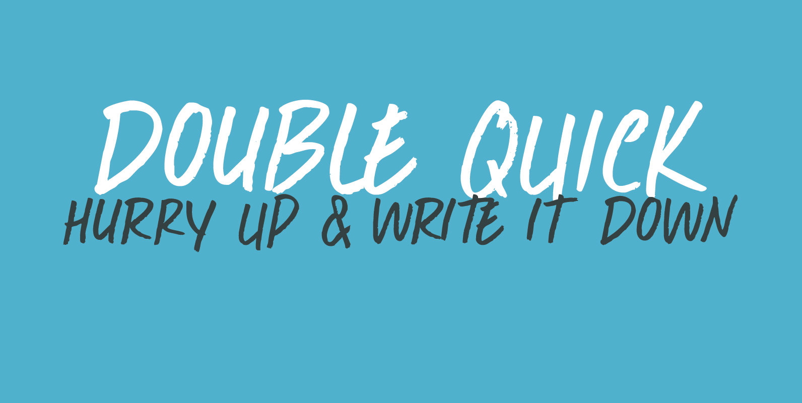
Double Quick Font
Double Quick is a fast, handwritten font with excellent legibility. It was designed to look like a quick grocery list, a hasty ‘I Love You’ note penned down on a Post-it or a home improvement to-do list. Comes with extensive
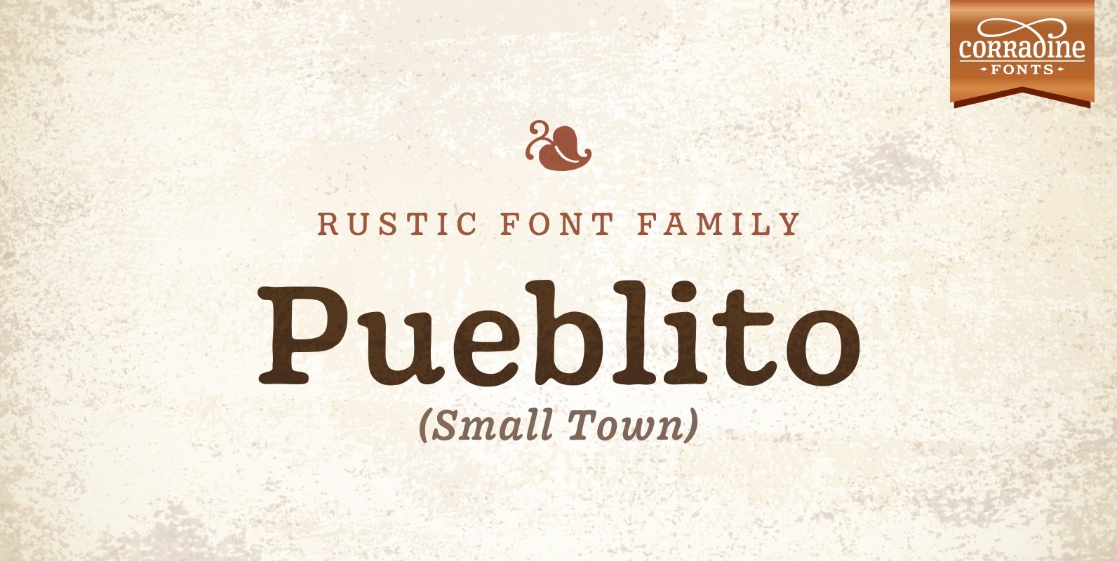
Pueblito Font
Pueblito is a hand drawn font with a rustic and antique appearance. Was inspired from old books and newspapers but express a very own personality and not necessary represent a specific classic style. The family consists of twelve fonts in
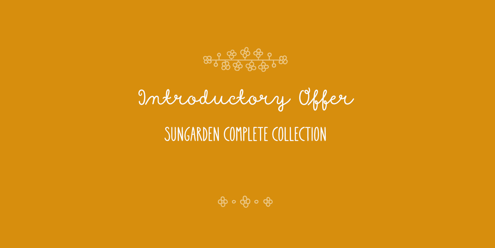
Sungarden Font
Welcome to my hand-drawn garden! Enjoy the sunshine, surrounded by my line illustrations of flowers, leaves, birds, hearts, arrows, snowflakes and various ornaments. Sungarden is a bouquet of about 400 handmade pics and floral ornaments, created to get along well