Tag: Hybrid
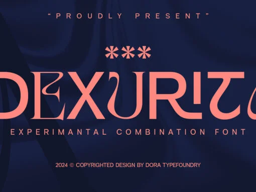
Reimagining Typography: The Dexurita Fonts Timeless Appeal in Digital Design
Our digital landscape is continually being redefined by various technological advancements. A notable element of this landscape is typography, an essential aspect of digital design. Enter Dexurita, a font that stands as a testament to creativity in digital design. The
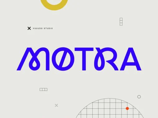
Motra: A Quantum Leap in Digital Typography by Agung Syaifudin
At the intersection of digital artistry and typographic innovation, lies Motra, a sans serif font by renowned designer Agung Syaifudin. This creative typographic solution not only redefines the boundaries of design but also appeals to the sophisticated aesthetics of graphic
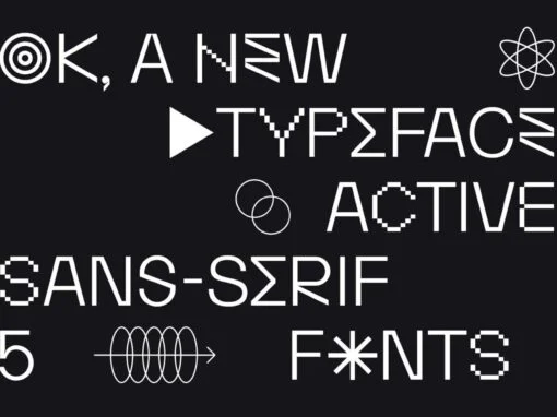
Imbibing Emotion in Digital Design: Exploring the FT Activica Font
When considering the expansive world of typography, a font capable of communicating more than mere text can truly shine as a linguistic gem. One such star in this socio-typographic universe is FT Activica, a chameleonic innovator that is as much
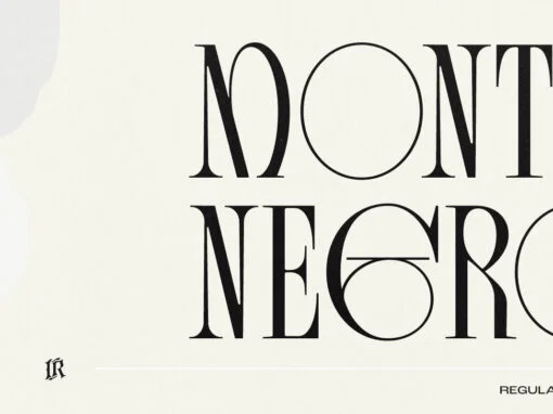
Monte Negro Font
Give your design projects the luxurious touch of Monte Negro! This condensed display serif font is perfect for creating custom logos, invitations and headlines. Featuring 64 stylish ligatures and 33 alternate glyphs, Monte Negro adds a timeless elegance and sophistication
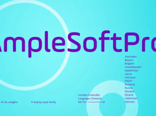
AmpleSoftPro Font
AmpleSoft Pro is an extended version of AmpleSoft type family. AmpleSoft Pro Includes Extended Languages Character Set for the following: Azerbaijan, Belarus, Bulgaria, Czech Republic, Kazakhstan, Latvia, Lithuania, Polish, Romania, Russia, Slovakia, Ukraine, Uzbekistan, Vietnam. AmpleSoft Pro is a display
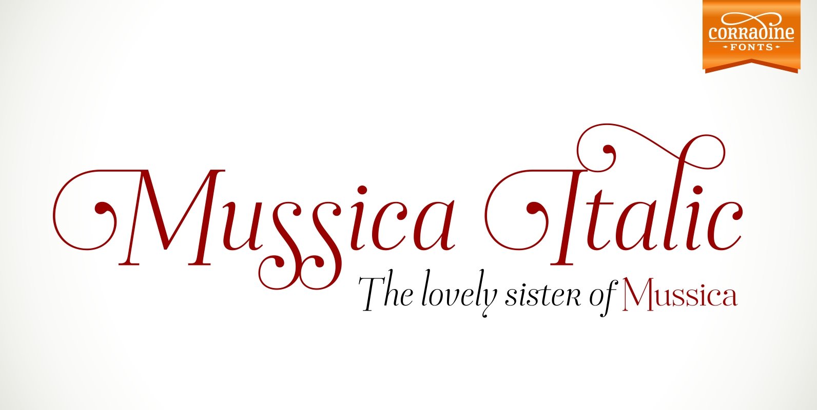
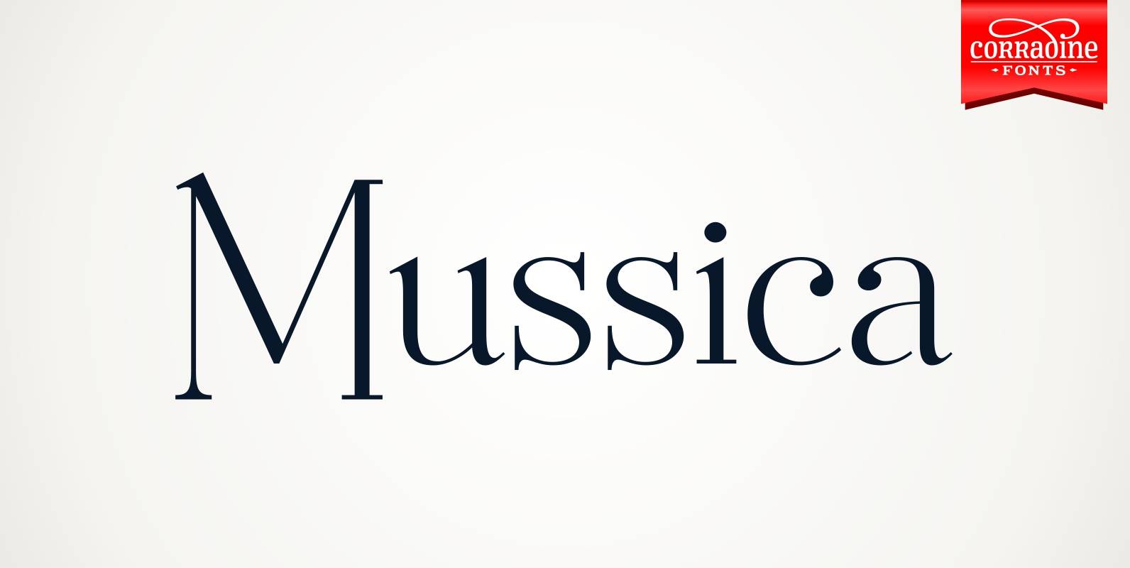
Mussica Italic Font
In 2009, Corradine Fonts released one of its most successful projects: Mussica, an experimental and hybrid typeface that explore the exaggeration of ascenders and descenders in a high contrast style. Now, around eight years later, we are proud to introduce
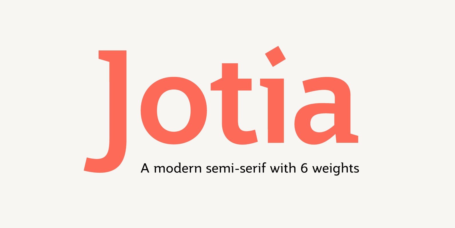
Jotia Font
Creating a combination between serif and sans serif typefaces, Jotia utilises the best of both worlds, resulting in a unique and modern neo-humanist font family. Taking its inspiration from lapidary inscriptions rather than pen drawn text, Jotia uses triangular serif
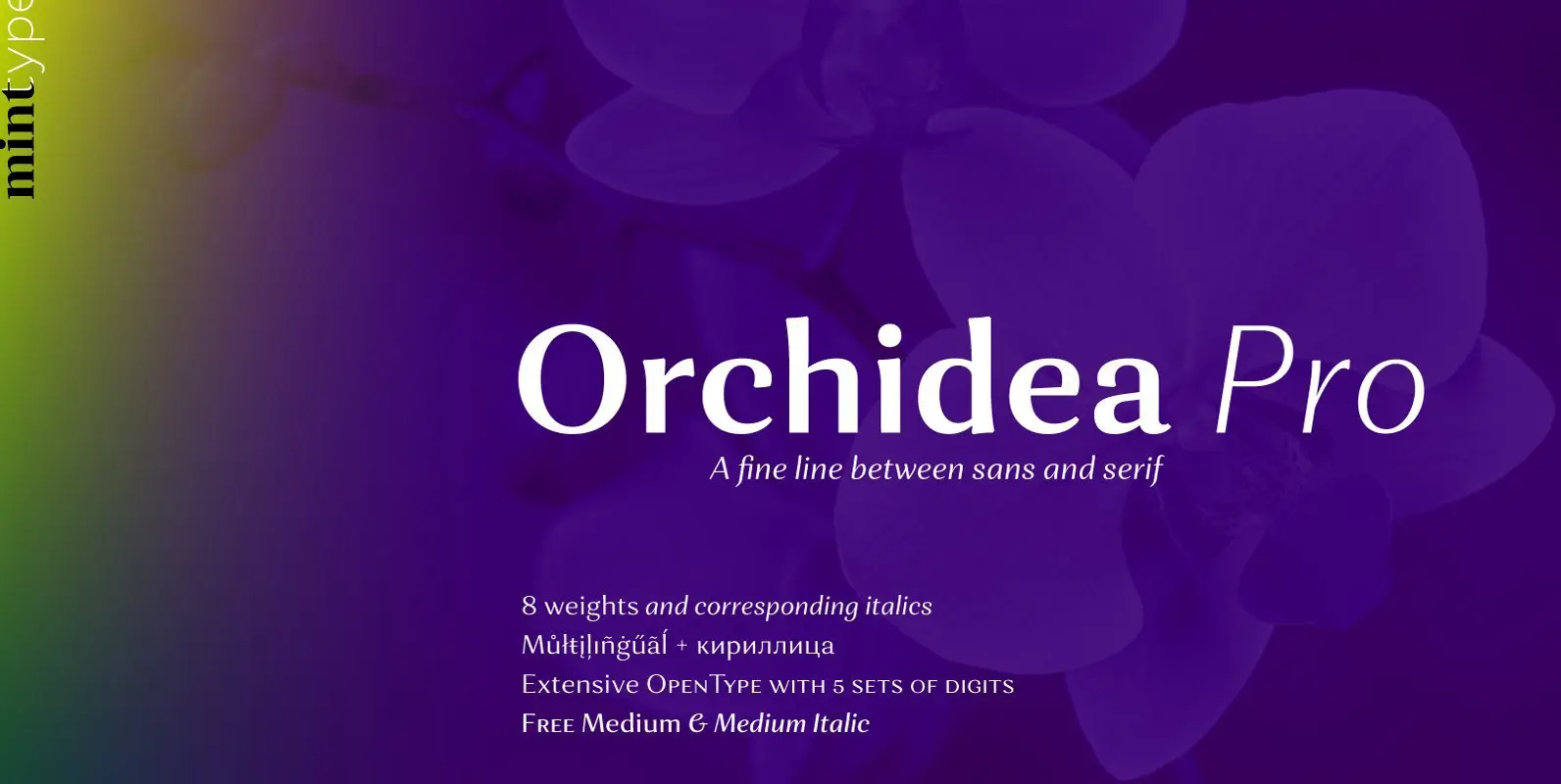
Orchidea Pro Font
Orchidea Pro is a typeface balancing on the verge of sans and serif. Called a stressed sans or a serifless serif, it does not feature any serifs, but resembles a serif typeface by build, and features unilateral nibs that speed
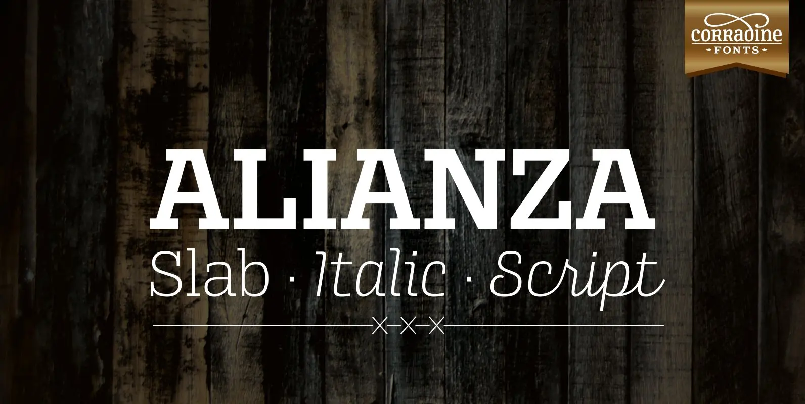
Alianza Font
This is a complex typographic system which includes three different but complementary styles so far: Slab, italic and script, with nine weights each one; plus three sets of ornamental fonts: labels, negative labels and ornaments. The soul of the family
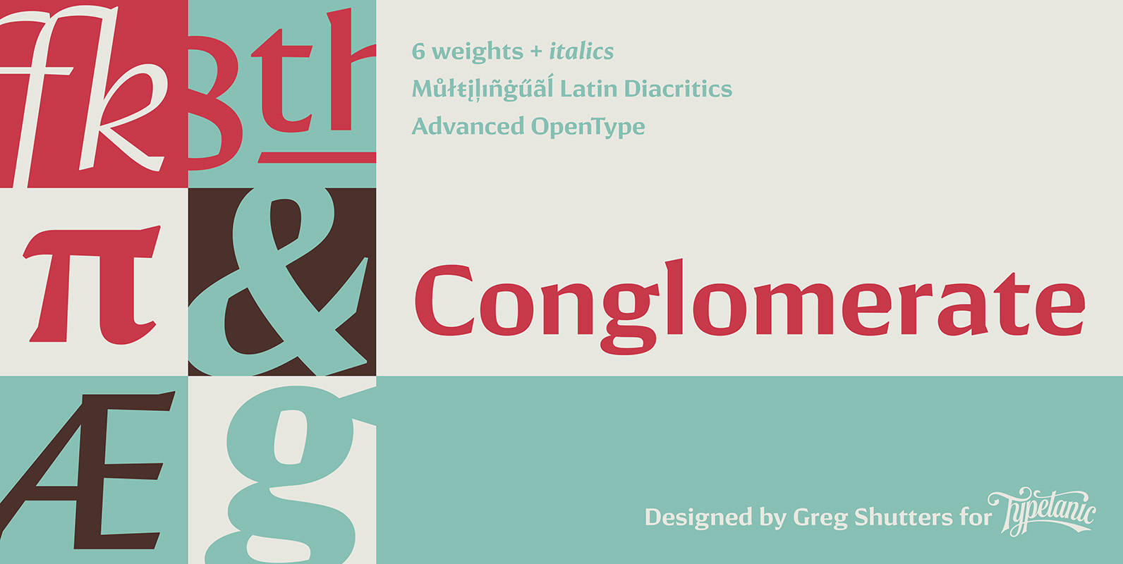
Conglomerate Font
Sans or serif? Square or rounded? Calligraphic or geometric? Conglomerate is both all and none of these things — a subtle yet unorthodox blend of typographic traits resulting in a clean, unique, and versatile font family with large, open counters
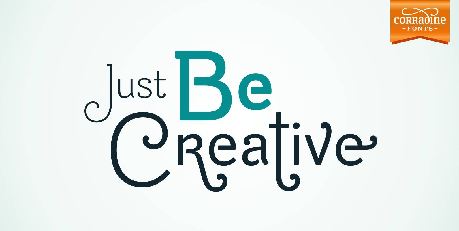
Be Creative Font
When you are trying to solve any problem, surely you round the solution like a swirl. This typeface represents that continuous search of creative solutions. So, our recommendation is “Be Creative” always. Based on the skeleton of the classic typeface
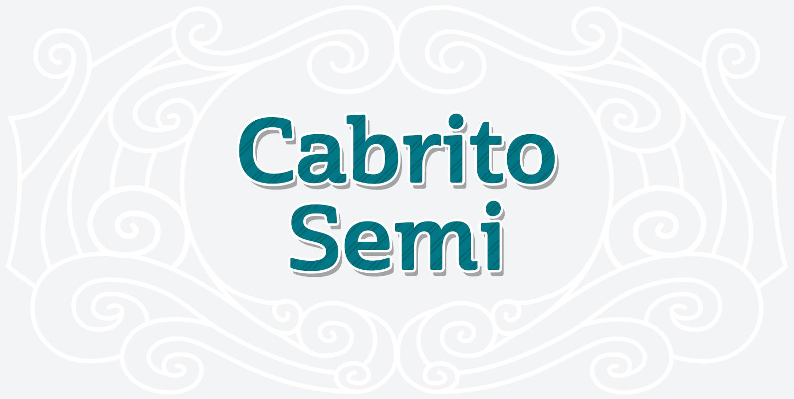
Cabrito Semi Font
Relax. Deep breath. And step away to font nirvana with Cabrito Semi. Like its Cabrito relatives, Semi’s handwriting-inspired feel is mellow and care-free. But don’t misunderstand us. Even with its fun-loving peculiarities, this free spirit will command whatever party you
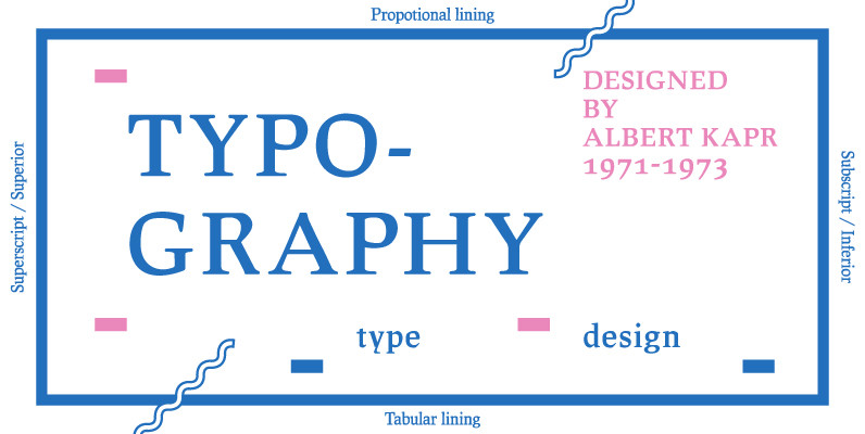
Leipziger Antiqua Font
The original typeface was designed by Albert Kapr between 1971 and 1973 for Typoart in Dresden. Kapr was the font designer and teacher as well as book author on type design of former East Germany. He also was an expert
Mussica Font
Mussica is an ornamental hybrid font derived mainly of transitional and Didone styles but including some script and uncial quirks too. Its proportions and measurements aren’t conventional giving a very special look. The family consists of two fonts which could
Vekta Neo Font
The Vekta Type System is part of a larger, interconnected grouping of 3 families: Neo, Sans & Serif. The goal was to develop a family designed along a common skeleton and matrix that would allow for interchangeable usage along a
Tristan Font
A headline font with medieval feel, Tristan borders between traditional /classic styled serif and modern calligraphic styled serifs. Finding any reason to use the lowercase g in any project is a must! Published by Suomi Type FoundryDownload Tristan
Vekta Complete Font
The Vekta Type System is part of a larger, interconnected grouping of 3 families: Neo, Sans & Serif. The goal was to develop a family designed along a common skeleton and matrix that would allow for interchangeable usage along a
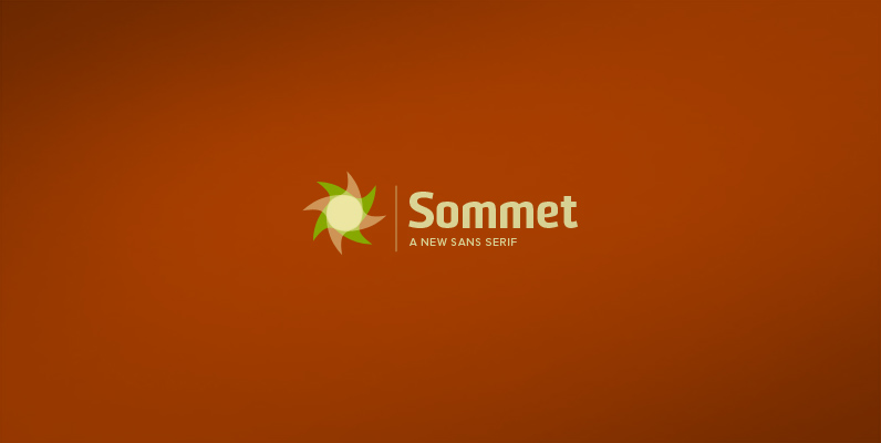
Sommet Font
Sommet is a sans-serif with a high-tech web 2.0 feel. The typeface family is a powerful and sharp design that is highly legible onscreen even at small sizes. Sommet features a tall x-height, and its letterforms are compressed, perfect for