Tag: humanistic
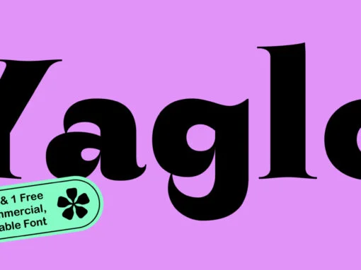
ZT Yaglo Font
ZT Yaglo is a dynamic and expressive display font, from the first impression you may have noticed that this font is a fishing rod-like concept, with a consistent rhythmic curve that gets sharper at the ends. The ZT Yaglo typeface
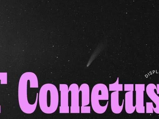
TT Cometus Font
Dynamic, attractive and catchy – the new TypeType display font! TT Cometus is an expressive typeface that captivates from the first time you read a text set in it. Despite its massiveness, the typeface is malleable and dynamic, like a
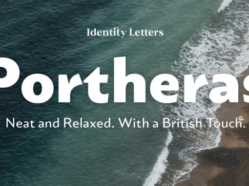
Portheras Font
What does “smart casual” look like as a font? Try Portheras: a fairly wide, contemporary humanist sans with a laid-back attitude. Inspired by the fine Cornish beach of Portheras Cove, this typeface pays homage to British design tradition while incorporating
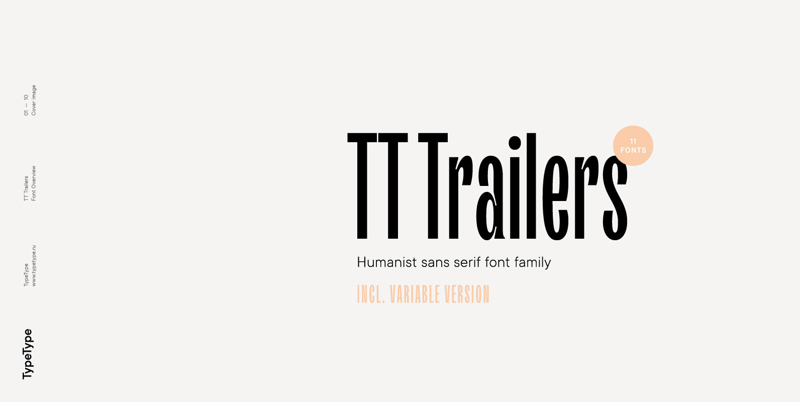
TT Trailers Font
Meet the new TT Trailers! The first version of TT Trailers was conceived as a font suitable for the film industry. The font harmoniously looks in posters, it is ideally suited for setting titles. However, the font has gained wide
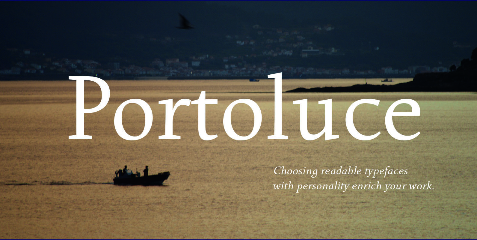
Portoluce Font
Portoluce is a Roman typeface. These fonts are delicate and highly readable at very small sizes but reveals all its strength and personality when used at big sizes. The contrast of the sharped serifs provides a fresh and very contemporary
Mastro Sans Font
Mastro is a contemporary humanist sans serif. The lowercase shapes are simple yet distinct, its organic design (specially the italic) are based on different stroke modulation ideas combined into a coherent whole. The uppercase is inspired in roman capital proportions

YE Benjamin Font
YE Benjamin is a decorative font design published by Yinon Ezra Published by Yinon EzraDownload YE Benjamin
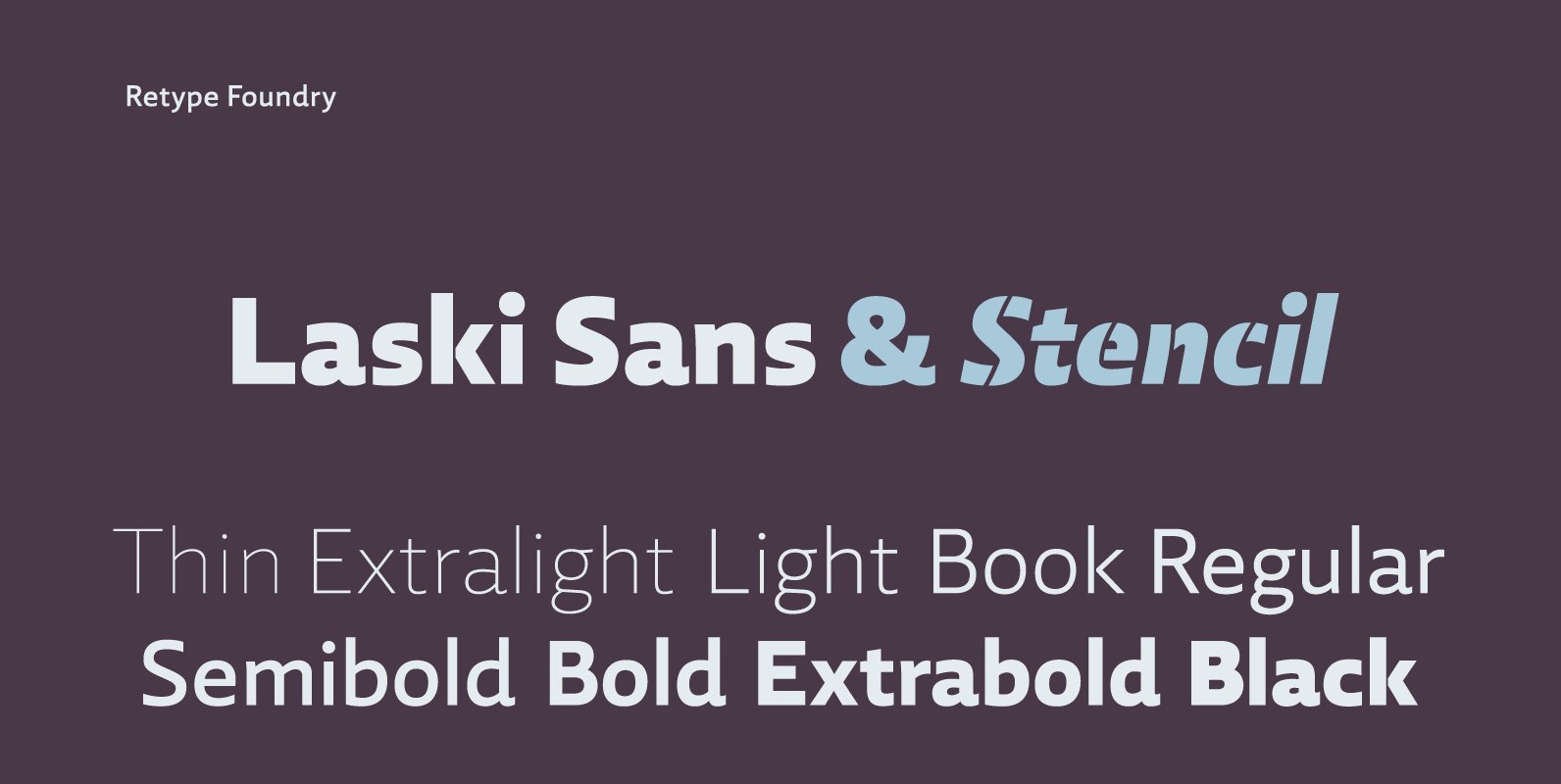
Laski Sans Font
In 2014 Paula Mastrangelo presented her first type family, Laski Slab. Over the last year, Ramiro Espinoza worked to expand the system and the outcome was Laski Sans, a refined humanistic sans addressing many of today’s design requirements, specifically optimized
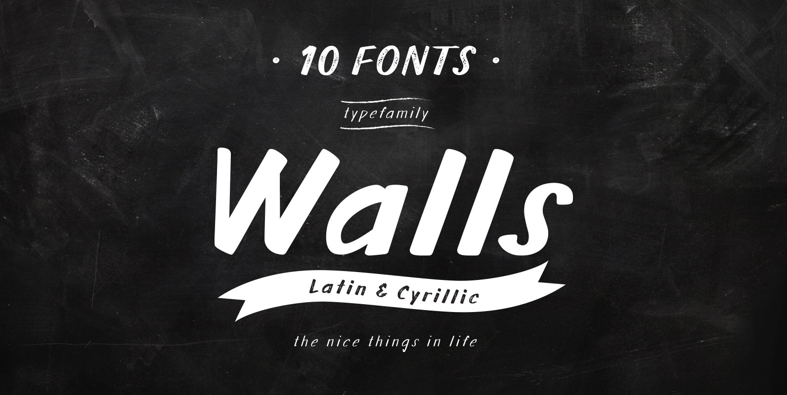
Walls Font
What do you use to write a price tag at a store or to design a wall menu in a cafe? What to choose – a marker or chalk? Now it makes no more sense to be torn apart by
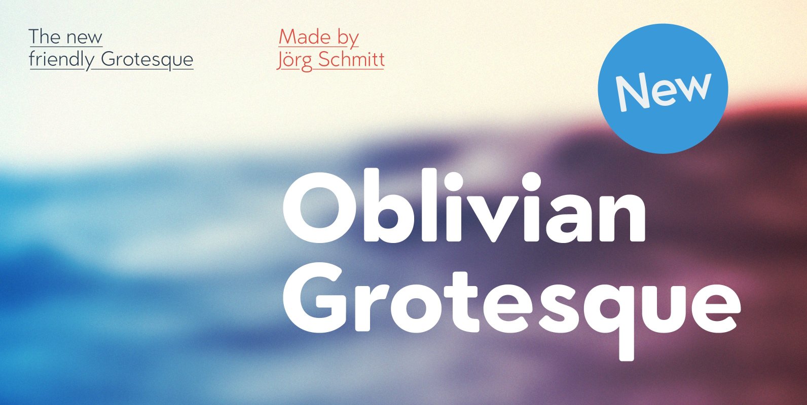
Oblivian Grotesque Font
Oblivian Grotesque is a sans serif type family of ten weights. The typeface is based on geometric forms with bits and pieces of modern humanistic grotesque fonts. Due the the rounded edges it has a very soft / warm look
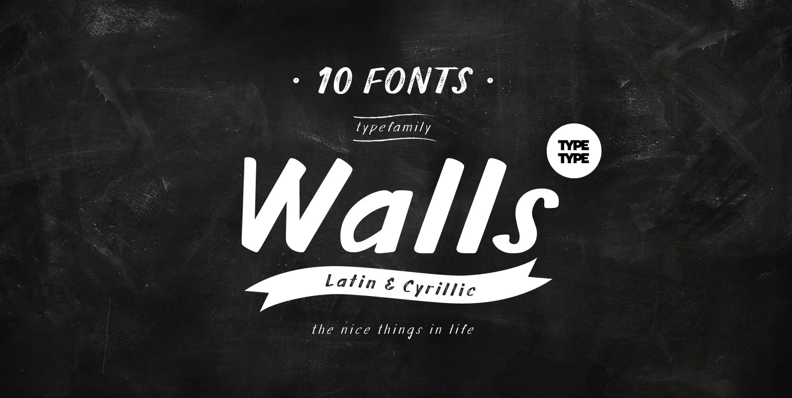
TT Walls Font
What do you use to write a price tag at a store or to design a wall menu in a cafe? What to choose – a marker or chalk? Now it makes no more sense to be torn apart by
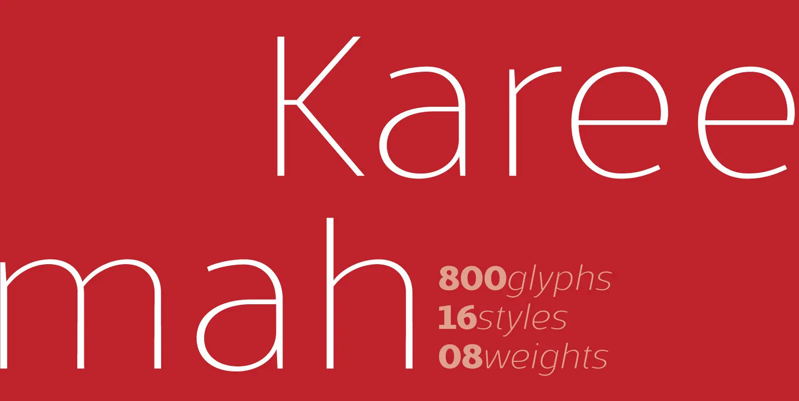
Kareemah Font
Kareemah is a humanist typography, composed by roman and italics with 16 styles and 08 weights (800 glyphs) including ligatures, alternates, small caps, old styles figures, fractions, superiors, inferiors and more. Perfectly legible and clean in the long, simple texts
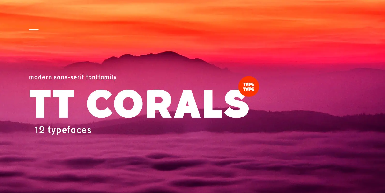
TT Corals Font
TT Corals is a modern humanistic sans-serif which has many typical traits of the beginning of the 20th century. For an increased functionality of the font family we’ve created 6 typefaces of various weights: Thin, Light, Regular, Bold, Extrabold, Black.
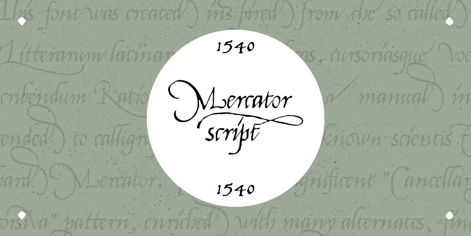
1540 Mercator Script Font
This font was created inspired from the so called “Litterarum latinarum, quas italicas, cursoriasque vocant, scribendum Ratio” (Louvain 1540), a manual intended to calligraphers by the well known scientist Gerhard Mercator. It was a magnificent “Cancellaresca corsiva” pattern, enriched with
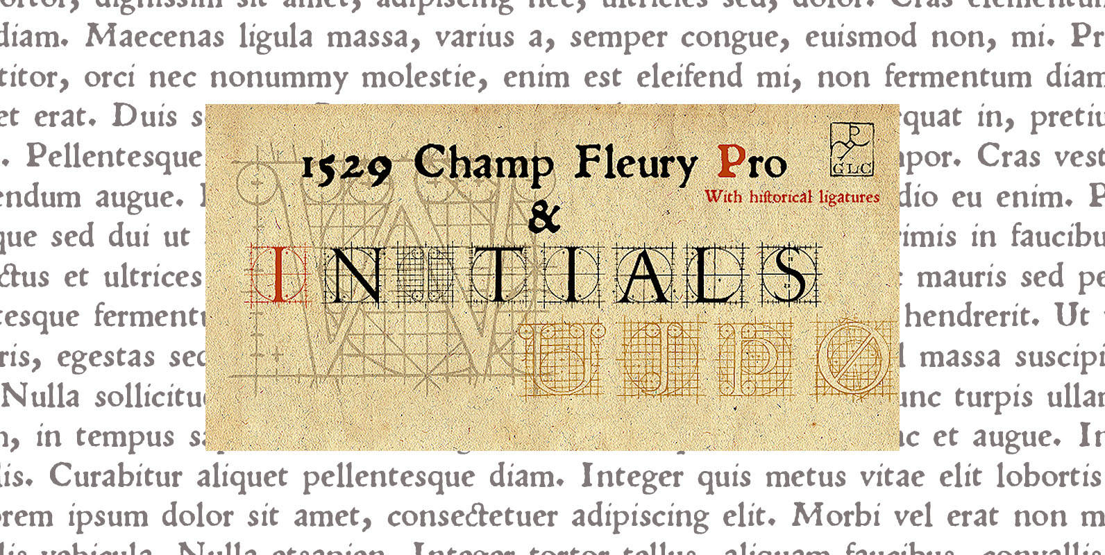
1529 Champ Fleury Pro Font
In 1529, Geofroy Tory, French scholar, engraver, printer, publisher and poet, was publishing the well known so called “Champ Fleury”, printed by Gilles de Gourmond, in Paris. It is a fully illustrated handbook where the author explain how to drawn

Remi-Rand Font
Based on the old Remington Rand typewriter logo from the the 1940’s, Remi-Rand is an approachable humanistic typeface suited for a wide array of applications. It’s packed with expressive alternates, a beautifully crafted numeral set and ligatures. Published by Mike