Tag: friendly
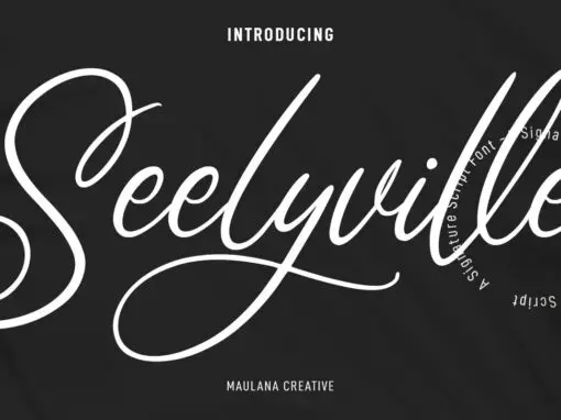
Seelyville Font
Seelyville is a script font design published by Maulana Creative Published by Maulana CreativeDownload Seelyville
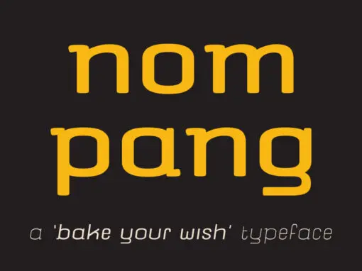
nompang Font
nompang is a sans serif font design published by dhammadha Published by dhammadhaDownload nompang
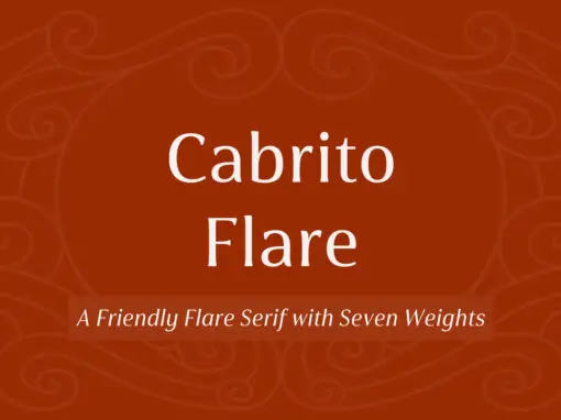
Cabrito Flare Font
Cabrito Flare joins the Cabrito font family, a family designed to help younglings with the recognition of letter shapes. The original fonts are part of the development of a children’s book, The Clothes Letters Wear. Cabrito Flare combines the simplicity
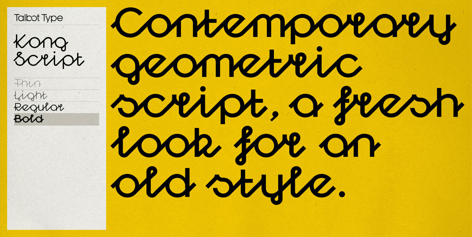
Kong Script Font
Kong Script is a geometric, script typeface, a contemporary interpretation of a traditional style. The upper and lower case character sets link seamlessly, in the manner of a traditional script, to create an easy, flowing look but with a crisp,
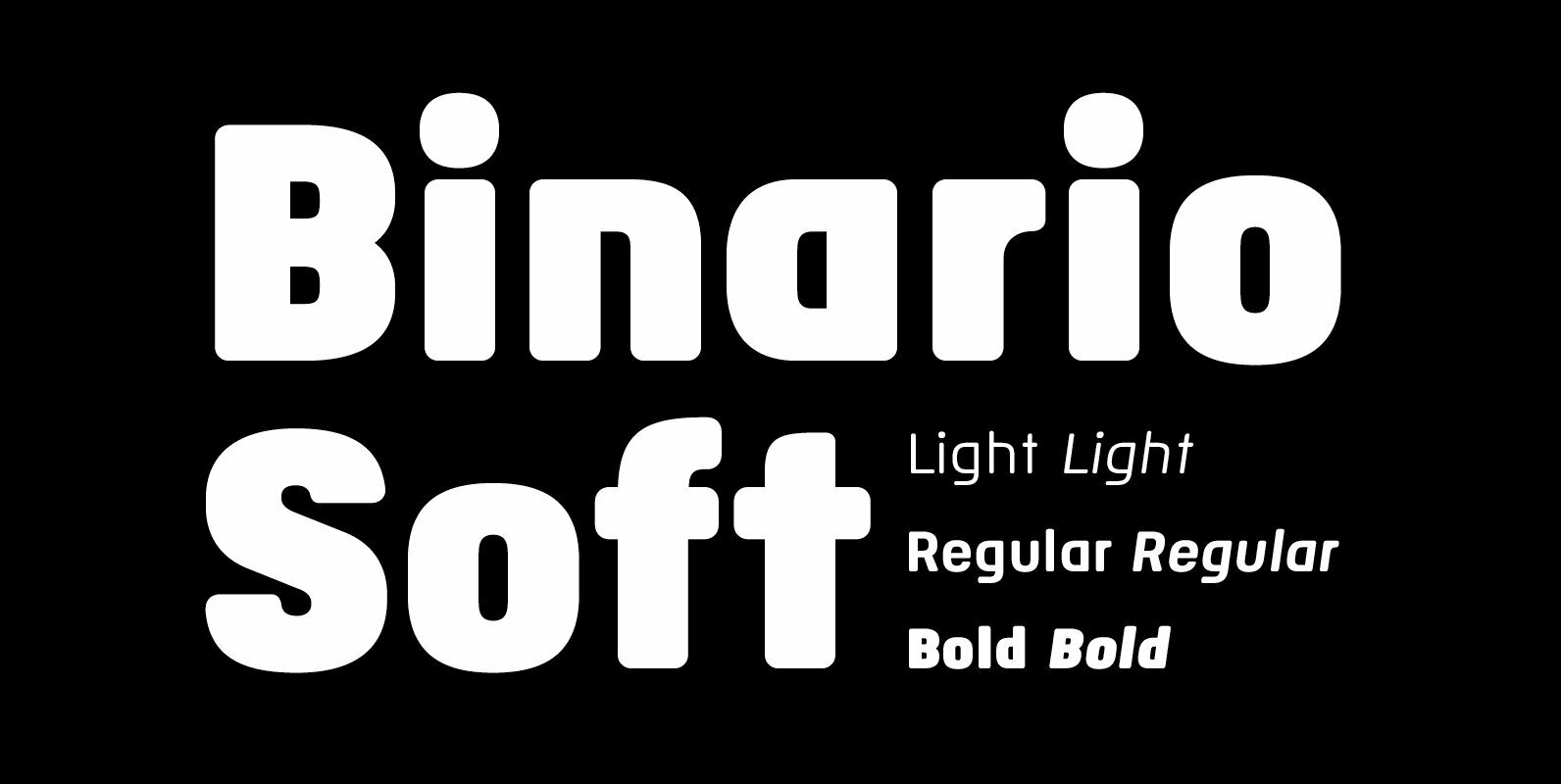
Binario Soft Font
Binario Soft is a gently rounded version of Binario, which is also available on this vendor’s website. Binario Soft is a geometric sans serif typeface with subtle rounded edges to give a softer and warmer impression. It comes in three
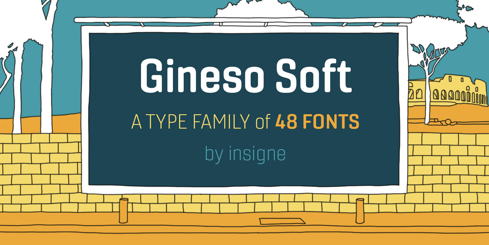
Gineso Soft Font
Handcrafted signs line the stoned walkways of old Italy. Some a century old, these oft forgotten works of unknown artists remain etched across cities and villages. But now, they make their inviting impressions once again as the inspiration for insigne
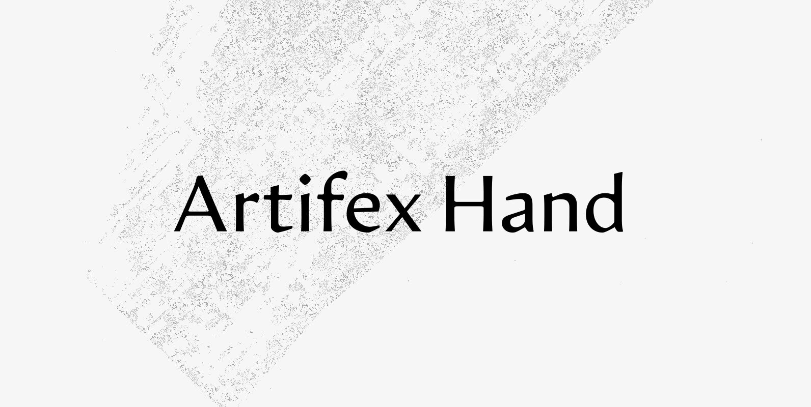
Artifex Hand CF Font
Artifex Hand is a humanist sans-serif cut of the original Artifex. Designed for flowing, easy-to-read text in Latin, Cyrillic, and Greek scripts. Soft details and moderate contrast let Artifex Hand excel in text and display settings. – Eight weights and
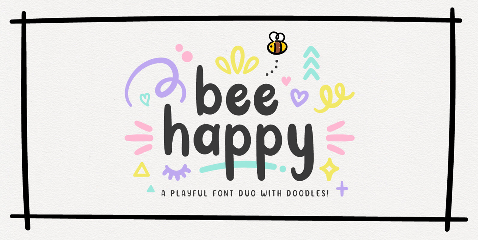
Bee Happy Font
Bee Happy is a playful font duo, comes with a set of regular and doodle fonts for you to make some fun typography work! Perfect for quotes, home decor, party invites, blog header, t-shirts, posters & absolutely any design &
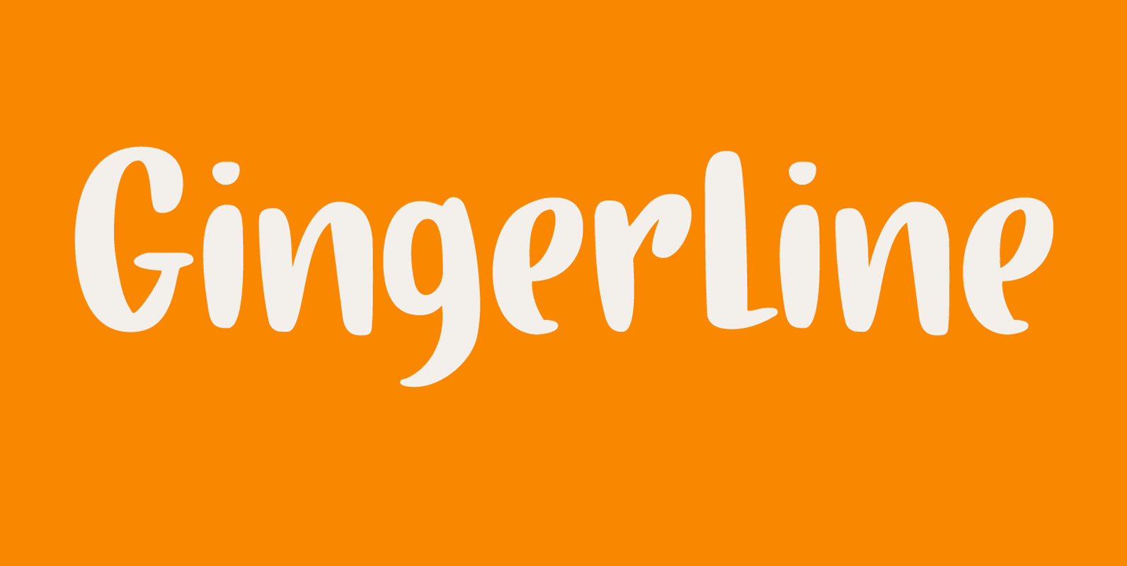
Gingerline Font
I love learning new words. I stumbled upon the term Gingerline after I named an older font Gamboge. Like Gamboge, Gingerline is a name for a shade of orange – the color of ripe kumquats to be precise. Didn’t know
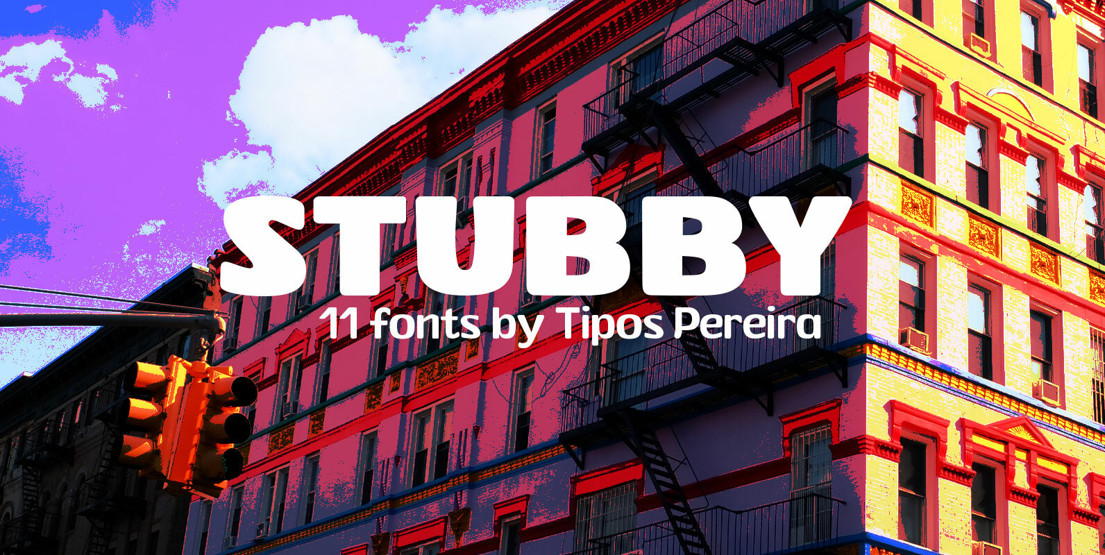
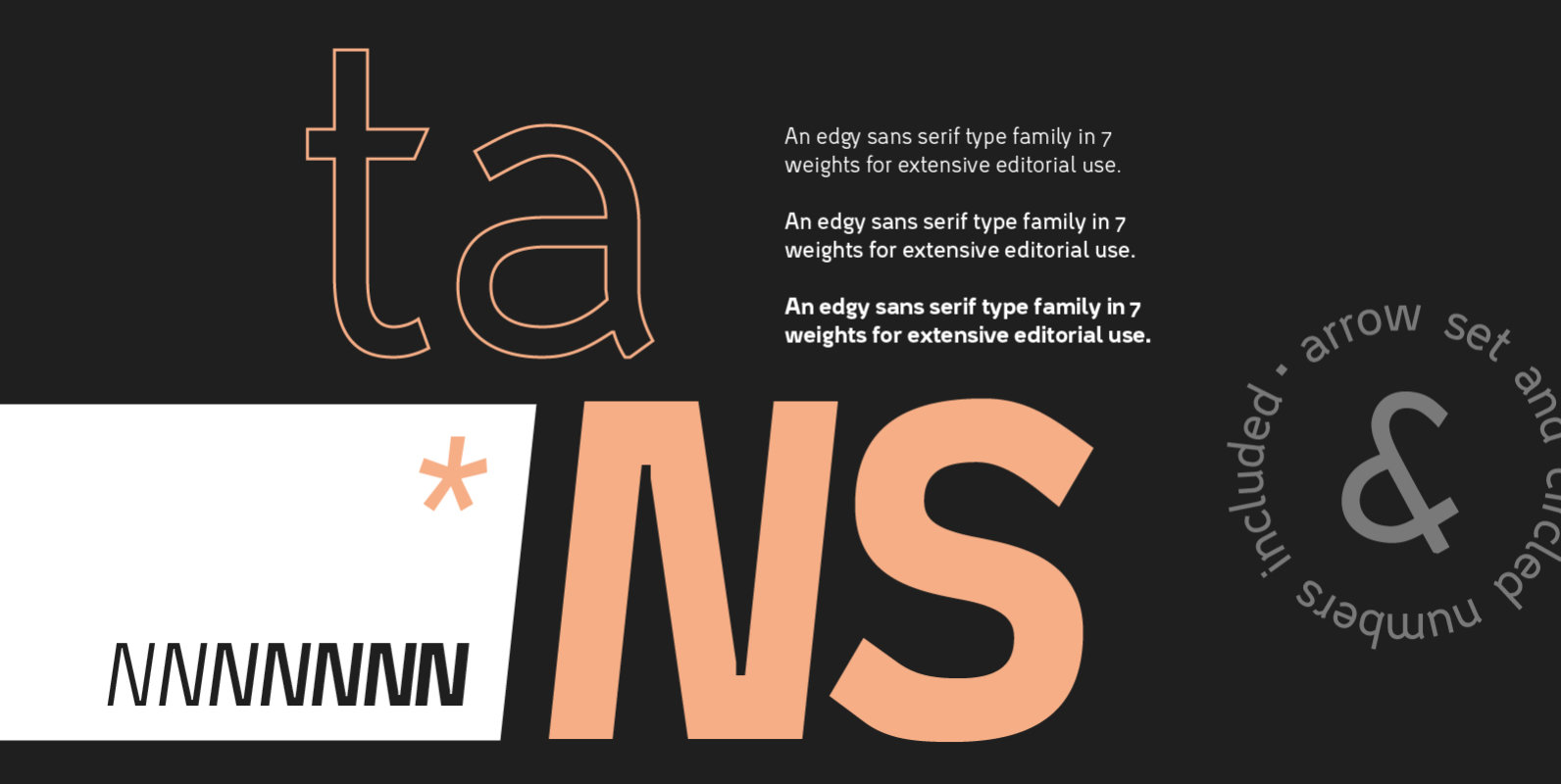
Stubby Font
Stubby is a display type family with 11 styles, inspired by the vernacular landscape. It was made for titles, headlines and also packages, posters and everything that provide space for a rude, fat and widish type. Nonetheless it can be
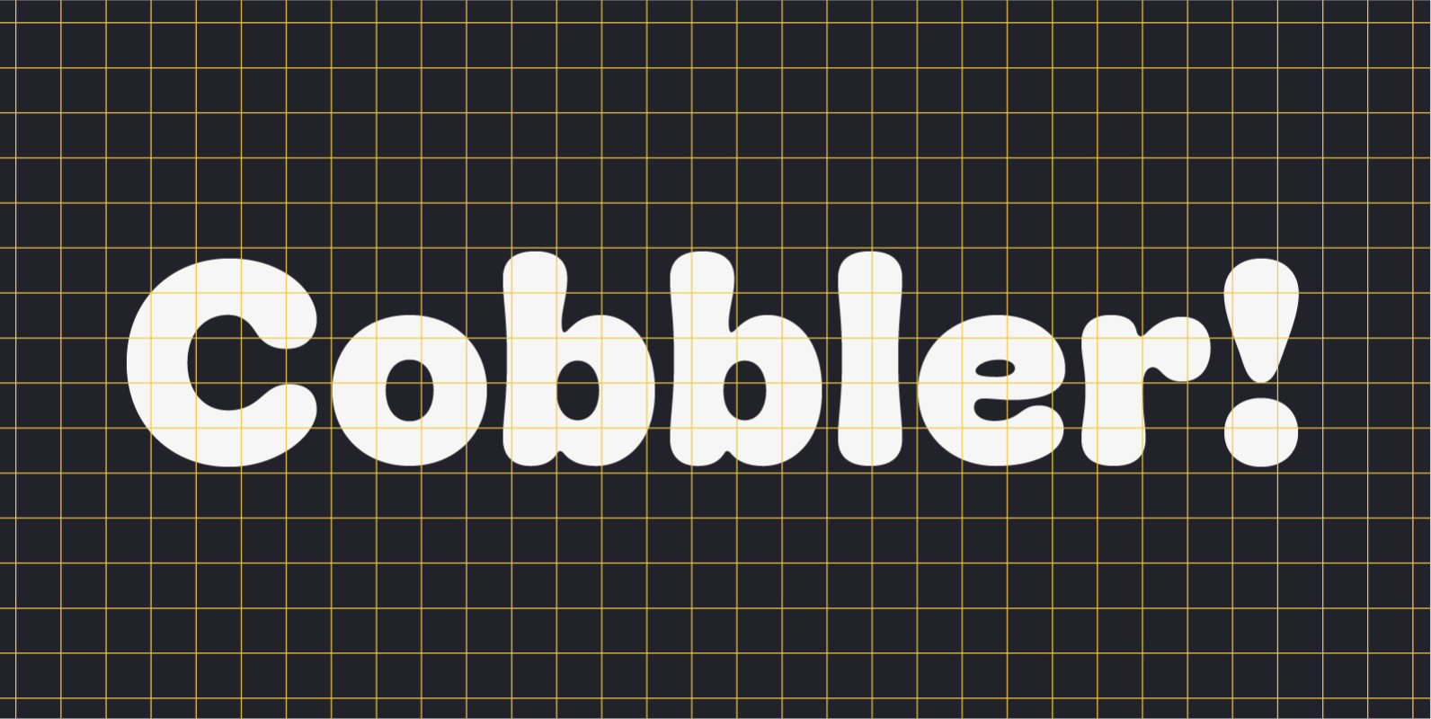
Cobbler Font
Cobbler is a friendly type family in six weights. With proportions of geometric type, Cobbler is a contemporary sans on the inside and an ultra soft display typeface on the outside. Not a single sharp corner and only a hand
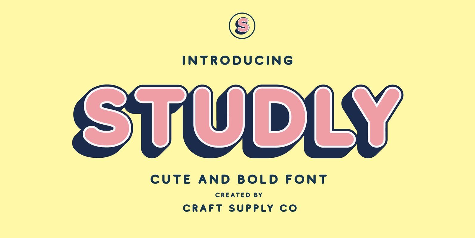
Studly Font
Studly is a bold sans serif with bold solid and outlined font files. comes with 6 style, Studly is suitable for Logo, greeting cards, quotes, posters, branding, stationary, design title, blog header, art quote, typography art, modern envelope lettering or
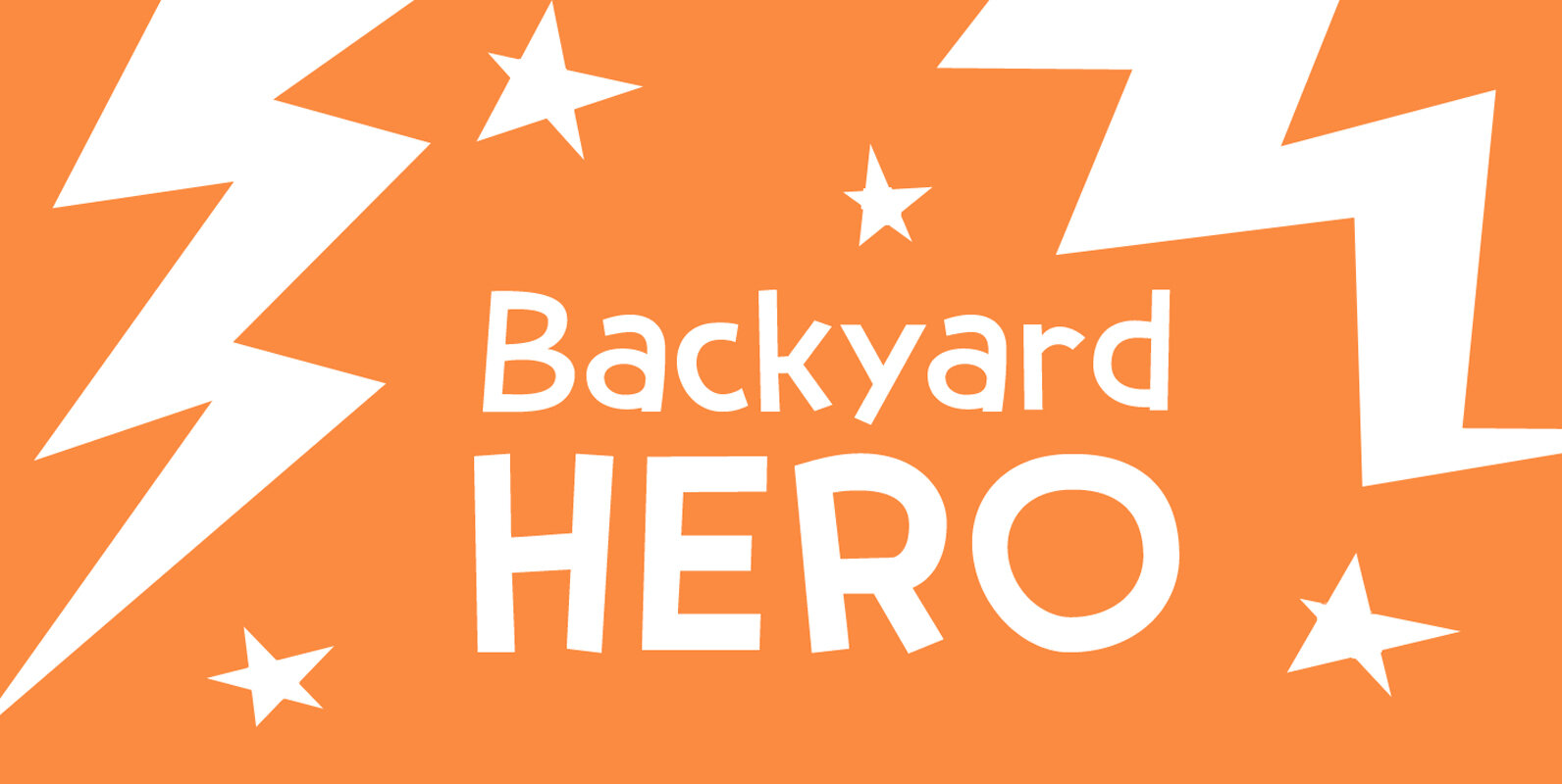
Backyard Hero Font
Judging the amount of superhero series, I thought it was time for a superhero-font. Meet Backyard Hero – your friendly neighbourhood good guy. He will fight off aliens and criminal masterminds, help old ladies across the street and give your
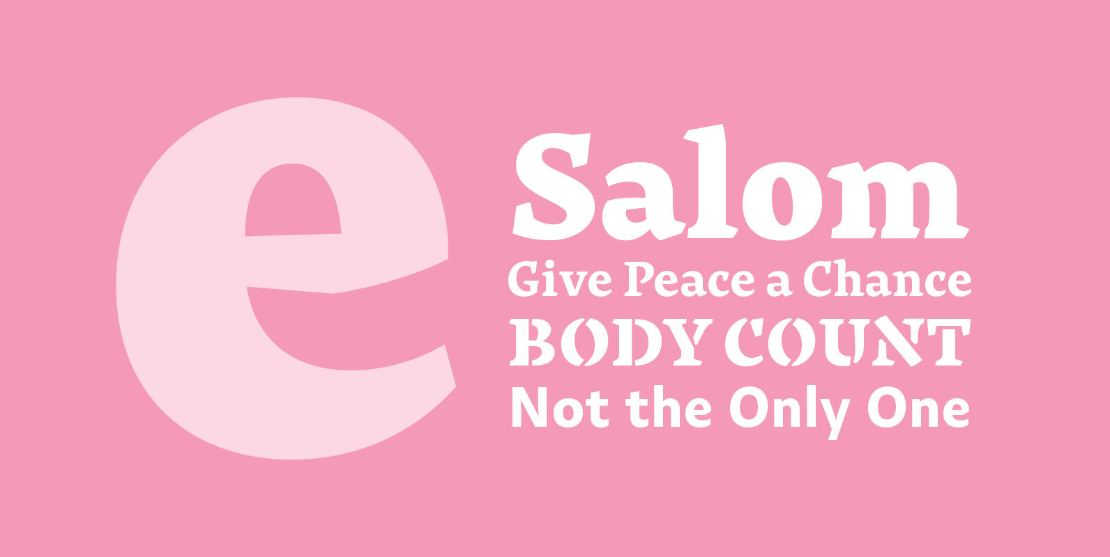
Salom Font
Salom was designed by Austrian type designer Igor Labudovic during his year at Reading University. Besides Latin, it originally included Arabic and Hebrew. The peaceful coexistence of both writing systems in his fonts led him to combine the words Salaam
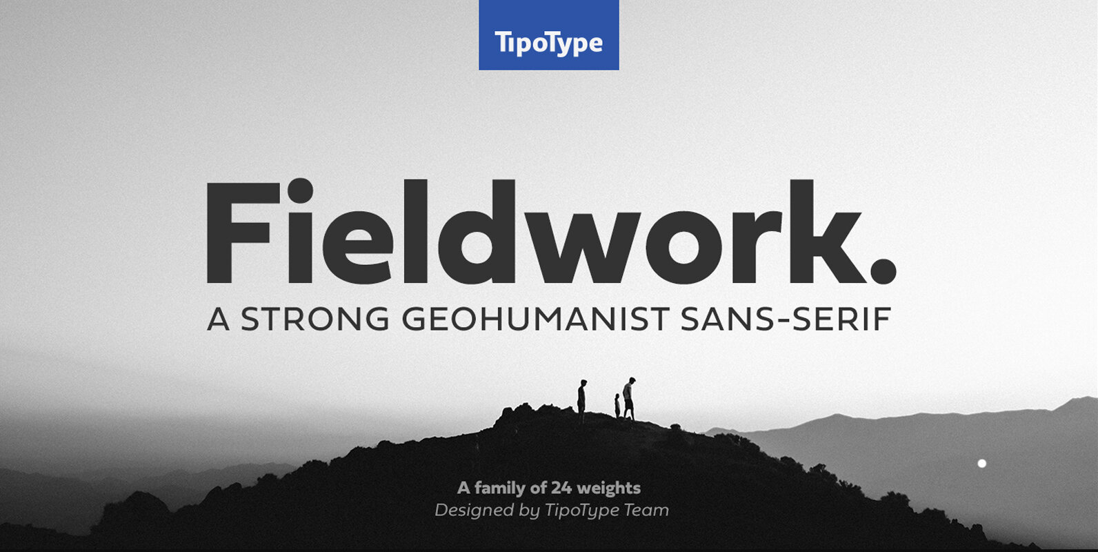
Fieldwork Font
Fieldwork brings back the manual tradition of typography production, veering away from lab interpolations. Each of its 24 variants was drawn based on optical evaluation; many of its curves and details were specifically adjusted for each weight, reformulating them to
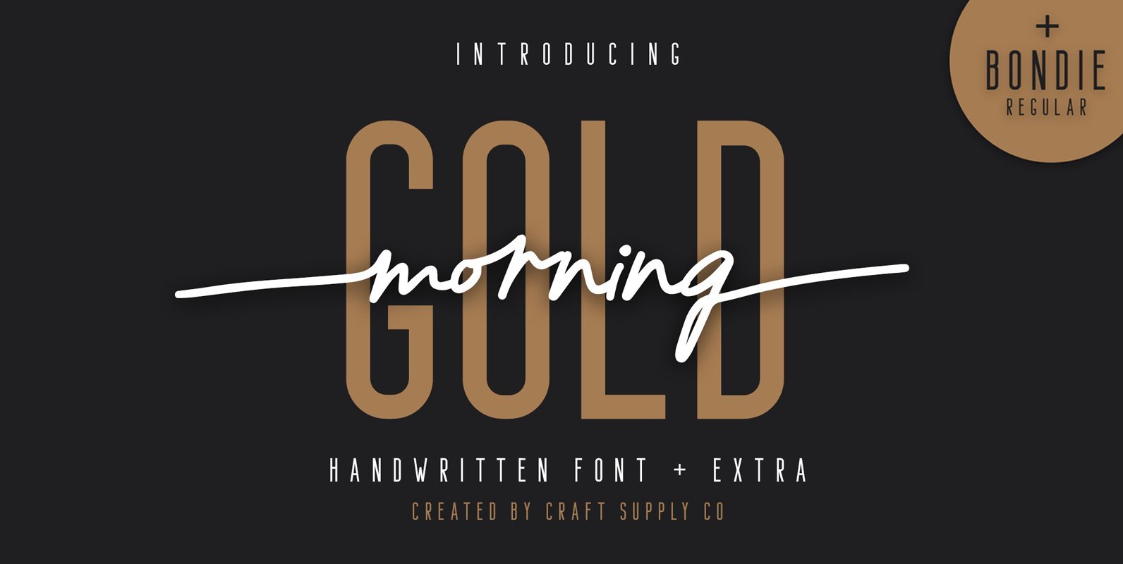
Morning Gold Font
Introducing New Font : Morning Gold – Handwritten Font + Bondie Regular Morning Gold – Handwritten Font is an handwritten script font based on the expression of real handwriting. Morning Gold – Handwritten Font + Extra will work perfectly for