Tag: fractions
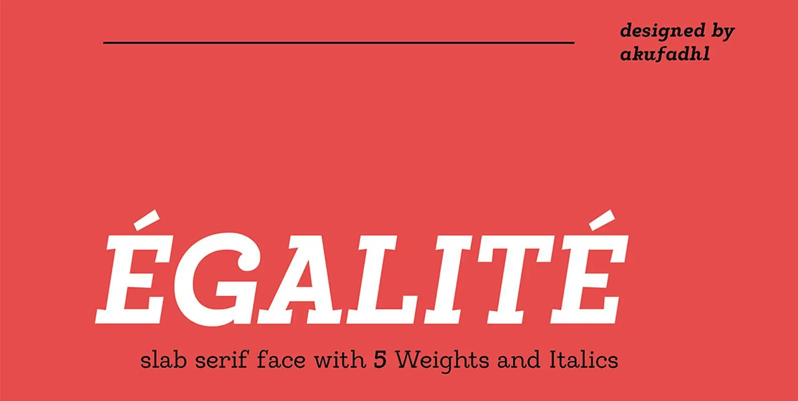
Egalite Font
Egalite iis a Slab-Serif face with a combination between sharp and Rounded shape, the sharp serif, and rounded terminals give a fun yet serious feel. It also have a low contrast shape to give more strong feel and personality. Come
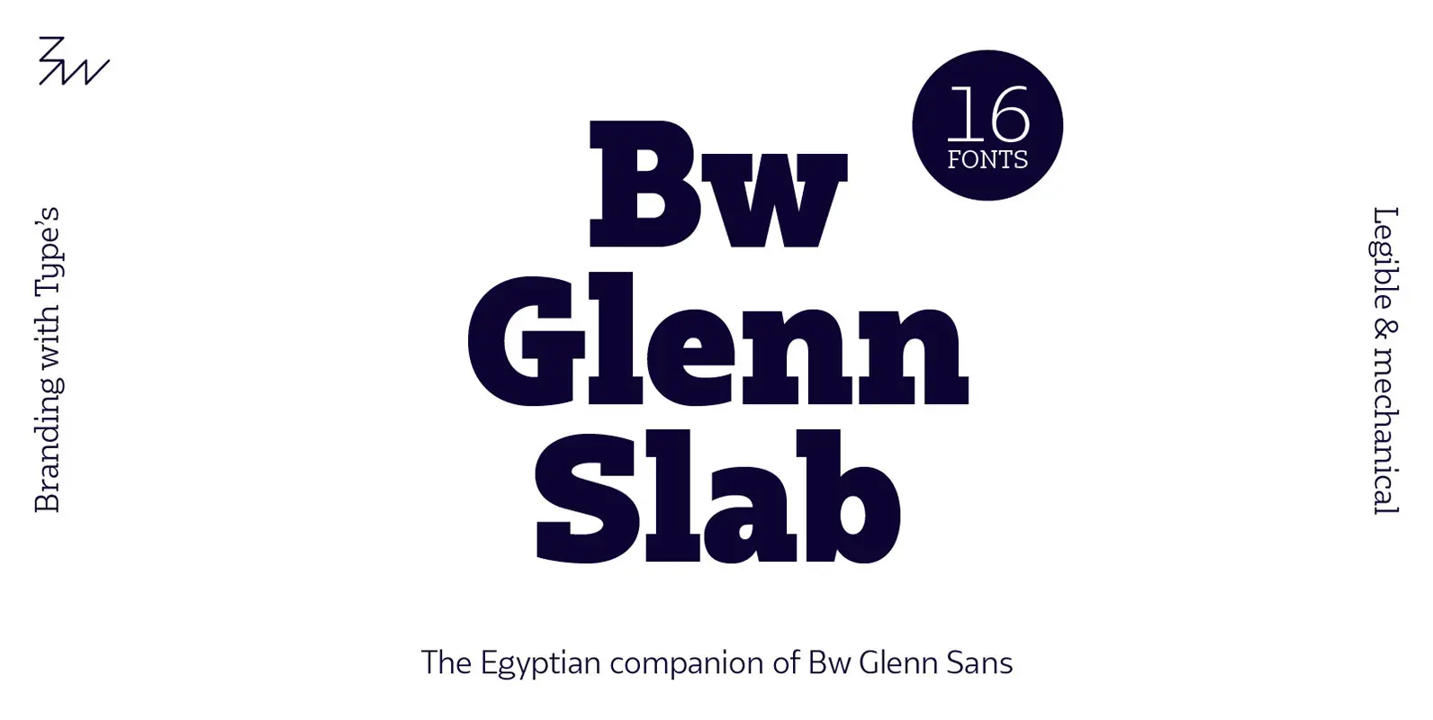
Bw Glenn Slab Font
Bw Glenn Slab is a confident and robust font family with a sturdy feel offering no concessions for ambiguity. Its strict geometry and open shapes provide a very legible and clean texture, performing well on print and screens alike. It’s
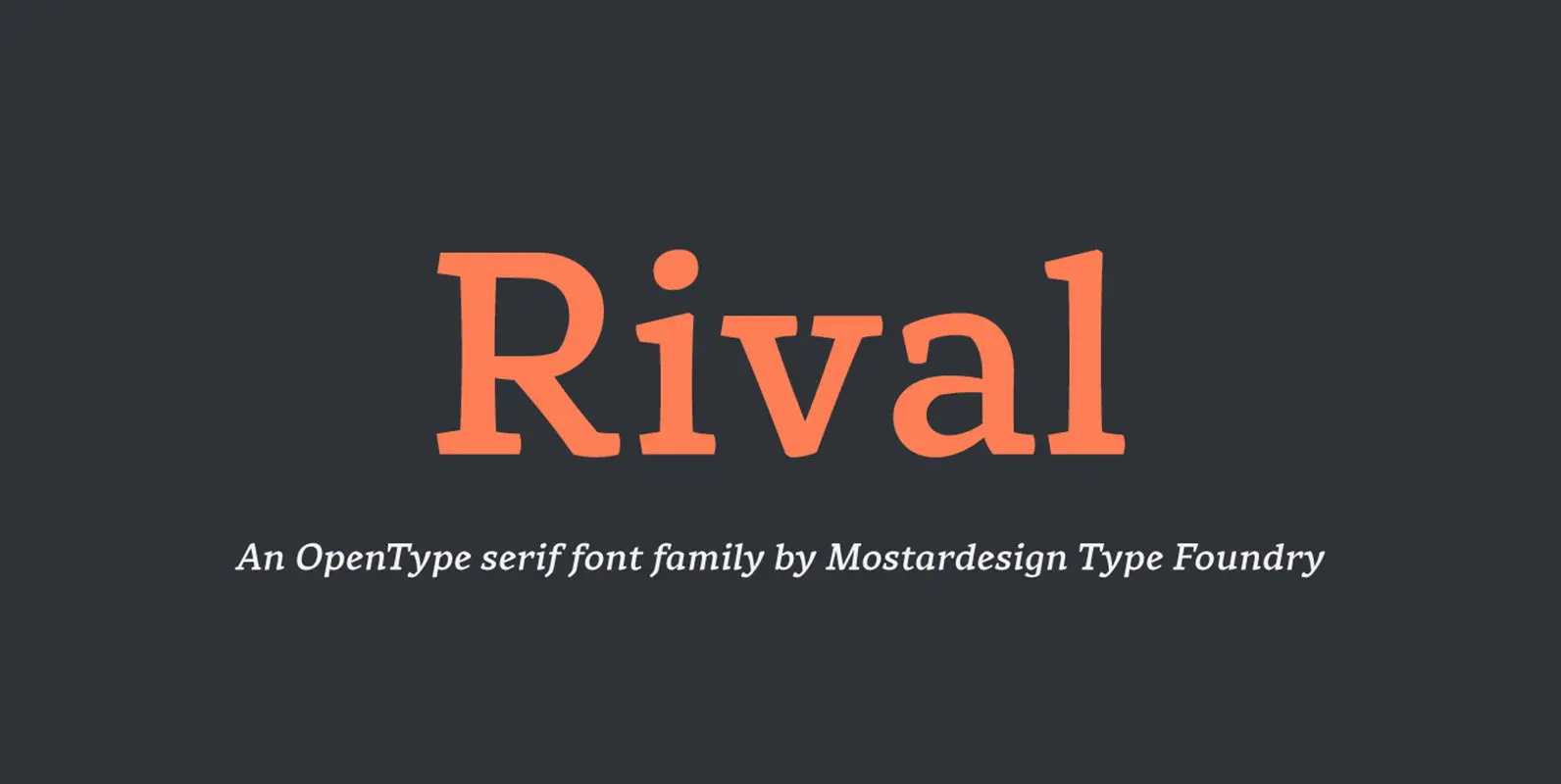
Rival Font
Rival – A serif font family with contemporary distinctive signs. Rival is a modern serif font family inspired by characters drawn with a round nib, it has many distinctive signs such as broken curves, slightly curved down strokes, curved diagonals,
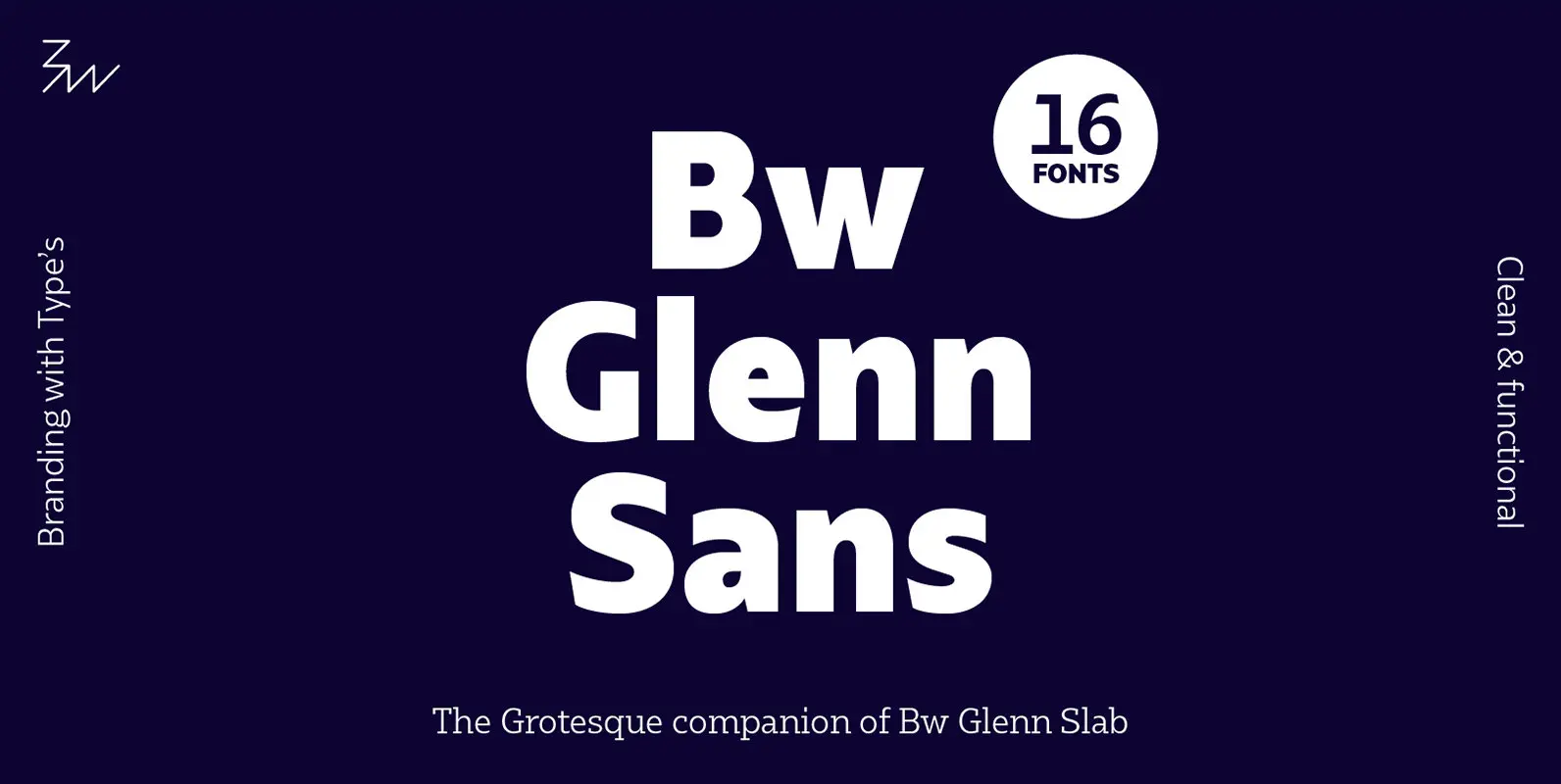
Bw Glenn Sans Font
Bw Glenn Sans is the result of mixing a grotesque skeleton with traits of the British sans serif tradition. The result is a modern and clean sans serif family that speaks with clarity and authority. Its contained width makes it
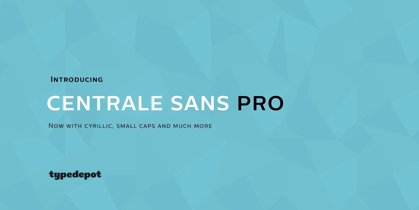
Centrale Sans Pro Font
We have finally finished our work on Centrale Sans. A lot of mistakes have been made, and we hope a lot of them have been fixed. But finally we are ready to end this five-year journey and present you the
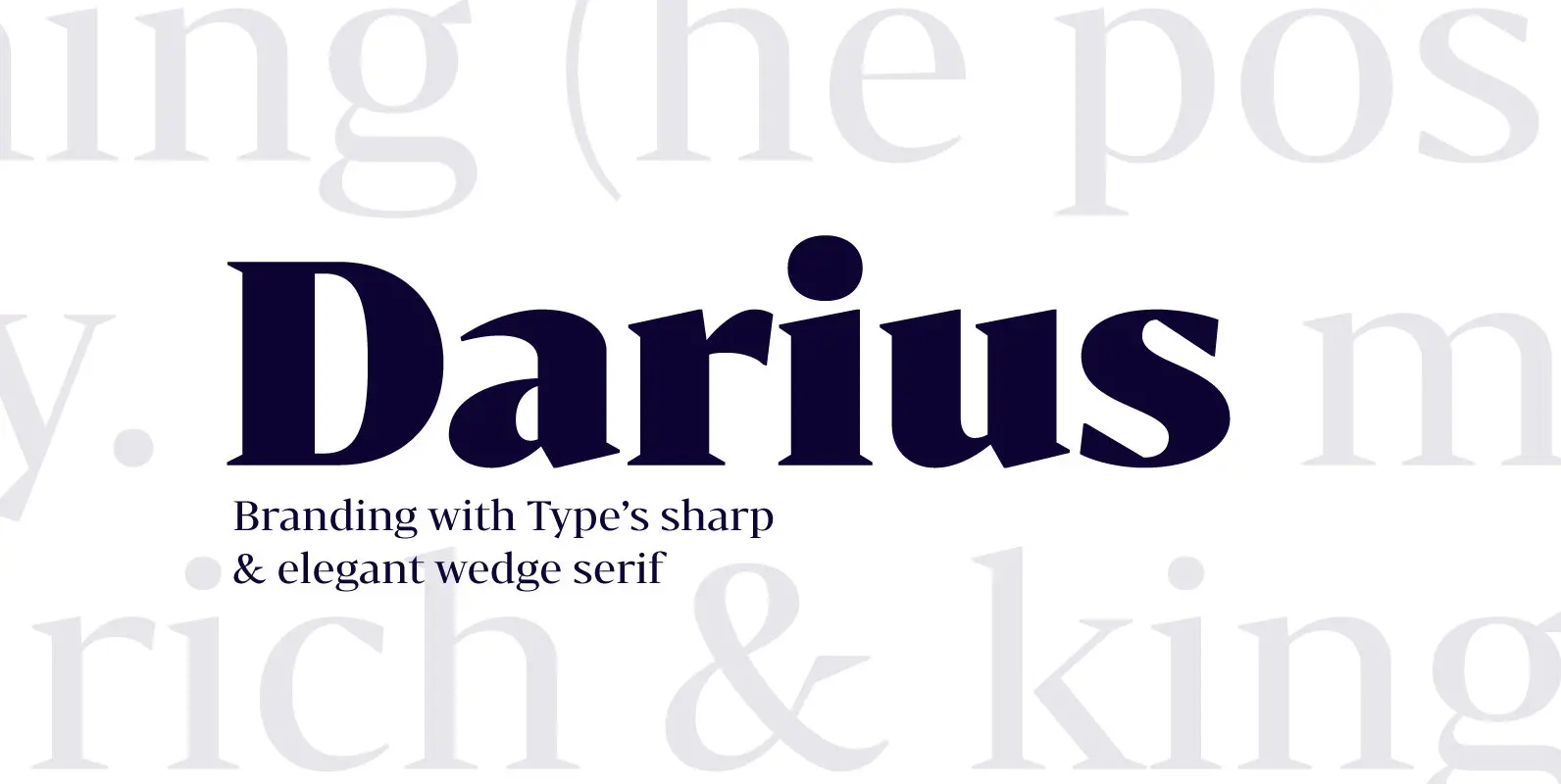
Bw Darius Font
Bw Darius is an elegant wedge serif typeface, halfway between the transitional and didone genres, with a sharper approach to terminals without falling on the stiffness of the didones. The wide skeleton, modern proportions and high contrast, all contribute to
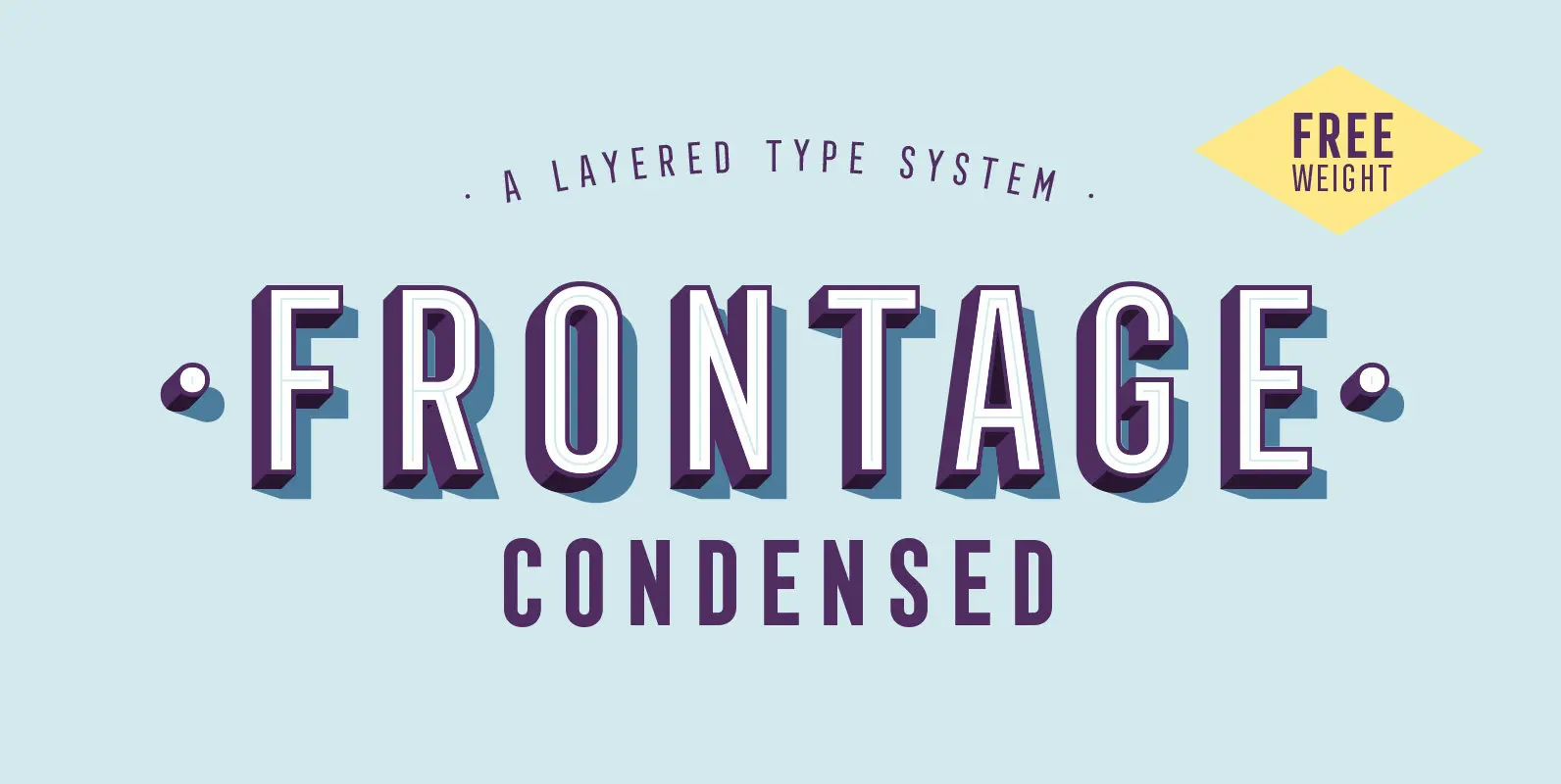
Frontage Condensed Font
Frontage Condensed is a layered type system inspired by eye-catching and colorful facade signage. Its main aspect is — like many typographic installations on storefronts — three dimensional. The narrow, generously spaced letterforms lend the typeface a bold and eminent
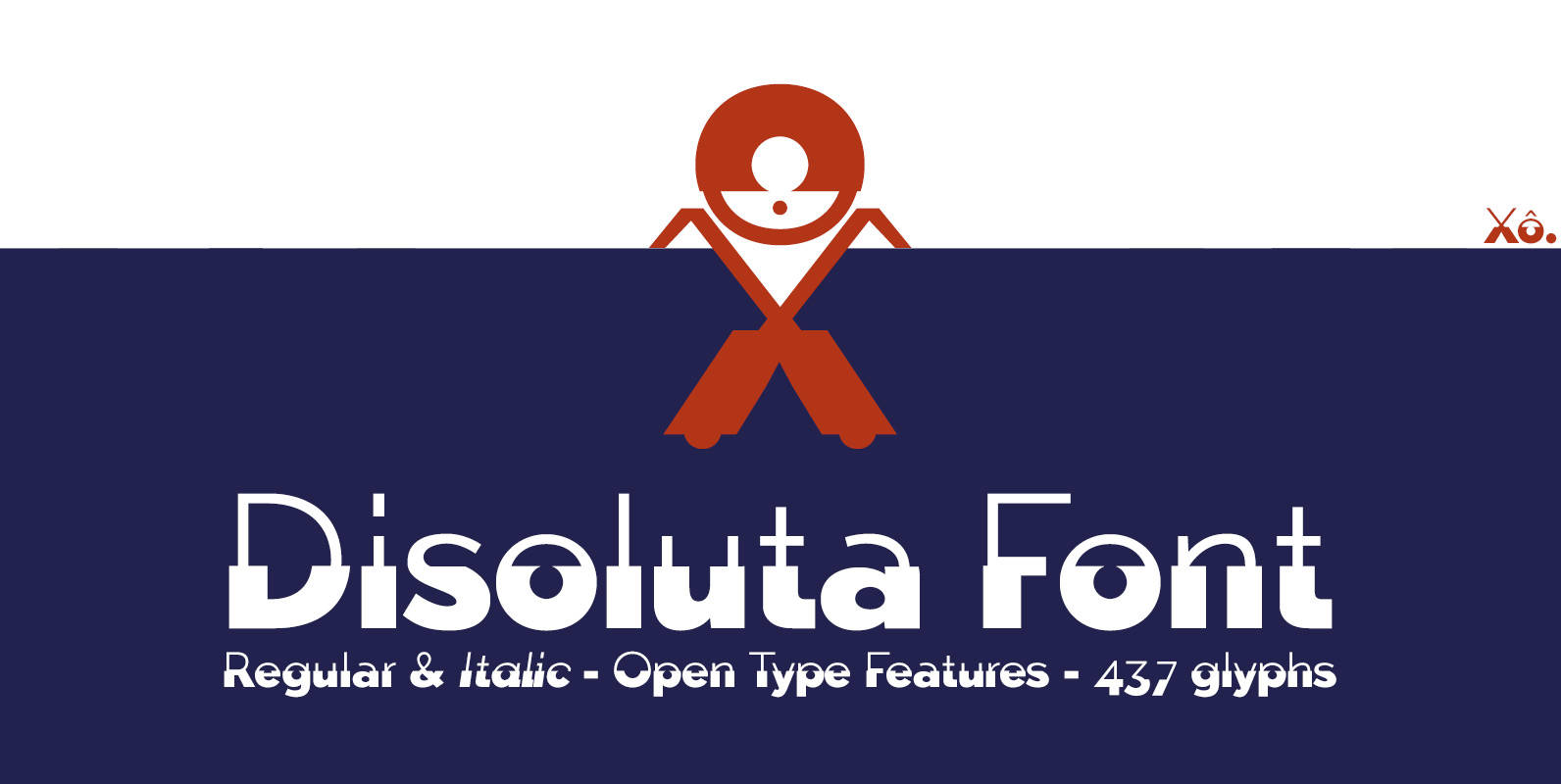
Disoluta Font
Disoluta is a typographical experiment fusion of two sans fonts with different weights, for which I used my previous Typefaces: Tabarra Light and Black. The Commercial version includes: 2 fonts (Regular & Italic) • 437 glyphs • OTT & TTF
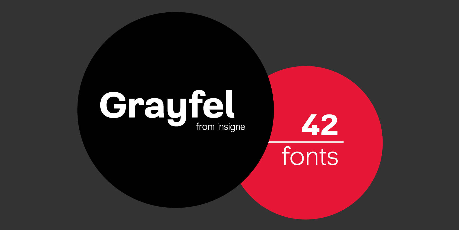
Grayfel Font
As designers, we seek perfection and originality. The more we step back and look at our work, the more changes we tend to find necessary. Drastic modifications are inevitable. The same is true of Grayfel. Grayfel began as an exercise
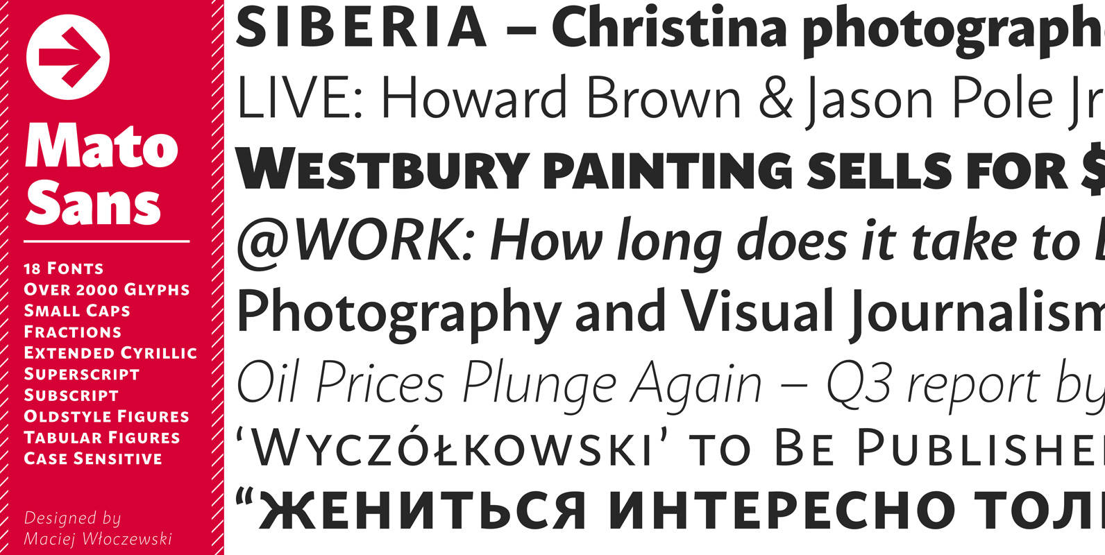
Mato Sans Font
Legible and dynamic shape, tons of OpenType options, different scripts – that’s Mato. Difficult small size, long text in vietnamese, huge heading in russian or table full of figures to create? It’s not a problem with this family. There are
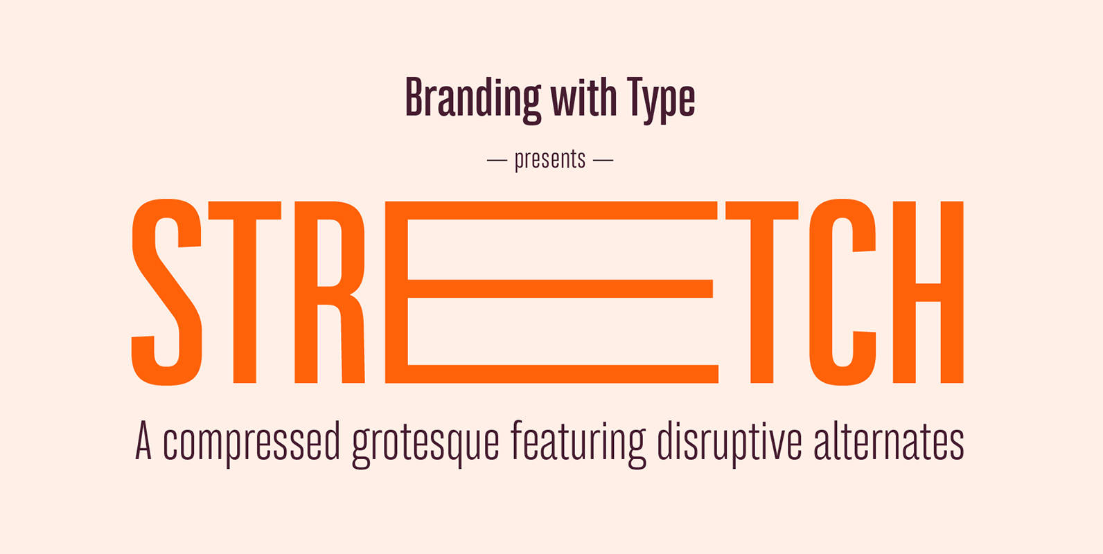
Bw Stretch Font
Bw Stretch is a compressed grotesque suited for display but also body text purposes. Inspired by early wood-block screen-printing sans serif designs, it spreads across eight weights from Thin to Heavy, covering all European Latin languages. It includes extended features
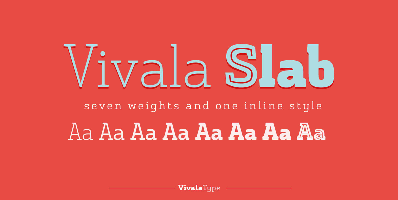
Vivala Slab Font
The family includes seven weights being seven uprights and an inline style. Vivala Slab is ideal for use in headline sizes, but it also works properly within text blocks and information design. Opentype features are ligatures, ordinal, fractions, numerator, denominator,
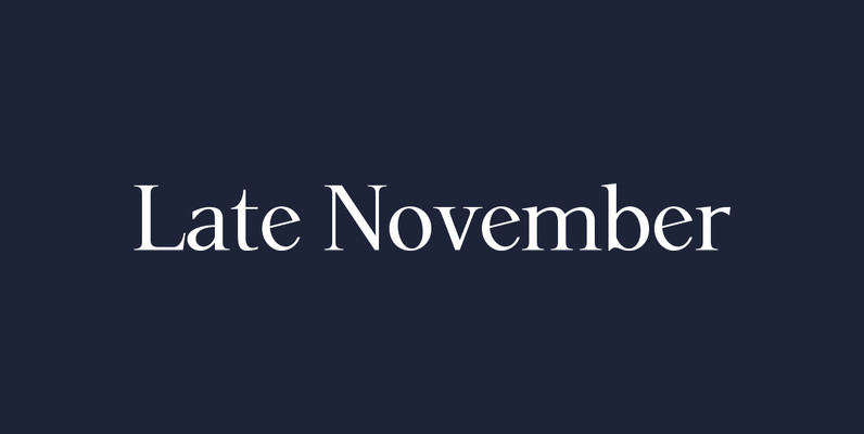
P22 Late November Font
P22 Late November is a new font family from Norwegian type designer Torliev Sverdrup. The font is a transitional Antiqua-inspired type design great for text and display uses Late November is a transitional Antiqua-inspired type design. Says Torliev: “I started
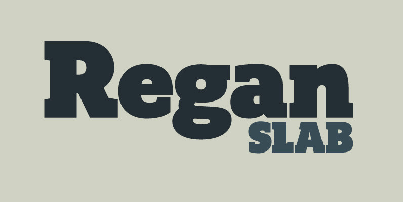
Regan Slab Font
A precision cut slab serif typeface. Simple curves are combined with sharp angles to provide a readable font with subtle characteristics. Regan Slab is ideally suited to a wide range of applications including magazines, newspapers and handheld devices. Details include
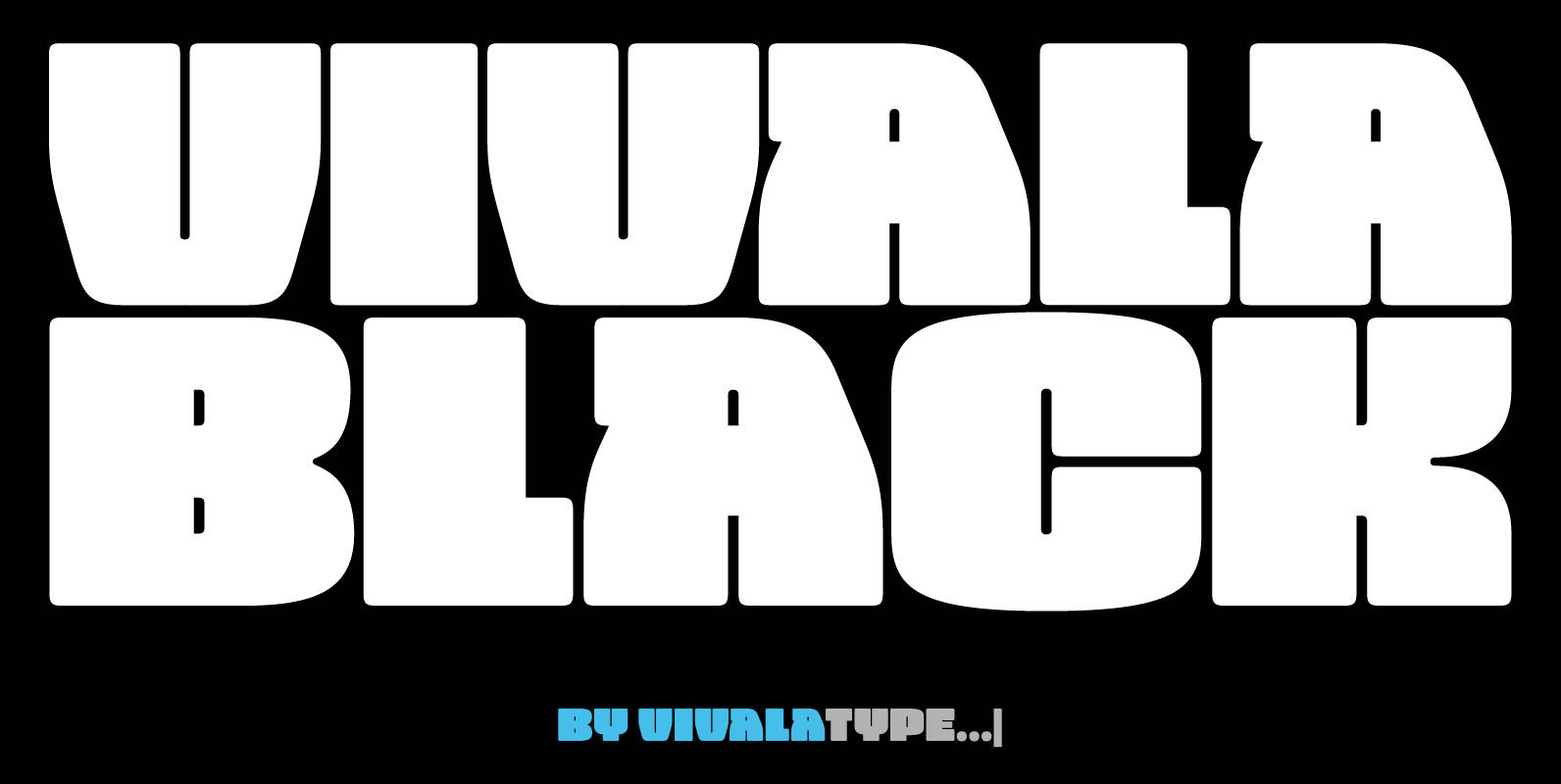
Vivala Black Font
The idea was to create a unicase typeface with a high black ratio that supports a compact typographic style. The four widths of Vivala Black share similar metrics, so they can be easily interchanged in a body of the text.
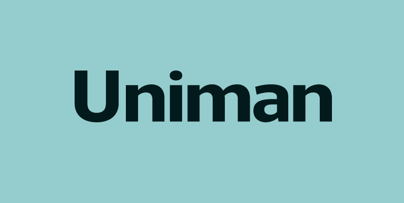
Uniman Font
A clear and simple sans serif typeface. Straight lines are combined with precision curves to form a functional and versatile font best suited for a wide range of applications. Developed to meet the needs of the professional user, details include
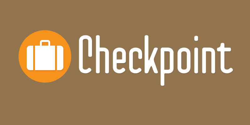
Checkpoint Font
Checkpoint is a condensed, display typeface family that contains three weights and their italics. Ranging from light to bold, this typeface can be used for short passages of text or for display uses like signage or tv titling. The font
Liebelei Font
“Liebelei” – dalliance, flirtation, hanky-panky (leo.org); kind of diminutive of “Liebe” (German for love) The typeface Liebelei has its roots back in 1932, when Vienna-based painter Rudolf Vogl created the poster for a movie called Liebelei after the popular play