Tag: eszett
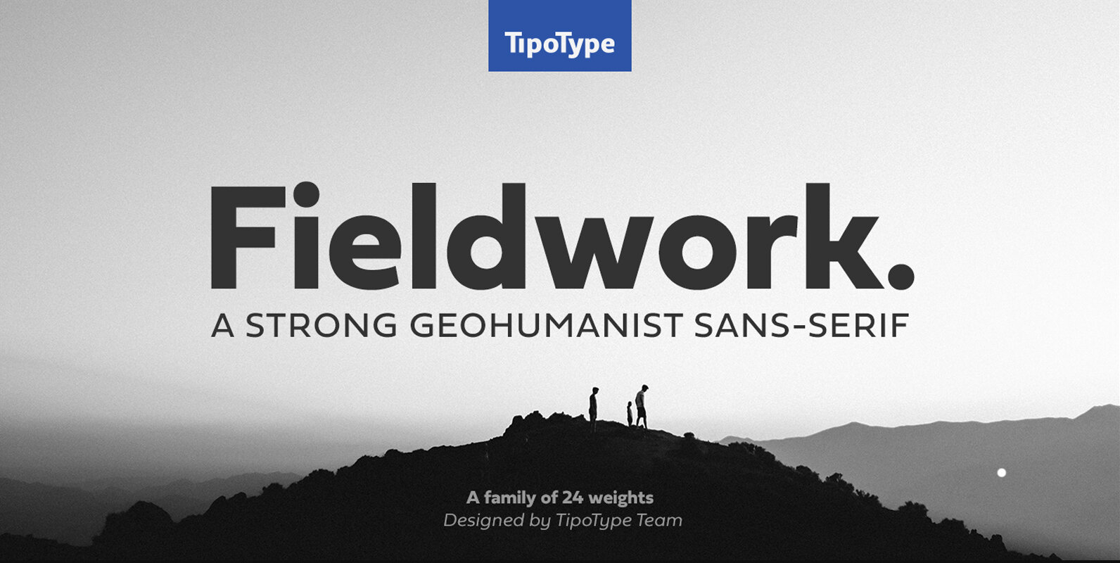
Fieldwork Font
Fieldwork brings back the manual tradition of typography production, veering away from lab interpolations. Each of its 24 variants was drawn based on optical evaluation; many of its curves and details were specifically adjusted for each weight, reformulating them to
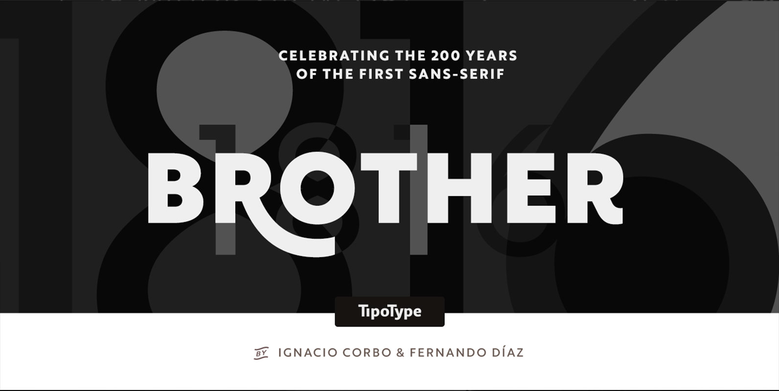
Brother 1816 Font
This year we commemorate the 200th anniversary of the first sans-serif typeface. and what better way to celebrate, than to design our own sans-serif! Brother 1816 is a very flexible, multifaceted and solid typeface, mixing Geometric shapes with Humanistic strokes
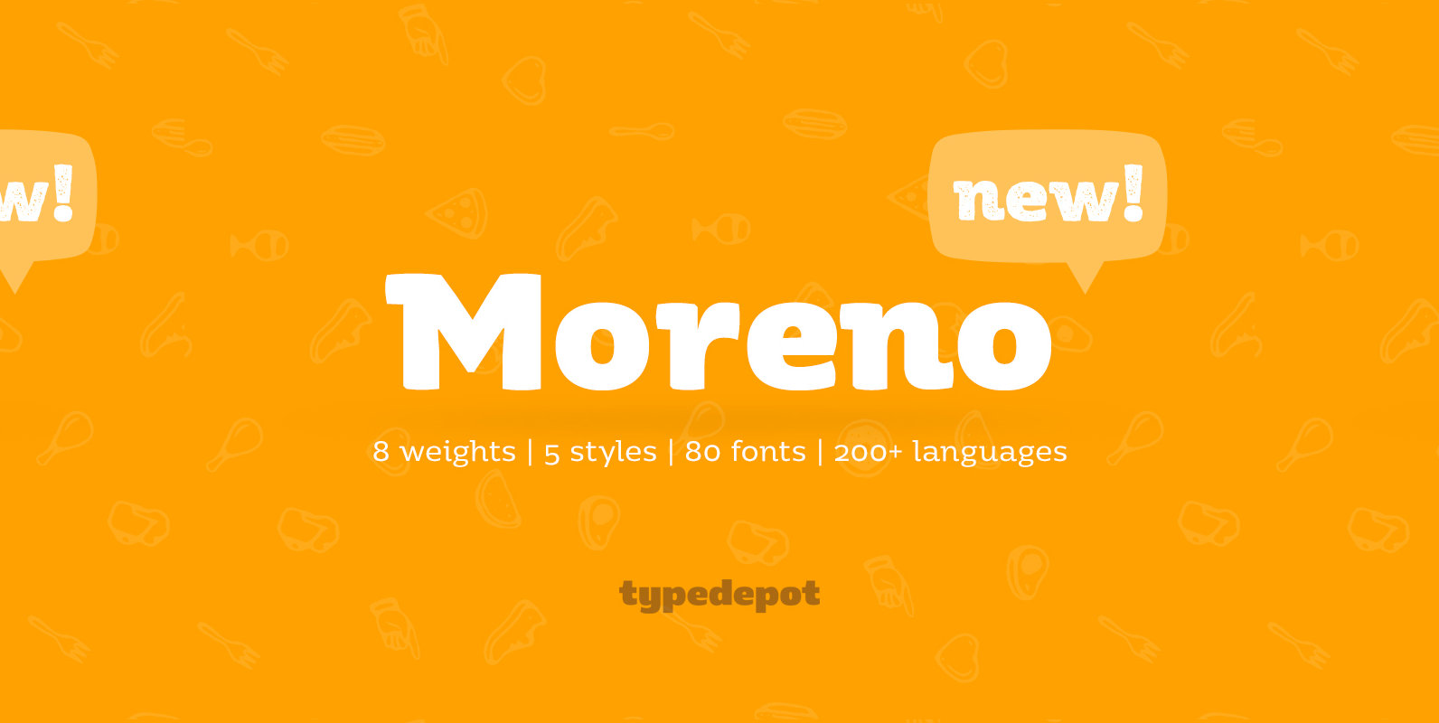
Moreno Font
Meet Moreno – a semi serif typeface full of personality and flavor. A display typeface in its nature Moreno is free and informal yet stable and trustworthy. Moreno comes with extensive OpenType support – with its more than 15 Opentype

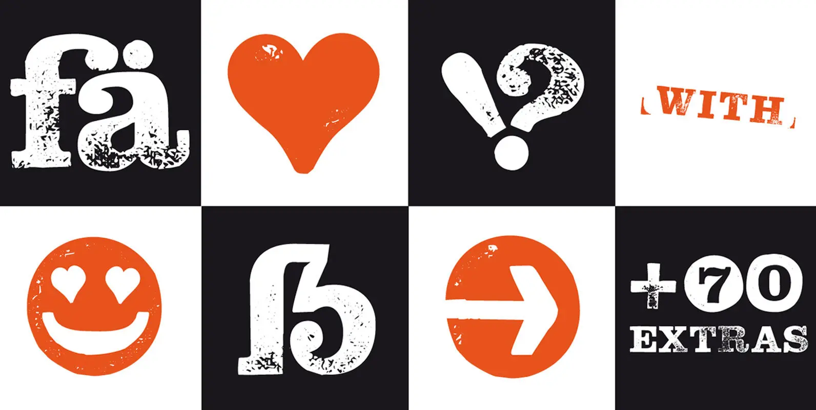
Raw Street Wall Font
The headline font Raw Street Wall from Manuel Viergutz for the Typo Graphic Design Font-Foundry is a playful handmade and rough display font with 567 glyphs. Incl. extras like emoticons/icons and OpenType-Features. Have fun with this font & use the
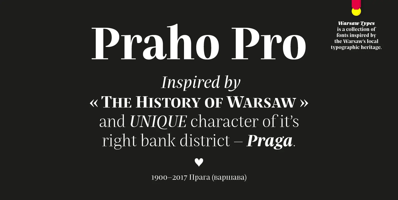
Praho Pro Font
Praho Pro is a part of Warsaw Types – a project based on Warsaw’s local typographic heritage. The project, presented at the Museum of Praga, is a collaboration of 12 young Polish typographers. Praho Pro is a multilingual family inspired
Hand Stamp Slab Serif Rough Font
The typeface “Hand Stamp Slab Serif Rough” is designed for the Typo Graphic Design font foundry in 2017 by Manuel Viergutz. The display font with a classic slab serif type for headlines, based on real rubber stamp letters for a
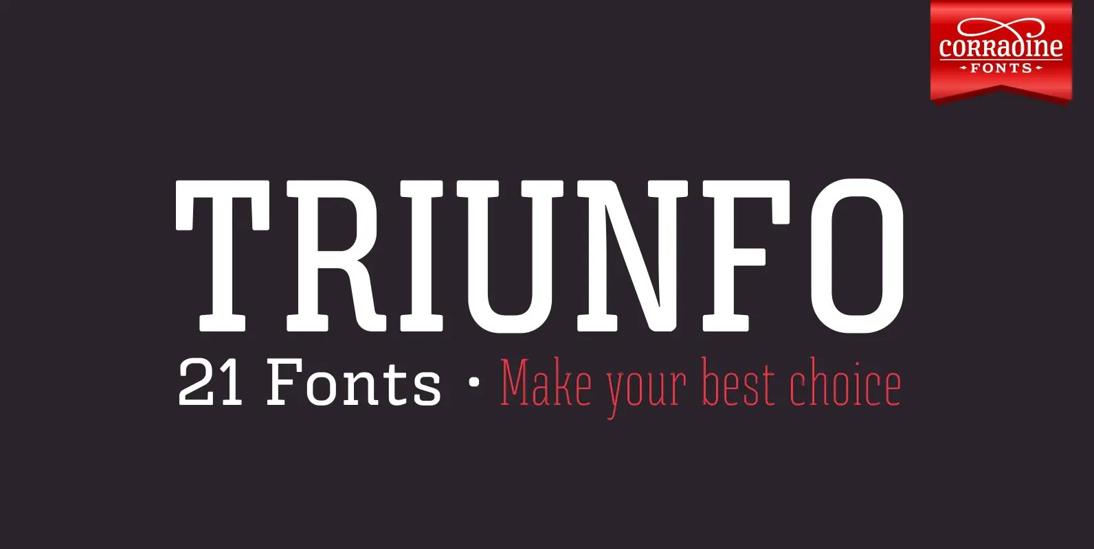
Triunfo Font
Triunfo is a modern slab serif font family with sports flavor. It comes in 21 variants of weight and wide that allows you to choose the best option to use in your work. Published by Corradine FontsDownload Triunfo
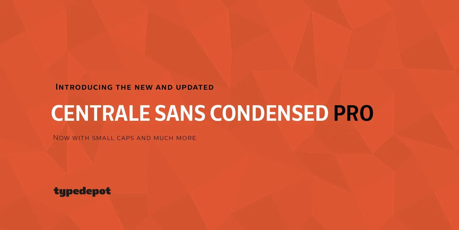
Centrale Sans Condensed Pro Font
Here comes the updated Pro version of Centrale Sans Condensed – not just a “squished” version of the normal Centrale Sans but designed from scratch with all the family characteristics in mind – combination of the grotesque and the humanist
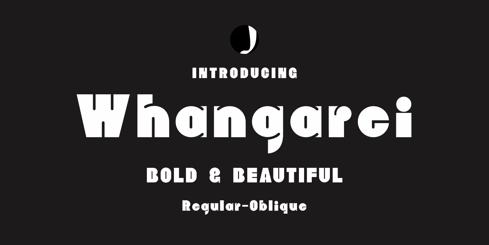
Whangarei Font
Whangarei is a bold, retro styled design that contains 2 styles. Published by Jadugar Design StudioDownload Whangarei
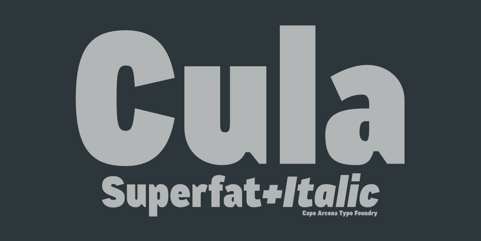
CA Cula Superfat Font
CA Cula Superfat is a distinctive fatty typeface, mainly intended for display purposes. You will find out that it looks best in extremely large sizes, or in very small ones. Whatever you do, avoid the ordinary and expectable. It’s not
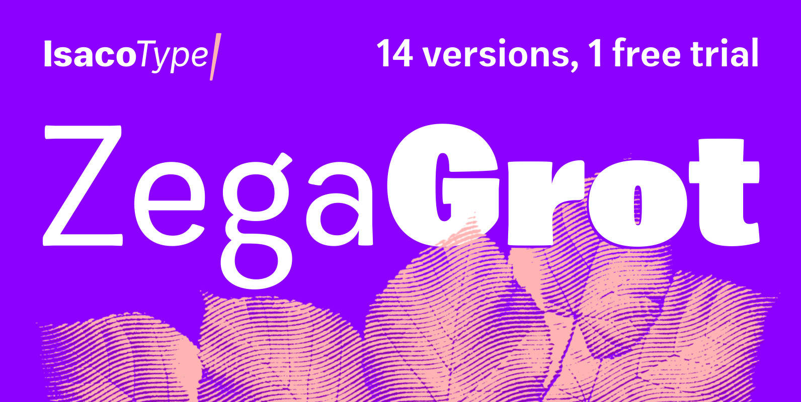
Zega Grot Font
Celebrate good times with Zega Grot family! This font is the companion of Zega Text but less “serious” than its predecessor. The Grot version has old vertical proportions, with higher capitals and asc-descenders, height difference between capitals and ascenders, beyond
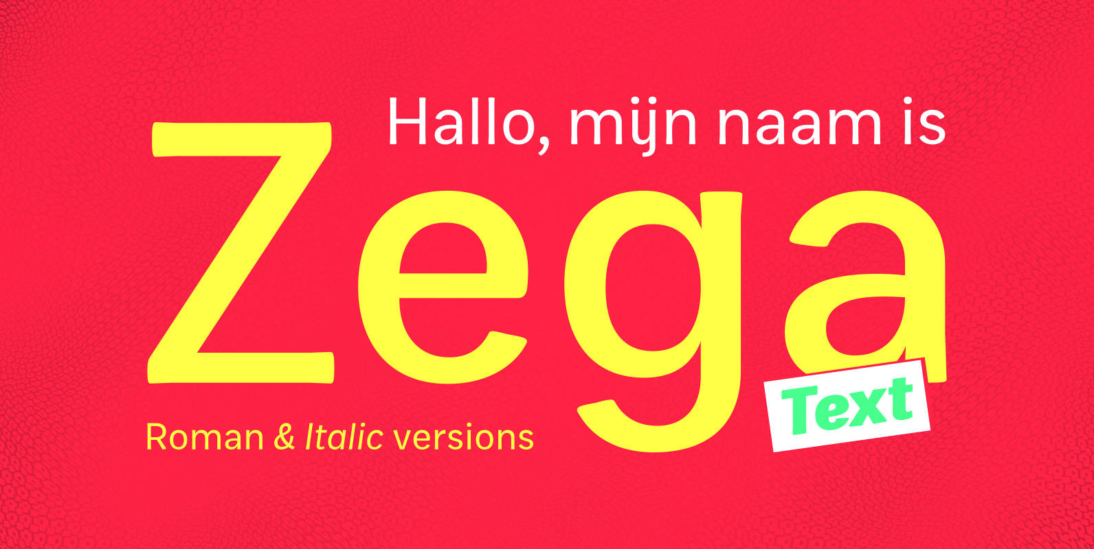
Zega Text Font
Zega Text is a top-heavy sans family, inspired in the imprecisions of letterpress printing. Zega has 14 versions that give to your text (printed or on screen) a delicious sense of old printing. Give an exclusive touch to your text
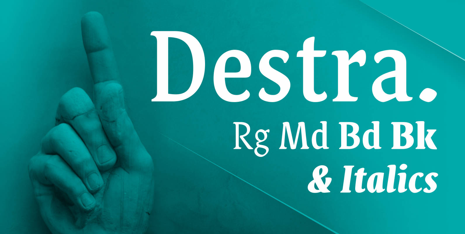
Destra Font
Destra is a contemporary, narrow serif family, suitable to save space and legible at small sizes. Its shapes are the result of a mix of styles. “Destra” is the Portuguese word for “right hand”. The font has several OT features
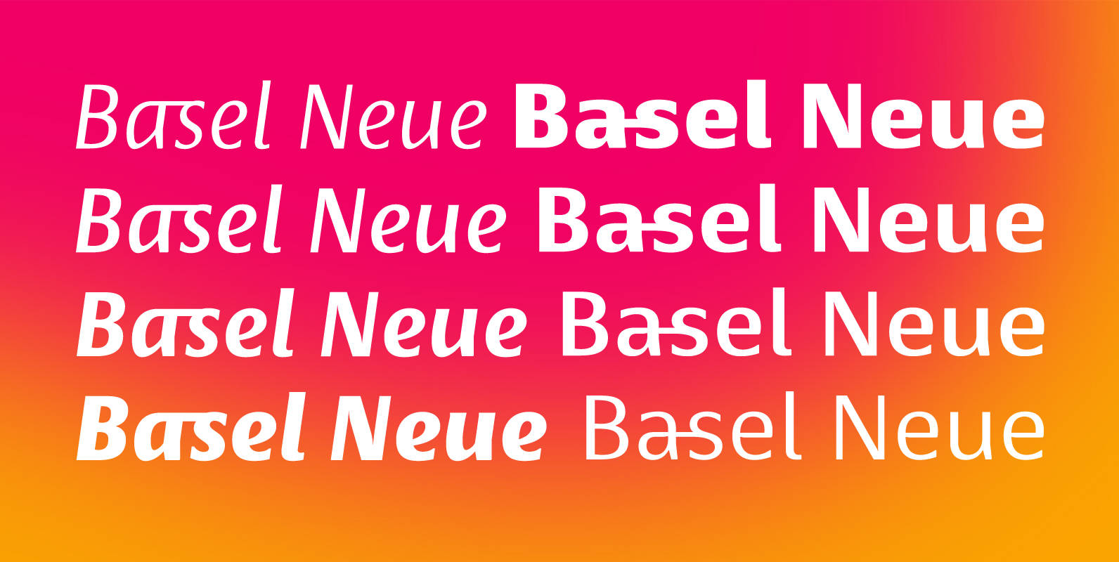
Basel Neue Font
Basel Neue is a legible and discrete typeface, a sans serif with thickness variation and humanistic touch. The family consists of 8 styles, 4 weights plus their respective italic versions. Download the “OT Features” pdf to know and take advantage
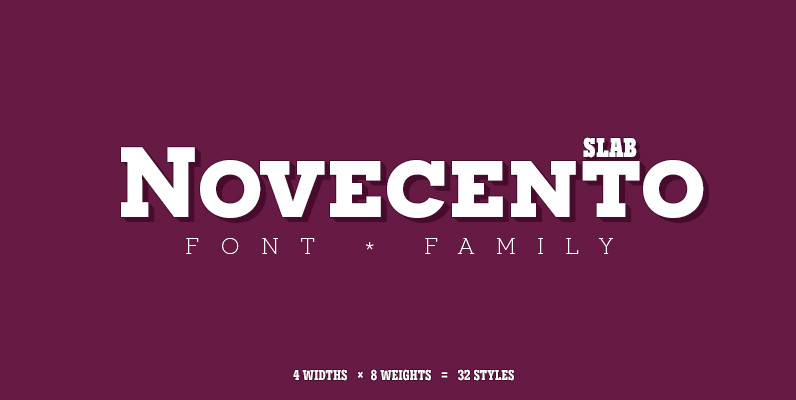
Novecento Slab Font
Novecento Slab is the “slab serif” companion of Novecento Sans, a font family inspired on european typographic tendencies between the second half of 19th century and first half of the 20th. This font face is designed to be used mostly
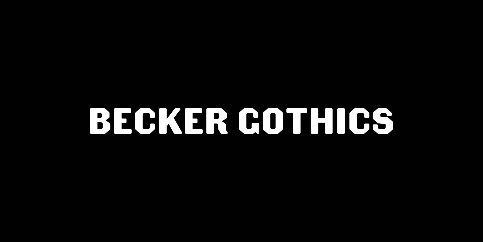
Becker Gothics Font
The Becker Gothics pay homage to the nineteenth century American lettering master George Becker. Designer James Puckett has given new life to the ingenious gothic alphabets found in Becker’s 1854 lettering manual Ornamental Penmanship. Use this quintet of typographic voices